Wikipedia:Featured picture candidates/April-2012
| Featured picture tools |
|---|
Please cut and paste new entries to the bottom of this page, creating a new monthly archive (by closing date) when necessary.
Voting period is over. Please don't add any new votes. Voting period ends on 1 Apr 2012 at 02:01:32 (UTC)

- Reason
- An attractive setting for quaint church with a lengthy lineage.
- Articles in which this image appears
- Frampton Mansell
- FP category for this image
- Wikipedia:Featured pictures/Places/Architecture
- Creator
- Saffron Blaze
- Support as nominator --Saffron Blaze (talk) 02:01, 23 March 2012 (UTC)
- Support -- Quaint is a great description. I love how you've included the drop in front of the church, great for showing the environs. Crisco 1492 (talk) 03:19, 23 March 2012 (UTC)
- Support -- Jkadavoor (talk) 05:14, 23 March 2012 (UTC)
- Comment The rock retaining wall looks over processed - or is that just my eyes? Aaadddaaammm (talk) 10:01, 23 March 2012 (UTC)
- Not sure what you mean. This one is pretty much straight from RAW as I was quite enamoured of the natural lighting. Saffron Blaze (talk) 10:29, 23 March 2012 (UTC)
- I think that the angle of the sun makes the wall's surface particularly contrasty; I'm not seeing anything that jumps out as a sharpening or noise-suppression artifact. TenOfAllTrades(talk) 14:46, 23 March 2012 (UTC)
- Support. TenOfAllTrades(talk) 14:46, 23 March 2012 (UTC)
- Support. Beautiful lighting. J Milburn (talk) 16:15, 23 March 2012 (UTC)
- Support. Nicely taken, once again. I'd like to get out into the countryside a bit more and do something similar. There are a lot of beautiful old buildings (churches or otherwise) in pretty natural settings. You've clearly gone out of your way to find a pleasing composition. Ðiliff «» (Talk) 10:21, 27 March 2012 (UTC)
- Support Colin°Talk 21:41, 31 March 2012 (UTC)
Promoted File:Frampton Mansell St Lukes Church.jpg --Papa Lima Whiskey 2 (talk) 10:46, 1 April 2012 (UTC)
Voting period is over. Please don't add any new votes. Voting period ends on 1 Apr 2012 at 10:34:43 (UTC)

- Reason
- Nice portrait of a notable cornetist
- Articles in which this image appears
- Connie Jones
- FP category for this image
- Wikipedia:Featured pictures/People/Entertainment
- Creator
- Vincent & Bella Productions
- Support as nominator --Tomer T (talk) 10:34, 23 March 2012 (UTC)
- Support; I can get behind this. J Milburn (talk) 16:13, 23 March 2012 (UTC)
- Comment I have added this image to two additional under-illustrated articles where it also carries significant EV; cornet (as an example of the instrument in use) and brass instrument (as the only example of a brass instrument actually being played!). - Zephyris Talk 11:13, 24 March 2012 (UTC)
- Support -- I really like that you can see the crowd in the bell part. Michael miceli (talk) 15:47, 25 March 2012 (UTC)
- Weak support -- Not especially keen on the background (stripe is distracting) Crisco 1492 (talk) 14:01, 26 March 2012 (UTC)
- Oppose: Crop is too tight and feels like a snapshot. Julia\talk 19:15, 31 March 2012 (UTC)
Oppose Good EV indeed but I gree with Julia.■ MMXX talk 11:34, 1 April 2012 (UTC)- Just noticed voting period was over, just one hour late! ■ MMXX talk 11:44, 1 April 2012 (UTC)
Not Promoted --Makeemlighter (talk) 14:20, 1 April 2012 (UTC)
Voting period is over. Please don't add any new votes. Voting period ends on 31 Mar 2012 at 21:59:18 (UTC)

- Reason
- A current and popular young British athlete doing one of the things she does best. Focus is satisfyingly straight on her face and the image has been the lead in her article since at least May last year.
- Articles in which this image appears
- Jessica Ennis, long jump (but only just added)
- FP category for this image
- Wikipedia:Featured pictures/Culture, entertainment, and lifestyle/Sport
- Creator
- Adam Kerfoot-Roberts
- Support as nominator --Julia\talk 21:59, 22 March 2012 (UTC)
- Weak Support for Jessica Ennis, oppose for long jump. A good action shot of her doing the jump, but for long jump we don't get to see the entire sandpit area or runway, which would allow us to put it into context. We don't know from this photo that she's doing a long jump as opposed to just any old jump. Matthewedwards : Chat 22:26, 22 March 2012 (UTC)
- The long jump article is under-illustrated, and this picture has been placed carefully in the section that describes the final part of the jump, so it's entirely relevant to that content. Other pictures would do a better job of illustrating the sandpit, but this one doesn't have to. Also, there's no need to oppose because of one article placement as long as the EV is present elsewhere? Strange way to vote. Julia\talk 22:41, 22 March 2012 (UTC)
- I always assumed that it had to do with the way it was captioned and linked at WP:Featured pictures. Oh well. Matthewedwards : Chat 02:02, 23 March 2012 (UTC)
- I think the general assumption is that since articles are to be put in order of greatest to least EV, where greatest EV usually coincides with narrowest scope, that the narrowest scope will be the nominal one at WP:FP listing. In the rare case that the greatest EV is for the article about the creator (notable artist/photographer), the second best may be included for variety. Papa Lima Whiskey 2 (talk) 08:53, 23 March 2012 (UTC)
- Weak oppose due to motion blur. Fine for an action shot, I guess, but not exactly the best way to identify someone. Honestly, I got an instant headache looking at it, although it's not as bad as an image I've seen at FPC on Commons. Crisco 1492 (talk) 02:00, 23 March 2012 (UTC)
- Support. Good action shot, managed to get a full shot of the face and everything. Clegs (talk) 08:36, 23 March 2012 (UTC)
- Weak support. Could be sharper, but it has a lot of personality. Chick Bowen 05:34, 27 March 2012 (UTC)
- Support per Clegs. 2ms shutter speed leaves nothing to be desired. Papa Lima Whiskey 2 (talk) 16:24, 28 March 2012 (UTC)
Not Promoted --Makeemlighter (talk) 14:22, 1 April 2012 (UTC)
Voting period is over. Please don't add any new votes. Voting period ends on 1 Apr 2012 at 01:12:42 (UTC)

- Reason
- High resolution, good quality, notable (if not iconic) work by a famous artist
- Articles in which this image appears
- Christ Crucified (Velázquez), Christianity, Christ myth theory
- FP category for this image
- Wikipedia:Featured pictures/Artwork/Paintings
- Creator
- Diego Velázquez
- Support as nominator --Crisco 1492 (talk) 01:12, 23 March 2012 (UTC)
- Support per nom. Clegs (talk) 08:53, 25 March 2012 (UTC)
- Support Jkadavoor (talk) 06:14, 26 March 2012 (UTC)
- Support in its own right. Brandmeistertalk 10:32, 26 March 2012 (UTC)
- Support Clears the bar that we've set here. Cowtowner (talk) 17:12, 31 March 2012 (UTC)
Promoted File:Cristo crucificado.jpg --Makeemlighter (talk) 14:23, 1 April 2012 (UTC)
Voting period is over. Please don't add any new votes. Voting period ends on 1 Apr 2012 at 13:41:37 (UTC)
.jpg)
- Reason
- Sharp and clear well-composed image, with high EV
- Articles in which this image appears
- HP Pavilion at San Jose, Hewlett-Packard, List of attractions in Silicon Valley, San Jose, California
- FP category for this image
- Wikipedia:Featured pictures/Places/Architecture
- Creator
- JaGa
- Support as nominator --Tomer T (talk) 13:41, 23 March 2012 (UTC)
- Comment Needs a better caption. Dusty777 16:56, 23 March 2012 (UTC)
- I changed the caption. That's what you meant? Tomer T (talk) 17:41, 23 March 2012 (UTC)
- That's what I meant... Its more informative. Full Support. Dusty777 02:37, 24 March 2012 (UTC)
- Support - Very sharp, high EV, and ... me wantee that camera Crisco 1492 (talk) 23:18, 23 March 2012 (UTC)
- Support Dusty777 02:37, 24 March 2012 (UTC)
- Support. Great shot. J Milburn (talk) 12:24, 24 March 2012 (UTC)
- Support extra999 (talk) 13:44, 25 March 2012 (UTC)
- Support Jkadavoor (talk) 06:16, 26 March 2012 (UTC)
- oppose This is a stitched image so the high-resolution is to be expected. Indeed it is probably downsampled but I have no problem with that given that it is 20MP. Unfortunately the quality has deteriorated since the first upload. The second upload (apparently to fix stitching errors) has a significantly lower JPG quality and strong JPG artefacts are visible in the sky. In fact, even the first image would benefit from a higher JPG quality level to avoid gnats around high-contrast areas. The second upload involved a strong adjustment, presumably from this JPG, which is a no-no. This has just emphasised the JPG artefacts in the sky, which are visible even at normal screen resolution. This image could be rescued if the original photographer could upload a higher-quality JPG, along with the later adjustments that improve the levels. Colin°Talk 22:05, 31 March 2012 (UTC)
Promoted File:HP Pavilion (angle).jpg --Papa Lima Whiskey 2 (talk) 16:40, 1 April 2012 (UTC)
Voting period is over. Please don't add any new votes. Voting period ends on 2 Apr 2012 at 09:48:38 (UTC)

- Reason
- One of the elements of our systemic bias is that we under-feature marine material, especially from the extreme deep. This was taken at a depth of 2602m, and shows a population of Yeti Crabs (white) going about their business around a hydrothermal vent. The image also shows species of Vulcanolepas and Peltospiroidea, which are annotated.
- Articles in which this image appears
- Kiwaidae, hydrothermal vent
- FP category for this image
- Wikipedia:Featured pictures/Sciences/Biology
- Creator
- A. D. Rogers et al., edited by Papa Lima Whiskey 2
- Support as nominator --Papa Lima Whiskey 2 (talk) 09:48, 24 March 2012 (UTC)
- Question -- What's that line? Crisco 1492 (talk) 12:18, 24 March 2012 (UTC)
- According to the caption it's a 10 cm scale bar. O.J. (talk) 12:24, 24 March 2012 (UTC)
- That looks... well, not very useful. It may be okay for the foreground, but it is useless the second we have some depth. Crisco 1492 (talk) 14:25, 24 March 2012 (UTC)
- It passed academic peer review. Do you have a better suggestion? Papa Lima Whiskey 2 (talk) 14:48, 24 March 2012 (UTC)
- For FP, I think a picture without the bar would be better. It's on a busy background, so we're losing detail. For images on a plain background, fine. For this... I don't think it works, from a composition standpoint. Crisco 1492 (talk) 15:16, 24 March 2012 (UTC)
- I don't think removing the information entirely is a step forward, in EV terms. Papa Lima Whiskey 2 (talk) 15:27, 24 March 2012 (UTC)
- Information could go on the description page. Crisco 1492 (talk) 15:38, 24 March 2012 (UTC)
- It's already on the description page. Papa Lima Whiskey 2 (talk) 15:44, 24 March 2012 (UTC)
- Then I don't see a point for the bar. Crisco 1492 (talk) 16:40, 24 March 2012 (UTC)
- I think putting a scale bar on an image with depth like this is a bit of a joke. JJ Harrison (talk) 07:30, 25 March 2012 (UTC)
- I don't see how you can give any sense of scale to it otherwise. Like I said, this was accepted for publication in PLoS, so the scale was either requested or accepted by two or three academic peer reviewers (not sure how many PLoS requires). Removing it gains very little, because you'd have to clone in the background - or get original copy from the researchers. Papa Lima Whiskey 2 (talk) 11:59, 25 March 2012 (UTC)
- As I've explained before, the problem is perspective (eg). It makes the scale bars almost meaningless. JJ Harrison (talk) 21:59, 27 March 2012 (UTC)
- And that's exactly why it's explicitly stated that the scale applies to the foreground. You may have realised that background sizes can be roughly estimated on the basis that the crabs in the background aren't, in reality, smaller than the ones in the foreground. Your argument really makes no sense to me - it's the equivalent of saying because we can't represent ultraviolet in human vision, let's have no colour photography at all. Papa Lima Whiskey 2 (talk) 09:13, 30 March 2012 (UTC)
- Where in the foreground? Perspective still applies there. JJ Harrison (talk) 02:21, 3 April 2012 (UTC)
- I don't think we need to make ourselves stupider than we are. It's pretty clear to me where the foreground is. I understand you may have felt your feathers ruffled by suggestions that you should include scales in some of your images in the past. I stand by the need for them. Papa Lima Whiskey 2 (talk) 17:07, 3 April 2012 (UTC)
- As I've explained before, the problem is perspective (eg). It makes the scale bars almost meaningless. JJ Harrison (talk) 21:59, 27 March 2012 (UTC)
- I don't see how you can give any sense of scale to it otherwise. Like I said, this was accepted for publication in PLoS, so the scale was either requested or accepted by two or three academic peer reviewers (not sure how many PLoS requires). Removing it gains very little, because you'd have to clone in the background - or get original copy from the researchers. Papa Lima Whiskey 2 (talk) 11:59, 25 March 2012 (UTC)
- I think putting a scale bar on an image with depth like this is a bit of a joke. JJ Harrison (talk) 07:30, 25 March 2012 (UTC)
- Then I don't see a point for the bar. Crisco 1492 (talk) 16:40, 24 March 2012 (UTC)
- It's already on the description page. Papa Lima Whiskey 2 (talk) 15:44, 24 March 2012 (UTC)
- Information could go on the description page. Crisco 1492 (talk) 15:38, 24 March 2012 (UTC)
- I don't think removing the information entirely is a step forward, in EV terms. Papa Lima Whiskey 2 (talk) 15:27, 24 March 2012 (UTC)
- For FP, I think a picture without the bar would be better. It's on a busy background, so we're losing detail. For images on a plain background, fine. For this... I don't think it works, from a composition standpoint. Crisco 1492 (talk) 15:16, 24 March 2012 (UTC)
- It passed academic peer review. Do you have a better suggestion? Papa Lima Whiskey 2 (talk) 14:48, 24 March 2012 (UTC)
- That looks... well, not very useful. It may be okay for the foreground, but it is useless the second we have some depth. Crisco 1492 (talk) 14:25, 24 March 2012 (UTC)
- According to the caption it's a 10 cm scale bar. O.J. (talk) 12:24, 24 March 2012 (UTC)
- Oppose. Quality isn't that great, and the bar really puts me off. Clegs (talk) 08:56, 25 March 2012 (UTC)
- I think you should consider the problems of shooting at 2600m (thick glass) and near a HTV (hot currents, murky water from suspended sediments/biomass) - compare e.g. another prominently used hi-res photograph. Papa Lima Whiskey 2 (talk) 11:59, 25 March 2012 (UTC)
- I have to agree here, at these depths and water conditions the thickness of glass necessary to keep the camera from turning into a mini-crushed version of it's self poses some limitations in quality one can reasonably expect. That and the rareness of such an image, people RARELY visit these locations, and its LIKELY next time someone does visit this area could be barren and may NEVER be photographed again. Thermal vents and the associated communities are very temporary, and not a lot of people are researching them and have the funding to afford to dive on them. Some technical images one has to be a bit forgiving in the image quality, and even size in some cases like many space photographs that are featured pictures, or ones like File:Pale_Blue_Dot.png which doesn't even come close to size requirements but is clearly something that should be featured because we likely will never get an image like that again. — raekyt 00:21, 26 March 2012 (UTC)
- I still oppose because of the bar. it's epically distracting. Clegs (talk) 11:28, 26 March 2012 (UTC)
- Support nice, rare and very interesting image. --Alchemist-hp (talk) 06:54, 26 March 2012 (UTC)
- Oppose because of that bar, as I've discussed above. Crisco 1492 (talk) 14:01, 26 March 2012 (UTC)
Not Promoted --Makeemlighter (talk) 16:04, 2 April 2012 (UTC)
Voting period is over. Please don't add any new votes. Voting period ends on 31 Mar 2012 at 00:52:40 (UTC)


- Reason
- Striking design, high resolution and quality
- Articles in which this image appears
- The Crucified Soldier, Crucifixion in the arts
- FP category for this image
- Wikipedia:Featured pictures/Culture, entertainment, and lifestyle/Culture and lifestyle or Wikipedia:Featured pictures/History/World War I
- Creator
- Fernando Amorsolo, restored by Crisco 1492
- Support as nominator --Crisco 1492 (talk) 00:52, 22 March 2012 (UTC)
- Support, prefer Edit. Very valuable illustration for the article. Jujutacular (talk) 03:06, 22 March 2012 (UTC)
- Question Why does the poster have text in both Spanish and English? What's its historical background. Nick-D (talk) 10:13, 22 March 2012 (UTC)
- The Spanish text means the same thing as the English text, the poster was most likely used in some bilingual areas. I didn't see any commentary on it at loc: [1]. Jujutacular (talk) 12:25, 22 March 2012 (UTC)
- Considering who the artist is, the poster may have been published in the Philippines as well. Crisco 1492 (talk) 15:32, 22 March 2012 (UTC)
- Without knowing the historic background of the image's unusual use of both English and Spanish, it's hard to see what it's EV is. As such, I'm regretfully going to
opposethis nomination on EV ground. Nick-D (talk) 09:42, 23 March 2012 (UTC)- LOC says published in Manila, Philippines. Crisco 1492 (talk) 06:35, 26 March 2012 (UTC)
- OK that helps, without more information it's hard to judge the EV of the image though. As such, I'm moving to neutral. Nick-D (talk) 09:43, 26 March 2012 (UTC)
- LOC says published in Manila, Philippines. Crisco 1492 (talk) 06:35, 26 March 2012 (UTC)
- Without knowing the historic background of the image's unusual use of both English and Spanish, it's hard to see what it's EV is. As such, I'm regretfully going to
- Considering who the artist is, the poster may have been published in the Philippines as well. Crisco 1492 (talk) 15:32, 22 March 2012 (UTC)
- The Spanish text means the same thing as the English text, the poster was most likely used in some bilingual areas. I didn't see any commentary on it at loc: [1]. Jujutacular (talk) 12:25, 22 March 2012 (UTC)
- Oppose We have at last count 11 FPs of Allied propaganda material and none for the Central Powers. I consider this a huge problem for Wikipedia's objectivity, to be rectified before we promote any more Allied material. Papa Lima Whiskey 2 (talk) 17:57, 22 March 2012 (UTC)
- As I've noted time and again, that's not one of the criteria. Crisco 1492 (talk) 21:20, 22 March 2012 (UTC)
- It's one of the overriding principles of any encyclopedia and as such, overrides the criteria. Papa Lima Whiskey 2 (talk) 21:32, 22 March 2012 (UTC)
- Isn't this just a function of availability as opposed to some other agenda? Particularly so since this is English Wikipedia. A great image with EV should always be open for consideration. Otherwise we will get rules like too many butterflies not enough moths, stop promoting hummingbirds until we have more crows. Saffron Blaze (talk) 21:48, 22 March 2012 (UTC)
- Exactly. Most German and other Central propoganda we have is of a very low resolution (the German archives gave us fairly small files, not like what is accessible through the LOC). Crisco 1492 (talk) 21:58, 22 March 2012 (UTC)
- Availability has little to do with it. We often oppose things not because something better is available, but because something better *could be* available. So saying we have lots of stuff in LOC is absolutely no excuse for systemic bias. Papa Lima Whiskey 2 (talk) 22:11, 22 March 2012 (UTC)
- Availability does indeed have much to do with it. I find it odd you would argue otherwise. If the LOC gives Wiki hundreds of high quality images with good EV they should be judged on their own merit not predicated on the fact that the German Archives (or any other agency) didn't do the same. If they had I suspect we'd see more of them getting nominated. I'd love to see more German and Russian ones but if they aren't available I am not going to penalise the ones that do get nominated. Moreover, I am not convinced something better *could be* available actually applies to these particular posters. Saffron Blaze (talk) 22:23, 22 March 2012 (UTC)
- You should do more research before lunging into hyperbolic claims. Bundesarchiv has nothing to do with it as for all we know they have no appropriate images. Nor is LOC our only source for Allied images, so please stop implying this. Contentedness with having the victors write history is simply not an acceptable position for an encyclopedia. Papa Lima Whiskey 2 (talk) 22:31, 22 March 2012 (UTC)
- The subject this has the most EV in is a decisively Allied one. I'd love a good quality Central poster; if I find one I'll be sure to nominate it. I just don't think we should penalise this one because we have many other propaganda posters. Would we say "too much da Vinci" if someone nominated another da Vinci work (or Goya, since that's what I've been digging up recently) Crisco 1492 (talk) 22:35, 22 March 2012 (UTC)
- Yes, actually, you have been nominating too much Goya and Whistler recently, and I stopped just short of making this a topic of conversation on the talk page. You're dragging this discussion into off topic territory, however. I'm deliberately making note of this. Papa Lima Whiskey 2 (talk) 23:41, 22 March 2012 (UTC)
- Meh, my recent painting nomination wasn't even Spanish. Alright, back to content creation. Crisco 1492 (talk) 00:27, 23 March 2012 (UTC)
- PLW, my premise is simply that more good quality Allied posters seem more readily availble than those of the Central Powers. Their sources or lack thereof are irrelevant to the discussion and I wasn't implying anything other than offering an example. If in your extensive research there is indeed high quality posters then they can be brought forward for nomination. It might help us avoid further hyperbolic statements like *Victors write history*. Saffron Blaze (talk) 23:01, 22 March 2012 (UTC)
- No hyperbole on my part - see e.g. Philosophy of history#Historical accounts of writing history. I don't remotely understand how you can place the burden of providing materials on the occupied nation itself. The bottom line is you can't expect to make a good encyclopedia only from materials that conveniently drop into your lap, you have to put some actual effort into it. This may involve finding materials that aren't in the LoC. Papa Lima Whiskey 2 (talk) 23:41, 22 March 2012 (UTC)
- Good golly, you actually felt the need to lecture me. Look, I am not placing a burden on anyone. It should be readily apparent to you that people contribute what interests them. As such this encylopedia is wholly dependent on what drops in its lap. It may not be ideal but it is what we have to work with so make the most of it. When a source comes forward with hundreds of Central Powers propaganda posters I hope you'll be here to ensure we don't go too apeshit over it. I suggest you go look for them because I will be too busy taking pretty little pictures of old churches and forcing an Anglican agenda on this hapless encylopedia. Saffron Blaze (talk) 01:24, 23 March 2012 (UTC)
- Forcing an Anglican agenda? With all the British editors here, I hardly think that's necessary... Besides, I like the pictures of churches I see here. Crisco 1492 (talk) 01:34, 23 March 2012 (UTC)
- I can assure you my tongue was firmly planted in my cheek :) I am neither Anglican nor British. Saffron Blaze (talk) 14:36, 23 March 2012 (UTC)
- Support edit Good reproduction and good EV. This picture is used in several places by WP and passes the criteria, so it deserves FP status. PLW, if you want to complain about our Anglican cabal, go find several of the high-rez, good quality Central posters, bring them here, and let us promote them. If we shoot them down because they're from the Central powers, then you can complain about systemic bias. Clegs (talk) 08:29, 23 March 2012 (UTC)
- Support Per nom. PLW confuses NPOV with systemic bias. JJ Harrison (talk) 22:32, 23 March 2012 (UTC)
- You raise a good point. How can we keep things NPOV, then? Papa Lima Whiskey 2 (talk) 09:15, 24 March 2012 (UTC)
- Other images would be good. However, the article caption starts with 'American propaganda poster depicting ...'. This largely takes care of the NPOV problem - the reader is made aware that the image is not a neutral depiction. JJ Harrison (talk) 22:14, 26 March 2012 (UTC)
- You raise a good point. How can we keep things NPOV, then? Papa Lima Whiskey 2 (talk) 09:15, 24 March 2012 (UTC)
- Support. I don't get the systemic bias charge. We feature the good pictures that are available. We can't feature what we don't have, and it's not a zero-sum game: featuring any one image does not make it less likely that another image with a different subject will be featured. Chick Bowen 05:45, 27 March 2012 (UTC)
- The problem is that we have 11 FPs of Allied propaganda already. We have absolutely none, zilch, zero for the Central Powers. If this doesn't strike you as a huge imbalance, I don't know what will. We're not talking about butterflies, mind you - we're talking about propaganda. Papa Lima Whiskey 2 (talk) 09:27, 27 March 2012 (UTC)
- I spent about 30 minutes earlier today looking for high quality Soviet Posters. I saw one or two, but they were not definitely free. Crisco 1492 (talk) 13:09, 27 March 2012 (UTC)
- That's nice, but the Soviets were Allied. Going off topic again... Papa Lima Whiskey 2 (talk) 13:21, 27 March 2012 (UTC)
- I spent about 30 minutes earlier today looking for high quality Soviet Posters. I saw one or two, but they were not definitely free. Crisco 1492 (talk) 13:09, 27 March 2012 (UTC)
- The problem is that we have 11 FPs of Allied propaganda already. We have absolutely none, zilch, zero for the Central Powers. If this doesn't strike you as a huge imbalance, I don't know what will. We're not talking about butterflies, mind you - we're talking about propaganda. Papa Lima Whiskey 2 (talk) 09:27, 27 March 2012 (UTC)
- Support we run into the WP:FS issue here. What happens when there is a high quality file that we have several of the same time of? Since the imbalence isn't that high, I will go with a support. --Guerillero | My Talk 14:15, 28 March 2012 (UTC)
Edit okay? Makeemlighter (talk) 01:35, 31 March 2012 (UTC)
- I'm fine with it, and I count two preferences for the edit. Crisco 1492 (talk) 04:19, 31 March 2012 (UTC)
- Fine by me --Guerillero | My Talk 14:47, 2 April 2012 (UTC)
Promoted File:Your Liberty Bond will help stop this Crisco restoration and colours.jpg --Makeemlighter (talk) 16:07, 2 April 2012 (UTC)
Voting period is over. Please don't add any new votes. Voting period ends on 3 Apr 2012 at 00:37:46 (UTC)

- Reason
- Iconic work in high resolution, nice and free
- Articles in which this image appears
- American Gothic, Grant Wood, +8
- FP category for this image
- Wikipedia:Featured pictures/Artwork/Paintings
- Creator
- Grant Wood
- Support as nominator --Crisco 1492 (talk) 00:37, 25 March 2012 (UTC)
- Support -- Great stuff. Would have loved to see even more detail. Saffron Blaze (talk) 01:59, 25 March 2012 (UTC)
- Question: Why is there a white border around three sides, but not the right side? Clegs (talk) 08:59, 25 March 2012 (UTC)
- I opened it in GIMP and could not see a border. There is some cracking around the edges, though. Crisco 1492 (talk) 09:22, 25 March 2012 (UTC)
- Support per nom. Brandmeistertalk 11:12, 25 March 2012 (UTC)
- Support extra999 (talk) 13:44, 25 March 2012 (UTC)
- Support I wanna party with these two! --Hadseys (talk) 15:22, 26 March 2012 (UTC)
- Support -- as per Hadseys :) Jkadavoor (talk) 05:49, 28 March 2012 (UTC)
- Support Agree with Saffron Blaze. Colin°Talk 22:08, 31 March 2012 (UTC)
- SupportThey look straight out of a zombie horror.[[User talk:ayanosh|T]]☺[[Special:Emailuser/ayanosh|M]] (talk) 18:19, 1 April 2012 (UTC)ayanosh
Promoted File:Grant DeVolson Wood - American Gothic.jpg --Papa Lima Whiskey 2 (talk) 15:24, 3 April 2012 (UTC)
Voting period is over. Please don't add any new votes. Voting period ends on 3 Apr 2012 at 13:04:37 (UTC)

- Reason
- Like the Chris Martin image below, this photo of notable comedian Zoe Lyons has been donated by photographer Steve Ullathorne. It is of high quality and represents her anarchic sense of humour quite well.
- Articles in which this image appears
- Zoe Lyons (lead image)
- FP category for this image
- People/Entertainment
- Creator
- Steve Ullathorne

- Support as nominator --A Thousand Doors (talk | contribs) 13:04, 25 March 2012 (UTC)
- Support -- Pure awesome, love the pose (made me LOL). Crisco 1492 (talk) 14:21, 25 March 2012 (UTC)
- Support Not exactly flattering! But that's not the point. Great to get the full-resolution original. Colin°Talk 16:15, 25 March 2012 (UTC)
- Support. I've updated the author information. From what I know of the subject, this fits completely! J Milburn (talk) 21:24, 25 March 2012 (UTC)
- Support. She's got creepy two-tone eyes just like I do! Clegs (talk) 12:11, 26 March 2012 (UTC)
- Support -- A portrait image of a comedian couldn't have been better. Sanyambahga (talk) 21:44, 27 March 2012 (UTC)
- Over-the-top enthusiastically support Best free image of a living person nominated here yet. Daniel Case (talk) 01:19, 30 March 2012 (UTC)
- SupportMost amusing picture around.[[User talk:ayanosh|T]]☺[[Special:Emailuser/ayanosh|M]] (talk) 18:15, 1 April 2012 (UTC)ayanosh
- Support funny lady Alborzagros (talk) 07:16, 2 April 2012 (UTC)
- Support edit Great pic. I've made a crop which I think improves the composition. The crop now obeys the rule of thirds vertically (on the open eye), and it gives equal space to the left and right of the arms. --99of9 (talk) 07:52, 3 April 2012 (UTC)
Promoted File:Zoe Lyons Cigar Wink High Res.jpg --Papa Lima Whiskey 2 (talk) 15:26, 3 April 2012 (UTC)
- If anyone else feels strongly about the crop, comment here and if there are enough voices, I'll swap them over. Papa Lima Whiskey 2 (talk) 16:11, 3 April 2012 (UTC)
Voting period is over. Please don't add any new votes. Voting period ends on 3 Apr 2012 at 12:58:08 (UTC)

- Reason
- This high-quality, professional image has kindly been donated to the Wikimedia Foundation by photographer Steve Ullathorne. The photo clearly indentifies Chris Martin (no, not that one), and has been released through the OTRS.
- Articles in which this image appears
- Chris Martin (comedian) (lead image)
- FP category for this image
- People/Entertainment
- Creator
- Steve Ullathorne
- Support as nominator --A Thousand Doors (talk | contribs) 12:58, 25 March 2012 (UTC)
- Support -- Love it. I don't mind that his hair is out of frame, comes across as more powerful. Crisco 1492 (talk) 14:23, 25 March 2012 (UTC)
- Oppose I don't like the tiny crop off his hair or the unbalanced crop of his arms. The background with the chairline matching his hairline is distracting. Otherwise it is a great pose and technically very good. Colin°Talk 16:39, 25 March 2012 (UTC)
- Support. Great protrait. Clegs (talk) 11:31, 26 March 2012 (UTC)
- Oppose I think the asymmetry of the crop is very off-putting. JJ Harrison (talk) 12:03, 1 April 2012 (UTC)
- Oppose Exceedingly awkward crop. NativeForeigner Talk 06:53, 3 April 2012 (UTC)
- Oppose crop, obviously poor. --99of9 (talk) 07:34, 3 April 2012 (UTC)
Not Promoted --Papa Lima Whiskey 2 (talk) 15:27, 3 April 2012 (UTC)
Voting period is over. Please don't add any new votes. Voting period ends on 4 Apr 2012 at 01:52:17 (UTC)

- Reason
- Crisp, encyclopedic, interesting, surprised it hasn't been nominated before.
- Articles in which this image appears
- Earth's location in the universe, Local Group, Milky Way, Observable universe, Solar System, Supercluster
- FP category for this image
- Space
- Creator
- Ras67
- Support as nominator --Hadseys (talk) 01:52, 26 March 2012 (UTC)
- Comment User:Azcolvin429 is the original creator of this image. It appears Ras67 uploaded an edited version. I wonder if this should be in png format because it's a diagram, and one that is comprised of 8 files that were all originally pngs. Matthewedwards : Chat 04:03, 26 March 2012 (UTC)
- It's very good though. Matthewedwards : Chat 04:03, 26 March 2012 (UTC)
- Conditional support The word "superclusters" in "local superclusters" and perhaps "interstellar neighborhood" should be decapitalized since they aren't proper names and the word "sol" is redundant. Btw, Google Chrome dealt well with the resolution. Brandmeistertalk 10:29, 26 March 2012 (UTC)
- Support. Wow. This is the most impressive diagram to come through in a while. Clegs (talk) 12:12, 26 March 2012 (UTC)
- Support per Clegs. Crisco 1492 (talk) 14:05, 26 March 2012 (UTC)
- Oppose The individual pictures are great but I don't think it is useful in this format. File:Earth's Location in the Universe SMALLER (JPEG).jpg has a more useful 4x2 format and a perfectly adequate size for both screen and printing up to A3 format. Using the Interactive large-image-viewer (flash-based) on my Firefox browser gives the most awful lossy JPG quality, and the non-flash one doesn't seem to work at all. I can download the full size image but it is a bugger to work with: to view the sequence, one has to pan right, but to do that reasonably, you have to reduce the size to fit the screen, which makes the ridiculously high resolution kind of pointless. If someone really is going to print poster sized images then they'll print the individual ones. I think there are better ways of presenting this kind of image. Colin°Talk 21:05, 26 March 2012 (UTC)
- Update: on a different computer I'm not getting the awful JPG artefacts with the flash viewer. But the Virgo Supercluster image has banding and the other issues still apply. Colin°Talk 22:13, 31 March 2012 (UTC)
.jpg)
Not Promoted --Makeemlighter (talk) 03:15, 4 April 2012 (UTC)
Voting period is over. Please don't add any new votes. Voting period ends on 4 Apr 2012 at 10:31:29 (UTC)

- Reason
- Wikimedia/Wikipedia is fortunate to have some or many good quality images; they're more Here's a chance I would not like to lose to recognise this as a good image from the world of religions. Perhaps for those who are not at all that familiar with Durga Puja: also referred to as Durgotsava , is an annual Hindu festival in South Asia-especially in Bengal-that celebrates worship and pays homage to the Hindu Goddess Durga. The gleaming idol of the deity and the supreme power makes this one a keeper, according to me.......this for me is the actual face of Kolkata, the City of Joy which never stops it for me is the city of cities and Durga Puja for me is the festivals of festivals and Maa Durga for me is the Supreme Power...well remember that God is One....irrespective of religions!!
- Articles in which this image appears
- Durga and Durga Puja.
- FP category for this image
- Wikipedia:Featured pictures/Culture, entertainment, and lifestyle/Religion and mythology
- Creator
- Jagadhatri
- Support as nominator --Jagadhatri(২০১২) 10:31, 26 March 2012 (UTC)
- Semi-Support It is a good quality image which wonderfully captures the face of the idol of Durga! But, I think you should write the description in details, where and when you took the image? --Tito Dutta (Send me a message) 10:57, 26 March 2012 (UTC)
- Oppose -- Comment first: this has not been in the article for a week, so it should not be nominated yet. Opposing reason: composition. Her headdress is cut off, as are many of her hands. Crisco 1492 (talk) 13:52, 26 March 2012 (UTC)
- "This one will not qualify as FI, I feel! --Tito Dutta (Send me a message) 10:26, 26 March 2012 (UTC)" Aaadddaaammm (talk) 19:15, 26 March 2012 (UTC)
- Oppose -- Low quality image with poor composition. Sanyambahga (talk) 06:09, 27 March 2012 (UTC)
- Comment With the articles being rather over-illustrated, I worry that some images will eventually be removed. I removed an unreferenced map from one of the articles today, and this was followed by Tito stating the same concern [2]. We don't really want to promote images in situations where they're likely to turn orphans shortly afterwards. Papa Lima Whiskey 2 (talk) 17:09, 29 March 2012 (UTC)
- Oppose-Same as Sanyambahga[[User talk:ayanosh|T]]☺[[Special:Emailuser/ayanosh|M]] (talk) 18:21, 1 April 2012 (UTC)ayanosh
Not Promoted --Makeemlighter (talk) 03:16, 4 April 2012 (UTC)
Voting period is over. Please don't add any new votes. Voting period ends on 4 Apr 2012 at 21:20:51 (UTC)

- Reason
- High EV, I'm not really satisfied with the quality, but it just got featured on Commons.
- Articles in which this image appears
- Metropolitan Opera House (39th St), Metropolitan Opera, Antonio Paoli, Josef Hofmann and Thomas Beecham
- FP category for this image
- USA History
- Creator
- Unknown photographer, restored by Mmxx
- Support as nominator -- ■ MMXX talk 21:20, 26 March 2012 (UTC)
- Support -- I took a look at this at Commons but didn't weigh in. Nice image. Crisco 1492 (talk) 23:13, 26 March 2012 (UTC)
- There's something quite odd about it. The blacks in the aisles are so black, and there's maybe some lens distortion too: the people next to the aisles look like paper cutouts. This is a newspaper shot and it probably was airbushed (I mean literally, not the photoshop tool) to look better in newsprint (see this picture, particularly the eyes, for the kinds of things they used to do). EV is definitely high, as this is maybe the most important demolished theater in New York, and, though I seem to have a picture of the stage in my own collection, I haven't seen too many of the house (there are a few non-free ones on the internet, though, like this, so they exist). I'm torn. Chick Bowen 05:31, 27 March 2012 (UTC)
- Weak Support The slightly off centre photographer position makes it feel a bit odd. JJ Harrison (talk) 12:04, 1 April 2012 (UTC)
- Support classic FP to me. Tomer T (talk) 22:01, 1 April 2012 (UTC)
- Oppose per Chick Bowen. I agonized over this one. I know it's non-repeatable and has very high EV, but it's so highly edited and poorly exposed that I can't in good conscience support. Clegs (talk) 18:17, 2 April 2012 (UTC)
Not Promoted --Makeemlighter (talk) 02:23, 5 April 2012 (UTC)
Voting period is over. Please don't add any new votes. Voting period ends on 4 Apr 2012 at 21:00:09 (UTC)


- Reason
- Well-composed, natural, high-resolution photo of Raphael Matos wearing his racing gear and with an appropriate back-drop for the subject.
- Articles in which this image appears
- Raphael Matos
- FP category for this image
- People/Sport
- Creator
- myself, User:nave.notnilc
- Support as nominator --Nave.notnilc (talk) 21:00, 26 March 2012 (UTC)
- Oppose original -- Poor composition (team member behind him) Crisco 1492 (talk) 05:10, 27 March 2012 (UTC)
- Support The composition is perfectly explained in the nomination statement, which one should take care to read, on repeated occasions. Papa Lima Whiskey 2 (talk) 13:50, 27 March 2012 (UTC)
- Very POINT-y. I read both (note that I didn't complain about the
cartires). The team member is extraneous, cut off, and distracting. Crisco 1492 (talk) 14:17, 27 March 2012 (UTC)
- Very POINT-y. I read both (note that I didn't complain about the
Neutral weighted towards oppose. Hands are cut off, distracting orange blob in the upper left corner. Yes, I know it's a crew member, but it still looks like a distracting orange blob. AndLet's please keep our comments to the picture at hand, not how we feel about other people's actions on other recent noms. Clegs (talk) 10:21, 28 March 2012 (UTC)- Reviewers should consider it their obligation to read the opening statement and caption, and if they evidently do not, they should be reminded of the need to do so. Papa Lima Whiskey 2 (talk) 12:45, 28 March 2012 (UTC)
- And if the reminder is barking up the wrong tree, i.e. making the wrong assumptions? Crisco 1492 (talk) 22:46, 28 March 2012 (UTC)
- If this is not relevant to the nom, it needs to find a new venue. Papa Lima Whiskey 2 (talk) 07:49, 29 March 2012 (UTC)
- I'm willing to edit out the crew member in the background (I think it can be done cleanly); would that be within the 'minimal editing' bounds of the guidelines? Nave.notnilc (talk) 17:51, 28 March 2012 (UTC)
- It looked to me like it could be done cleanly, and yes, that would easily be sufficiently minor based on previously promoted items. Papa Lima Whiskey 2 (talk) 21:32, 28 March 2012 (UTC)
- I'd certainly reconsider my vote. Crisco 1492 (talk) 22:46, 28 March 2012 (UTC)
- It looked to me like it could be done cleanly, and yes, that would easily be sufficiently minor based on previously promoted items. Papa Lima Whiskey 2 (talk) 21:32, 28 March 2012 (UTC)
- And if the reminder is barking up the wrong tree, i.e. making the wrong assumptions? Crisco 1492 (talk) 22:46, 28 March 2012 (UTC)
- Reviewers should consider it their obligation to read the opening statement and caption, and if they evidently do not, they should be reminded of the need to do so. Papa Lima Whiskey 2 (talk) 12:45, 28 March 2012 (UTC)
- Comment - Edited to remove crew member from upper left. Nave.notnilc (talk) 04:30, 29 March 2012 (UTC)
- Comment: The edit should generally be added separately. I'd support it, but it should follow Commons' policy. Crisco 1492 (talk) 05:28, 29 March 2012 (UTC)
- Sorry, wasn't aware of the convention; reverted and re-uploaded as separate file. Nave.notnilc (talk) 21:08, 29 March 2012 (UTC)
- Support edit 1 only Crisco 1492 (talk) 23:12, 29 March 2012 (UTC)
- Support edit 1 only. Addresses my above concerns enough. Clegs (talk) 07:15, 30 March 2012 (UTC)
- Support edit 1 only. The edit to remove the "orange blob" has been skilfully done and greatly improves the portrait. What was all that fuss about. Colin°Talk 22:19, 31 March 2012 (UTC)
- Oppose Forced smile and awkward body pose, face in shadow. JJ Harrison (talk) 02:23, 3 April 2012 (UTC)
- Oppose per JJ. This is not an exceptional portrait. J Milburn (talk) 09:01, 3 April 2012 (UTC)
- Oppose per JJ Harrison. Sanyambahga (talk) 17:59, 4 April 2012 (UTC)
Not Promoted --Makeemlighter (talk) 02:25, 5 April 2012 (UTC)
Voting period is over. Please don't add any new votes. Voting period ends on 5 Apr 2012 at 03:06:42 (UTC)

Legend | |||
|---|---|---|---|
Areas of the prison as labelled by Ransom:
|
- Reason
- High resolution, good quality, valuable depiction of the subject
- Articles in which this image appears
- Andersonville National Historic Site, National Register of Historic Places listings in Sumter County, Georgia, Prisoner-of-war camp
- FP category for this image
- Wikipedia:Featured pictures/History/War
- Creator
- John L. Ransom, restored by Jujutacular
- Support as nominator --Jujutacular (talk) 03:06, 27 March 2012 (UTC)
- Support -- Striking. I'd copy the numbers to the image description page and maybe overlay the information on the map in the article, like our diagram of the Su25 Crisco 1492 (talk) 05:02, 27 March 2012 (UTC)
- ✓ Added labels to the image description page, overlayed numbers on image. Jujutacular (talk) 16:14, 27 March 2012 (UTC)
- Beautiful. Crisco 1492 (talk) 23:09, 27 March 2012 (UTC)
- ✓ Added labels to the image description page, overlayed numbers on image. Jujutacular (talk) 16:14, 27 March 2012 (UTC)
- Support -- Jkadavoor (talk) 05:45, 28 March 2012 (UTC)
- Support ■ MMXX talk 16:25, 30 March 2012 (UTC)
- Support Tomer T (talk) 10:52, 31 March 2012 (UTC)
Promoted File:Andersonville Prison.jpg --Papa Lima Whiskey 2 (talk) 10:19, 5 April 2012 (UTC)
Voting period is over. Please don't add any new votes. Voting period ends on 13 Apr 2012 at 16:43:06 (UTC)

- Reason
- Think it looks good
- Articles in which this image appears
- Gimingham
- FP category for this image
- Places
- Creator
- Tomtomn00
- Support as nominator --~ ⇒TomTomN00 @ 16:43, 4 April 2012 (UTC)
- Oppose The tree obscures the top of the church and the combination of the tree and shadow is very distracting. Puffin Let's talk! 16:48, 4 April 2012 (UTC)
- I suppose. I have other images on my camera, but mostly not high-resolution. ~ ⇒TomTomN00 @ 16:52, 4 April 2012 (UTC)
- Strong oppose. I would note technical issues but this doesn't even meet the minimum resolution standard as it's only 640px along its longer axis (Minimum is 1000px; see FP criterion #2.). Daniel Case (talk) 19:25, 4 April 2012 (UTC)
- Speedy close only 640px, perspective projection distortion, tree obstruction. Sanyambahga (talk) 20:22, 4 April 2012 (UTC)
- Speedy close and oppose per above. Crisco 1492 (talk) 23:12, 4 April 2012 (UTC)
Not Promoted --Makeemlighter (talk) 14:04, 5 April 2012 (UTC)
- Speedy close. No possibility of passing. Makeemlighter (talk) 14:04, 5 April 2012 (UTC)
Voting period is over. Please don't add any new votes. Voting period ends on 5 Apr 2012 at 19:45:08 (UTC)

.svg)
- Reason
- SVG format; complicated information that is not easily replicated in text form; clear presentation; standard colours; very informative to the reader; US military source.
- Articles in which this image appears
- Air raids on Japan, Allied naval bombardments of Japan during World War II (newly replaced raster version [latter only])
- FP category for this image
- Diagrams, drawings, and maps
- Creator
- Grandiose
- Support as nominator --Grandiose (me, talk, contribs) 19:45, 27 March 2012 (UTC)
- Comment -- Very nice. You have a typo on the second lowest red ship though (missing a "y" in July) Crisco 1492 (talk) 23:05, 27 March 2012 (UTC)
- Comment -- Just up by Hokkaido, 'Tomaxomai' should be 'Tomakomai', 'Uckiura' should be 'Uchiura', and 'Haxodate' should be 'Hakodate'. There might be a few more too. — Preceding unsigned comment added by 71.92.107.191 (talk) 02:45, 28 March 2012 (UTC)
- Note Grandiose, I've left some comments on your talk page so they don't bloat the nomination. Matthewedwards : Chat 06:14, 28 March 2012 (UTC)
Could I possibly call a Pause for a couple of hours whilst I take these points on board? Thanks. Grandiose (me, talk, contribs) 10:01, 28 March 2012 (UTC)
Edit 1 now uploaded. (Some of the original labels were very hard to read; if I've made any more transcription errors, I will not hesitate to correct them. However, the IP's ones were the actually the ones I was most unsure of.) Grandiose (me, talk, contribs) 10:48, 28 March 2012 (UTC)
- I'd suggest giving the city names a quick Google search (or Wikipedia search) to check for possible transcription errors. Crisco 1492 (talk) 11:58, 28 March 2012 (UTC)
- I did for the dozen or so I thought I'd got wrong - the ones pointed out were next in line. I don't have the few hours doing all of them would take. Grandiose (me, talk, contribs) 13:13, 28 March 2012 (UTC)
- Support edit 1 I made a couple of minor edits to the shading, aquatic typeface etc. I also smoothed out the latitude lines that I mentioned on your talk page (forgive me for being presumptuous but I assumed you didn't understand what I was talking about there). Hope that's okay. Matthewedwards : Chat 18:06, 28 March 2012 (UTC)
- Support edit 1 This is an excellent map, and a big improvement on the US military original. I'm very grateful for Grandiose developing this for the Air raids on Japan article (which is currently at FAC). My only comment is that 'Sasebp' on Kyushu should be 'Sasebo' Nick-D (talk) 23:25, 28 March 2012 (UTC)
- Now corrected. Grandiose (me, talk, contribs) 10:13, 29 March 2012 (UTC)
Comment There is no name on the city which the southernmost black arrow points to. Can this be fixed? Katalysator (talk) 12:18, 29 March 2012 (UTC)
- Fixed. Grandiose (me, talk, contribs) 14:24, 29 March 2012 (UTC)
- Support edit 1 Great effort. Good looking and useful. Katalysator (talk) 16:05, 29 March 2012 (UTC)
Not Promoted --Papa Lima Whiskey 2 20:44, 5 April 2012 (UTC)
- 4 out of 5 required. Worth renominating. Papa Lima Whiskey 2 20:44, 5 April 2012 (UTC)
Voting period is over. Please don't add any new votes. Voting period ends on 5 Apr 2012 at 05:37:11 (UTC)

- Reason
- Something completely different this time: a freely licensed, fairly high quality screenshot of a video game. I like the artistic style, and the EV is high as it shows us the game's combat system
- Articles in which this image appears
- The Banner Saga, Turn-based strategy
- FP category for this image
- Wikipedia:Featured pictures/Culture, entertainment, and lifestyle/Entertainment
- Creator
- Stoic Studio
- Support as nominator --Crisco 1492 (talk) 05:37, 27 March 2012 (UTC)
- Comment Not seeing it - the fact that it's turn-based is not at all evident in the screenshot, and there is little evidence of a "combat system". Also seems to be vaporware so far - who knows if this will ever be finished and distributed? For all we know, the article was written solely to justify the screenshots (presumably stuck in OTRS for three days), and to top things off, the screenshots haven't even been in the article for seven days! Papa Lima Whiskey 2 (talk) 14:50, 27 March 2012 (UTC)
- Oppose I have no idea what is going on in the image. JJ Harrison (talk) 03:41, 28 March 2012 (UTC)
- Updated description. Crisco 1492 (talk) 04:56, 28 March 2012 (UTC)
- Oppose. I am intrigued by the visual style and I wish this new, indie studio well—but I am reluctant to Feature content related to game software so soon after its public announcement, still several months from its anticipated release (See WP:CRYSTALBALL, Duke Nukem Forever) and potentially subject to substantial change or delay. For an illustration of a combat system, the dark knights aren't really doing very much, with their weapons held low and a lack of...engagement between the melee characters; is this likely to accurately represent the appearance of the final product, or is this an artifact of the game's early stage of development? Is the mage's spell about to do something really exciting in the next few seconds? TenOfAllTrades(talk) 16:03, 30 March 2012 (UTC)
- Oppose Don't see the encyclopedic value... Once the game is released, there is probably going to be 1,000 videos on YouTube in the first week, and an innumerable number of screenshots online. This one is not anymore significant then any other. Dusty777 16:57, 30 March 2012 (UTC)
Not Promoted --Makeemlighter (talk) 00:06, 6 April 2012 (UTC)
Voting period is over. Please don't add any new votes. Voting period ends on 5 Apr 2012 at 05:46:57 (UTC)
- Reason
- Notable film, decisively free, full version available, as high resolution as possible with our size limits
- Articles in which this image appears
- Sintel
- FP category for this image
- Wikipedia:Featured pictures/Culture, entertainment, and lifestyle/Entertainment
- Creator
- Blender Foundation
- Support as nominator --Crisco 1492 (talk) 05:46, 27 March 2012 (UTC)
- Support -- For the quality and the efforts behind the project. Saffron Blaze (talk) 13:12, 27 March 2012 (UTC)
- Oppose I'm pretty sure this is covered by WP:NOT. Papa Lima Whiskey 2 (talk) 14:43, 27 March 2012 (UTC)
- Which part?
- "Not promotion" -- Entire project was CC from the get go, not OTRS. Interested parties can download a higher quality version from the official website and share it for free; we are not on the receiving end of promotion.
- "collections of photographs or media files" -- We have an article, with several RS backing it up. This would do better in the "plot" section, but it would clash with the infobox on low-resolution monitors.
- Can't think of anything else that would remotely fit. "Summary-only descriptions of works"? We have design and reception info. "Journalism", "Who's who", "a diary", "Internet guides", "Academic language." "Genealogical entries." etc.? Out of left field, no relevance to this media file. Crisco 1492 (talk) 15:04, 27 March 2012 (UTC)
- First of all, license has nothing to do with intention. Just because something has the same license we do, doesn't mean we, as an NPOV encyclopedia, have a reason to promote it. Secondly, WP is neither a movie streaming site nor the Oscars, so what is this doing here? Thirdly, you make the very good point that Wikipedia does not offer the best viewing experience for this, so we're not even doing the users a favour. Much better to link to offsite hosting that's geared towards displaying such media. Papa Lima Whiskey 2 (talk) 18:45, 27 March 2012 (UTC)
- WP:NOT does not cover streaming or "the Oscars", so policy-wise this is acceptable. For encyclopedic value, we have the plot of the film (which is a key part to articles on works of fiction). For the quality of the video, there are links to higher quality video feeds from the file. We are limited by the software limitations, and should not, for example in a nomination for File:Van Gogh - Starry Night - Google Art Project.jpg, say "Oppose, higher resolution versions available". We should work within the file size limits and not expect something the software doesn't support.
- Regarding "Promotionalness", how old would a film have to be before we considered featuring it not promotional? Fifty years? 100? Do genres count, say a documentary is less promotional than a feature film? If so, that's biased. If a high quality version of A Free Ride could be found, should it be promoted, or would we be giving the filmmaker free advertising? If you are worried about any "advertising" vibes, we could just not show the file on the main page. Crisco 1492 (talk) 04:50, 28 March 2012 (UTC)
- Oppose I agree with PLW2 that this fails WP:NOT in my opinion (particularly WP:NOTREPOSITORY). I may try an AfD but the bar for deletion is low and it is also on Commons, which takes months to delete things had has an even lower bar than WP. So this is some barely notably fantasy story, but let's say it was An Inconvenient Truth and that got released under an appropriate licence? It would be deleted before you could blink. Our articles should be about a subject, not be the subject. Images and other media should be selected to educate the reader about the subject, not require them to view the whole thing. I have no problem with the article linking to the full and best-quality video, hosted elsewhere. Colin°Talk 07:53, 30 March 2012 (UTC)
- Let's remember Commons is not Wikipedia and this file is more than welcome there and should be linked to both the Blender Foundation and Sintel articles. Saffron Blaze (talk) 09:56, 30 March 2012 (UTC)
- Not sure what level of linking you had in mind, but it's pretty clear that Blender Foundation output would be starting to get pretty crowded by now - three films and a video game that exists in two major variants, presumably with trailers - you'll eventually hit a limit in terms of acceptable direct linking from the Blender Foundation article. Papa Lima Whiskey 2 (talk) 11:05, 30 March 2012 (UTC)
- I wasn't aware that WP was bound by such limits. When an article section gets too big a dedicated article would be created or a category on Commons with all the relevant media files could be used. This is getting ahead of ourselves though. The question is whether this is suitable content for a Wikipedia article. The material is within scope on Commons and useful for highlighting what Blender can do. Saffron Blaze (talk) 12:13, 30 March 2012 (UTC)
- I agree Commons has differnet rules. It quite clearly isn't encyclopaedic content, which as I said is about as subject rather than being a subject. On Commons, the requirement is that media be for an educational purpose, which is defined as "providing knowledge; instructional or informative". This film, in its entirity rather than merely clips, does not satisfy that requirement. It is not an educational film. The "highlighting what Blender can do" is satisifed within seconds. Colin°Talk 13:07, 30 March 2012 (UTC)
- It is not clear to me this film doesn't meet the the stadard of being encyclopaedic content. While the extent of that value is open for debate I would tend to leave that judgement to those that have interest in the film and the Blender software. The part I don't get is where you imply a short clip would be sufficient. What purpose would supplying a short clip achieve when the full file is readily available? ...other than restricting the user's choice in the matter. Saffron Blaze (talk) 14:22, 30 March 2012 (UTC)
- The same reason that a TV program about a film shows clips of the film. Or an academic book about a novel doesn't contain the entire text of the novel. We explicitly don't allow this for text. For example, one doesn't find the entire text of Pride and Prejudice in the encyclopaedia article (but we do link to the WikiSource and a number of other externally hosted alternatives). The main reason WP:NOTREPOSITORY only says "entire books" and not "entire books, albums or films" is that the latter have been very unlikely to be freely licensed so this hasn't been a problem. Perhaps it is time that was made clearer. Colin°Talk 15:09, 30 March 2012 (UTC)
- Don't get the analogy to books. It's not as if the content of a movie is forced on a page as it would be with the text of a book. Are you saying that emedding a link to the full text of the book is wrong? If so then I suppose embedding a link to the full content of a video file would be wrong too. Saffron Blaze (talk) 15:22, 30 March 2012 (UTC)
- The content of the movie is on the page. That's not a link to the movie, it is the movie (albeit only streamed when you press the play button). The File:Sintel movie 720x306.ogv is on Wikipedia's servers (copied from Commons). Colin°Talk 18:11, 30 March 2012 (UTC)
- I think there is more than a semantic difference between the two conditions of having an orginal source text document in an article and the option of pressing a button (or clicking a link) to retrieve a media file. This difference should allow for handling of the material differently as well. I will say that there seems little merit in having the actual file on WP and Commons. Saffron Blaze (talk) 18:39, 30 March 2012 (UTC)
- See Commons:Deletion requests/File:Sintel movie 720x306.ogv. Colin°Talk 18:45, 30 March 2012 (UTC)
- Turns out that Commons can't delete the movie because Wikipedia uses it. And Wikipedian's are using it because Commons has it: if the movie has an article, someone will want to embed the whole thing just because they can. So it doesn't really matter that the movie has no educational purpose. If Commons did not exist, I think WP:NOT would disallow it to be held by WP. But you can't delete media on WP that is also held by Commons. So I still think it can't pass as a WP featured picture because it breaks policy. Colin°Talk 12:26, 2 April 2012 (UTC)
- Oppose. This comes back to the question of whether the standard for notability for featured pictures is higher than for articles. To me, it has always seemed clear that it must be, particularly when an individual artwork is being proposed. Among paintings, for example, we have generally promoted frequently discussed paintings by major artists; even if a high-resolution reproduction existed for a public-domain or otherwise free painting by an amateur or non-notable painter, we would not be inclined to feature it unless it represented something of interest in itself. In this case, the film itself is not terribly important or valuable, nor does it illustrate the software or the creator better than other available images. So it does not represent Wikipedia's best work. Chick Bowen 19:17, 30 March 2012 (UTC)
- What about an AfD on WP? The movie has not won any awards, no notable people were in on its creation--it has no notability. Clegs (talk) 09:54, 4 April 2012 (UTC)
- I think the article topic is just notable enough: a few 3D magazines both online and print have covered it. There's an interview on CreativeCommons. Very much special-interest only. Technically, this movie doesn't "illustrate" anything because it is the thing. That, IMO, separates it from being an encyclopaedic picture/video, or being educational (any more than anything is educational about itself by being merely existing). It is out of scope. Unfortunately we have some circular logic going on that prevents its deletion. Colin°Talk 10:16, 4 April 2012 (UTC)
Not Promoted --Makeemlighter (talk) 00:06, 6 April 2012 (UTC)
Voting period is over. Please don't add any new votes. Voting period ends on 5 Apr 2012 at 03:51:17 (UTC)

- Reason
- High resolution scan, decent quality for the era, restored
- Articles in which this image appears
- Andersonville National Historic Site, Prisoner of war, American Civil War
- FP category for this image
- Wikipedia:Featured pictures/History/War
- Creator
- Unknown, restored by Jujutacular
- Support as nominator --Jujutacular (talk) 03:51, 27 March 2012 (UTC)
- Weak support -- heart wrenching, but I'm not big on how blurry the image is. Crisco 1492 (talk) 04:59, 27 March 2012 (UTC)
- Support. Sharp at eligible size. Can't ask more of 1865. Papa Lima Whiskey 2 (talk) 13:41, 27 March 2012 (UTC)
- Support -- Highly thought-provoking image. Sanyambahga (talk) 21:40, 27 March 2012 (UTC)
- Support -- for it's value Jkadavoor (talk) 05:41, 28 March 2012 (UTC)
- Support Tomer T (talk) 18:15, 28 March 2012 (UTC)
- Support for strong historic value. Daniel Case (talk) 01:17, 30 March 2012 (UTC)
- Oppose. It's a compelling subject, but a terrible photograph. Kaldari (talk) 04:37, 31 March 2012 (UTC)
- Support: irreplaceable on quality, which is fair, from 1865. Grandiose (me, talk, contribs) 15:37, 31 March 2012 (UTC)
- Support: staggering, nice and historical.Alborzagros (talk) 07:12, 2 April 2012 (UTC)
Promoted File:Prisoner of war, from Belle Isle, Richmond, at the U.S. General Hospital, Div. 1, Annapolis.jpg --Makeemlighter (talk) 00:11, 6 April 2012 (UTC)
Voting period is over. Please don't add any new votes. Voting period ends on 14 Apr 2012 at 13:37:35 (UTC)

- Reason
- Impressive photo of high resolution of Carina Nebula
- Articles in which this image appears
- Carina Nebula
- FP category for this image
- Wikipedia:Featured pictures/Space/Astronomy
- Creator
- NASA, ESA, N. Smith (University of California, Berkeley), and The Hubble Heritage Team (STScI/AURA)
- Support as nominator --Tomer T (talk) 13:37, 5 April 2012 (UTC)
- What makes the crop have higher EV than File:Eta Carinae Nebula 1.jpg (already an FP?) Crisco 1492 (talk) 13:56, 5 April 2012 (UTC)
I withdraw this nomination. I wasn't aware of the other FP. Tomer T (talk) 14:42, 5 April 2012 (UTC) Not Promoted --Makeemlighter (talk) 00:15, 6 April 2012 (UTC)
- Withdrawn by nominator. Makeemlighter (talk) 00:15, 6 April 2012 (UTC)
Voting period is over. Please don't add any new votes. Voting period ends on 6 Apr 2012 at 10:57:56 (UTC)

- Reason
- Nice composition, good sharpness and high EV panorama
- Articles in which this image appears
- Averbode Abbey
- FP category for this image
- Wikipedia:Featured pictures/Places/Panorama
- Creator
- JH-man
- Support as nominator --Tomer T (talk) 10:57, 28 March 2012 (UTC)
- Support - Quite nice, good angle. Crisco 1492 (talk) 12:03, 28 March 2012 (UTC)
- Support Jkadavoor (talk) 07:23, 29 March 2012 (UTC)
- Support Jujutacular (talk) 21:12, 30 March 2012 (UTC)
- Support Surprisingly good for a compact camera. Colin°Talk 22:30, 31 March 2012 (UTC)
- Support in power of 2. Alborzagros (talk) 07:11, 2 April 2012 (UTC)
Promoted File:Averbode abbey - panorama.jpg --Papa Lima Whiskey 2 (talk) 12:59, 7 April 2012 (UTC)
Voting period is over. Please don't add any new votes. Voting period ends on 7 Apr 2012 at 07:26:34 (UTC)

- Reason
- High quality and underrepresented area
- Articles in which this image appears
- War bond, Lucian Bernhard
- FP category for this image
- Wikipedia:Featured pictures/History/World War I
- Creator
- Lucian Bernhard, restored by Bellhalla
- Support as nominator --Crisco 1492 (talk) 07:26, 29 March 2012 (UTC)
- Support. Good quality reproduction. Was briefly tempted to
Oppose; we don't need German propaganda here, but it's not April Fools and I don't feel like getting lynched. Clegs (talk) 08:06, 29 March 2012 (UTC) - Support. Interesting. Jkadavoor (talk) 08:48, 29 March 2012 (UTC)
- Support, indeed interesting from impartial historical point of view. Brandmeistertalk 18:54, 29 March 2012 (UTC)
- Support Per nom Dusty777 16:49, 30 March 2012 (UTC)
- Support extra999 (talk) 02:38, 1 April 2012 (UTC)
Promoted File:So hilft dein Geld.jpg --Papa Lima Whiskey 2 (talk) 13:05, 7 April 2012 (UTC)
Voting period is over. Please don't add any new votes. Voting period ends on 16 Apr 2012 at 09:42:11 (UTC)


- Reason
- Angle has high EV in depicting St Michael's Church in the article Burrow Mump, quality is good, a featured picture at commons
- Articles in which this image appears
- Burrow Mump
- FP category for this image
- Wikipedia:Featured pictures/Places/Architecture
- Creator
- Julia W
- Support as nominator --Tomer T (talk) 09:42, 7 April 2012 (UTC)
- Weak oppose Tilt and not the best angle (a bit more of clockwise rotation would be better). Brandmeistertalk 10:20, 7 April 2012 (UTC)
- I tried to make an edit. Tomer T (talk) 11:42, 7 April 2012 (UTC)
- Please withdraw. Sorry, I don't think this is good enough to be an FP. And it was taken several years ago with a poor compact camera and was only uploaded for its encyclopaedic value. Julia\talk 11:53, 7 April 2012 (UTC)
- I think it's good enough, but if you want, I withdraw. Tomer T (talk) 11:56, 7 April 2012 (UTC)
- Yes, please, and I'm very sorry. I appreciate the nomination, but also don't want to suffer through all the opposes to come! Thank you. :) Julia\talk 12:04, 7 April 2012 (UTC)
- I think it's good enough, but if you want, I withdraw. Tomer T (talk) 11:56, 7 April 2012 (UTC)
Not Promoted --Julia\talk 15:00, 7 April 2012 (UTC)
- Withdrawn Julia\talk 15:00, 7 April 2012 (UTC)
Voting period is over. Please don't add any new votes. Voting period ends on 7 Apr 2012 at 17:26:38 (UTC)

- Reason
- A quality image of one of the Cotswolds' iconic places.
- Articles in which this image appears
- Bibury
- FP category for this image
- Wikipedia:Featured pictures/Places/Architecture
- Creator
- Saffron Blaze
- Support as nominator --Saffron Blaze (talk) 17:26, 29 March 2012 (UTC)
- Question is the one facing the camera also part of the row? Crisco 1492 (talk) 05:18, 30 March 2012 (UTC)
- According to the National Trust it is. Saffron Blaze (talk) 07:58, 30 March 2012 (UTC)
- In that case, Support. Crisco 1492 (talk) 08:31, 30 March 2012 (UTC)
- According to the National Trust it is. Saffron Blaze (talk) 07:58, 30 March 2012 (UTC)
- Support. Very quaint and beautiful. I had to laugh: the first thing I say when I zoomed in on these 14th century houses was.... a satellite dish. Clegs (talk) 07:23, 30 March 2012 (UTC)
- Support. I am a big fan of your photography! J Milburn (talk) 15:41, 31 March 2012 (UTC)
- Support. Lovely. But I'd be very tempted to take a clone tool to that satellite dish! Colin°Talk 22:34, 31 March 2012 (UTC)
- I was, very much so, but didn't want to be deceptive! Saffron Blaze (talk) 23:42, 31 March 2012 (UTC)
- Support extra999 (talk) 02:38, 1 April 2012 (UTC)
- Support Jkadavoor (talk) 04:02, 1 April 2012 (UTC)
- Support Very nice! ■ MMXX talk 11:26, 1 April 2012 (UTC)
- Support, beautiful --Z 20:08, 1 April 2012 (UTC)
- Support, exceptional and wonderfulAlborzagros (talk) 07:10, 2 April 2012 (UTC)
- Oppose: The composition is poor. No sky, foreground chimneys chopped off, and overall a tight, awkward cropped view of what is meant to be a "row" but is barely visible here. A quick google images search demonstrates that there are much better options for composition, like this one: [3]. Julia\talk 20:11, 3 April 2012 (UTC)
- Oppose: Google images search indeed shows sunnier better composed images of the same row. Sanyambahga (talk) 16:41, 4 April 2012 (UTC)
- Support - picturesque and does a nice job of illustrating the subject. --Ser Amantio di NicolaoChe dicono a Signa?Lo dicono a Signa. 17:21, 4 April 2012 (UTC)
Promoted File:Arlington Row Bibury.jpg --Papa Lima Whiskey 2 (talk) 17:32, 7 April 2012 (UTC)
Voting period is over. Please don't add any new votes. Voting period ends on 8 Apr 2012 at 00:53:55 (UTC)

- Reason
- Fairly high resolution, very sharp, great depiction of a notable subject
- Articles in which this image appears
- DeWitt Clinton +2
- FP category for this image
- Wikipedia:Featured pictures/People/Political
- Creator
- Rembrandt Peale
- Support as nominator --Crisco 1492 (talk) 00:53, 30 March 2012 (UTC)
- Supprt per nom. Clegs (talk) 07:23, 30 March 2012 (UTC)
- Supprt ace Alborzagros (talk) 07:09, 2 April 2012 (UTC)
- Support I find it a-Peale-ing. --Ser Amantio di NicolaoChe dicono a Signa?Lo dicono a Signa. 15:32, 3 April 2012 (UTC)
- Support upstateNYer 01:46, 5 April 2012 (UTC)
- Support -- very, very nice. i can see the individual brush strokes. piranha (talk) 07:50, 6 April 2012 (UTC)
- Support Solid quality and good ev. SpencerT♦C 17:50, 7 April 2012 (UTC)
Promoted File:DeWitt Clinton by Rembrandt Peale.jpg --Papa Lima Whiskey 2 (talk) 11:01, 8 April 2012 (UTC)
Voting period is over. Please don't add any new votes. Voting period ends on 8 Apr 2012 at 20:16:29 (UTC)
- Reason
- Quite good quality, unpixelated, large.
- Articles in which this image appears
- Norwich Cathedral, Cathedral
- FP category for this image
- Places
- Creator
- Tomtomn00
- Support as nominator --~ ⇒TomTomN00 @ 20:16, 30 March 2012 (UTC)
- Oppose, due primarily to the distracting shadow line, and the noise and blurriness at higher resolution. Daniel Case (talk) 22:14, 30 March 2012 (UTC)
- Comment. The picture has not been in the article for the required one week, hence the nomination should be suspended. I am, however, afraid that this picture is not of FP standards, mainly due to reasons already mentioned by Daniel. O.J. (talk) 22:26, 30 March 2012 (UTC)
- Oppose per Daniel. Crisco 1492 (talk) 04:20, 31 March 2012 (UTC)
- Oppose per all. Saffron Blaze (talk)
- Oppose per Daniel extra999 (talk) 02:39, 1 April 2012 (UTC)
- Oppose per all above --Z 20:07, 1 April 2012 (UTC)
- Oppose bad shade. Alborzagros (talk) 07:01, 2 April 2012 (UTC)
- Oppose Perspective projection distortion. Sanyambahga (talk) 16:42, 4 April 2012 (UTC)
Not Promoted --Makeemlighter (talk) 14:39, 8 April 2012 (UTC)
Voting period is over. Please don't add any new votes. Voting period ends on 8 Apr 2012 at 16:22:16 (UTC)

- Reason
- Nice sport shot with good EV.
- Articles in which this image appears
- Line-out (rugby union)
- FP category for this image
- Sport
- Creator
- PierreSelim
- Support as nominator -- ■ MMXX talk 16:22, 30 March 2012 (UTC)
- Support Some good sports photography! A little bit noisy, but quite high resolution. Jujutacular (talk) 20:59, 30 March 2012 (UTC)
- Support -- It got me to read the article. Good image, a little noisy though. Crisco 1492 (talk) 04:21, 31 March 2012 (UTC)
- Support as nominator in Commons. Tomer T (talk) 10:45, 31 March 2012 (UTC)
- Support -- It shouts through the noise that this is rugby. Iconic. Saffron Blaze (talk) 15:44, 31 March 2012 (UTC)
- Support Jkadavoor (talk) 04:00, 1 April 2012 (UTC)
- Support good-lookingAlborzagros (talk) 07:06, 2 April 2012 (UTC)
- Very Weak Support on EV grounds. The slight lack in quality is made up for by the rareness of great quality sports shots. This must be a strange line-out play. Where is white's back pod? Both sides should be matching numbers. Why are there two players from white in front of the pods? On an unrelated note, I have the same rugby ball sitting right beside me. --Guerillero | My Talk 02:23, 4 April 2012 (UTC)
Promoted File:ST vs LOU - 21.jpg --Papa Lima Whiskey 2 (talk) 18:32, 8 April 2012 (UTC)
Voting period is over. Please don't add any new votes. Voting period ends on 9 Apr 2012 at 04:15:56 (UTC)

- Reason
- High quality, nice artwork, notable person
- Articles in which this image appears
- Charles III of Spain (lede image)
- FP category for this image
- Wikipedia:Featured pictures/People/Royalty
- Creator
- Anton Raphael Mengs
- Support as nominator --Crisco 1492 (talk) 04:15, 31 March 2012 (UTC)
- Support Odd composition but a wonderful painting nonetheless. Seems to have captured his reported character quite well too. Saffron Blaze (talk) 13:06, 31 March 2012 (UTC)
- Support ■ MMXX talk 11:28, 1 April 2012 (UTC)
- Support -- George Chernilevsky talk 05:31, 3 April 2012 (UTC)
- Support -- excellent quality, and informative value. piranha (talk) 08:00, 6 April 2012 (UTC)
- Support the painting, not the face. (Oooh, low blow? Sorry.) --Ser Amantio di NicolaoChe dicono a Signa?Lo dicono a Signa. 21:06, 6 April 2012 (UTC)
Promoted File:Charles III of Spain high resolution.jpg --Makeemlighter (talk) 02:51, 9 April 2012 (UTC)
Voting period is over. Please don't add any new votes. Voting period ends on 9 Apr 2012 at 15:30:17 (UTC)

- Reason
- High resolution, sharp and free under cc-by license, already a FP on Commons
- Articles in which this image appears
- Emily Osment, Emily Osment discography
- FP category for this image
- Wikipedia:Featured pictures/People/Entertainment
- Creator
- Mikey Hennessy
- Support as nominator --Morning Sunshine (talk) 15:30, 31 March 2012 (UTC)
- Support Tomer T (talk) 16:02, 31 March 2012 (UTC)
- Support as I put that in the article (then forgot about it :-/ ) Crisco 1492 (talk) 01:45, 1 April 2012 (UTC)
- Support [[User talk:ayanosh|T]]☺[[Special:Emailuser/ayanosh|M]] (talk) 18:04, 1 April 2012 (UTC)ayanosh
- Support. Love the way the blurred lights offset the tight detail on the body ... the shadows of her eyelashes and the sweat and/or sparkle on her skin. Great photo of a singer in action. Daniel Case (talk) 04:43, 2 April 2012 (UTC)
- Oppose. Sorry to be a negative voice, but I don't think the composition is as good as it could be, and I'm not certain that the EV is super-high; it doesn't seem to give the best impression of what she looks like, and, as far as I can tell from the article, she's more of an actress than a singer. I do normally like portraits, but I don't think this is quite up to scratch. J Milburn (talk) 13:37, 2 April 2012 (UTC)
- Oppose: We're generally much too harsh on concert photography, and I would like to see more of it promoted. The conditions are often such that some noise and softness are practically unavoidable, and having microphones and instruments a little in the way ought to be forgivable, I think. In this case, though, as a portrait, we should be able to see her eyes. Julia\talk 20:25, 3 April 2012 (UTC)
- Oppose. Agree with Julia W, the focus appears to be on her right shoulder, not her face. A nice portrait but not well executed. Ðiliff «» (Talk) 06:58, 4 April 2012 (UTC)
- Oppose. Poor composition, focus issues. Clegs (talk) 10:02, 4 April 2012 (UTC)
- Oppose: per J Milburn. Sanyambahga (talk) 16:46, 4 April 2012 (UTC)
Not Promoted --Makeemlighter (talk) 15:38, 9 April 2012 (UTC)
Voting period is over. Please don't add any new votes. Voting period ends on 10 Apr 2012 at 02:52:18 (UTC)

- Reason
- High quality dusk panorama showing all the buildings in the Perth CBD.
- Articles in which this image appears
- Perth, Western Australia
- FP category for this image
- Wikipedia:Featured pictures/Places/Panorama
- Creator
- JJ Harrison
- Support as nominator --JJ Harrison (talk) 02:52, 1 April 2012 (UTC)
- Support aesthetic, sharp, good timing and certainly has EV. A delight to explore. - Blieusong (talk) 15:20, 1 April 2012 (UTC)
- Support per above. Tomer T (talk) 17:41, 2 April 2012 (UTC)
- Weak Support. Great detail, no real complaints about anything except the exposure. JJ, I saw you were recently railing against accusations of overexposure but I think this one is a little bright. It's not an issue of blown highlights, it's just that it was clearly taken near dusk but it looks a bit peculiarly bright given that time of day. I know as photographers, particularly encyclopaedic photographers, we choose the camera settings that best demonstrates the subject in all its detail, but I think that where possible we also have a duty to show it as it appears to the eye (unless detail is significantly lost by such an exposure). Feel free to convince me otherwise by the way, you were there, I'm just going by experience and gut feeling. :) Ðiliff «» (Talk) 14:31, 3 April 2012 (UTC)
- I forgot to change my camera's clock over there. This panorama was taken 7 minutes after the official sunset time (on average, it took a bit of time to shoot), so still relatively light conditions. The mostly pink building (it actually changes colour continuously) behind the Swan Bells hadn't even turned it's lights on when I started stitching this panorama. JJ Harrison (talk) 09:39, 4 April 2012 (UTC)
- Support. I agree with Dliff that the exposure looks a little bright, but it's not blown out and this is one of the best cityscapes I've seen in a long time. Clegs (talk) 10:06, 4 April 2012 (UTC)
- Support Incredible! This is probably the best Cityscape I have seen. Dusty777 17:55, 6 April 2012 (UTC)
- Support per Clegs. ■ MMXX talk 12:32, 7 April 2012 (UTC)
- Support --Alchemist-hp (talk) 14:01, 7 April 2012 (UTC)
- Support very impressive--Morning Sunshine (talk) 03:53, 8 April 2012 (UTC)
Promoted File:Perth CBD from Mill Point.jpg --Makeemlighter (talk) 01:32, 10 April 2012 (UTC)
Voting period is over. Please don't add any new votes. Voting period ends on 10 Apr 2012 at 02:55:45 (UTC)

- Reason
- High quality flight image of this attractive species.
- Articles in which this image appears
- Red-necked Avocet
- FP category for this image
- Wikipedia:Featured pictures/Animals/Birds
- Creator
- JJ Harrison
- Support as nominator --JJ Harrison (talk) 02:55, 1 April 2012 (UTC)
- Support -- Purdy. Crisco 1492 (talk) 09:47, 1 April 2012 (UTC)
- Support ■ MMXX talk 11:30, 1 April 2012 (UTC)
- Support -- Saffron Blaze (talk) 14:23, 1 April 2012 (UTC)
- Support. J Milburn (talk) 19:43, 1 April 2012 (UTC)
- Support --Z 20:10, 1 April 2012 (UTC)
- Support Jkadavoor (talk) 05:48, 2 April 2012 (UTC)
- Support incredible . Alborzagros (talk) 06:54, 2 April 2012 (UTC)
- Support You win! Kaldari (talk) 05:08, 3 April 2012 (UTC)
- Very impressive --99of9 (talk) 07:29, 3 April 2012 (UTC)
- Support Excellent. --ELEKHHT 07:18, 4 April 2012 (UTC)
- Support Amazing! Dusty777 17:38, 6 April 2012 (UTC)
- Support WOW --Morning Sunshine (talk) 03:52, 8 April 2012 (UTC)
Promoted File:Recurvirostra novaehollandiae in flight - Lake Joondalup.jpg --Makeemlighter (talk) 01:36, 10 April 2012 (UTC)
Voting period is over. Please don't add any new votes. Voting period ends on 10 Apr 2012 at 17:43:07 (UTC)

- Reason
- I think it meets all the criteria for a FP.it is of high standard and has sufficently large resolution.It is highly detailed and is under free license.Adds value to the brahma kamal article.Its description is complete and is not manipulated.Also its verifiable.
- Articles in which this image appears
- Saussurea obvallata, Uttarakhand, List of Indian state flowers
- FP category for this image
- Plants
- Creator
- Nilesh Gonsalves
- Support as nominator --[[User talk:ayanosh|T]]☺[[Special:Emailuser/ayanosh|M]] (talk) 17:43, 1 April 2012 (UTC)
- Oppose. Sorry, but this really is not up to the standard of flower FPs. Compare it to others in the category. Further, there seems to be something going on with the image's orientation, but that may just be me. J Milburn (talk) 19:40, 1 April 2012 (UTC)
- Oppose. Sorry, composition and lighting could be better. :- ) DCS 20:15, 1 April 2012 (UTC)
- Oppose, sorry. I actually really like the composition - it makes a refreshing change from "flower in a field". But technically it's just not up to it - it's not sharp, it has too much noise, and there's colour-fringing and jpeg compression artifacts. -- Boing! said Zebedee (talk) 20:32, 1 April 2012 (UTC)
- Oppose sorry, per all above. --Z 02:15, 2 April 2012 (UTC)
- Oppose --Morning Sunshine (talk) 15:12, 7 April 2012 (UTC)
Not Promoted --Makeemlighter (talk) 01:39, 10 April 2012 (UTC)
Voting period is over. Please don't add any new votes. Voting period ends on 14 Apr 2012 at 21:09:44 (UTC)
- Reason
- Previous nomination threw up a few small things which have been fixed. As before: SVG format; complicated information that is not easily replicated in text form; clear presentation; standard colours; very informative to the reader; US military source. The consensus edit is presented here.
- Articles in which this image appears
- Air raids on Japan, Allied naval bombardments of Japan during World War II (just replaced the previous FPC file with the consensus edit)
- FP category for this image
- Diagrams, drawings, and maps
- Creator
- Grandiose
- Support as nominator --Grandiose (me, talk, contribs) 21:09, 5 April 2012 (UTC)
- Support per previous nomination Nick-D (talk) 22:58, 5 April 2012 (UTC)
- Very Weak Oppose. I stayed out of this last time because I don't really have a strong opinion either way. However, given another go-round so soon, here's my thought: It doesn't grab me visually and doesn't have the over-the-top EV to offset that. If it were to provide more information than just "plane strike" and 'surface bombardment" (for example, what ships were involved) I might go for it. Also concerned with scale. Are the bars the actual fleet location at the time of bombardment? They're 35-40 miles off-shore, and the only ships that had that sort of range were the big battleships. Were the smaller ships not involved? Clegs (talk) 12:54, 6 April 2012 (UTC)
- I'm afraid I don't know, perhaps Nick does, but it's not clear. It's a US military map, if it's only a selection of the attacks it would have been odd to have omitted it – and certainly not without reason.
- Insofar as others might wish to take this into account, the appropriate criteria for this sort of fault are: 3.2 It illustrates the subject in a compelling way, making the viewer want to know more... diagrams and other illustrations are clear and informative., 3.3 A featured picture is not always required to be aesthetically pleasing; it might be shocking, impressive, or just highly informative. and 5.2 A picture's encyclopedic value (referred to as "EV") is given priority over its artistic value.. Grandiose (me, talk, contribs) 13:41, 6 April 2012 (UTC)
- The locations of the ships isn't accurate; the bombardments were conducted within visual range of the Japanese coast and the carriers were generally a bit further offshore. However, depicting this accurately would mean that the bombarding ships would be placed almost on the coastline (thus obscuring the names of the cities they attacked) and there would be long lines all over the place showing the (approximate) routes taken by the carrier aircraft. As such, the placement used by the original US military map maker seems a good compromise. Nick-D (talk) 23:37, 7 April 2012 (UTC)
- Question: Is it possible to rotate the map so that the latitude lines are roughly horizontal (now they are quite angled with the right side being much higher)? SpencerT♦C 17:49, 7 April 2012 (UTC)
- I don't think rotating it would be a good idea, it would only serve to make it a larger image with more empty space. -RunningOnBrains(talk) 19:39, 7 April 2012 (UTC)
- Weak oppose it's very detailed and clear at high resolution, but at thumbnail resolution you really can't see anything. I would like it better if the legend were larger, and maybe the names of the islands as well, and so you could at least see a rough summary of the image at thumbnail resolution. Otherwise its encyclopedic value suffers. -RunningOnBrains(talk) 19:39, 7 April 2012 (UTC)
- For what it's worth, that sits oddly with current practice. Obviously I'm careful of doing so, but images like this FP (at 320px) and this (also 320px) don't render usefully at thumbnail size: we expect people to click through. The criteria don't really seem to address it, which may also lean towards not considering it. Grandiose (me, talk, contribs) 20:04, 8 April 2012 (UTC)
- Weak oppose. It seems like there is a lot of information that could be in this figure. Per Clegs, the identities of the major ships (or at least the task groups) would add significant value. Some of this sort of information is already hinted at; for example, on 28 July there are three carrier plane strikes shown, originating from two adjacent icons—the reader is left to suspect or guess that this could represent two separate carriers/groups operating in the same waters (one of which launched two sorties), but we really don't know for sure. TenOfAllTrades(talk) 16:43, 9 April 2012 (UTC)
Withdrawn pending consideration of the merits and feasibility of additional information. Grandiose (me, talk, contribs) 18:09, 9 April 2012 (UTC) Not Promoted --Makeemlighter (talk) 01:45, 10 April 2012 (UTC)
- Withdrawn by nominator. Makeemlighter (talk) 01:45, 10 April 2012 (UTC)
Voting period is over. Please don't add any new votes. Voting period ends on 10 Apr 2012 at 07:38:01 (UTC)
.jpg)
- Reason
- Very impressive with good quality and high encyclopedic value for Northrop Grumman E-2 Hawkeye
- Articles in which this image appears
- Northrop Grumman E-2 Hawkeye
- FP category for this image
- Wikipedia:Featured pictures/Vehicles/Air
- Creator
- U.S. Navy photo by Lt. j.g. Andrew Leatherwood
- Support as nominator --Tomer T (talk) 07:38, 1 April 2012 (UTC)
- Support -- Nice Crisco 1492 (talk) 09:38, 1 April 2012 (UTC)
- Support per nom. JJ Harrison (talk) 12:09, 1 April 2012 (UTC)
- Support -- Saffron Blaze (talk) 14:22, 1 April 2012 (UTC)
- comment the fact that the wingtip of the more distant plane ends at the edge of the hull of the closer plane is unfortunate.©Geni 01:23, 3 April 2012 (UTC)
- Oppose The overlap between the planes, and the plane and the mountain distract from a clear reading of the plane. --ELEKHHT 07:09, 4 April 2012 (UTC)
- Oppose per Elekhh: this is a nice photo, but the EV is very limited. Note that these kind of aircraft almost always operate by themselves at high altitude, so it doesn't depict the aircraft doing anything other than taking part in a staged PR photo shoot (US military aircraft based in Japan seem to be routinely photographed in front of Mount Fuji). Nick-D (talk) 12:14, 5 April 2012 (UTC)
- Oppose per Elekhh. ■ MMXX talk 12:32, 7 April 2012 (UTC)
- Oppose per above --Morning Sunshine (talk) 03:46, 8 April 2012 (UTC)
- Oppose per Elekhh. Sanyambahga (talk) 17:18, 9 April 2012 (UTC)
Not Promoted --Makeemlighter (talk) 16:00, 10 April 2012 (UTC)
Voting period is over. Please don't add any new votes. Voting period ends on 8 Apr 2012 at 08:42:14 (UTC)

- Reason
- Highly detailed image of this attractive dragonfly.
- Articles in which this image appears
- Emperor (Dragonfly)
- FP category for this image
- Wikipedia:Featured pictures/Animals/Insects
- Creator
- Quartl
- Support as nominator --Quartl (talk) 08:42, 30 March 2012 (UTC)
- Support Everything about this is just wonderful. Saffron Blaze (talk) 08:57, 30 March 2012 (UTC)
- Support per Saffron. Crisco 1492 (talk) 12:20, 30 March 2012 (UTC)
- Support. Subject is nice and crisp; background is not distracting; good color; excellent wing detail. TenOfAllTrades(talk) 15:34, 30 March 2012 (UTC)
- Support Great. Colin°Talk 22:35, 31 March 2012 (UTC)
- Support extra999 (talk) 02:38, 1 April 2012 (UTC)
- Support Jkadavoor (talk) 04:01, 1 April 2012 (UTC)
- Support Highly detailed[[User talk:ayanosh|T]]☺[[Special:Emailuser/ayanosh|M]] (talk) 18:04, 1 April 2012 (UTC)ayanosh
- Support nice --Z 20:11, 1 April 2012 (UTC)
- Support that's really outstanding. Alborzagros (talk) 07:07, 2 April 2012 (UTC)
- Support 99of9 (talk) 02:17, 3 April 2012 (UTC)
- Comment Despite unanimous support, this is technically ineligible because it's only used in a gallery. I'll hold off on closing for now, but it's a non-promotion unless that's dealt with. Makeemlighter (talk) 14:44, 8 April 2012 (UTC)
- I switched images in the article. Hope this is ok. --Quartl (talk) 17:58, 8 April 2012 (UTC)
Promoted File:Anax imperator qtl2.jpg --Makeemlighter (talk) 21:39, 10 April 2012 (UTC)
- Better. Let's hope it stays there. Makeemlighter (talk) 21:39, 10 April 2012 (UTC)
Voting period is over. Please don't add any new votes. Voting period ends on 10 Apr 2012 at 22:00:00 (UTC)

- Reason
- Another candy by Saffron Blaze
- Articles in which this image appears
- Little Malvern Priory, List of English abbeys, priories and friaries serving as parish churches
- FP category for this image
- Wikipedia:Featured pictures/Places/Architecture
- Creator
- Saffron Blaze
- Support as nominator --Tomer T (talk) 22:00, 1 April 2012 (UTC)
- Support -- Saffron's work is great Crisco 1492 (talk) 05:15, 2 April 2012 (UTC)
- Support Jkadavoor (talk) 05:43, 2 April 2012 (UTC)
- Support -- George Chernilevsky talk 05:30, 3 April 2012 (UTC)
- Weak Support. Resolution not fantastic and the composition feels very tight at the bottom. I suspect the point was to eliminate distracting foreground elements but it's a shame IMO. Otherwise, nice composition as per the rest of the series of abbeys, churches, etc. Ðiliff «» (Talk) 14:15, 3 April 2012 (UTC)
- Ah. f/18 isn't ideal. This goes some way to explaining the lack of detail, and I assume this was cropped from a wider photo, rather than downsampled to 1667×1786px. Ðiliff «» (Talk) 14:17, 3 April 2012 (UTC)
- Oppose Looks a little snapshot-ish, the composition is rather poor, the building looks like it is leaning to the left, light artifacts throughout the picture (not that noticeable, but they do appear to be present.) Also, I am not impressed with the reason the nominator gave, on why he thinks the picture should be promoted to FP status. Dusty777 17:32, 3 April 2012 (UTC)
- So let me give you the more obvious phrasing: High EV, impressive, good quality. Tomer T (talk) 17:38, 3 April 2012 (UTC)
- You should probably put those into the reasons for nominating. Dusty777 17:00, 4 April 2012 (UTC)
- Oppose: Too soft at this somewhat low resolution; we normally expect rather more of architecture photography, in terms of sharpness and detail. (Also, there are dust spots. Should be easy to take care of before nominating.) Julia\talk 20:34, 3 April 2012 (UTC)
- Oppose It is a pretty picture that needs to be re-shot to do the ruined priory justice. I was surprised it was nominated here. Saffron Blaze (talk) 21:55, 4 April 2012 (UTC)
- Oppose per Saffron Blaze. Sanyambahga (talk) 17:15, 9 April 2012 (UTC)
- Weak oppose - though the photo ticks most of the assessment boxes, the composition is a bit awry - it seems to be cropped to create a composition with the background, rather than focus on the building; the building looks like it is leaning; the flattened perspective is useful in many ways, but seems to have been achieved by cropping the centre of a high-res photo taken by a non-telephoto lens. Overall, it is perfectly adequate for illustrating a WP article, but not a great photographic example IMO. Sionk (talk) 13:00, 10 April 2012 (UTC)
Not Promoted --Makeemlighter (talk) 21:42, 10 April 2012 (UTC)
Voting period is over. Please don't add any new votes. Voting period ends on 11 Apr 2012 at 06:12:33 (UTC)

- Reason
- Beautiful, high quality, and impressive symmetry
- Articles in which this image appears
- Lotfollah mosque, Symmetry
- FP category for this image
- Wikipedia:Featured pictures/Places/Interiors
- Creator
- Phillip Maiwald (Nikopol)
- Support as nominator --Z 06:12, 2 April 2012 (UTC)
- Support good quality, technical framing, 3D conception.Alborzagros (talk) 06:52, 2 April 2012 (UTC)
- Support, wonderful Jkadavoor (talk) 08:04, 2 April 2012 (UTC)
- Support support support support. Great image, framing. Underrepresented area (Islam) Crisco 1492 (talk) 09:45, 2 April 2012 (UTC)
- Support--MR.Brain 12:57, 2 April 2012 (UTC)
- Oppose. Have people actually looked at the articles in which this is used? The EV in symmetry is next to none, as the section is over-illustrated and this kind of architecture (nevermind this particular example) is not mentioned at all. In the mosque article, it's just been tagged on to the end of a (large) gallery. A great candidate for Commons FP, a poor one for enwp. J Milburn (talk) 13:42, 2 April 2012 (UTC)
- Comment: Has this been advertised somewhere? J Milburn (talk) 13:52, 2 April 2012 (UTC)
- Oppose Agree with J Milburn: limited EV. For the mosque article, the photo showing half the ceiling and some wall is actually more useful. — Preceding unsigned comment added by Colin (talk • contribs)
- Comment Colin, Milburn, I think you're entirely missing the point and purpose of the artist. To explain in approachable language, the designer causes the viewer to experience an altered state of mind. Keep in mind, that the artist has decided that the proper viewing position is to stand straight with your head leaning back so your face points towards the heavens above, and you lose the sense of connection (visual and symbolic) to the ground, as well as the whole bloodflow thing. Beginning by overloading the viewers vision with fine detail and pattern which increases towards the center of the image, matching the rod and cone density of the human eye, then using the central focusing point which the artists has given the viewer to "hold onto for dear life" as their brain 'compensates' by negating the pattern which 'disappears' after a few moments for some people, but takes longer for others (same way some people can't see the 3D images on paper by refocusing their eyes, this is easy for some, takes longer for others). The viewer is holding onto the central point as all the rest of the image disappears and swirls. This has obvious connections to the place the viewer has in the world. There are many messages this artist has for the viewer, and certainly the religious messages are clear. Am I the only person seeing these clear meanings ? This is not Christmas wrapping paper. This is a mosque ceiling. Unfortunately, although we can well stare at the center point on our monitor, no matter how good or how wide and detailed the monitor is, A) none of us are holding the monitor overhead B) none of us are pilgrims. So I guess it's 'what fraction' of the message of this artist can we grasp. That is the question. Having part of the floor in the picture is not helpful. The best way to understand is to adjust our monitors by switching them off and then wandering the earth. I think no image on this page comes close to the real life experiences that exist outside. (I took a wander with my mind over the pictures on this page, it would be so cool to go to 1/10th of these places, wow, alas) Penyulap ☏
- That's nice. Now, maybe you'd like to note the featured picture criteria? That's what we're meant to be judging this against. J Milburn (talk) 08:54, 3 April 2012 (UTC)
- Indeed, Featured picture criteria Number 1. "a high technical standard. Its main subject is in focus, it has good composition and has no highly distracting or obstructing elements." such as having a wall in the picture. Sure, there may indeed be valid reasons to oppose, but the lack of a wall doesn't convince me it should be opposed. Penyulap ☏
- That's nice. Now, maybe you'd like to note the featured picture criteria? That's what we're meant to be judging this against. J Milburn (talk) 08:54, 3 April 2012 (UTC)
- Oppose. I'm inclined to go with J Milburn on this one. The image is striking in an abstract way, but unfortunately it is only very tangentially linked to the articles in which it appears. Penyulap's comment above is certainly interesting, but it doesn't reflect the way that this image is discussed in our articles. TenOfAllTrades(talk) 15:35, 3 April 2012 (UTC)
- Oppose Per J Milburn. Dusty777 17:17, 3 April 2012 (UTC)
- Support, Irānshahr (talk) 21:35, 3 April 2012 (UTC)
- Comment: Again, where has this been advertised? J Milburn (talk) 22:18, 3 April 2012 (UTC)
- I've added it to WProject Math. Iran, Islam and Architecture, as they are bannered on the article tp's. Something I do not know, can a candidate category be added for symmetry ? I'm not familiar with process. Penyulap ☏
- Penyulap, can I ask what brought you to the discussion? J Milburn (talk) 08:42, 4 April 2012 (UTC)
- Certainly. My technostalker seemed unusually reclusive the last few days after the bot he wrote for me was approved. So I stalked him here, just to have a look what he was up to. I have nothing but a general knowledge interest in Mosques, Math, and Islamic art, and had no intention to comment until I came across the comment that the wall should be in the picture. As an artist and many other things, it was obvious to me what the artist who did this roof was after, of course we can't ask him, I mean the guy is dead by 400 years, so your opinion is as valid as mine on that topic. But you can get a grasp of his intention when you fill the screen and center your focus. You know I think that the problem here is the venue in time and space. We can't see life 400 years ago, but I have to tell you this, it was much more quiet, slower, and there was no constant bombardment of the senses by audio-visual information. You have to be very obscene with the illusions, like this kind of thing so that people can get any idea of what is going on. (actually this is a shade quieter). 400 years ago people usually only heard music at church, a cathederal is not designed for people to look at the preacher (think columns), that is not the point of the cathederal. you come into a different (sometimes darker) world of sound, where you switch off your eyes and drift with your mind on the emotions expressed by the choirs and in the hymns. The real world is in a galaxy far away. I would define regular sunday mass at a cathederal so the listener can see the shuffling shoes and restless kids, I'd define the monastery to show the robes are not as itchy as they look, and I'd call music I just stole for my personal use thank you very much. Similar principle here in the mosque, but it's a visual, durr. The journey defined by this image is personal, not communal, one pilgrim at a time, and they wander in on any day at any time in the summerlike heat in their white robes, are they thirsty ? I think everyone in the middle east is thirsty. I'd say that to go there and experience the mosque is the only way to know how to define it, and even then, everyone comes away with a different story, but I'd say this ceiling tells a popular story. To be honest, I haven't looked at the walls myself. But I am captured instantly, if only briefly, by the message of this image. Penyulap ☏
- Penyulap, can I ask what brought you to the discussion? J Milburn (talk) 08:42, 4 April 2012 (UTC)
- I've added it to WProject Math. Iran, Islam and Architecture, as they are bannered on the article tp's. Something I do not know, can a candidate category be added for symmetry ? I'm not familiar with process. Penyulap ☏
- Support: Great image, underrepresented area (math). CRGreathouse (t | c) 06:00, 4 April 2012 (UTC)
- Support: This image illustrate a rotational symmetry of order 32 (if my count is correct). This should be added in Symmetry#Rotational symmetry. This image also illustrate another kind of symmetry, not explicitly described in the article, namely the product of a rotation of angle 2π/64 by a homothety. In other words, this image is an excellent but poorly used illustration for the article symmetry. D.Lazard (talk) 07:23, 4 April 2012 (UTC)
- If the image is excellent but the usage poor, it should not be promoted on the English Wikipedia. Here, the usage of featured pictures is highly important, as opposed to Commons, where we are judging on just the picture. J Milburn (talk) 08:41, 4 April 2012 (UTC)
- it's not rotational symmetry of order 32 (see my !vote below). I make it 8, with reflections, so the group is D8. But it's far from obvious and I may have missed some detail.--JohnBlackburnewordsdeeds 10:50, 10 April 2012 (UTC)
- See Wikipedia talk:Featured picture candidates#Project and talk page notifications -- Colin°Talk 07:55, 4 April 2012 (UTC)
- Oppose per lack of EV as currently used. Also concerned about possible canvassing. Clegs (talk) 10:11, 4 April 2012 (UTC)
- Support I hadn't wanted to vote, but if there is any canvassing going on, then I had better vote to help stamp it out. Some may say I am following a fashion of wiki politics, others will say I look beyond such juvenile pursuits and want to give an honest opinion of this image. I don't care which they say. For I at least, looked at this image. Penyulap ☏
- Yes, again, we know you like the image, but this isn't Commons, we're not just judging the image. Please take a look at the criteria. J Milburn (talk) 13:25, 4 April 2012 (UTC)
- is that the same page that I cut and pasted from yesterday when I quoted "1. a high technical standard. Its main subject is in focus, it has good composition and has no highly distracting or obstructing elements." or is it a different page entirely ? And are you sure this isn't commons ? Penyulap ☏ 14:18, 4 April 2012 (UTC)
- There are eight criteria to judge images against. You've picked part of one. The major different between this and Commons is the additional requirement wrt encyclopaedic value in actual articles. Colin°Talk 14:28, 4 April 2012 (UTC)
- Well I go by a Dead poet standard and don't follow the two dozen criteria here, (more a matter of ripping out the page and trusting my own artistic instincts). I only mentioned one because someone else brought up having a wall in the picture. I honestly have no problem with this image. Penyulap ☏
- If you're not going to pay attention to the criteria, then, with all due respect, you should not be taking part in the process, and I would hope any closer ignores your comments. I also do not see anything wrong with the picture itself; as I said, this would be a decent candidate on Commons (and yes, I'm sure that this isn't Commons, whatever that's supposed to mean). However, we are not just judging the artistic elements of the picture, which seems to make up the entirety of your vote. There are a great number of other factors- copyright, correspondence with reality and usefulness in the encyclopedia being three elements of easily equal importance to artistic value. The criteria quite clearly note that artistic value comes second to encyclopedic value (of course, you're above such pettiness, so I speak to others only...) If you want to play at being an art critic, that's fine, I'm sure you'll get a lot out of it, but here is not the place to do it. J Milburn (talk) 16:31, 4 April 2012 (UTC)
- You've misunderstood. I've read the entire list, it makes intuitive sense and as I read it first time I cross off mentally everything that I'd do naturally, only looking for unusual things that I actually need to remember, but there are none. I don't need to refer to it ever again as it's intuitive. Strangely, you don't seem to remember it, as I had quoted you part of it, and then a day later you'd asked if I had seen it, but that's all cool. Engineers need years of study into lift, drag, thrust, airframe construction theory, aircraft engines and avionics get so darn complicated, and then the pilots even after years of experience still need a co-pilot and a heap of checklists whereas a bird simply spreads its wings and takes to the sky. Some people can sing naturally, I can't and no amount of training will change that. We all have talents and weaknesses. You asked if I know where I am, in regards to 'this is not commons', well yes I do, I contribute to wikipedias in dozens of languages, and I speak without words. I write PURELY visual documentations where pictures are the only language like a FAQ for a visual gallery of barnstars and a a robot console (which needs one more pic I haven't done yet). If I need an image to make another image I don't need to read up documentation to tell me how to choose the best ones, actually that would take me weeks even months for one days work if I had to process at that speed. But written documentation is very important and it is very important that you do read that list, at least daily I guess, as you had asked me if I had read it the next day remember ? So read that list and you can't go wrong. Anyhow, there are lots of people arrived to help with other problems like if it has EV for symmetry, experts from wikiproject math. How about the guy who says stuff like "the product of a rotation of angle 2π/64 by a homothety" pretty darn impressive that, I have no idea what on earth he is talking about, but he talks the talk, he can see the same thing I saw, that the image is nothing but net, but he can translate it into proper mathematical language, which is what you're after, yes language ? Anyhow, I don't know how things work around here, so I agree, nobody should listen to me. I have too many other things to do than explain more than why a wall doesn't belong in the pic. Anyhow we are going to cop a spanking if we don't take this off to our talkpages. I'm very happy to continue discussion on my talkpage if you like, but we'd best stop here. Penyulap ☏
- If you're not going to pay attention to the criteria, then, with all due respect, you should not be taking part in the process, and I would hope any closer ignores your comments. I also do not see anything wrong with the picture itself; as I said, this would be a decent candidate on Commons (and yes, I'm sure that this isn't Commons, whatever that's supposed to mean). However, we are not just judging the artistic elements of the picture, which seems to make up the entirety of your vote. There are a great number of other factors- copyright, correspondence with reality and usefulness in the encyclopedia being three elements of easily equal importance to artistic value. The criteria quite clearly note that artistic value comes second to encyclopedic value (of course, you're above such pettiness, so I speak to others only...) If you want to play at being an art critic, that's fine, I'm sure you'll get a lot out of it, but here is not the place to do it. J Milburn (talk) 16:31, 4 April 2012 (UTC)
- Well I go by a Dead poet standard and don't follow the two dozen criteria here, (more a matter of ripping out the page and trusting my own artistic instincts). I only mentioned one because someone else brought up having a wall in the picture. I honestly have no problem with this image. Penyulap ☏
- There are eight criteria to judge images against. You've picked part of one. The major different between this and Commons is the additional requirement wrt encyclopaedic value in actual articles. Colin°Talk 14:28, 4 April 2012 (UTC)
- is that the same page that I cut and pasted from yesterday when I quoted "1. a high technical standard. Its main subject is in focus, it has good composition and has no highly distracting or obstructing elements." or is it a different page entirely ? And are you sure this isn't commons ? Penyulap ☏ 14:18, 4 April 2012 (UTC)
- Yes, again, we know you like the image, but this isn't Commons, we're not just judging the image. Please take a look at the criteria. J Milburn (talk) 13:25, 4 April 2012 (UTC)
- Support(tentative): It seems like an excellent picture. Admittedly this is the first chance I've had to apply the guidelines here. Can someone explain which guidelines are being used to object to the picture? I have been looking and can't decide. Rschwieb (talk) 15:49, 4 April 2012 (UTC)
- Criterion 5. The usage in the Mosque article is not appropriate for it to pass as a featured picture- the article is woefully over-illustrated, and this particular shot is just tacked onto the end of a gallery. The particular section of the symmetry article, too, is over-illustrated, and, to make matters worse, the use of this kind of symmetry in Islamic architecture is not discussed at all. It would be like promoting a picture of a flower for the illustration it adds to an article on human beauty. Essentially, we are not just judging the image itself (I do not challenge that the image itself is an interesting one- as I said, it would make an excellent candidate at Commons), but the extent to which it contributes to the articles. J Milburn (talk) 16:25, 4 April 2012 (UTC)
- Weak Oppose low EV.--GoPTCN 18:01, 4 April 2012 (UTC)
- Oppose - as per other comments above, the image meets every other part of the criteria except for Point 5. I've been invited here from WP Architecture and, from what I can see, the picture neither helps understand the Mosque, or symmetry in architecture. The other three pictures in the mosque article are far more descriptive of the ceiling (which I didn't realise was a circular dome until I saw them). Symmetry in architecture is far better illustrated by building facades, vistas etc. rather than a technically clever picture of a ceiling pattern. Sorry to disappoint the author! Sionk (talk) 18:14, 4 April 2012 (UTC)
- Doesn't "Symmetry in architecture" create a non-existent category ? like "Mosques in Mathematics" few images would explain the new subject. Is it separate categories or mix and (mis)match ? Penyulap ☏
- Not sure what you mean. The photo is used to illustrate the 'Symmetry in Architecture' section of the article. To be honest, if it wasn't for this 'vote' I would remove the photo and replace it with something more central to the subject. Sionk (talk) 22:02, 4 April 2012 (UTC)
- Part of the point for its inclusion there is that it illustrates a different type of symmetry, actually a dihedral symmetry, rather than the very common bilateral symmetry you would see in building facade. You need this particular view to show the symmetric relation precisely. --Salix (talk): 23:55, 7 April 2012 (UTC)
- Doesn't "Symmetry in architecture" create a non-existent category ? like "Mosques in Mathematics" few images would explain the new subject. Is it separate categories or mix and (mis)match ? Penyulap ☏
- Support. Everything else, as the opposes admit, is great; the EV would be less disputable if the article on the mosque didn't have that gallery of images as this is the only one of only the ceiling. Nothing a little editing of the article can't fix. Daniel Case (talk) 19:34, 4 April 2012 (UTC)
- Weak oppose I think generally speaking a detail of the interior of a dome has high enough EV to become FP, but here what disturbs me is that is no element of scale, is not clear what extent of the dome is depicted, and the landscape format is distracting from the central character of the space. I would much more prefer a square format, depicting the whole dome. --ELEKHHT 21:17, 5 April 2012 (UTC)
- Strong Oppose Image is used in gallery for primary article, thus fails criteria there, and has ALMOST ZERO EV in secondary article, so imho fails the criteria there. Unless the primary article actually talks about the ceiling and uses this image to illustrate that section and not in a gallery, OR there is RELIABLE SOURCES that use this ceiling in relation to Symmetry then it has ZERO EV for that article. Based on this I would vote for speedy close with failure to meet the minimum requirements for nomination. — raekyt 09:26, 6 April 2012 (UTC)
- Support per Robert Byron's quote in the Lotfollah mosque "I know of no finer example of the Persian Islamic genius than the interior of the dome" followed by quite an extensive quote describing it. So we have an exemplar of the Islamic artistic style which builds upon their long tradition of using symmetric patterns in their art work, at the time they were much ahead of western use of symmetrical designs. (I think the article has expanded this section considerably since more of the previous comments so the EV is now much stronger). --Salix (talk): 23:55, 7 April 2012 (UTC)
- Looking closer it does have a lot of different symmetries going on, each "petal" is bilaterally symmetric, further the 3rd, 5th and 7th rings have two lines of reflection. The choice of 32 is no accident as being a power of 2 allow rotation symmetry by 180°, 90°, 45°, 22.5° and 11.25°. The design allows some spirals to be seen, a feature of the rotation+homothety mentioned above.--Salix (talk): 00:20, 8 April 2012 (UTC)
- Oppose per J. Milburn. The building in question is gorgeous and well-deserving of a featured-picture-quality image. Sadly, the nominated image isn't it. Spikebrennan (talk) 21:09, 9 April 2012 (UTC)
- oppose very nice to look at but of very poor encyclopaedic value, both as an architectural picture per other editors and as a far too complex an example of symmetry: see how long it takes you to read off exactly what it's symmetry group is (you can't do this from the thumbnail).--JohnBlackburnewordsdeeds 10:45, 10 April 2012 (UTC)
Not Promoted --Makeemlighter (talk) 03:53, 11 April 2012 (UTC)
Voting period is over. Please don't add any new votes. Voting period ends on 11 Apr 2012 at 07:25:30 (UTC)

- Reason
- very good quality
- Articles in which this image appears
- Brick and wall
- FP category for this image
- Creator
- User:peter23
- Support as nominator --Alborzagros (talk) 07:25, 2 April 2012 (UTC)
- Comment This certainly a well executed image, however, I am still struggling with the idea of these simple images having wow. Saffron Blaze (talk) 17:00, 2 April 2012 (UTC)
- Support I don't know, it does wow for me. And I find it well illustrative. Tomer T (talk) 17:52, 2 April 2012 (UTC)
- Comment I am at risk of being a hypocrite for liking this so much then :) Saffron Blaze (talk) 18:13, 2 April 2012 (UTC)
- I like your linked picture too. Nice composition. Colin°Talk 21:05, 2 April 2012 (UTC)
- Comment I am at risk of being a hypocrite for liking this so much then :) Saffron Blaze (talk) 18:13, 2 April 2012 (UTC)
- Oppose It doesn't illustrate a brick. It doesn't illustrate a brick wall. It is too abstract and flat. It doesn't show a classic bond (pattern). The articles have an abundance of pictures, none of which stand out as being the one for the lead. This is a rather ugly, garish and unweathered grid of bricks with mortar. The misnamed File:Concrete wall.jpg is a better photo. I'd be tempted to remove this recent insertion from both articles, but I suspect doing so during an FPC might be viewed as disruptive. Colin°Talk 21:05, 2 April 2012 (UTC)
- Oppose No Encyclopedic value that I can see. Brick has 30+ pictures already, and this one does not add anymore EV then the others, (They are all pretty much a picture of the same thing) I don't know of anyone who hasn't seen a brick wall, so... it's not really that informative of a picture. I just don't see any EV here. Dusty777 21:15, 2 April 2012 (UTC)
- Comment Morse Code? --99of9 (talk) 14:03, 3 April 2012 (UTC)
- Oppose. Well-executed, but meh, and doesn't really show a brick wall, just a pattern of bricks with no sense of scale. Clegs (talk) 10:13, 4 April 2012 (UTC)
- Oppose low EV. Sanyambahga (talk) 17:09, 4 April 2012 (UTC)
- Weak oppose - I would vote keep, apart from the fact the image lacks any adequate description, therefore failing (7) of the assessment criteria. I would like to know more about where the wall was located and some information about the type of brick. Apart from failing (7), it meets every other part of the criteria. It is an excellent illustration for the Brick article, because it shows a wide variety of handmade(?) bricks, of a variety of colours and a non-standard (but illustrative) bond. The lighting allows one to see that the mortar is recessed. Sionk (talk) 11:53, 10 April 2012 (UTC)
Not Promoted --Makeemlighter (talk) 03:53, 11 April 2012 (UTC)
Voting period is over. Please don't add any new votes. Voting period ends on 11 Apr 2012 at 17:50:41 (UTC)

- Reason
- Good quality, composition and EV
- Articles in which this image appears
- Messerschmitt Bf 108
- FP category for this image
- Wikipedia:Featured pictures/Vehicles/Air
- Creator
- Joe Rimensberger

- Support as nominator --Tomer T (talk) 17:50, 2 April 2012 (UTC)
- Oppose - Soft... for an image that size I'd expect a bigger file (and hopefully sharper image). Crisco 1492 (talk) 23:03, 2 April 2012 (UTC)
- Oppose - Good plane image is like this: (see below). MathewTownsend (talk) 18:53, 3 April 2012 (UTC)
- Are you saying you don't like the composition? The two images are actually very similar... Clegs (talk) 10:14, 4 April 2012 (UTC)
- And this is also a good plane photograph. Tomer T (talk) 21:28, 3 April 2012 (UTC)
- Support. Have you actually tried taking pictures of planes? It's VERY hard to get a plane that's moving 300+ mph perfectly sharp. Good composition and acceptable quality. Clegs (talk) 10:16, 4 April 2012 (UTC)
- Oppose It's an impressive picture, but (per Crisco) the picture is soft and not entirely in focus. Dusty777 17:46, 6 April 2012 (UTC)
- Support very difficult to take such or similar images. --Alchemist-hp (talk) 13:59, 7 April 2012 (UTC)
- Weak support A little bit soft as mentioned above, but with degree-of-difficulty this is really great. I see no difference in quality between the above and below pictures. -RunningOnBrains(talk) 19:55, 7 April 2012 (UTC)
Not Promoted --Makeemlighter (talk) 21:48, 11 April 2012 (UTC)
Voting period is over. Please don't add any new votes. Voting period ends on 11 Apr 2012 at 20:27:32 (UTC)

- Reason
- Sharp photo, good posture, showcasing his Navy Cross. This image was used for the US postage stamp and perhaps for the "Above and beyond" poster. Brandmeistertalk 21:15, 2 April 2012 (UTC)
- Articles in which this image appears
- Doris Miller, Africans in Hawaii
- FP category for this image
- People/Military
- Creator
- US Navy
- Support as nominator --Brandmeistertalk 20:27, 2 April 2012 (UTC)
- Comment: Probably not relevant, but a related picture has been nominated before. J Milburn (talk) 21:09, 2 April 2012 (UTC)
- Comment - I'm torn. The image is fairly nice, but the angle is odd. If one were to restore this file I think it may have a better chance (but that's just me) Crisco 1492 (talk) 23:06, 2 April 2012 (UTC)
- There you can see his face only partially and the Navy Cross is obscured. Brandmeistertalk 23:19, 2 April 2012 (UTC)
- For identification purposes only, I agree that this is a better image. However, for both photographic style and EV (him actually receiving the medal) I think the other is a bit higher). I'm not going to oppose this on angle alone, but I wouldn't feel comfortable with a support vote either. Crisco 1492 (talk) 02:19, 3 April 2012 (UTC)
- Comment - His face is unclear and his eye on the right side looks odd. (Is it partly blotted out?) His mid section overwhelms his face, drawing attention to his stomach first. MathewTownsend (talk) 18:47, 3 April 2012 (UTC)
- Oppose Indeed an odd angle for a portrait shot. Sanyambahga (talk) 17:01, 4 April 2012 (UTC)
Not Promoted --Makeemlighter (talk) 21:48, 11 April 2012 (UTC)
Voting period is over. Please don't add any new votes. Voting period ends on 9 Apr 2012 at 15:29:30 (UTC)

- Reason
- Very nice one with high EV
- Articles in which this image appears
- Tewkesbury Abbey, List of English abbeys, priories and friaries serving as parish churches
- FP category for this image
- Wikipedia:Featured pictures/Places/Architecture
- Creator
- Saffron Blaze
- Support as nominator --Tomer T (talk) 15:29, 31 March 2012 (UTC)
- Support -- per nom. Crisco 1492 (talk) 01:47, 1 April 2012 (UTC)
- Support Jkadavoor (talk) 03:57, 1 April 2012 (UTC)
- Support[[User talk:ayanosh|T]]☺[[Special:Emailuser/ayanosh|M]] (talk) 18:10, 1 April 2012 (UTC)ayanosh
- Support. Now this is how you photograph an old English church. Daniel Case (talk) 04:41, 2 April 2012 (UTC)
- Support nice building Alborzagros (talk) 06:59, 2 April 2012 (UTC)
- Weak oppose: Nobody's noticed the dust spots yet, or how soft it is? Julia\talk 20:16, 3 April 2012 (UTC)
- For softness, I don't quite mind as this is at a high resolution. If we were to insist on sharpness, we'd probably end up with a downsampled image. I cannot comment on dust spots as this monitor is insanely dirty (I'm not at home) Crisco 1492 (talk) 01:58, 4 April 2012 (UTC)
- I took the resolution into account, which is why I only opposed weakly. But even at the reduced resolution you added (and I had looked at it downsampled before voting), it's visibly unsharp, particularly on any of the spires. I can make exceptions for underwater photography, concert pics, other live events, animals (they move) and plants (wind is often an issue), but this is too easily reproducible to consider it our best work. Julia\talk 07:07, 4 April 2012 (UTC)
- Support. Couldn't find any dust spots. Same thoughts on sharpness as Crisco. Clegs (talk) 10:01, 4 April 2012 (UTC)
- Support. Beautiful and sharp enough. O.J. (talk) 13:28, 5 April 2012 (UTC)
- Support Now that the dust spots are gone. I took the liberty of applying some sharpening to the original and removing the resize. Saffron Blaze (talk) 00:48, 6 April 2012 (UTC)
- Support - Beautiful picture. -- King of ♥ ♦ ♣ ♠ 17:11, 10 April 2012 (UTC)
Promoted File:Tewkesbury Abbey 2011.jpg --Makeemlighter (talk) 01:55, 12 April 2012 (UTC)
- I guess this is a promotion. I don't know why I haven't closed it yet. Makeemlighter (talk) 01:55, 12 April 2012 (UTC)
Voting period is over. Please don't add any new votes. Voting period ends on 12 Apr 2012 at 03:06:35 (UTC)

- Reason
- High quality scan, contemporary depiction of a historical punishment, notable artist
- Articles in which this image appears
- Auto-da-fé (lead image), Inquisition, Saint Dominic, +5
- FP category for this image
- Wikipedia:Featured pictures/History/Others
- Creator
- Pedro Berruguete
- Support as nominator --Crisco 1492 (talk) 03:06, 3 April 2012 (UTC)
- Oppose The artistic value is there, but the image may be historically inaccurate, see Saint Dominic: the grace of the word and Inquisition from Its Establishment to the Great Schism, p. 82. Brandmeistertalk 17:13, 3 April 2012 (UTC)
- comment -- i am just feeling my way around here; hope you don't mind lengthy commentary. i can't access your first reference, and the second one doesn't impress me much; it sounds very defensive and offers no evidence. according to the prado's portuguese website (the link to the painting itself on Auto-da-fé is broken), yes, the painter has taken all sorts of liberties in order to convey the aspects of an auto-da-fé, but behaviour as well as clothing is acknowledged to be representative of the time. does it matter whether that was really st dominic presiding at this particular auto-da-fé? i mean, of course in an absolute sense it does, but isn't what we'd expect from any painting of the time a general feeling of authenticity rather than cold, hard facts only? the article is about auto-da-fé, not about st dominic, and there is a note under the image that points out that it might not be accurate. and in the article about st. dominic there is a paragraph right next to it on how his involvement has been disputed. i really like the image educationally; it's very detailed; much better than the other ones (it certainly got me to read a lot about the inquisition just now). piranha (talk) 08:57, 6 April 2012 (UTC)
Not Promoted --Makeemlighter (talk) 02:04, 12 April 2012 (UTC)
Voting period is over. Please don't add any new votes. Voting period ends on 13 Apr 2012 at 09:44:04 (UTC)

- Reason
- I think I spent about two days hoping for a picture of one of these in Canberra. It seems as though I had to go west to have any luck.
- Articles in which this image appears
- Buff-banded Rail
- FP category for this image
- Wikipedia:Featured pictures/Animals/Birds
- Creator
- JJ Harrison
- Support as nominator --JJ Harrison (talk) 09:44, 4 April 2012 (UTC)
- Comment: looks slightly overexposed. Or is that just me? Clegs (talk) 10:28, 4 April 2012 (UTC)
- Oppose -- Slightly overexposed, and I'm not into how that bird jumps out at you from the background. Crisco 1492 (talk) 11:03, 4 April 2012 (UTC)
- Oppose overexposed and the out-of-focus grass at the lower end is a bit distracting. Sanyambahga (talk) 17:00, 4 April 2012 (UTC)
- Support Looks great to me, I think it has improved the article substantially. TehGrauniad (talk) 11:57, 6 April 2012 (UTC)
- Oppose The motion blur isn't necessarily a bad thing, but between that and the slight overexposure, at high resolution it looks a bit messy. -RunningOnBrains(talk) 19:50, 7 April 2012 (UTC)
- Oppose. The in-focus and out-of-focus "zones" in the grass are a bit distracting, sorry. -- King of ♥ ♦ ♣ ♠ 17:09, 10 April 2012 (UTC)
Not Promoted --Makeemlighter (talk) 16:32, 13 April 2012 (UTC)
Voting period is over. Please don't add any new votes. Voting period ends on 24 Mar 2012 at 00:16:34 (UTC)
_01_Crisco_edit.jpg)
- Reason
- This large, public domain image of actor Cary Grant reminded me quite a lot of File:Hepburn-afternoon.jpg, which was promoted to FP back in November. It clearly identifies the subject, and appears to be of a high quality. The original image has kindly been brightened by Crisco 1492.
- Articles in which this image appears
- Cary Grant
- FP category for this image
- People/Entertainment
- Creator
- Photograph originally taken by RKO publicity photographer; retouched by Crisco 1492
_01.jpg)
- Support as nominator --A Thousand Doors (talk | contribs) 00:16, 15 March 2012 (UTC)
- Support Crisco 1492 (talk) 01:36, 15 March 2012 (UTC)
- Support <3 <3 <3 --Ser Amantio di NicolaoChe dicono a Signa?Lo dicono a Signa. 13:35, 15 March 2012 (UTC)
- Oppose Insufficient proof of copyright status. Per Wikimedia counsel (in response to a query about publicity images such as this), "It is essential to confirm that the exact image uploaded to Common was released without a copyright notice". See WP:CCI#Attorney reply. There is no proof specific to this image showing that there was no copyright notice/no renewal. Calliopejen1 (talk) 18:42, 15 March 2012 (UTC)
- Dang, thanks for the warning. Any advice on how I can fix this or whom I should speak to? A Thousand Doors (talk | contribs) 02:49, 18 March 2012 (UTC)
- I'd look on ebay to see if there is a copy of the same image with both the back and front. Crisco 1492 (talk) 04:33, 18 March 2012 (UTC)
- This image for the same film, for example, is clearly PD. I'd think it's safe to assume that this one is too, but IANAL. Crisco 1492 (talk) 01:08, 24 March 2012 (UTC)
- Support Tomer T (talk) 10:36, 23 March 2012 (UTC)
- Support if the copyright s ok. JJ Harrison (talk) 22:39, 23 March 2012 (UTC)
- Clerk comment Waiting for confirmation of public domain status. Is anyone actually looking into this? Papa Lima Whiskey 2 (talk) 10:00, 24 March 2012 (UTC)
- I looked, as noted above, but could not find the same image with both front and back. However, one from the same film is PD, linked above. Not explicit, but circumstantial evidence. Crisco 1492 (talk) 11:02, 24 March 2012 (UTC)
- A search of copyright renewal records for 1969 and 1970 ([4], [5], [6], [7]) reveals that no renewal was filed as would have been required to maintain copyright protection, if any, on any bound collection of material that might encompass this photograph. Does this count for anything? A Thousand Doors (talk | contribs) 13:33, 24 March 2012 (UTC)
- I tried to investigate any copyright renewal, and I think we are probably fine. A 1941 work would have to have been renewed in 1968 or 1969; here are the four books with all the registrations and renewals for the category that includes photos for that time period: [8], [9], [10], [11]. (The search by A Thousand Doors did not cover renewals for photgraphs.) The word "Cary" doesn't appear anywhere in any of these renewal/registration record books, and all hits for "RKO" and "Grant" are irrelevant (this, of course, assumes that one of these words would be in the renewal). There were only a total of 667 renewals for the artworks/photographs category for those two years, so it's unlikely that we just missed the title for some reason. Calliopejen1 (talk) 23:07, 12 April 2012 (UTC)
- Thanks for taking a further look into this. Crisco 1492 (talk) 00:21, 13 April 2012 (UTC)
Promoted File:Grant, Cary (Suspicion) 01 Crisco edit.jpg --Makeemlighter (talk) 16:34, 13 April 2012 (UTC)
Voting period is over. Please don't add any new votes. Voting period ends on 13 Apr 2012 at 09:49:46 (UTC)

- Reason
- You can think of this as one element of a set with the image above if you like. I believe both images meet the criteria
- Articles in which this image appears
- Australian Shelduck
- FP category for this image
- Wikipedia:Featured pictures/Animals/Birds
- Creator
- JJ Harrison
- Support as nominator --JJ Harrison (talk) 09:49, 4 April 2012 (UTC)
- Support although I'm curious what the black nib at the tip of her beak is for (needless to say, the article is not very helpful) Crisco 1492 (talk) 10:56, 4 April 2012 (UTC)
- Support - JJ Harrison has took some brilliant pictures, and this is a good example of one. ~ ⇒TomTomN00 @ 19:03, 4 April 2012 (UTC)
- Support Great shot, meets the criteria. TehGrauniad (talk) 12:03, 6 April 2012 (UTC)
- Support --Morning Sunshine (talk) 15:20, 7 April 2012 (UTC)
- Weak support It'd be nice to see the feet, but overall great shot. -RunningOnBrains(talk) 19:47, 7 April 2012 (UTC)
Promoted File:Tadorna tadornoides female - Perth.jpg --Makeemlighter (talk) 16:37, 13 April 2012 (UTC)
Voting period is over. Please don't add any new votes. Voting period ends on 9 Apr 2012 at 23:02:58 (UTC)

- Reason
- London's King's Cross railway station is being transformed from being ugly and congested to something beautiful and free-flowing. The newly-opened departures concourse, by architect John McAslan, is a sight to behold rather than just a means of going somewhere else. A stereographic fish-eye lens was used to capture the full-visual-field scene with one shot, though this leads to a small degree of uncorrectable distortion. The ½ second exposure captures the movement of the rush hour scene. Oh, and there's a bit of Harry Potter in there too if you look closely. I hope you enjoy it. Colin°Talk 23:02, 31 March 2012 (UTC)
- Articles in which this image appears
- London King's Cross railway station, John McAslan (the architect)
- FP category for this image
Wikipedia:Featured pictures/Places/ArchitectureWikipedia:Featured pictures/Places/Interiors- Creator
- Colin
- Support as nominator --Colin°Talk 23:02, 31 March 2012 (UTC)
- Support -- Loved it on Commons. Crisco 1492 (talk) 23:53, 31 March 2012 (UTC)
- Support Its a good photograph with EV. I'm usually a little iffy on spherical/cylindrical projections (which includes fisheye lenses) for architecture shots if it is unneeded, this is just slightly wider than any readily available rectilinear lens, and the distortion isn't too bad so I'm ok with it. JJ Harrison (talk) 12:08, 1 April 2012 (UTC)
- Thanks for your support. The shot has a 180° diagonal field-of-view, which is considerably more than the 120° a rectilinear projection or ultra-wide lens could reasonably achieve. I'm pretty pleased with this lens' ability to achieve this feat with only a little curvyness, particularly if you align the most prominent lines with the central axes. Colin°Talk 11:52, 2 April 2012 (UTC)
- Support -- per Commons. Saffron Blaze (talk) 14:23, 1 April 2012 (UTC)
- Weak Oppose. Not a fan of the fish eye or all the motion-blurred people. Clegs (talk) 10:03, 4 April 2012 (UTC)
- Oppose I'm not sure if fish-eye lens is a good option for architectural photography. Sanyambahga (talk) 16:51, 4 April 2012 (UTC)
- Hi Sanyambahga. I agree with you that because they don't do straight lines then for formal architectural photography this is a problem. I'd argue, that WP has to serve all readers, which means it is also valuable to give a sense of the space of the building, and an aliveness that a populated busy station has during rush hour. Compare a conventional view that has the same right-hand-side here. This is about 50-60% as wide/tall as the above. It too has sloping verticals. If I were to crop the above picture to the same area, it would look very similar. But the linked picture, like many of the architectural shots taken during construction, is boring and dead. It is possible that the above pic appears more distorted than it really is. The picture is taken with the camera on the handrail at the point where the walkway curves round in a meandering 90° bend. The roof, of course, is extremely curvy. -- Colin°Talk 18:58, 4 April 2012 (UTC)
- Dear Colin, architectural photography does not serve only the architects. Your image might depict a sense of aliveness but surely does not provide a sense of space as compared to the 60% cropped image you have tagged. I would surely not want to find this image in the Architecture category. In my opinion, the fact that it has a 180° field-of-view isn't sufficient enough for the image to be nominated. Sanyambahga (talk) 19:55, 4 April 2012 (UTC)
- You may be right about the category. Perhaps Wikipedia:Featured pictures/Places/Interiors is more appropriate, and a category with other non-standard projections too. Colin°Talk 20:37, 4 April 2012 (UTC)
- Dear Colin, architectural photography does not serve only the architects. Your image might depict a sense of aliveness but surely does not provide a sense of space as compared to the 60% cropped image you have tagged. I would surely not want to find this image in the Architecture category. In my opinion, the fact that it has a 180° field-of-view isn't sufficient enough for the image to be nominated. Sanyambahga (talk) 19:55, 4 April 2012 (UTC)
- Hi Sanyambahga. I agree with you that because they don't do straight lines then for formal architectural photography this is a problem. I'd argue, that WP has to serve all readers, which means it is also valuable to give a sense of the space of the building, and an aliveness that a populated busy station has during rush hour. Compare a conventional view that has the same right-hand-side here. This is about 50-60% as wide/tall as the above. It too has sloping verticals. If I were to crop the above picture to the same area, it would look very similar. But the linked picture, like many of the architectural shots taken during construction, is boring and dead. It is possible that the above pic appears more distorted than it really is. The picture is taken with the camera on the handrail at the point where the walkway curves round in a meandering 90° bend. The roof, of course, is extremely curvy. -- Colin°Talk 18:58, 4 April 2012 (UTC)
- Support. Nice photo. O.J. (talk) 13:13, 5 April 2012 (UTC)
- Oppose Too much distortion, motion blur, and noise for me. Makeemlighter (talk) 20:17, 8 April 2012 (UTC)
- I'm fine with the image not being to everyone's taste but am upset about the "noise" criticism. This is an evening interior shot with a challenging dynamic range, but taken with a modern DSLR at ISO 100 and upload at the full 14MP. I don't think that is fair, and just encourages folk to cheat by downsizing their images before upload. Colin°Talk 11:42, 9 April 2012 (UTC)
- That's why noise was third: it's the weakest of my objections. It's the combination (mostly of the first two) that leads me to oppose. Makeemlighter (talk) 15:42, 9 April 2012 (UTC)
- We can't read your mind, so they all appear as equal reasons in your list. Since we're judging against Featured picture criteria, it shouldn't be listed as an objection at all because it isn't "significant" at any resolution and doesn't exist at all at resolutions that are still way above the minimum standard. You may prefer that at 100% there was no noise at all, but that is holding the image against a standard we have not agreed to and fairly unrealistic given this wasn't taken by some little compact at ISO 800. To list it here is unfair against those who upload their original sized images. I'm not asking you to change your vote but would like you to strike that objection. It harms the FP process to pick faults at pixel peeping levels that are only visible because the photographer has been generous when uploading. It is like wandering round an art gallery with a magnifying glass, complaining about brush strokes. -- Colin°Talk 16:37, 9 April 2012 (UTC)
- That's why noise was third: it's the weakest of my objections. It's the combination (mostly of the first two) that leads me to oppose. Makeemlighter (talk) 15:42, 9 April 2012 (UTC)
- I'm fine with the image not being to everyone's taste but am upset about the "noise" criticism. This is an evening interior shot with a challenging dynamic range, but taken with a modern DSLR at ISO 100 and upload at the full 14MP. I don't think that is fair, and just encourages folk to cheat by downsizing their images before upload. Colin°Talk 11:42, 9 April 2012 (UTC)
- Support Interesting projection, good quality and motion blur appropriately shows how busy place is. BTW that Samyang lens looks a pretty good bargain. Also read somewhere it's not really a fisheye lense, but a stereographic.- Blieusong (talk) 13:57, 9 April 2012 (UTC)
- Support. Very nice wide view of the interior. Not bothered by the distortion (necessary with very wide views) or the noise (It's higher than I'd like to see for ISO 100, but tolerable), and the blur does not detract from the image IMO, as detail of the people is not particularly relevant, and instead it offers a bit of movement to the scene. Ðiliff «» (Talk) 06:16, 12 April 2012 (UTC)
Promoted File:King's Cross Western Concourse.jpg --Makeemlighter (talk) 16:41, 13 April 2012 (UTC)
Voting period is over. Please don't add any new votes. Voting period ends on 14 Apr 2012 at 13:41:07 (UTC)

- Reason
- Good EV and quality
- Articles in which this image appears
- Brown Pelican, List of national birds
- FP category for this image
- Wikipedia:Featured pictures/Animals/Birds
- Creator
- Ianare
- Support as nominator --Tomer T (talk) 13:41, 5 April 2012 (UTC)
- Oppose per composition. Technically the image is fairly good, although a little soft methinks. I don't like how the bird is photographed from above; the image also looks like it was just plopped in the article (EV issues). Composition-wise, I prefer something like File:Brown pelican - natures pics.jpg - Shame that particular image has technical issues. Crisco 1492 (talk) 14:39, 5 April 2012 (UTC)
- Oppose Per crisco. JJ Harrison (talk) 06:05, 7 April 2012 (UTC)
- Oppose--Morning Sunshine (talk) 13:54, 9 April 2012 (UTC)
- Support I actually like this picture. The resolution is great, I don't see any errors. ComputerJA (talk) 07:01, 12 April 2012 (UTC)
Not Promoted --Makeemlighter (talk) 15:35, 14 April 2012 (UTC)
Voting period is over. Please don't add any new votes. Voting period ends on 14 Apr 2012 at 13:29:09 (UTC)

- Reason
- I find it a good quality photo with high EV
- Articles in which this image appears
- Morro Rock, Morro Bay, California
- FP category for this image
- Wikipedia:Featured pictures/Places/Landscapes
- Creator
- Kjkolb
- Support as nominator --Tomer T (talk) 13:29, 5 April 2012 (UTC)
- Do those pieces of dirt at the edges continue to the land, or is there sea near them? What are those green and red things in the miniature stream in front of the rock? Crisco 1492 (talk) 14:08, 5 April 2012 (UTC)
- The red/green channel markers are navigation aids. This should answer your questions: http://amazingdata.com/mediadata6/Image/amazing_fun_featured_2524448090104237032S600x600Q85_200907231634013052.jpg Saffron Blaze (talk) 20:31, 5 April 2012 (UTC)
- Weak oppose -- Possibly misrepresentational, as one of the two sandbars is clipped when it should be able to be worked into the frame. I can't see that it is only attached to the mainland by the sandbar in front of the photographer Crisco 1492 (talk) 23:04, 5 April 2012 (UTC)
- Oppose low EV from this angle. Basically, per Crisco. Clegs (talk) 12:40, 6 April 2012 (UTC)
- Oppose There is light noise throughout the picture. Dusty777 17:51, 6 April 2012 (UTC)
Not Promoted --Makeemlighter (talk) 15:36, 14 April 2012 (UTC)
Voting period is over. Please don't add any new votes. Voting period ends on 14 Apr 2012 at 05:20:23 (UTC)

- Reason
- High quality, notable painting, interesting composition, subject matter, and symbolism
- Articles in which this image appears
- Fight with Cudgels, Black Paintings, The two Spains, +2
- FP category for this image
- Wikipedia:Featured pictures/Artwork/Paintings
- Creator
- Francisco Goya
- Support as nominator --Crisco 1492 (talk) 05:20, 5 April 2012 (UTC)
- Support Tomer T (talk) 13:41, 5 April 2012 (UTC)
- Support. Wow. NauticaShades 21:21, 8 April 2012 (UTC)
- Support I have to support Goya. This painting is a masterpiece. ComputerJA (talk) 07:02, 12 April 2012 (UTC)
- Support P. S. Burton (talk) 09:24, 12 April 2012 (UTC)
- Support Jkadavoor (talk) 06:28, 13 April 2012 (UTC)
Promoted File:Francisco de Goya y Lucientes - Duelo a garrotazos.jpg --Makeemlighter (talk) 15:38, 14 April 2012 (UTC)
Voting period is over. Please don't add any new votes. Voting period ends on 10 Apr 2012 at 03:00:40 (UTC)

- Reason
- This subspecies of the Black-winged Stilt is sometimes considered a separate species, the White-headed Stilt, depending on the authority. At any rate, this is a high quality article illustration.
- Articles in which this image appears
- White-headed Stilt, Black-winged Stilt
- FP category for this image
- Wikipedia:Featured pictures/Animals/Birds
- Creator
- JJ Harrison
- Support as nominator --JJ Harrison (talk) 03:00, 1 April 2012 (UTC)
- Question -- Is that a drop of water on its beak? Crisco 1492 (talk) 09:45, 1 April 2012 (UTC)
- Yep. JJ Harrison (talk) 11:58, 1 April 2012 (UTC)
- Support - Nice and sharp. Crisco 1492 (talk) 12:12, 1 April 2012 (UTC)
- Yep. JJ Harrison (talk) 11:58, 1 April 2012 (UTC)
- Support --Z 20:10, 1 April 2012 (UTC)
- Support Jkadavoor (talk) 05:47, 2 April 2012 (UTC)
- Support -- George Chernilevsky talk 05:30, 3 April 2012 (UTC)
- Oppose -- i consider this image to be considerably worse than the already existing image for Black-winged Stilt and the shelduck above (same photographer, i see ;). mainly i can't distinguish any feathers in the over-exposed areas on the head and side of the breast, and it has some chromatic aberration along the back. i know white/black birds are notoriously hard to photograph, and this is ok as an illustration of the articles, but not as a featured photo. piranha (talk) 07:43, 6 April 2012 (UTC)
- Support Good quality --Morning Sunshine (talk) 15:11, 7 April 2012 (UTC)
- Oppose per piranha. Papa Lima Whiskey 2 (talk) 15:12, 7 April 2012 (UTC)
- Oppose per piranha. Sanyambahga (talk) 17:16, 9 April 2012 (UTC)
- Support It's my understanding that this photo is of a White-headed Stilt, and the picture mentioned by Piranha is of a Black-winged Stilt. I think this is quite an interesting distinction. TehGrauniad (talk) 19:11, 9 April 2012 (UTC)
Promoted File:Himantopus himantopus leucocephalus - Lake Joondalup.jpg --Makeemlighter (talk) 00:35, 16 April 2012 (UTC)
Voting period is over. Please don't add any new votes. Voting period ends on 13 Apr 2012 at 09:49:08 (UTC)

- Reason
- You can think of this as one element of a set with the image below if you like. I believe both images meet the criteria
- Articles in which this image appears
- Australian Shelduck
- FP category for this image
- Wikipedia:Featured pictures/Animals/Birds
- Creator
- JJ Harrison
- Support as nominator --JJ Harrison (talk) 09:49, 4 April 2012 (UTC)
- Question - Why does it have a tuft of down on its beak? Is it ill? Crisco 1492 (talk) 10:47, 4 April 2012 (UTC)
- Probably from preening. JJ Harrison (talk) 22:31, 4 April 2012 (UTC)
- Support assuming that the bird is not ill / unrepresentative of the species. Crisco 1492 (talk) 23:18, 4 April 2012 (UTC)
- Probably from preening. JJ Harrison (talk) 22:31, 4 April 2012 (UTC)
- Support Sharp, nice bokeh. Saffron Blaze (talk) 20:10, 5 April 2012 (UTC)
- Support Excellent. I think the article could've retained the female in the female in the water though (http://en.wikipedia.org/wiki/File:Australian_shelduck_male_arp.jpg) as it's an aquatic bird. TehGrauniad (talk) 12:02, 6 April 2012 (UTC)
- Comment Needs highlight recovery. Papa Lima Whiskey 2 (talk) 18:54, 7 April 2012 (UTC)
- Weak oppose The blown highlights are blown just a little too much for me, especially for such an easily reproducible photo. -RunningOnBrains(talk) 19:44, 7 April 2012 (UTC)
- support Tomer T (talk) 18:33, 10 April 2012 (UTC)
Promoted File:Tadorna tadornoides male - Perth.jpg --Makeemlighter (talk) 00:37, 16 April 2012 (UTC)
Voting period is over. Please don't add any new votes. Voting period ends on 17 Apr 2012 at 20:12:08 (UTC)


- Reason
- Photo, showing how the church looked like before bombing of Dresden in 1945, good quality considering the age
- Articles in which this image appears
- Dresden Frauenkirche and articles in other wikis
- FP category for this image
- Places/Architecture
- Creator
- Support as nominator --Brandmeistertalk 20:12, 8 April 2012 (UTC)
- Comment: We're really going to need better sourcing than that. J Milburn (talk) 22:00, 8 April 2012 (UTC)
- Comment Lots of JPEG artifacts. Makeemlighter (talk) 00:54, 9 April 2012 (UTC)
- Oppose per above two comments. Crisco 1492 (talk) 06:15, 9 April 2012 (UTC)
- Comment. Added ALT-1. I did some restoration on the original lossless tiff file. I also did some work on the sourcing. O.J. (talk) 23:41, 12 April 2012 (UTC)
- Comment: Restoration looks much better, but it's tilted. Clegs (engage in rational discourse) 09:10, 13 April 2012 (UTC)
- I thought the original looked tilted, so I rotated it clockwise about 0,5 degrees. O.J. (talk) 14:22, 13 April 2012 (UTC)
- It still looks tilted to the left 2 or 3 degrees. Clegs (engage in rational discourse) 07:34, 15 April 2012 (UTC)
Not Promoted --Makeemlighter (talk) 21:43, 17 April 2012 (UTC)
Voting period is over. Please don't add any new votes. Voting period ends on 18 Apr 2012 at 16:54:39 (UTC)

- Reason
- The image is of high resolution and has a free license.
- Articles in which this image appears
- James A. Garfield (only current article, but more could follow)
- FP category for this image
- People/Political
- Creator
- Original creator was one G. F. Gilman, uploader was the nominator
- Support as nominator --Alexcoldcasefan (talk) 16:54, 9 April 2012 (UTC)
- Comment -- Image has not been in article for requisite 7 days. Crisco 1492 (talk) 22:55, 9 April 2012 (UTC)
- Comment It needs to be retouched too. ■ MMXX talk 12:59, 10 April 2012 (UTC)
- Also I must add that I prefer the old lead image of the article, this one looks more real: File:James Abram Garfield, photo portrait seated.jpg ■ MMXX talk 13:13, 10 April 2012 (UTC)
- I would restore it, but I don't think it's really a FP worthy image. NativeForeigner Talk 20:09, 10 April 2012 (UTC)
- Oppose As MMXX said, the previous lead image was much better than this here. Apart from the noise, the composition is boring and it has too much head room. --GoPTCN 09:54, 11 April 2012 (UTC)
- Oppose. Poor composition and technical issues. Clegs (engage in rational discourse) 12:58, 11 April 2012 (UTC)
- This is not a great lithograph, and it replaced an excellent photograph. That edit should be reverted, and indeed, if the photograph remains stable in the article, we might consider it for FP instead. Chick Bowen 15:23, 11 April 2012 (UTC)
- Oppose no longer appears in the article. Pine(talk) 07:40, 17 April 2012 (UTC)
- Oppose Bottom left of picture has multiple cracks and white spots (those need to get fixed), and I don't see as how this picture will contribute any encyclopedic value to the article, as it already has 20+ pictures, and (lastly), the picture isn't even in the article anymore. Dusty777 17:19, 17 April 2012 (UTC)
Not Promoted --Makeemlighter (talk) 22:54, 18 April 2012 (UTC)
Voting period is over. Please don't add any new votes. Voting period ends on 18 Apr 2012 at 07:29:40 (UTC)

- Reason
- High quality, good painting of a notable person.
- Articles in which this image appears
- John Biddle (Michigan politician), List of mayors of Detroit
- FP category for this image
- Wikipedia:Featured pictures/People/Political
- Creator
- Thomas Sully
- Support as nominator --Crisco 1492 (talk) 07:29, 9 April 2012 (UTC)
- Support - I love Sully, though this isn't the finest example of his work I've seen. (Maybe I'll root around for one somewhere...) --Ser Amantio di NicolaoChe dicono a Signa?Lo dicono a Signa. 13:38, 9 April 2012 (UTC)
- Support --Morning Sunshine (talk) 12:07, 10 April 2012 (UTC)
- Oppose Quite soft at full resolution, and distracting levels of dust etc. JJ Harrison (talk) 05:43, 16 April 2012 (UTC)
- Support has some dust on the bottom but it isn't a big problem for me. Large image of a portrait of a notable person. Pine(talk) 07:45, 17 April 2012 (UTC)
Not Promoted --Makeemlighter (talk) 22:55, 18 April 2012 (UTC)
Voting period is over. Please don't add any new votes. Voting period ends on 18 Apr 2012 at 07:35:32 (UTC)
-Vincent-van-Gogh-Met.jpg)
- Reason
- High resolution and notable work; we haven't had a van Gogh in a while
- Articles in which this image appears
- Wheat Field with Cypresses
- FP category for this image
- Wikipedia:Featured pictures/Artwork/Paintings
- Creator
- Vincent van Gogh
- Support as nominator --Crisco 1492 (talk) 07:35, 9 April 2012 (UTC)
- Support extra999 (talk) 09:12, 9 April 2012 (UTC)
- Support Jkadavoor (talk) 05:59, 11 April 2012 (UTC)
- Support Good choice. The resolution is great. ComputerJA (talk) 06:58, 12 April 2012 (UTC)
- Support per above. JJ Harrison (talk) 05:44, 16 April 2012 (UTC)
- Support nice picture of work by a notable artist. Pine(talk) 07:41, 17 April 2012 (UTC)
Promoted File:Wheat-Field-with-Cypresses-(1889)-Vincent-van-Gogh-Met.jpg --Makeemlighter (talk) 00:25, 19 April 2012 (UTC)
Voting period is over. Please don't add any new votes. Voting period ends on 19 Apr 2012 at 18:30:50 (UTC)
.jpg)
- Reason
- Very nice composition, high EV and quality
- Articles in which this image appears
- Reef starfish
- FP category for this image
- Wikipedia:Featured pictures/Animals/Others
- Creator
- Avenue
- Support as nominator --Tomer T (talk) 18:30, 10 April 2012 (UTC)
- Comment:Geotag please--Gauravjuvekar (talk) 13:04, 11 April 2012 (UTC)
- Oppose. Only the very top of the image is in focus, focus deteriorates farther down the pictures. Looks like the camera wasn't quite level with the ground when this was taken. Too bad, b/c otherwise it's a really cool picture. Clegs (engage in rational discourse) 13:22, 11 April 2012 (UTC)
- Oppose per Clegs. Crisco 1492 (talk) 08:31, 12 April 2012 (UTC)
Not Promoted --Makeemlighter (talk) 21:56, 19 April 2012 (UTC)
Voting period is over. Please don't add any new votes. Voting period ends on 19 Apr 2012 at 05:16:05 (UTC)

- Reason
- High technical standard and resolution, public domain, verifiable in article, complete file description. It adds value to article. It is a graphic so criteria 8 doesn't apply. I can't say anything about criteria 3.
- Articles in which this image appears
- Pythagorean theorem
- FP category for this image
- Wikipedia:Featured pictures/Diagrams, drawings, and maps/Diagrams
- Creator
- Gauravjuvekar
- Support as nominator --Gauravjuvekar (talk) 05:16, 10 April 2012 (UTC)
- Comment: something a bit different. I'd really like to see some reference to some book where this diagram is taken from, preferably with accompanying proof as laid out there: including the proof itself feels a bit OR, as if we're expected to validate it ourselves. Grandiose (me, talk, contribs) 10:30, 10 April 2012 (UTC)
- Comment:I vectorized it from its bitmap version but I did find a book (textbook).:Geometry Standard X (textbook) Maharashtra State Board of Secondary & Higher Secondary Education Pune -411 004 (First Edition:2011) Page 23.
The figure there is at best described as "crude" with a simple right angled triangle ABC(B is the right angle) and a perpendicular BD onto AC(hypotenuse). The figure there is black and white with only the right angles marked(no other markings except vertices). The exact proof there is:
In \tri ABC, seg BD \perp hypotenuse AC ...(construction)
\ther \tri ABC ~ \tri ADB ...(similarity in right angled triangles)
\ther AB/AD=AC/AB ...(corresponding sides of similar triangles)
\ther AB^2=AC X AD ...(i)
Similarly, we have \tri ABC ~ \tri BDC
\ther BC/DC=AC/BC ...(corresponding sides of similar triangles)
\ther BC^2=AC X DC ...(ii)
\ther AB^2 + BC^2 =AC X AD + AC X DC ...[by adding (i) and (ii)]
=AC(AD+DC)
=AC X AC ...(A-D-C)
=AC^2
\ther AB^2 + BC^2=AC^2
I couldn't be bothered to use the math tags again so \tri means the triangle symbol(Delta), \ther means the therefore symbol(three dots) and X means the multiplication sign. Everything after ... are reasons for the corresponding statements.
I didn't originally reference it as the book is unreliable (IMO) with frequent errors. (eg:An image from Wikipedia is cited as htpp[sic]://en.wikipedia.org/wiki/pythagorean-themorem[sic] (pages 3, 4 and 5)[since when do Wikipedia articles have pages])I have several other reasons that don't belong here.
BTW I didn't understand what you meant by as if we're expected to validate it ourselves.--Gauravjuvekar (talk) 11:52, 10 April 2012 (UTC)
- If you have a book which demonstrates that this image is correct and uses the proof - and is a reliable source - then add it. I would like to see one before I can support. Grandiose (me, talk, contribs) 18:50, 10 April 2012 (UTC)
- Comment' -- I think this nomination is in the wrong forum. Here we assess the encyclopaedic value of pictures in articles, not mathematical proofs. And I can't see anything remarkable in this image. (BTW, the proof above makes little sense, there is no vertex D) -- Alvesgaspar (talk) 18:44, 10 April 2012 (UTC)
- I believe the nomination is correct. The image significantly adds to the article by illustrating the proof. The proof given is in response to my verifiability/sourcing comment, not part of the nomination. Grandiose (me, talk,contribs) 18:50, 10 April 2012 (UTC)
- @Alvesgaspar--The proof is not with regard to this figure, it's according to the one given in the book. For it to make sense, just switch labels of vertex C and B and rename H as D--Gauravjuvekar (talk) 03:55, 11 April 2012 (UTC)
- Strong oppose -- Nothing extraordinary here. It is not even a good illustration of the proof in the article, which only refers to the lengths of the sides in the form: a, b, c, etc. Considerable sophistication is needed, in my opinion, for an illustration to win the star. Please browse the relevant part of our FP gallery to see what I mean. -- Alvesgaspar (talk) 19:12, 10 April 2012 (UTC)
- Comment-I'm sorry but this is Wikipedia's FPC. FPs on Commons require a WOW factor. FPs on Wikipedia require encyclopedic value. So there need not be any thing extraordinary, just something very much educationally and encyclopedic-ally illustrative. Also, AC=b, BC=a, AH=d, BH=e, AB=AH+BH=d+e=c. It's one and the same thing.--Gauravjuvekar (talk) 04:01, 11 April 2012 (UTC)
- Comment:I don't know how to add the reference so I added it to the source field on the file description page. Please correct it if it's wrong--Gauravjuvekar (talk) 04:14, 11 April 2012 (UTC)
- Support: does everything that is required of it that I can see under the criteria, being clear, informative and adding considerably to understanding the proof, which would frankly be unintelligible to most readers without. Now verifiable. Grandiose (me, talk, contribs) 06:50, 11 April 2012 (UTC)
- Support per Grandiose. Jkadavoor (talk) 07:59, 11 April 2012 (UTC)
- Thanks for reminding me the schooldays. :) Jkadavoor (talk) 08:05, 11 April 2012 (UTC)
- Support Very helpful, informative and enyclopedic.--GoPTCN 09:29, 11 April 2012 (UTC)
- Oppose as is Firstly, don't mix the notational conventions. Use a,b,c,d,... or AB,AC,BC,... to denote edges, not both. Secondly, make it clear if the textbook is a source for the proof or the images or both. If it isn't both then I'd prefer to see the proof referenced too. Thirdly, we use arrows around the "c", but not other letters, be consistent. Any proof on the image description page should match the image. Finally, it doesn't really fit the article text perfectly. JJ Harrison (talk) 22:47, 11 April 2012 (UTC)
- Comment:The capital letters are used to denote triangles and angles. The small are used to denote individual segments for simplicity. The article mainly uses small letters for denoting the sides in the proof. The textbook uses capital letters(AB) to denote angles, triangles as well as sides. The proof in Wikipedia article uses capital as well as small letters so both notations should be in the image(unless we change the proof in the article). On the image description page, I used only one form of notation(capital letters). If we replace the lowercase notations in the article with two uppercase notation form, we could do away with the smaller notations in the image;even the 'c', the arrows denoting length AB and the lines extended from A and B.
Yes, the textbook is a source for the figure and the proof.(The figure is slightly different, the positions of B and C are switched and H is labeled D but that doesn't really matter much) I didn't understand what you meant by we use arrows around the "c", but not other letters. The arrows around c denote the length of c is AB.(Just as AC is b and BC is a, AB is c). Writing it without the arrows in the same line as d and e would be confusing. Lastly, I really don't know how to make it fit the article text. Could you please explain the part about the 'c' and the arrows around it in detail?--Gauravjuvekar (talk) 04:02, 12 April 2012 (UTC)
- Support Tomer T (talk) 22:36, 12 April 2012 (UTC)
- Comment -- Changing my vote to strong oppose above. Come on guys! This is clearly below par among our featured drawings and doesn't even illustrate well the proof in the article. I can't see any good justification for promotion among the supporters, most of them being more or less hollow comments. -- Alvesgaspar (talk) 09:45, 14 April 2012 (UTC)
- I don't understand "doesn't even illustrate well the proof in the article": it illustrates Pythagorean_theorem#Proof_using_similar_triangles very well in my opinion, and some sort of diagram there is vital to the reader. I get JJ's points but they appear to be in a useful discussion about them.
- FPCR #1 requires a high technical standard, something widely assumed to not really apply to SVGs, and I don't see that any part of it is an issue here. #2 requires a high resolution, not applicable to an SVG. #3: "Is among Wikipedia's best work." ~ I don't think there's a better way of presenting this, if JJ's points are addressed. Otherwise #3 is appropriately covered by what I believe to be "diagrams and other illustrations are clear and informative." and "highly informative". #4 is clearly fulfilled, and I beleive as regards #5 that it is vital to a reader understanding the proof being given, unless they're very good at picturing it in their heads. Verifiability I believe is there, subject to any of JJ's concerns being fulfilled. Which criterion do you believe is not fulfilled? I'd hardly describe my approach as "more or less hollow". Grandiose (me, talk, contribs) 10:16, 14 April 2012 (UTC)
- Comment -- Let me clarify my previous comments. First, the drawing does not illustrate well the proof in the article because it contains excessive and superfluous information. As already stated, more than once, the only features that need to be labelled are the edges. Second, the encyclopaedic value of an illustration doesn't quality if automatically as a FP. If it were so, most illustrations in the articles would be featured. The bottom line is: a picture, any picture, must be exceptional in some way to win the star. Which is not obviously the case. Alvesgaspar (talk) 12:04, 14 April 2012 (UTC)
- Could you please clarify which of the criteria requires a given picture to be "exceptional"? #3 is the closest but draws a comparison between the image and similar images, where this would do well. Grandiose (me, talk, contribs) 12:32, 14 April 2012 (UTC)
- From the top of the FPC page: Featured pictures are images that add significantly to articles, either by illustrating article content particularly well, or being eye-catching to the point where users will want to read its accompanying article. Taking the adage that "a picture is worth a thousand words," the images featured on Wikipedia:Featured pictures should illustrate a Wikipedia article in such a way as to add significantly to that article, according to the featured picture criteria. -- Alvesgaspar (talk) 12:44, 14 April 2012 (UTC)
- Please read the entire section in the article, it won't take long. The second paragraph uses the vertices to denote triangles. Hence they are needed(A, B, C and H). But it refers to the hypotenuse as "c" being divided into "d" and "e" at point "H" and the ratios below use the a, b, c, d, e forms(in math tags). Hence both forms are needed. Change the wording in the article and I will change/remove the markings in the image accordingly. I feel that you are confusing Commons and Wikipedia FPC. Commons FP require WOW factor so this image is unlikely to pass at Commons because it's "too simple". Wikipedia FPCs require EV which I feel is satisfied by this image and hence, this nomination is at Wikipedia.--Gauravjuvekar (talk) 15:04, 14 April 2012 (UTC)
- Oppose I think the image helps understanding the accompanying text in the section. I also understand c has an arrow and not d and e, but since author chose to use color on d and e, maybe it's redundant to use arrow on c. Maybe section could be rewritten to use notation AB, BC, CD instead of a, b, .... this would make a, b, c, ... useless and unclutter the diagram a bit. This also somehow meets JJ Harrison suggestion. I oppose for lack of consistency, but mostly because author used sans serif fonts. I've always seen serif fonts used in mathematics diagrams. - Blieusong (talk) 22:51, 14 April 2012 (UTC)
- Comment:Wikipedia:Manual_of_Style/Mathematics#Graphs_and_diagrams doesn't give a consistent guideline. It says that matching the font with the text used in the article is better. The article uses plain text as well as LaTeX. LaTeX currently uses serif fonts in italics but I don't know which font it exactly is. I could change it in the file if I know what font LaTeX rendering uses. Please give the font and I will change it accordingly (Please state whether the file should be overwritten or a new file used).Problem is that the plain text uses sans serif while LaTeX uses serif font.
- I don't think just the colour on 'c' would suffice as floating the 'c' wouldn't be much effective. I think the arrow is very much needed.--Gauravjuvekar (talk) 11:38, 15 April 2012 (UTC)
- Wiki (and most web pages) displays sans serif fonts for readability reasons only (might change with new high density pixels screens), but you are probably right when you mention the font should match the article's. Unfortunately for you the article has mix of both, since the formulas are rasterized from a typical LaTeX output. I would stuck to the serif version, but now it's only a matter of tastes. My "inconsistency" and "removing useless elements points" still stand. - Blieusong (talk) 18:49, 17 April 2012 (UTC)
- LaTeX uses Computer Modern font (it's actually a family of font, and a default setup LaTeX uses the roman italic variant of it for mathematical formulas). It's free to use, and I think it's be easy to find version (true type?) you can use from your vector program (Inkscape it seems). This would make your diagram more consistent with the formulas for sure. - Blieusong (talk) 18:55, 17 April 2012 (UTC)
- I don't think just the colour on 'c' would suffice as floating the 'c' wouldn't be much effective. I think the arrow is very much needed.--Gauravjuvekar (talk) 11:38, 15 April 2012 (UTC)
- Oppose It is indeed of reasonable technical quality and adds value to understanding one part of the article. However, it is dubious whether it is one of Wikipedia's best works. It certainly does not outshine the myriad other pictures on Wikipedia describing various different proofs of the Pythagorean theorem. For example this proof by rearrangement of parts is a well-executed vector illustration of a quite different proof which is not any less beautiful, but it is nonetheless not a Featured Picture. Furthermore, this picture does not stand on its own - it seems more an accessory to the accompanying proof rather than a clear visual demonstration of the said proof. As a side note, I agree with Blieusong regarding the inconsistency wherein the image description refers to the line segments by their vertex endpoints whereas the article uses the labelled edges. Purpy Pupple (talk) 23:16, 17 April 2012 (UTC)
- Oppose per JJH, Alvesgaspar, and Purpy Pupple. Clegs (engage in rational discourse) 07:54, 18 April 2012 (UTC)
.svg)
Not Promoted --Makeemlighter (talk) 21:57, 19 April 2012 (UTC)
Voting period is over. Please don't add any new votes. Voting period ends on 14 Apr 2012 at 18:48:36 (UTC)


- Reason
- Great EV and a fine photo of a stunning piece of the coast. It was only added to Dorset and Jurassic Coast today, but is superior to the image it replaced. The alternative is by the same photographer and is currently used in Durdle Door. I prefer the original for aesthetic value and context, but the alternative gives a closer view of the subject. Both photos might be better without the people, but they do give a sense of scale, and it's usually pretty busy when the weather is good.
- Articles in which this image appears
- Durdle Door (alternative currently used), Jurassic Coast, Dorset
- FP category for this image
- Wikipedia:Featured pictures/Places/Landscapes
- Creator
- Saffron Blaze
- Support as nominator --Mahahahaneapneap (talk) 18:48, 5 April 2012 (UTC)
- Support (Original) I like the composition and light. Less convinced by processing. Seems noise reduction was pushed a bit too far, giving the picture a paint look when being starred at from too close (it doesn't really matter actually ;) ) - Blieusong (talk) 21:52, 5 April 2012 (UTC)
- It would matter to me so please let me assure you no noise reduction was used. Saffron Blaze (talk) 21:58, 5 April 2012 (UTC)
- I'm very surprised by the result then. Look at the people and the steps. But nothing wrong. I don't think it's meant to be pixel peeped (which I do too much...) - Blieusong (talk) 05:39, 6 April 2012 (UTC).
- Question: Are we going to enforce the 7 day rule? If so, this should be suspended. For what it's worth, I like the image too Crisco 1492 (talk) 23:08, 5 April 2012 (UTC)
- This is the image I replaced: No higher resolution available. Durdle_Door_-_geograph.org.uk_-_55738.jpg (640 × 480 pixels, file size: 119 KB, MIME type: image/jpeg) Saffron Blaze (talk) 23:41, 5 April 2012 (UTC)
- I Agree that the new image is better, but we should double check whether other editors are willing to IAR on the time in-article. Crisco 1492 (talk) 23:47, 5 April 2012 (UTC)
- Historically the 7 day "rule" isn't something we used to follow or do, and in some circumstances it's an uncontroversial addition to an article, like an article that had no illustration before or an illustration that is so obviously important for the article that noone would object to it's addition. It's where a new image is crammed into an already stuffed article or replacing another decent image and the replacer & nominator is the creator of the image, those things are controversial, and MUCH more likely to be contested in the article, thats where the 7 day should be strictly followed. If it's uncontroversial and you see no reason why anyone would object to the addition of the image, I'd vote IAR in that case. — raekyt 09:35, 6 April 2012 (UTC)
- As long as we're IAR-ing, Support "original" (prefer the colours) and neutral on alt. Crisco 1492 (talk) 11:20, 6 April 2012 (UTC)
- Support (Original) per Crisco 1492. Saffron Blaze (talk) 12:02, 6 April 2012 (UTC)
- IAR and Support Original. The coloring has more EV, and having a little bit of the geographical context also adds EV. Clegs (talk) 12:44, 6 April 2012 (UTC)
- Support (original). Good composition of an iconic piece of coastline. In my view the people in the image add to the experience by adding scale - often vital with landscape features such as this. PaleCloudedWhite (talk) 00:44, 7 April 2012 (UTC)
- Support original Better EV. ■ MMXX talk 12:30, 7 April 2012 (UTC)
- Support original per Mmxx --Morning Sunshine (talk) 15:20, 7 April 2012 (UTC)
- Support original per Mmxx Preceding vote added by Extra999 with this edit. Crisco 1492 (talk) 04:50, 8 April 2012 (UTC)
- Support Original Per Crisco Dusty777 16:57, 8 April 2012 (UTC)
- Support original per Mmxx Jkadavoor (talk) 06:22, 9 April 2012 (UTC)
- Support original, better use of line. -- King of ♥ ♦ ♣ ♠ 17:15, 10 April 2012 (UTC)
Promoted File:Durdle Door Overview.jpg --Makeemlighter (talk) 00:11, 20 April 2012 (UTC)
Voting period is over. Please don't add any new votes. Voting period ends on 18 Apr 2012 at 07:21:30 (UTC)

- Reason
- Absolutely stunning, high resolution and quality, FP at Commons
- Articles in which this image appears
- Hall of Mirrors (Palace of Versailles) (lead image), Louis XIV of France
- FP category for this image
- Wikipedia:Featured pictures/Places/Interiors
- Creator
- Myrabella
- Support as nominator --Crisco 1492 (talk) 07:21, 9 April 2012 (UTC)
- Support extra999 (talk) 09:14, 9 April 2012 (UTC)
- Support - a great photo of an impressive, key feature of the P of V. Amazingly the photo is devoid of C21st tourists, while the sunlight streaming across the floor cleverly decribes the windows. It is currently used in three articles and it absolutely fundamental for describing Hall of Mirrors (Palace of Versailles) and Palace of Versailles (recently added). Sionk (talk) 11:38, 10 April 2012 (UTC)
- Support The room was undergoing restoration when I visited it in 2003 and I couldn't see what the fuss was about it. Now I do: great work. Nick-D (talk) 11:42, 10 April 2012 (UTC)
- Support --Morning Sunshine (talk) 12:08, 10 April 2012 (UTC)
- Support Jkadavoor (talk) 06:02, 11 April 2012 (UTC)
- Support Well done. Clegs (engage in rational discourse) 12:57, 11 April 2012 (UTC)
- Support per above. Chick Bowen 15:28, 11 April 2012 (UTC)
- Oppose Poor lighting (overcast day with some lights on would look a lot better). It is tilted too (going by the chandeliers and background pillars). JJ Harrison (talk) 22:50, 11 April 2012 (UTC)
Comment: I can see the tilt but I think the lighting situation serves to show off the room, which was clearly designed with it in mind. Grandiose (me, talk, contribs) 14:42, 13 April 2012 (UTC)
- Support -- Laber□T 03:11, 14 April 2012 (UTC)
- Support. Very nice. Kaldari (talk) 07:27, 17 April 2012 (UTC)
Promoted File:Chateau Versailles Galerie des Glaces.jpg --Makeemlighter (talk) 00:14, 20 April 2012 (UTC)
Voting period is over. Please don't add any new votes. Voting period ends on 6 Apr 2012 at 15:48:04 (UTC)


- Reason
- Good setting and entire comet tail captured. Recent, yet already a historical photo since the next appearance will be only in ca. 2550–2600.
- Articles in which this image appears
- Comet Lovejoy, comet tail and others
- FP category for this image
- Space/Astronomy or Space/Looking out
- Creator
- Dan Burbank
- Support as nominator --Brandmeistertalk 15:48, 28 March 2012 (UTC)
- Support Tomer T (talk) 18:14, 28 March 2012 (UTC)
- Weak support -- Beautiful at thumbnail size, but a little blurry at full size. Crisco 1492 (talk) 22:47, 28 March 2012 (UTC)
- Most likely due to noise reduction, the original looked too fuzzy. Brandmeistertalk 23:13, 28 March 2012 (UTC)
- Comment. Added ALT-1. I applied some chroma noise reduction to the original file and cropped out the window frames. O.J. (talk) 00:19, 29 March 2012 (UTC)
- I think the bottom part isn't a window frame, but Earth, as in this photo, where there is some orange illumination in the lower right. Brandmeistertalk 02:36, 29 March 2012 (UTC)
- I agree. Can we get another alt using the same color/sharpness edit but leaving earth in? Clegs (talk) 08:01, 29 March 2012 (UTC)
- You're right! I have now updated ALT-1 accordingly. You might have to refresh your browser cache to see the changes. O.J. (talk) 10:53, 29 March 2012 (UTC)
- Thanks. I'll vote later once I have a chance to look at it. Clegs (talk) 07:20, 30 March 2012 (UTC)
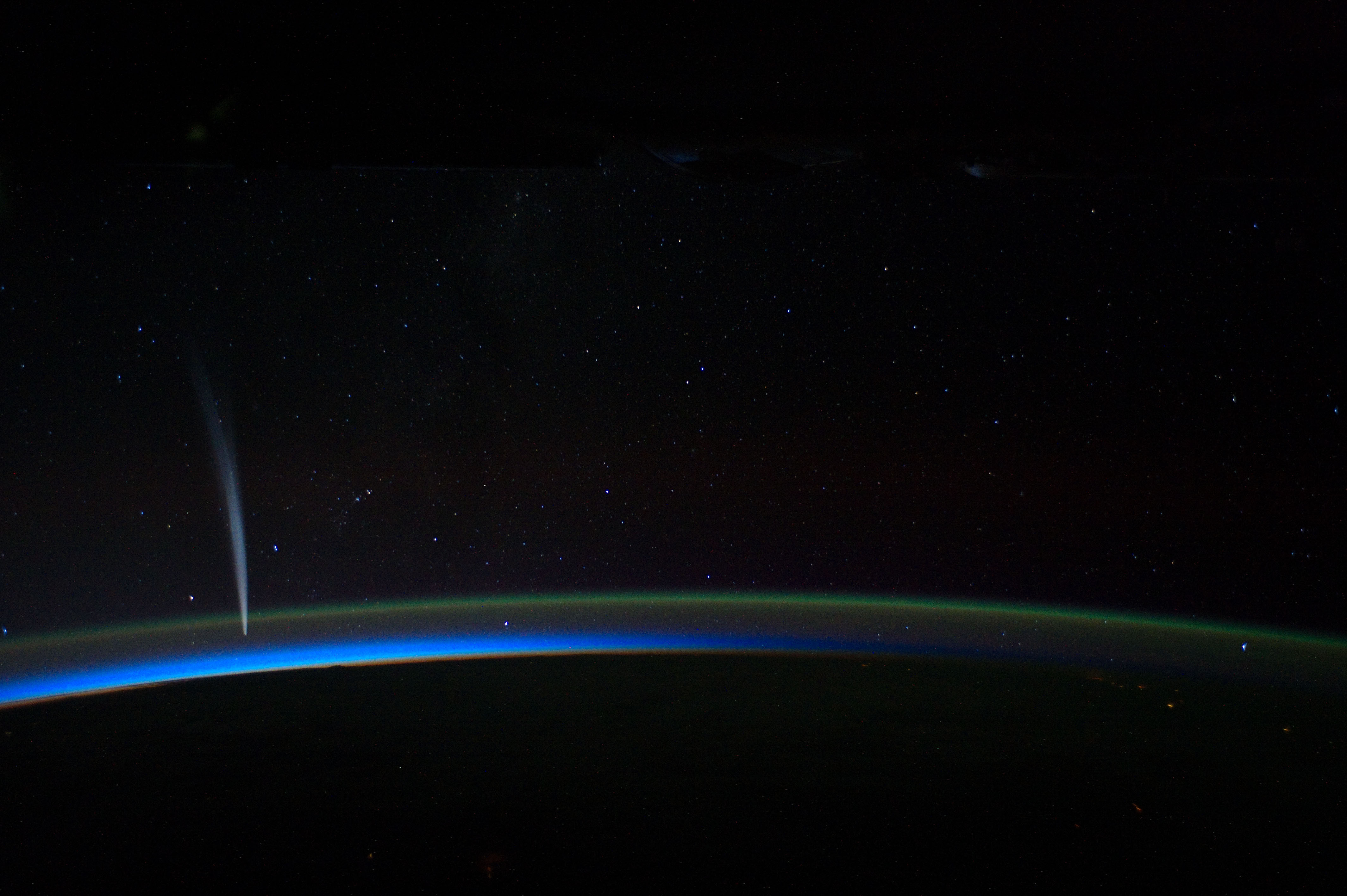
- Support Impressive. Probably wont get another picture anytime soon. Dusty777 16:53, 30 March 2012 (UTC)
- Support alt The air glow is super cool. JJ Harrison (talk) 12:12, 1 April 2012 (UTC)
- Support --Z 20:08, 1 April 2012 (UTC)
- Weak Support. Very noisy, but we'll probably never see a shot like this again. Clegs (talk) 09:56, 4 April 2012 (UTC)
NeutralWeak support. Compositionally, this is mind-bogglingly awesome. Encyclopedically, it's very good, and non-reproducible. But technically, not so great. The camera obviously moved during the shot (or it was a long exposure), and there's some pretty serious chromatic abberation at full-scale. -RunningOnBrains(talk) 15:03, 4 April 2012 (UTC)
- Clerk question Alt or "original"? Papa Lima Whiskey 2 (talk) 13:11, 7 April 2012 (UTC)
- Prefer original, accept edit. Crisco 1492 (talk) 16:08, 7 April 2012 (UTC)
- Alt only. Clegs (engage in rational discourse) 08:14, 8 April 2012 (UTC)
- Support Either Makes no difference to me. Dusty777 16:58, 10 April 2012 (UTC)
Promoted File:Iss030e015472 Edit.jpg --Makeemlighter (talk) 00:18, 20 April 2012 (UTC)
Voting period is over. Please don't add any new votes. Voting period ends on 21 Apr 2012 at 07:40:52 (UTC)
- Reason
- High resolution scan of a highly notable work of art, Leonardo's most famous after the Mona Lisa. Watermarks have been removed skillfully.
- Articles in which this image appears
- The Last Supper (Leonardo da Vinci)
- FP category for this image
- Wikipedia:Featured pictures/Artwork/Paintings
- Creator
- Leonardo da Vinci, retouched to remove watermarks by Quibik.
- Support as nominator --Crisco 1492 (talk) 07:40, 12 April 2012 (UTC)
- Comment. Great and valuable work; but I afraid that I'm not talented enough to make a review in this case. Jkadavoor (talk) 05:16, 13 April 2012 (UTC)
- Comment. Faint remnants of the watermarking can still be seen if you look for them. It's very unfortunate that people would rather squeeze a few more dollars out of this painting than share it freely with the rest of the world as part of our collective artistic heritage. Kaldari (talk) 07:22, 17 April 2012 (UTC)
Not Promoted --Makeemlighter (talk) 19:13, 21 April 2012 (UTC)
Voting period is over. Please don't add any new votes. Voting period ends on 21 Apr 2012 at 08:23:56 (UTC)
.jpg)
- Reason
- This was previously nominated in May 2010 and failed with fairly mixed discussion. Looking at the full size image, it's absolutely stunning. Although it is not a historically accurate representation of the profession, it shows how such individuals are perceived by society. The highest resolution TIFF file cannot be uploaded due to its size.
- Articles in which this image appears
- Lion taming, Lion, Circus
- FP category for this image
- Wikipedia:Featured pictures/Culture, entertainment, and lifestyle/Entertainment
- Creator
- Gibson & Co., 1873. uploaded and retouched by Trialsanderrors
- Support as nominator --Crisco 1492 (talk) 08:23, 12 April 2012 (UTC)
- Per criterion 5, I do not see what this currently adds to the article. You're right to say if it illustrated a discussion about the popular culture basis for lion taming then it might have an educational value, but it's not employed in that role, it's not captioned or explained. Accordingly I must oppose it on that ground: as the top of the FPC puts it "Featured pictures are images that add significantly to articles", and I just don't see it at the moment. Has potential in the future, though. Grandiose (me, talk, contribs) 19:42, 12 April 2012 (UTC)
- Grandiose! Support. Aaadddaaammm (talk) 14:12, 14 April 2012 (UTC)
- Oppose Per Grandiose. I also don't see where this contributes much EV to the linked articles Dusty777 17:07, 17 April 2012 (UTC)
Not Promoted --Makeemlighter (talk) 19:13, 21 April 2012 (UTC)
Voting period is over. Please don't add any new votes. Voting period ends on 21 Apr 2012 at 14:20:17 (UTC)

- Reason
- The largest flying parrot species, nice appearance.
- Articles in which this image appears
- Hyacinth Macaw
- FP category for this image
- Animals/Birds
- Creator
- Hank Gillette

- Support as nominator --Brandmeistertalk 14:20, 12 April 2012 (UTC)
- Support - Quite nice Crisco 1492 (talk) 15:02, 12 April 2012 (UTC)
- Oppose No tail in the frame compromises EV, noisy, underexposed. Captive shot doesn't leave much excuse. JJ Harrison (talk) 00:09, 13 April 2012 (UTC)
- Weak support original, support alt 1 The alt is clearer and shows the tail. Pine(talk) 07:31, 17 April 2012 (UTC)
- Weak oppose - Alt 1, at 683x1024, just barely clears the FP resolution limit; the subject itself is only about 900px tall. For a 'skinny' subject like this – particularly one in captivity – we really need more resolution. There's also significant difference in color between the two images; is this representative of normal variation between specimens? TenOfAllTrades(talk) 22:22, 17 April 2012 (UTC)
- I too think the Alt 1 from Flickr (and from different contributor?) has not enough quality. Jkadavoor (talk) 04:43, 18 April 2012 (UTC)
Not Promoted --Makeemlighter (talk) 19:17, 21 April 2012 (UTC)
Voting period is over. Please don't add any new votes. Voting period ends on 21 Apr 2012 at 17:56:34 (UTC)
.jpg)
- Reason
- Good scan of a notable painting
- Articles in which this image appears
- The Birth of Venus (Bouguereau), William-Adolphe Bouguereau, Venus (mythology), Aphrodite
- FP category for this image
- Wikipedia:Featured pictures/Artwork/Paintings
- Creator
- William-Adolphe Bouguereau
- Support as nominator --Tomer T (talk) 17:56, 12 April 2012 (UTC)
- Weak oppose - This painting is 10 feet tall. I'd expect a bit more resolution for something that size. Crisco 1492 (talk) 22:53, 12 April 2012 (UTC)
Not Promoted --Makeemlighter (talk) 19:17, 21 April 2012 (UTC)
Voting period is over. Please don't add any new votes. Voting period ends on 21 Apr 2012 at 10:34:04 (UTC)

- Reason
- Good quality, high EV for SBB-CFF-FFS Re 460
- Articles in which this image appears
- SBB-CFF-FFS Re 460, Pininfarina
- FP category for this image
- Wikipedia:Featured pictures/Vehicles/Land
- Creator
- Kabelleger
- Support as nominator --Tomer T (talk) 10:34, 12 April 2012 (UTC)
- Weak support, looks a little soft Crisco 1492 (talk) 15:14, 12 April 2012 (UTC)
- Source link doesn't work... Aaadddaaammm (talk) 14:09, 14 April 2012 (UTC)
- The work is by Kabelleger... Tomer T (talk) 18:33, 14 April 2012 (UTC)
- OK, but the link under "Source" in the image description is dead. Aaadddaaammm (talk) 05:55, 15 April 2012 (UTC)
- It was removed. Tomer T (talk) 11:44, 15 April 2012 (UTC)
- OK, but the link under "Source" in the image description is dead. Aaadddaaammm (talk) 05:55, 15 April 2012 (UTC)
- The work is by Kabelleger... Tomer T (talk) 18:33, 14 April 2012 (UTC)
- I fixed the source link. Regarding sharpness: One could sharpen the image a bit, then it would look much better when viewed 1:1 (e.g. try Gimp -> sharpen -> 40). I often do not sharpen images as it degrades quality and can always be done later if required. --Kabelleger (talk) 18:51, 16 April 2012 (UTC)
- Weak oppose agree with Crisco 1492 about softness especially in the foreground on the right and on the smaller lettering on the door of the locomotive. Pine(talk) 07:51, 17 April 2012 (UTC)
- Weak oppose per softness issues. -RunningOnBrains(talk) 21:52, 17 April 2012 (UTC)
- Support. It is sharp enough I think. Of course it is slightly soft if you view it at 1:1 (appears to be a combination of very slight motion blur and slight back focus), but since the resolution is so high it looks reasonably sharp at, say, 2 or 3 megapixels. Purpy Pupple (talk) 22:44, 17 April 2012 (UTC)
- Support I agree completely with Purpy Pupple Nick-D (talk) 11:28, 19 April 2012 (UTC)
- Support. The composition and "wow" factor outweigh any technical deficiencies IMO. -- King of ♥ ♦ ♣ ♠ 22:49, 20 April 2012 (UTC)
Not Promoted --Makeemlighter (talk) 22:48, 23 April 2012 (UTC)
- Only 4.5 of 5 required supports. Makeemlighter (talk) 22:48, 23 April 2012 (UTC)
Voting period is over. Please don't add any new votes. Voting period ends on 20 Apr 2012 at 09:40:31 (UTC)

- Reason
- Large, informative, impressive, high-quality, great reproduction
- Articles in which this image appears
- Fyodor Dostoyevsky
- FP category for this image
- Wikipedia:Featured pictures/Artwork/Paintings
- Creator
- Vasily Perov; faithful reproduction by Google Art Project.
- Support as nominator --GoPTCN 09:40, 11 April 2012 (UTC)
- Support - love it Crisco 1492 (talk) 13:21, 11 April 2012 (UTC)
- Comment. As with other Google Art images, this photograph is considerably darker than other available reproductions. Before we get into a tiff about "accuracy," let me proactively point out that this has nothing to do with accuracy: the brighter the light you shine at a painting, the brighter it will appear. Google is photographing these darker so as to minimize the appearance of wear in the paint (visible in the USC image linked above as white spots, which are worn bits of paint catching the reflection of the lights). Chick Bowen 15:21, 11 April 2012 (UTC)
- Well, I think it is the best reproduction of this painting. Otherwise, feel free to put an alternative.--GoPTCN 17:45, 13 April 2012 (UTC)
- Support. Good reproduction. Clegs (engage in rational discourse) 08:12, 14 April 2012 (UTC)
- Support <3 Perov. --Ser Amantio di NicolaoChe dicono a Signa?Lo dicono a Signa. 13:49, 16 April 2012 (UTC)
- Support Jkadavoor (talk) 08:46, 17 April 2012 (UTC)
Promoted File:Vasily Perov - Портрет Ф.М.Достоевского - Google Art Project.jpg --Makeemlighter (talk) 22:51, 23 April 2012 (UTC)
Voting period is over. Please don't add any new votes. Voting period ends on 24 Apr 2012 at 23:08:10 (UTC)

- Reason
- High resolution and nice and sharp; the fairly dark background is due to the foliage overhead (the crown was hanging over the flower). The bokeh isn't too bad either. I'm surprised I got this out of my camera, to be honest.
- Articles in which this image appears
- Syzygium malaccense
- FP category for this image
- Wikipedia:Featured pictures/Plants/Flowers
- Creator
- Crisco 1492
- Support as nominator --Crisco 1492 (talk) 23:08, 15 April 2012 (UTC)
- Oppose The red channel has fairly large blown patches. --99of9 (talk) 06:58, 16 April 2012 (UTC)
- Question I see a blob of red in the center of the flower. Is that how they look in person? Pine(talk) 07:35, 17 April 2012 (UTC)
- Are you referring to the buds? There are several, including some hidden under thistles. Crisco 1492 (talk) 14:50, 17 April 2012 (UTC)
- May be; and not in the center but under the sides. This is a group of several flowers. A common plant in Asia; in my courtyard, it't fruits always attract birds, squirrels and bats besides the children. :) Jkadavoor (talk) 04:38, 18 April 2012 (UTC)
- I weak support this for now. At full size parts of the flowers look like there's something wrong with how the photograph handled the red color with so many bright red tendrils in one place. Pine(talk) 07:26, 18 April 2012 (UTC)
- Oppose Blown highlights and awkward composition. Could do with fill light too. A photographic reflector from eBay can be had for nearly nothing, alternatively try more overcast conditions. JJ Harrison (talk) 23:52, 19 April 2012 (UTC)
- Shipping to Indonesia isn't cheap, however... so not nearly nothing. Crisco 1492 (talk) 07:31, 20 April 2012 (UTC)
- Can you get aluminium foil, glue, and some cardboard or light plywood to glue it to? JJ Harrison (talk) 12:26, 20 April 2012 (UTC)
- I could theoretically get a hold of it, but I wouldn't expect it to last on an hour's motorcycle ride up a winding road. Oh well, I'll just focus on finding works of art and restoring posters and photographs. Crisco 1492 (talk) 12:54, 20 April 2012 (UTC)
- weak support I like the composition, it captures some of the branch system and the leaves as well as the flower. The article is very picture-heavy, but this image does a lot for it. I'm not looking at it with graphics editing software, but I do agree with comments above that it's lost some information. TehGrauniad (talk) 12:08, 20 April 2012 (UTC)
Not Promoted --Makeemlighter (talk) 23:30, 24 April 2012 (UTC)
Voting period is over. Please don't add any new votes. Voting period ends on 25 Apr 2012 at 05:33:52 (UTC)

- Reason
- I believe this image meets all criteria.
- Articles in which this image appears
- Australian White Ibis
- FP category for this image
- Wikipedia:Featured pictures/Animals/Birds
- Creator
- JJ Harrison
- Support as nominator --JJ Harrison (talk) 05:33, 16 April 2012 (UTC)
- Support. Ðiliff «» (Talk) 06:01, 16 April 2012 (UTC)
- Question Did you have this guy specially washed? IMO this is too bright, they are typically much dirtier and less seagull-clean. (Obviously that pic is not anywhere near this standard, but just uploaded to show colour comparison with a seagull.) It's also a pity his feet couldn't be seen. I would consider supporting a darker version of this. --99of9 (talk) 06:56, 16 April 2012 (UTC)
- Per the article text: "The body plumage is white although it may become brown-stained". This one was pretty close to Seagull white. JJ Harrison (talk) 22:57, 16 April 2012 (UTC)
- Support -- Don't care if it was washed for this shot, striking picture. Crisco 1492 (talk) 08:50, 16 April 2012 (UTC)
- Support per Crisco. Clegs (engage in rational discourse) 13:43, 16 April 2012 (UTC)
- Support Jkadavoor (talk) 06:06, 17 April 2012 (UTC)
- Support No one wants to see a dirty bird anyway. Saffron Blaze (talk) 07:50, 20 April 2012 (UTC)
Promoted File:Threskiornis molucca - Perth.jpg --Makeemlighter (talk) 21:25, 25 April 2012 (UTC)
Voting period is over. Please don't add any new votes. Voting period ends on 25 Apr 2012 at 05:31:28 (UTC)

- Reason
- High quality, geocoded image of the only only convict-built town hall in Australia
- Articles in which this image appears
- Perth Town Hall
- FP category for this image
- Wikipedia:Featured pictures/Places/Architecture
- Creator
- JJ Harrison
- Support as nominator --JJ Harrison (talk) 05:31, 16 April 2012 (UTC)
- Weak oppose I know you likely couldn't get further back, but it's just a crazy amount of vertical distortion. Ðiliff «» (Talk) 05:59, 16 April 2012 (UTC)
- Weak oppose per Diliff. Crisco 1492 (talk) 08:49, 16 April 2012 (UTC)
- Weak Oppose. They're right. :-( Clegs (engage in rational discourse) 13:42, 16 April 2012 (UTC)
- Comment Vertical distortion is very fixable using many programs, no? Although I don't know if that would qualify as "inappropriate digital manipulation". -RunningOnBrains(talk) 21:49, 17 April 2012 (UTC)
- I wouldn't think so; WP:WIAFP explicitly permits digital manipulation that is "not deceptive", and describes "perspective correction" as a "typical acceptable manipulation". TenOfAllTrades(talk) 22:08, 17 April 2012 (UTC)
- I belive this image was already "corrected", and this is a typical result when an orginal has considerable distortion. Saffron Blaze (talk) 09:08, 18 April 2012 (UTC)
- Safron Blaze is right - kind of. In any three-dimensional scene, if you correct one kind of distortion, you introduce (or increase) another, so geometric compromises are inevitable, and they are exacerbated by a wide angle of view. If you take a photo looking up at a building at an acute angle such as this, you will only ever see a thin slice of what's up there at the top. You can bend or stretch it or whatever you like, but you can never 'fix' it so it looks like it was taken from a more acceptable distance. It's a fundamental limitation of perspective. Ðiliff «» (Talk) 09:44, 18 April 2012 (UTC)
- I belive this image was already "corrected", and this is a typical result when an orginal has considerable distortion. Saffron Blaze (talk) 09:08, 18 April 2012 (UTC)
- I wouldn't think so; WP:WIAFP explicitly permits digital manipulation that is "not deceptive", and describes "perspective correction" as a "typical acceptable manipulation". TenOfAllTrades(talk) 22:08, 17 April 2012 (UTC)
- Comment the perspective seems wrong here, maybe that's unavoidable. Either way it's a huge improvement on the article's preceding photo. TehGrauniad (talk) 12:17, 20 April 2012 (UTC)
Not Promoted --Makeemlighter (talk) 21:27, 25 April 2012 (UTC)
Voting period is over. Please don't add any new votes. Voting period ends on 25 Apr 2012 at 05:24:17 (UTC)

- Reason
- Only Commons image of the species. It can be difficult to distinguish from the Atlantic Yellow-nosed Albatross, but I'm very confident about the ID.
- Articles in which this image appears
- Indian Yellow-nosed Albatross
- FP category for this image
- Wikipedia:Featured pictures/Animals/Birds
- Creator
- JJ Harrison
- Support as nominator --JJ Harrison (talk) 05:24, 16 April 2012 (UTC)
- Support. Great detail. Ðiliff «» (Talk) 06:48, 16 April 2012 (UTC)
- Support Excellent. --99of9 (talk) 07:00, 16 April 2012 (UTC)
- Comment - It looks like the bird got the full force of the flash at the base of its neck. Looking at the image on 2 monitors simultaneously (new toy), and both have the same issue. Crisco 1492 (talk) 08:46, 16 April 2012 (UTC)
- Yeah, it is a bit bright, but I don't think unnaturally so. I'll post an edit at some point. On a general note, most new toys come poorly adjusted. I've added highlight adjustment information to the FPC Header. How many circles can you see? My display was set to a contrast of "81" during the process of hardware calibration. There, I can see four circles, barely discerning the fourth. If I set my monitor's contrast to "90" I can see one circle. When purchased, the monitor had a setting of "100" - no circles are visible at that setting. Set the contrast as high as possible without making the circles disappear without being really concerned about the fourth. I'd be willing to bet at least a few people at FPC can't see anything. JJ Harrison (talk)
- Very useful comments... But there's more to the curve than extreme highlights. I've found that, to my tastes, a few of your photos were a bit bright throughout the range (although I don't necessarily consider this one to be one of them). It's as much personal choice as anything else. When things that are usually dark or almost black with the naked eye look washed out grey on the monitor, it could be calibration problems on the part of the viewer, or it could be overexposure/intentionally bright on the part of the photographer. The trouble is that even when the circles are visible, it doesn't necessarily translate to visible texture. I try to keep highlights (that I'm interested in keeping, anyhow) well below the absolute upper limit of visibility if possible... Ðiliff «» (Talk) 11:20, 16 April 2012 (UTC)
- Do we want visible texture or realism though ;)? Would one see such fine texture detail in real life? I think great feather texture would only be present if the sun was at an angle suitable to provide a large penumbral region on the body of the bird. Such an angle would likely leave important parts in shadow, compromising EV, and I don't always get framing flexibility on a boat. So yes, lighting perhaps, but the clouds-but-fine weather was not what I'd consider terrible lighting wise. JJ Harrison (talk) 12:35, 16 April 2012 (UTC)
- Very useful comments... But there's more to the curve than extreme highlights. I've found that, to my tastes, a few of your photos were a bit bright throughout the range (although I don't necessarily consider this one to be one of them). It's as much personal choice as anything else. When things that are usually dark or almost black with the naked eye look washed out grey on the monitor, it could be calibration problems on the part of the viewer, or it could be overexposure/intentionally bright on the part of the photographer. The trouble is that even when the circles are visible, it doesn't necessarily translate to visible texture. I try to keep highlights (that I'm interested in keeping, anyhow) well below the absolute upper limit of visibility if possible... Ðiliff «» (Talk) 11:20, 16 April 2012 (UTC)
- Yeah, it is a bit bright, but I don't think unnaturally so. I'll post an edit at some point. On a general note, most new toys come poorly adjusted. I've added highlight adjustment information to the FPC Header. How many circles can you see? My display was set to a contrast of "81" during the process of hardware calibration. There, I can see four circles, barely discerning the fourth. If I set my monitor's contrast to "90" I can see one circle. When purchased, the monitor had a setting of "100" - no circles are visible at that setting. Set the contrast as high as possible without making the circles disappear without being really concerned about the fourth. I'd be willing to bet at least a few people at FPC can't see anything. JJ Harrison (talk)
- I can see three (the third barely). I will take a look on the one I normally use later, but considering the difficulty of getting a good image of this bird I doubt I'll oppose. Crisco 1492 (talk) 10:20, 16 April 2012 (UTC)
- I can see three circles too, and a lack of texture in the feather highlights... But actually, I have to reduce exposure by ~1.2 EV before I actually start to see anything there. I don't think this is an exposure problem so much as unfortunate lighting. Ðiliff «» (Talk) 11:40, 16 April 2012 (UTC) JJ Harrison (talk) 12:35, 16 April 2012 (UTC)
- Support It is a smidge bright on the neck, but not enough to kill the wow and EV. Clegs (engage in rational discourse) 13:40, 16 April 2012 (UTC)
- Support' per Clegs... as I said above, I don't really mind, it's just surprising. Crisco 1492 (talk) 14:03, 16 April 2012 (UTC)
- Support' Jkadavoor (talk) 06:34, 17 April 2012 (UTC)
- Support' nice--Morning Sunshine (talk) 11:21, 21 April 2012 (UTC)
Promoted File:Thalassarche carteri - SE Tasmania.jpg --Makeemlighter (talk) 21:29, 25 April 2012 (UTC)
Voting period is over. Please don't add any new votes. Voting period ends on 18 Apr 2012 at 18:21:54 (UTC)

- Reason
- Verifiable map of the US military now converted to SVG form, aiding in clarity. Conventional colours and scalable format. I would like to think that it would be extremely helpful to readers as it is difficult to describe textually.
- Articles in which this image appears
- Battle of Guam (1944), 1st Provisional Marine Brigade, 18th Infantry Regiment (Imperial Japanese Army)
- FP category for this image
- Diagrams, drawings, and maps
- Creator
- Grandiose
- Support as nominator --Grandiose (me, talk, contribs) 18:21, 9 April 2012 (UTC)
- Support Not much else to say. Dusty777 17:05, 10 April 2012 (UTC)
- Support per Dusty. Clegs (engage in rational discourse) 13:16, 11 April 2012 (UTC)
- Support Way better than the original design. ComputerJA (talk) 07:05, 12 April 2012 (UTC)
- Support This is a very clear and very useful map Nick-D (talk) 08:46, 13 April 2012 (UTC)
- Support Like it. Hchc2009 (talk) 19:47, 14 April 2012 (UTC)
- Comment I realize that this map is true to the source, but wouldn't it make more sense for it to say "Battle of Guam" instead of "Island of Guam"? Makeemlighter (talk) 23:34, 24 April 2012 (UTC)
- Done, seemed unobjectionable and sensible. Grandiose (me, talk, contribs) 14:54, 25 April 2012 (UTC)
Promoted File:Map of the Battle of Guam, 1944.svg --Makeemlighter (talk) 02:30, 26 April 2012 (UTC)
Voting period is over. Please don't add any new votes. Voting period ends on 26 Apr 2012 at 03:18:51 (UTC)

- Reason
- I do not know much about photography, but I have been told that it is a great picture. The historic Phoenix Indain School, built in 1891, is a still standing reminder of how unfairly the Native Americans were treated in the United States.
- Articles in which this image appears
- Phoenix Indian SchoolNational Register of Historic Places listings in Phoenix, Arizona
- FP category for this image
- Places. History
- Creator
- Tony the Marine
- Support as nominator --Tony the Marine (talk) 03:18, 17 April 2012 (UTC)
- Oppose. The image is, unfortunately, not sharp when viewed at full size. (It looks like there may have been some sort of overly-aggressive processing – noise suppression, maybe? – going on, possibly in-camera.) From a composition standpoint, I'd be inclined to crop out the large empty paved area filling the foreground, as well as the 'please pick up after your pets' bag dispenser on the right side. The palm tree in the center of the image is rather distracting; I know that we can't cut it down to get a better photograph, but it might be better if the photographer could move a bit to the left and closer to the building so that the peak of the roof and the middle, upper-level window weren't directly behind the tree's trunk. From an EV standpoint, it would help to have a little bit more information about the identity of the building itself; Phoenix Indian School states that there are three surviving buildings on the site, but it's not immediately apparent which building this one is. TenOfAllTrades(talk) 02:06, 19 April 2012 (UTC)
- Oppose, on composition. Palm tree blocking the view of the building (I'm assuming you could move to the right about 10 feet and have a better line of view), and other fronds visible in the top corner. Crisco 1492 (talk) 02:09, 19 April 2012 (UTC)
- Oppose Per above. I have seen the Indian School, and this is not the best representative picture. If the angle was different, and if the the picture hadn't been edited, it would probably be an alright picture. Dusty777 18:24, 19 April 2012 (UTC)
- Oppose I don't mean to pile on, but I thought I'd add that the image is tilted and underexposed to the hopefully-taken-as constructive criticism. JJ Harrison (talk) 23:48, 19 April 2012 (UTC)
- Oppose. To phrase as constructive criticism: There's the beginnings of a great picture here. First, we need not to have taken the image with a polarizer; it plus the overprocessing gives us the underexposed look. It's probably also the reason for the noisy sky despite the efforts to suppress that noise, and the blurring of the bricks (in many other pictures like this, we have been able to make out the original bricks at full resolution).
Then there's the composition. It's great except for that palm tree right in the middle of the front, obscuring and distracting from what the picture really want to show us. A start at the next picture might be getting in front of the palm, or changing the angle so that the palm doesn't break the front facade in half. Daniel Case (talk) 01:57, 20 April 2012 (UTC)
- Oppose per JJ Harrison. Sanyambahga (talk) 04:44, 20 April 2012 (UTC)
Not Promoted --Makeemlighter (talk) 21:25, 26 April 2012 (UTC)
Voting period is over. Please don't add any new votes. Voting period ends on 26 Apr 2012 at 05:20:53 (UTC)

- Reason
- Large image of a notable artist by another notable artist, good quality for its age
- Articles in which this image appears
- Carl Spitzweg
- FP category for this image
- Wikipedia:Featured pictures/People/Entertainment
- Creator
- Franz Hanfstaengl
- Support as nominator --Pine(talk) 05:20, 17 April 2012 (UTC)
- Comment - Several dust spots. Welcome back! Crisco 1492 (talk) 06:15, 17 April 2012 (UTC)
- Conditional Support Per Crisco, the dust spots should get removed, and also per Crisco, Welcome Back! Dusty777 17:09, 17 April 2012 (UTC)
- Is this a scan of a print? At full size I can see some halftone patterns. O.J. (talk) 17:48, 17 April 2012 (UTC)
Not Promoted --Makeemlighter (talk) 21:26, 26 April 2012 (UTC)
Voting period is over. Please don't add any new votes. Voting period ends on 27 Apr 2012 at 13:16:42 (UTC)


- Reason
- Clear and good quality photo, demonstrating well the form of a Bismarck tower.
- Articles in which this image appears
- Bismarck tower
- FP category for this image
- Wikipedia:Featured pictures/Places/Architecture
- Creator
- Wisniowy
- Support as nominator --Tomer T (talk) 13:16, 18 April 2012 (UTC)
- Weak support due to slight tapering and shadows (would a picture in another season be better, or another time of day?) Crisco 1492 (talk) 14:29, 18 April 2012 (UTC)
- Oppose original this is leaning to the right. Pine(talk) 07:14, 21 April 2012 (UTC)
- I tried to fix it. Not sure I succeeded. Added as 'Edit 1'. Tomer T (talk) 14:12, 21 April 2012 (UTC)
- Support Alt 1 better. Pine(talk) 02:06, 22 April 2012 (UTC)
- I tried to fix it. Not sure I succeeded. Added as 'Edit 1'. Tomer T (talk) 14:12, 21 April 2012 (UTC)
- Weak oppose. Snow and shadows are distracting. Clegs (engage in rational discourse) 12:52, 23 April 2012 (UTC)
Not Promoted --Makeemlighter (talk) 20:44, 27 April 2012 (UTC)
Voting period is over. Please don't add any new votes. Voting period ends on 27 Apr 2012 at 11:10:15 (UTC)

- Reason
- High quality, notable event in American history
- Articles in which this image appears
- Whiskey Rebellion (lede image), Presidency of George Washington, Taxation history of the United States, 1794 in the United States
- FP category for this image
- Wikipedia:Featured pictures/History/USA History
- Creator
- Unknown, attributed to Frederick Kemmelmeyer
- Support as nominator --Crisco 1492 (talk) 11:10, 18 April 2012 (UTC)
- Comment/neutral: to me this looks a bit average, but I don't know much about this particular area. I wonder if you could take a look at criterion 3 and reason it out a bit. In particular, although you may wish to draw instead on other parts, It illustrates the subject in a compelling way and/or [It] is not always required to be aesthetically pleasing; it might be shocking, impressive, or just highly informative... historical... images may not have to be classically beautiful at all. Grandiose (me, talk, contribs) 11:18, 18 April 2012 (UTC)
- You and I seem to have a very different opinion of what is "compelling". The painting is nearly contemporary (painted one year after the events pictured), and I've yet to see another with equal EV. Colours may be a bit faded, but that is to be expected for a 200+ year old work. As Kemmelmeyer seems to have been a realist, there is little symbolism (readily apparent, at least) to draw the eye. "Wow" isn't everything - this isn't Commons; "wow" can be offset by high EV, irreplaceability, etc. Crisco 1492 (talk) 11:29, 18 April 2012 (UTC)
- Support, with a comment regarding the above: this may not have "wow" in the traditional "this is incredibly gorgeous and I love to look at it" sense. What it does have, for me, is a tremendous amount of "wow" in the sese of "here is a moment in American history that has been depicted by a near-contemporary", which is a great thing for me. As to artistic merits, honestly, if I were writing a paper about this painting as an object it would be mildly condemnatory. It's not awful (I've seen worse), but it's not the greatest, either; the colors are faded, the landscape's a shade unbelievable, the soldiers are ranged too neatly in rows, and by and large it doesn't have any artistic "oomph" to me. The sad fact is, though, that much of history was depicted at first-hand by the second-rates, as it were, and this is no different.
- Anyhow, there's my tuppence ha'penny'orth on the matter. --Ser Amantio di NicolaoChe dicono a Signa?Lo dicono a Signa. 13:59, 18 April 2012 (UTC)
Not Promoted --Makeemlighter (talk) 20:45, 27 April 2012 (UTC)
Voting period is over. Please don't add any new votes. Voting period ends on 27 Apr 2012 at 10:56:01 (UTC)
_01_colour_edit.jpg)
- Reason
- High quality and resolution
- Articles in which this image appears
- Treasure Island (1934 film), Treasure Island
- FP category for this image
- Wikipedia:Featured pictures/Culture, entertainment, and lifestyle/Entertainment
- Creator
- Employee(s) of MGM, restored by Crisco 1492
- Support as nominator --Crisco 1492 (talk) 10:56, 18 April 2012 (UTC)
Question: is there jpeg artifacting in "Barrymore", or is that weirdness in the ink pattern? Clegs (engage in rational discourse) 07:17, 20 April 2012 (UTC)
- Looks like a bit of jpg artifacting, I'll try and get that when I get home. Crisco 1492 (talk) 07:36, 20 April 2012 (UTC)
- I've fixed it. Crisco 1492 (talk) 12:18, 20 April 2012 (UTC)
Not Promoted --Makeemlighter (talk) 20:46, 27 April 2012 (UTC)
Voting period is over. Please don't add any new votes. Voting period ends on 21 Apr 2012 at 12:45:44 (UTC)


- Reason
- Clear image of this large and attractive moth. Note this is a live animal.
- Articles in which this image appears
- Atlas Moth
- FP category for this image
- Wikipedia:Featured pictures/Animals/Insects
- Creator
- Quartl
- Support as nominator --Quartl (talk) 12:45, 12 April 2012 (UTC)
- For this picture, we absolutely need a sense of scale. Scale bar would be ideal, but in image description would probably be ok. Aaadddaaammm (talk) 14:17, 12 April 2012 (UTC)
- The wingspan is about 25 cm. That's roughly the distance from the tip of your thumb to the tip of your little finger when you stretch your hand. Best wishes, --Quartl (talk) 16:49, 12 April 2012 (UTC)
- OK, support, then. Aaadddaaammm (talk) 14:07, 14 April 2012 (UTC)
- Support, great quality. -- Jkadavoor (talk) 05:07, 13 April 2012 (UTC)
- Comment:Added a whitened version.--Gauravjuvekar (talk) 09:17, 13 April 2012 (UTC)
- Many thanks for your effort, but the masking seems to be quite coarse especially near the body. --Quartl (talk) 11:18, 13 April 2012 (UTC)
- Oppose whitened version,
waiting for some sort of scale indication before I vote on original.Clegs (engage in rational discourse) 08:14, 14 April 2012 (UTC)- I put the scale information in the image description. The wingspan is the distance from one wingtip to the other. Best wishes, --Quartl (talk) 12:26, 14 April 2012 (UTC)
- Support Original. Thanks for the scale. Clegs (engage in rational discourse) 07:38, 15 April 2012 (UTC)
- Support original Pine(talk) 07:33, 17 April 2012 (UTC)
- support original Tomer T (talk) 13:18, 18 April 2012 (UTC)
Promoted File:Attacus atlas qtl1.jpg --Makeemlighter (talk) 16:58, 28 April 2012 (UTC)
Voting period is over. Please don't add any new votes. Voting period ends on 27 Mar 2012 at 12:38:09 (UTC)


- Reason
- Striking to see a large battleship in the middle of a city. High resolution
- Articles in which this image appears
- USS Arizona (BB-39)
- FP category for this image
- Wikipedia:Featured pictures/Vehicles/Water
- Creator
- US Navy (Enrique Muller, Jr.), restored by Centpacrr and Crisco 1492. Second version restored by Mmxx
- Support as nominator --Crisco 1492 (talk) 12:38, 18 March 2012 (UTC)
- Support. The image is striking.
- Preceding unsigned comment added by Enthdegree with this edit. Crisco 1492 (talk) 23:44, 18 March 2012 (UTC)
- Support per above. I support both edits, they are both good to me. Tomer T (talk) 22:39, 18 March 2012 (UTC)
- Comment - something wrong with the angle - seems distorted. MathewTownsend (talk) 02:06, 21 March 2012 (UTC)
- Perhaps I looked at the image for too long but I don't see it. This image seems to have been taken from a hundred feet up or so, methinks. Crisco 1492 (talk) 11:39, 21 March 2012 (UTC)
- Perhaps Mathew means the distortion which was mentioned in this review. ■ MMXX talk 16:16, 21 March 2012 (UTC)
- Perhaps. I know jack-all about fixing lens distortion. Crisco 1492 (talk) 00:29, 22 March 2012 (UTC)
- C & C edit still has some distortion, the tower in right has clockwise tilt, I tried to fix this in the other version, but now I feel in my edit towers are slightly leaned to the center. ■ MMXX talk 20:48, 26 March 2012 (UTC)
- Perhaps. I know jack-all about fixing lens distortion. Crisco 1492 (talk) 00:29, 22 March 2012 (UTC)
- Perhaps Mathew means the distortion which was mentioned in this review. ■ MMXX talk 16:16, 21 March 2012 (UTC)
- Perhaps I looked at the image for too long but I don't see it. This image seems to have been taken from a hundred feet up or so, methinks. Crisco 1492 (talk) 11:39, 21 March 2012 (UTC)
- Support Love this image, it was my desktop for a while. Aaadddaaammm (talk) 18:32, 22 March 2012 (UTC)
- Support edit JJ Harrison (talk) 12:03, 24 March 2012 (UTC)
- C&C or Mmxx? They are both edits (I'm assuming you mean Mmxx, but it never hurts to ask) Crisco 1492 (talk) 03:46, 27 March 2012 (UTC)
- The latter JJ Harrison (talk) 03:39, 28 March 2012 (UTC)
Which one? Makeemlighter (talk) 03:06, 28 March 2012 (UTC)
- Mmxx's is fine with me. Crisco 1492 (talk) 04:58, 28 March 2012 (UTC)
- Although, naturally, I would like my own (collaboration) to be promoted... Crisco 1492 (talk) 02:46, 26 April 2012 (UTC)
- C&C is my preference because I like the "colours" better. Why are we distorting a historical image anyway? Touch up is fine, but correcting lens distortion seems out of place. Aaadddaaammm (talk) 07:05, 2 April 2012 (UTC)
- OK, neutral because of the artefacting in C&C's. Aaadddaaammm (talk) 05:33, 3 April 2012 (UTC)
- I prefer Mmxx's. Tomer T (talk) 08:52, 2 April 2012 (UTC)
- I vote for C&C's because his looks less blown out.
- ^That was Enthdegree. Aaadddaaammm (talk) 13:38, 2 April 2012 (UTC)
- Okay, that put us right back where we started. Perhaps a differently phrased questions: is any opposed to / would anyone oppose either edit (this question extends to JJ, who only specified the Mmxx edit) Crisco 1492 (talk) 14:26, 2 April 2012 (UTC)
- So that the vote can be closed, I'll say I prefer C&C's. Tomer T (talk) 16:31, 23 April 2012 (UTC)
Promoted File:USS Arizona in New York City Crisco edit.jpg --Makeemlighter (talk) 17:04, 28 April 2012 (UTC)
Voting period is over. Please don't add any new votes. Voting period ends on 29 Apr 2012 at 06:04:34 (UTC)

- Reason
- I think the fish adds interest and has good EV for the article. The ISO was a little high because I only had a split second to take the shot, and the light conditions were changing continuously on the day. The photo was taken handheld from a small inflatable dinghy. A friend majoring in zoology is fairly confident about the fish species. There is an existing FP, but that image is a breeding display in breeding plumage.
- Articles in which this image appears
- Greater Crested Tern
- FP category for this image
- Wikipedia:Featured pictures/Animals/Birds
- Creator
- JJ arrison
- Support as nominator --JJ Harrison (talk) 06:04, 20 April 2012 (UTC)
- Comment There are some strange shaped dividing lines between blurred and unblurred rocks underneath the bird's tail, presumeably part of your processing to reduce the noise, but I think they can be done better. --99of9 (talk) 06:21, 20 April 2012 (UTC)
- Hmm, that is a bit odd. I'll fix it tomorrow anyway. JJ Harrison (talk) 12:48, 20 April 2012 (UTC)
- Support really attention-grabbing eye-catchy shot. I'm amazed how the photographer has been able to capture such a moment. Sanyambahga (talk) 10:08, 22 April 2012 (UTC)
- Support --Morning Sunshine (talk) 11:00, 22 April 2012 (UTC)
- Weak Support. Stunning, but there's a spot under the bird's tail that looks doubled like a bad stitch. Since this is not a stitch, I'm not sure what caused it, but it's kind of distracting to have the "ghost" floating there. Clegs (engage in rational discourse) 12:54, 23 April 2012 (UTC)
- I've uploaded a new version, blurring a section of background to make it consistent at least. JJ Harrison (talk) 00:35, 25 April 2012 (UTC)
Not Promoted --Makeemlighter (talk) 17:58, 29 April 2012 (UTC)
- Oppose. I'm not sure what it is about the composition, but I find that my eyes are don't seem to want to focus on the bird's head. I think that it's something to do with the angle of the bird's head being very similar to the shape of the horizon behind it. This is a particular issue with the low-resolution version that appears alongside the nomination (and, let's face it - that's the only version that most people will see). Far from being an "eye-catching shot", and the above supporter says, I feel that it is a perfectly normal shot of a seabird, of which we'll find thousands on wikipedia. And the issue with the head actually makes it slightly sub-par, in my opinion. (I suffer from protonopia, so perhaps it is because I think that the colour of the top of the darker patch of plumage is nearly identical to the colour of the sky. That being said, this isn't usually a problem with featured-picture candidates, so I felt obliged to make this !vote.) Bluap (talk) 14:53, 26 April 2012 (UTC)
Voting period is over. Please don't add any new votes. Voting period ends on 29 Apr 2012 at 06:10:43 (UTC)

- Reason
- This bird is of cultural and economic importance as the species was harvested for feathers, flesh and oil by the Aborigines, and then later early European settlers. There is still a commercial industry today. Approximately 23 million individuals breed in South-eastern Australia, making it one of the world's most numerous sea birds. This picture shows a common pose when they land on the water, and has the advantage of showing both under and over wing plumages.
- Articles in which this image appears
- Short-tailed Shearwater
- FP category for this image
- Wikipedia:Featured pictures/Animals/Birds
- Creator
- JJ Harrison
- Support as nominator --JJ Harrison (talk) 06:10, 20 April 2012 (UTC)
- Support. I am very jealous of your setup and opportunities. Clegs (engage in rational discourse) 07:28, 20 April 2012 (UTC)
- If you own a camera, then I think you have some opportunities of your own! Pelagic trips run monthly from Westport, Washington State, which is 2.5 hrs drive if you are in Seattle. Don't forget to take some sea-sickness medication. There are plenty of opportunities on such trips to use shorter telephoto lenses. This shot was taken at a focal length of 160mm or so, for example. JJ Harrison (talk) 12:46, 20 April 2012 (UTC)
- Support with comment: You have lens flare or something near the top of the image, above the bird's beak. Crisco 1492 (talk) 07:30, 20 April 2012 (UTC)
- Support Very illustrative. Wonderful composition. Saffron Blaze (talk) 07:46, 20 April 2012 (UTC)
- Weak Support Attractive thumbnail, but slightly disappointing a large size. The debatable "advantage of showing both" sides of wings is counter balanced by the blurriness of the right one. Of course, I can understand you might haven't had the time for fine tuning your settings, and that you needed high shutter speed. But was 1/1600th sec really necessary ? On the other hand, maybe a narrower aperture wouldn't have been enough. - Blieusong (talk) 22:25, 20 April 2012 (UTC)
- The colour is more important than feather detail imo. This might indicate why I would choose a relatively high shutter speed, even on a calm day. That video was filmed with the same lens as this photo (70-200 IS). I think it gives some idea how difficult shooting with 500mm at sea can be. JJ Harrison (talk) 00:19, 21 April 2012 (UTC)
- Support I like how this shows the different wing colors, even though the wings are a little OOF. Pine(talk) 08:29, 21 April 2012 (UTC)
- Support --Morning Sunshine (talk) 11:00, 22 April 2012 (UTC)
Promoted File:Puffinus tenuirostris - SE Tasmania.jpg --Makeemlighter (talk) 18:00, 29 April 2012 (UTC)
Voting period is over. Please don't add any new votes. Voting period ends on 29 Apr 2012 at 06:12:53 (UTC)


- Reason
- This species is the only ocean-going Cormorant in Australia. The other species are mostly found more inland. This photograph was taken from a boat in the Derwent Estuary.
- Articles in which this image appears
- Black-faced Cormorant
- FP category for this image
- Wikipedia:Featured pictures/Animals/Birds
- Creator
- JJ Harrison
- Support as nominator --JJ Harrison (talk) 06:12, 20 April 2012 (UTC)
- Weak support - Bird is beautiful, but those rocks... I winced. Crisco 1492 (talk) 07:28, 20 April 2012 (UTC)
- The rocks are covered in white guano. JJ Harrison (talk) 12:39, 20 April 2012 (UTC)
- Support Tomer T (talk) 19:19, 20 April 2012 (UTC)
- Oppose those rocks are awfully bright and large in the frame and they're OOF which is too distracting for me. How about cropping the bottom of the image? Pine(talk) 08:35, 21 April 2012 (UTC)
- Support Alt Saffron Blaze (talk) 20:34, 24 April 2012 (UTC)
- Support. Prefer original for compositional reasons. Ðiliff «» (Talk) 06:08, 25 April 2012 (UTC)
Not promoted --Makeemlighter (talk) 18:03, 29 April 2012 (UTC)
- Is it worth asking Clegs what he thought of the edit that he asked for? JJ Harrison (talk) 10:42, 30 April 2012 (UTC)
- You mean Pine? Ðiliff «» (Talk) 12:14, 30 April 2012 (UTC)
- Probably. Sorry about that. Makeemlighter (talk) 23:12, 30 April 2012 (UTC)
- 1st crop still has too much of those blurry bright rocks for me to support. I added Alt 2 which I would support. Hopefully this isn't too late but if it is I'd support this on a re-nom. Pine(talk) 04:51, 1 May 2012 (UTC)
- Probably. Sorry about that. Makeemlighter (talk) 23:12, 30 April 2012 (UTC)
- You mean Pine? Ðiliff «» (Talk) 12:14, 30 April 2012 (UTC)
- Is it worth asking Clegs what he thought of the edit that he asked for? JJ Harrison (talk) 10:42, 30 April 2012 (UTC)
Voting period is over. Please don't add any new votes. Voting period ends on 26 Apr 2012 at 05:05:53 (UTC)

- Reason
- Large image that's a lead image for the article Monarch butterfly
- Articles in which this image appears
- Monarch (butterfly), Butterfly, and others
- FP category for this image
- Wikipedia:Featured pictures/Animals/Insects
- Creator
- Kenneth Dwain Harrelson
- Support as nominator --Pine(talk) 05:05, 17 April 2012 (UTC)
- Support although not happy with position of the antennae. Jkadavoor (talk) 06:12, 17 April 2012 (UTC)
- Support - Striking Crisco 1492 (talk) 06:17, 17 April 2012 (UTC)
- Support-Gauravjuvekar (talk) 15:15, 17 April 2012 (UTC)
- Support Per above. Dusty777 17:03, 17 April 2012 (UTC)
- Awesome performance by the camera. Would be better without the background though. — Preceding unsigned comment added by 128.100.216.170 (talk) 21:44, 20 April 2012 (UTC)
- Support -- Awesome performance by the photographer. Saffron Blaze (talk) 08:37, 21 April 2012 (UTC)
- Oppose: The exposure has resulted in almost no visible detail on the thorax and head. Julia\talk 09:03, 21 April 2012 (UTC)
Promoted File:Monarch In May.jpg --Dusty777 18:30, 30 April 2012 (UTC)
Voting period is over. Please don't add any new votes. Voting period ends on 30 Apr 2012 at 09:36:15 (UTC)

- Reason
- A rare high resolution image of a prestigious management school in India designed by celebrated architect B V Doshi.
- Articles in which this image appears
- Indian Institute of Management Bangalore, B. V. Doshi
- FP category for this image
- Wikipedia:Featured pictures/Places/Interiors
- Creator
- Sanyam Bahga
- Support as nominator --Sanyambahga (talk) 09:36, 21 April 2012 (UTC)
- Oppose Striking use of line, but technically lacking in sharpness, and the overexposed top left is a deal breaker. Aaadddaaammm (talk) 10:17, 21 April 2012 (UTC)
- I believe that the overexposed top-left emphasises the natural lighting of the building instead of causing any loss of detail in the image.Sanyambahga (talk) 05:31, 22 April 2012 (UTC)
- Oppose agree with Aaadddaaammm. Also this doesn't have high EV that might compensate for the technical problems. Pine(talk) 02:09, 22 April 2012 (UTC)
- The IIM-Bangalore is a highly prestigious management school in India. Photography is prohibited within the campus and I had to sought special permissions to be able to click photographs. It is difficult to find a good quality image of the institute.Sanyambahga (talk) 05:31, 22 April 2012 (UTC)
- Weak Oppose. I appreciate the difficulty of getting this shot, and it will be good to illustrate the article about the school. Unfortunately, the technical side of the picture is not up to the demanding standards of an FP. The focus seems a little bit soft throughout, some areas are overexposed and some are underexposed. Clegs (engage in rational discourse) 12:59, 23 April 2012 (UTC)
- Oppose: I'm sorry but the technical quality is very bad. Too much overexposed, too much chromatic aberration in the overexposed regions(top left), also CAs in the top right bright areas. Also, I would have preferred geo-location. Composition could have been slightly better if the bright area on the right could have been excluded(by taking the shot from a bit further in. Also, this doesn't have much EV in B. V. Doshi. A better description would be useful(e.g. which part of the institution is this).--Gauravjuvekar (talk) 16:50, 23 April 2012 (UTC)
Not Promoted --Makeemlighter (talk) 21:55, 30 April 2012 (UTC)
Voting period is over. Please don't add any new votes. Voting period ends on 30 Apr 2012 at 05:43:39 (UTC)

- Reason
- high resolution, I think it's encyclopedic, I also believe he's rather an attractive little bird, and well captured.
- Articles in which this image appears
- Baltimore Oriole
- FP category for this image
- Wikipedia:Featured pictures/Animals/Birds
- Creator
- Mdf
- Support as nominator --Alborzagros (talk) 05:43, 21 April 2012 (UTC)
- Comment great color. One of the sticks is a bit distracting but not terrible. How about cropping the right side? Pine(talk) 08:34, 21 April 2012 (UTC)
- Weak Support everything looks great except for the branch in the right. Maybe you could do something about it. Sanyambahga (talk) 07:11, 22 April 2012 (UTC)
- Support--Morning Sunshine (talk) 10:58, 22 April 2012 (UTC)
- Suggest Turn this into a portrait orientation when getting rid of that branch on the right. Saffron Blaze (talk) 09:34, 27 April 2012 (UTC)
Not Promoted --Makeemlighter (talk) 21:55, 30 April 2012 (UTC)
Voting period is over. Please don't add any new votes. Voting period ends on 30 Apr 2012 at 16:26:41 (UTC)

- Reason
- Good quality and EV. Shows an under-represented subject well.
- Articles in which this image appears
- Salah, Taslim
- Creator
- Muhammad Mahdi Karim
- Support as nominator --Muhammad(talk) 16:26, 21 April 2012 (UTC)
- Oppose Fairly ordinary photo. The corner wall is distracting. And 1.7MP is not "high resolution". Colin°Talk 18:52, 21 April 2012 (UTC)
- I don't get why you write high resolution in quotes as if I had mentioned it. The image surpasses the requirements for FPC criteria which makes your concern moot --Muhammad(talk) 19:51, 21 April 2012 (UTC)
- I'm quoting the FPC. In full it says "a minimum of 1000 pixels in width or height; larger sizes are generally preferred". Just because a picture scrapes past the "minimum" doesn't mean it deserves featuring as our best work. If there were mitigating circumstances that prevented a higher resolution version, or the image was so outstanding that I'm saying to myself "thank-you so much for donating your commercially extremely valuable picture to Wikipedia", then I might be persuaded. But this is a snapshot of a guy in a room. Sub-HDTV resolution pictures should be an exception. Colin°Talk 20:18, 21 April 2012 (UTC)
- I am surprised to see the bully-ish commons attitude has come here as well. A minimum of 1000 in width or height, mine is greater than that in both dimensions. And FWIW, this picture is commercially valuable to me as I have earned quite a bit from it already --Muhammad(talk) 07:58, 22 April 2012 (UTC)
- There's nothing "bully-ish" about this. You've donated a useful picture to WP and if that's the largest size you want to donate then I don't have a problem with that. Thank you for donating. But if you want me to support it as "among Wikipedia's best work" or even to claim it is "of high resolution" then sorry, that won't do. I can get a higher resolution picture by pressing pause on my TV. The criteria clearly state that larger sizes are preferred. There's nothing extraordinary about this photograph that makes we want to accept the bare minimum. Colin°Talk 08:47, 22 April 2012 (UTC)
- Don't stop at pause. Why don't you record the videos from your TV and upload them here? Coz it's not free! --Muhammad(talk) 00:45, 23 April 2012 (UTC)
- Yes, it is great that your image free. Thank you for uploading it. Doesn't make it featurable, though. Colin°Talk 07:35, 23 April 2012 (UTC)
- Don't stop at pause. Why don't you record the videos from your TV and upload them here? Coz it's not free! --Muhammad(talk) 00:45, 23 April 2012 (UTC)
- There's nothing "bully-ish" about this. You've donated a useful picture to WP and if that's the largest size you want to donate then I don't have a problem with that. Thank you for donating. But if you want me to support it as "among Wikipedia's best work" or even to claim it is "of high resolution" then sorry, that won't do. I can get a higher resolution picture by pressing pause on my TV. The criteria clearly state that larger sizes are preferred. There's nothing extraordinary about this photograph that makes we want to accept the bare minimum. Colin°Talk 08:47, 22 April 2012 (UTC)
- I am surprised to see the bully-ish commons attitude has come here as well. A minimum of 1000 in width or height, mine is greater than that in both dimensions. And FWIW, this picture is commercially valuable to me as I have earned quite a bit from it already --Muhammad(talk) 07:58, 22 April 2012 (UTC)
- I'm quoting the FPC. In full it says "a minimum of 1000 pixels in width or height; larger sizes are generally preferred". Just because a picture scrapes past the "minimum" doesn't mean it deserves featuring as our best work. If there were mitigating circumstances that prevented a higher resolution version, or the image was so outstanding that I'm saying to myself "thank-you so much for donating your commercially extremely valuable picture to Wikipedia", then I might be persuaded. But this is a snapshot of a guy in a room. Sub-HDTV resolution pictures should be an exception. Colin°Talk 20:18, 21 April 2012 (UTC)
- I don't get why you write high resolution in quotes as if I had mentioned it. The image surpasses the requirements for FPC criteria which makes your concern moot --Muhammad(talk) 19:51, 21 April 2012 (UTC)
- Oppose per Colin°. Sanyambahga (talk) 09:05, 22 April 2012 (UTC)
- Comment - Would a video work better, Muhammad? A video showing an entire prayer would of course be great, but I'm not sure if its allowed in Islam. Crisco 1492 (talk) 15:31, 22 April 2012 (UTC)
- It's allowed but there are different lengths of prayers for different times of the day. The shortest prayer would take around 2 mins --Muhammad(talk) 00:45, 23 April 2012 (UTC)
- We have different articles for Subuh, Maghrib, and the other three mandatory prayers, right? I don't see why we couldn't have videos of all of them Crisco 1492 (talk) 03:42, 23 April 2012 (UTC)
- It's allowed but there are different lengths of prayers for different times of the day. The shortest prayer would take around 2 mins --Muhammad(talk) 00:45, 23 April 2012 (UTC)
- Oppose Illustrative but lacking in many compositional elements including background choice, lighting (shadows) etc that would make this suitable for FP. Where are his feet? Saffron Blaze (talk) 18:47, 22 April 2012 (UTC)
- Oppose I don't see much need for higher resolution. While that might reveal further details of the skin, hair or carpet, it would have no bearing on the EV of the picture, which is related to demonstrating the posture. What makes this image not be one of Wikipedia's best is the distracting background and the composition. Not only the corner is distracting, but white is not a good background for the white head cover, and blue is not a good background for blue pants. --ELEKHHT 22:59, 22 April 2012 (UTC)
- Thanks, your argument makes some sense --Muhammad(talk) 00:45, 23 April 2012 (UTC)
- Comment Please could you consider adding commons:Template:Consent with the appropriate parameter to confirm the subject's approval of publishing these photographs? --99of9 (talk) 06:47, 23 April 2012 (UTC)
- I'm pretty sure that's not a requirement and is rather rare template... we use the personality rights template on commons as a warning about living persons, but consent of the person being photographed is implied by posing for them. There would be only extremely rare instances where you'd want to request consent of the person in the photograph if it's not clear they're posing and are in a private place, then POSSIBLY, but if they're in a public place or it's clear they're posing then it's pretty clear they consented or consent isn't necessary (in the case of public place). — raekyt 09:21, 23 April 2012 (UTC)
- Actually, commons:COM:PEOPLE was changed a while back (after a WMF resolution) to require an assertion of subject consent for photos of identifiable people in private locations (which this photo appears to be). (It doesn't have to be done with a template, but IMO that is the easiest and best way to keep track of this in future.) Your statement assuming that posing implies consent to publish is incorrect - the most extreme counter-example is ex-boyfriend/girlfriend pics. --99of9 (talk) 00:42, 24 April 2012 (UTC)
- ( a little more than 90 images out of the over 12 million images on common's uses that template... ) — raekyt 09:28, 23 April 2012 (UTC)
- It's true that it's not common yet, which is one reason I'm seeking to raise awareness, especially on content we consider featuring. --99of9 (talk) 00:42, 24 April 2012 (UTC)
- I agree. Commons has a poor record for considering anything other than copyright law. Thanks for raising this 99of9, and thanks for confirming the consent, Muhammad. -- Colin°Talk 07:48, 24 April 2012 (UTC)
- It's true that it's not common yet, which is one reason I'm seeking to raise awareness, especially on content we consider featuring. --99of9 (talk) 00:42, 24 April 2012 (UTC)
 Done --Muhammad(talk) 13:57, 23 April 2012 (UTC)
- Thanks. --99of9 (talk) 00:42, 24 April 2012 (UTC)
- I'm pretty sure that's not a requirement and is rather rare template... we use the personality rights template on commons as a warning about living persons, but consent of the person being photographed is implied by posing for them. There would be only extremely rare instances where you'd want to request consent of the person in the photograph if it's not clear they're posing and are in a private place, then POSSIBLY, but if they're in a public place or it's clear they're posing then it's pretty clear they consented or consent isn't necessary (in the case of public place). — raekyt 09:21, 23 April 2012 (UTC)
- 'Support I think this had good EV. JJ Harrison (talk) 00:18, 25 April 2012 (UTC)
Not Promoted --Makeemlighter (talk) 21:56, 30 April 2012 (UTC)
Voting period is over. Please don't add any new votes. Voting period ends on 30 Apr 2012 at 16:30:00 (UTC)

- Reason
- Good quality and EV. Shows an under-represented subject well. Complements the image below
- Articles in which this image appears
- Salah, Taslim
- Creator
- Muhammad Mahdi Karim
- Support as nominator --Muhammad(talk) 16:30, 21 April 2012 (UTC)
- Oppose corner in the background distracting. --ELEKHHT 20:17, 21 April 2012 (UTC)
- Oppose Illustrative but lacking in many compositional elements including background choice, lighting (shadows) etc that would make this suitable for FP. Saffron Blaze (talk) 18:46, 22 April 2012 (UTC)
Not Promoted --Makeemlighter (talk) 21:56, 30 April 2012 (UTC)
Voting period is over. Please don't add any new votes. Voting period ends on 30 Apr 2012 at 16:37:05 (UTC)

- Reason
- Good quality and EV, image has been stable in the article for some time.
- Articles in which this image appears
- Onion
- Creator
- Muhammad Mahdi Karim
- Support as nominator --Muhammad(talk) 16:37, 21 April 2012 (UTC)
- Oppose Nothing special and not high resolution.
The article is already loaded with images, including another very similar one showing shoots (one of them should go). The lead image by Fir0002 is the best image for the article.However, all these images suffer from being downsized from their original 10+MP to 2MP (or less in the case of Fir0002's one). While such a small image might be the best we can expect after cropping some distant bird-in-flight photograph, for a studio shot it there is no excuse other than to limit what Wikipedia gets or to hide flaws. Colin°Talk 18:47, 21 April 2012 (UTC) Additionally, the photograph is not sharply focused and the fake shadow does not correspond to the lighting direction. Colin°Talk 22:31, 22 April 2012 (UTC) - Update I have added two new high-quality images to the onion article and tidied its image use. File:Onion on White.JPG is the new lead image and File:Red Onion on White.JPG is an example of a red onion. Both are full-resolution images, which allows the distinctive texture of onion skin to be clearly seen. The candidate here clearly fails FPC #3. -- Colin°Talk 22:31, 22 April 2012 (UTC)
- Support I think the resolution is good enough for this subject. It's very well executed. Clegs (engage in rational discourse) 10:37, 22 April 2012 (UTC)
- Support Our best picture of a sprouting onion.--GoPTCN 11:21, 23 April 2012 (UTC)
- Comment. Needs size reference (a scale or, at least, a statement on the image page as to how large this specimen was). Spikebrennan (talk) 16:29, 23 April 2012 (UTC)
- Reluctant oppose due to low EV; the image is jammed into the see also section. Isn't there a bit on growth or something? Crisco 1492 (talk) 11:36, 28 April 2012 (UTC)
- I'm no gardener but don't think this image has much EV at all. What it seems to show is a normal shop-bought onion that has started growing shoots. This isn't how onions are grown, which is either from seed or from "onion sets" -- tiny onions that you plant in the ground. FYI, the article looked like this when this nomination started, where this image was the second of two showing onions sprouting shoots. It was placed in the "propagation" section, where (as explained), I don't think it belongs. The article currently shows a re-organisation of the images I did and the only reason I didn't remove this image from the article was because of the ongoing FP candidacy. Colin°Talk 13:20, 28 April 2012 (UTC)
- Support Tomer T (talk) 19:03, 29 April 2012 (UTC)
- Oppose Beautiful picture, but it contributes zero EV. It's not even really in the article.. It's just kinda sitting there by itself. Dusty777 23:13, 29 April 2012 (UTC)
Not Promoted --Makeemlighter (talk) 21:57, 30 April 2012 (UTC)