Wikipedia:Featured picture candidates/May-2014
| Featured picture tools |
|---|
Please cut and paste new entries to the bottom of this page, creating a new monthly archive (by closing date) when necessary.
David Copperfield edit
Voting period is over. Please don't add any new votes. Voting period ends on 1 May 2014 at 23:15:59 (UTC)
.jpg)
- Reason
- This photograph of David Copperfield was taken by Homer Liwag and has been released through the OTRS system.
- Articles in which this image appears
- David Copperfield (illusionist), 1956
- FP category for this image
- People/Entertainment
- Creator
- Homer Liwag
- Support as nominator --A Thousand Doors (talk | contribs) 23:15, 21 April 2014 (UTC)
- Oppose - I looked into nominating this before, then decided that it was a) too noisy and b) somewhat OoF. My judgment hasn't changed. — Crisco 1492 (talk) 00:25, 22 April 2014 (UTC)
- Oppose - Very low EV. It only shows a guy in a suit. Something like this would show why he's notable. And EV in 1956 is 0. --ELEKHHT 09:37, 24 April 2014 (UTC)
Not Promoted --Armbrust The Homunculus 23:55, 1 May 2014 (UTC)
Softball edit
Voting period is over. Please don't add any new votes. Voting period ends on 2 May 2014 at 07:42:51 (UTC)
- Reason
- Looks like they're ready (high EV).
- Articles in which this image appears
- Softball, Simon Fraser Clan
- FP category for this image
- Sport
- Creator
- Fiona Burrows
- Support as nominator --Brandmeistertalk 07:42, 22 April 2014 (UTC)
- Weak Oppose. Hmmm, it's a creative composition, but I feel like the players are a little bit underexposed. It's clear that the light (what light there is anyway) is coming mainly from behind and to the left. A fill flash would have made them stand out more. Also, I'm not against historical images when they have notability but it's relatively low in notability in this case. None of the players have their own article, and the fact that it spells out 2010 in the image makes it seem a bit 'stale' in 2014. I mean, are people looking at the Softball article really going to be interested in a team from a Canadian university from four years ago? Even Simon Fraser Clan is an article about sports teams in general at the university, not the softball team specifically. At best it has low EV in both of the articles. Ðiliff «» (Talk) 08:40, 22 April 2014 (UTC)
- I think it's about softball equipment, that is bats, glove and balls, all of which are shown, so EV is there IMO. Brandmeistertalk 09:29, 22 April 2014 (UTC)
- Oppose - I'd be all over this picture if I were still president of my high school's yearbook club, but from a professional/encyclopedic perspective I think it falls short. Lighting and composition are subpar within the realm of formal portraiture; as a broad illustration of softball, it doesn't convey much info about how the sport is played or celebrated. I feel any EV is limited to the very specialized topic of the Simon Fraser Clan, and while I'm not opposed to obscure topics being represented in FPs, the image quality is simply not there. Sorry. – Juliancolton | Talk 19:14, 22 April 2014 (UTC)
- Oppose —
ZZZzzzz. Lacks visual interest. Sca (talk) 00:28, 23 April 2014 (UTC)- It's a little rude to put "ZZzzz" as the sole justification for an oppose. 'Wow' is obviously a factor for many FPs but remember that obscure subjects can still be featured. It's about EV more than personal interest. Ðiliff «» (Talk) 08:20, 25 April 2014 (UTC)
- I've been telling Sca that for months, and linking to the featured picture criteria on the off chance that Sca will read them and understand why I linked them. — Crisco 1492 (talk) 08:57, 25 April 2014 (UTC)
- It's a little rude to put "ZZzzz" as the sole justification for an oppose. 'Wow' is obviously a factor for many FPs but remember that obscure subjects can still be featured. It's about EV more than personal interest. Ðiliff «» (Talk) 08:20, 25 April 2014 (UTC)
- As I've argued before, the Main Page of English WP is more than the home page of an online encyclopedia — it's a medium seen by millions daily that perforce competes visually with other media on the Net. If you disagree, fine; let's move on. (But please stop pushing the Rule Book at me. Thank you.) Sca (talk) 13:55, 25 April 2014 (UTC)
- PS: I agree with User:Juliancolton's remarks above. Sca (talk) 13:59, 25 April 2014 (UTC)
- Once you have shown that you have read and understood the rules, I'll consider it. Right now your opposes tend to fall far short of what the rules ask for. Some seem to be going in the right direction, but then opposes like these... — Crisco 1492 (talk) 00:19, 26 April 2014 (UTC)
- PS: I agree with User:Juliancolton's remarks above. Sca (talk) 13:59, 25 April 2014 (UTC)
- Comment Criterion #3 does state that "It illustrates the subject in a compelling way, making the viewer want to know more". A boring photo will not urge the viewer to know more. The girls in the photo belong to a less-important team (softball is the last team mentioned in the article for the Simon Fraser Club), of an obscure club, of a less-popular sport. The photo is posed and does not show the whole team (or even the correct amount of players that are on the field at the time). Needless to say, the optimum kind of picture for a sport-FP would be an action shot. (writing "ZZZzzzz" is quite rude though) --Ebertakis (talk) 20:17, 25 April 2014 (UTC)
- Which is why we have "All objections should be accompanied by a specific rationale that, if addressed, would make you support the image." right at the top of this page. If Sca were to write, say, "the colouring is quite bland, and the encyclopedic value of this image is low because it is a posed photograph rather than an action shot", I doubt there would have been any comments regarding said oppose. But no, we've gotten "Zzzzzz" five or six times. For new contributors, it's enough to possibly make them never come back. For old hands, it's just plain disrespectful; many of us (myself included) would like feedback so that we can improve our photography/restorations. — Crisco 1492 (talk) 00:19, 26 April 2014 (UTC)
- As I've argued before, the Main Page of English WP is more than the home page of an online encyclopedia — it's a medium seen by millions daily that perforce competes visually with other media on the Net. If you disagree, fine; let's move on. (But please stop pushing the Rule Book at me. Thank you.) Sca (talk) 13:55, 25 April 2014 (UTC)
Not Promoted --Armbrust The Homunculus 08:34, 2 May 2014 (UTC)
Aqueduct of Segovia edit
Voting period is over. Please don't add any new votes. Voting period ends on 2 May 2014 at 23:31:31 (UTC)


- Reason
- A quality image of this aqueduct in the city of Segovia
- Articles in which this image appears
- Aqueduct of Segovia, Segovia, Roman aqueduct, Roman art
- FP category for this image
- Wikipedia:Featured pictures/Places/Architecture
- Creator
- Bgag
- Support as nominator --Bgag (talk) 23:31, 22 April 2014 (UTC)
- Support -- Sanyambahga (talk) 06:20, 23 April 2014 (UTC)
- Support -Godhulii 1985 (talk) 14:14, 23 April 2014 (UTC)
- Comment File:AcueductoSegovia edit1.jpg has been promoted in 2008 and was the infobox image until changed in 2013 without an edit summary. --ELEKHHT 23:12, 23 April 2014 (UTC)
- To clarify: the nominated image has the advantage of showing the proportion of individual arches more clearly, whereas the current FP better shows the impressive length of the preserved structure, and its position within the urban context. Also the current FP has a more interesting composition, in terms of lighting and the use of the square. Thus I placed it back into Segovia - the article about the city, where it obviously has a higher EV. --ELEKHHT 13:25, 24 April 2014 (UTC)
- Support - Prefer this one. — Crisco 1492 (talk) 11:39, 24 April 2014 (UTC)
- Support Hafspajen (talk) 15:00, 25 April 2014 (UTC)
- Support (having stumbled here from my FPC discussion page). Both are quite high quality and have striking perspective lines. — Cirt (talk) 16:41, 26 April 2014 (UTC)
- Support --///EuroCarGT 03:32, 27 April 2014 (UTC)
- Support I like 'em both, although this has better sky. Daniel Case (talk) 22:13, 29 April 2014 (UTC)
Promoted File:Aqueduct of Segovia 08.jpg --Armbrust The Homunculus 23:42, 2 May 2014 (UTC)
James Buchanan edit
Voting period is over. Please don't add any new votes. Voting period ends on 3 May 2014 at 04:54:01 (UTC)

- Reason
- High quality scan of the official portrait of Buchanan. Notable artist. Well used.
- Articles in which this image appears
- James Buchanan, Presidential portrait (United States), George Peter Alexander Healy
- FP category for this image
- Wikipedia:Featured pictures/People/Political
- Creator
- George Peter Alexander Healy
- Support as nominator -- — Crisco 1492 (talk) 04:54, 23 April 2014 (UTC)
- Support (having stumbled here from my FPC discussion page). High quality image of deceased politician. — Cirt (talk) 16:40, 26 April 2014 (UTC)
- Oppose There is excessive JPEG artefacting, to the point that his coat has more detail from the compression errors than from the paint. Adam Cuerden (talk) 17:20, 26 April 2014 (UTC)
- Oppose per Adam Cuerden. – Editør (talk) 11:03, 2 May 2014 (UTC)
Not Promoted --Armbrust The Homunculus 09:04, 3 May 2014 (UTC)
The Milkmaid edit
Voting period is over. Please don't add any new votes. Voting period ends on 3 May 2014 at 09:36:29 (UTC)

- Reason
- High quality photo of a famous painting by a famous painter.
- Articles in which this image appears
- The Milkmaid (Vermeer), Johannes Vermeer, List of paintings by Johannes Vermeer, Dutch Golden Age painting, Rijksmuseum, Chiaroscuro, Umber, Western painting, Oil painting, The Doors of Perception, Yellow
- FP category for this image
- Wikipedia:Featured pictures/Artwork/Paintings
- Creator
- Johannes Vermeer (painting)
Google Art Project (photographer)
DcoetzeeBot (uploader)
- Support as nominator --Editør (talk) 09:36, 23 April 2014 (UTC)
- I was surprised to see this was not already a featured picture. – Editør (talk) 09:38, 23 April 2014 (UTC)
- Support — Perhaps a somewhat lesser-known Vermeer, due to the prosaic character of the subject? Sca (talk) 15:31, 23 April 2014 (UTC)
- Support - I could have sworn that we had a featured version of this. Good thing I didn't. — Crisco 1492 (talk) 11:39, 24 April 2014 (UTC)
- Support. Support.... Is a good picture (and quite famous too, even if nobody made a film on it) Hafspajen (talk) 11:10, 25 April 2014 (UTC)
- Support (having stumbled here from my FPC discussion page). Agree with Crisco 1492, above, thought this was already featured. — Cirt (talk) 16:38, 26 April 2014 (UTC)
Promoted File:Johannes Vermeer - Het melkmeisje - Google Art Project.jpg --Armbrust The Homunculus 09:37, 3 May 2014 (UTC)
The Raising of Lazarus (Rembrandt) edit
Voting period is over. Please don't add any new votes. Voting period ends on 5 May 2014 at 01:41:12 (UTC)

- Reason
- High quality scan of a notable painting by one of the great masters.
- Articles in which this image appears
- The Raising of Lazarus (Rembrandt) +2
- FP category for this image
- Wikipedia:Featured pictures/Artwork/Paintings
- Creator
- Rembrandt
- Support as nominator -- — Crisco 1492 (talk) 01:41, 25 April 2014 (UTC)
- Support (having stumbled here from my FPC discussion page). High quality and high encyclopedic value. — Cirt (talk) 16:38, 26 April 2014 (UTC)
- Support High-quality, even if the painting itself could be in better condition. Cleanup would likely be inappropriate. Adam Cuerden (talk) 17:22, 26 April 2014 (UTC)
- Support--Nice composition but could have been in a better condition.. The herald 14:04, 30 April 2014 (UTC)
- Support A good scan, the painting itself is not in the best quality, but without a time machine... Mattximus (talk) 00:05, 1 May 2014 (UTC)
- Comment That is one creepy picture, Crisco... The guy is green. Hafspajen (talk) 00:09, 1 May 2014 (UTC)
- Sadly, the Mona Lisa is yellow. — Crisco 1492 (talk) 00:31, 1 May 2014(UTC)
- That's not a reason to oppose; the paint has its own article, thus EV. Whether or not you find it engaging or aesthetic is irrelevant. — Preceding unsigned comment added by 70.72.190.205 (talk) 18:13, 3 May 2014
- Support - good EV--Godot13 (talk) 05:00, 4 May 2014 (UTC)
- Support High quality scan of a notable painting is an instant support from me. --Lewis Hulbert (talk) 01:16, 5 May 2014 (UTC)
Promoted File:Rembrandt Harmensz. van Rijn - The Raising of Lazarus - Google Art Project.jpg --Armbrust The Homunculus 01:47, 5 May 2014 (UTC)
Kirinia roxelana edit
Voting period is over. Please don't add any new votes. Voting period ends on 5 May 2014 at 08:37:30 (UTC)

- Reason
- High quality image, useful, used in three articles.
- Articles in which this image appears
- Kirinia roxelana +2
- FP category for this image
- Wikipedia:Featured pictures/Animals/Insects
- Creator
- Gideon Pisanty
- Support as nominator -- — Crisco 1492 (talk) 08:37, 25 April 2014 (UTC)
- Support Lovely picture! Like the difference in texture - butterfly-stone, and the grey colour keeping it together. Hafspajen (talk) 11:08, 25 April 2014 (UTC)
- Support (having stumbled here from my FPC discussion page). Beautiful and quite high quality. — Cirt (talk) 16:37, 26 April 2014 (UTC)
- Support Good catch. I was feeling annoyed by the orange blur up left, but I decided I liked the photo nevertheless. Pity that the article on the species is a stub though. --Ebertakis (talk) 20:59, 27 April 2014 (UTC)
- Comment Funny enough the orange blur is the thing that gives balace to the picture, it takes up the colour of the small patches on the butterfly, also gives the balance this picture needs, just cover it and look at the picture again. Hafspajen (talk) 19:19, 30 April 2014 (UTC)
- I even downloaded the image and used Gimp to eliminate the orange blur (I duplicated the layer and desaturated it *a lot*, then I painted the rest of the image back in). I also tried cropping it. I found that my eyes could concentrate more on the butterfly afterwards. Exactly because the blur has the same tone as the spots on the butterfly, my eyes keep jumping back and forth. I think that a "balance" effect would be the case if e.g. the out-of-focus orange spots were homogeneously distributed around the butterfly. Then again, nobody else is complaining, so I decided that this was just me, and I proceeded to support the image :-) --Ebertakis (talk) 23:04, 30 April 2014 (UTC)
Promoted File:Kirinia roxelana male 1.jpg --Armbrust The Homunculus 08:40, 5 May 2014 (UTC)
The Grains edit
Voting period is over. Please don't add any new votes. Voting period ends on 5 May 2014 at 09:48:43 (UTC)


- Reason
- High quality image. Still doubt why the first nomination failed...
- Articles in which this image appears
- Cereals
- FP category for this image
- Wikipedia:Featured pictures/Food and drink
- Creator
- Peggy Greb
- Support original/Alt.1/Alt.2 as nominator --The herald 09:48, 25 April 2014 (UTC)
- Comment - Below minimum resolution. In 2006 this would have been amazing. In 2014... — Crisco 1492 (talk) 09:55, 25 April 2014 (UTC)
- Then how about the alternate..?? The herald 12:36, 25 April 2014 (UTC)
- That might be worth considering. However, note that the date should most certainly not the date it was uploaded, but the date it was created. — Crisco 1492 (talk) 00:08, 26 April 2014 (UTC)
- Support
alt 1Alt.2. But I actually think the colours and texture were a bit better on original. Hafspajen (talk) 11:09, 25 April 2014 (UTC)
- @Hafspajen: Can you please now specify which one you are supporting..?? Thank you.. The herald 15:10, 27 April 2014 (UTC)
Support alt 1— But ditto re texture in orig. (And I wonder if there isn't also wheat flour in the bread.) Sca (talk) 13:38, 25 April 2014 (UTC)- Support the white balance correction of the original with the resolution from alt 1 (a theoretical alt 2). WB is clearly too warm in the original (which isn't actually the original, it's a derivative... confusing). It should be relatively straight forward to do this, but I'm not in a position to at the moment. Ðiliff «» (Talk) 09:19, 26 April 2014 (UTC)
- @Diliff:..How now..?? The herald 16:44, 26 April 2014 (UTC)
- Support alt 2
until what Diliff has suggested is done.Correctness isn't as important as believable. Yet, I think these are indeed correct now Saffron Blaze (talk) 15:58, 26 April 2014 (UTC) (edit) Saffron Blaze (talk) 22:16, 26 April 2014 (UTC)
- Its gonna be a mammoth task but how's the Alt.2...??The herald 16:33, 26 April 2014 (UTC)
- Support (having stumbled here from my FPC discussion page), alt 1 or original, as part of a balanced Wikipedia diet. — Cirt (talk) 16:35, 26 April 2014 (UTC)
- @Cirt: How's Alt.2..?? The herald 15:11, 27 April 2014 (UTC)
- Oppose Good image, but with so much doubt as to the correct colour, I'm not sure I trust any of them. Adam Cuerden (talk) 21:51, 26 April 2014 (UTC)
- Support ALT2. Lighting looks reasonable, resolution is up to par. Composition is lovely. — Crisco 1492 (talk) 01:28, 27 April 2014 (UTC)
- Support — Transferring my support from Alt. 1 to Alt. 2. Sca (talk) 14:25, 27 April 2014 (UTC)
- Oppose per Adam. Samsara (FA • FP) 09:16, 30 April 2014 (UTC)
Promoted File:Various grains.jpg --Armbrust The Homunculus 09:53, 5 May 2014 (UTC)
The Impact of Wikipedia by Adrianne Wadewitz edit
Voting period is over. Please don't add any new votes. Voting period ends on 6 May 2014 at 16:21:21 (UTC)
- Reason
- High EV, high quality video file, free-use licensed by Vgrigas, no unnecessary digital manipulation.
- Articles in which this image appears
- Adrianne Wadewitz
- FP category for this image
- Wikipedia:Featured pictures/People/Artists and writers
- Creator
- Vgrigas
- Support as nominator --— Cirt (talk) 16:21, 26 April 2014 (UTC)
- Note: Transcribed text to English Wikisource at s:The Impact of Wikipedia by Adrianne Wadewitz. Also available in captions in other languages at m:Fundraising 2012/Translation/Adrianne Wadewitz video (captions), so could be added to other Wikisource sites. — Cirt (talk) 16:28, 26 April 2014 (UTC)
- Comment (no support or oppose yet as I haven't had the time to view the film; rather late) - This is unlikely to run in POTD in the near future, owing to the possible COI of having an image/video of a Wikipedian in the slot. Our image of Mike Godwin, for instance, did not run until 3 years after he left the Wikimedia Foundation. — Crisco 1492 (talk) 16:42, 26 April 2014 (UTC)
- Support A good-quality, professionally produced video by a notable Wikipedian. Adam Cuerden (talk) 17:14, 26 April 2014 (UTC)
- Support Jane (talk) 22:35, 26 April 2014 (UTC)
- Support --The herald 15:18, 27 April 2014 (UTC)
- Comment - In the captions, "Nineteenth Century" needs to be "nineteenth-century". There may be other issues with the closed captions, but for some reason this isn't streaming well right now. — Crisco 1492 (talk) 05:35, 28 April 2014 (UTC)
- @Crisco 1492: how can I help fix this? — Cirt (talk) 18:09, 28 April 2014 (UTC)
- I'm not familiar with fixing captions, otherwise I'd have done it myself. Does anyone know? — Crisco 1492 (talk) 23:51, 28 April 2014 (UTC)
- I fixed it, at m:Fundraising 2012/Translation/Adrianne Wadewitz video (captions). — Cirt (talk) 00:34, 29 April 2014 (UTC)
- That didn't seem to fix the video file, itself, however. I could still use some help with that. — Cirt (talk) 00:35, 29 April 2014 (UTC)
- I think Wikipedia:Timed text fits in here, somewhere, but I'm not sure. — Crisco 1492 (talk) 00:38, 29 April 2014 (UTC)
- I asked Victor, and he gave me the correct link, so I fixed it (note that the italics display on the video themselves). If I missed anything, just don't fiddle with the timings. Adam Cuerden (talk) 14:25, 29 April 2014 (UTC)
- Support. gobonobo + c 13:18, 29 April 2014 (UTC)
- Support, though main page appearance should be discussed in a couple years at the earliest. — Crisco 1492 (talk) 15:10, 29 April 2014 (UTC)
- Thank you, Crisco 1492, and no worries about some time passing before main page appearance. — Cirt (talk) 17:37, 29 April 2014 (UTC)
- Although I do think that six months to a year should be ample. It's not like she was employed by Wikipedia. The one year anniversary might not be bad. Adam Cuerden (talk) 21:17, 29 April 2014 (UTC)
- Agreed, but that could be a separate discussion for a later point in time, after this discussion has been closed. — Cirt (talk) 22:45, 29 April 2014 (UTC)
- That's my plan. — Crisco 1492 (talk) 22:51, 29 April 2014 (UTC)
- Support Jee 09:26, 30 April 2014 (UTC)
- Comment (unless addressed, the closer should consider this an oppose vote): I was under the impression that FP was not accepting videos. That's a large part of the reason that Featured Sounds, during its revival a few years ago, accepted videos. If we're going to allow this one, we need to allow high quality videos at FP in general, and that needs to be a change that the Featured Pictures community is willing to live with (and back with support votes when warranted). Sven Manguard Wha? 00:24, 5 May 2014 (UTC)
- Reply: Actually, Sven Manguard, the criteria at Wikipedia:Featured picture criteria specifically allows for video files. Please see for example last line under existing criteria for point number two (2): "Animations and video may be somewhat smaller." Thank you, — Cirt (talk) 00:35, 5 May 2014 (UTC)
- What is allowed in theory and what happens in practice are not always the same thing though. It might be written into the rules, but back when I was involved in FS, people seemed to believe that a video didn't have a chance in FP. That's why I really need to hear from FP regulars that they would support videos in the future. Sven Manguard Wha? 00:43, 5 May 2014 (UTC)
- What you heard was wrong. We have featured several videos, including of a cheetah running, a controversial ad, and a "living" decapitated dog's head. We don't have many videos (there's still a few more, but not many... I think plasma globe and surfing both have featured videos), but we do promote them. — Crisco 1492 (talk) 01:16, 5 May 2014 (UTC)
- Thank you, Crisco 1492, for this helpful explanation. Most appreciated, — Cirt (talk) 03:29, 5 May 2014 (UTC)
- Note: Per above, "Voting period ends on 6 May 2014 at 16:21:21 (UTC)", it now appears the voting period for this nomination is over. — Cirt (talk) 18:07, 6 May 2014 (UTC)
Promoted File:The Impact of Wikipedia Adrianne Wadewitz.webm --Armbrust The Homunculus 19:24, 6 May 2014 (UTC)
Royal Marines helicopter underslinging a watercraft edit
Voting period is over. Please don't add any new votes. Voting period ends on 15 May 2014 at 07:29:04 (UTC)
,_off_Studland_Bay,_Dorset,_UK._MOD_45155975.jpg)
- Reason
- This is an informative, encyclopedic illustration with colorful aesthetic quality of a "daring" insertion and extraction procedure.
- Articles in which this image appears
- Royal Marines, Rigid-hulled inflatable boat, Boeing Chinook (UK variants)
- FP category for this image
- Wikipedia:Featured pictures/Vehicles/Water or Wikipedia:Featured pictures/Vehicles/Air
- Creator
- "LA PHOT HAMISH BURKE" / Royal Navy
- Support as nominator – Pine✉ 07:29, 5 May 2014 (UTC)
- Support - The UK Ministry of Defence publishes around 50 photographs a month on its images archive, representing what they feel are the best of the photography library of interest to the public and using their API I upload these as they become available; it would be great to have an exemplar photograph to FP status in order to showcase the other 3,300 photographs in our collection, most having excellent potential to illustrate articles. This photograph was part of the Royal Navy Peregrine Trophy photography competition. As well as aesthetically pleasing in composition and colour, this would have been a technically challenging shot, to get a clear silhouette directly against the low sunlight. --Fæ (talk) 08:13, 5 May 2014 (UTC)
- Oppose Pretty, but the dark helicopter and boat against the sunset basically obscures all the EV in the image: it's not a clear image of the helicopter and boat combination Nick-D (talk) 09:50, 5 May 2014 (UTC)
- As an example of what I'm getting at, File:Army CH-47 helicopter on July 16, 2008.jpg and File:US Navy 080716-N-4500G-040 An Army CH-47 helicopter attached to the 159th Aviation Regiment lifts a Naval Special Warfare 11-meter rigid-hull Inflatable boat (RHIB) during a maritime external air transporation system training e.jpg depict the same military tactic much more clearly (though these images are definitely less eye-grabbing) Nick-D (talk) 11:04, 5 May 2014 (UTC)
- Oppose - Perfect for Commons, but the lack of EV sinks this nom here. — Crisco 1492 (talk) 09:53, 5 May 2014 (UTC)
- Oppose per Crisco. I'm happy to see a UK military image considering the number of US military images that we have, but I feel that well-made artistic decisions have here limited the documentary value of the photograph. J Milburn (talk) 15:43, 5 May 2014 (UTC)
- As a comparison, would you be inclined to support this image, which is in use to illustrate hot-starting and is a dramatic and interesting photograph in its own right? This is used to illustrate the parent category, and might be a good alternative example to promote wider use of the batch upload set. --Fæ (talk) 18:26, 5 May 2014 (UTC)
- Oppose... In addition to the other above reasons for opposition, the image quality itself is poor and the image has clearly been 'enhanced' with a saturation boost. It may have been a technically challenging shot but it's been ruined by fiddling after the event. Featured Pictures should be documentary quality, with the accuracy and integrity that is associated with it. Ðiliff «» (Talk) 10:22, 6 May 2014 (UTC)
- Open the image in a photo editor and look at the RGB Histogram. He's right. Adding that bit of drama is probably OK for Commons but here not so much. Saffron Blaze (talk) 18:51, 6 May 2014 (UTC)
- Even without looking at the RGB histogram, I've seen enough photos of sunsets to know what kind of colours and saturation the sky gets. Also, the edges have been 'sharpened' and there is an unpleasant halo around them. It actually seems to have been upsampled too, possibly because this isn't the original framing and it was cropped and enlarged to reach MoD's image resolution specifications. Just guesswork on my part. If so though, it would explain the particularly obvious sharpening and softness. Ðiliff «» (Talk) 07:39, 7 May 2014 (UTC)
- It would be useful to have a page of recommended tests for nominators to consider before putting an image forward to FPC. I would expect the photograph was cropped, indeed I gave it a slight rotational correction after this was requested on Commons which itself required a minor crop. As for the other points, it is not possible to prove a negative and as I was not the photographer (nor even the nominator here), I cannot provide any assurance otherwise. --Fæ (talk) 08:14, 7 May 2014 (UTC)
- Oppose other opposes. --Alchemist-hp (talk) 00:05, 7 May 2014 (UTC)
Not Promoted --Sven Manguard Wha? 01:35, 8 May 2014 (UTC)
- Speedy/SNOW closing this Sven Manguard Wha? 01:35, 8 May 2014 (UTC)
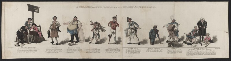
An ocean of motion about Spanish commotions edit
Voting period is over. Please don't add any new votes. Voting period ends on 9 May 2014 at 14:41:32 (UTC)
- Reason
- See jpeg version if you prefer to use the ZoomViewer.
- As a scan, this is of a high technical or research quality at 36 megapixels (11,800 pixels wide), being difficult to digitize due to size (45 inches or 1.14 metres wide), and this is part of the reason for nominating it as an exemplar of the excellent work of the archivists at the Library of Congress in releasing the British Cartoon Prints Collection. Pyne was notable for establishing the Royal Watercolour Society. The cartoon is historically significant as it was made at the time of the Anglo-Spanish War (1796–1808) showing stereotypes of the Spanish as expressed by different classes of the British population. It is a rare example of William Pyne's humorous cartoons (the only political cartoon of his that I can find on Commons), the majority of his published work being palace illustrations and British costumes. The digitization shows detail of costumes and characters, sufficient for each to be taken as a separate detailed illustration, see detailed crop. The full size image shows natural foxing due to age, and creases from being folded up, which it was designed to do, but these do not detract from the encyclopaedic value or quality of the etchings. The main humour of the text is to poke fun at the Spanish, with the cobbler calling them "fish-eating rascals" and the journalists for the Spanish Gazette having nothing to report (on the left) while the British cryers (on the right) are exhausted from having ten years worth of incidents to report in one day.
- I would hope that a consequence of bringing attention to this cartoon would be to help improve Wikipedia articles by using more of the several hundred unused high quality scans we have available of historic political cartoons and especially Pyne, at the moment the article about his life exists only in English and is a stub. Note that the image was nominated on Commons and had only supporting votes, however encyclopaedic value tends to have less weight in that process.
- Articles in which this image appears
- William Henry Pyne
- FP category for this image
- Wikipedia:Featured pictures/Artwork/Others
- Creator
- William Henry Pyne / archive scan by the Library of Congress
- Support as nominator – Fæ (talk) 14:41, 29 April 2014 (UTC)
- Support (having stumbled here from my FPC discussion page). Incredibly high quality, high encyclopedic value. — Cirt (talk) 17:50, 29 April 2014 (UTC)
- Oppose for now: This is an engraving, so there will be lots of copies of this, as such, restoration would be appropriate. Lots of shadows and folds in it. Adam Cuerden (talk) 23:01, 29 April 2014 (UTC)
- Oppose for now: Per Adam. — Crisco 1492 (talk) 23:26, 29 April 2014 (UTC)'
- Also, JPG should be used in the article since it renders more sharply. — Crisco 1492 (talk) 23:43, 29 April 2014 (UTC)
- Oppose I understand the idea, but as art, is not very high quality and it is difficult to see the figures. Hafspajen (talk) 19:03, 30 April 2014 (UTC)
- Looking at the feedback so far, perhaps I was putting too much weight on the technical accomplishment of the scan by the LoC (which is wonderful work). I'll have a think about the other examples of political cartoons from the 18th/19th century that I have been uploading. In the next few weeks I am planning on uploading many of the 100MB+ files that were previously skipped, and it may well be that one of those will be able to be converted from tiff to a high resolution jpeg, be aesthetically pleasing at thumbnail size and not suffer from any damage such as foxing. --Fæ (talk) 19:41, 30 April 2014 (UTC)
- This is not meant to belittle your work, or the LOC's. It's just that the vast majority of FPs from the LOC's collection (and there are quite a few) undergo some restoration beforehand, so that reusers can use them easily and the presentation is better online. Even if it's just minor flyspecking for dust, like our FP of Muhammad Ali. This image would require... a fair bit of restoration. But it's doable. — Crisco 1492 (talk) 00:29, 1 May 2014 (UTC)
Not Promoted --Armbrust The Homunculus 15:48, 9 May 2014 (UTC)
Set: Estonian beauty edit
Voting period is over. Please don't add any new votes. Voting period ends on 9 May 2014 at 15:43:19 (UTC)
- Estonian beauty
-
 Sunrise in Viru bog, Estonia.
 -
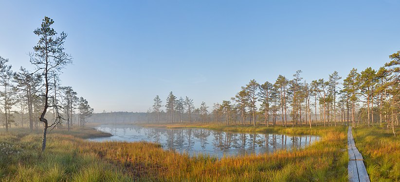 Sunrise at Viru Bog, Estonia
 -
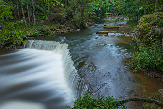 Nõmmeveski waterfall
 -
 Bog landscape at winter, Kakerdaja Bog
 -
 Tarvasjõgi at Kõrvemaa Nature Park in Estonia


- Reason
- Perfect composition + high quality + high resolution = this nomination
- Articles in which this image appears
- Lahemaa National Park
- FP category for this image
- Wikipedia:Featured pictures/Places/Landscapes
- Creator
- Abrget47j and Ireena From commons
- Support set or either as nominator – The herald 15:43, 29 April 2014 (UTC)
- Support — The two 'sunrise' pics in particular are fine compositions w/plenty of px, and all illustrate the concept of bog well. Sca (talk) 16:06, 29 April 2014 (UTC)
- Support -- ArionEstar (talk) 17:02, 29 April 2014 (UTC)
- Support (having stumbled here from my FPC discussion page). Quite striking and simply breathtaking. — Cirt (talk) 17:51, 29 April 2014 (UTC)
- Oppose I refuse to support images by an author who was so disruptive to Commons. Saffron Blaze (talk) 20:50, 29 April 2014 (UTC)
- @Saffron Blaze:..Please don't !vote on the author, but on the pictures. Thank you..The herald 14:01, 30 April 2014 (UTC)
- @The Herald: Please don't bother lecturing me. The images in question are tainted by ill will, suspect ownership and sockpuppetry. Moreover, the user when "disappearing" requested all his and her images be deleted out of courtesy, which was rejected, but only further sullies their status. Saffron Blaze (talk) 15:34, 30 April 2014 (UTC)
- @Saffron Blaze: Now that's flogging dead horse. You are here to justify the image not the author. The herald 15:39, 30 April 2014 (UTC)
- No, I am here to say I would be repulsed if we featured pictures of children done by a known paedophile. Here you are asking me to feature pictures produced by a bully, project disruptor and someone of questionable character (who used sockpuppetry to advance his images for FP status on Commons). That you don't think this should be a concern is fine. I cannot imagine any scenario where I would care what you think though, so appeals to me in this regard are wasting your time. As would lectures on hyperbole. Saffron Blaze (talk) 15:49, 30 April 2014 (UTC)
- Support as I supported so many of these at Commons. Daniel Case (talk) 22:11, 29 April 2014 (UTC)
- Oppose - These are in a gallery. What EV? — Crisco 1492 (talk) 23:25, 29 April 2014 (UTC)
- Oppose - EV not sufficiently demonstrated - three images seem to be of the exact same locality, and little context is provided for any image in the larger set. Gallery use is a concern unless mitigating circumstances can be brought forward. Two images in particular (2 and 5) may have had significant post-processing applied, which would also make them ineligible. Samsara (FA • FP) 07:01, 30 April 2014 (UTC)
- @Samsara:..Post-processing applied on the pictures do not make them ineligible. Please check this image and this FP. Thank you...The herald 14:01, 30 April 2014 (UTC)
- Herald, neither of those was digitally manipulated to the extent we're talking about here. Both are long-term exposures, meaning that the fluids blurred together giving a bridal veil-like appearance. This (obviously) means using a filter to allow one to not get blown highlights, likely a neutral density filter, but that is not considered digital manipulation. — Crisco 1492 (talk) 11:16, 3 May 2014 (UTC)
- Oppose per Samsara; a collection of pretty pictures does not make a FP set. There seems to be a lot of reasoning completely unrelated to the FP criteria going on in this discussion. J Milburn (talk) 08:07, 30 April 2014 (UTC)
- Support - beautiful. Godhulii 1985 (talk) 09:22, 30 April 2014 (UTC)
- Oppose 1. Do all these images are of the same park? I checked a few and see different names. 2. One of the authors don't want to get his works featured. In Commons, the author can withdraw the nomination. I don't know what the policy here. (There is some oversight; so please don't mention them in discussions, even if you find them accidentally.) Jee 09:40, 30 April 2014 (UTC)
- No, but some of them. Others are finest available pictures from Estonian countrysides. Thank you..The herald 14:01, 30 April 2014 (UTC)
- IMHO, such a generic set is not good if they not belongs to a single article. My other concern (the author's disagreement) also stands. So suggest a withdraw or speedy close. Jee 15:49, 30 April 2014 (UTC)
- Oppose They are very nice pictures, but I'm not clear on the encyclopedic value. In fact, I don't see one of them in the article you posted, and the rest are in a gallery. Not sure why all are nominated at once either. Mattximus (talk) 00:02, 1 May 2014 (UTC)
- Oppose per lack of EV. Nikhil (talk) 16:32, 1 May 2014 (UTC)
- Oppose I don't want to repeat what others say above. More like a photo in a contest rather than something that will add a helpful factor in an article. ///EuroCarGT 03:58, 5 May 2014 (UTC)
 Comment: Sven, care to explain why you placed the "not a ballot" template on this nomination? — Preceding unsigned comment added by Saffron Blaze (talk • contribs)
- Unusually high level of participation, coupled with seeing several people on this page (on both sides) that I do not recognize as having participated at FPC before. Sven Manguard Wha? 14:13, 5 May 2014 (UTC)
- Several have been regulars here in the past, though somewhat infrequently recently. I recognize most of the names here from previous FPCs. — Crisco 1492 (talk) 14:53, 5 May 2014 (UTC)
- Yep Crisco, your are right. Some are older guys who were dormant. May be they are looking forward for a FPC nomination too. :-) The herald 15:06, 5 May 2014 (UTC)
- It appears that all of the people that drew my attention do have at least intermittent history in the area. I've removed the tag. Sven Manguard Wha? 15:52, 5 May 2014 (UTC)
- Oppose. They are beautiful images in their own right but I agree with others that this is a disparate set and should not be promoted as such. They should be nominated individually and stand alone. Ðiliff «» (Talk) 21:12, 8 May 2014 (UTC)
Not Promoted --Armbrust The Homunculus 15:51, 9 May 2014 (UTC)
Codrington Library facade, Oxford edit
Voting period is over. Please don't add any new votes. Voting period ends on 10 May 2014 at 05:52:35 (UTC)

- Reason
- High EV, high quality
- Articles in which this image appears
- Codrington Library, All Souls College, Oxford
- FP category for this image
- Wikipedia:Featured pictures/Places/Architecture
- Creator
- Godot13
- Support ALT as nominator – Godot13 (talk) 05:52, 30 April 2014 (UTC)
- Oppose Where's the rest of the building? --Janke | Talk 08:16, 30 April 2014 (UTC)
- As part of an Oxford college quad the library faces inwards on one side of the square, meaning this is a picture of the entire library facade. See the aerial photo here: http://binged.it/1u3HEx8 - Zephyris Talk 11:47, 30 April 2014 (UTC)
- Oppose Nice picture, but to get the sense that it's part of a quad, you would have to step back a bit to show that the walls come in on either side, right now it's ambiguous, so missing some critical encyclopedic value. Mattximus (talk) 23:59, 30 April 2014 (UTC)
- Comment I would like to see this picture cropped. I think the ends of the picture is what it makes it - ambiguous. It ends in something that starts, if you understand what I mean. Hafspajen (talk) 19:23, 6 May 2014 (UTC)
.jpg)
- Well, that was fast. let me think. Hafspajen (talk) 19:43, 6 May 2014 (UTC)
- Ok, Support ALT. The image is good, clear and depicts an iconic building. I think it may have a place among Featured pictures, after this change. This image has the crisp quality people want about the other pictures. Hafspajen (talk) 19:46, 6 May 2014 (UTC)
- Suppor ALT - The crop really brings out the facade's personality. — Crisco 1492 (talk) 14:55, 7 May 2014 (UTC)
- Oppose both - I'd want to see more, not less, of the building. Sven Manguard Wha? 01:34, 8 May 2014 (UTC)
- Oppose Alt 1. & Weak support original-- The picture must show the subject. You are placing a cropped version with almost 60% of library missing. IMO, original is far better than the Alt.1. But both have the quality and EV perfect.The herald 13:27, 8 May 2014 (UTC)
- Support Alt. — Sometimes less is more. Sca (talk) 00:31, 10 May 2014 (UTC)
Not Promoted --Armbrust The Homunculus 07:35, 10 May 2014 (UTC)
Saga Ruby edit
Voting period is over. Please don't add any new votes. Voting period ends on 10 May 2014 at 23:58:12 (UTC)

- Reason
- decent size and shows all the important details of the ship
- Articles in which this image appears
- Saga Ruby
- FP category for this image
- Vehicles
- Creator
- Geni
- Support as nominator – ©Geni (talk) 23:58, 30 April 2014 (UTC)
- Oppose - I feel it is not sharp enough and shadow on the right of the ship is slightly distracting. Sorry. Nikhil (talk) 13:20, 2 May 2014 (UTC)
- Oppose - Good angle and nice view but the photo feels a little dark and somewhat hazy. ///EuroCarGT 03:45, 5 May 2014 (UTC)
- Oppose. Image quality is fairly poor. Why is it so soft? To reach a level of sharpness I would deep acceptable for a subject of this kind, it needs to be downsampled to about 50%. That makes it just above the minimum resolution requirements for a FP, but given the fairly pedestrian nature of the image, I think it needs some wow to get it over the line (good detail, interesting location, notable feature, etc). Also, I'd crop a little of the foreground water if it were me, to comply with the rule of thirds. It is a better image than the current lead image though. Ðiliff «» (Talk) 21:10, 8 May 2014 (UTC)
Not Promoted --Armbrust The Homunculus 23:58, 10 May 2014 (UTC)
Dolmabahçe Mosque edit
Voting period is over. Please don't add any new votes. Voting period ends on 11 May 2014 at 15:22:09 (UTC)

.jpg)
- Reason
- High quality and resolution images that even show the context (Dolmabahçe palace) in the background. VI in Commons, FP in trwiki.
- Articles in which this image appears
- Dolmabahçe Mosque
- FP category for this image
- Wikipedia:Featured pictures/Places/Architecture
- Creator
- Arild Vågen
- Support as nominator – ArildV (talk) 15:22, 1 May 2014 (UTC)
- Oppose - Foreground is noisy. Trees come way too close to the mosque's walls... I have a feeling if you stepped a meter to your right the angle may have helped reduce that. — Crisco 1492 (talk) 23:46, 1 May 2014 (UTC)
- Thank you for your review Crisco 1492 . I dont think (one year since I took the image) that is was possible to step a step a meter to the right, next to the water is a small guard house and a fence that protects a private section of the quay, please see the very left of this picture. If I on the other hand had taken the picture from a boat, it had been disturbing modern buildings in the background.--ArildV (talk) 07:46, 2 May 2014 (UTC)
- Perhaps, but right now there are considerable distractions (between the cars and trees). Architectural FPs generally have considerably less distracting foregrounds; some, such as the National Press Monument, have activity in the foreground, but even then it adds to the image (showing a function of the building). — Crisco 1492 (talk) 07:54, 2 May 2014 (UTC)
- Thank you for your review Crisco 1492 . I dont think (one year since I took the image) that is was possible to step a step a meter to the right, next to the water is a small guard house and a fence that protects a private section of the quay, please see the very left of this picture. If I on the other hand had taken the picture from a boat, it had been disturbing modern buildings in the background.--ArildV (talk) 07:46, 2 May 2014 (UTC)
- Comment — Could be cropped in a bit tighter on L and below to mininmize noise. Sca (talk) 01:31, 3 May 2014 (UTC)
- Comment A photo from the Bosporus would have a clearer composition, and given that about a zillion ferries and tourist boats sail past this mosque each day, it should be possible to obtain a high quality image with a composition such as that used in File:İstanbul 5495.jpg and File:Exterior view of Dolmabahçe Mosque.jpg. Nick-D (talk) 09:55, 5 May 2014 (UTC)
- I strongly disagree, because of all the distracting modern buildings in the background (the point here is that you only see the mosque and the palace, but no modern buildings).--ArildV (talk) 13:28, 5 May 2014 (UTC)
- A good choice of DOF could mitigate that issue... — Crisco 1492 (talk) 11:51, 6 May 2014 (UTC)
- Not really, even if you manage to get the buildings in the background out of focus, they will still be a highly visible part of the picture. And you will lose the palace.--ArildV (talk) 14:00, 6 May 2014 (UTC)
- Never said anything about "eliminating" issues, but "mitigate" issues. Make them less prominent. — Crisco 1492 (talk) 00:18, 7 May 2014 (UTC)
- Not really, even if you manage to get the buildings in the background out of focus, they will still be a highly visible part of the picture. And you will lose the palace.--ArildV (talk) 14:00, 6 May 2014 (UTC)
- A good choice of DOF could mitigate that issue... — Crisco 1492 (talk) 11:51, 6 May 2014 (UTC)
- I strongly disagree, because of all the distracting modern buildings in the background (the point here is that you only see the mosque and the palace, but no modern buildings).--ArildV (talk) 13:28, 5 May 2014 (UTC)
- Oppose — I'm going to vote no, not because of pictorial issues, but because the article is only 17 words — essentially a stub. I'm curious to know more about this interesting building. Sca (talk) 15:13, 6 May 2014 (UTC)
- It's not 17 words anymore; I expanded it a little. Epicgenius (talk) 20:21, 7 May 2014 (UTC)
- Oppose due to reasons outlined above. As Crisco 1492 said, for example,
...there are considerable distractions (between the cars and trees)...
. Epicgenius (talk) 20:21, 7 May 2014 (UTC)
Not Promoted --The herald 15:30, 11 May 2014 (UTC)
- Not enough concensus The herald 15:30, 11 May 2014 (UTC)
Girl in a White Kimono edit
Voting period is over. Please don't add any new votes. Voting period ends on 12 May 2014 at 11:00:23 (UTC)
.jpg)
- Reason
- High quality photograph of a great painting.
- Articles in which this image appears
- Girl in a White Kimono, Japonism
- FP category for this image
- Wikipedia:Featured pictures/Artwork/Paintings
- Creator
- George Hendrik Breitner (painter)
Rijksmuseum (photographer)
Aiko (uploader)
- Support as nominator – Editør (talk) 11:00, 2 May 2014 (UTC)
- Comment - If someone has the patience, I'm about 99% sure we can get a larger version of this painting from the Rijkmuseum's website. — Crisco 1492 (talk) 00:36, 3 May 2014 (UTC)
- This version was already downloaded from the website of the Rijksmuseum. Do you mean you have requested a better version? – Editør (talk) 17:54, 6 May 2014 (UTC)
- The version they offer for download is smaller than the largest version which they have (maximum zoom). Check out our version of File:Raden Saleh.jpg; last I checked, it's considerably higher resolution than what the Rijkmuseum offers for direct download. It just takes a heck of a long time (have to download the individual tiles, then stitch them in GIMP). — Crisco 1492 (talk) 01:30, 10 May 2014 (UTC)
- Thanks, now I understand what you mean. But until the stitched image is available, I don't see a reason not to vote on this version. – Editør (talk) 07:47, 10 May 2014 (UTC)
- The version they offer for download is smaller than the largest version which they have (maximum zoom). Check out our version of File:Raden Saleh.jpg; last I checked, it's considerably higher resolution than what the Rijkmuseum offers for direct download. It just takes a heck of a long time (have to download the individual tiles, then stitch them in GIMP). — Crisco 1492 (talk) 01:30, 10 May 2014 (UTC)
- This version was already downloaded from the website of the Rijksmuseum. Do you mean you have requested a better version? – Editør (talk) 17:54, 6 May 2014 (UTC)
- Comment Is the original so dark on left side? Hafspajen (talk) 15:03, 3 May 2014 (UTC)
Not Promoted --Armbrust The Homunculus 11:32, 12 May 2014 (UTC)
14th C. Doberan Minster altar edit
Voting period is over. Please don't add any new votes. Voting period ends on 13 May 2014 at 00:11:02 (UTC)

- Reason
- Significantly enhances pictorial presentation of detailed Doberan Minster article, an amazing account of Medieval church ornamentation in northern Europe.
- Articles in which this image appears
- Doberan Minster
- FP category for this image
- Artwork
- Creator
- User:Malchen53 [3]
- Support as nominator – Sca (talk) 00:11, 3 May 2014 (UTC)
- Comment - Looks like it wasn't corrected for lens distortion. — Crisco 1492 (talk) 00:33, 3 May 2014 (UTC)
- Support the one corrected for lens distortion. The Minster in Bad Doberan is a medieval building of the highest technical and artistic perfection. It is not new, if anyone would think that, it is an old building, and it is handmade bricks and the altar is really unique. High EV, what is it now, folks? It is a highly spectacular building, don't we want this one for our Wikipedia? Hafspajen (talk) 14:34, 6 May 2014 (UTC)

Altar in Roskilde cathedral, same style

- This picture need more input, relist maybe? Hafspajen (talk) 14:01, 10 May 2014 (UTC)
- Picture feels a little weird. Was it was taken slightly off-centre, then perspective-corrected without taking that into account? Because the altar doesn't line up quite with the centre of the arched roof behind it. But I'm not really sure... Adam Cuerden (talk) 23:49, 12 May 2014 (UTC)
- This picture need more input, relist maybe? Hafspajen (talk) 14:01, 10 May 2014 (UTC)
Not Promoted --Armbrust The Homunculus 00:11, 13 May 2014 (UTC)
Pena National Palace edit
Voting period is over. Please don't add any new votes. Voting period ends on 13 May 2014 at 13:35:19 (UTC)

- Reason
- Good quality and high EV. Commons FP.
- Articles in which this image appears
- Pena National Palace, Portugal
- FP category for this image
- Wikipedia:Featured pictures/Places/Architecture
- Creator
- Cccefalon
- Support as nominator – Tomer T (talk) 13:35, 3 May 2014 (UTC)
- Support (having stumbled here from my FPC discussion page). High quality image, Featured Picture on Wikimedia Commons. — Cirt (talk) 21:28, 3 May 2014 (UTC)
- Support - Been there, seen it. Great image.--Godot13 (talk) 04:56, 4 May 2014 (UTC)
- Support - Solid, though I wonder if it was downsampled. — Crisco 1492 (talk) 06:01, 4 May 2014 (UTC)
- Support per Commons. Saffron Blaze (talk) 03:12, 5 May 2014 (UTC)
- Support. J Milburn (talk) 15:45, 5 May 2014 (UTC)
- Support Sven Manguard Wha? 23:35, 8 May 2014 (UTC)
Promoted File:Sintra Portugal Palácio da Pena-01.jpg --Armbrust The Homunculus 13:39, 13 May 2014 (UTC)
Chalk Cliffs on Rügen edit
Voting period is over. Please don't add any new votes. Voting period ends on 13 May 2014 at 14:54:18 (UTC)


- Reason
- High quality reproduction of such a fine painting
- Articles in which this image appears
- Caspar David Friedrich, Chalk Cliffs on Rügen and Germany
- FP category for this image
- Wikipedia:Featured pictures/Artwork/Paintings
- Creator
- Caspar David Friedrich
- Support as nominator – The herald 14:54, 3 May 2014 (UTC)
- Support. A lovely picture. Hafspajen (talk) 15:01, 3 May 2014 (UTC)
- Support — An iconic work by an artist perhaps less widely known in the English-speaking world than in continental Europe. Sca (talk) 16:25, 3 May 2014 (UTC)
- Support (having stumbled here from my FPC discussion page). Iconic and high quality picture. — Cirt (talk) 21:29, 3 May 2014 (UTC)
- Oppose this version. Rather soft, seems to have scanning artifacts. The Yorck Project scans almost always have issues; I think they were taken from art books, honestly. — Crisco 1492 (talk) 05:59, 4 May 2014 (UTC)
- Oppose I will agree with Crisco, the scan is not very crisp, I can't tell what medium was used. Mattximus (talk) 16:52, 4 May 2014 (UTC)
- @Crisco 1492: and @Mattximus:, I have uploaded another version of the picture. How now.?? The herald 17:02, 4 May 2014 (UTC)
- Hope they will be satisfied because this is one wounderful picture, it would be a pity to sack it. Hafspajen (talk) 17:41, 4 May 2014 (UTC)
- What's the source for this new scan? — Crisco 1492 (talk) 00:22, 5 May 2014 (UTC)
- from here..The herald 07:04, 5 May 2014 (UTC)
- I really shouldn't have to say this... that should be on the description page. — Crisco 1492 (talk) 10:01, 5 May 2014 (UTC)
- Oppose - Low quality scan. Should be of at least this quality. P. S. Burton (talk) 23:00, 6 May 2014 (UTC)
Not Promoted --Armbrust The Homunculus 14:55, 13 May 2014 (UTC)
Colonial currency set edit
Voting period is over. Please don't add any new votes. Voting period ends on 14 May 2014 at 05:04:33 (UTC)
- Reason
- High quality, high EV (presented as a set).
A set of Colonial currency with issue dates ranging from 1729 to 1780. Each note bears at least two autographed signatures of community members appointed by legislation to supervise the printing and personally sign the currency. Notes for this set were selected, when possible, for the signers' historical notability and include (but are not limited to): Speakers of a state or colonial legislative assembly (4); delegates to the Continental Congress (4, including its first President); Governors (or in one case State President) (3); signers of the Declaration of Independence (2); delegates to the Constitutional Convention (2); delegates to the Stamp Act Congress (2); Colonial treasurers (2); an inaugural appointee to the Supreme Court of the United States (1).
Different from prior nominations of paper currency, the obverse and reverse images are separate. In a few instances the orientation of the obverse/reverse of Colonial currency are not aligned making the presentation in a single image distracting. Only the obverse presented is nominated. - Original
- A 13-note group of Colonial currency with one representative example from each of the Thirteen Colonies (or its successor Province or State).
- Articles in which these images appear
- Early American currency (all); additionally, one each in John McKinly, Thomas Collins, William Few, John Hart, John Stevens, Jr., John H. Cruger, Edward Moseley, Metcalf Bowler, Peyton Randolph, John Blair, Jr., and Robert Carter Nicholas, Sr.; recently added to New Jersey pound, North Carolina pound, and Virginia pound.
- FP category for this image
- Currency
- Creator
- The respective Colonial, Provincial, and State governing bodies. Engravers and printers noted when present on the banknote or available from research literature.
From the National Numismatic Collection, NMAH, Smithsonian Institution.
Images by Godot13.
-

Connecticut Colony (1775)
Williams, Seymour, Payne
Reverse -

Delaware Colony (1776)
McKinly, Collins, Manlove
Reverse -

Province of Georgia (1778)
Kent, Few, Netherclift, O’Bryen, Wade
Reverse -

Province of Maryland (1770)
Clapham, Couden
Reverse
-Connecticut_-2_Jan_1775_OBV.jpg)
-Delaware-1_Jan_1776_OBV.jpg)
-Georgia-4_May_1778_OBV.jpg)
-Maryland-1_Mar_1770_OBV.jpg)
-

Province of Massachusetts Bay (1741)
Choate, Hale, Brown, Eveleth
Reverse -

Province of New Hampshire (1780)
McClure, Robinson, Pearson, Gilman
Reverse -

Province of New Jersey (1776)
Smith, Hart, Stevens
Reverse -

Province of New York (1775)
Cruger, Waddell
Reverse
-Massachusetts-1_May_1741_OBV.jpg)
-New_Hampshire-29_Apr_1780_OBV.jpg)
-New_Jersey-25_Mar_1776_OBV.jpg)
-New_York-2_Aug_1775_OBV.jpg)
-

Province of North Carolina (1729)
Downing, Lovick, Moseley, Pollock, Swann
Reverse -

Province of Pennsylvania (1771)
Hopkinson, Jones, Fisher
Reverse -

Rhode Island (1780)
Harris, Bowler
Reverse
-North_Carolina-27_Nov_1729_OBV.jpg)
-Pennsylvania-20_Mar_1771_OBV.jpg)
-Rhode_Island-2_Jul_1780_OBV.jpg)
-

South Carolina (1779)
Scott, Smyth, Weston
Reverse -

-South_Carolina-8_Feb_1779_OBV.jpg)
-Virginia-4_Mar_1773_OBV.jpg)
_during_a_maritime_external_air_transporation_system_training_e.jpg)
_LCCN2003681692.jpg)
_Diliff.jpg)
![[1]](http://nippaku.files.wordpress.com/2013/09/dsc04982.jpg)
![[2]](http://www.mennomail.nl/wp-content/uploads/2013/05/2.png)
-Connecticut_-2_Jan_1775_REV.jpg)
-Delaware-1_Jan_1776_REV.jpg)
-Georgia-4_May_1778_REV.jpg)
-Maryland-1_Mar_1770_REV.jpg)
-Massachusetts-1_May_1741_REV.jpg)
-New_Hampshire-29_Apr_1780_REV.jpg)
-New_Jersey-25_Mar_1776_REV.jpg)
-New_York-2_Aug_1775_REV.jpg)
-North_Carolina-27_Nov_1729_REV.jpg)
-Pennsylvania-20_Mar_1771_REV.jpg)
-Rhode_Island-2_Jul_1780_REV.jpg)
-South_Carolina-8_Feb_1779_REV.jpg)
-Virginia-4_Mar_1773_REV.jpg)
- Support as nominator – Godot13 (talk) 05:04, 4 May 2014 (UTC)
- Support - A lot less green this time, eh? — Crisco 1492 (talk) 05:56, 4 May 2014 (UTC)
- Oppose I understand that there is historical value in these, and that part of that value lies in their present condition, but some of these are in awful shape. I don't like the idea of heavily damaged images being considered 'among Wikipedia's best', even when the damage is to the source work itself, and the file at hand is a high quality, accurate representation of the damaged source work. File:US-Colonial (NC-33)-North Carolina-27 Nov 1729 OBV.jpg is in awful, illegible shape, File:US-Colonial (PA-149)-Pennsylvania-20 Mar 1771 OBV.jpg isn't much better, and File:US-Colonial (MA-87.15)-Massachusetts-1 May 1741 OBV.jpg is pretty damaged, too. I could perhaps support some of these individually, but I can't support the set as a whole because I can't support some of the members. Sven Manguard Wha? 00:17, 5 May 2014 (UTC)
- Comment I thought this was about encyclopedic value? Does an example need to be in pristine condition to be a high EV FP? You mention the North Carolina (NC) note. It is possible to find an uncirculated example from the 1770’s or 1780’s? Yes. However the first issue printed by NC was in 1712-1713. There are no known examples from that issue (of a total of 1550 individual notes, miniscule printing). The second issue of currency from NC was in 1715 (handwritten like the first) and none have ever been reported or illustrated. The third issue (1722 and again handwritten) is only illustrated in the seminal reference with a single counterfeit note. The fourth series, handwritten in 1729 (and the note included in this set) is likely one of the earliest known pieces of colonial currency from North Carolina.
The Pennsylvania note in the set is a case where condition was weighed against the notability of the signers. The example included is actually in very respectable condition, and it has the added bonus of having been hand signed by someone who signed the Declaration of Independence, participated in the design of the first American flag, and also happened to create the Great Seal found on the U.S. $1 bill. While not quite as early in Massachusetts colony’s history as North Carolina, a similar argument could be made for that note.
High grade colonial notes from the late issues are common and they do not have the same historical significance as the notes in this set. Regarding your comment about “awful, illegible shape” this example of the same 1729 NC issue (thought to be a counterfeit) is graded as “very fine.” -- Godot13 (talk) 02:44, 5 May 2014 (UTC)
- For a document, I don't think digital restoration would be called for. Paintings, even those in poor condition (the recent Rembrandt, for instance) generally go through on EV. I think these bills, some almost 300 years old, are similar. — Crisco 1492 (talk) 09:57, 5 May 2014 (UTC)
- I know that the FP criteria specifically state that images don't have to be in pristine condition (the words they use are aesthetically pleasing), but I think that there is a point where a source work is so heavily damaged that it undercuts the encyclopedic value. In the case of File:US-Colonial (NC-33)-North Carolina-27 Nov 1729 OBV.jpg, I have to strain to make out what is being depicted. The value it adds to the articles it is in isn't terribly great. It doesn't help me understand Edward Moseley at all, and any image of a North Carolina pound would work for that article. The image's strongest claim to EV is in Early American currency, where it is shrunk down to such a small size that it's legibility issues are magnified. I appreciate that this is difficult, if not impossible, to replace, but I don't feel that this is the kind of thing that the "not always required to be aesthetically pleasing" exemption is meant for. Sven Manguard Wha? 14:35, 5 May 2014 (UTC)
- Comment I thought this was about encyclopedic value? Does an example need to be in pristine condition to be a high EV FP? You mention the North Carolina (NC) note. It is possible to find an uncirculated example from the 1770’s or 1780’s? Yes. However the first issue printed by NC was in 1712-1713. There are no known examples from that issue (of a total of 1550 individual notes, miniscule printing). The second issue of currency from NC was in 1715 (handwritten like the first) and none have ever been reported or illustrated. The third issue (1722 and again handwritten) is only illustrated in the seminal reference with a single counterfeit note. The fourth series, handwritten in 1729 (and the note included in this set) is likely one of the earliest known pieces of colonial currency from North Carolina.
- Support. These notes are so rare that just having a free use image in any condition is an amazing accomplishment. Rreagan007 (talk) 05:27, 5 May 2014 (UTC)
- Support Another phenomenal grouping from the Smithsonian Institution captured at high quality. A veritable treasure trove of signatures from the birth of a nation. NiceCurrency (talk) 21:50, 5 May 2014 (UTC)
- Support — High historical EV, visual interest (to a Yank, anyway). Sca (talk) 15:04, 6 May 2014 (UTC)
- Support per Rreagan007. Jee 13:13, 7 May 2014 (UTC)
Promoted File:US-Colonial (CT-178)-Connecticut -2 Jan 1775 OBV --Armbrust The Homunculus 05:25, 14 May 2014 (UTC)
Promoted File:US-Colonial (DE-76)-Delaware-1 Jan 1776 OBV --Armbrust The Homunculus 05:25, 14 May 2014 (UTC)
Promoted File:US-Colonial (GA-124)-Georgia-4 May 1778 OBV --Armbrust The Homunculus 05:25, 14 May 2014 (UTC)
Promoted File:US-Colonial (MD-55)-Maryland-1 Mar 1770 OBV --Armbrust The Homunculus 05:25, 14 May 2014 (UTC)
Promoted File:US-Colonial (MA-87.15)-Massachusetts-1 May 1741 OBV --Armbrust The Homunculus 05:25, 14 May 2014 (UTC)
Promoted File:US-Colonial (NH-179)-New Hampshire-29 Apr 1780 OBV --Armbrust The Homunculus 05:25, 14 May 2014 (UTC)
Promoted File:US-Colonial (NJ-179)-New Jersey-25 Mar 1776 OBV --Armbrust The Homunculus 05:25, 14 May 2014 (UTC)
Promoted File:US-Colonial (NY-173)-New York-2 Aug 1775 OBV --Armbrust The Homunculus 05:25, 14 May 2014 (UTC)
Promoted File:US-Colonial (NC-33)-North Carolina-27 Nov 1729 OBV --Armbrust The Homunculus 05:25, 14 May 2014 (UTC)
Promoted File:US-Colonial (PA-149)-Pennsylvania-20 Mar 1771 OBV --Armbrust The Homunculus 05:25, 14 May 2014 (UTC)
Promoted File:US-Colonial (RI-282)-Rhode Island-2 Jul 1780 OBV --Armbrust The Homunculus 05:25, 14 May 2014 (UTC)
Promoted File:US-Colonial (SC-155)-South Carolina-8 Feb 1779 OBV --Armbrust The Homunculus 05:25, 14 May 2014 (UTC)
Promoted File:US-Colonial (VA-69)-Virginia-4 Mar 1773 OBV --Armbrust The Homunculus 05:25, 14 May 2014 (UTC)
Orion Molecular Cloud complex edit
Voting period is over. Please don't add any new votes. Voting period ends on 14 May 2014 at 16:49:43 (UTC)

- Reason
- High quality non-NASA image
- Articles in which this image appears
- Betelgeuse, Orion's Belt, Orion (constellation), Orion Molecular Cloud Complex, Rogelio Bernal Andreo
- FP category for this image
- Wikipedia:Featured pictures/Space/Looking out
- Creator
- Rogelio Bernal Andreo
- Support as nominator – The herald 16:49, 4 May 2014 (UTC)
- Comment Why "reduced" in the file name? Adam Cuerden (talk) 16:40, 9 May 2014 (UTC)
- @Adam Cuerden:..That's because of its reduced size (earlier version). I think of to go for a rename request. The herald 13:07, 11 May 2014 (UTC)
- Question Why is it in portrait orientation? The original work was in landscape. This is also Sven Manguard 19:58, 9 May 2014 (UTC)
- This is the standard orientation Orion appears in. Adam Cuerden (talk) 20:57, 9 May 2014 (UTC)
- @Sven Manguard: ..The orientation cannot have anything to do with FP nominations (IMHO).. The herald 15:00, 11 May 2014 (UTC)
- The Herald I am not sure where you are getting that idea from, but it's certainly not correct. The orientation that is being used is not the orientation that the photographer chose. I am not sure whether to oppose over that or not (Adam is right in that this is the typical orientation), but I do feel that I would be justified in doing so. Sven Manguard Wha? 15:24, 11 May 2014 (UTC)
- @Sven Manguard: ..The orientation cannot have anything to do with FP nominations (IMHO).. The herald 15:00, 11 May 2014 (UTC)
- This is the standard orientation Orion appears in. Adam Cuerden (talk) 20:57, 9 May 2014 (UTC)
OpposeWhen the label was removed, it was done so in a way that changed a significant chunk of the information in that region of the image, and hence made the image misleading. The upper right corner is now completely at odds with the reality of that part of the sky. Adam Cuerden (talk) 14:44, 11 May 2014 (UTC)
- @Adam Cuerden:..
 Done..fixed it..how now..? The herald 15:00, 11 May 2014 (UTC)
- It looks a lot better. Did you manage to get a copy without the label released? Adam Cuerden (talk) 15:42, 11 May 2014 (UTC)
- Yep.. The herald 15:45, 11 May 2014 (UTC)
- Support, then. I'd post a message to WT:FPC saying the issues have been resolved. Adam Cuerden (talk) 16:10, 11 May 2014 (UTC)
- Yep.. The herald 15:45, 11 May 2014 (UTC)
- It looks a lot better. Did you manage to get a copy without the label released? Adam Cuerden (talk) 15:42, 11 May 2014 (UTC)
- @Adam Cuerden:..
Not Promoted --Armbrust The Homunculus 17:24, 14 May 2014 (UTC)
Olive ridley sea turtle edit
Voting period is over. Please don't add any new votes. Voting period ends on 14 May 2014 at 17:21:05 (UTC)

- Reason
- Good EV and POTY 2011 finalist
- Articles in which this image appears
- Olive ridley sea turtle, Playa de Escobilla Sanctuary, and Sea turtle
- FP category for this image
- Wikipedia:Featured pictures/Animals/Reptiles
- Creator
- Claudio Giovenzana www.longwalk.it
- Support as nominator – The herald 17:21, 4 May 2014 (UTC)
- Oppose Below minimum size and rather soft. According to the file history the author already replaced the photo with a bigger one in order for it to qualify for FP, but the smallest edge is still 1329 pixels. It only falls short for a few pixels, but the photo also does not look as sharp as one would expect from a downsampled image. I will be happy to support if the author gives us at least the 1500 pixels we expect, but I would appreciate it more if we would get the full resolution version. --Ebertakis (talk) 20:22, 4 May 2014 (UTC)
- Oppose. A lovely photograph, but not up to today's standards. J Milburn (talk) 22:15, 4 May 2014 (UTC)
- Oppose per J Milburn, it's a nice photo but does not meet the criteria. ///EuroCarGT 03:43, 5 May 2014 (UTC)
- Ebertakis,J Milburn & EuroCarGT..How now..??The herald 05:18, 5 May 2014 (UTC)
- I've reverted. Your edit introduced considerable JPG artefacting, and Commons policy is to not allow the overwriting of featured images. — Crisco 1492 (talk) 10:06, 5 May 2014 (UTC)
- Ebertakis,J Milburn & EuroCarGT..How now..??The herald 05:18, 5 May 2014 (UTC)
Not Promoted --Armbrust The Homunculus 17:28, 14 May 2014 (UTC)
Basking shark edit
Voting period is over. Please don't add any new votes. Voting period ends on 16 May 2014 at 13:25:35 (UTC)

- Reason
- Pretty good quality considering it's an underwater photograph. Rather hard to reproduce.
- Articles in which this image appears
- Basking shark +7 or so
- FP category for this image
- Wikipedia:Featured pictures/Animals/Fish
- Creator
- Greg Skomal / NOAA Fisheries Service
- Support as nominator – — Crisco 1492 (talk) 13:25, 6 May 2014 (UTC)
- Support, a very suggestive picture, big favourite. Even the Animal project wanted to use it as a possible header. Hafspajen (talk) 13:29, 6 May 2014 (UTC)
- strong support a very good underwater image. --Alchemist-hp (talk) 00:04, 7 May 2014 (UTC)
- Support - Recent Commons FP which has some good EV. ///EuroCarGT 02:48, 7 May 2014 (UTC)
- Support - SagaciousPhil - Chat 15:54, 7 May 2014 (UTC)
- Oppose. Sorry to go against the flow, but I'm really not feeling this one. I don't think there'd be any support for this were it not such an impressive creature, as the quality just isn't what we've come to expect at FPC. I'm also unconvinced that it's all that hard to replace- we've got at least three separate underwater shots of the species on Commons. They are not uncommon in a lot of waters, and the interest in the species leads me to suggest that we'll get more images in years to come. J Milburn (talk) 10:09, 8 May 2014 (UTC)
- Oppose I agree with J. Sven Manguard Wha? 01:01, 9 May 2014 (UTC)
- Oppose Per J: There's a bright purple "dead pixel" right in his mouth, amongst other issues. Looks a bit blurry and unsharp. Resolution is okay, but resolution + problems means that the effective resolution is likely a lot less. Adam Cuerden (talk) 23:56, 12 May 2014 (UTC)
Not Promoted --Armbrust The Homunculus 13:25, 16 May 2014 (UTC)
In the Conservatory edit
Voting period is over. Please don't add any new votes. Voting period ends on 16 May 2014 at 22:55:06 (UTC)

- Reason
- High quality, high resolution (688.29 Megapixel) image for a notable painting
- Articles in which this image appears
- In the Conservatory (most EV), Édouard Manet,
- FP category for this image
- Wikipedia:Featured pictures/Artwork/Paintings
- Creator
- Édouard Manet
- Support as nominator – Armbrust The Homunculus 22:55, 6 May 2014 (UTC)
- Support. Manet is a notable painter, and this is a good picture. Like the Victorian air about it. The palms, the beard... Like the light, it is dispersed - probably because of the conditions in the conservatory. Nice. Hafspajen (talk) 00:04, 7 May 2014 (UTC)
- Support — The subjects' hands seem to be almost a leitmotiv in this composition. [4] Sca (talk) 14:21, 7 May 2014 (UTC)
- Support – wasn't sure when I first looked at it but after studying it again I can appreciate its virtues and attraction. SagaciousPhil - Chat 15:56, 7 May 2014 (UTC)
- Support Of course. Adam Cuerden (talk) 03:06, 8 May 2014 (UTC)
- Comment – Some orange/brown color (part of the frame?) is visible at the top side and right side of the image. Could this be removed from the image without loosing part of the painting? – Editør (talk) 11:26, 8 May 2014 (UTC)
- Comment IMO the frame can't be removed without loosing parts of the painting. Armbrust The Homunculus 12:08, 8 May 2014 (UTC)
- Support. Excellent quality and useful image. --Carioca (talk) 19:33, 16 May 2014 (UTC)
Promoted File:In the Conservatory - edited.jpg --Sven Manguard Wha? 04:14, 17 May 2014 (UTC)
Blue Marble edit
Voting period is over. Please don't add any new votes. Voting period ends on 17 May 2014 at 12:36:06 (UTC)

- Reason
- High Quality and full EV.
- Articles in which this image appears
- Blue Marble
- FP category for this image
- Creator
- NASA
- Support as nominator – Alborzagros (talk) 12:36, 7 May 2014 (UTC)
- There was a previous nomination 70.72.190.205 (talk) 03:33, 8 May 2014 (UTC)
- Never mind. Support The herald 13:31, 8 May 2014 (UTC)
- Oppose basically for the reasons given in the previous nomination. The low-earth-orbit perspective is not what the reader would expect, and is not mentioned in the article, making the image potentially more confusing than illustrative. --Paul_012 (talk) 20:01, 10 May 2014 (UTC)
- Support - This is not being given as a representation of Earth. The EV for this image is from it representing "The Blue Marble 2012", which means it has to be a low-earth-orbit perspective because that's what "The Blue Marble 2012" actually used. — Crisco 1492 (talk) 00:57, 11 May 2014 (UTC)
- Comment/Question It doesn't have a particularly high EV in the article it is used in, which has essentially become a gallery of images of the Earth. I'm not opposing, as Blue Marble 2012 does have its own section, but I do have concerns about the EV. Is there enough coverage of Blue Marble 2012 to warrant spinning it off into its own article (which would have this as the lead image)? Sven Manguard Wha? 22:47, 12 May 2014 (UTC)
- Probably does. — Crisco 1492 (talk) 07:52, 13 May 2014 (UTC)
- I would support this nomination if Blue Marble 2012 had its own article. Sven Manguard Wha? 02:36, 14 May 2014 (UTC)
- Probably does. — Crisco 1492 (talk) 07:52, 13 May 2014 (UTC)
Not Promoted --Armbrust The Homunculus 12:40, 17 May 2014 (UTC)
Mary Ellen Best - An Interior edit
Voting period is over. Please don't add any new votes. Voting period ends on 17 May 2014 at 19:39:58 (UTC)

- Reason
- Found this while going through WikiCup submissions from last round. It's a nice article on a notable female painter, and the artwork is stunningly detailed. I presume this is about 8"x11", which makes this about 300dp
- Articles in which this image appears
- Mary Ellen Best
- FP category for this image
- Wikipedia:Featured pictures/Artwork/Paintings
- Creator
- Mary Ellen Best
- Support as nominator – Adam Cuerden (talk) 19:39, 7 May 2014 (UTC)
- Support --///EuroCarGT 00:46, 8 May 2014 (UTC)
- Question - What's with the black edge on the bottom and right? — Crisco 1492 (talk) 03:38, 8 May 2014 (UTC)
- Bit of the frame sneaking in, I fancy. Can someone get cropbot out? Adam Cuerden (talk) 09:15, 8 May 2014 (UTC)
- Somebody's go some of it, but there is still a black edge. — Crisco 1492 (talk) 16:09, 9 May 2014 (UTC)
- @Crisco 1492: I don't see the black edge. Can you purge? Adam Cuerden (talk) 22:53, 10 May 2014 (UTC)
- Support - You're right. — Crisco 1492 (talk) 00:19, 11 May 2014 (UTC)
- @Crisco 1492: I don't see the black edge. Can you purge? Adam Cuerden (talk) 22:53, 10 May 2014 (UTC)
- Somebody's go some of it, but there is still a black edge. — Crisco 1492 (talk) 16:09, 9 May 2014 (UTC)
- Bit of the frame sneaking in, I fancy. Can someone get cropbot out? Adam Cuerden (talk) 09:15, 8 May 2014 (UTC)
- Question - It looks like there's damage in the ceiling area (possibly mold), but the absence of it from the rest of the photo makes me wonder if the damage is part of the original painting or not. Adam? Sven Manguard Wha? 23:18, 8 May 2014 (UTC)
- Spotting on the paper; it's not uncommon. But Ib believe we generally frown on restoring artworks that only have a single copy, unless they're so damaged as to be useless otherwise. Adam Cuerden (talk) 23:22, 8 May 2014 (UTC)
- Support--The herald 15:03, 11 May 2014 (UTC)
- Support--Godot13 (talk) 05:53, 12 May 2014 (UTC)
- Support. --Carioca (talk) 19:36, 16 May 2014 (UTC)
Promoted File:Mary Ellen Best - An Interior - Google Art Project.jpg --Armbrust The Homunculus 19:40, 17 May 2014 (UTC)
Charlie Murder edit
Voting period is over. Please don't add any new votes. Voting period ends on 18 May 2014 at 01:31:02 (UTC)

- Reason
- Why do I feel that this should be an FP? Actually, I don't. I think that it's too small. Adam Cuerden feels that a size exception should be made, however, and since the size is the only thing that was holding me back... well... here it is. It has decent EV, high quality, and freely licensed screenshots are still not all that common.
- Articles in which this image appears
- Charlie Murder (first of three screenshots in a vertical bar), Ska Studios
- FP category for this image
- Wikipedia:Featured pictures/Culture, entertainment, and lifestyle/Entertainment
- Creator
- Ska Studios, who released a boatload of screenshots and character art after discussions with me
- Support as nominator – Sven Manguard Wha? 01:31, 8 May 2014 (UTC)
- Support - If the game's native resolution is 1280 pixels wide, we can't ask for more. — Crisco 1492 (talk) 03:38, 8 May 2014 (UTC)
- I did some checking, and most Xbox 360 games are natively 1280x720 (720p) resolution, which is what this is. My last screenshot FP nominee was larger, 1920x1080 (1080p), but that game was intended for release on the PC. Sven Manguard Wha? 05:03, 8 May 2014 (UTC)
- Support Godhulii 1985 (talk) 06:57, 8 May 2014 (UTC)
- Support if the native resolution matches the image, it follows that a higher resolution would mislead. Adam Cuerden (talk) 17:57, 8 May 2014 (UTC)
- Support: Admittedly, this is my first FP vote, but I don't see any issues with the WP:Featured picture criteria, and this is an all-around good picture IMO. (Good job on getting Ska to release the pictures, BTW) Supernerd11 :D Firemind ^_^ Pokedex 02:17, 9 May 2014 (UTC)
- What exactly is the educational value in this, aside from showing what the game looks like?-- Brainy J ~✿~ (talk) 19:52, 9 May 2014 (UTC)
- Far as I know, educational value can be bypassed for FP's. Since this is definitely a compelling picture and, as nom said, there's not a lot of free screenshots out there, that's enough to get around that since it fits all of the featured picture criteria, IMO. Supernerd11 :D Firemind ^_^ Pokedex 20:20, 9 May 2014 (UTC)
- (edit conflict) Brainy J: Actually, that's exactly where the EV comes from. Screenshots are tremendously useful in helping readers understand elements of the game that don't lend themselves easily to being described with prose. This includes the art style, what the playable characters look like, elements of the user interface, and so on. In much the same way that an article about a painting is greatly enriched by being able to see the actual painting, an article about a video game is greatly enriched by being able to see stills from the game. This is also Sven Manguard 20:29, 9 May 2014 (UTC)
- Supernerd11 and Brainy J: At FPC we use the term "encyclopedic value", rather than "educational value". That way, people can discuss how much an image adds to the articles it is in, without having to deal with people's subjective opinions on the subject of the image itself. The discussion is not "do video games (or images of video games) have educational value", it is "does this image help readers understand the article, or points within it". See item #5 at Wikipedia:Featured picture criteria. This is also Sven Manguard 20:32, 9 May 2014 (UTC)
- (edit conflict) Brainy J: Actually, that's exactly where the EV comes from. Screenshots are tremendously useful in helping readers understand elements of the game that don't lend themselves easily to being described with prose. This includes the art style, what the playable characters look like, elements of the user interface, and so on. In much the same way that an article about a painting is greatly enriched by being able to see the actual painting, an article about a video game is greatly enriched by being able to see stills from the game. This is also Sven Manguard 20:29, 9 May 2014 (UTC)
- Far as I know, educational value can be bypassed for FP's. Since this is definitely a compelling picture and, as nom said, there's not a lot of free screenshots out there, that's enough to get around that since it fits all of the featured picture criteria, IMO. Supernerd11 :D Firemind ^_^ Pokedex 20:20, 9 May 2014 (UTC)
- Support The picture is alright, surprisingly got the game after looking at this picture! ///EuroCarGT 01:39, 10 May 2014 (UTC)
Promoted File:Charlie Murder screenshot 5.png --Armbrust The Homunculus 01:41, 18 May 2014 (UTC)
Adrin Nazarian edit
Voting period is over. Please don't add any new votes. Voting period ends on 18 May 2014 at 06:07:52 (UTC)
.jpg)
- Reason
- Quality is nice. EV is good. He's been a respected politician in California these past years.
- Articles in which this image appears
- Adrin Nazarian
- FP category for this image
- Wikipedia:Featured_pictures/People/Political
- Creator
- Plato1988
- Support as nominator – Étienne Dolet (talk) 06:07, 8 May 2014 (UTC)
- Oppose — Sorry, but I must reiterate my opposition to official portraits of serving politicians as lacking visual interest, and being tantamount to free political advertising. Sca (talk) 14:56, 8 May 2014 (UTC)
Not Promoted --Armbrust The Homunculus 06:10, 18 May 2014 (UTC)
Pumps at Dunball February 2014 edit
Voting period is over. Please don't add any new votes. Voting period ends on 18 May 2014 at 18:48:05 (UTC)

- Reason
- Important illustration of the effort needed to drain the floods on the Somerset Levels. The movement of the water shows the pumps were working in horrendous weather conditions.
- Articles in which this image appears
- Winter flooding of 2013–14 on the Somerset Levels, Winter storms of 2013–14 in the United Kingdom
- FP category for this image
- Wikipedia:Featured pictures/Engineering and technology/Machinery
- Creator
- Rodw
- Support as nominator – — Rod talk 18:48, 8 May 2014 (UTC)
- Support Adam Cuerden (talk) 19:30, 8 May 2014 (UTC)
- Question - Was there anything blocking you to your right? Feels like another 30 cm right would have helped make that pole less distracting. — Crisco 1492 (talk) 00:54, 9 May 2014 (UTC)
- The pole on the left was a new pile being driven into the bank as part of it had collapsed with the weight of the pumps. There were workmen and lorries all over the place and for safety reasons stopping access to the site.— Rod talk 06:33, 9 May 2014 (UTC)
- That wasn't the question though. The question was whether there was anything on the right of the frame that stopped you from including it in the photo. I agree with Crisco, the composition seems slightly unbalanced to me. I think that rotating to the right to avoid cutting the right-most pipe off and so that the pole on the left was just out of frame would have been better. Just my opinion though, I know it's not always easy to get the perfect view when access is limited. Ðiliff «» (Talk) 10:23, 9 May 2014 (UTC)
- I've now uploaded all of the pictures I got that day so you can see the area to the right of the pumps in one or two of them, and also the conditions on the site that day. See File:Pumps at Dunball February 2014 2.JPG, File:Pumps at Dunball February 2014 3.JPG, File:Pumps at Dunball February 2014 4.JPG, File:Pumps at Dunball February 2014 5.JPG, File:Pumps at Dunball February 2014 6.JPG, File:Pumps at Dunball February 2014 7.JPG, File:Pumps at Dunball February 2014 8.JPG, File:Pumps at Dunball February 2014 9.JPG, File:Pumps at Dunball February 2014 10.JPG, File:Pumps at Dunball February 2014 11.JPG, File:Pumps at Dunball February 2014 12.JPG, File:Pumps at Dunball February 2014 13.JPG.— Rod talk 16:06, 9 May 2014 (UTC)
- Comment: I may be wrong, but I think the sky to the top-right is blown, and the horizon is a little tilted. While this is a valuable picture, I'm not convinced that it's FP quality (but I neither support nor oppose for now). J Milburn (talk) 11:46, 9 May 2014 (UTC)
- Support Being a citizen of flood prone country, I feel the usage of such pumps in flood season. Godhulii 1985 (talk) 11:01, 10 May 2014 (UTC)
Not Promoted --Armbrust The Homunculus 19:00, 18 May 2014 (UTC)
- Not enough support for promotion. Armbrust The Homunculus 19:00, 18 May 2014 (UTC)
Skepchickal edit
Voting period is over. Please don't add any new votes. Voting period ends on 18 May 2014 at 19:53:09 (UTC)

- Reason
- High EV, high quality photograph, free-use licensed by Ragesoss, no unnecessary digital manipulation.
- Articles in which this image appears
- Adrianne Wadewitz
- FP category for this image
- Wikipedia:Featured pictures/People/Artists and writers
- Creator
- Ragesoss
- Support as nominator – — Cirt (talk) 19:53, 8 May 2014 (UTC)
- Note: The caption above is the same as used previously at "Community mourns passing of Adrianne Wadewitz". — Cirt (talk) 19:53, 8 May 2014 (UTC)
- Support Adam Cuerden (talk) 20:21, 8 May 2014 (UTC)
- Oppose I appreciate that people want to memorialize Wadewitz, but I don't really think that this photo is FP quality. It cuts to blur too quickly, the left-side background is distracting, and I don't like the half-shadow on the face. Sven Manguard Wha? 23:03, 8 May 2014 (UTC)
- @Sven Manguard: Is there a way you could suggest specific recommendations on how the photograph could be edited so you feel it could be improved in quality? — Cirt (talk) 03:37, 9 May 2014 (UTC)
- I'm really not the person to ask on questions of photo editing; I own a DSLR that I barely know how to use, and have never edited a RAW file. I'm not sure it's possible to correct some of the lighting issues once the photo has been taken though. This is also Sven Manguard 19:55, 9 May 2014 (UTC)
- Oppose per Sven. This is a useful photo of a much-respected and greatly missed member of our community, but I'm afraid it simply isn't a FP standard portrait: the lighting and composition aren't great, the background is distracting and there doesn't appear to be any offsetting unique EV. Nick-D (talk) 08:36, 9 May 2014 (UTC)
- Oppose. Agreed, lighting, pose and depth of field are all sub-par. Objectively speaking, it's not one of our best portraits. Ðiliff «» (Talk) 10:10, 9 May 2014 (UTC)
Not Promoted --Armbrust The Homunculus 19:58, 18 May 2014 (UTC)
Potatoes or Patates 2 edit
Voting period is over. Please don't add any new votes. Voting period ends on 19 May 2014 at 09:19:11 (UTC)

- Reason
- Perfect EV and high quality
- Articles in which this image appears
- Potato, Cash crop, List of foods +
- FP category for this image
- Wikipedia:Featured pictures/Food and drink
- Creator
- Scott Bauer, USDA ARS
- Support as nominator – The herald 09:19, 9 May 2014 (UTC)
- Oppose. The quality just isn't there for such an easily replaceable photo, to my eyes. J Milburn (talk) 09:45, 9 May 2014 (UTC)
- Support – I really like this photo. I think the picture is clear, the colors are great, and the varieties of potato are arranged in an interesting way. I don't think the fact that not all varieties of potato are included is a reason not to select it. CorinneSD (talk) 20:48, 10 May 2014 (UTC)
- Oppose - rather low resolution for a food/still-life image (and it almost looks like it's already been upsampled). This sort of image should have massive amounts of detail given how easy it would be to arrange. I really don't like how the metal grate can be seen poking through gaps in the potatoes, and the lighting leaves much to be desired as well. – Juliancolton | Talk 03:28, 11 May 2014 (UTC)
Not Promoted --Armbrust The Homunculus 09:40, 19 May 2014 (UTC)
The Last of the Mohicans edit
Voting period is over. Please don't add any new votes. Voting period ends on 20 May 2014 at 05:19:36 (UTC)

- Reason
- Decent resolution, good quality, interesting scene.
- Articles in which this image appears
- The Last of the Mohicans +2
- FP category for this image
- Wikipedia:Featured pictures/Artwork/Literary illustrations
- Creator
- Frank T. Merill; restored by Chris Woodrich
- Support as nominator – — Crisco 1492 (talk) 05:19, 10 May 2014 (UTC)
- Question - do the very left and right sides have some reddish speckling/toning?-Godot13 (talk) 21:33, 10 May 2014 (UTC)
- You're right, Godot13. I've tried to fix it, and also taken the opportunity to knock back the saturation a bit (the red of the paper had been bothering me). — Crisco 1492 (talk) 00:43, 11 May 2014 (UTC)
- Support - better.-Godot13 (talk) 03:07, 12 May 2014 (UTC)
- Support per above. Thanks for the restoration, Chris. Cheers, Pete Tillman (talk) 14:31, 12 May 2014 (UTC)
- Comment Paper's a bit pink for my taste. Could you raise the green and possibly the blue's white point a bit? It's nearly there, just a tiny tweak will do it. Adam Cuerden (talk) 14:21, 13 May 2014 (UTC)
- How's this, Adam Cuerden? — Crisco 1492 (talk) 16:54, 13 May 2014 (UTC)
- That'll do. Support. Adam Cuerden (talk) 20:34, 13 May 2014 (UTC)
- How's this, Adam Cuerden? — Crisco 1492 (talk) 16:54, 13 May 2014 (UTC)
- Support, unless one of them is actually a medicine man :) Brandmeistertalk 21:53, 15 May 2014 (UTC)
- That's an impressive photograph. But, your edits appear to have been on the JPG and not the TIFF (which can be responsible for many of the issues which may have been removed through denoise). If you were to do that from the TIFF, you'd get much better results. — Crisco 1492 (talk) 00:21, 16 May 2014 (UTC)
Promoted File:Last of the Mohicans, Merrill bear.jpg --Armbrust The Homunculus 06:00, 20 May 2014 (UTC)
Netherlands American Cemetery (memorial tower) edit
Voting period is over. Please don't add any new votes. Voting period ends on 20 May 2014 at 21:27:08 (UTC)

- Reason
- High EV, high quality image.
- Articles in which this image appears
- Netherlands American Cemetery
- FP category for this image
- Wikipedia:Featured pictures/Places/Others
- Creator
- Godot13
- Support as nominator – Godot13 (talk) 21:27, 10 May 2014 (UTC)
- Comment - I'm essentially at support. Just a quick comment about noise: is it possible to selectively denoise parts of the sky? It looks to have had noise introduced during post processing. The statue of the woman has some noise as well, but not so much that it disturbs the image. — Crisco 1492 (talk) 00:55, 11 May 2014 (UTC)
- Support - Noise reduction considerably better in this new version. — Crisco 1492 (talk) 00:14, 12 May 2014 (UTC)
Weak Oppose- I would prefer the earliest version with higher resolution and no crop. The herald 13:09, 11 May 2014 (UTC)
- There you go. Now Support. The reason is that I would prefer more surroundings than just the monument. Nice pic and shot anyway. Thank you. The herald 05:04, 13 May 2014 (UTC)
- Comment- I'm working on sorting this image out, please give me 24 hours. Thanks--Godot13 (talk) 15:16, 11 May 2014 (UTC)
- Support Nice work. Saffron Blaze (talk) 00:30, 13 May 2014 (UTC)
- Support Some minor chromaticism in the nearmost water, but certainly not enough to oppose at all. Adam Cuerden (talk) 13:30, 15 May 2014 (UTC)
Promoted File:NET-Margraten-American Cemetery 01.jpg --Armbrust The Homunculus 21:28, 20 May 2014 (UTC)
Insect anatomy diagram edit
Voting period is over. Please don't add any new votes. Voting period ends on 21 May 2014 at 10:14:28 (UTC)


- Reason
- Highly educational, with good EV
- Articles in which this image appears
- Insect morphology, insect
- FP category for this image
- Wikipedia:Featured pictures/Diagrams, drawings, and maps/Diagrams
- Creator
- Piotr Jaworski
- Support as nominator – — Crisco 1492 (talk) 10:14, 11 May 2014 (UTC)
- D&R while we're at it. — Crisco 1492 (talk) 16:46, 11 May 2014 (UTC)
- While it's great for Commons, is there any reason why it couldn't be labelled in English, instead of numerically, so it can stand alone? It makes using the diagram an exercise in cross-referencing. It's not terrible. Adam Cuerden (talk) 16:29, 11 May 2014 (UTC)
- Also, The PNG version is already a featured picture so this needs to be a delist and replace. Adam Cuerden (talk) 16:32, 11 May 2014 (UTC)
- There are 32 individual parts labelled, which would be much less legible at thumbnail size (and thus have less EV) if given the full names rather than the numbers. We've already featured numerous images with numbers instead of words (in the diagram section, mostly). — Crisco 1492 (talk) 16:46, 11 May 2014 (UTC)
- Also, The PNG version is already a featured picture so this needs to be a delist and replace. Adam Cuerden (talk) 16:32, 11 May 2014 (UTC)
- Delist unsure about replace, need to think about it and compare some other diagrams. It's informative, but not as visually attractive as some. Adam Cuerden (talk) 17:07, 11 May 2014 (UTC)
Not Promoted --Armbrust The Homunculus 11:46, 21 May 2014 (UTC)
- PNG version kept as a featured picture. Armbrust The Homunculus 11:46, 21 May 2014 (UTC)
Panaromic view of Chittorgarh fort,India edit
Voting period is over. Please don't add any new votes. Voting period ends on 30 May 2014 at 08:51:14 (UTC)

- Reason
- Is of high resolution,Free License
- Articles in which this image appears
- https://en.wikipedia.org/wiki/Chittorgarh_Fort
- FP category for this image
- World_Heritage_Sites_in_India,Creative Commons Attribution-ShareAlike 3.0 files
- Creator
- Rahultalreja11
- Support as nominator – Rahul Talreja 08:51, 20 May 2014 (UTC)
- Speedy close? Heavily photoshopped with numerous patent stitching errors. 129.234.113.238 (talk) 11:48, 20 May 2014 (UTC)
- Oppose -- As above, plus unfortunate framing. -- Alvesgaspar (talk) 13:54, 20 May 2014 (UTC)
- Agree, Speedy Close per WP:SNOW. --Janke | Talk 14:14, 20 May 2014 (UTC)
- Comment One motorcycle can be seen in the picture whose rider is left behind. The vehicles moves all by itself. 122.182.31.131 (talk) 04:43, 21 May 2014 (UTC)
Thanks to everyone for comments.They will be useful for me for publishing next time Rahultalreja11 — Preceding unsigned comment added by 170.252.219.1 (talk) 05:35, 21 May 2014 (UTC)
- Not Promoted --Sven Manguard Wha? 16:26, 21 May 2014 (UTC)
- Speedy close Sven Manguard Wha? 16:26, 21 May 2014 (UTC)
U.S. Refunding Certificate (1879) edit
Voting period is over. Please don't add any new votes. Voting period ends on 22 May 2014 at 05:49:09 (UTC)

- Reason
- High EV, high quality image. High grade example of a rare one-year issue of United States banknotes.
- Articles in which this image appears
- Refunding Certificate
- FP category for this image
- Currency
- Creator
- Bureau of Engraving and Printing.
From the National Numismatic Collection, NMAH, Smithsonian Institution.
Image by Godot13.
- Support as nominator – Godot13 (talk) 05:49, 12 May 2014 (UTC)
- Comment - Nothing (sourced) on the blue tint in the article. — Crisco 1492 (talk) 06:05, 12 May 2014 (UTC)
- Crisco 1492 - Explanation and references added.--Godot13 (talk) 07:25, 12 May 2014 (UTC)
- Support - There we go, much better. — Crisco 1492 (talk) 07:28, 12 May 2014 (UTC)
- Crisco 1492 - Explanation and references added.--Godot13 (talk) 07:25, 12 May 2014 (UTC)
- Support It turns out that old Ben is also honored here, not just on 100$. Brandmeistertalk 21:47, 15 May 2014 (UTC)
- Support Jee 17:36, 16 May 2014 (UTC)
- SupportHafspajen (talk) 19:02, 18 May 2014 (UTC)
- Support High quality and much EV. Alborzagros (talk) 05:53, 19 May 2014 (UTC)
Promoted File:US-$10-RC-1879-Fr-214.jpg --Armbrust The Homunculus 06:24, 22 May 2014 (UTC)
American robin perching edit
Voting period is over. Please don't add any new votes. Voting period ends on 22 May 2014 at 17:13:09 (UTC)


- Reason
- Meets FP criteria, no other photos of this behavior
- Articles in which this image appears
- American robin
- FP category for this image
- Birds
- Creator
- arustleund
- Support as nominator – Arustleund (talk) 17:13, 12 May 2014 (UTC)
- The image looks like a wallpaper, almost. The very plain background makes everything seem flatter. It's a neat effect, but has it been processed at all to achieve it? Adam Cuerden (talk) 23:53, 12 May 2014 (UTC)
- Comment The only modification I made to the original file was tweaking the levels slightly --Arustleund (talk) 01:44, 13 May 2014 (UTC)
- I think that's a wall behind the bird. Is it? — Crisco 1492 (talk) 07:53, 13 May 2014 (UTC)
- Nope, it's actually dirt. :) --Arustleund (talk) 12:29, 13 May 2014 (UTC)
- Dirt? — Crisco 1492 (talk) 12:37, 13 May 2014 (UTC)
- Correct. There's an empty lot next to my house, and it's pretty much just light-colored dirt and rocks right now. At the angle this picture was taken, the ground took up the entire background of the frame. --Arustleund (talk) 13:07, 13 May 2014 (UTC)
- That's... unexpected. Guess you had the higher vantage point. — Crisco 1492 (talk) 16:37, 13 May 2014 (UTC)
- Yeah, rare for a bird shot, but he was perched on a young tree and I was actually higher than him while taking this picture. --Arustleund (talk) 14:31, 15 May 2014 (UTC)
- Comment — The green tape at left seems a little bit distracting. Sca (talk) 14:12, 13 May 2014 (UTC)
- Added an alternative Edit 1 with green tape cropped out --Arustleund (talk) 14:28, 15 May 2014 (UTC)
- Support Godhulii 1985 (talk) 19:55, 18 May 2014 (UTC)
- Comment I'm still relatively new to this process. Is there is reason that this did not receive many votes? It hasn't received any Opposed votes so I'm not sure how to improve any future submissions. Any help would be greatly appreciated, thanks! --Arustleund (talk) 16:14, 22 May 2014 (UTC)
Not Promoted --Armbrust The Homunculus 17:16, 22 May 2014 (UTC)
- Not enough support for promotion. If you want advice about how to improve future submissions than you can ask Crisco 1492, Diliff or JJ Harrison. Armbrust The Homunculus 17:16, 22 May 2014 (UTC)
- Sorry, I actually didn't see this nomination or I would have given you my feedback during the nomination. As for a lack of votes, positive or negative, sometimes that's a sign that people are ambivalent or too polite to oppose. I think I'd be neutral on it. It's high resolution and detailed, but the pose of the bird is slightly awkward IMO with the neck twisted around so much like that (seems even more than 90 degrees). Also, is the background/lighting natural? There's something that bothers me about it, and the bird and tree appears like it's slightly cut and pasted on top of the background. The EXIF data says no flash was fired but it looks a lot like flash was used (but perhaps just bright direct sunlight). It's hard for me to put my finger on any single objective reason for opposing it but the overall feeling I get is that it's not quite the best of its kind that Wikipedia has to offer. Ðiliff «» (Talk) 18:32, 22 May 2014 (UTC)
- Thanks for taking the time to leave feedback, I appreciate it! No flash used, just bright sunlight. As I stated above, the only modification I made to the original file was tweaking the levels very slightly. The background just happened to be very uniform in color. I noticed that most bird FPs were profile shots, and there were no Robin pictures that showed the feet. Again, thanks for the feedback and I'll keep trying! --Arustleund (talk) 19:26, 22 May 2014 (UTC)
- Sorry, I actually didn't see this nomination or I would have given you my feedback during the nomination. As for a lack of votes, positive or negative, sometimes that's a sign that people are ambivalent or too polite to oppose. I think I'd be neutral on it. It's high resolution and detailed, but the pose of the bird is slightly awkward IMO with the neck twisted around so much like that (seems even more than 90 degrees). Also, is the background/lighting natural? There's something that bothers me about it, and the bird and tree appears like it's slightly cut and pasted on top of the background. The EXIF data says no flash was fired but it looks a lot like flash was used (but perhaps just bright direct sunlight). It's hard for me to put my finger on any single objective reason for opposing it but the overall feeling I get is that it's not quite the best of its kind that Wikipedia has to offer. Ðiliff «» (Talk) 18:32, 22 May 2014 (UTC)
Cappadocia Chimneys edit
Voting period is over. Please don't add any new votes. Voting period ends on 22 May 2014 at 22:02:48 (UTC)


- Reason
- Wide panorama
- Articles in which this image appears
- Cappadocia, Geography of Turkey
- FP category for this image
- Wikipedia:Featured pictures/Places/Panorama
- Creator
- Original by Benh LIEU SONG, Edit by Der Wolf im Wald
- Support as nominator – ///EuroCarGT 22:02, 12 May 2014 (UTC)
- Support Alt.1 -- Better than original in my view. The herald 14:04, 15 May 2014 (UTC)
Not Promoted --Armbrust The Homunculus 22:10, 22 May 2014 (UTC)
British Robin edit
Voting period is over. Please don't add any new votes. Voting period ends on 23 May 2014 at 14:10:18 (UTC)

Singing british robin in tree, sharper than other images of singing european robins.
- Reason
- Meets the FPC criteria.
- FP category for this image
- Erithacus rubecula melophilus
- Creator
- lesseresser
- Support as nominator – Lesseresser (talk) 14:10, 13 May 2014 (UTC)
- Comment — One could crop out the blurry parts. Sca (talk) 17:56, 13 May 2014 (UTC)
- Oppose The Wikipedia Featured Picture requires the image to be present in an article. (e.g., European robin). Currently, File:Erithacus rubecula with cocked head.jpg represents the British variant and is a Commons Featured Picture (and could well merit Wikipedia FP too). There are currently six Commons Featured Pictures of European Robins. Your picture is very nice, but I'm not sure it is superior to those, and appears a bit over-saturated. -- Colin°Talk 13:06, 14 May 2014 (UTC)
- Oppose Harsh light and unfortunate overlap with the background. But keep trying! --Ebertakis (talk) 22:16, 16 May 2014 (UTC)
Not Promoted --Armbrust The Homunculus 17:45, 23 May 2014 (UTC)
JackXArik.png 3 edit
Voting period is over. Please don't add any new votes. Voting period ends on 24 May 2014 at 07:14:42 (UTC)

- Reason
- Well, the first nomination failed by a hair, and the second had little interest. Let's try again. My rationale is the same. "I think this should qualify as a featured picture as it is a tactful representation of the subject matter, Yaoi (also known as boys love), which as noted by the article is "female-oriented fictional media that focus on homoerotic or homoromantic male relationships". The image is of high resolution and good artistic quality. Although this is rightfully not a FP criteria, it should also be noted that the image is featured at Commons. As a side note, it appears that this image would be one of the first anime and manga related FPs." Please see the first nomination for discussion of the medium.
- Articles in which this image appears
- Yaoi (lead image)
- FP category for this image
- Wikipedia:Featured pictures/Artwork/East Asian art
- Creator
- Sen Cross (first published at Animexx), uploaded by Don-kun
- Support as nominator – — Crisco 1492 (talk) 07:14, 14 May 2014 (UTC)
Oppose, per my comment back in November. I've raised the same concern both times, and I am unconvinced that the issue has been adequately addressed. The EV here derives from its status as an example of the genre, but we have no reliable source tying the work/artist to the genre, and the medium appears to be atypical. J Milburn (talk) 08:31, 14 May 2014 (UTC)- I think Nihonjoe explained that adequately in the first nomination, but that's me. — Crisco 1492 (talk) 08:45, 14 May 2014 (UTC)
- Oppose, basically per my previous vote. Even if it were a notable artist, I don't think this particular stuff would be of FP level - putting aside divisive public opinions on this, I'd say this is rather "meh" than "wow". Brandmeistertalk 21:44, 15 May 2014 (UTC)
- Question: do you have any examples of yaoi that are "wow" for you? — Crisco 1492 (talk) 00:17, 16 May 2014 (UTC)
- Frankly, I don't think yaoi as a whole is FP level. Brandmeistertalk 08:57, 16 May 2014 (UTC)
- That's what I was afraid of, and proof of the bias against LGBT topics mentioned elsewhere. So be it, at least we proved FOX News wrong. — Crisco 1492 (talk) 11:35, 16 May 2014 (UTC)
- Frankly, I don't think yaoi as a whole is FP level. Brandmeistertalk 08:57, 16 May 2014 (UTC)
- Question: do you have any examples of yaoi that are "wow" for you? — Crisco 1492 (talk) 00:17, 16 May 2014 (UTC)
- Comment I don't have any objection to having a featured picture of yaoi. Heck, I know exactly what it feels like to have an FPC questioned because of someone's personal views on the subject matter being depicted. My concern here is that I'm not sure that this is the best we can do, art quality wise. I know from dealing with Category:Artwork depicting Natalia Poklonskaya that we can get reams of very high quality art from art communities (in the Poklonskaya case, the community was pixiv, not Animexx) by asking the artists. You might never win some people over on criteria 5 (which is a shame), but you're losing support from several people over criteria 3, people you might get support from with a higher quality image. You might want to reach out to Benlisquare and get the exact wording he used to get so many images released. Sven Manguard Wha? 19:42, 16 May 2014 (UTC)
- I have a couple of issues with the images from pixiv, although I can't be sure that they would apply to the community's yaoi. First and foremost, the resolution of the images donated is just too small; the vast majority are below the 1500 px minimum. Second, the backgrounds are too simple (at least in the images in that category); that's a good choice for a moe portrait, which focuses on the individual, but not so good for a genre which relies on the atmosphere and interactions between characters to create its romance (especially with no dialogue). This image can tell a story, even though it's just one frame; several of the portraits aren't as communicative. — Crisco 1492 (talk) 01:53, 17 May 2014 (UTC)
- I did some rummaging around on Animexx, and while I was able to find a number of pieces that I considered higher in technical quality, the only ones that met the size requirements contained copyrighted characters (this and this for example). I was surprised to find that colored pencils are a surprisingly common medium on that site, so while I'd still prefer a nominee using computer graphics, my concerns about the art quality are somewhat alleviated. I'll give it some thought. Sven Manguard Wha? 04:07, 17 May 2014 (UTC)
- Quote: "First and foremost, the resolution of the images donated is just too small; the vast majority are below the 1500 px minimum" - it depends on the author. If they choose to upload a tiny image, we can't really do much about it. However, people with a Pixiv account can download high resolution images if the author uploads one. --benlisquareT•C•E 05:21, 17 May 2014 (UTC)
- For the images in the category Sven mentioned above, it's true. I haven't had time to go to the community and see what other things they have to offer. — Crisco 1492 (talk) 07:28, 17 May 2014 (UTC)
- I have a couple of issues with the images from pixiv, although I can't be sure that they would apply to the community's yaoi. First and foremost, the resolution of the images donated is just too small; the vast majority are below the 1500 px minimum. Second, the backgrounds are too simple (at least in the images in that category); that's a good choice for a moe portrait, which focuses on the individual, but not so good for a genre which relies on the atmosphere and interactions between characters to create its romance (especially with no dialogue). This image can tell a story, even though it's just one frame; several of the portraits aren't as communicative. — Crisco 1492 (talk) 01:53, 17 May 2014 (UTC)
Not Promoted --Armbrust The Homunculus 07:27, 24 May 2014 (UTC)
Joseph Merrick edit
Voting period is over. Please don't add any new votes. Voting period ends on 24 May 2014 at 16:19:16 (UTC)

- Reason
- Very high EV, the photograph was taken in 19th century, so I think it is historical and quality isn't big concern.
- Articles in which this image appears
- Joseph Merrick
- FP category for this image
- People
- Creator
- Unknown Photographer
- Support as nominator – Bkouhi (talk) 16:19, 14 May 2014 (UTC)
- Oppose - Poor reproduction; look at the white at the top of the image. Contrast is awfully bad too. — Crisco 1492 (talk) 07:05, 15 May 2014 (UTC)
Not Promoted --Armbrust The Homunculus 16:49, 24 May 2014 (UTC)
Rep. Marriott H. Brosius edit
Voting period is over. Please don't add any new votes. Voting period ends on 26 May 2014 at 20:37:56 (UTC)
.jpg)
- Reason
- High quality, high EV. The article originally had no image of the subject and this engraving is far superior to the only other image on Commons (that I was able to locate).
- Articles in which this image appears
- Marriott H. Brosius
- FP category for this image
- Wikipedia:Featured pictures/People/Political
- Creator
- Bureau of Engraving and Printing, restored by Godot13
- Question Would you be opposed to preparing an alt for consideration that contained significantly less whitespace around the edges? I think it would help the image 'pop' in thumbnail form. I don't know if there's a medium/context specific reason not to do that, though. Sven Manguard Wha? 04:11, 17 May 2014 (UTC)
-crop.jpg)
_(name_cropped_out).jpg)
-
Much better. I might even have cut some of the white space between the bottom of the portrait oval and the line of text, or cut the text entirely, but I can be an aggressive cropper and this is acceptable as is. Quality is there, as is EV. Support.Sven Manguard Wha? 13:18, 17 May 2014 (UTC)
- I'd be incined to add more head room back, keeping the crop on the sides, to balance the caption. Adam Cuerden (talk) 14:02, 17 May 2014 (UTC)
- Support, currently by far prefer original. Strongest Possible "Burn It To The Ground" Oppose Alt 2 We are not in the business of mangling historic works to make them fit modern sensibilities. Adam Cuerden (talk) 14:03, 17 May 2014 (UTC)
- Support per Adam. The crop is a bit too far over the line re: balance. — Crisco 1492 (talk) 16:42, 17 May 2014 (UTC)
- Support ALT2 as well. Oppose ALT1. — Crisco 1492 (talk) 00:36, 18 May 2014 (UTC)
- Comment: I'm not convinced of the utility of the caption at all, to be honest. It doesn't really enhance this as a portrait of Brosius, which is how we're using it; if anything, it makes the image less useful, as it means the portrait itself is smaller at thumbnail size. J Milburn (talk) 18:02, 17 May 2014 (UTC)
- I've added a second alt. I think that the crop is centered, but I didn't measure it too precisely. Someone may want to redo it if it's not exact enough. I have pulled my support for the first alt and support alt 2 only. Pinging Adam Cuerden, Crisco 1492, J Milburn, and of course Godot13. Sven Manguard Wha? 18:55, 17 May 2014 (UTC)
- Support Alt2: Beautiful image, fits well on the page, eye-catching. While I share the previous issues, the second alt addresses them nicely. Also: I am new, hopefully I am formatting this correctly. Let me know if not. Samecircle_productions — Preceding undated comment added 23:26, 25 May 2014
- Oppose original and alt1, support alt2. No "mangling" is taking place. A portrait's a portrait whether or not it uses the original captions, watermarks or anything of the like. J Milburn (talk) 10:09, 26 May 2014 (UTC)
- No, it really is not. 18th and 19th century engravings - which is what the is, not a photograph - have a very distinct aesthetic. The caption forms part of that. This is a terrible precedent to set. This is why we have a number of works on commons, bereft of their original context, that cannot easily be restored. A complete work should be a requirement at FPC, and I think that voting for a mangled work is shameful. Adam Cuerden (talk) 14:32, 26 May 2014 (UTC)
Promoted File:BROSIUS, Marriott (BEP engraved portrait) (name cropped out).jpg --Armbrust The Homunculus 20:48, 26 May 2014 (UTC)
- Only ALT 2 has enough support. Armbrust The Homunculus 20:48, 26 May 2014 (UTC)
Palma Cathedral edit
Voting period is over. Please don't add any new votes. Voting period ends on 27 May 2014 at 10:02:39 (UTC)

- Reason
- Good quality and high EV
- Articles in which this image appears
- Palma Cathedral, Roman Catholic Diocese of Majorca
- FP category for this image
- Wikipedia:Featured pictures/Places/Architecture
- Creator
- XRay
- Support as nominator – Tomer T (talk) 10:02, 17 May 2014 (UTC)
- Comment Looks somewhat watercolorish at full size, may be due to jpg artefacts. Brandmeistertalk 15:50, 17 May 2014 (UTC)
- Comment - Fountain is cut-off and therefore distracting. — Crisco 1492 (talk) 16:41, 17 May 2014 (UTC)
- Oppose -- Not the best angle or the best light. Image quality is poor. Alvesgaspar (talk) 14:00, 20 May 2014 (UTC)
- Oppose Perhaps with an alternate edit. As is: Mediocre lighting, awkward fountain placement. Decent, but not featured-quality.Samecircle_productions — Preceding undated comment added 23:32, 25 May 2014 (UTC)
Not Promoted --Armbrust The Homunculus 10:06, 27 May 2014 (UTC)
El Atazar Dam edit
Voting period is over. Please don't add any new votes. Voting period ends on 27 May 2014 at 16:39:33 (UTC)

- Reason
- Very useful and attractive image; shows the reservoir and dam very well
- Articles in which this image appears
- El Atazar Dam, Arch dam
- FP category for this image
- Wikipedia:Featured pictures/Engineering and technology/Others, as our image of Shasta Dam is there.
- Creator
- Carlos Delgado
- Support as nominator – — Crisco 1492 (talk) 16:39, 17 May 2014 (UTC)
- Support. Ðiliff «» (Talk) 16:51, 17 May 2014 (UTC)
- Support--Godot13 (talk) 19:31, 17 May 2014 (UTC)
- Support Spectacular. Hafspajen (talk) 23:12, 17 May 2014 (UTC)
- Support Jee 16:17, 18 May 2014 (UTC)
- Support --Pine✉ 22:26, 18 May 2014 (UTC)
- Support Wow. --Lewis Hulbert (talk) 14:39, 22 May 2014 (UTC)
- Support Spectacular image. --Carioca (talk) 19:55, 24 May 2014 (UTC)
Promoted File:Presa de El Atazar - 01.jpg --Armbrust The Homunculus 16:40, 27 May 2014 (UTC)
- Placed it in Wikipedia:Featured pictures/Places/Architecture, like the Gordon Dam FP. The Shasta Dam is in the above mentioned category, because the image shows its construction (just like Manhattan Bridge construction). Armbrust The Homunculus 16:40, 27 May 2014 (UTC)
The Cenotaph, Whitehall edit
Voting period is over. Please don't add any new votes. Voting period ends on 6 Jun 2014 at 02:26:41 (UTC)

- Reason
- High EV, high quality image.
- Articles in which this image appears
- The Cenotaph, Whitehall (stable), Cenotaph (not 7 days, but nearly identical higher detail replacement)
- FP category for this image
- Wikipedia:Featured pictures/Places/Architecture
- Creator
- Godot13
- Support as nominator – Godot13 (talk) 02:26, 27 May 2014 (UTC)
- Comment - Part of the base is clipped. — Crisco 1492 (talk) 02:50, 27 May 2014 (UTC)
- Oppose The technical flaw Crisco spots is indeed a shame. But ultimately it isn't the most interesting objects to photograph and what it represents captured better in an image like File:Wreaths Are Laid at the Cenotaph, London During Remembrance Sunday Service MOD 45152052.jpg. -- Colin°Talk 20:27, 27 May 2014 (UTC)
- Withdraw - On a fairly easy to reproduce image, a clipped base is not really acceptable.--Godot13 (talk) 20:49, 27 May 2014 (UTC)
Not Promoted --Armbrust The Homunculus 21:04, 27 May 2014 (UTC)
- Withdrawn nomination. Armbrust The Homunculus 21:04, 27 May 2014 (UTC)
Rt. Hon. Herb Grey Parkway construction edit
Voting period is over. Please don't add any new votes. Voting period ends on 4 Jun 2014 at 09:49:53 (UTC)
- Reason
- I was recently given this image by the MTO to upload under a free licence, after waiting nearly a year since requesting it. Though it may not be the largest photo, it is large enough to showcase this massive construction project in Windsor, Ontario. This image adds a large amount of encyclopedic value to the featured article in which it is placed. The description and meta data will need some improvement, but that's an easy fix if there are suggestions regarding it.
- Articles in which this image appears
- Ontario Highway 401
- FP category for this image
- Wikipedia:Featured pictures/Engineering and technology/Others
- Creator
- Ministry of Transportation of Ontario (MTO)
- Support as nominator – Floydian τ ¢ 09:49, 25 May 2014 (UTC)
- Oppose - Yes, this is a brilliant image. No, this is not featureable. Nowhere near the minimum resolution. I'm actually from Windsor, so the next time I go home (probably not until December) I can see if I can get a better image. — Crisco 1492 (talk) 02:35, 26 May 2014 (UTC)
- Comment There's a watermark in there, too. Speedy close? 129.234.113.238 (talk) 08:06, 26 May 2014 (UTC)
- You're right. I think a speedy close is reasonable. — Crisco 1492 (talk) 09:54, 26 May 2014 (UTC)
- No, there is no hard-and-fast minimum size requirement. Read: "Exceptions to this rule may be made where justified on a case-by-case basis, such as for historical, technically difficult or otherwise unique images, if no higher resolution could realistically be acquired. This should be explained in the nomination so that it can be taken into consideration." The watermark is a valid oppose reason, but I'll see if that can be removed because it is so faint that I didn't even see it until it was pointed out. As for getting a better image Crisco, I don't think a December image does any justice (will look like a pit of mud and snow) and I'm assuming you're coming home on a flight. This is the size of the image I've gotten, it is not realistically possible to obtain a larger version, and this is certainly a unique image since the project will be far advanced in a year from now. - Floydian τ ¢ 21:36, 26 May 2014 (UTC)
- WP:FP? clearly states "Still images should be a minimum of 1500 pixels in width and height; larger sizes are generally preferred"; that is almost twice what you've got here. That exceptions can be made on a case-by-case basis does not mean that they will be, and for a subject this large they really shouldn't be. There are also technical issues such as this being PNG (owing to issues with the MediaWiki software, photographs display better as JPGs) and the watermark. Now, I notice that you reverted the close of this nomination. Did you get permission for that? — Crisco 1492 (talk) 00:37, 27 May 2014 (UTC)
- Also, your argument that "it is not realistically possible to obtain a larger version" is untenable, as the original version of this image is clearly more than the 1,200 × 753 pixels they gave us. No EXIF data to back this up, but I'd be surprised if their actual original was less than 4k wide. — Crisco 1492 (talk) 00:43, 27 May 2014 (UTC)
- If you think jpegs display better, you shouldn't be here. jpegs have artifacts when the software creates thumbnails of an image. This doesn't happen with png. As for reverting the "close", it was a non admin closure, so yes, I got permission from me, myself and I. - Floydian τ ¢ 09:51, 27 May 2014 (UTC)
- Then you are desperately misinformed about both the MediaWiki software and the FPC process. I am perfectly aware of JPG artefacting and other compression artefacts. I simply said "owing to issues with the MediaWiki software, photographs display better as JPGs", meaning that the bug is with MediaWiki itself. If we're working with images to, say, edit them, PNG is better (or TIFF), owing to the lack of compression artefacts. For display on Wikipedia, JPG is much better supported (see Commons:File types for a more detailed discussion). Try making a JPG version of this image and displaying thumbnails side by side if you don't believe me: do they render the exact same?
- As for the closure: closures at featured content nominations (including FPC) do not have to be conducted by admins, but simply one who has not yet become involved with the content (i.e. has not reviewed it, created it, or whatever). There were already two suggestions that this be closed speedily, which Armbrust acted on. You reverted a valid closure, and your reply here indicates that you don't realize that.
- You did well to get them to donate this image; nobody is doubting that, even with the watermark. However, that does not mean that this meets the featured picture criteria. Unless they are willing to donate a higher resolution image without a watermark, there's little we can do other than take another photograph. — Crisco 1492 (talk) 11:56, 27 May 2014 (UTC)
- Fair enough. This can be closed then I suppose, but I figured I had to make a case at least. However, while this picture has no issue in jpeg vs. png, I can point to an image that does - go check out the post I made many moons ago at Wikipedia talk:Featured picture candidates/Jack Layton. Cheers - Floydian τ ¢ 22:35, 27 May 2014 (UTC)
Not Promoted --Armbrust The Homunculus 22:45, 27 May 2014 (UTC)
- Speedy close, bellow the size requirements. Armbrust The Homunculus 22:45, 27 May 2014 (UTC)
Ibrahim Isaac Sidrak edit
Voting period is over. Please don't add any new votes. Voting period ends on 28 May 2014 at 05:03:11 (UTC)

- Reason
- High Ev as lead image, high quality, very rare to find any pictures of the Coptic Catholic church in free domain let alone the Patriarch
- Articles in which this image appears
- Ibrahim Isaac Sidrak
- FP category for this image
- Wikipedia:Featured pictures/People/Religious figures
- Creator
- Ctruongngoc
- Support as nominator – Spongie555 (talk) 05:03, 18 May 2014 (UTC)
- Oppose - Very little point for an encyclopedia to feature a 2014 image in B&W, especially digital B&W. — Crisco 1492 (talk) 05:19, 18 May 2014 (UTC)
- That's a point of view but I don't really understand the reasons behind. --PierreSelim (talk) 15:50, 19 May 2014 (UTC)
- It's been expanded on multiple times by numerous reviewers, elsewhere. In short, color is also part of an encyclopedic depiction of an individual, and so (for me at least) colour is preferred where it can be reasonably expected. Artistic considerations come second. — Crisco 1492 (talk) 05:56, 21 May 2014 (UTC)
- Oppose Very close to being a support vote, but the color looks off, somewhat overcast. Too darkSamecircle_productions — Preceding undated comment added 00:29, 26 May 2014 (UTC)
- Oppose Not among the finest black and white picture we have, it's too dark and not that sharp. --PierreSelim (talk) 12:32, 26 May 2014 (UTC)
Not Promoted --Armbrust The Homunculus 07:32, 28 May 2014 (UTC)
Mating of kind of grasshopper, Atractomorpha edit
Voting period is over. Please don't add any new votes. Voting period ends on 28 May 2014 at 13:21:52 (UTC)

- Reason
- High EV and quality
- Articles in which this image appears
- grasshopper: Atractomorpha
- FP category for this image
- Wikipedia:Featured pictures/Animals/Insects
- Creator
- 池田正樹
- Support as nominator – Alborzagros (talk) 13:21, 18 May 2014 (UTC)
Not Promoted --Armbrust The Homunculus 14:25, 28 May 2014 (UTC)
Featured picture candidates/Cucullie de la scrofulaire MHNT Chenille.jpg edit
Voting period is over. Please don't add any new votes. Voting period ends on 28 May 2014 at 13:32:07 (UTC)

- Reason
- Full EV and High quality
- Articles in which this image appears
- Shargacucullia scrophulariae (Water Betony)
- FP category for this image
- Wikipedia:Featured pictures/Animals/Insects
- Creator
- Ercé
- Support as nominator – Alborzagros (talk) 13:32, 18 May 2014 (UTC)
- Support as nominator in Commons. Tomer T (talk) 17:18, 18 May 2014 (UTC)
- Comment - Amazing at thumb, but considerably noisy at full size. What's with the ISO 2500? — Crisco 1492 (talk) 01:57, 19 May 2014 (UTC)
- ISO 2500 is a logical choice for in vivo macro shot (i.e. low aperture, relatively high speed shot without flash). --PierreSelim (talk) 11:11, 19 May 2014 (UTC)
- I use an EOS 60D, and with my 100mm macro lens (in Indonesia, admittedly) in full sun at F13 I can get 1/160 seconds at much less than ISO 2500 (ISO 500 is generally enough for 1/200). Unless this caterpillar was in some darned dark shade, ISO 2500 may have been overkill. — Crisco 1492 (talk) 14:45, 19 May 2014 (UTC)
- It really depends where you take your picture just an example around 5pm in France when the sun is still quite harsh thoses days, I'm at ISO 200 f/4 1/160s. Just do the math to get to f/10 or f/14. --PierreSelim (talk) 16:06, 19 May 2014 (UTC)
- Okay, I accept that. But what is the benefit of not downsampling? There's no detail lost if we knock this down 10%, or even 15%. — Crisco 1492 (talk) 16:41, 19 May 2014 (UTC)
Not Promoted --Armbrust The Homunculus 14:25, 28 May 2014 (UTC)
Hawksmoor Towers, All Souls College, Oxford edit
Voting period is over. Please don't add any new votes. Voting period ends on 28 May 2014 at 20:24:28 (UTC)

- Reason
- High EV, high quality image
- Articles in which this image appears
- All Souls College, Oxford and Ivory tower.
- FP category for this image
- Wikipedia:Featured pictures/Places/Architecture
- Creator
- Godot13
- Support as nominator – Godot13 (talk) 20:24, 18 May 2014 (UTC)
- Question Is it just my monitor or is that sky violet in colour? Saffron Blaze (talk) 21:35, 18 May 2014 (UTC)
- Saffron Blaze - I had loaded a second to last correct version in error. I hope this is better (or else I'm still having monitor problems).-Godot13 (talk) 23:14, 18 May 2014 (UTC)
- I think it still looks a little violet on mine. — Crisco 1492 (talk) 01:55, 19 May 2014 (UTC)
- Frustrating. Checking calibration and reworking from original, please give me a few hours...--Godot13 (talk) 02:17, 19 May 2014 (UTC)
- Crisco 1492- Dare I ask if this is fixed?--Godot13 (talk) 03:44, 19 May 2014 (UTC)
- Looks fine to me. Saffron Blaze? — Crisco 1492 (talk) 05:30, 19 May 2014 (UTC)
- Sky looks fine, but now I wonder about the stone. Would this not have been constructed of Cotswold limestone, which is much more of a honey blonde to golden colour? Saffron Blaze (talk) 06:45, 19 May 2014 (UTC)
- Support Too much to like about this to chicken shit it to death. Visually striking image. Love the lines of it. Saffron Blaze (talk) 17:31, 19 May 2014 (UTC)
- Support. As per Saffron Blaze. But it's this nitpicking over easily fixed details that broadly improves the quality of our images. In this case, it sounds like it may have pointed out a monitor calibration issue. ;-) Ðiliff «» (Talk) 17:35, 19 May 2014 (UTC)
- Comment: Does the perspective seem a bit off? The horizontal lines, even the ones higher than eye-level, seem to curve slightly upwards towards the edges. --101.108.255.85 (talk) 18:12, 19 May 2014 (UTC)
- Support - Per Saffron and Diliff. — Crisco 1492 (talk) 00:19, 20 May 2014 (UTC)
- Comment -- Two suggestions: bring the ground line to horizontal and center the composition more precisely (Exact symmetry is the strong point of this picture). Alvesgaspar (talk) 14:16, 20 May 2014 (UTC)
- Comment -- I have upload a new version of the image over the existing. It reflects very slight perspective/rotation corrections and slight adjustment in centering. Pinging those who have already voted:Saffron Blaze,Diliff, and Crisco 1492.-Godot13 (talk) 19:09, 20 May 2014 (UTC)
- No worries. Saffron Blaze (talk) 02:25, 21 May 2014 (UTC)
- Support Good shot, however I would like to see the whole building. ///EuroCarGT 00:42, 21 May 2014 (UTC)
- Support -- Much better now, thanks for the improvement. Alvesgaspar (talk) 11:19, 21 May 2014 (UTC)
- Support -- Hafspajen (talk) 16:01, 21 May 2014 (UTC)
Promoted File:UK-2014-Oxford-All Souls College 03.jpg --Armbrust The Homunculus 20:30, 28 May 2014 (UTC)
Externsteine 2 edit
Voting period is over. Please don't add any new votes. Voting period ends on 28 May 2014 at 22:54:16 (UTC)

- Reason
- Good quality panorama showing the Externsteine seen from the water. The existing FP shows the Externsteine from the land side.
- Articles in which this image appears
- Externsteine
- FP category for this image
- Wikipedia:Featured pictures/Places/Landscapes
- Creator
- Dschwen
- Support as nominator – Pine✉ 22:54, 18 May 2014 (UTC)
- Comment - For a rock formation this size, 1600 px is not really that much — Crisco 1492 (talk) 01:58, 19 May 2014 (UTC)
- Oppose Stitching error or some sort of artifact above the rock, white balance seems off and some upper portions of the rock seem blurred. Daniel Case (talk) 02:01, 22 May 2014 (UTC)
Not Promoted --Armbrust The Homunculus 23:02, 28 May 2014 (UTC)
Aircraft ground handling edit
Voting period is over. Please don't add any new votes. Voting period ends on 28 May 2014 at 23:22:23 (UTC)

- Reason
- Encyclopedic illustration of aircraft ground handling
- Articles in which this image appears
- Aircraft ground handling, Airbus A380, Transport in Germany
- FP category for this image
- Wikipedia:Featured pictures/Vehicles/Air
- Creator
- Flickr user Grogri
- Support as nominator – Pine✉ 23:22, 18 May 2014 (UTC)
- Oppose -- Too tight crop, excessive distortion, poor image quality. Alvesgaspar (talk) 14:10, 20 May 2014 (UTC)
- Support -- High quality and high EV, nice surroundings that perfecttly illustrate the subject. A wider crop would IMHO include too much of the airport surroundings.--FAEP (talk) 15:18, 20 May 2014 (UTC)
- Qualified support — It's a competent image of what I suppose remains the world's largest passenger plane, and I don't think the crop is too tight for such a large symmetrical object, but the old journalist in me has to wonder why we're featuring a 4-year-old posed pic. of a plane in wide service today. Sca (talk) 22:00, 20 May 2014 (UTC)
- Oppose I agree that the distortion here limits the EV to below FP standards, especially given that this is a fairly easy to reproduce shot. Nick-D (talk) 23:47, 20 May 2014 (UTC)
Not Promoted --Armbrust The Homunculus 23:26, 28 May 2014 (UTC)
Glastonbury Tor showing the terraces edit
Voting period is over. Please don't add any new votes. Voting period ends on 29 May 2014 at 13:49:10 (UTC)

- Reason
- Clear illustration the terracing around Glastonbury Tor.
- Articles in which this image appears
- Glastonbury Tor
- FP category for this image
- Wikipedia:Featured pictures/Places/Landscapes
- Creator
- Rodw
- Support as nominator – — Rod talk 13:49, 19 May 2014 (UTC)
- Oppose - Hill's not in focus. The focus seems to be on the foreground. Composition is lovely, but we can't really fix that focus issue. — Crisco 1492 (talk) 07:57, 22 May 2014 (UTC)
- Oppose. Sorry, I agree with Crisco, it's quite soft. The view shows the terraces reasonably well, which is interesting, but at the expense of the view of the tower. Ðiliff «» (Talk) 09:08, 23 May 2014 (UTC)
- Considering how it's used, though, I think that has good EV. — Crisco 1492 (talk) 00:00, 24 May 2014 (UTC)
- True, I guess I was thinking about it as merely a view of the Tor and didn't consider that the terracing is a notable enough feature. But given how much is written about the terracing in the article, I suppose it's a legitimate subject to illustrate. Still, I'm not sure that it's a good enough image in this case. There are many great images showing the terracing on Google image search but sadly all the good ones seem to be aerial photos, so it wouldn't be easy to replicate. All of the ground based images showing the terraces seem to be taken from almost exactly this angle so it could be that this is as good as we can realistically get, but it's still an awkward angle IMO. Ðiliff «» (Talk) 14:19, 24 May 2014 (UTC)
- I had my quadcopter camera with me to take aerial photos but it was too windy to fly it. I think reason all the pics are from the same angle is because its the only place you can legally get access to that side of the tor & the topography on the other side means the terraces, the origin of which has been debated, can't be seen.— Rod talk 14:26, 24 May 2014 (UTC)
- Most quadcopters also exhibit too much vibration to take sharp photos though (unless you spend some serious money on a good stabilised camera mount), not to mention a lot 'kit quadcopters' are set up to carry an 'action cam' video camera like a GoPro which are usually fisheye and not ideal for quality still photography. Having said that, I'd be interested to see what kind of aerial photography you can get from it. I've considered getting a hex/octocopter capable of carrying a DSLR but it's just a bit cost-prohibitive, not to mention arguably illegal without a license since if you are shooting with Wikipedia in mind, it could possibly be considered 'commercial photography' as the CC-BY-SA and GFDL licenses are not non-commercial. I do wonder though what defines 'commercial' though. Money exchanging hands? Intent? Anyway, I'm digressing! Ðiliff «» (Talk) 16:07, 24 May 2014 (UTC)
- I've heard the comment about the fish eye lens before but have put a few videos etc on commons (see Cabot Tower, Ashen Hill Barrow Cemetery, Stanton Drew stone circles great circle and north east circle etc which I think help to get the concepts of the sites invlved). I try to comply with CAA rules and as I receive no money, or other payment, consider it non-commercial.— Rod talk 16:23, 24 May 2014 (UTC)
- Most quadcopters also exhibit too much vibration to take sharp photos though (unless you spend some serious money on a good stabilised camera mount), not to mention a lot 'kit quadcopters' are set up to carry an 'action cam' video camera like a GoPro which are usually fisheye and not ideal for quality still photography. Having said that, I'd be interested to see what kind of aerial photography you can get from it. I've considered getting a hex/octocopter capable of carrying a DSLR but it's just a bit cost-prohibitive, not to mention arguably illegal without a license since if you are shooting with Wikipedia in mind, it could possibly be considered 'commercial photography' as the CC-BY-SA and GFDL licenses are not non-commercial. I do wonder though what defines 'commercial' though. Money exchanging hands? Intent? Anyway, I'm digressing! Ðiliff «» (Talk) 16:07, 24 May 2014 (UTC)
- I had my quadcopter camera with me to take aerial photos but it was too windy to fly it. I think reason all the pics are from the same angle is because its the only place you can legally get access to that side of the tor & the topography on the other side means the terraces, the origin of which has been debated, can't be seen.— Rod talk 14:26, 24 May 2014 (UTC)
- True, I guess I was thinking about it as merely a view of the Tor and didn't consider that the terracing is a notable enough feature. But given how much is written about the terracing in the article, I suppose it's a legitimate subject to illustrate. Still, I'm not sure that it's a good enough image in this case. There are many great images showing the terracing on Google image search but sadly all the good ones seem to be aerial photos, so it wouldn't be easy to replicate. All of the ground based images showing the terraces seem to be taken from almost exactly this angle so it could be that this is as good as we can realistically get, but it's still an awkward angle IMO. Ðiliff «» (Talk) 14:19, 24 May 2014 (UTC)
- Considering how it's used, though, I think that has good EV. — Crisco 1492 (talk) 00:00, 24 May 2014 (UTC)
Not Promoted --Armbrust The Homunculus 13:53, 29 May 2014 (UTC)
St Michael's Tower on Glastonbury Tor edit
Voting period is over. Please don't add any new votes. Voting period ends on 29 May 2014 at 13:39:45 (UTC)

- Reason
- Detail of ruined tower on Glastonbury Tor
- Articles in which this image appears
- Glastonbury Tor
- FP category for this image
- Wikipedia:Featured pictures/Places/Architecture
- Creator
- Rodw
- Support as nominator – — Rod talk 13:39, 19 May 2014 (UTC)
- Comment - The patch of dirt around the tower would be best if it were all in the image; the tower appears to be leaning a little. — Crisco 1492 (talk) 14:42, 19 May 2014 (UTC)
- I did File:St Michael's Tower Glastonbury Tor 6.jpg as well which might be better, but I wasn't sure about the position of the couple in the archway - advice appreciated.— Rod talk 15:23, 19 May 2014 (UTC)
- I didn't notice them. Hmmm... I rather prefer #6, except for the couple. — Crisco 1492 (talk) 16:07, 19 May 2014 (UTC)
- Should I put #6 up as an ALT (I'm not sure of normal practice here)? The Tor & tower are supposed to have "spiritual properties" (along with a load of other folklore (see Glastonbury Tor)) and often used by "courting couples".— Rod talk 16:11, 19 May 2014 (UTC)
- You can give it a shot, sure. — Crisco 1492 (talk) 16:50, 19 May 2014 (UTC)

- Oppose -- Poor image quality (chromatic aberration, overall unsharpness) and strong geometric distortion due to small focal length. The presence of people doesn't add either. -- Alvesgaspar (talk) 13:57, 20 May 2014 (UTC)
- Unless you are there very early in the morning there are almost always people there. It is not possible to get further away from the tower without falling down the hill.— Rod talk 14:50, 24 May 2014 (UTC)
- Have you looked into photo stitching with masking? That's how I was able to get no people in my Taman Sari images above. — Crisco 1492 (talk) 00:57, 25 May 2014 (UTC)
- NO I haven't I will find out more, but also worry about whether we are then representing reality.— Rod talk 08:05, 25 May 2014 (UTC)
- The only difference between coming earlier and getting an image with no people and coming later and using photostitching to remove people is you might get better lighting with the latter. (Especially since this is an architectural photograph, and thus the "reality" we want is the reality of the building.) — Crisco 1492 (talk) 02:37, 26 May 2014 (UTC)
Not Promoted --Armbrust The Homunculus 13:53, 29 May 2014 (UTC)
Château de Chenonceau chapel and library edit
Voting period is over. Please don't add any new votes. Voting period ends on 6 Jun 2014 at 13:11:31 (UTC)

- Reason
- There was a previous nom with another view, which failed, and I think this one is better.
- Articles in which this image appears
- Château de Chenonceau
- FP category for this image
- Places/Architecture
- Creator
- Yvan Lastes
- Support as nominator – Brandmeistertalk 13:11, 27 May 2014 (UTC)
- Strong Oppose. The sky is absolutely cooked, with severe artifacting across the frame. Much too aggressive tone mapping, sharpening and noise reduction IMO. Shame, because the composition is otherwise quite nice. Ðiliff «» (Talk) 14:40, 27 May 2014 (UTC)
- Oppose Per Diliff. -- Colin°Talk 20:14, 27 May 2014 (UTC)
- Oppose and speedy close per Diliff. — Crisco 1492 (talk) 02:41, 29 May 2014 (UTC)
Not Promoted --Sven Manguard Wha? 16:21, 29 May 2014 (UTC)
- Speedy close, per consensus to do so. Sven Manguard Wha? 16:21, 29 May 2014 (UTC)
Verinag Water Spring edit
Voting period is over. Please don't add any new votes. Voting period ends on 2 Jun 2014 at 04:37:57 (UTC)

- Reason
- It is a picture of a spring which is the source of one of the major rivers of India, Jhelum River
- Articles in which this image appears
- Verinag , Jhelum River
- FP category for this image
- Wikipedia:Featured pictures/Places
- Creator
- Akshey25
- Support as nominator – Akshey25 (talk) 04:37, 23 May 2014 (UTC)
- Oppose - This looks like the site has great potential. However, the railing is quite distracting. — Crisco 1492 (talk) 12:23, 23 May 2014 (UTC)
- Comment — This Verinag panorama pic was what I had in mind when I made the suggestion at Mughal Garden below here
- While the structure does appear to have "great potential," a different perspective might be necessary to obtain an illustrative view of useable dimensions. (Original file here is 15,687 X 2,954.) There must be other pix of such an interesting site — or could this panorama simply be nominated instead? Sca (talk) 14:43, 23 May 2014 (UTC)
- The dimensions are usable. But that sky has obviously been photoshopped in. You can see the haloing around the trees. — Crisco 1492 (talk) 16:12, 23 May 2014 (UTC)
- Oppose. Lighting is quite average (washed out sky) and there is nothing compelling about the composition. Ðiliff «» (Talk) 20:33, 23 May 2014 (UTC)
- Oppose Looks nice but the sky looks very unrealistic and doesn't go well with the trees. ///EuroCarGT 05:38, 24 May 2014 (UTC)
- I think you made the same mistake that I did at first glance. The photo under consideration is not the one with the fake sky. It's the 'original' image at the top right. Sca, I've taken the opportunity to link to the 'alternative' photo you added, rather than show it in this nomination as it's quite confusing. Ðiliff «» (Talk) 09:20, 24 May 2014 (UTC)
- Comment Please evaluate the picture of place nominated above rather than discussing about the panorama of place. Akshey25 (talk) 13:12, 25 May 2014 (UTC)
- Oppose — Per User:Diliff. Sca (talk) 14:35, 25 May 2014 (UTC)
- User:Diliff evaluated the panorama. Please evaluate the nominated one. Akshey25 (talk) 06:09, 26 May 2014 (UTC)
- Diliff evaluated both. "Washed out sky" applies to this one. — Crisco 1492 (talk) 09:55, 26 May 2014 (UTC)
- User:Diliff evaluated the panorama. Please evaluate the nominated one. Akshey25 (talk) 06:09, 26 May 2014 (UTC)
- Oppose — Per User:Diliff as well. Composition leaves much to be desired as well. Saffron Blaze (talk) 13:57, 26 May 2014 (UTC)

- Comment--- Please evaluate the alternate one. Akshey25 (talk) 04:20, 27 May 2014 (UTC)
- Comment — I empathize regarding the difficulty of picturing a large circular structure. Alas, this view doesn't really show the general form of the basin or capture the majesty of the setting. The panorama referenced above (here) accomplishes this, but as noted the sky has been unacceptably flimflammed. The other pix at Verinag don't appear to offer a solution, sorry to say. Sca (talk) 14:33, 29 May 2014 (UTC)
Not Promoted --Sven Manguard Wha? 16:23, 29 May 2014 (UTC)
- Speedy close Sven Manguard Wha? 16:23, 29 May 2014 (UTC)
Cluster Fly edit
Voting period is over. Please don't add any new votes. Voting period ends on 30 May 2014 at 13:44:56 (UTC)

- Reason
- A very high quality and good resolution depiction of a well-known species of fly, showing some characteristic features
- Articles in which this image appears
- Pollenia rudis
- FP category for this image
- Wikipedia:Featured pictures/Animals/Insects
- Creator
- Alvesgaspar (talk)
- Support as nominator – Alvesgaspar (talk) 13:44, 20 May 2014 (UTC)
- Comment - There is a petal or something jutting in from the bottom. It's distracting. — Crisco 1492 (talk) 05:53, 21 May 2014 (UTC)
- Done - Distracting critter cropped. Alvesgaspar (talk) 10:12, 21 May 2014 (UTC)
Not Promoted --Armbrust The Homunculus 13:46, 30 May 2014 (UTC)
King Alfred's Tower edit
Voting period is over. Please don't add any new votes. Voting period ends on 31 May 2014 at 10:45:33 (UTC)

- Reason
- Good technical quality, lead image in a relatively well developed article, used in several articles. Only improvement I can imagine would be a bit tighter crop above the tower, but this is fine.
- Articles in which this image appears
- King Alfred's Tower +5
- FP category for this image
- Wikipedia:Featured pictures/Places/Architecture
- Creator
- Jürgen Matern
- Support as nominator – — Crisco 1492 (talk) 10:45, 21 May 2014 (UTC)
- Support — Interesting image of an interesting building. (Although in this view it looks a bit out of plumb, even though the ground seems to slant the other way a bit. Perspective?) Sca (talk) 16:57, 21 May 2014 (UTC)
- Sca, I noticed that too. See this though. It's almost perfect. Sven Manguard Wha? 23:48, 21 May 2014 (UTC)
- Support - Unusual architecture presented well.--Godot13 (talk) 01:57, 22 May 2014(UTC)
- Support - Interesting picture. Really. Hafspajen (talk) 22:55, 22 May 2014 (UTC)weird, it is not slanting, indeed. But here on the nomination it looks like it does- wonder why... I think the shadow at the left.
- Support - It's not what I'd call a pretty building, and staring at the image for too long is disconcerting, but yeah, the quality is there. Sven Manguard Wha? 03:26, 23 May 2014 (UTC)
- Oppose -- Sorry to go agains the stream but I don't like the angle and perspective. In my opinion bringing the vertical lines to perfect parallelism wasn't the best solution. The lighting and image quality are not the ideal either. -- Alvesgaspar (talk) 13:28, 23 May 2014 (UTC)
- Oppose -- Great building but I find it is poorly lit and perspective over corrected. While straight it is rather top heavy. Saffron Blaze (talk) 21:31, 26 May 2014 (UTC)
- Oppose I agree with the criticism of the perspective. I think this perspective would work better although without the branch in the way. --Pine✉ 07:09, 28 May 2014 (UTC)
Not Promoted --Armbrust The Homunculus 11:40, 31 May 2014 (UTC)
The garden of Eden with the fall of man edit
Voting period is over. Please don't add any new votes. Voting period ends on 31 May 2014 at 13:28:08 (UTC)

- Reason
- Rich and detailed work of two very eminent old masters, and actually one of the best representation of the topic in art history, depicting Adam and Eve in the Paradise.
- Articles in which this image appears
- :Original sin, Garden of Eden, Pieter Paul Rubens
- FP category for this image
- Peter Paul Rubens/Old Testament
- Creator
- Artist Pieter Paul Rubens (1577–1640) and Jan Brueghel the Elder (1568–1625), uploaded www.geheugenvannederland.nl?
- Support as nominator – Hafspajen (talk) 13:28, 21 May 2014 (UTC)
- Weak support I'd say one of my favorite paintings, but the size is rather small for that kind of artwork. Also, EV would be higher in the article on the painting itself. Brandmeistertalk 13:46, 26 May 2014 (UTC)
Not Promoted --Armbrust The Homunculus 13:47, 31 May 2014 (UTC)
File:Wells Cathedral West Front Exterior, UK - Diliff.jpg edit
Voting period is over. Please don't add any new votes. Voting period ends on 31 May 2014 at 17:45:08 (UTC)

- Reason
- It's a simple, architecturally accurate, high resolution, aesthetically pleasing view of the western front of Wells Cathedral.
- Articles in which this image appears
- Wells Cathedral
- FP category for this image
- Wikipedia:Featured pictures/Places/Architecture
- Creator
- User:Diliff
- Support as nominator – Ðiliff «» (Talk) 17:45, 21 May 2014 (UTC)
- 'Support. Lovely picture, high EV. Hafspajen (talk) 17:48, 21 May 2014 (UTC)
- Support, per Hafs. Brilliant. — Crisco 1492 (talk) 00:45, 22 May 2014 (UTC)
- Support, great detail. Daniel Case (talk) 01:55, 22 May 2014 (UTC)
- Support — Per previous. Monumental. Sca (talk) 01:58, 22 May 2014 (UTC)
- Support - wow... --Godot13 (talk) 02:02, 22 May 2014 (UTC)
- Support High-res shot. ///EuroCarGT 03:34, 22 May 2014 (UTC)
- Support Fantastic detail. --ELEKHHT 23:53, 22 May 2014 (UTC)
- Support. Great detail and displays the subject well. -- bydand•talk 11:01, 23 May 2014 (UTC)
- Support I give this a slight edge to my own on this subject. Saffron Blaze (talk) 14:05, 26 May 2014 (UTC)
Promoted File:Wells Cathedral West Front Exterior, UK - Diliff.jpg --Armbrust The Homunculus 17:55, 31 May 2014 (UTC)
File:Waddesdon Manor North Façade, UK - Diliff.jpg edit
Voting period is over. Please don't add any new votes. Voting period ends on 31 May 2014 at 17:52:20 (UTC)

- Reason
- It's a simple, architecturally accurate, high resolution, aesthetically pleasing view of Waddesdon Manor (OK, I'm being lazy and copying the previous nomination, but it's still true). Perhaps the people in the frame are a slight distraction, but the building is not significantly obscured and it gives a modern context to the photo (it's no longer a private residence and is now a National Trust property).
- Articles in which this image appears
- Waddesdon Manor
- FP category for this image
- Wikipedia:Featured pictures/Places/Architecture
- Creator
- User:Diliff
- Support as nominator – Ðiliff «» (Talk) 17:52, 21 May 2014 (UTC)
- Support - Almost perfect. — Crisco 1492 (talk) 00:46, 22 May 2014 (UTC)
- Comment — Suggest somewhat tighter crop — less foreground. Sca (talk) 01:56, 22 May 2014 (UTC)
- Support - per Crisco.--Godot13 (talk) 01:58, 22 May 2014 (UTC)
- Support - Nice shot. ///EuroCarGT 03:33, 22 May 2014 (UTC)
- Support — Looks good to me. Sca (talk) 13:35, 22 May 2014 (UTC)
- Support - Godhulii 1985 (talk) 14:55, 22 May 2014 (UTC)
Promoted File:Waddesdon Manor North Façade, UK - Diliff.jpg --Armbrust The Homunculus 17:59, 31 May 2014 (UTC)