My main reason is that is very pleasing to my eye and encyclopedic. Meets criteria: High quality (though it is jpeg, I see no artifacts, feel free to correct me, I'm not terribly experienced in image quality detection); useful to its article (The Starry Night); high resolution (more than 1000px each side); in the public domain; I think it shows as one of Wikipedia's best work.
Oppose Even more problematic than the colors is the provenance ('Can no longer find web site"). If we feature well-known paintings we should stick to official reproductions done by the owner or a source known for accuracy and not something found somewhere on the internets. ~ trialsanderrors06:44, 14 February 2007 (UTC)[reply]
I don't think you should withdraw the nomination. I think you should let it go, and since no consensus was reached on color ballance last time, I would suggest we not engage in an edit orgy but just vote on this version. I'd bet there is a reasonably good chance it passes.Debivort02:45, 15 February 2007 (UTC)[reply]
Well, I guess if we keep long enough to get a proven proper color scan. I was withdrawing this edit of the picture until it could be proven at least. --WillMak05038904:31, 15 February 2007 (UTC)[reply]
Perhaps this could be a chance to have a go at figuring out what the proper colouring should be? The discussion last time didn't seem to get anywhere conclusive. Raven4x4x03:00, 15 February 2007 (UTC)[reply]
Maybe this photo could help. We could use the lady to establish the gray value. Maybe part of her scarf is an actual gray. That would seem to indicate a color balance closer to the cyan edit of the last nomination. Debivort07:28, 15 February 2007 (UTC)[reply]
All right - here's a shot at an objective color ballance. I took the image with the lady and the scarf, took 8 of the gray subpanels of her scarf and averaged them and then set the gray point of the image to that color. Then I matched the nominated image to the corrected image as best I could by eye. Seems pretty aesthetic, and it matches my recollection of the image. Debivort22:58, 15 February 2007 (UTC)[reply]
We can't know that the light falling on the scarf is identical to the light on the painting - and do we know the scarf really is a true grey? In edit 1, the painting looks a bit too blue-green. I made an experiment, assuming the wall is white, and depending on where on the wall the white balance is checked, I can get thew painting from anything between reddish orange to dark blue. So, it is almost impossible to determine the correct color without having a true grey card (Kodak 18% type) directly in front of the painting. OTOH, I think edit 1 is the best so far, so I'll weak support that one. (PS: Why did you GNU licence the edit, when the original is PD? A simple color correction isn't reason enough for changing the PD status.) --Janke | Talk08:41, 16 February 2007 (UTC)[reply]
Hi Janke - I know what you mean about different pixels on the wall. I think the variability is just color noise in that image. - that's why I chose several regions of the scarf to average. You could try averaging a region of the wall. As for different light on her and the painting, yes it's abslolutely possible. But most walls are slightly creamy versions of white, and that I ended up with that color on the walls after correcting based on her scarf is suggestive that the correction is somewhat close. I GNU licensed it because I couldn't figure out a better license, mostly because I thought VVG had died within 70 years, checking that, it isn't the case - I'll go PD it. Debivort13:53, 16 February 2007 (UTC)[reply]
Weak Oppose The fog in the foreground is nice, but the mountains in the background are suffering from blown highlights and atmospheric haze. Perhaps some retouching could help? Asiir20:11, 22 February 2007 (UTC)[reply]
Weak Support Edit 1 I was origenaly going to abstain from voting on this because I had said "It has a shot to be featured" on the PPR and I felt compelled to offer some support here which would be unobjective. However, I think the shot illistrates fog exeptionaly well because it not only shows a, 'cut away' if you will, of the fog but also the fact that it can sit in valleys and has a very different look from above. I think the edit corrects all the complaints above and from a technical point of view the image is good. -Fcb98115:31, 23 February 2007 (UTC)[reply]
Oppose. I personally think there is too much noise all around in the image, especially on the mountains and on the fog. JHMM1320:36, 23 February 2007 (UTC)[reply]
Weak Oppose - It's not clear enough, in my opinion, especially in thumbnail form. Too much noise and haze. JoshHolloway22:02, 26 February 2007 (UTC)[reply]
Photograph of Go board (old variant)High res variant w/ background
Reason
Looks really nice. That said, I am slightly concerned about its size (it's rather small) and there is some fuzzines at the end - perhaps somebody could help address those issuses with some editing? Please note that a different variant exists at commons (commons:Image:Go board.jpg) however our variant was changed when the background was 'blacked', I think. While the black background is nice, the Commons version seems sharper.. let's decide on the best variant (or create it) and synchronize it with Commons.-- Piotr Konieczny aka Prokonsul Piotrus | talk 16:40, 24 February 2007 (UTC)[reply]
Oppose edit I don't understand why the board is (or appears to be) on the ground by people's feet, especially when there's someone kicking a soccer ball (football) around. ShadowHalo17:43, 25 February 2007 (UTC)[reply]
Oppose Has a strong unsightly yellow color cast (I took this out in an edit at some point but this was reverted). Also, it's not really that interesting a picture. Note that the original image was almost completely unsaturated, and then the saturation was boosted (to an ungodly level), and a very imprecise mask was added to attempt to block the background. Any user with a real go board and stones and a decent camera should be able to take a much better (more interesting, higher resolution, better color) photograph with not much trouble. --jacobolus(t)00:37, 25 February 2007 (UTC)[reply]
Oppose Low resolution and it looks like there are artifacts around the edges of the board and some of the pieces. Aside from that, I don't think it's the best picture of a Go board that could be taken. Leebo8603:56, 25 February 2007 (UTC)[reply]
Oppose Very poor focus in upper third of image, thus it becomes "messy". FPs should be razor-sharp. Beauty alone does not an FP make. --Janke | Talk16:05, 24 February 2007 (UTC)[reply]
Neutral. I'm not good enough at judging pictures to make a decision on this one, but I have noticed some blurring here and there on places that is not the center of the image (so it may not be enough to kill this), and I'm not entirely sure about the brightness (seems pretty bright) and sharpness on the plant. JHMM1320:33, 23 February 2007 (UTC)[reply]
weak oppose - nicely shows the plant, but the background is cluttered and the plant doesn't really stick out.. Maybe if the camera angle were lower or the light wasn't as direct on the plant. Debivort22:53, 23 February 2007 (UTC)[reply]
Oppose For a picture like this in a clutered enviroment you almost have take a macro shot otherwise the background takes too much away from the subject. The angle is also uninteresting. -Fcb98106:34, 24 February 2007 (UTC)[reply]
A Green Passenger Express Steam Locomotive designed for the London and Southwestern railway and built in 1893
Reason
I though about nominating this picture as the light on it I think is quite well divided up and not too bright and it gives the full effect of what Steam trains were like before going into musuems and generally gives a well formatted and eye catching image.
Oppose poor composition - needs cropping and the locomotive is distorted. Poor lighting, there is too much reflection on the tender and splasher and the smokebox detail is lost in shadow. I've moved the image out of the Steam locomotive (please, this is not a train) article into the London and South Western Railway where it is more appropriate. Gwernol12:23, 26 February 2007 (UTC)[reply]
"A photo I took of the Hancock Tower on a recent trip to Chicago in September 2006."
Reason
Great picture of an awesome building . . . maybe a little cropping on the bottom to take the lamp out, but other than that it looks gorgeous. I also feel the water tower in the foreground provides an appropriate contrast between classical and modern architecture, both of which are excellent examples.
Hmm, I fail to see where the subject has been "cut off", unless you're referring to the bottom, which really isn't entirely relevant. --Soakologist06:06, 23 February 2007 (UTC)[reply]
Oppose A very mundane shot. The building is still there (I hope ;-), so it would be easy to get a new shot, with different lighting and composition - i.e. a little "wow", which this shot lacks. --Janke | Talk07:38, 23 February 2007 (UTC)[reply]
Oppose A beautiful building, but it feels like anyone could snap this photo from the sidewalk. I concur with previous editors -- there is simply too little "wow" here for an FP. --Asiir13:15, 23 February 2007 (UTC)[reply]
Oppose, unfortunately, per all above. Living in the middle of Boston, MA, I know [and hate] how difficult it is to get a decent shot of a building like this. With a low POV, and buildings all around, it's a really difficult thing to do. tiZom(2¢)23:01, 23 February 2007 (UTC)[reply]
Weak support - lovely composition, but I wonder if we could clean up the perspective distortion a bit. The walls seem to bulge outwards. Stevage23:24, 15 February 2007 (UTC)[reply]
Support - The picture itself is beautifully taken at a good angle. The picture is high-resolution. The fact that the walls seem to bulge outwards give the picture a slight 3D effect, which is something that I consider very pleasing to the eye. Maybe a small caption could be added. Wwicki00:13, 16 February 2007 (UTC)[reply]
Neutral Focus is a little soft, there is to much of the tree/shrub on the right. bad focus on the left background isn't great but since it isn't the subject I cant complain that much. Other than that a good picture. -Fcb98102:00, 16 February 2007 (UTC)[reply]
Comment - This is the reason why we don't have enough FP. We're too picky and have a lot of time on our hand. --Arad
Um, SHOULDN'T we be picky. We ARE trying to select the very finest pictures after all. I'd rather have 700 very good featured pictures than 1200 OK ones. -Fcb98104:45, 16 February 2007 (UTC)[reply]
Of course we should be picky. But a featured picture isn't just about hw it looks. What is also important is if it actually adds to the article. Is it a significant addition? Why do you think this picture would label as "ok"? It gives an excellent overview of the architecture and is high-resolution. I personally don't think that the walls bulge outwards however, I don't think regular users who aren't experts or picky, will be when it comes to the minor,minor glitches of a high-resolution (I don't think this picture has glitches). Wwicki13:35, 17 February 2007 (UTC)[reply]
Support I checked the verticals and can't find any bulging walls that aren't the result of the architecture (note that circumference increases upwards, especially in the towers). The only thing I can't identify is an odd yellow dot to the right of the tower. Rest is well done and enc. I think the foliage in the foreground adds context. ~ trialsanderrors05:26, 16 February 2007 (UTC)[reply]
It might be a leaf from the tree in the foreground since it's not mirrored in the lake. Since the picture has already been photoshopped I'd support removing it. ~ trialsanderrors17:58, 16 February 2007 (UTC)[reply]
It does look like a leaf. I can't think of any possible yellow flag that could be associated with (the Counts of) Egeskov, so I wouldn't mind seeing it gone. Support btw. ValentinianT / C00:26, 17 February 2007 (UTC)[reply]
Oh, that's from the spire, right? I was looking at the dot to the right of the right tower, roughly at the level of the topmost window under the roof. The UFO on top of the spire looks like a weathervane. ~ trialsanderrors06:29, 17 February 2007 (UTC)[reply]
Support - Nice architecture; I'd like to do this as a jigsaw. Oh, and that's definitely just a leaf there. Mrug2
Support per nom and others. This is a lovely pic, and gives a lot of information about the structure of the castle which you wouldn't get from a straight-on entrance view. Mak(talk)17:29, 16 February 2007 (UTC)[reply]
Support very nicely done. I very much like the scene, the tree on the right is only a little prob. But all in all it is a very nice image, meets FP requirements. ~ Arjun14:22, 17 February 2007 (UTC)[reply]
Support The castle appears under perfect conditions and makes for an amazing photo. The only way it could improve would be to crop a bit of the water out to add balance. No doubt FP worthy. - Nilington08:15, 18 February 2007 (UTC)[reply]
Oppose has anyone opened up the original and this version in two different tabs and jumped back and forth to compare? The person in the pink shirt is still faintly visible in the bushes. The cloning of the steps on the left side of the building has some bad repeating patterns, and the bench has been completely removed with some fictional object. Also, the composition is a little unbalanced with the foreground foliage on the right side.-Andrew c03:18, 20 February 2007 (UTC)[reply]
No part of the subject itself has been modified, people were removed, a branch and the people on the bench was replaced by a bench. I think the image page should make these edits very clear, but I don't think it damages the encyclopedic value. HighInBC(Need help? Ask me)03:22, 20 February 2007 (UTC)[reply]
Oppose This certainly doesn't illustrate the observatory very well, does it? The rest of the picture is just generic grass, hills and trees, so, a "no go" from me... --Janke | Talk17:15, 26 February 2007 (UTC)[reply]
oppose it may illustrat the camp better than it illustrates the observatory, but there are technical problems like chromatic aberation in the trees, and motion blur. Debivort21:30, 26 February 2007 (UTC)[reply]
Weak oppose this isn't an image of the observatory. It is illustrating the camp in general (shows the field, pond, and observatory framed with mountains and trees). It is adequately encyclopedic for the topic. The image also isn't terrible, but it isn't anything that special either. While it does help me understand the camp better, there isn't really enough going on. No wow factor, not the best of wikipedia IMO.-Andrew c01:55, 27 February 2007 (UTC)[reply]
Oppose -No "Wow" factor. The observatory is not really featured in the photo -Nelro
the evolution of the States of Australia since 1788 to the present
Reason
Interesting, clear and informative. This information is known by very few people (including Australians). The animation may be a little jerky for some people. What do you think?
Oppose - not especially good quality (artifacts around the borders, background changes colour halfway through) and actually not all that clear IMO - what's the little kinked arrow for next to ACT? What was the central, northern area called when it was annexed by the creation of Queensland (was it still administered as part of NSW)? --YFB¿05:58, 26 February 2007 (UTC)[reply]
On reading Yummifruitbat's comment, I must say I agree. I've posted a note at Chuq's talk page to ask him to change the file in that light, hopefully he does... Wittylama19:17, 27 February 2007 (UTC)[reply]
Oppose - I don't think the image illustrates the subject very well, for all its quality. The shape of the whole plant is unclear from this angle. Mrug201:55, 26 February 2007 (UTC)[reply]
Oppose -The whole plant should be in the picture, not just the flower -Nelro
Support. With the tons of excellent illustrations LoH has created so far, it is surprising not seeing more of her pics on FPC. --Dschwen(A) 19:14, 18 February 2007 (UTC)[reply]
Comment. It doesn't really show why the osmosis is happening. Maybe show little particles moving in or out of the cell to emphasize that it's osmosis going on? Right now it looks like water just flowing around for no reason --frothT20:10, 18 February 2007 (UTC)[reply]
A good animation illustrating osmosis is still missing. But I would not cram that into this image. This pic shows hypotonic, hypertonic, and isotonic blood cells, and that's it. It is not explaining osmosis, just as it is not explaining how a red blood cell works. --Dschwen(A) 20:19, 18 February 2007 (UTC)[reply]
I don't mean an animation, I'm just trying to say that while it explains what's going on, it doesn't even attempt to explain why. It seems like it shouldn't be too hard to add particulates "in motion" with little arrows --frothT20:30, 18 February 2007 (UTC)[reply]
The only particles in motion are the water molecules, that is the point and is shown at the bottom (or has that been added since Froth's comment?). Possibly what you require is the definition of hypertonic vs hypotonic vs isotonic? David D.(Talk)17:59, 19 February 2007 (UTC)[reply]
Support. I would prefer it if the hypotonic cells showed a little more bloating. Right now, the difference with the regular cells is hard to spot if you're not sure what to look for. Why are the arrows in two different colors? Isn't the arrow head enough to show the direction? - Mgm|(talk)09:50, 19 February 2007 (UTC)[reply]
Support Reasons given above. Only negative about this picture is the water splashes showing up blurry should have been cloned out. --Althepal03:28, 16 February 2007 (UTC)[reply]
Support - Great shot, although would liked a bit higher shutter speed but at 700mm focal length (is that the 35mm focal length or multiplied by 1.3?) what more can you expect? --antilivedT | C | G04:52, 16 February 2007 (UTC)[reply]
Oppose Would be an ok FP on commons but not here. It's not so much encyclopaedic as an interesting photo. Does not teach me about the subject. Also blurry on wings. Wittylama05:42, 16 February 2007 (UTC)[reply]
Comment I don't think that the blurred wings detract at all from the picture, and even though the DOF was small, Mdf did a fine job. Anyhow, here's something that the picture teaches you: These birds often stand up in water and flap their wings while preening and playing. I don't know if you want to change your vote or anything, but it is something to think about. ;-) --Althepal06:11, 16 February 2007 (UTC)[reply]
Oppose. Impressive focal length (not entirely sure how he got that particular length.. 700 doesn't correspond to any standard focal length except the 35-350mm f/5.6L with a 2x teleconverter.. it doesn't take into account non 35mm sensors for effective FLs) but the angle just isn't ideal. The wings look quite awkward. Would have preferred a more frontal view. Diliff | (Talk)(Contribs)08:19, 16 February 2007 (UTC)[reply]
Support to me opposing for the wings being out of focus just doesn't make sense. The image is mostly in focus, the wings really look fine to me. A gorgeous image and highly encyclopedic. ~ Arjun14:18, 17 February 2007 (UTC)[reply]
Oppose, the wings are just a bit *too* blurry. And considering that they're the essential part of this scene, that's a problem. Can you imagine printing and framing a picture like that? The sharpness of the rest is great though. Stevage00:12, 18 February 2007 (UTC)[reply]
Common in common photos, not so common in exceptional photos.. Technically this image is very good except in composition. If it were more front-on, the right hand wing would be less of an OOF blob and the blur would be easier to accept (IMHO anyway). Diliff | (Talk)(Contribs)17:15, 19 February 2007 (UTC)[reply]
Support - This amount of wing blur is exactly what you are aiming for in wildlife photography. Also 700mm is a very standard focal length as this is a 500mm with a 1.4 TC. Nice catch. Wwcsig22:54, 22 February 2007 (UTC)[reply]
Support - I think it shows the bird's plumage exceptionally well. I don't see how the slight blur detracts from the photo or how it would be inappropriate given that it's showing the bird in action. Basar06:28, 2 March 2007 (UTC)[reply]
— — Below is a candidate caption for use in Close-packing article, added 16:33, 26 February 2007 (and revised 20:15, 26 February 2007) — —
Shown above is what the science of sphere packing calls a closest-packed arrangement. Specifically, this is the cannonball arrangement or cannonball stack. Per the Kepler conjecture, no other arrangement of spheres can exceed its packing density of 74.048%. The cannonball stack shown above (which takes the form of a regular tetrahedron) has a face-centered cubic lattice. Note how the two balls facing the viewer in the second tier from the top contact the same ball in the tier below. This does not occur in hexagonal close-packing.
Reason
It’s a ray-traced CAD image that I think is attractive and informative
Comment. Is it really many chemical elements that form close packed structures? The reflecting balls sure are eye-candy, but I'm not entirely convinced that this is the most clear illustration. And what about the two possible stacking orders? --Dschwen09:31, 26 February 2007 (UTC)[reply]
Comment (answer) Many. Roughly 43 at room temperature. More at absolute zero. There isn't any consistency among sources though. For instance Wikipedia and WebElements differ. Greg L17:07, 26 February 2007 (UTC)[reply]
Comment (response) I agree. The Close-packing article could benefit from a 3D illustration of close-packed spheres; not everyone can easily or quickly grasp the 2D illustration that's already there. But what's already there is pretty good so it will take some effort to add this without redundancy. I have a bit more studying to do on the subject before interjecting this into that article. I've got both my crystalograhy/mineral books out. One could also add it to the talk page and let someone more expert in the subject move it to the article (as I had done with this picture of the sun). The first sentence of the newly added caption wouldn’t appear in the caption in its actual placement. Greg L17:07, 26 February 2007 (UTC)[reply]
Three-face + base (tetrahedral) pyramidal cube packing is definetely FCC. HCP is an entirely different arrangement (starting at the third tier down). Notice how the two balls facing the viewer, in the second tier down, both touch the same ball in the third tier down. That doesn’t happen in HCP. I revised the alternative caption with this explanation. Greg L19:40, 26 February 2007 (UTC)[reply]
Visualizing 3D sphere packing is tough. Exercises like Featured picture candidates seems to be a good venue for fine-tuning captions. As now revised, confusion will hopefully be infrequent. Greg L22:13, 26 February 2007 (UTC)[reply]
Question Can we get more information on this specific map? Currently the image is used in the article only as a generic example of an old map and all we know about it is that it was created in Amsterdam in 1689 by someone called Van Schagen. With more information, this map could be useful in articles such as history of cartography. --KFP (talk | contribs) 18:19, 19 February 2007 (UTC)[reply]
Weak oppose. There's no information about this map, violating criterion #8. Normally, I'm not such a stickler for this one, but we know nothing about the map. Was this significant in any way? Is it an example of a certain map style? Does the map show any particular misconception about the world that was common at its time? You say it's encyclopedic, but how? I don't think being old in and of itself counts. howcheng {chat}23:24, 20 February 2007 (UTC)[reply]
Support: Wow. This is a fascinating picture. They even seem to have the Western coastline of Australia down there - how did they do that?! Ackatsis01:50, 22 February 2007 (UTC)[reply]
Weak Support - Very good. My support is weak because it's not the best map of the time. Look at Middle East, specially Persia and Persian gulf. I've seen older map which are much more precise. --Arad23:48, 3 March 2007 (UTC)[reply]
Comment. I like the image a lot, but it needs a much more informative caption. First of all, it should place the image in historical context, and second, it should explain, if at all possible, why the opposing seat is empty and who it is for.--ragesoss23:25, 15 February 2007 (UTC)[reply]
Comment: The picture is of great historical importance. This digital version's contrast is too flat and should be enhanced. Greg L16:43, 18 February 2007 (UTC)[reply]
Support, this is an FP based on historical significance, irreplacability and it's a pretty good shot too! However the caption is wrong - this is not a peace brokerage, it's a surrender. Wittylama04:56, 26 February 2007 (UTC)[reply]
Support -Okay picture. Great historical signifigance -Nelro
This is an image of rallying (WRC) action on snow, and I think it succeeds in depicting that very well. It seems to meet the criteria and is quite eye-catching too. I was planning to nominate this after uploading, but was a bit unsure until now, when I noticed this is a candidate on the German Wikipedia and currently has unanimous support.
Support and Comment This is a Flickr photo, so there might be a larger version if someone can contact the photographer (no idea how that works on Flickr). ~ trialsanderrors18:52, 25 February 2007 (UTC)[reply]
Support Finally a good car photo. Amazing. And I'll be very happy to see a larger version. Many thanks to the creator for the licence. --Arad20:40, 25 February 2007 (UTC)[reply]
Strong Support. I was blown away by this picture the first time that I saw it on someone's userpage. One of the most interesting racing pics that I have ever seen (that from a huge racing fan!). RoyalbroilT : C04:12, 26 February 2007 (UTC)[reply]
Oppose Cool picture, but fake (or at least heavily altered). Observe the snow at the bottom left around the fender - some displays motion blur, whereas other is crystal clear. Driver shows impossible lean (his whole body is tilted such that his lower extremities would be somewhere on the gearshift; if properly harnessed, his head would be tilted, but not his whole body). In the upper right corner in the background snow there has been some heavy cloning (notice lack of smooth color gradation versus, say, the car itself). Noraad14:26, 26 February 2007 (UTC)[reply]
Comment. I have to disagree with your rationale for proving this is a "fake". Observe the snow at the bottom left around the fender - some displays motion blur, whereas other is crystal clear. - Easy to explain: The snow particles that have a trajectory straight towards the camera would not be blurred. I can't see any other definitive proof of editing, either. --Janke | Talk15:13, 26 February 2007 (UTC)[reply]
Comment. I can reply more as a long time rally follower and less as an image expert, but I see absolutely nothing bizarre about this image. Pykälistö's shoulders and head are in the position those are supposed to be, when landing a high speed "yump" on two wheels on a road like that. Rally drivers are not glued to their seats and they have room to move around a bit and do tricks like Scandinavian flicks, opposite locks and handbrake turns, as you can see for yourself from footage on YouTube. I see neither proof of altering nor can I think of any motive to do so. The action in the image is pretty common, even if capturing it well is not easy. Prolog16:16, 26 February 2007 (UTC)[reply]
Comment. I understand about camera and trajectory, et al. And I doubt there is any definitive proof of anything; but there are suspicious elements to the picture. Also note the wheel in the lower left of the picture. There seems to be something of a transparent fender - you can clearly see a motion-blurred wheel where you shouldn't be able to. Yes, I noticed that the fenders are damaged, understand that suspension or transaxle might be broken, etc., but viewing other pictures of Peugeot 206 rally cars says to me that something is not right with that wheel. I realize that this is only my opinion on the picture; perhaps someone should contact the creator of the image. --Noraad16:03, 26 February 2007 (UTC)[reply]
I ran it through the bag of tricks I know to detect Photoshop tampering, but I don't find any strong evidence. The image might've been sharpeneed, but I don't see evidence for cloning. The fender is ripped into pieces, that's why you see the tire peeking through. ~ trialsanderrors19:20, 26 February 2007 (UTC)[reply]
Okay, I trust your expertise there. I like the picture, and have no problem with it being featured as such. I would like to see a larger version, which would make for a better image and allow for closer examination, but I will by no means stand in the way of it being featured -- Noraad20:24, 26 February 2007 (UTC)[reply]
Does't look tampered with. the snow that is crystal clear as opposed to the motion blurred snow is moving directly at the camera so that its position as percived by the lens doesn't change in the time of exposure and is a fairly common sight. -Fcb98100:00, 27 February 2007 (UTC)[reply]
Support If anyone thinks this photo is tampered with, I would encourage them to seek out some other top-level rallying images. You might be surprised how often surreal "effects" miraculously happen when vehicles are in such radical conditions. Still, this is a well framed and cropped example with good color and visual impact. - Plasticbadge22:32, 2 March 2007 (UTC)[reply]
Alternative 1: 2003 versionAlternative 2: 2004 version. Stitching errors fixed.
Reason
Oh no, not another nebula! I found this doing comparison surfing for the recent nomination, and noticed the picture in the Helix Nebula article was of low resolution. I discovered the hubblesite.org versions and extracted those two from the full resolution tiff files. Both versions are centered, cropped and downsampled to a manageable file size. No other edits were made. I'm indifferent between the two versions here, so I'm posting them both for your consideration. On the Nebula itself, hubblesite calls it "one of the largest and most detailed celestial images ever made". Both versions are composites of a nine-image Hubble panorama and ground-based images. The Helix Nebula is only 650 light years away, which accounts for the high level of detail. This is the visible light version of the nebula, the infrared version is currently up for FPC at Commons, but in my opinion this one is far superior. ~ trialsanderrors20:58, 26 February 2007 (UTC)[reply]
Strong Support Alternative 2 - Yes, definitely number 2. The encyclopedic quality is very high, the image dimensions are high, and the image quality is high - you can see the white dwarf in the middle clearly. I'm going to put this on my user page, I like it so much! Mrug223:42, 26 February 2007 (UTC)[reply]
Comment - What's up with the 1px horizontal lines in the red on the left-hand side? One that initially caught my eye can be found between approx [450px,2175px] and [825px,2175px] (about 2/3 down the image vertically). I wouldn't ordinarily be this picky, but it really jumped out at me... tiZom(2¢)04:28, 27 February 2007 (UTC)[reply]
The line looks like a stitching error. Those are fairly complicated panoramas from my understanding. The original tiff is quite a bit bigger, so I think I can fix it without loss of information. On the background noise, I just checked the last featured nebula and it's there too. The consensus seems to be not to retouch astronomical images unless necessary and accept some flaws that stem from the complexity of creating them. ~ trialsanderrors06:14, 27 February 2007 (UTC)[reply]
Support 2. This has been one of my favorite Hubble images for years. — BRIAN0918 • 2007-02-27 15:23Z
Support both - As said above, this was also my favorite Hubble photo for years. I like both of them. The second one is new for me and I think it's sort of better and the colors looks better too. --Arad21:54, 27 February 2007 (UTC)[reply]
Weak support 2, against 1 - Picture 1 is slightly grainy around the central white dwarf. Picture 2 is nice, but I'm supersaturated with HST images of big things. Zoomed in images are more intriguing. --zandperl03:54, 6 March 2007 (UTC)[reply]
A clear, sharp picture that illustrates very well the subject. (Lillium Michiganese) The foreground flowers are in focus, but the background is not, so it is not to distracting from the flower. There is both a horizontal and a vertical version.
I'm afraid not... The highlights are all blown out, and the composition is kinda "messy", with none of the flowers completely within the image. So, Oppose, sorry. --Janke | Talk21:03, 27 February 2007 (UTC)[reply]
Oppose -The background is destracting. No "Wow" factor -Nelro
Biodegradable starch-polyester utensils photographed using photoelasticity.Edit 1: Sides cropped.
Reason
A picture of kitchen utensils made of biodegradable plastic. The image was created using photoelasticity to produce the variety of colors based on stress distributions. Probably one of the best illustrations of the phenomenon (or at least, Google didn't produce anything close). The picture is also currently a candidate for featured picture status at the Commons.
Conditional Support - please crop away the partial utensils at left and right edges - there's even a black stripe on the very left edge... This could also illustrate polarization. --Janke | Talk19:40, 22 February 2007 (UTC)[reply]
Neutral While the quality is good, they don't look any different from normal plastic utensils and as from the commons FPC, what is the "polarisation" (?) of the plastic doing there? I know it's used to show the distribution of stress but what is the point in here? --antilivedT | C | G05:37, 23 February 2007 (UTC)[reply]
The reason I nominated this image is because I thought it illustrated photoelasticity much better than any single object probably could because of the various shapes used. I thought it was interesting to see how stress was distributed through the curve of the spoons or the rod-like parts on the forks, but much less on the flat blades of the knives. I also thought the image was "eye-catching to the point where users will want to read its accompanying article". My interest in the image is not in how it illustrates the utensils themselves (so I suppose this page's title may have been misleading), but rather how it uses the utensils to illustrate stress distributions as shown with photoelasticity. ShadowHalo01:36, 24 February 2007 (UTC)[reply]
Oppose Agree with Antilived, I don't see the relevance of this picture. If the objective is to show the stress, a single piece would be better. If the objective is to depict biodegradable utensils, why the special lighting? Aesthetically, I don't like it. - Alvesgaspar09:41, 23 February 2007 (UTC)[reply]
support cropped version nicely shows the results of the technique. The article on the other hand doesn't explain the technique very clearly. Debivort22:55, 23 February 2007 (UTC)[reply]
Strong Oppose Only one fork is shown fully and all the other partial knives, forks and spoons detract from the image. I find it a confusing mess of weirdly lit plastic things. Wow factor is none and it is displeasing to the eye. I really can't imagine this on the main page as the best of wiki. -Fcb98118:44, 24 February 2007 (UTC)[reply]
Comment the unnatural lighting from a flash is really obvious. we need an edit (I'll fool around a bit myself) at least killing the reflection in the eye and the blown highlights on the beak etc. depending on how that goes this may get my support but I think it may very difficult to get the lighting looking good. -Fcb98115:24, 22 February 2007 (UTC)[reply]
Support - It all seems to be one hue; I don't think that can be helped though, and is it possible that the light in the bird's eyes is from the sun? Besides the lighting probs, It's quite clear and encyclopedic. Mrug215:32, 23 February 2007 (UTC)[reply]
Support Razor sharp focus. I'm willing to overlook the blown highlights on the beak and eye, but if someone can produce a satisfactory edit, so much the better.--HereToHelp19:16, 24 February 2007 (UTC)[reply]
Slightly Less Than Total Support Razor sharp focus EXCEPT at the end of the beak. jlkramer(talk)
Support Very nice, good subject, good focus (besides the beak which is an issue that can't always be avoided in nature photography. and good framing of the subject. Cat-five - talk21:24, 7 March 2007 (UTC)[reply]
Support Not great quality, but is fair enough for a 101 year old picture, and is interesting. It isn't going to happen again either. I think... · AOTalk19:09, 22 February 2007 (UTC)[reply]
Support The subject is extremely interesting, and it is a great historic representation of the effects of the earthquake. The age of the image explains its poorer quality. RoyalbroilT : C20:03, 22 February 2007 (UTC)[reply]
I support either version, although I prefer trialsanderrors' version. The image demonstrated the destructiveness of the earthquake, so it should represent the 1906 SF earthquake article IMHO. RoyalbroilT : C05:19, 24 February 2007 (UTC)[reply]
Support Quality ok, but the substance of the image is stunning. Could use some retouching on the upper left corner to remove the white cast there. Asiir20:03, 22 February 2007 (UTC)[reply]
Comment Would like to support a better scan of this - it looks a bit like it has been scanned from a printed source. Also, the shadows are inky - no details. --Janke | Talk07:46, 23 February 2007 (UTC)[reply]
PD-old requires that the copyright holder to have been dead for 70+ years. Fortunately, this was published before 1923 making it PD-US. Even more fortunately, it was taken by the USGS, making it PD-USGov-USGS. howcheng {chat}21:22, 23 February 2007 (UTC)[reply]
OpposeSupport Edit 1 or Alternative This is eye-catching alright and good for Commons, but the very fact that the building is unrecognizable (and the pedestal is not visible) makes this image less enc than most other contemporary versions (see e.g. cdlib.org), so I agree it shouldn't be used in the 1906 San Francisco earthquake article. ~ trialsanderrors01:14, 24 February 2007 (UTC)[reply]
I'm derived from a San Francisco family, and know from family lore that this image is quite iconic of the earthquake. Not that I can cite that... Debivort01:48, 24 February 2007 (UTC)[reply]
The image or the subject? There are any number of versions of the subject in the online libraries, from a variety of angles. This one is a pretty poor one, and I also believe it gets most of its visual attraction from digital enhancement. ~ trialsanderrors02:13, 24 February 2007 (UTC)[reply]
Good distinction to draw. The subject is iconic. I'm not sure the building is more recognizable in the alt version (it is missing a roof line for example), but seeing the pedestal helps. Debivort08:35, 26 February 2007 (UTC)[reply]
Comment I found the current version on the USGS website and created a restored version from the largest available copy. If anyone else wants to attempt their own restoration efforts, the orginal is in the edit history. My comment about lack of enc stands. ~ trialsanderrors03:25, 24 February 2007 (UTC)[reply]
Conditional support for the picture with the alternative perspective if it's cleaned up since it better portrays the effect of the earthquake than the original: viewers can picture that statue falling off the pedestal; the original seems like an accident.--BirdKr13:24, 25 February 2007 (UTC)[reply]
Support Edit 1 - I'm changing my vote to support the first edit. I did not know that there was a better version out there, and I would rather the better image was used. Readro01:35, 2 March 2007 (UTC)[reply]
Strong support for the alternate version. I really like the additional context provided by the zoology building and the statue's old platform next to the other statue. I Oppose the original or its edit. Basar07:06, 2 March 2007 (UTC)[reply]
Concert hall "Finlandia" in Helsinki, designed by the "father of modernism" Alvar Aalto in 1971. The walls are carrara marble. In my opinion very nice angle of this piece of modern architecture, looks very good to me.
Support great composition - shows of Alto's rhythmic facade nicely - particularly like the reflections from the (nearly unseen) glazing. --Mcginnly | Natter16:29, 2 March 2007 (UTC)[reply]
Comment It is a little difficult for me to look at and understand because of the lack of context. Although I understand the picture may have meaning architecturally, I still think that this picture might be considered to be "cutoff" in the FP criteria since it only shows part of a wall. The flag in the bottom is also unfortunate. Basar17:15, 2 March 2007 (UTC)[reply]
Support Captures the spirit of the architecture. This building is huge, and can be shown "uncut" only in a picture shot from the bay side - unfortunately, those pics tend to be rather dull - there's not even a full image on the official site, as far as I saw... --Janke | Talk19:12, 2 March 2007 (UTC)[reply]
Oppose no context.. the only idea of scale I get is from the size of the lights underneath the overhang. It's also not a plan, elevation or section so its not exactly useful for architectural study. Regardless, the image could be sharper. -- drumguy8800CT23:20, 2 March 2007 (UTC)[reply]
Weak oppose. The composition is pretty good, but I agree with drumguy8800 that the pic is basically too artsy to be encyclopedically useful. --Dschwen09:05, 4 March 2007 (UTC)[reply]
Sorry chaps, I never interrupt on FIC but there's two people now who are objecting for this pictures lack of encyclopedic quality because its too arty - presumably a elevation would be considered encyclopedic? Well architecture is a fine art - what you suggest is like illustrating a painting by number break down of the mona lisa - an assmebly drawing does not show how the light hits a building's forms and masses or how the rhythym of a facade diminishes with perspective - these are things the architect has in mind. The lack of scale is a criticism often laid at the door of modern architecture - so it's inclusion in this image, makes that point and is therefore encylopedic on that basis alone. Some thoughts anyway. --Mcginnly | Natter00:20, 9 March 2007 (UTC)[reply]
Are you sure that's a product of the picture and not the building itself? I'm trying to find other pictures of the building to see if there is a way it would be more clear and more encyclopedic... grenグレン20:59, 4 March 2007 (UTC)[reply]
Oppose This picture sits uncomfortably between the poles of representing the building and representing the architectural style, and for both poles there are better pictures. This one captures the full facade and puts the building in context, while this one does much better at capturing the international style of the building. Now we just have to collect the money to send Diliff to Helsinki... ~ trialsanderrors17:59, 5 March 2007 (UTC)[reply]
Oppose per trialsand errors. The two linked images in his/her comments are much more informative than the nomination. Debivort21:55, 5 March 2007 (UTC)[reply]
The problem is more that the accompanying text will probably have to be removed from the articles, rendering the images contextless. ~ trialsanderrors06:10, 1 March 2007 (UTC)[reply]
It's actually #6, and it just says it should be supported by facts/refs, which it is with the ratings behind them and so I see no problem with it. --antilivedT | C | G07:32, 1 March 2007 (UTC)[reply]
Oppose And completely unrelated to the context discussion I find the image rather unattractive, starting with the drop shadows. This strikes me more like a nomination for "Neat Research Idea". ~ trialsanderrors08:13, 1 March 2007 (UTC)[reply]
Oppose Interesting concept, may however be WP:OR, but I oppose mainly because of the low quality of the full-size image - very fuzzy! --Janke | Talk18:03, 1 March 2007 (UTC)[reply]
Weak Oppose I like the idea. But there are many problems to be solved above. And also the faces looks pretty much the same. They are mostly "Not" for me. --Arad23:35, 1 March 2007 (UTC)[reply]
Comment: Since it was created with a freeware tool using very basic data assembly, I wouldn't consider it a violation of WP:NOR, unless significant original conclusions were being advanced at the same time. I do agree that it's not a particularly stunning image.--Eloquence*00:45, 2 March 2007 (UTC)[reply]
Oppose: Even if you solved the above issues, I think the phrase "hot or not" (in the picture) is inappropriate, especially for the main page. Perhaps if you had a more scientific title, or even better, no title at all. Basar06:40, 2 March 2007 (UTC)[reply]
I think that would make it appropriate if the image were only used to enhance the hot or not article, but since it is being used in general articles like physical attractiveness, I feel that a more than less slang phrase from a popular website would be less appropriate than something like "female physical attractiveness". I think letting the caption do the describing would be best though. Basar17:32, 2 March 2007 (UTC)[reply]
Oppose, ignoring for the time being the sourcing, OR, and copyright issues cited by others, I personally dislike the design of the image. The typography is poor, and the drop shadow and bevel effects are cliche. I do not consider this the best wikipedia has to offer by any means.-Andrew c03:02, 3 March 2007 (UTC)[reply]
Neutral, will support if the drop shadows and title are removed. Willing to cast lone dissenting vote if necessary -- I like it. But I may still need to yield to OR concerns, if that's what the consensus says. Spebudmak10:00, 7 March 2007 (UTC)[reply]
And what about privacy issues? I'd hate to be one of the people in this image and find myself on the Wikipedia Main Page one day -- especially if I was one of the low-rated ones. At least on Hotornot.com your photo is one among a zillion. Spebudmak10:03, 7 March 2007 (UTC)[reply]
Neutral - I'm not sure about the accuracy of this, but if it is true (and there should be sources that justify what the picture says) - I support. Tomer T14:34, 8 March 2007 (UTC)[reply]
I guess by now we all know what contre-jour is ;-). But unfortunately illustrating an article significantly is a prerequisite for a FP nominee. --Dschwen22:01, 4 March 2007 (UTC)[reply]
Oppose. This one is already featured, and more enc due to the cut pieces reviealing the interior of the fruit. --Dschwen12:07, 4 March 2007 (UTC)[reply]
I just reverted your edit to Lemon (rv picture replacement. The old one is more appropriate for this section, and the new one is redundant.). Sorry, but the pic showing the fruit on the tree is better in the Cultivation section. And yours is redundant compared to the pic above. Sorry, the picture really is not bad, pretty good actually. Its just that there already is an even better one. --Dschwen12:10, 4 March 2007 (UTC)[reply]
Oppose - This isn't really a panorama of the resort, it's a panorama of a carpark, some cars, a few random people and a couple of trees. A very small part of the resort is visible, but not sharp and not prominent, in the middle. Reasonable stitching but otherwise just a snapshot - no encyclopaedic value, and it certainly doesn't give "a great deal of information about Mountain High". Try again on a clear day and from a viewpoint where you can actually get the resort in the frame, without distractions. --YFB¿01:09, 4 March 2007 (UTC)[reply]
Note that the east resort is on the left and west resort is middle-right. Also mountain high is usually foggy, and is rarely clear.—The preceding unsigned comment was added by Mtf612 (talk • contribs).
I'm sorry, but this picture has almost no chance of becoming featured. The parts of the resort that are visible are indistinct and uninformative, and are not nearly prominent enough in the image as a whole, as evidenced by the fact that you felt it necessary to point them out. Even if Mountain High is "usually foggy" (it's not today, for example: [2]) there is no way that a photo largely consisting of cloud will be a suitable featured picture of the subject. If it's really not possible to get a good photo of the resort from a high vantage point, I suggest trying a shot from somewhere below the cloudline, where you can look up at the resort and make it a more prominent feature of the photo. Try to illustrate a specific part of the resort clearly if it's not possible to get a good shot of the wider area. --YFB¿01:51, 4 March 2007 (UTC)[reply]
Oppose - a foggy ski resort car park? I don't get it. I like panoramas, but we need a bit more than this. What's the focus of the image? Are the cars and kids intentional? Stevage02:44, 5 March 2007 (UTC)[reply]
Comment The kid in the photo i liked, as t is symbollic to me of the awe one sees in such a majestic mountain. However, the car was not on purpose and i agree it ruins the image. I agree i need to go to a better location, i simply went here because i wanted the east resort in the image. Hopefully next time it will be a clear day.
Oppose - Fog obscures most of the sky and a bit of the mountain, and there are distracting details such as people, cars and litter. Mrug222:32, 7 March 2007 (UTC)[reply]
Two F-22 Raptors over Ohio Utah. Their first official deployement.Alternative, but not historicalEdit 1 - contrast boost, colour correction, noise reductionAlternative Edit 1 - contrast boost, NR
Reason
It's historical (the first official deployement of F-22) and very good quality for such a hard to catch image.
CommentCould we have the historical year in the picture description?Basar 22:37, 3 March 2007 (UTC) I found it in the metadata. Basar22:41, 3 March 2007 (UTC)[reply]
Oppose original, weak support neutral Edit 1 - I've uploaded an edit which fixes the poor contrast, green colour cast and fairly heavy noise. I'm not 100% convinced about the enc of a head-on shot like this, though. I prefer the alternative as an illustration but the image quality isn't that great. --YFB¿02:44, 4 March 2007 (UTC)[reply]
Weak support Neutral Alternative Edit 1 - Better after a spot of noise reduction and a minor contrast boost, but there's not a great 'wow' factor and I'm a bit puzzled by the port vertical stabiliser, which looks sort of like it's been manipulated badly in Photoshop (rear edge, just in front of the rudder). --YFB¿03:15, 4 March 2007 (UTC)[reply]
I fail to see how this is historical. Are we going to see pictures of the first Toyota Camry being sold in Washington state soon? Also, call me old fashioned, but that deployment over Ohio didn't really involve any military action, did it? Wasn't it a mere testdrive? --Dschwen12:55, 4 March 2007 (UTC)[reply]
Come on. How can you compare Toyota Camry to F-22 Raptor, the best fighter plain in the world. It's technology is the best available. It's something you don't see everyday. --Arad04:21, 5 March 2007 (UTC)[reply]
Make it a Prius then ;-). Anywho, my point was more on historical... ...and the deployment being just a testdrive (not that I would rather want to see them in an actual fight). All in all it is a decent pic (but please don't call it historical). Just like all those military promo shots, I don't think it is of terribly high enc value (if it were, it probably wouldn't be declassified). --Dschwen08:26, 5 March 2007 (UTC)[reply]
Oppose all Run-of-the-mill aircraft photos. Just because this is the Testarossa of fighter jets doesn't mean we have to elevate any middling photo of it to FP. ~ trialsanderrors22:13, 5 March 2007 (UTC)[reply]
Oppose all per trailsanderrors. Plus, I don't know if anyone has noticed, but the caption here says the planes are over Ohio. Whereas in the article it says this was taken over Utah. Furthermore, the picture summary just says the planes are en route to Utah and gives no info on location whatsoever. Uberlemur00:13, 6 March 2007 (UTC)[reply]
Original — Eielson Air Force Base, Alaska: The Aurora Borealis, or Northern Lights, shines above Bear LakeEdited version — Picture of the year at CommonsEdit 2 by trialsanderrors — Rotated, cropped, color corrected, noise reduced, downsampled.Edit 3 by AzaToth — Cropped, color corrected, noise reduced, downsampled.
Reason
Commons Picture of the Year 2006, somehow not an FP on the Wikipedia
Hmmm, the original version is actually of decent quality, concering the circumstances it was made. So my initial oppose was due to the POTY surprise. I'll stay Neutral for now. --Dschwen17:53, 6 March 2007 (UTC)[reply]
Comment - Probably so; I've been hanging around for a while, but it's my first nom and I couldn't figure out how to add more than one image in the template. — Goodmanjaz04:43, 4 March 2007 (UTC)[reply]
Oppose POTY edit and Edit 3 I was trying to find out what the motivation for the color correction was, but can't find any other than it seems to make it look prettier. The main problem is that it turned the aurora turquoise and the snow blue, killing any enc the original had. I haven't made up my mind yet about the original. ~ trialsanderrors05:53, 4 March 2007 (UTC)[reply]
Oppose original, weak support my edit. I fixed the problems that bugged me with the original without overdoing the color correction like in the POTY edit. I agree with Alvesgaspar that this is among the best impressions of an aurora borealis (compare Flickr), so with a number of edits the technical problems should be solvable. Happy to ditch this though if someone finds a better picture of an aurora. ~ trialsanderrors17:24, 4 March 2007 (UTC)[reply]
Comment I'm not a photograph expert, but as I'm grouw up in such conditions, I personally can assert that the snow may look like that. →AzaToth18:26, 6 March 2007 (UTC)[reply]
Not sure what this means but when comparing to the original I'm not buying that a turquoise aurora reflects purple in the snow. When I'm trying to recreate the edit I have to move the blue color balance slider all the way over to the right, something that doesn't instill any confidence in me that this was done to replicate the original natural colors. ~ trialsanderrors20:25, 6 March 2007 (UTC)[reply]
Support color corrected edit. I'd rather see the snow blue than a sickly yellow-green. As for the "true" color, that's impossible to tell. In low light, the human eye loses color vision, and cameras and films behave differently than in normal lighting conditions. However, the edit matches the majority of aurora pics I've seen. As for being grainy, that's pretty unavoidable - I'm sure this wasn't shot at 50 ISO speed... ;-) --Janke | Talk08:07, 4 March 2007 (UTC)[reply]
Neutral - Aesthetically it is overdone and somehow kitschy. Also, the deformation is annoying and the photographic quality is not great even considering the difficult conditions of the shot. But I won't oppose the promotion: it is still the best available Aurora borealis image and the Commons POTY 2006. However I'm not surprised with the promotion, anyone has noticed the voters' comments (the quantity and the quality) in the four best pics? It is not by chance that I have tried (with no success)to select the POTY 2006 by a "consensual type" of election rather than by a "blind voting"- Alvesgaspar13:16, 4 March 2007 (UTC)[reply]
Oppose All The original two per above. Edit 2 (trialsanderrors) looks unsaturated and lacking in contrast. -Fcb98100:32, 5 March 2007 (UTC)[reply]
Support POTY - Not my favorite but we should defer to the judgment of hundreds of other Wikipedians from a broader audience. —dgiestc20:00, 5 March 2007 (UTC)[reply]
Oppose It seems that the camera hasn't been still during exposure, as the stars are stretched. →AzaToth 20:06, 5 March 2007 (UTC)Neutral changing because of invalid reasoning from my side. →AzaToth22:05, 5 March 2007 (UTC)[reply]
The exposure length is 25 seconds. The stars moved. If they used an automatic steering device, the ground would be blurred. —dgiestc20:53, 5 March 2007 (UTC)[reply]
Oppose. Very nasty colors before photoshopping and since the main appeal of image is the beautiful colors it's not a very good image --frothT23:00, 6 March 2007 (UTC)[reply]
The Tawny Owl (Strix aluco), is a medium-sized earless owl. It is 37-34 centimeters in length and has a wingspan of 81-96 centimeters.Edit 1 Noise removed - By: Arad
Reason
This image, used in it's mainbox, adds a lot to the article in my opinion.
Support. I see no noise in the original and the edit introduces slight blurring. I prefer the original, but I support promotion of either image. - Mgm|(talk)09:31, 8 March 2007 (UTC)[reply]
Comment -wouldn't it be better if we could see the eintire stall -Nelro —The preceding unsigned comment was added by 65.94.134.65 (talk)
Weak Support I agree with Nelro, it does not depict its subject very well. Still, it is a good picture and is encyclopedic enough to suit its purpose. Jellocube2722:52, 4 March 2007 (UTC)[reply]
Weak oppose for not being soft shell... but.... I think the illustration of a crab should be clearer... this is hard to tell where one crab ends and the other crabs. grenグレン13:36, 6 March 2007 (UTC)[reply]
Support I can't oppose this picture because nature made this crabs' shells kind of confusing. Also, this picture it's quite attracting and reminds me of a Costa Rican fish market (that may be my personal opinion, but the point is the picture is good). Also, even if I had never seen a crab in my life, the one on top is quite distinguishable and accurately depicts what a blue crab looks like, so I have to say this picture is encyclopedic.Bernalj9003:15, 13 March 2007 (UTC)[reply]
The image is way too small to be a FP, unfortunately. Try to get the larger original from Gilgamesh. — BRIAN0918 • 2007-03-05 15:22Z
Unfortunately, there is no larger version of the picture. It was contributed to Wikipedia by one of Gilgamesh's friends, and he has only this version of the picture. Isn't there any chance to feature the picture in this version? Tomer T16:12, 6 March 2007 (UTC)[reply]
Yes, it's absolutely gorgeous, but way too small to ever survive FPC. I'd support a 1000px+ version in a heartbeat. --Golbez19:41, 5 March 2007 (UTC)[reply]
I've already asked him for a larger image, he said that this is the largest he has. (The creator also speaks English, if you want to ask him) Tomer T14:53, 10 March 2007 (UTC)[reply]
weak oppose original, oppose alternative - original seems washed out, shouldn't those domes be brilliantly colored? The angle is significantly better than the alternative though, which really doesn't show the building. Debivort20:32, 6 March 2007 (UTC)[reply]
Weak oppose original. The original has the more impressive angle, but the overcast sky doesn't do justice to the dome. Oppose alternative. The alternative doesn't have the nice angle of the original. (believe it or not, I formed this opinion before reading Debivort's response :P )— BRIAN0918 • 2007-03-06 20:42Z
Weak Oppose Both Per above. (Believe it or not i made my decision from the first moment this image was nominated) :-) --Arad23:09, 7 March 2007 (UTC)[reply]
Weak support. Just because easily-obtainable photographs should be superb. This is a little blurry (but still highly interesting). --Tewy02:05, 22 February 2007 (UTC)[reply]
Strong Oppose see below - Am I the only one that sees the massive artifacts in this picture, particularly in the nuts without shells? (Pay close attention to any lines that appear at a 45 degree angle) Sorry, I have to oppose this, but I would definitely support it if this problem were fixed. Such a unique and fun way of displaying nuts! tiZom(2¢)01:34, 23 February 2007 (UTC)[reply]
I see them too. They're not really massive artifacts but rather look similar to scanlines. Looks rather strange to be honest, but not something that is easy to fix. Downsampling would help and probably not lose much/any information. In fact it looks as though the image has been upsized already with poor sampling hence the artifacts. Diliff | (Talk)(Contribs)11:20, 23 February 2007 (UTC)[reply]
OK, maybe not massive! But I can't justify supporting pictures with this problem (see crop) ...it's just not the quality I've come to expect at FPC. Again, I would happily support if we got a copy that addressed this issue. I really do think it's a fun, encyclopedic shot. tiZom(2¢)18:35, 24 February 2007 (UTC)[reply]
Weak Oppose. Due to artifacts mainly. The pattern brings attention but doesn't really add to the understanding of the nut. A more casual presentation of shelled and unshelled pecans would probably be better IMO. Diliff | (Talk)(Contribs)11:20, 23 February 2007 (UTC)[reply]
Comment I've applied a Gaussian blur and reduced the image to 2000x1309 (which should still be more than adequate resolution) to remove some of the pixelization/artifacts. ShadowHalo19:29, 24 February 2007 (UTC)[reply]
Support original, oppose edit — The original is nice. It has some flaws, but it is overall pleasing and informative. The edit causes some loss of quality and strange tone/color change. ♠ SG→Talk03:45, 25 February 2007 (UTC)[reply]
Oppose not very clean looking, also that isn't exactly a natural formation. A better photograph might have a whole pecan next to a cracked-open shell and the shelled nut sitting alongside it. drumguy8800CT08:58, 26 February 2007 (UTC)[reply]
Support original I don't see what the improvement is of the edit. There is a barely visible cut in the center of the picture, roughly at a 167 degree angle, but the edit doesn't remove that either. ~ trialsanderrors20:10, 8 March 2007 (UTC)[reply]
Oppose edit, decreasing resolution to a point where the artifacts aren't noticable anymore also discards good data from the picture. Weak oppose original not very enc as each individual nut is fairly small. I'd strongly prefer macroshots of closed, cut and opend nuts. --Dschwen12:51, 13 March 2007 (UTC)[reply]
Support original Aesthetically a very nice picture that shows pecans in an artistic yet informative way. I see no improvement in the edit -- it merely seems blurrier. I agree that close-up macro shots would add to the Pecan article, but I don't think that should count against this particular image. Despite some technical flaws, I think this image should be promoted. --Asiir14:56, 13 March 2007 (UTC)[reply]
weak support - lovely idea, gray is a bit drab, the polygons comprising the solids are a bit simple, i.e. the cylinder part of the mug expands non-smoothly into the handle. Also, it would be nice if the figure preserved its volume throughout. Debivort08:29, 26 February 2007 (UTC)[reply]
Homeomorphisms aren't volume-preserving transformations, so I don't think there is a reason to have the volume preserved. There is something to be said even for not having the volume preserved. Spebudmak00:58, 28 February 2007 (UTC)[reply]
I agree, the bottom of the coffee cup rising to make a solid cylinder at the start of the animation could be a bit smoother with the rest of the deformation. Spebudmak07:34, 1 March 2007 (UTC)[reply]
That was my original idea, but it didn't work the ways I've tried. It's just hard to interpolate a highly concave shape like the mug into a convex shape like the torus the way I did it. Maybe later when I figure a better way to do it, but right now that's beyond my abilities. Sorry. — Kieff | Talk00:32, 2 March 2007 (UTC)[reply]
Comment Good animation. Gray is fine. But I'm afraid it gives a wrong idea of a homeomorphism. It doesn't illustrate which point of the donut goes to which point of the mug. And it is not necessary to have a continuous deformation between the two objects in order to have a homeomorphism: think of a trefoil knot which is homeomorphic with a cylinder for instance. This animation should probably go to homotopy instead. Someone on Talk:Homeomorphism has already made this remark. --Bernard01:41, 27 February 2007 (UTC)[reply]
Support. The animation is just fine where it is. Just because basic topology is a prerequisite to understand String therory I wouldn't cram it into that article. And I disagree about the move to homotopy too, that's just taking it too abstract. The anim is a proverbial example for topological equivalancy. The fact that it is animated is not the point, it just helps understanding whats going on. How it is animated, whether it conserves volume or not etc. is completely irrelevant to the concept presented. --Dschwen19:53, 27 February 2007 (UTC)[reply]
Weak support This is a good animation and illustrates well enough the concept. But I don't like the part when the cup is "emptied". After all topology is about "deformation" not "removal" of material. Maybe it could be modified to make it more obvious. In that sense, I agree with Debivort's comment. - Alvesgaspar00:03, 1 March 2007 (UTC)[reply]
Not at all, that is not relevant. But it would illustrate better the idea of deformation if the volume removed from the interior of the cup would be put (slide) to the "margins". Alvesgaspar16:07, 1 March 2007 (UTC)[reply]
Well, I was looking at it the other way around. But yes, while the cup fills its height should be decreasing, so that the transformation is perceived as a deformation of the existing volume, not the adition of new "material" - Alvesgaspar09:15, 2 March 2007 (UTC)[reply]
Comment well, apparently the colors were too faint for anyone else to notice, so I made it bluer. It's the only change I can make right now, with my current tools, time and knowledge. — Kieff | Talk00:58, 2 March 2007 (UTC)[reply]
Oppose. There are several ways that people could get wrong ideas of homeomorphisms from this animation:
If you think that a homeomorphism is a continous deformation, you have it wrong. You must understand that the homeomorphism is just the map from the initial state to the final state.
If you think that such deformations always exist between homeomorphic objects, and therefore conclude that a trefoil knot cannot be homeomorphic to a cylinder, you have it wrong.
Then there are problems about the way the mug is filled. If you visualize it like water being poured in the mug, you have it wrong: you have to deform matter already present, not add some new.
If, consequently, you think that the mug should be filled by expanding the inner part of the bottom of the mug, you still have it wrong, because the map is not continuous.
If, consequently, you decide to expand the inner and outer parts of the bottom of the mug together, and simultaneously shrink the upper part of the mug, you may still have it wrong, because in the process the inner part of the boundary of the mug (the cylinder part) gets contracted into a circle and the map is no longer injective.
It is likely that some mathematicians, when thinking of homeomorphisms, have in mind something like in the animation, but unfortunately it is difficult to make it into a rigorous argument. I'm curious to know if wikipedians have made the mistakes I describe? It is still a good animation, but should be better explained, probably moved to homotopy, and should not be featured. --Bernard16:43, 3 March 2007 (UTC)[reply]
The first three objections are nitpicks. There are many wrong things one can imagine a layman will think from such an animation. The relevant question is whether the essential idea has been conveyed. The last two objections are apparently why BernardH considers this not to demonstrate a homeomorphism, but it does. This is a perfectly good isotopy in fact. --C S (Talk)17:37, 13 March 2007 (UTC)[reply]
Well, I very well knew all the time that it could demonstrate a homeomorphism, and I wrote it. Salix's solution doesn't surprise me; I could certainly have done something similar if I had wished (it's actually very much like making the two steps of my solution into one). I felt that people, in the discussion above, were at risk of making those mistakes, and I think I was right. Even after I had warned about pitfall 4 two times, someone below still made the mistake. Was I wrong to insist on these problems? I don't think so. My conclusion is that warnings in the image page would be useful. You talk about confusion below but it is not on my side. --Bernard20:23, 13 March 2007 (UTC)[reply]
Support The fact that homeomorphisms are not necessarily continuous deformations does not change the fact that this is an ideal illustration of the often-repeated phrase, in undergraduate classes, of "a donut and a coffee cup have the same topology". As such, per Dschwen, the animation is perfectly adequate at doing what it purports to do. Also, my comments above were just nitpicks and I still think this is a good animation. Spebudmak04:54, 7 March 2007 (UTC)[reply]
Support The fact that is an animation helps the viewer understand how the two shapes are topologically the same. Sure, you don't have to transform between two items with an animation to make them topologically the same, but it sure illustrates the point! Normally I'm a bit skeptical at bland, simple illustrations, but this actually does have a "wow" factor. And it's certainly encyclopedic. Enuja10:31, 8 March 2007 (UTC)[reply]
Support although the caption should be changed from "A classic example" to "The classic example". On Bernard's points above, correct me if I'm wrong, but every single frame in this animation is homeomorphic to every other frame. Also, I find the topologies as physical "matter" objection unconvincing. Since they're both subsets of the R³ they both contain infinitely many points, so there is no matter added even if the object expands. A mug is also homeomorphic to a mug five times its size. ~ trialsanderrors16:37, 8 March 2007 (UTC)[reply]
Thanks for replying to my arguments. It's true that every single frame is homeomorphic to every other, but the reader has to imagine for himself what those homeomorphisms are, and if he takes the trouble to do so, then the animation strongly suggests a transformation that is not a homeomorphism. I'm going to repeat and expand on my last point above: if we expand the lower part of the mug and simultaneously shrink the upper part, it's all the upper, 3-dimensional cylinder part of the mug that becomes contracted into a 2-dimensional annulus. Sure the transformation could be made a homeomorphism, but the animation is not helping. It took me some time to see this problem, and somehow it looks like just a detail, but it still makes the animation either imprecise or mathematically incorrect. That's annoying. I could imagine ways to fix the problem... But anyway I don't like this animation so much. --82.66.235.134 22:25, 8 March 2007 (UTC) --Bernard22:27, 8 March 2007 (UTC)[reply]
OK, I'm not quite if I follow this, your "bottom part" of the mug is the disc at the bottom and the "top part" is the tubular part, and they are for some reason distinct elements? ~ trialsanderrors08:57, 9 March 2007 (UTC)[reply]
That's it. We consider them as distinct elements because we really need to apply different treatments to different parts of the mug. Another possible decomposition would be a radial one, but as I said it doesn't work either. --Bernard11:17, 9 March 2007 (UTC)[reply]
Change to Oppose for reasons unlrealted to mathematics: I just noticed that the lighting is inconsistent between the cylinder and the ring. On the ring, there is a spotlight above the viewer, but this light never appears on the cylinder. Also, as the mug hollows out one of the shadows indicates a light source to the right, but the right side of the cylinder is itself in the shade. ~ trialsanderrors08:57, 9 March 2007 (UTC)[reply]
Actually, you are wrong. In the POV-Ray scene I wrote, there's only one light source just behind the "camera" and a bit to the right. The reason the lighting may look odd is that I'm using orthographic projection and a bit of transparency and ambient light to soften shadows a bit. Also, there are no areas on the surface of the cylinder with a normal vector at the right direction to create a specular reflection in this angle, unlike in the torus, so your criticism doesn't really make any sense, 'mathematically'. Sorry, but there's nothing inconsistent here. — Kieff | Talk11:12, 9 March 2007 (UTC)[reply]
On second viewing it's not inconsistent as much as it's unrealistic. A single light source would leave a spotlight even on a cylindric surface, just turn on your desk lamp and point it on your coffee mug. Of course if you stick to a mathematical model of lighting the spotlight is a single point on the upper ring, which creates the impression that the mug is made from different material than the handle. ~ trialsanderrors21:28, 9 March 2007 (UTC)[reply]
Weak support. After some thinking, I've decided to support my own image. I'm not sure, is this against the rules? ... Now, I like this image. I think it shows well enough how the mug and the torus are topologically equivalent, and it just requires a little bit of thought to figure that the bottom of the cup is rising to the top in order to make the overall shape convex for a smooth transition, and it seems that once the average person realizes this the whole concept of topological equivalence seems to "snap" in place (worked with a few friends I showed to, so I'm happy with the results — but don't take my word for it.) So I guess this animation ended up being a good thing after all. Also, if or not the image would be better at homotopy instead of homeomorphism is irrelevant to this nomination, since it's just a matter of moving the image to a different article. My only issue here is that I wish I could add a texture to it, but that's UV mapping and it only works with parametric surfaces on POV-Ray. That'd be extremely difficult. — Kieff | Talk20:26, 11 March 2007 (UTC)[reply]
I will ask you to be more precise about how you think the object should be deformed when the bottom of the cup is rising. If you think that the bottom should be expanded only in the z direction and the rest of the cup left unchanged, then it is just wrong, since the deformation is not coutinuous. I am annoyed that nobody gives accurate answers to my remarks, and I wonder how people can support without doing so. It seems to me that nobody sees the problem: I can assure you, as a mathematician, that there is one. This problem is all the more serious if nobody sees it: it is acceptable to be approximative only if one is conscious of the limitations. --Bernard23:50, 11 March 2007 (UTC)[reply]
My answer to "I wonder how people can support without doing so" is that non-topologists may support this animation without knowing what's "wrong" with it and without understanding the math just as non-taxonismists can support animal pictures without researching to see if the illustrated animal is, in fact, the correct species and a typical member of the species. This makes it important for topologists, taxonomists, and everyone else to make VERY CLEAR what's wrong with articles or pictures. I'm sorry but I STILL don't understand what's wrong with the picture. Since I still think it very clearly shows that mugs and donuts are the same topologically, I still think this deserves to be a featured picture. Enuja00:43, 13 March 2007 (UTC)[reply]
You are right and my comment was a bit abusive. However I don't know how to explain better than I did... I will ask you to be more specific about what you don't understand. I am a little lost here. I had thought my comments would be understandable at least by mathematicians and would have hoped one of them would lurk around here, so if a mathematician reads this he is encouraged to give his opinion on this matter, whether he understands and agrees or not. If non-mathematicians fail to understand... Sorry, but that is also a weakness of the animation. People think they understand but they actually understand very little, I'm afraid. --Bernard03:09, 13 March 2007 (UTC)[reply]
To be honest, I have no idea what would be the best and most accurate way to make this animation, and I'm pretty sure such a thing is beyond my skills at the moment. So I can't say how it should be deformed. The only reasons it turned out this way, with the bottom rising and all that, is because it gave the best aesthetical results and it was withing my skills. I also have a feeling that a mathematically accurate animation would look less convincing than what it this one is. The original point of this animation, in case you're not aware, was just to illustrate the famous idea that the donut and the coffee mug are topologically equivalent, and to this purpose it seems to be good enough. It was never meant to accurately illustrate the mathematical concept of homeomorphism or homeotopy. See this page for more info on where it came from. I'm certain that it is inaccurate in that sense, but I think you're missing the point and expecting too much from the animation. Meanwhile, you are encouraged to suggest a better and more accurate approach for the image, and if it is within my skills I'll certainly give it a try. Also, if you feel the animation is misplaced and lacks an accurate description to clear things up, just be bold and make the changes yourself! I'd really like some constructive criticism here, and I hope you're willing to provide it. Thanks for the comments, looking forward to a reply. — Kieff | Talk00:44, 12 March 2007 (UTC)[reply]
It is not so much that this picture is inaccurate, but that it suggests a wrong way to deform the object. I am not asking too much of the animation. I recognized its value. But having a mathematically wrong animation in FP, that is not possible. As I said, I have ideas to fix the problem, but that would not put it in FP realm to me, and would make it more complicated; and after all, why fix a problem that nobody acknowledges? The best would be to just warn about those problems in the image page. Sorry, don't want to work on the animation myself, lost too much energy here (actually, asking people who oppose to do better themselves has several times been viewed as bad style on FPC). I will ask for comments in the page you mentionned. --Bernard01:52, 12 March 2007 (UTC)[reply]
I'm not asking you to do better animation or anything like that, I just pointed out that you could have edited the articles already. Also, I noticed you have said, several times, that you have ideas on how to fix these issues you pointed out, but you never really stated what these changes are. I'm just asking you to explain this further. I'm just curious, really. And I'll learn something more on the subject, and that's always a good thing. :) — Kieff | Talk02:22, 12 March 2007 (UTC)[reply]
It is some work to describe, and I would have done it more happily if people had understood my previous comments. Anyway, here it is, I've added the thumbnail on top of the section. This raises a few other issues: it will be difficult to understand without seeing the interior of the mug; people who don't see the original problem will wonder why it is done this way... --Bernard15:59, 12 March 2007 (UTC)[reply]
I'm a graph theorist, and we don't really deal with those kinds of minutiae, but it seems to me your objection stems from the visualization of the mug as a tube on top of a disk, with the diameter of the disk the same as the outer diameter of the tube. In that case the removal of matter from inside the tube amounts to a reduction to a 2-dimensional annulus. But an alternative visualization is the disk inside the tube. In that case the removal compresses the inner cylinder into a flat but 3-dimensional disk – a volume-reducing but perfect homeomorphic transformation. ~ trialsanderrors09:14, 12 March 2007 (UTC)[reply]
That's the "radial decomposition" I was writing about. I think you are making mistake 4 on my list above. Your transformation is not continuous. --Bernard15:09, 12 March 2007 (UTC)[reply]
OK, in that case I can't continue the conversation without formalizing this, and that's not something I'm particularly interested in. ~ trialsanderrors17:52, 12 March 2007 (UTC)[reply]
support graphic is fine, illustrates the topological concept of a homotopy perfectly. But I do agree with Bernard that its not the right one for homeomorphism. It actually reinforces the wrong idea about what a homeomorphish is. People will look at the animation and leave with that incorrect impression. --Salix alba (talk) 22:24, 12 March 2007 (UTC)[reply]
Thank you for giving your opinion on the homeomorphism/homotopy problem. I would like to ask also what you think of the other problem I wrote about, namely that the transformation that is suggested between the torus and the mug is not in fact an homeomorphism (fails to be either continuous or injective)? Whether you understand, agree, and think it is a serious problem or not... --Bernard12:24, 13 March 2007 (UTC)[reply]
I beleive you can construct a continuous and injective map which mirrors this illustration. What you don't get is differentiability. Consider just a small portion round the top of the cup, before its been pressed in, and just after. A slice through is illustrated below, I've constructed two diagonals lines and divided the interiour into three sets of points: a,b,c.
I expect many people intuitively visualize something of this sort when they see the animation. I'm rather baffled that it has been a source of confusion, but in hindsight it's somewhat understandable. I remember when I started learning topology that I would overthink these things. There was a tendency to think things really couldn't be as they somehow appeared. If one works a lot in hands-on topology in 3 dimensions, one learns to trust one's intuition again (or at least certain parts of it....). --C S (Talk)17:37, 13 March 2007 (UTC)[reply]
Support. The only real objection I see is that the animation demonstrates an isotopy, which is a stronger condition than homeomorphism between two objects contained in an ambient space. Is this a serious objection? I don't think so. The gist of what topology is about is conveyed more than adequately. It's a great animation. --C S (Talk)17:37, 13 March 2007 (UTC)[reply]
Animated gif of the evolution of Canada's provinces and territories
Reason
Self-nom; seeing the response to the animated Australia map below (people saying the concept was good), I thought it was time to nominate one I made of Canada some time ago, spruced up a little bit. It may look low quality in thumbnail view but full view makes it better. The actual animated version is in the two articles mentioned; each frame is also individually used in Territorial evolution of Canada.
Do you take suggestions? It would be good to have an intermittent frame showing only the outline of the country at the end so it doesn't jump from present to 1867. Also, the dates might be better presented as a timeline. Otherwise this is pretty nice. ~ trialsanderrors19:35, 27 February 2007 (UTC)[reply]
Not sure how to make that one clearer, I do believe that Keewatin never included them, so they always belonged to either the NWT or Nunavut. I've added dashed lines between Nunavut and NWT though. --Golbez12:41, 28 February 2007 (UTC)[reply]
Comment. There was a peer review of this image (by the same nominator) here, which includes some other suggestions as well. Just throwing that out there. --Tewy23:08, 27 February 2007 (UTC)[reply]
Weak support, very well done. The only reason I do weak is because I'm not sure that gif is the best way to represent this. Maybe an html solution where you click on tabs to change images would work better (I can't find an example, but I know I've seen them). grenグレン11:44, 28 February 2007 (UTC)[reply]
Comment - I've uploaded a new version with a timeline, explanations, and a blank frame at the end as suggested, which I thought would not work at all but it kinda does, it cleanses the palate (and palette! heh) before restarting again. I should have done this after the peer review, but here it is. :) --Golbez12:41, 28 February 2007 (UTC)[reply]
Support Very nice. High enc value. I liked to see it start from the beginning of Canada, but maybe that'll be too long to fit in a single map. Anyway, good job again. --Arad15:19, 28 February 2007 (UTC)[reply]
It would also seriously threaten my sanity, as the borders of the colonies of pre-dominion Canada were, shall we say, poorly documented. ;) I'll eventually make one, probably. --Golbez16:07, 28 February 2007 (UTC)[reply]
Support — Well done, especially now that you have incorporated the other suggestions. Though, I've got one more for you: could you make the borders slightly thinner? I'm thinking about 0.5 to 1pt smaller. ♠ SG→Talk03:10, 1 March 2007 (UTC)[reply]
Weak Support I think it's great, I especially like the recent addition of the timeline. I was thinking of doing the same kind of thing for the Grateful Dead#Lineups, haha. A couple of comments though: Perhaps the text of Saskatchewan could be the same (or comprarable) size as the others, and not slanted? A hyphen could make it fit, maybe. Also, it would be great if the text could be curved to follow the lines of equal latitude, which are particularly important in the case of the edges of the Western provinces. Spebudmak07:29, 1 March 2007 (UTC)[reply]
Support. I like the delay between the frames, as it gives you ample time to read it. Also,
Question: Does anyone know if Flash presentations are ever going to be compatible with WP? With a forward/backward button, this would be an ideal candidate, as the viewer could read at his own pace... tiZom(2¢)15:58, 3 March 2007 (UTC)[reply]
weak oppose - ambiguous regional identity of islands at many places in the animation, and the boundary lines change thickness throughout. Debivort20:24, 6 March 2007 (UTC)[reply]
They do? Where? The international borders are thicker than the internal borders, but beyond that there should be no changes. As for lack of identity, 1) I don't think the District of Keewatin extended beyond the mainland, the islands always belong to the NWT except when 3) Nunavut comes along, and its borders are clearly delineated. So, please be specific - where are the borders wonky, and which islands are ambiguous? --Golbez20:27, 6 March 2007 (UTC)[reply]
No the borders are the same. The international ones are thicker only. I think it's a mistake eye makes because of colors maybe. --Arad15:24, 8 March 2007 (UTC)[reply]
You are right about the borders changing only when they change status. I hadn't realized that was the distinction. It would be worth saying that in the caption. As for the NWT, there is no way to know that the islands belong to NWT or any of the other sepia territories that run into the water there. Change opposition to weak opposition. Debivort03:01, 9 March 2007 (UTC)[reply]
The brise soleil on Santiago Calatravas's Quadracci Pavilion of the Milwaukee Art Museum in three different positions. Image 1: open.
Image 2: closing.
Image 3: Almost closed.
Reason
After the failed nomination earlier this month I was intrigued by the building and looked for better versions of the brise soleil. This set of pictures from Flickr captures the entrance of the pavilion at sundown, just when the brise soleil is closing, and gives a better idea of its purpose. It also has a quite beautiful atmosphere. I did some cleanup work on the image, but I did not retouch the right wing of the sail, which seems to have some surface damage. (Note this is not a representation of the whole pavilion, which should be covered from a different angle.)
Question Are all three of these images being nominated as a single image, or are we supposed to select the one we like most? Basar06:48, 2 March 2007 (UTC)[reply]
Support Well then, I'm willing to go out and support picture 1. I can understand why some people may have trepidation because of the cars and people in the picture, but I'm willing to overlook that because of the composition which I feel is good, the quality, and the enc value it has. Basar17:37, 2 March 2007 (UTC)[reply]
I thought about removing the cars but didn't because by good luck they have the same color as the background. Next round of retouching I'll remove the dent in the door though :-) About the people, any architecture photographer would drool over them. Thankfully they're all wearing dark colors, so they add a human element without distracting from the main subject. They're almost like the human props drawn into architecture sketches to add the impression of habitation. ~ trialsanderrors17:51, 2 March 2007 (UTC)[reply]
Support a composite image of all three, which would have great encyclopedicness. I'd make one but I don't really have the time right now. howcheng {chat}17:43, 2 March 2007 (UTC)[reply]
Comment, I wanted to support the first one... but the blacks on all of them seem really odd... does anyone else notice this? Look at the bushes, the car tires, and the back of the person with the black shirt. grenグレン21:06, 4 March 2007 (UTC)[reply]
That image are the parts I referenced. The blacks seem to just be hollow and two color not showing any of the detail. grenグレン03:23, 5 March 2007 (UTC)[reply]
OK, I can only see it when I invert the picture, but it seems it's a side effect of my way of increasing contrast, which is supposed to give the image a more "metallic" feel. I switched back to normal contrast enhancement. Let me know if that solves the problem. ~ trialsanderrors04:15, 5 March 2007 (UTC)[reply]
It seems to always look like that to me... you told me to comment... but, I have to remain neutral on it. I really don't like that metallic look as you call it... and maybe it's just my monitor... grenグレン07:51, 12 March 2007 (UTC)[reply]
Support Image 1. I've reduced the size of the other two - let's make this a nomination just for one image, as per normal. I don't think a composite of 3 images would be good. Stevage02:58, 5 March 2007 (UTC)[reply]
Comment A composite would add an incredible amount of enc. I actually had no idea what this actually was until I saw the pictures of it opening and closing. Granted, I didn't read the article but a composite would be very interesting. CaseKid06:17, 6 March 2007 (UTC)[reply]
I added a sequence of images to all individual images now if you click on any of them. It spans a total of six once I get the last one uploaded. ~ trialsanderrors06:27, 6 March 2007 (UTC)[reply]
Paris metro network pictured at a geographically accurate scale.Edit 1: white background.
Reason
It's clean: without the names of the stations, the interconnectedness of the network is easier to see, and the map isn't too cluttered. Also, this map doesn't have the artificially-parallel lines that the standard RATP-distributed one does, making it (purportedly) geographically accurate.
Oppose May I have the honour of screaming "SVG!!!" for the first time? Also is it geo-referenced? If it is it should be treated like a map with scales and other things that you would find on a map. --antilivedT | C | G04:17, 7 March 2007 (UTC)[reply]
I agree with you completely on these technical issues; perhaps they could be addressed by someone who knows how to make SVG images. What do you think of the aesthetics, though? Spebudmak04:32, 7 March 2007 (UTC)[reply]
IMHO the contrast is low and a white background would be better than the current grey background. The lines should be thicker and the station dots should be larger. --antilivedT | C | G04:56, 7 March 2007 (UTC)[reply]
Bucket fill is not optimal, since the antialiasing of the image is geared towards a grey bg. Recoloring, another reason to use SVG. -> Oppose both. --Dschwen09:30, 7 March 2007 (UTC)[reply]
Oppose Unfortunately, this isn't very appealing, graphically. Informative, yes, very good for the article, but no "wow" factor to make it an FP. --Janke | Talk09:31, 7 March 2007 (UTC)[reply]
Oppose, although aesthetically very well done (obviously a lot of work in this one!) I would only support a metro map (of any city) if it had the station names and other information found on the official map. As a metro map on wikipedia, this is not ecyclopaedically useful except for showing that the metro covers a lot of ground. Wittylama10:19, 7 March 2007 (UTC)[reply]
I don't think you could fit all the station names on here -- look at the high density of stations in the centre! (note that only the central one-quarter of the image is actually "Paris"). It's a tradeoff between geographical accuracy and getting all the station names on. Maybe you could fit the names of the transfer stations but that's all. Spebudmak17:58, 9 March 2007 (UTC)[reply]
Oppos Even after clicking on it, it's almost impossible to see which lines are RER and which are metro. No station names, no geographic names of any kind. Not very informative, not very visually pleasing, and it's not even an .svg. Stevage02:56, 9 March 2007 (UTC)[reply]
Oppose with the leaps and bounds we've undergone in diagram awesomeness you'd need a clear SVG with an image map, probably. grenグレン08:47, 10 March 2007 (UTC)[reply]
Comment - It's very hard to get a high contrast picture of icicles, due to weather conditions; I know this from experience. I'd support an untilted version of this picture - of course part of the edges would have to be clipped. Mrug219:22, 9 March 2007 (UTC)[reply]
Reason: Lady of Hats has many very high quality SVGs which are all "biology book" worthy. So here I nominate the collection. We already had a FP collection before, so here is another one.
Support: 3, 4, 6, 7, 8, 9, 10. Oppose: 5. Neutral: 1. Can see: 2 Animal cell can be shown better, namely the chromatin and the neuclous isn't very clear. Sodium channels on #1 need to be labled. I can't see #2. (I also added the number lables for the purpose of identification in the votes) -Fcb98123:51, 7 March 2007 (UTC)[reply]
oppose procedurally - there is no community consensus on what to do with a set like this. First of all, they aren't united by a theme. What article do they illustrate? If we let these nominations linger a full week, it will be a nasty burden on whoever has to close the nomination. Let's go to the talk page, hammer out some ideas and then re-nominate. Debivort02:24, 8 March 2007 (UTC)[reply]
Oppose as set They illustrate so different things, that I see no reason to bunch them together as an "FP set". This is quite different from the Mandelbrot FP, where the images formed an unbroken sequence. --Janke | Talk13:15, 8 March 2007 (UTC)[reply]
Not promoted without prejudice. Feel free to renominate if and when featured picture sets become a reality, or individually. MER-C08:45, 14 March 2007 (UTC)[reply]
Comment I think we need to define what a "set" of featured pictures is. I don't think it applies in this case though since the only commonality is the creator. Oppose procedurally therefore, I'd be up for supporting individual images though. LadyofHats needs more barnstars though. ~ trialsanderrors00:04, 8 March 2007 (UTC)[reply]
Strongly oppose 6, 10, 11, 12: The drawings are great, but following the labels is like watching a tennis match (though at least they're not just numbers). Most of these drawings could use image maps too. I made one for number three just a week ago (after moving the labels slightly). I'm also not sure about having a group of images going through FPC together and oppose procedurally as per Trialsanderrors. —Pengo00:15, 8 March 2007 (UTC)[reply]
Oppose as set There is some duplication among these, at least visually, and not all are FP quality, IMO. This is quite different from the Mandelbrot FP, where the images formed an unbroken sequence. --Janke | Talk13:13, 8 March 2007 (UTC)[reply]
Not promoted without prejudice. Feel free to renominate if and when featured picture sets become a reality, or individually. MER-C08:45, 14 March 2007 (UTC)[reply]
The O2, formerly the Millennium Dome, seen from the River Thames.Alternative edit.
Reason
A fortuitous shot of this monster. The Dome is highlighted by lateral sunlight while contrasting nicely against the cloudy sky. It's among the "most interesting" free-license architecture images on Flickr and certainly the most encyclopedic view.
Support Sharpness lacks, but this is one of those pictures that has enough going for it in terms of composition that there's an acceptable tradeoff. — Preceding unsigned comment added by Harmil (talk • contribs)
I already did some noise reduction, although other editors might have better tools for it. There is always a tradeoff between sharpness and low noise, so I usually try to hit the middle ground. On sharpness, it's not Diliff quality but I think it's pretty sharp for a picture taken from half a mile away. The thumbnails came out pretty blurry though. ~ trialsanderrors02:35, 7 March 2007 (UTC)[reply]
Weak oppose. I'm not too thrilled by the compo, too much dead space. The subject is fairly small and yet rather blurry.. --Dschwen21:13, 7 March 2007 (UTC)[reply]
I took this on an atmospheric evening last summer, having used the bridge frequently to travel from my home in Cardiff to work in Bristol. Although the bridge is in silhouette, I think this shot does a good job of illustrating its structure and size, and is visually appealing and eyecatching. It's already featured on Commons but I hesitated to nominate it here because I thought it'd be shot down for unc1; I've reconsidered because (bias aside) I believe it's highly enc.
Support original, weak support alt 1, oppose alt 2, Needs to be looked at in full size since the thumbnail doesn't show off the detail of the image effectively (esp the diagonal cables). Btw, I swtiched the image to panorama in the article. ~ trialsanderrors23:17, 26 February 2007 (UTC)[reply]
Weak oppose while the resolution is high and quality decent, I feel that the backlighting kills the encyclopedic value. You can only see so much of the structure, and I would rather see the subject lit than in shadow.-Andrew c01:51, 27 February 2007 (UTC)[reply]
Suppot - Excelent composition and atmosphere is this contre-jour picture. I like the dark menacing shades of the clouds above the bridge. - Alvesgaspar17:37, 1 March 2007 (UTC)[reply]
Um, good point - I'm not sure what happened there. I've restitched the image with the rest of the frames and uploaded the result as an alternative version which shows the entire bridge. I'm not convinced that any particularly useful information is gained by this addition and I can't decide whether the first seems a more balanced composition. Thanks for pointing it out - any opinions either way? --YFB¿07:31, 3 March 2007 (UTC)[reply]
Oppose - Maye it's good for commons but I don't see the Enc value for Wikipedia. I like it in a way but the subject (i think it's the bridge) is too dark (no detail) --Arad22:17, 3 March 2007 (UTC)[reply]
Arad, thanks for commenting. If you're struggling to make out the subject, it may be that your monitor isn't properly calibrated. Many monitors are set too dark "out of the box" and need adjusting to get full shadow detail. Admittedly this image is dark (as Alvesgaspar puts it, "contre-jour") but it should be easy to see the bridge's structure in considerable detail on a properly calibrated display. --YFB¿01:55, 4 March 2007 (UTC)[reply]
Thanks for the reply but I can assure you my monitor is perfectly calibrated. It's just that I don't think the image is a perfect FP for Wikipedia. It's a very good photo indeed, --Arad23:40, 5 March 2007 (UTC)[reply]
Support The detail is great when viewed at full resolution. In case it makes a difference, I created a version of this with slightly greater contrast and brightness.
Support alternative, Oppose alternative version 2 I can't really decide what version is better (original or alternative), but I have a slight preference for the alternative (after all, there's more information in it). The sky of version seems almost too bright in my opinion. -Wutschwlllm13:36, 15 March 2007 (UTC)[reply]
Comment. I actually like the asthetics of this picture, but I wonder if it might have too much noise in the sky. I would make a decision after seeing the opinion of a more capable user. JHMM1320:38, 1 March 2007 (UTC)[reply]
Oppose. Harsh shadows everywhere, grain in the sky, and it's nowhere near as sharp as it could be at that resolution --frothT23:39, 1 March 2007 (UTC)[reply]
Oppose a very artistic shot however could be more ENC. The focus and noise in the sky distract me more than the dark shadows. -Fcb98105:37, 2 March 2007 (UTC)[reply]
Strong Support - Photo IS of high quality. the shadows are NOT that harsh, and the shadowing ads emphesis onto the colour of the rainbow. The waterfall behind is quite beautiful and SHARP! —The preceding unsigned comment was added by Syberwolff (talk • contribs).
Animated timeline map of the Confederate States of America
Reason
Self-nom. After seeing the happy responses and suggestions for my Canada map (Below) I decided to try it out on the Confederacy. This is much less a 'territorial evolution' map and more an 'animated timeline' but I'll stick with the naming system. ;) I added a days-of-the-month timeline because there are a few months where a large number of events happen. I wonder, should it be there the whole time, or only during busy months? Anyway, let me know what you think. --Golbez10:02, 4 March 2007 (UTC)[reply]
Day of the month; since some months, particularly in 1861, had multiple things going on, I figured that was the best way. --Golbez14:42, 4 March 2007 (UTC)[reply]
Question Are the colors based on a cartographic precedent? I have to admit I find them poorly matched and not very telling (for instance USA and CSA could be separated by different color schemes, with different levels of brightness or saturation establishing different levels of incorporation). Also, I don't see the need for the day-of-the-month timeline or the thick line between USA and CSA. ~ trialsanderrors19:24, 4 March 2007 (UTC)[reply]
The colors are based on all of the hundreds of maps I've made up to this point, and I haven't yet been shown a better scheme. :) As for 'different levels of incorporation', I'm not quite sure what you mean; like showing how much control the CSA held at a certain time? That would be more of a war timeline, whereas this is more of a political timeline. --Golbez21:01, 4 March 2007 (UTC)[reply]
Yeah, that's a term I made up on the spot for want of a better one. It roughly means a state in a union is a higher level of incorporation than a territory, so a possible color scheme would be:
Hm, I might try that out at some point, but for now I like my system. :) though it did get a little out of whack here, I used my normal "disputed" color for the CSA territory. --Golbez13:46, 5 March 2007 (UTC)[reply]
Support. In reference to Trialsanderrors. I don't know (care) so much about colors. I think the day of month thing works because there is plenty of room and I can't think of anything more worthwhile. I think the thick line is good because it's claiming to be a national boundary... not just a state boundary. grenグレン20:28, 4 March 2007 (UTC)[reply]
Comment - I haven't looked at this in enough detail to make any criticism of the quality (looks pretty good on first glance) but I don't really think an animated GIF is an ideal way to show this progression. There are simply too many steps and the animation is therefore too long and lacks user control. This would be great as a Flash applet with forward/back controls and a speed slider for the automation. Unfortunately it doesn't seem that there's a Flash implementation for Wikipedia so I can't really suggest a constructive way to make this better - I just think it's too long at present, and too likely that someone would want to go back a frame or two and not be able to. --YFB¿20:45, 4 March 2007 (UTC)[reply]
Yeah, as with my other animated timelines I'll eventually make a list article, I simply haven't done that yet. And yeah, this is rather long. And no, I will not be making one for the United States, that animated gif would be over 5 minutes long. =p --Golbez21:01, 4 March 2007 (UTC)[reply]
HTML-ish tabs
I was wondering the same thing. Is there a way to make it so you click on a little tab with a year and it changes to another (preloaded) image. I know this can be done... but I'm not sure if the code is allowed in Wikipedia. I think that would be ideal (providing there aren't too many years. But, can it be done? grenグレン13:51, 6 March 2007 (UTC)[reply]
Support, very nicely done, I like how it shows the confederacy separate from seceded states. Although it might be good to also show the borders of the US territories. Also, should Indian Territory (oklahoma) be confederate too as in this map, or at least shown as disputed? I tried doing something similar several months ago made from maps on wikipedia, interestingly with colors like those suggested by trials&errors above and showing part of the war borders. I had previously thought that writing would not work in an animated gif, but it does work very well here. --Astrokey4412:24, 5 March 2007 (UTC)[reply]
My original version did have the U.S. territories, but there are too many changes in the time period that it distracted from the focus, which was the CSA. --Golbez19:42, 5 March 2007 (UTC)[reply]
And that one includes Indian territory, but I specifically omitted that from mine, because even though it started under CSA control, it was never formally annexed or organized by the CSA, unlike Arizona Territory. --Golbez13:49, 5 March 2007 (UTC)[reply]
Support Very well done animation, shows the image's intention well. The image is very informative with its descriptions and dates. Hello3202022:43, 5 March 2007 (UTC)[reply]
weak support very informative, but I would prefer something like the color scheme in the non nominated example. Debivort20:27, 6 March 2007 (UTC)[reply]
Comment I would recoment pending above recomended color scheme (blues and greys); also your "day of the month" bar kind of threw me off (I thought that it was going to be a slide counter, as in "map 1 of 30".) Otherwise, I am totally digging this map, and hope to see your continured involvement with Wikipedia. OverMyHead02:56, 7 March 2007 (UTC)[reply]
Oppose The Canada one does a better job at representing this kind of an animated map. This one here is too cluttered, the day-of-the-month timeline is unintutive and unexplained, and the color scheme is unhelpful and unattractive. ~ trialsanderrors18:29, 11 March 2007 (UTC)[reply]
Pomegranate (Punica granatum), illustration by Otto Wilhelm Thomé, 1885Alternative: white background.
Reason
This is a nomination partially to advertise two rich and underused resources: biolib.de , a repository of old, mostly out-of-print biology books, and Otto Wilhelm Thomé's work on German, Austrian and Swiss plants in particular. I picked one that is both attractive and easy to clean up (since most original scans have the common dark edges). There are two versions: I prefer the version with the yellowed, somewhat uneven paper, but there is also an edit with white background. (The original is here.)
In 1885, paper was (sometimes) plenty white; color like in this "original" (which has been retouched already and may have had an unknown amount of color correction to enhance the red even before trialsanderrors worked on it) would be a combination of aging discoloration and a not-super-white but probably much whiter original color. Still, I mostly agree with you.--ragesoss04:21, 12 March 2007 (UTC)[reply]
I should have been more clear--yes, the paper will have darkened considerably, but the background of the second picture is, essentially, blank—i.e., not like paper at all. Chick Bowen04:45, 12 March 2007 (UTC)[reply]
The original of my edit is directly from the biolib source. Looking at their gallery as a whole, they certainly didn't do any editing to their images. Of course the scanner setting might have contributed to the high saturation, but I don't see eveidence that all their images are oversaturated. I agree with Chick that the white background is digital white. ~ trialsanderrors05:40, 12 March 2007 (UTC)[reply]
Closeup of Eastern carpenter bee (Xylocopa virginica) male, showing white face and mouthparts.
Reason
This is a great shot of a bee. The vivid colour of the flower the bee is resting on is dramatic, and reflected nicely in its eyes. The tight focal length on the bee's face gives it a personality that would be lacking in a blander photograph.
The problem is not that it depicts food, but that it depicts it in a not very attractive, encyclopedic, or technically outstanding way. ~ trialsanderrors00:46, 10 March 2007 (UTC)[reply]
Weak oppose just noticed some worrying DOF problems on the back of the fish. In fact, almost all of the fish is at least a little out of focus.. FPs should be razor sharp --frotht 05:23, 11 March 2007 (UTC) Neutral Don't know what everyone else is talking about- seems like a nicely enc (and very sharp and high-res) pic of fish n chips. But it doesn't belong on a beach; the beach background makes no sense. Put it in a fast food place or something --frothT18:31, 10 March 2007 (UTC)[reply]
Froth, in many parts of the world where fish and chips is most common (ie UK and Australia, not so much the United States), it is pretty common to have them at or on the beach. See the image caption in the fish and chips article. Your own American bias may place fish and chips in a fast food restaurant but that isn't necessarily the case, particularly since this is a British image. Diliff | (Talk)(Contribs)21:35, 10 March 2007 (UTC)[reply]
Hm, I didn't know that but I was referring to the incongruity of having fast food just sitting alone near the beach, as if it washed up on shore or grows naturally in nature or something. Something like this provides a more realistic context --frotht05:21, 11 March 2007 (UTC)[reply]
Support. I'm going to buck the trend here and support it. Ideally it could be higher res and the horizon could be straightened somewhat but it isn't vital since it is OOF and of secondary importance to the beach and the foreground. Diliff | (Talk)(Contribs)21:35, 10 March 2007 (UTC)[reply]
Oppose', the composition doesn't work for me, why are the fish and chips just sitting there on the foreshore, and where are the seagulls?--Peta00:21, 12 March 2007 (UTC)[reply]
Oppose. The light on the sunward side of the food seems too bright. Plus the composition seems odd to me. This just looks like someone left their order on a wall or something. howcheng {chat}23:35, 12 March 2007 (UTC)[reply]
Oppose The beach is blurry enough not to be the focus of the picture, but is also clear enough to distract the viewer from the fish and chips. Better focusing would improve the picture. -- Sturgeonman20:45, 14 March 2007 (UTC)[reply]
Weak oppose. The composition is good, but there are artifacts, it's blurry, and the lighting is dull. A downsizing might help. --Tewy17:24, 10 March 2007 (UTC)[reply]
Viewed in full size, the subject itself is a little blurry (look at, for instance, the eye). A downsizing would increase the overall sharpness of the image, even if it makes it smaller. --Tewy22:40, 10 March 2007 (UTC)[reply]
Oppose Sorry, but I don't think it's quite good enough for a FP. It just isn't very striking; I think it might be because it's a little busy; maybe it lacks some important lines or coloring, something that would bring the picture together. The reflection almost does it, but it is disturbed by the weeds. Basar06:29, 13 March 2007 (UTC)[reply]
Support if either an image map version is made, or a labelled-with-words version is made. (It's a great picture and i'm sure it will pass anyway). I wish I had bought that journal where they'd done a study which showed exactly how much more effectively people learnt when labels were closer to the picture. I also wish I had a word for the "close label effect". —Pengo02:32, 9 March 2007 (UTC)[reply]
Support. Also, I suggest creating either an "image map version" (first I've heard of this), or simply a second version with English labels instead of numbers. I've never understood the arguments for one or the other: just make both. Stevage02:52, 9 March 2007 (UTC)[reply]
Comment: This image has parts that are not visible on a white background. This might be obvious to people with good monitors when you see the grey checkerboard, but my screen's contrast is pretty crap, So i've made a red backgrounded version to highlight it instead. Umm.. Does anyone else find this odd? (detail especially on the left side of the eye is lost with a white background) —Pengo01:11, 10 March 2007 (UTC)[reply]
I'm seeing perfectly those transparent parts on white background. It look great. The quality of this pic is amazing, idk how can it be improved. --Arad04:29, 10 March 2007 (UTC)[reply]
Just checked and those bits are visible when the colours are inversed, so it must just be my old LCD screen. My apologies. —Pengo08:48, 10 March 2007 (UTC)[reply]
Conditional Support - It looks great. But I'm not so crazy about the background being the same colour as many elements in the subject. A light cyan might be better, since it really isn't present anywhere else in the image, and is light enough to allow labels to be seen. --Paul18:13, 12 March 2007 (UTC)[reply]
Comment - Also, does SVG support embedded metadata? (I'd be surprised if it didn't , since it's XML-based.) Because I preferred the version with labels. However, if the descriptions for each numbered label were in the metadata, it would make the picture independent of any page it might be embedded in. It's a pet peeve of mine to see images with label descriptions or colour keys that are in the referring page instead of the picture itself (though in this case, having the descriptions in the picture itself would make it too noisy, which is why I'm suggesting the use of metadata). --Paul18:13, 12 March 2007 (UTC)[reply]
Yes, SVG supports metadata but I don't believe there's a standard way to embed caption information, or at least any standard way to read it back again (someone please, please correct me). There is a standard [way to include href links, but unless Wikipedia begins to support them, or has a way to convert SVG link tags (with CURIEs) into image maps, then, well, it's all just an exercise in futility. Perhaps you'd just like the labels named or given IDs that reflect what they point to. I doubt it would help anyone though. —Pengo02:37, 13 March 2007 (UTC)[reply]
Oppose - It looks good, but I feel it doesn't really show much of the park. It would be better if the picture had something important to the park, not just a brick sidewalk with trees. If this picture, hypothetically, had made it to FP status, nobody would know where that place is. — JuWiki (Talk <> Resources) 22:13, 10 March 2007 (UTC)[reply]
Oppose: my knowledge on photography is basic, enough to say that this picture is nothing compared to other featured pictures. Has nothing special or at least a technique. Sorry guys but I'm pretty sure Colombia has better views. --((F3rn4nd0 ))(BLA BLA BLA)05:06, 11 March 2007 (UTC)[reply]
Oppose. The white balance is way off- way too bright. Also, why are there trees growing all over the sidewalk in the background? --frotht08:17, 11 March 2007 (UTC)[reply]
Oppose — I love these sorts of old maps/starmaps but even at 1804 × 1236 pixels, it is still not high enough resolution for the detail to be visible, sorry. —Pengo22:50, 10 March 2007 (UTC)[reply]
Comment: Unfortunately, the reproduction I've scanned from is only about 8 x 12 inches in size, and doesn't show any more detail than in this scan. If anyone has a better original, pleace replace. --Janke | Talk08:39, 11 March 2007 (UTC)[reply]
Oppose I feel kinda bad opposing for resolution when it's 1804x1236px, but there isn't enough detail to be able to read some of the text. ShadowHalo23:51, 12 March 2007 (UTC)[reply]
Well, you can't really read the small print on the existing FP "Carta Marina" [3], either, even though it's over 5000 px wide... --Janke | Talk06:50, 14 March 2007 (UTC)[reply]
I can read just about all of the text pretty easily, and the major captions are larger and clearly visible. I think it's more of a problem that I can't read the names of the planets (I'm presuming that's what they are based on the corresponding symbols) in the center-top circle. ShadowHalo06:11, 16 March 2007 (UTC)[reply]
Support We are lucky to have a free license on a diagram that aethetically seems (IMHO) worthy of a quality biology textbook. Spebudmak05:46, 7 March 2007 (UTC)[reply]
Weak Support This is pretty well done, although I'm not sure why the background is grey and what the significance of the green and yellow arrows is (both easily fixed, I suppose). "Weak" only because I see number of more impressive illustrations on LadyofHats' user page. ~ trialsanderrors21:40, 7 March 2007 (UTC)[reply]
Oppose for now. The arrows indicate the direction water is moving in, but the colors suggest the arrows indicate the movement of two different substances. I will support an image in which the arrows are the same color. - Mgm|(talk)09:26, 8 March 2007 (UTC)[reply]
Weakly Oppose The yellow arrows indicate the diffusion of water into the cell's vacuole, the green arrows show water diffusion out of the vacuole. This is obvious if you think about it, but not immediately clear. I agree that the quality of the diagram is extremely high; however I do not really think that the image holds enough interest to be featured. -- Ninjakannon17:32, 15 March 2007 (UTC)[reply]
Oppose original, it needs a caption. There also appears to be jpg artifact at the bottom, fuzziness, and a little up and left of the big-pig's head you see a scratch line. grenグレン19:58, 11 March 2007 (UTC)[reply]
Support I removed the scratch line and a whole slew of scanner artifacts. The background is far from perfect, but the subject is in focus and the composition is good enough to support. ~ trialsanderrors21:21, 11 March 2007 (UTC)[reply]
I guess aesthetics; it just seems a little distracting. Why, are those blown out reflections or is that just a bunch of white stuff on the ground? It also might be nice to have more DOF. Basar02:52, 12 March 2007 (UTC)[reply]
It looks like some heavy frost or light snowfall. anyway Support, highly enc (nursing, farm, pig, etc.) good quality. -Fcb98103:33, 12 March 2007 (UTC)[reply]
This is quite certainly frost. I checked for blown highlights but didn't see any digital white. Even the very light areas have structure. ~ trialsanderrors03:50, 12 March 2007 (UTC)[reply]
Strong Oppose. I find several distractions in the picture. The sow's tail is docked, and she has an ear tag. The sow is not washed or cleaned. I would expect to see a better looking pig competing at my local county fair. At least the piglet is clean and extraordinary looking. The picture as a whole doesn't strike me as an extraordinary picture of a pig (as my grandpa had these Yorkshire pigs when I used to help at his pig farm). The snow in the background doesn't provide a great contrast like some nice green grass or mud would. RoyalbroilT : C04:16, 12 March 2007 (UTC)[reply]
That may be so, but isn't it nice to have a pig looking like a pig and not all prettied up? I think that mud would be nice too, but if pigs live in frost, then I think it's enc. Basar04:40, 12 March 2007 (UTC)[reply]
come on, if you want a perfect picture of a pig someone can make an .svg picture. This is a great animal shot, full of life (for a change) Good lighting, composition, clerity is great. Tag on ear is Enc to farm. -Fcb98105:22, 12 March 2007 (UTC)[reply]
A FP should be the best that Wikipedia has to offer. It's just a dirty pig to me. It's probably more than mud if you know what I mean. Look at these clean pigs and tell me that they don't look much better: HampshireDuroca clean Yorkshire . Either that, or go to a dirty muddy pig like this one. Notice that it they still has its have their tail intact and no ear tag. RoyalbroilT : C05:26, 12 March 2007 (UTC)[reply]
I cleaned up my wording above a bit to better reflect my thoughts. I realize that my words are quite harsh (which is unusual for me), but I expect a featured picture of any animal to feature show quality animal. FP is a high standard. RoyalbroilT : C14:46, 12 March 2007 (UTC)[reply]
Both aesthetics and encyclopaedic value are required. The line of reasoning "it's hard to take a pretty photo of X" is bogus, sorry. Stevage01:03, 13 March 2007 (UTC)[reply]
umm, it's not mud. Mud requires the temperature to be above freezing, and the snow indicated otherwise. It's 4 letter word that starts with S. I could be in favor of a pig with a muddy snout and/or muddy legs. That is not the case here. There are other breeds of pigs that look a lot nicer with some s... on them like I linked to above. I bet you couldn't even see the s... on the red breed called Durocs. RoyalbroilT : C20:56, 15 March 2007 (UTC)[reply]
Oppose. I thought about it for a bit, but no. It's glarey, with not much contrast, and the quality just isn't great. The composition is nice, but it's let down by so many other things. The bright background is just too displeasing. Stevage14:03, 12 March 2007 (UTC)[reply]
Oppose Aesthetically painful to look at. It's just used to illustrate "pig" and "omnivore," there is no reason to have an ugly sow with an ear-tag and a distracting background. Enuja01:23, 13 March 2007 (UTC)[reply]
Sorry, I just don't see either overexposure nor harsh shadows. There is plenty of detail in the shadows as far as I can see. That being said I'm not too excited about the pic either. Focus is a bit soft and the subject matter is a bit too arbitrary. --Dschwen19:17, 11 March 2007 (UTC)[reply]
Arbitrary!? Since when is the ruins of an ancient civilization arbitrary? As a matter of fact, since when is a UNESCO world heritage site arbitrary?Bernalj9002:29, 13 March 2007 (UTC)[reply]
By arbitrary I meant that the way the photo is taken does not depict the site in a unique way (or show its unique features) that makes it distinguishable from other ruins of an ancient civilizations. I did not intend to belittle the subject itself at all. --Dschwen07:00, 13 March 2007 (UTC)[reply]
Thats easy to say, but I think we give should the contributor some appreciation for uploading the picture under a free license... --Dschwen07:26, 12 March 2007 (UTC)[reply]
Neutral Not concerned about shadows, which would be hard to get rid of without artificial lights (bleh) or if the sun was directly behind the subject, and that might not be possible based on positioning of the subject and lends itself to overexposure, which I see none of here. (That long and still a fragment! My English teachers would be proud.) But the view does not lend itself to showing the layout of the whole site (where am I?), and the focus, while good, could be better. This may be due to the camera itself.--HereToHelp00:56, 13 March 2007 (UTC)[reply]
Strongly Support I agree the shadows are well proportioned in this picture and I can't complain about the quality or resolution in any reasonable way. Also, I love the fact that it depicts a little-known yet immensely important ancient historical site. Bernalj9002:29, 13 March 2007 (UTC)[reply]
Oppose Artifacts all over the place. The shadows look interesting, but overall this image is just not that striking to me. The lower third looks too bright. Not really Wikipedia's best work. -Wutschwlllm14:39, 14 March 2007 (UTC)[reply]
Las Limas Monument 1, an important iconic representation of the Olmec belief system. Carved between 3000 and 2500 years ago, this statue shows a youth holding an apparently-lifeless were-jaguar baby. Incised icons on the youth's shoulders, legs, and face are considered by many prominent archaeologists as archetypical representations of Olmec dieties.
[[Señor_de_las_limas_2.jpg|thumb|200px|Edit 1 by Chabacano]].
Reason
First, this is a very striking picture. The statue itself is very expressive and the light pool surrounding the were-jaguar baby gives it an otherworldly glow. Second, this statue is very important archaeologically, and a drawing or photograph of this appears in nearly any book on the Olmec culture. Third, the clarity is such that, at highest resolution, the incised icons on the statue can be clearly seen. In summary, this is the best photo I've seen of this statue, and one that Wikipedia is very fortunate to have. It's less in focus in the chest area than the face, and I myself wish the glow were a little less bright. Nonetheless, I do think the combination of its encyclopedi-osity and striking beauty makes this a fine candidate.
This photo was taken by an amateur photog from Mexico at the Museum of Anthropology in Xalapa, Veracruz, where the statue is on display. I saw it on Flickr and contacted the photographer, who graciously allowed me to upload it under CC 2.5 Attribution. For comparison sake, here is another photo of the same subject.
P.S., I also think that the subject matter is a nice counterbalance to the many wildlife, landscape, and cityscape shots we see here in FPC. Thanks, Madman15:08, 10 March 2007 (UTC)[reply]
Comment I think it needs some editing to remove the lines and dots in the background. It may still be too low resolution and I'm not sure why such lighting is best to illustrate this sculpture. I'd probably oppose after editing but I think it could help. grenグレン21:26, 10 March 2007 (UTC)[reply]
Regarding background, I will have to depend on the kindness of strangers to do this, but I'm sure it can be done. Regarding the resolution, the criteria states that one side must be at least 1000px, and so this does qualify. And, I'm not sure that this lighting is the best to illustrate this sculpture, but the lighting does emphasize the religious nature of the statue and perhaps shows why this statue was venerated in modern times as a Madonna. Too often artifacts like this are shown in a dead, antiseptic light, and that's what makes this photo exciting to me. In addition, museum photos are difficult since amateur photogs do not control the lighting, placement, etc., and often risk getting chased out by the authorities. The results usually end up like this.
Whatever enc you lose is more than made up by by the composition. I would support an edit to remove the non-black patches, and to make the black blacker. The idea is there, but a bit of editing can bring out the full potential. I will abstain until such an edit is created.--HereToHelp04:04, 11 March 2007 (UTC)[reply]
Okay...but somehow the sharpness is lacking. Alas, I have been spoiled by Diliff, Fir, etc. and their professional equipment. I still congratulate the photographer, though.--HereToHelp00:59, 13 March 2007 (UTC)[reply]
That was fast! Check out Edit #1. I have used the Graphics labs folks in the past to improve several photographs. As mentioned, it is very difficult to get good shots of archaeological artifacts and they are really brought out the detail in this shot of Maya glyphs. Madman19:10, 11 March 2007 (UTC)[reply]
Oppose, great subject, not a terrible shot, but the image quality just isn't that amazing. Seems... not very sharp? And to continue the argument above, the subject itself is only about 710×970 pixels, which would barely qualify. Would be great if someone with a high-end camera got a shot of this using a tripod. —Pengo07:35, 11 March 2007 (UTC)[reply]
CommentThe edited one is much better. I don't think the concerns about bad lighting are justified, on the contrary the lighting adds to the picture. I believe that there are good reasons for using effectful ligthing when taking a picture of a three dimentional artefact, inbstead of always using a straight flash or a diffuse lighting. ·Maunus··ƛ·19:53, 13 March 2007 (UTC)[reply]
I suppose what Fcb981 is saying is that there is nothing in the picture to give an indication of scale - the statue could be 1 foot tall or 20 feet tall, the picture is no guide. However, the picture needn't be a guide as to scale, that information could be in the caption and/or the article, which ought to be sufficient. Pstuart84Talk17:15, 12 March 2007 (UTC)[reply]
I think any additional size reference would distract from the quality of the image. It may be sufficient to write the size in the caption/comments of the image -- Chris 73 | Talk23:57, 13 March 2007 (UTC)[reply]
Support This picture definitively intrigues me, catches my eye, and makes me want to read more about its article. The quality is quite good and seriously I can't really see the difference between both the original and the edit. Bernalj9003:09, 13 March 2007 (UTC)[reply]
Weak oppose - No doubt it is a bad lighting, with blown parts and harsh shadows, affecting the clarity of the image and its enc value. However, without this type of lighting the mistery is lost... Alvesgaspar12:21, 13 March 2007 (UTC)[reply]
Oppose, mainly because of the blown highlights right in the middle of the subject. It really detracts from an otherwise compelling image.--ragesoss05:54, 15 March 2007 (UTC)[reply]
Size requirement not fulfilled, unpleasant background, (one) german annotation. Also it clearly seems to be a derivative work and it is a bit fishy that this isn't mentioned anywhere. --Dschwen20:21, 12 March 2007 (UTC)[reply]
Oppose Too small, and I really don't like the background glare in the middle/bottom of the picture. Also, this seems like a small subset of pasta types that don't include most of the ones I'm interested in. Enuja01:18, 13 March 2007 (UTC)[reply]
A good example of a food picture.Suggestion If your goal is to take a featured picture with pasta kinds as a subject, I suppose you could lay out different pasta noodles and take a higher quality picture in the style of "Lemon" at right. Good luck. -- Sturgeonman20:11, 14 March 2007 (UTC)[reply]
Another possibility is to do something like the coquina variation image that Debivort did: take individual pictures of pasta noodles and stich them all together into one single picture, so you avoid the flash reflection. howcheng {chat}20:57, 14 March 2007 (UTC)[reply]
A very important thing is to use bounced/indirect flash instead of direct flash. Just hold a mirror in front of the flash and reflected to a white ceiling or somewhere and crank the flash level compensation (or exposure compensation if that's not available) up to avoid under-exposures. --antilivedT | C | G07:15, 15 March 2007 (UTC)[reply]
Displaced victims of the earthquake, in front of a temporary tent shelter. Other tents can be seen in the background at right.
Reason
A picture that adds significantly to the SF 1906 earthquake article - the very first shelters were tents, before the Army built more permanent shelters. A high quality scan (1381 by 1078 px) of a 1906 snapshot that has survived in good shape for over 100 years. A snaphot, yes, but with high historical significance.
Comment: I think the image illustrates the clothing of the period very well, but doesn't do much to illustrate the tents, nor the article in question. — BRIAN0918 • 2007-03-12 16:21Z
Ditto Brian. I couldn't tell from the picture that this is near SF, related to an earthquake, or even a shelter. For all I know this could be a camping vacation in sweden. Just commenting on the picture, this doesn't mean that I doubt your word if you say it is what it is, Janke! --Dschwen20:24, 12 March 2007 (UTC) Still a great find though![reply]
Unfortunately, our great-aunt died many years ago (at the ripe age of 98!), so it's impossible to get any more info about the picture, or the location, other than what's written in the album. She lived in California for over a decade back then, and we have many of her pictures from SF. I doubt anyone can pinpoint the exact location of this shot, without having access to records of displaced people - such records may (or may not) have been kept back then. --Janke | Talk07:00, 13 March 2007 (UTC)[reply]
Well, this doesn't show the quake, it shows the displaced victims in front of their tent shelter... ;-) Seriously, I think it adds some human perspective to the article. --Janke | Talk07:00, 13 March 2007 (UTC)[reply]
Oppose with regrets. This is a nice picture, with the right amount of patina to convey "old", but as has been mentioned before, the occasion of this tent outing remains unclear. Also there are a bunch of technical problems, e.g. the elder gentleman on the right has no eyes. And finally, no caption. I'll give it a E4T5A9. ~ trialsanderrors17:42, 13 March 2007 (UTC)[reply]
Oppose I may be missing something, but I don't see how the picture demonstrates that they actually are quake victims. They could be anyone in 1906 merely standing in front of a tent. -- Sturgeonman20:20, 14 March 2007 (UTC)[reply]
Oppose. The haze prevents a clear view of the subject, and the wing distracts from it. This looks like a typical snapshot, not like the best Wikipedia has to offer. --Tewy04:40, 12 March 2007 (UTC)[reply]
Oppose edit 1. The wing and haze are probably the biggest problems, and cannot be significantly fixed in an edit. --Tewy22:12, 12 March 2007 (UTC)[reply]
Oppose Not only for the already mentioned reasons, but I also think a picture from space of the area would be much more significant.Bernalj9002:15, 13 March 2007 (UTC)[reply]
A company of Danish artists in Rome, a painting by Constantin Hansen from 1837. Description from the image's page: A group of Danish artists in Rome. Lying on the floor is the architect Bindesbøll. From left to right: Constantin Hansen, Rørbye, Marstrand, Küchler, Blunck and Jørgen Sonne.Edit1
Support — Beautifully detailed. I've added an image map so you can click on their faces. Only two three of the subjects don't have Wikipedia articles already. —Pengo11:12, 7 March 2007 (UTC)[reply]
Oppose I like the picture, but someone needs to put serious effort into improving quality before this is supportable. Both versions have dust particles all over the place. ~ trialsanderrors18:31, 16 March 2007 (UTC)[reply]
Holdridge Life Zone Classification scheme. Potential evapotranspiration is the amount of evaporation that would occur if water were not limited. Annual precipitation is rain or snow.v2: Larger numbers & labelsv3: Larger belts/region labels too
Reason
Really well illustrates Holdridge's life zones, and is visually pleasing.
The numbers down the left and right sides (which I assume you're talking about) appeared larger (or at least clearer) in Inkscape before I uploaded. I'll have a go at fixing them. —Pengo05:45, 4 March 2007 (UTC)[reply]
Support if you can add to the image page all of the sources you used to create the image (to allow us to verify that it is factually correct). It'd also be nice if you could say what you used to make it... but, that isn't as necessary. grenグレン20:54, 4 March 2007 (UTC)[reply]
It was created entirely in Inkscape. It's an amalgamation of various sources. See the image page for links to 7 web-based sources and 2 textbooks referenced (Sorry, they weren't linked from the old image page). Textbook of Biodiversity can be viewed through google books, but the other book (Ecology) was my main reference point and AFAIK is only available hardcopy. The colours used are my own. —Pengo03:15, 5 March 2007 (UTC)[reply]
I wasn't so interesting in checking the sources myself, hah, but... I've just noticed people forget to source diagrams. I'd just looked at the old version it seems. Great job :) --grenグレン03:25, 5 March 2007 (UTC)[reply]
I didn't invent this diagram, I based it on existing diagrams, so I can only give a best guess. A hexagon better approximates a circle than would triangles or diamonds. E.g. a dry forest is has 500 to 1000mm precipitation (actually to 2000mm) and an evavotranspiration ratio between 1 and 2, which would fill a diamond on this diagram. However at the extremes of these parameters it might start to be considered a steppe or a very dry forest, so the hexagon better approximates this, while still giving rigid boundaries without gaps. —Pengo22:09, 5 March 2007 (UTC)[reply]
That's why bees use hexagons in their honeycombs: they are the regular polygon with the most sides that still tessellates.--HereToHelp15:14, 6 March 2007 (UTC)[reply]
Support v2 v3 Enc, SVG, larger labels visible in preview (important since many people don't have the ability to read SVGs).--HereToHelp 15:14, 6 March 2007 (UTC)
Weak support edit Overall it is fairly well done and informative. It isn't remarkably striking, but it is probably about as interesting an image you can get with the subject matter. The use of color helps, and the shapes are dynamic. Isn't that useful in a thumbnail because labels are hard to see, but the edit helps the preview be more readable. SVG is a plus so it can easily be translated, edited, and updated by others.-Andrew c03:27, 8 March 2007 (UTC)[reply]
English actor David Garrick as the titular role in Shakespeare's Richard III as painted by William Hogarth. The scene depicted is Act V, Scene 3 where, on the eve of the battle of Bosworth Field, Richard is visited by the ghosts of those he has murdered. They warn of his death and he awakes to the realization that he is liked by no one.Alternative version.
Reason
David Garrick was one of the most painted individuals of his time, but this is really the most arresting image of him. Garrick was one of the first actors to use a naturalistic style of acting and while we only have descriptions of his performance and paintings of him in character, this image comes the closest of any of them to portraying the power of his performance.
Neutral high quality, oppose nom. Malemi's version is larger (the other is too small to qualify) and has better colors. It also has a layer of colorful noise on it.--HereToHelp23:53, 13 March 2007 (UTC)[reply]
Tapantí National Park during a foggy/rainy day. One can see the tropical plants on the sides and the natural fog from the waterfall in the background.
Reason
Not only is this the only picture in Wikipedia that depicts the Tapantí National Park in Costa Rica, but it's also one of the most beautiful depictions of a tropical rain forest in Wikipedia. This picture grabs the viewer's attention and incites him/her to read more about the article. The picture has a relatively high quality and resolution (2080 × 1544 pixel) and any blurriness in the background is caused by the naturally forming fog from the waterfall and the water vapour exhaled by the trees and wet ground (not to mention that it was raining the day the picture was taken).
Oppose This picture has alot of potential if it is taken properly. That waterfall catches my eye but its depiction isnt very good. Overall, the picture has bad composition and I really hate the fog. I find it takes away from the picture. --Midnight Rider02:58, 13 March 2007 (UTC)[reply]
Oppose Bad timing and composition. Generally it is bad to shoot landscapes during the day especially overcast noons, and are best taken dawn or dusk when the dynamic range is much more balanced. Composition wise, I have no idea what you trying to show here, other than a montain with a fall with some foliage close to the camera. --antilivedT | C | G07:15, 13 March 2007 (UTC)[reply]
Oppose Sorry but it's too small and obviously not the best of Wikipedia. We can have a larger size for sure. Needs a crop at the bottom --Arad02:49, 13 March 2007 (UTC)[reply]
Female internees practicing calisthenics at Manzanar internment camp, 1943.
Reason
Another political image of sorts. In 1943, Adams visited the Japanese-American internment camp at Manzanar and took a series of photographs, many of which are considered among his best portraits. He has been criticized for putting a positive spin on the subject, but when he gifted the set to the Library of Congress, he defended his decision:
The purpose of my work was to show how these people, suffering under a great injustice, and loss of property, businesses and professions, had overcome the sense of defeat and dispair [sic] by building for themselves a vital community in an arid (but magnificent) environment. — Ansel Adams, 1965
I believe this picture perfectly encapsulates this intent.
Support I looked through this database on several occasions for images to nominate. Good choice! — BRIAN0918 • 2007-03-12 16:23Z
Support. This is an issue that resonates highly with me. My wife's family was interned during the war and I've visited Manzanar several times myself. howcheng {chat}17:50, 12 March 2007 (UTC)[reply]
Female internees practicing calisthenics at Manzanar War Relocation Center, Owens Valley, California. In 1943, Ansel Adams followed an invitation by newly appointed camp director Ralph Merritt to photograph the everyday life of the Japanese American internees in the camp. Unlike his colleague Dorothea Lange, whose pictures for the War Relocation Authority focused on the hardship and humiliation of the deportation and internment, Adams's intent was to "show how these people, suffering under a great injustice, (…) had overcome the sense of defeat and despair by building for themselves a vital community in an arid (but magnificent) environment." (Ansel Adams, 1965)
Support. Very good caption. I agree about making extended captions mandatory. Even for photos of mundane things, information about location, provenance of the subject, etc., and a basic description is helpful.--ragesoss01:06, 13 March 2007 (UTC)[reply]
It might also help cut down on the number of ill-conceived nominations we get if editors are required to write a paragraph on the picture they nominate rather than just exclaim "beautiful shot". ~ trialsanderrors01:25, 13 March 2007 (UTC)[reply]
Support Very nice historic photo by famous photographer -- Chris 73 | Talk
Support Yowza, what a great photo we've found here :D although its encyclopedic value may be dubious, it is nonetheless a famous (and I dareday fantastic) photo of good technical quality! Jellocube2707:45, 14 March 2007 (UTC)[reply]
An example of the entire post-processing effort used to make a viewable "HDR" image in one depiction (if requested, all exposure brackets can be uploaded).
Comment: it looks to me as if you could have gotten the same result by just tweaking the gamma curves of the 0.0/f offset exposure. The subject isn't really calling for such a long exposure series and HDR as far as I can see. More details on the tonemapping algorithm (and the software) used would be a plus for the caption too. --Dschwen08:12, 13 March 2007 (UTC)[reply]
I agree with Dschwen here. It looks like there were no blown highlights on any of the exposures apart from +1.33. You could have achieved much the same result from post-processing the +1.0 exposure I think. In fact, apart from a more subtle gradient from left to right in the sky, I don't see how the end result is significantly different from the +1.0 exposure apart from being a bit soft from the stacking... A very aesthetic scene (where is it?) but doesn't really do justice to tone mapping for me. Diliff | (Talk)(Contribs)08:44, 13 March 2007 (UTC)[reply]
Thanks, I'd almost agree, accept that no matter how you tweak either the 0.00ev or the 1.00ev, details are always lost (especially along the coast and in the sky as you said). You can grab the originals (Nikon RAW) at 0.00ev NEF or 1.00ev NEF. The point of this blending was to to find the subtly in color without making a surreal image -- hence the actually small exposure range. Also, it's Lake Michigan inside the Sleeping Bear Dunes National Lakeshore.
Thre range is small in terms of f-stops, but large considering the number of shots. Was that really necessary, wouldn't two or three exposures have been enough? --Dschwen12:54, 13 March 2007 (UTC)[reply]
Sorry, what do you mean by lack of caption? I can make the caption more detailed as requested, but it is certainly present. Cody.Pope09:48, 13 March 2007 (UTC)[reply]
Oppose Image does not give a good example of tone mapping as the dynamic range of the subject is not that large. I can release this HDR series into a compatible license if there is interest. HighInBC(Need help? Ask me)20:26, 13 March 2007 (UTC)[reply]
Response I can see many of your concerns and I appreciate the feedback. The one thing I would say is that the small range is actually very helpful when it comes to blending the image. Most tone mapping software actually suggest 9-15 images to get the best results; since the blending is pretty complex, the more data the better results. A lot of hazy and murky tone-mapped images are a result of too few exposures and/or poor blending software/settings (think murky black skies). I good tone-mapped image should actually be -- at first glance -- unnoticeable and natural. And a lot of the HDR-tone-mapped-images aren't usually like that all. That being said, I still would like to see a good tone-mapped image presented in a similar matter as this. It's more the format of the image that I was promoting. In the future, I'll try to get a image with a higher overall range, but I'll still make sure to get a large number of shots. --Cody.Pope19:12, 14 March 2007 (UTC)[reply]
I agree with some of your points but disagree with others. I don't think you need a large number of images. You just need images with a reasonable amount of overlap. Tone mapped images that end up with problems such as murky skies are usually the result of poor settings and trying to squeeze too much dynamic range into a limited output rather than a low number of source images. Your image does look quite natural but that is mainly due to the fact that the scene didn't really HAVE a large dynamic range requirement in the first place. Any time you try to fit significantly more dynamic range into a typical PC output, you're going to either lower overall contrast, create halos or at least display a scene that on first glance looks a bit fishy and strange. Diliff | (Talk)(Contribs)08:37, 15 March 2007 (UTC)[reply]
The Jolly Roger is the traditional flag of European and Americanpirates. In early Roman times through the Middle Ages, skulls and long bones were on display in catacombs, churches, and graveyards to serve as a reminder of your own death. Thus, it became a common symbol of death and decay. It might seem a bad idea to forewarn a quarry by flying the Jolly Roger; however, its use may be seen as an early form of psychological warfare.
Reason
I think this is a good use of the SVG format, and it is a commonly used and encyclopedic flag.
Have a look at this page and you'll see why that's a rather silly reason to support this picture. I oppose, as it doesn't properly meet the size requirement. PhoenixTwo22:55, 14 March 2007 (UTC)[reply]
Oppose - I don't feel it properly represents the subject. It seems very childish in a way. It's also only 800x500, which doesn't meet the size requirement. The upside-down heart for a nose doesn't really look to great either. 24.239.185.95 22:15, 14 March 2007 (UTC) Please log in to vote. HereToHelp01:41, 15 March 2007 (UTC)[reply]
Oppose: I agree with Froth. I think the picture is rather simplistic and childish- unless there was evidence that a flag looking exactly like that was used, I think it is a no. Otherwise, it should be portrayed as the flag of that individual or group, rather than a generic Jolly Roger. J Milburn23:26, 14 March 2007 (UTC)[reply]
Reply I chose this version because I felt it was the most encyclopedic. There is a whole, and rather large, article on this flag. It is also the basis of all the other permutations of similar flags such as the one of Calico Jack. Many good SVGs exist for the different permutations of this flag that are particular to a pirate, but articles are not written on those; this is the main flag. Basar03:37, 15 March 2007 (UTC)[reply]
I didn't realize there were so many good flags. Perhaps flags should be exempt from FP; if that is the case, consider this nomination withdrawn. Basar15:01, 15 March 2007 (UTC)[reply]
I don't think they should be exempt, but we should go through the svg designs and look for the one that shows a high level of creative effort, accuracy and provides detailed info on the image page. ~ trialsanderrors17:19, 15 March 2007 (UTC)[reply]
Yes, featured pictures are the best images Wikipedia has to offer, and this applies to the flags as well. If there is an exceptional flag, as you described, then it may be nominated. I just don't feel that this particular flag is exceptional. --Tewy19:27, 15 March 2007 (UTC)[reply]
I thought I remembered a discussion about NOT allowing flag images. Someone had nominated a Union Jack (or something similar) at one point, but now I can't seem to find the discussion in the archives. howcheng {chat}21:47, 15 March 2007 (UTC)[reply]
Oppose. I've seen a lot of Jolly Rogers in my day, and I must say this is the cutest version I've ever seen. Problem is, the Jolly Rogers isn't supposed to look cute! It's supposed to look ominous and foreboding. Maybe even intimidating. Kaldari21:19, 15 March 2007 (UTC)[reply]
Comment: I have thought about this a lot, and I have decided to stick with my vote. If we accept this, we are setting a precedent that flags will get through. Though I admit some definately are featured picture worthy (Image:Austria Bundesadler.svg, for example) if we accept this, then almost all of the flags in the linked category (including flags such as the Japanese one, which would be ridiculous) would basically have a 'right' to FP status. J Milburn11:12, 21 March 2007 (UTC)[reply]
Oppose. Technical shortcomings ruin it for me. Edge unsharpness and slight overall blurryness, flat shadow without details, but considerable noise, and a slight tilt (especially noticable on the right edge of the frame). --Dschwen20:35, 15 March 2007 (UTC)[reply]
OpposeE4T5A8 Very atmospheric shot, but not very high technical quality, and among the gazillions of photos taken every year in SF it's certainly not the most encyclopedic shot of the Port. ~ trialsanderrors02:46, 16 March 2007 (UTC)[reply]
Comment Exposure looks perfect to me. Just the right amount of accent white. Also I didn't notice any artifacts. Fg207:40, 15 March 2007 (UTC)[reply]
The exposure looks pretty good to be too, but look at the bottom - the white areas fade into the artificial background and it is difficult to see the definition of the biscuit. Also, it looks a bit 'overcooked' (no pun intended) - there are some definite dithering and posterization issues in the detail. Diliff | (Talk)(Contribs)08:24, 15 March 2007 (UTC)[reply]
I do see what you mean about the bottom blending in with the white background (which I presume is a light table). Fg2 10:41, 15 March 2007 (UTC) But at full res, it looks distinct. Fg210:42, 15 March 2007 (UTC)[reply]
Oppose Illustrates the subject in question, but is not among Wikipedia's best work in my opinion (and it doesn't make me want to eat a sausage biscuit).-Wutschwlllm13:20, 15 March 2007 (UTC)[reply]
Support. High-quality shot and it really does look quite tasty. Don't know what everyone else is talking about --frotht13:08, 18 March 2007 (UTC)[reply]
Very weak oppose, this would probably be great on commons, but as an encyclopaedic image I'm just not seeing it here, sorry. :( --Golbez23:16, 15 March 2007 (UTC)[reply]
Oppose A lens glare art does not make. Personally, I don't find beautiful things that make me flinch or wince (it looks so bright), and I don't see how it's particularly encyclopedic. Very few buildings can actually be made out, and it looks like there is dirt or smudge on the lens, making the shadowed buildings even harder to see. Enuja07:35, 16 March 2007 (UTC)[reply]
Oppose Try putting the sun *behind* you next time. That will avoid the unpleasant lens flare and overexposed centre part of the image. Stevage05:54, 17 March 2007 (UTC)[reply]
Osteorpermum ecklonis, or African Daisy, is a species of shrub belonging to the Asteraceae family, the same of sunflowers. It is a perennial plant, 60cm to 1m tall, normally grown as annual. The flowers are daisy-shaped, white or bluish, blooming in summer or early autumn, and the leaves are green and elliptic.
weak oppose Beautiful picture, but not very encyclopedic. Yes, flowers are most the important diagnostic feature of flowering plants, but it helps to be able to see other parts, as in the oft-quoted cut lemon shot. In the case of pictures to identify plants, I think we should insist on foliage, although some way to include roots and seeds would be superb. Also, I'm not a big fan of the pale, slightly washed out lower and left petals, especially in the larger versions. Enuja07:28, 16 March 2007 (UTC)[reply]
The surrender of the British at Yorktown, Virginia, on October 19, 1781, which ended the American Revolutionary War. Painting by John Trumbull, photograph by the Architect of the Capitol
Reason
This is one of those 'famous' paintings that many people recognize, and as such I thought it would make a good Featured Picture. Of course, before it gets to be an Featured Picture it has to clear this selection process first :)
The Virginia Opossum (Didelphis virginiana) is the only marsupial found in North America. A solitary and nocturnal animal about the size of a domestic cat, it is a successful opportunist and is found throughout North America from coast to coast (introduced to California in 1910), and from Central America and Mexico to southern Canada .AlternativeAlternative 2
Support (original image) What's with the interface between the tail and body in the original? If someone can explain to me what is going on there, and convince me that there are no edits to the actual opossum in the original (finger placement, tail, ect.) I'll support. Otherwise, I oppose. It is a very pretty picture, but I don't think featured pictures should be misleading about their subjects. One minor thing that bothers me is how its eyes look; not having seen an opossum in the daytime, I think it might just be that opossums have funny eyes, but does anyone know? Enuja03:17, 16 March 2007 (UTC)[reply]
CommentNot sure about the eyes, Enuja. He was out during the winter and he was out during the day neither of which are normal for opossums. --Cody.Pope08:02, 16 March 2007 (UTC)[reply]
Support The tail is going behind a twig first and then the big branch that's all. No edits at all, only some minor color tweaking when converting from RAW to jpg (also cropping, obviously). Also, concerning the full size version display, I tend to save my jpgs as 5-scan-progressive which means that your browser will load the image five times, which each scan getting progressively clearer (you won't notice this at all on fast connections); so you may need to wait a sec for a clearer version (the advantage being that the file sizes tends to be smaller for the same quality image, I think). --Cody.Pope06:11, 16 March 2007 (UTC)[reply]
Support awesome possum! I've seen opossums during the day before, although it's rare (usually you just see them dead on the road or not at all) and this is a great depiction of one. The way he's sitting stock-still in a tree like that is absolutely typical. I once almost walked straight under one without seeing it until a friend pointed it out. Mak(talk)17:02, 16 March 2007 (UTC)[reply]
Support and comment (original) Like HeretoHelp, I too seem to have difficulty downloading the fullsize image, and not just because the download takes a long time. It just stops, says done, with nothing on the screen. This should be worked out before nomination. However, I think the picture is very good quality, especially in capturing an opossum in daylight. --Asiir20:52, 16 March 2007 (UTC)[reply]
Comment: I had the same trouble, but I purged the page and then purged my cache and it was fine. I wonder why the problem is persisting. Perhaps a re-upload is in order? Mak(talk)20:56, 16 March 2007 (UTC)[reply]
Comment. I can't vote on the original since it isn't loading for me. It just stops. I've tried clearing my cache, but nothing works. Anyway, I don't support alternative or alternative 2. While the face of the animal is in focuse, much of the lower half is not. It seems as if the twig in front of the animal grabbed the focus, so the animal's tail and feet are all blurry. --Mad Max04:00, 17 March 2007 (UTC)[reply]
Eh I'm not really sure why there are so many problems with viewing -- progressive scan is supposed to be a standard. On Sunday Monday I'll re-upload as jpeg basic. If you're having problems, could you please leave a message on my talk page, telling me what browser/OS you're using. Thanks. --Cody.Pope07:22, 17 March 2007 (UTC)[reply]
Atmospheric gases scatter blue wavelengths of visible light more than other wavelengths, giving the Earth’s visible edge a blue halo. At higher and higher altitudes, the atmosphere becomes so thin that it essentially ceases to exist. Gradually, the atmospheric halo fades into the blackness of space.
Reason
A beautiful high resolution phograph that illustrates Earth's atmosphere very well. Some image noise and minor compression artifacts are visible in the dark areas but I don't this is a very big problem.
Support A great shot, very illustrative- although perhaps somewhat uninformative. It is a pity that the sky has so much noise. Also, the horizon is tilted.Jellocube2723:11, 4 March 2007 (UTC)[reply]
Weak oppose - I'm not sure what this image represents, but it is not for sure the top of the atmosphere, whatever the way we define it (the air density decreases exponentially with height). The "normal" clouds may extend from near the surface to the tropopause (the top of the troposphere), which is about 10 km high. At heights of about 80 km, the top of the stratosphere, the air is barely dense enough to scatter light to a visible degree. However, the atmosphere extends much higher than that, with measurable effects (like the auroras, which may occur at 1000 km). The question is: if, in the present picture, the cloud tops are 10 km high, what is the altitude of that line separating the blue from the black: 20, 30 km? But it is a beatiful image though the quality could be much better. - Alvesgaspar00:06, 5 March 2007 (UTC)[reply]
The naming of this image as "The Top of the Atmosphere" on NASA's site is apparently based on the Kármán line which "is commonly used to define the boundary between the Earth's atmosphere and outer space." According to [4], this photograph was taken from an altitude of 335 kilometres. --KFP (talk | contribs) 00:33, 5 March 2007 (UTC)[reply]
Weak support Alvesgaspar, see accompanying text at [5]. I like the faint moon in the picture (should be noted in the caption though, at first I thought it might be a reflection). I don't have much problem with the noise or the tilt, but the color gradation gets a bit stripey in the mid-resolution version. ~ trialsanderrors01:21, 5 March 2007 (UTC)[reply]
Comment – Using simple geometric reasoning, and based on the apparent curvature of the Earth in the photo, I have made a gross estimation of the scale of the image, which is of the order of 1:300 000 (this is a lower estimation, the true figure might be 1:150 000 or even more). This means that the height above the clouds of that line separating the blue from the black is of the order of 10-20 km (12 km according to my calculations), very far from the Karman line’s 100 km. Anyone interested in making a better estimate? - Alvesgaspar10:05, 5 March 2007 (UTC)[reply]
I don't see a sourced claim that this is the Kármán line. Are you saying that the image incorrectly presents the gradual color change in the atmosphere, and the fade into blackness should occur at higher altitudes? I don't see any argument in the accompanying text that the atmosphere ends where the picture turns black. We should be careful when writing our captions for the image not to imply this, but for the most part the image visually represents the gradual thinning of the atmosphere. ~ trialsanderrors16:20, 5 March 2007 (UTC)[reply]
Support Photographically, it's as good a picture as I've seen of the upper atmosphere. KFP has given us a good overview of the source's information, and it seems to portray the facts well, even if Wikipedia's editors can't agree on what they're seeing (I'll take NASA's word on the altitude over "a gross estimation of the scale of the image.") The composition is excellent, and it relates well to encyclopedic content. -Harmil21:06, 6 March 2007 (UTC)[reply]
This is a high quality scan of Ernst Haeckel's arachnid illustrations from Kunstformen der Natur. I think it illustrates the article arachnid very well.
Oh, it's Haeckel-time again?! I'll support as soon as the species on the pic got articles. Otherwise it's more like eye candy. Oppose. --Dschwen16:17, 25 February 2007 (UTC)[reply]
But it illustrates arachnid right? This seems like asking a panorama of New York city to link to articles of every building visible, not just the article on the city... Debivort20:45, 25 February 2007 (UTC)[reply]
I wonder why you chose that example :-), as I happen to have an example for just that (but maybe you knew that...). Granted, its not every building, but the notable ones (better than none at all...) --Dschwen09:39, 26 February 2007 (UTC)[reply]
Haha no, that was a coincidence. That said, I think that image would have perfectly illustrated New York, without any blue links to the buildings - of course it's better with them though. Debivort21:37, 26 February 2007 (UTC)[reply]
Support The picture is attractive and highly informative. That we have no articles on the species is the (very understandable) fault of article-writers. 18:45, 25 February 2007 (UTC)
Support - These ones are always good. Also the red links link to Commons articles, not Wikipedia. It is very unlikely that we are going to have pictures on every one of those species, even if an article was written. Chris_huhtalk12:33, 4 March 2007 (UTC)[reply]
Comment It's possible that we do have articles on some of these spiders, just that the scientific names have changed since this plate was drawn. That's often the case with Haeckel's drawings. It can be very difficult to track down the new names just using the web (i've done so with a few of his drawings before). For example spider #1 (Tegeocranus hericins) gets only 3 hits on Google, all somewhat based on this image's description page. Not hugely helpful. Anyone who wants to have a go finding new scientific names or common names is welcome. —Pengo13:06, 7 March 2007 (UTC)[reply]
It seems a little overbrightened to me (the numbers and the lines that should be close to black are a pretty light grey), but it's something of a matter of taste... and an improvement, in any case. By the way, I can provide something closer to the original scan if it will help (before I fiddled with it in Picasa).--ragesoss19:03, 8 March 2007 (UTC)[reply]
Well technically the colored areas should not be affected (I spent about an hour creating a mask for this yesterday), but I toned it down a bit. I guess those darkened borders have a certain nostalgic appeal. ~ trialsanderrors19:39, 8 March 2007 (UTC)[reply]
What's the hangup with this one? I could upload my edit over ragesoss's original if that solves the deadlock, since he already ok'ed it. ~ trialsanderrors06:32, 23 March 2007 (UTC)[reply]
Spilled diesel on Easter Road, Edinburgh, 2006. The thin layer of hydrocarbon results in iridescence, the appearance of fringes of colour.Variant cropVariant crop
Reason
I was very pleased with how this worked out. The diesel was fresh and smelly. I took it on my Fuji Finepix and cropped and rotated it to this composition, which turns it into a rainbow. What do you think?
CommentOppose The sidewalk in the bottom third is distracting. I would support this if it were cropped to just include the rainbow, and if the resulting image was still large enough (at least 1 MP, and 2 MP is better). It also needs a more detailed caption. --Asiir20:58, 16 March 2007 (UTC)[reply]
Apologies, I was looking at a variant. However, with digital cameras easily producing pictures 2000 or more pixels wide there's no reason (apart from heavy cropping) for a small pic. But I do think it's a fascinating picture - Adrian Pingstone08:14, 17 March 2007 (UTC)[reply]
Weak Oppose Uninteresting angle, subject blends in with background, lighting is a bit cold, composition is too simple (looks like a mug shot) -Fcb98114:30, 16 March 2007 (UTC)[reply]
Neutral - I love to support but the background kills it for me. The animal blends too much with it and the background is uninteresting. Otherwise it's a very sharp image. --Arad19:24, 17 March 2007 (UTC)[reply]
Question: Who left the anonymous vote? I didn't think that was alllowed, anyway, can you clarify, oppose as per nom doesn't make sense, thanks --Benjamint44423:34, 17 March 2007 (UTC)[reply]
Weak Oppose For same reason as I did on common (user Benh) ; the overall picture has too much sad "brown/gray" colors I don't like (looks like the weather was cloudy a shoot time, so I suggest you try to adjust temperature to a warmer side a little). As has been said, the picture is very sharp though and I may support an edit.Blieusong10:46, 18 March 2007 (UTC)[reply]
Neutral for the edit version, I change my mind from oppose to neutral, so my vote won't be a penalty if other user like the pic. still not enough for me to support however (ack every comments over here). Blieusong12:35, 20 March 2007 (UTC)[reply]
Oppose Not very striking composition. Distracting background. Not quite up to the very high standards of Wikipedia's existing featured pictures of mammals. -- Balster neb17:08, 18 March 2007 (UTC)[reply]
A view of downtown Boston, Massachusetts taken in August of 2006.Edit 1, fixed tilt.
Reason
This photo features a magnificent view of the Boston Harbor. The image with exhibits bright, vibrant colors, and its lighting and composition is ultimately flawless. As one who has studied photography and enjoys photographs of city skylines, I can say that this is one of the best images I have ever seen of its kind.
Oppose. Weird borders on many of the buildings against the sky, especially the one on the far right. Buildings all lean in toward the center. Also, lacks a good extended caption.--ragesoss02:54, 16 March 2007 (UTC)[reply]
Oppose Full size image is blurry, many of the windows look strange (in addition to the edges as Rageoss brought up), and this picture makes Boston look like a very small city (I think because of how its cropped). Somehow, the thumbnail looks fake (like a computer generated image). Enuja03:08, 16 March 2007 (UTC)[reply]
In response to the "computer generated image" comment, that is the reason that the image caught my eye at first. It does have that CGI look to it because its composition and lighting is so detailed and flawless. –Crashintome419611:01, 16 March 2007 (UTC)[reply]
Oppose - This is a beautiful picture. I love the sky, the buildings, the boats in the foreground (which give it a nice "Boston" touch). I do agree it looks a little fake, but I'm over it. What concerns me is the cropping. I'm editing today from One Financial Center :o) ...a building that is part of downtown, but cut off from this picture on the left. Also, the Federal Reserve Building is missing. I think that the crop really reduces enc. tiZom(2¢)18:56, 16 March 2007 (UTC)[reply]
Oppose Per above. The tilt is very very bad also. And the quality is poor, except on the thumb view. If the tilt is fixed, with a few of other issues i might give a weak support. --Arad19:26, 17 March 2007 (UTC)[reply]
Oppose The subject should be of natural things or make a point about urban life. Too bland and featureless. Padddy5
Oppose The tilt looks horrible, the sky just looks plain awkward, and the picture is blurry and grainy. And why in the world are those dots splattered all over one of the building's windows? ~~Eugene2xSign here ☺ ~~01:51, 18 March 2007 (UTC)[reply]
Oppose As per above. I suspect that heavy post processing has made this picture look artificial. The post processing is also likely responsible for the strange artifacts on the borders of the taller buildings. -- Balster neb16:47, 18 March 2007 (UTC)[reply]
Comment This is the original image (the top image), save for a minor crop. I've since fixed the tilt (it is pretty bad!), but I'm afraid the blurriness was unavoidable: the quality of the camera I used is nowhere near that of a professional model. I appreciate the feedback! Spinnick59722:16, 21 March 2007 (UTC)[reply]
Comment. Alas, only photographs and svgs are passing these days… This might be hard to vectorize because of the shadow and texture of the bones can be rather irregular.--HereToHelp03:57, 11 March 2007 (UTC)[reply]
Support. Not my favourite diagram but proud of it none the less, it's as good as any FP wikipedia has, and better than most imho. I'm not going to get into a lengthy discussion about the pro's and cons of SVGs and JPEGs. But the reality of the situation is that this image is 2000 pixels square thereabouts and no PC monitor looking at wikipedia can display even near that. It can be printed on A3 paper at around 200 DPI, it's really not an issue. Its one thing to request new diagrams be done in SVG, or painfully small ones, but theres no point wasting time that could be spent making new diagrams on tracing old ones into a new format with no real benefits. And no, locomotive system doesn't refer to muscles. Muscles are, interestingly, part of the muscular system. And even if muscles were part of the locomotive system, i'm bemused as to a good way to show both the bones and muscles as one would cover the other. WikipedianProlific(Talk)11:09, 11 March 2007 (UTC)[reply]
I think the main argument for SVG is because someday somewhere someone might have an application off of the computer screen. I'd have loved to bring your horse to science fair on a glossy 4 foot wide piece of paper. I think simpler ones should be SVG, but the shading on this would make that rather difficult. That's why I thought SVG was supposed to be better than large monitor filling PNG grenグレン20:06, 11 March 2007 (UTC)[reply]
Oppose I believe there are four spelling mistakes - tuber ischm should be tuber ischium, tubuar sacrale should be tuber sacrale, humerous should be humerus and coccygeal vetebrae should be coccygeal vertebrae Can someone confirm if I'm right? - Adrian Pingstone17:42, 11 March 2007 (UTC)[reply]
Support if it's factually correct. Very nice looking and if someone with the ability and time wants it could use a nice image map. grenグレン20:08, 11 March 2007 (UTC)[reply]
Support if the spelling is checked/fixed. I'd also prefer a white background. Otherwise I think this is a very good illustration. --KFP (talk | contribs) 22:08, 13 March 2007 (UTC)[reply]
Comment I'm a little surprised to see support for an image that (at the time of my writing this) still has four spelling errors. A count of Support at this moment might make it a Featured Pic!! - Adrian Pingstone16:44, 15 March 2007 (UTC)[reply]
Support Doesn't appear tilted to me... The focus is alright, but there is a problem with the graininess. Is there a sharpened version? Anyways, it's a very shocking and unusual pic, as well as being encyclopedic. JumpingcheeseCont@ct09:43, 18 March 2007 (UTC)[reply]
Oppose statisfies all technical criterias ? don't think so. it's grainy and blurry, vertical lines aren't so vertical and I don't like the composition - Blieusong10:32, 18 March 2007 (UTC)[reply]
Oppose While the picture is eyecatching and illustrates the subject matter well, it is too grainy and out of focus in parts. The overall composition is also a bit weak. -- Balster neb17:15, 18 March 2007 (UTC)[reply]
Oppose and comment for all the reasons above. Someone, however, should get a shot of this some year, so that we can feature it as Picture of the Day on St. Patrick's Day. But I guess we missed it for this year. Great encyclopedic value here. Asiir12:23, 20 March 2007 (UTC)[reply]
A set of playing cards released by the United States Department of Defense. The cards depict high-ranking officials of Saddam Hussein's government who the United States sought to capture in the Iraq war.
Reason
Its a high-quality, high resolution picture of a list of all of the most important officials of Saddam Hussein's regime. I think that this image is very encyclopedic.
Support What a coincedence! I was just looking at this image 5 minutes ago! I think it's enc, and high-res, although I'll go neutral if someone knows of a better version. · AOTalk13:22, 20 March 2007 (UTC)[reply]
Support, and before someone brings up the possible legal argument, the Jokers are trademarked, not copyrighted. I think that means it's FP-legal. --Golbez16:47, 20 March 2007 (UTC)[reply]
Since the word "propaganda" appears nowhere in that link, I fail to see how your WP:POINT oppose is relevant. --Golbez17:11, 20 March 2007 (UTC)[reply]
You're missing the point of WP:POINT. Propaganda is grounds to oppose, and even if it were misapplied here (on which I have no opinion) it has nothing to with disrupting Wikipedia to make a point. Please be more careful in your accusations. ~ trialsanderrors18:23, 20 March 2007 (UTC)[reply]
Which part of the FP guidelines says propaganda can't be a featured picture? — Irrelevant. WP:POINT refers to disruptive actions taken in order to amplify ones viewpoint. If Debivort starts nominating 20 ugly propaganda pictures because he's unhappy with the way the discussion here is proceeding it's WP:POINT. Offering his interpretation of the criteria is not WP:POINT, even if it is outside the consensus opinion. ~ trialsanderrors20:07, 20 March 2007 (UTC)[reply]
I suppose the clause was slightly eliptical. It was rejected because the illustrated article was POV, not because anyone called it propaganda. That said, I feel the Pastafarian image is certainly anti-religious propaganda. See my enumerated point below if you still don't understand my point. Debivort19:40, 20 March 2007 (UTC)[reply]
Complete and utter rubbish propaganda is defined as "Propaganda is a type of message aimed at influencing the opinions or behavior of people. Often, instead of impartially providing information, propaganda can be deliberately misleading, using logical fallacies, which, while sometimes convincing, are not necessarily valid". This isn't attempting to influence anybody's opinion it is merely informing people of who the USA wishes to capture.82.36.182.21719:18, 20 March 2007 (UTC)[reply]
Was this a civil comment 82.36.182.217? Now, just to be clear: I believe that an image should be eligible (and not considered POV) as long as it illustrates its article neutrally. Others (a majority of people voting in the past) have indicated that an image is ineligible if it illustrates an article that is inherently POV, regardless of whether it illustrates it neutrally or not. I have accepted this consensus, and my current vote here reflects that. So, let's reason it out: 1) This image very neutrally illustrates Most wanted Iraqi playing cards. 2) The topic Most wanted Iraqi playing cards is inherently POV because it is the American Defense Department's subjective evaluation of who were bad guys in Iraq. 3) Therefore: if we allow illustrations associated only with NPOV articles, this is ineligible. However, if consensus has changed, and NPOV illustrations of POV articles (such as this one) are eligible, then I will change my vote, and renominate Touched by His Noodly Appendage which illustrates the POV article parody religion in an NPOV way. Cheers. Debivort19:37, 20 March 2007 (UTC)[reply]
Yes it was a civil comment, I apologize if it came off as otherwise. I think if an image is POV it should be no grounds to oppose. Anyway I hope you do change your vote :) —The preceding unsigned comment was added by Ahadland1234 (talk • contribs).
"utter rubbish" is civil, well ok... You haven't really explained your opinion in the context of my argument. I'm guessing you think an image that illustrates a POV article in an NPOV way is OK (I agreed in the past but am yielding to consensus here). Do you also think that an image which illustrates an article in a POV way is OK? I.e. could the Flying spaghetti monster be used to illustrate Christianity? Lastly, please sign your comments using four tildes: ~~~~. Debivort20:22, 20 March 2007 (UTC)[reply]
To be completely fair I could have said complete and utter shit, or some other profanity. I completely agree with your Flying Spaghetti Monster pic. Ill support yours if yo support mine :P —The preceding unsigned comment was added by 82.36.182.217 (talk • contribs).
Well to be honest you opposed for no valid reason who cares about POV. If POV is not listed as a reason to oppose a featured article candidate dont oppose it —The preceding unsigned comment was added by Ahadland1234 (talk • contribs).
Hahaha now you're just messing with us right? Or maybe you are overlooking FPC#9... Also, you could at least humor us by signing your statements with four tildes.Debivort21:31, 20 March 2007 (UTC)[reply]
Sighh. You seem to be ignoring the rest of the comments and questions I left. I even asked you about them directly 6 bullet points ago, with no reply. My patience for trying to explain my relatively simple point has evaporated, so unless you start adressing my points, don't expect much more energetic participation in this discussion from me, if any. Debivort21:42, 20 March 2007 (UTC)[reply]
Oppose Most of the actual photos are very poor quality. Fully 25% of the playing cards have no image at all. The DoD watermark is unnecessary. Chicago god19:38, 20 March 2007 (UTC)[reply]
That is no reason to deny FP status, I have the actual playing cards in my home and the quality on those pictures is the same as on this picture. The reason being some of the suspects were very hard to photograph. The watermark is relevant because it tells you who published it and suggests a reason why they were taken, i.e. the us government took it to inform people who the "enemy" was.Ahadland19:48, 20 March 2007 (UTC)[reply]
Chicago, I think you have completely misunderstood this poster, It has been issued by the US Government and has NOT been created by the nominator Ahadland. So the missing pics, the low quality of some of them and the watermark are simply features of the poster itself - Adrian Pingstone23:07, 20 March 2007 (UTC)[reply]
I put in brackets until they state their reasons, once they have I'll reinstate it —The preceding unsigned comment was added by Ahadland1234 (talk • contribs).
I reverted it. Discarding invalid !votes by logged users is the closer's job. ~ trialsanderrors 22:12, 20 March 2007 (UTC
I put in the strike because he never gave no reasons
As I understand it, the FMS pic was rejected due to POV issues, even though a majority considered it worthy of being a FP (yes yes, I know, it's not a poll), and I agree with Debivort that if the rules should apply at all, the same rules should apply here... highlunder03:40, 21 March 2007 (UTC)[reply]
Oppose. Why the big discussion about NPOV? I know it's an important topic, but let's talk about that some other day on WT:FPC. This image should be rejected based on quality alone. Half the faces have really bad artifacts, none of the borders line up with the other cards, and to be quite frank, it looks like a school project. tiZom(2¢)01:04, 21 March 2007 (UTC)[reply]
Oppose per Tomtheman5 - very poorly executed... they could at least have lined up the edges of the cards and got the border thicknesses consistent. --YFB¿03:28, 21 March 2007 (UTC)[reply]
Oppose - I agree with above. The Quality alone is very bad. It really does look like a school project. Even worst. Even though I hate all these people (on the cards) it's still not a good idea to put their faces on cards as if they are some sort of game or something. This whole thing could be done much much better with better images. --Arad05:16, 21 March 2007 (UTC)[reply]
Oppose. You know, this technically might be counted as a fair use image under Wikipedia rules. It's unlikely that the DOD is the owner of any of the head shots themselves. Although Iraq and the US do not have a copyright treaty, Jimbo has stated that we should still honor Iraqi copyrights (although I can't seem to find that link right now). howcheng {chat}05:40, 21 March 2007 (UTC)[reply]
Oppose I don't like the watermark. I would prefer to support an actual photograph of the actual playing card set (assuming the quality was good enough) rather than this image which looks like it was made in PowerPoint or something like that. Perhaps a real photograph, with just two or three of the cards, so that in thumbnail, some detail could be seen? Spebudmak07:02, 22 March 2007 (UTC)[reply]
Oppose for quality of the collage. I don't mind the pixelated images of the Iraqis because I think they were that way on the printed cards as well. But, the differing border heights and widths is something that should be done correctly. Also, I see no reason for the logo (although, that's less important if it weren't pixelated). I would support a version that thixed this. I really don't understand the NPOV arguments. It doesn't matter if it's propaganda if it's noteworthy and well done... and this image represents Most-wanted Iraqi playing cards incredibly well--propaganda or not. grenグレン10:34, 22 March 2007 (UTC)[reply]
Strong oppose for copyright reasons. This is not a free image; a collage of fair use photos cannot magically become PD.--Pharos16:27, 22 March 2007 (UTC)[reply]
That's not the argument. The argument is that the government released this set of cards and therefore it's free. But, the government didn't originally take the pictures so, I think it may be possible that they are violating copyright? grenグレン03:02, 23 March 2007 (UTC)[reply]
I'd say that's exactly the same argument. Btw, wasn't the U.S. Government sovereign over Iraq during the time the poster was released? Oppose btw. ~ trialsanderrors05:46, 23 March 2007 (UTC)[reply]
Look, the US government has a right to fair use just like everyone else, and fair use is often employed in government documents. It's very important to understand that not everything in US government documents is PD, because many items in these documents are not produced by US government workers — and this is especially true of photos of people the US is trying to capture. I would say it's irrelevant whether or not the US was ever sovereign over Iraq — the US has certainly never made any claim of conquest over Iraqi intellectual property. By the way, I've listed this image as "no source" on Commons, for lack of information about the individual photographs.--Pharos07:14, 24 March 2007 (UTC)[reply]
Strong oppose Propaganda. Propaganda is inherently POV, and therefore lacks encyclopedic value. Maybe in 20+ years time this can be looked at as an example of propaganda instead of simply being propaganda. Besides which the image is pretty lousy (it would be better if it were a photo of the actual playing cards), and lastly there are possible copyright issues as stated above. —Pengo13:17, 23 March 2007 (UTC)[reply]
Every picture is propaganda --Ahadland 19:45, 23 March 2007 (UTC)
See Wikipedia:Featured picture criteria #9. Religious, political, and commercial photos require caution. There's a fine line between describing a POV and promoting it, and the line has a lot to do with timing. Ten years from now a propaganda image from 2003 might be an appropriate FP (unless the war is still on, sigh). But not now. Kla'quot07:06, 24 March 2007 (UTC)[reply]
Oppose Almost every article in this article is propaganda; the argument against this image on those grounds is absolutely absurd. My problem with this image is that in any scaled form (in an article) it's totally unintelligible. Perhaps a high res scan or crop of a few of the cards would be better. Leon01:14, 24 March 2007 (UTC)[reply]
Strong oppose can only be used under fair use. I have uploaded the file to Wikipedia under a Fair Use claim and deleted the Commons image. As the photographs are not the work of the US Govt, this is not a public domain image. I'd appreciate if people more experienced in writing FU rationales check the image page.--Nilfanion (talk) 23:27, 24 March 2007 (UTC)[reply]
Oppose LOL! I don't mean to insult, because it is a good picture, but it's more of an April Fools' schtick than a real instructional tool, in my opinion. YechielMan00:24, 26 March 2007 (UTC)[reply]
I have a WP:FL (3/16), I am close to having and a WP:FA (3/26), I want to become an admin to be involved in WP:FC. I might as well get my hands dirty at WP:FP
Do you mean "I am not a photographer", or "I am not the photographer"? If it's the latter, then the licencing information on the image page is incorrect. If it's the former, apparently you are a photographer, albeit perhaps a reluctant one... but you won't be able to do perspective correction without a decent photo editing programme - MS Paint is definitely not going to be sufficient. --YFB¿01:30, 20 March 2007 (UTC)[reply]
I am the photographer. I am not a serious photographer. I just use a point and shoot Canon Powershot A620 and MS Paint for cropping in general. I have a new (Feb 2007) Hewlett Packard Pavilion DV9000 and all the programs that come with Microsoft Vista Home Premium edition plus the Canon utilities programs. I may have other
I can see you didn't finish your comment, but I'll respond anyway. I'll do the cropping and perspective correction - MSPaint is not sufficient (it's bad quality for re-saving images and it can't do perspective correction). It's very low quality. For FP-quality, you need something like Adobe Photoshop (what I use), Corel Paint Shop Pro or the GIMP. I've uploaded it on Commons, I'll add cats when CommonSense is updated. —Vanderdecken∴ ∫ξφ19:54, 20 March 2007 (UTC)[reply]
Oppose - severe noise, composition isn't great (bottom of plaque is cropped off, a 'front-on' view would be better than one slanted up from below), and the flash glare at the bottom is distracting and makes the lighting uneven. Re-shoot (if possible with a higher-quality camera - the noise may be difficult to avoid otherwise), from a better viewpoint, using a tripod and with the flash turned off. --YFB¿01:37, 20 March 2007 (UTC)[reply]
Weak oppose Vanderdecken's Edit 02, oppose all other versions. Tony, you've addressed most of my criticisms and the new non-flash image is a vast improvement over the original, particularly after Vanderdecken's crop (Vanderdecken - I think your colour correction is a bit off; it seems to have a slightly red cast). Unfortunately (and I think this is probably the fault of your camera, so it's going to be hard to do anything about it) there's still a lot of noise and the sharpness isn't great. Top marks for effort and for responding positively to criticism, but sadly I can't quite place this image amongst Wikipedia's best. --YFB¿22:43, 24 March 2007 (UTC)[reply]
Weak oppose its a lovely subject although it has far too many technical faults Ahadland 15:29, 21 March 2007 (UTC)
Support — I have retaken the photo. I don't want to crop it with MS Paint given the technical sophistication of this panel of judges. It could be cropped slightly especially at the bottom to get rid of the exit sign. Feel free to aid in the photo editing by cropping and any other minor adjustments that are considered fair in this process. Please vote on new image. TonyTheTiger (talk/cont/bio) 20:29, 22 March 2007 (UTC)[reply]
I'll make another edit tonight (after 6:00PM GMT/UTC). Bagsy that, I'll do one of the flash, one of the non-flash. I'll upload them both to commons and post here - until then, keep voting above this divider. —Vanderdecken∴ ∫ξφ10:55, 23 March 2007 (UTC)[reply]
Done. I now Support edit 02. I found the quality of the non-flash one to be so superior to that of the flash one, I didn't bother uploading an edit of the with-flash. —Vanderdecken∴ ∫ξφ12:26, 24 March 2007 (UTC)[reply]
Oppose, uninspiring subject. The photo cannot represent "WP's best" on this subject unless it's been professionally photographed. These photos do the plaque justice, but they do not represent Featured Quality. Wittylama23:58, 25 March 2007 (UTC)[reply]
Comment. It seems to me that the nominator has slightly misunderstood the purpose of the Reason section in the nominations. It is intended to point out the strengths of the nominated image not the nominator :-) --Dschwen11:15, 27 March 2007 (UTC)[reply]
Autumnal foliage of Virginia Creeper Parthenocissus quinquefolia climbing a green railing at the side of an urban road (Forques, southern France)
Reason
The photo captures the Virginia Creeper at its most vibrantly-colored, with good saturation, lighting and composition, contrasted against a green railing.
Oppose Composition alone is what kills it for me. there is no size reference, the angle is confusing and the green bars are bad. Other than that good shot but the composition is glaring. -Fcb98123:08, 19 March 2007 (UTC)[reply]
Weak support. The composition isn't that bad. The bars appear to be some sort of railing, so they act as a relative frame of reference. I think this image might have done better if shot in a more natural environment for encyclopedic purposes. But plants do grow in urban environments, and there are gardens and such (what I'm getting at is the context of this photo is confusing, hence the weak support). However, the composition is dynamic and engaging. The subject is very interesting, the colors are vibrant, and it illustrates not only the plant but the change of color in autumn. While the subject takes a large portion of the frame and is at an angle, the photographer did a good job of maximizing the depth of field on the subject. I really do enjoy this image. The reflection off the leaves, white balance suggests a cloudy/rainy day, as does the overall darkness and shadows. The dark background counter balances the red leaves. The green bars are a good contrast to the red as well. And the stones under the leaves are a nice touch. I've convinced myself to change this to a full on support, despite the confusing context.-Andrew c02:24, 22 March 2007 (UTC)[reply]
comment I agree the context is confusing, as you would expect ornamental plants to normally grow in a garden environment. However the Parthenocissi are incredibly vigorous and grow wild all over southern France. Apart from foliage color, the image illustrates a part of the article which mentions the plant's propensity to climb structures like telephone poles. I've amended the caption here to reflect this. mikaul10:58, 22 March 2007 (UTC)[reply]
Recieved support to nominate in picture peer review Wikipedia:Picture peer review/StMarysChurch. I believe its of a high quality/resolution and is pleasing to the eye. I welcome any other user to edit using tools/photoshop etc (as I do not have the tools or the knowledge) if they are worried about the foreground tree shadow or roof highlights (as mentioned in review).
Support - I don't think I can find any faults with this pic. Well, the bottom right is very slightly blurred and an extreme pedant would accuse it of colour fringing in a few places, but I'm willing to overlook that. At 1024x768 preview size it's crystal clear, so a thumbnail will be perfect. The image page is very helpful, has all metadata intact etc., good job. —Vanderdecken∴ ∫ξφ18:05, 17 March 2007 (UTC)[reply]
Comment I have just improved the caption but would like to note that the image description page has an extended caption explaining its significance. If the caption needs work, please feel free to improve. LordHarris23:59, 17 March 2007 (UTC)[reply]
Oppose It would be great if submitters of FP candidates corrected tilts and leans, this pic is a good example. The tower is leaning heavily to the right which, to me, looks ridiculous. Remember that we are looking for the very best pics so distortions like this are not acceptable to me (even if few voters on FPC notice such distortions) - Adrian Pingstone16:58, 18 March 2007 (UTC)[reply]
SupportI dont like that tree in the front view but its a very nice picture and the distortion and angle are fine. Its a nice pic. I looked at other featured architecture pictures and must say they are all of big and significant buildings, there are no small buildings. I think you shouldnt judge a photograph of a building on how it looks to other buildings, but by its own merits.LostCity4217:49, 18 March 2007 (UTC)[reply]
The Las Vegas Strip at night viewed from the Bellagio - New OriginalRemoved all hot pixels and the halo around the bleu dome - Edit1 by AradEdit 2 The right side of the restich looked a little dull. I upped the levels over there but in hindsight maybe a touch too much, I still say it looks good -Fcb981
Comment Very cool picture, but I feel like I'm seeing double on the far right side, there seem to be some doubles of buildings. Also, in the center there are two bright green spots in the sky which I can't account for. The are a couple other lines which I can't understand where they're coming from. I don't know whether these are due to stitching errors or what, but I wonder whether it's possible to fix them? Or at least minimize the doubling effect on the right side? It's an awesome picture in any case, just thought I'd ask though. Mak(talk)20:37, 27 February 2007 (UTC)[reply]
Comment They are not stitching errors, they are actually reflections. The only way to get this shot is to take it from inside the Bellagio which necessitates taking it from behind a non opening dual paned window. This led to some slight reflections at the right hand end where the camera was at a very oblique angle to the glass for the extreme right shots. For photographic purposes I would crop the panorama down to remove any reflections but I decided to leave the shot with them in as for encyclopedia purposes I felt it was more useful to include the Project City Center construction on the right. Mfield20:51, 27 February 2007 (UTC)[reply]
Weak oppose - Great scene, but I'm afraid the reflections everywhere really kill it. Has anyone noticed a pair of blue lights, repeated about ten times across the whole length of the sky? Mrug222:25, 27 February 2007 (UTC)[reply]
Weak oppose. Several minor issues. The color balance might be a tiny bit off towards too much yellow. I'd like to see the pano extended at the bottom. And there is that duplication effect from shooting through glass. Everything is doubled. The New York casino suddenly is the New York, New York Casino. --Dschwen15:36, 1 March 2007 (UTC)[reply]
Comment There is an odd halo effect around the blue dome near the center.. also there are still several hot pixels. Other than that, absolute rubbish just like the rest of your photos ;) heheh drumguy8800CT16:25, 1 March 2007 (UTC)[reply]
Support Edit 1 - But I still see hot pixels. And there are a few bleu dots in the sky. They look wierd. What are they? --Arad20:46, 3 March 2007 (UTC)[reply]
Info Edit 1 - removed all hot pixels and the halo around the bleu dome and Eiffel tower of Paris Hotel. --Arad21:20, 3 March 2007 (UTC)[reply]
Support new Original - Good job really. Amazing photo now. The edit 2 isn't much different. So I support both. --Arad04:27, 5 March 2007 (UTC)[reply]
Oppose both I know it might seem odd for me to be opposing a picture I took, but I've just looked at it properly and realized how embarassingly badly the verticals are aligned and what a mess I made of something in the PP process which made it hazy. I am rebuilding it from scratch right now and I will replace my original so I am opposing both edits in the mean time. Mfield03:40, 4 March 2007 (UTC)[reply]
Oppose Edit 1 - have replaced original with complete restitch, now is vastly improved over all previous edits. Mfield06:48, 4 March 2007 (UTC)[reply]
Oppose edit1, weak support new original. Great job on the verticals, and I very much prefer the new version in terms of contrast/exposure correction. --Dschwen08:58, 4 March 2007 (UTC)[reply]
Comment It looks as if the new origenal and edit arn't being voted on. Should it be renominated or something so that conscensus can form. -Fcb98105:47, 6 March 2007 (UTC)[reply]
I can't quite follow this "new original" stuff, so I'll just support which ever one is agreed upon by the community. Unfortunately, that doesn't seem to get us much of anywhere…--HereToHelp22:34, 14 March 2007 (UTC)[reply]
Support Edit 2 Ill support my oun edit as it now has some other support and I think it balances the image in terms of brightness better than the new original. -Fcb98104:47, 16 March 2007 (UTC)[reply]
Support New Original Fcb981's edit is good, but it leaves an awful green glare at the left side of the MGM Grand building. Arad's edit leaves the image kind of muddy (looks like smog) with washed out colors, and it isn't as clear. --Mad Max04:18, 17 March 2007 (UTC)[reply]
The order which the original 13 states ratified the constitution, then the order that the others were admitted to the union
Reason
I looked at the article and saw this picture, which clearly explained and showed in a nice, attractive manner the order the states entered the union. It even shows W.V. and Maine splitting from Virgina and Massachusetts. Having this as a featured piture would compliment the featured list it is in. The Placebo Effect20:45, 5 March 2007 (UTC)[reply]
Weak Support -i think there must be a better way to show Maine becoming a seperate state from Massachusetts -Nelro
Weak oppose - This is a nice and illustrative animation. But no being an American, it would be an useful improvement to show the names of the states when they appear. Alvesgaspar21:30, 5 March 2007 (UTC)[reply]
Question: I'm terrible at U.S. History, but... is that exactly what each state looked like AS it joined the union? In other words, did any of them change boundaries after they joined? tiZom(2¢)22:04, 5 March 2007 (UTC)[reply]
Oppose - I would like to see the name of each state in its location at the "map". Now it's not really understandable for readers who don't know a lot about the U.S., its states and its geography. I think that in its current condition, it is not an attractive picture for most of Wikipedia's visitors. Tomer T16:03, 6 March 2007 (UTC)[reply]
Support I feel that adding names would clutter this map, and initials wouldn't add much to those without much knowledge about the US.KenBest04:03, 7 March 2007 (UTC)[reply]
Provisional Support, I would like to see the year in question written in a large font - currently it only really shows the sequence of statehoods, to see what year the state received statehood you have a lot of trouble reading the years on the slider-bar at the bottom.
Actually I tried updating it with the dates before, but the thumbnail image refuses to work. Probably this is because of the larger filesize.. it is now located here --Astrokey4412:31, 7 March 2007 (UTC)[reply]
Comment - Agree with Witty lama. Also, why is the time scale grey (instead of back or dark blue)? By the way, the states names are nice. Alvesgaspar10:55, 7 March 2007 (UTC)[reply]
Is it really that likely the date of statehoods will change? The image should look good at full size. It absolutely does not.Circeus22:24, 11 March 2007 (UTC)[reply]
Comment A better, extended caption is needed before some people will support this picture. It is a FP criterion. What are those small white lines throughout the picture? Basar18:46, 13 March 2007 (UTC)[reply]
Comment So sorry... I found this while surfing from one Wikarticle to another, via "See Also...". Anyway, since it is a satallite photo, I assume the white lines are similar to the ones in this photo, used by the techinicians at NASA for measuring distances. I think they are called "reticles". Does this exclude the pic from FPC status?
Sorry, I didn't mean to sound rude when I said it would need an extended caption, it's just that some people have recently decided to be stricter about that. I don't know if the lines exclude the picture. Perhaps there is a version where they aren't present or maybe someone could edit them out. The picture is also not very prominent in that article right now. Maybe it could be used in the Edward's AFB article too. Basar19:08, 13 March 2007 (UTC)[reply]
Support Why is it in black and white; it's still there isn't it? And it does need a better caption: those lines actually exist! It looked Photoshopped at first. I support nonetheless.--HereToHelp23:49, 13 March 2007 (UTC)[reply]
Oppose because the vanilla Google Maps satellite image is in color and at comparable resolution; surely there must exist a high-rez, color, satellite image of this that would be more suitable for FP. It's a really cool subject though. Spebudmak01:10, 14 March 2007 (UTC)[reply]
Support edit - I personally don't think that color adds much to this image, and the visibility of the actual subject of the picture -- the rose -- is much lower in the Google version. I took out the yellow whiskers. --TotoBaggins01:29, 14 March 2007 (UTC)[reply]
Oppose 1. Needs a caption. 2. Not very encyclopedic, not particular high quality, and not that eye-catching: E4T5A6. (The subject OTOH might be feature-worthy with a better picture.) ~ trialsanderrors07:49, 14 March 2007 (UTC)[reply]
Comment OMG GIGANTIC CROP CIRCLES!!! This is definitive proof that a) Aliens use crop circles to navigate, b) The government knows about it, and c) Worst of all, the government supports it! 66.109.229.101 (talk·contribs) 12:41, 14 March 2007 (UTC)[reply]
Clarification - The color version is a copy-vio-illegal-for-the-front-page-or-any-other-page... thing. I only put it there to encourage people to finda a fair use or some such copyright-free image... The black-and-whites are the noms here... 'WiiWillieWiki(talk)14:24, 16 March 2007 (UTC)[reply]
Support. Good quality, and an overall interesting image. I would probably go for either of the first two, not the colored version. └Jared┘┌talk┐17:43, 19 March 2007 (UTC)[reply]
A 1888 "Goodwin Champions" baseball card of King Kelly, one of the earliest cards using chromolithography to create multi-colored images of players.Edit 1 by Fir0002 - removed color cast
Reason
A beautiful early baseball card that's also an interesting industrial artifact. From the Library of Congress collection at memory.loc.gov. For the full set, see my Commons user page. Proposed PotD caption:
Support Not only is it beautiful and razor sharp, it's so encyclopedic that it has a very strong contribution to three almost unrelated articles. Impressive! Enuja07:30, 16 March 2007 (UTC)[reply]
StrongSupport - great scan, pin sharp, wonderful enc. This is a perfect example of the ideal FPC - hosted on Commons, way above the resolution guidelines, perfect description, tagged impeccably, nomination flawless - even including a PotD caption. Absolutely great. I propose we add this to the WIAFP page as a shining example to new contributors and voters. —Vanderdecken∴ ∫ξφ18:13, 17 March 2007 (UTC)[reply]
Are you sure it's actually "color cast"? The image is of a paper object mass produced in the 1880s. A yellow discoloration from acidic paper is to be expected. I don't think it takes anything away from the image as it is in the original. Mak(talk)05:52, 19 March 2007 (UTC)[reply]
Fwiw, the mount paper in the original photograph has a higher saturation level, almost identical to the card paper. I partially desaturated the border to create more contrast to the card, but I didn't set it all the way to zero saturation because that created an unappealing contrast. So the 60% desaturation is a compromise I found least intrusive. I've looked at pretty much the whole LoC collection since I started working on this set and I can't find any evidence that the yellowing is the result of the reproduction. The card is about as yellowed as one would expect after 120 years. ~ trialsanderrors07:51, 19 March 2007 (UTC)[reply]
Animated map/timeline of the territorial evolution of Mexico
Reason
Self-nom; after the success and good reception of my lasttwo nominations, I decided to throw this one up. The individual frames will eventually be at Territorial evolution of Mexico once I get that article done. The color of the United States changes to a paler gray to kind of move it to the background and cause it to be ignored; it still needs to be there, unless I make the map jerk around, but I wanted to make it kind of forgotten, since it's not involved in the changes anymore. --Golbez10:50, 17 March 2007 (UTC)[reply]
Oppose The only problem i have with this image is a possible NPOV issue with the wording. I'm refering when it says: "united states recieves mexican cesion". I think it would be more apropiate to just say something like: ceeded to the US, because of X treaty or whatever. The way it's currently writen almost sound like it was a gift where there was actually a war. if that is changed i will change to strong support. (The image itself it's f-ing GREAT by the way. I hope you keep doing stuff like these on interesting/encyclopedic topics. Keep it up!!) Nnfolz08:10, 19 March 2007 (UTC)[reply]
I share your concern over this, I wasn't quite sure how to word it in so few letters - especially because the area didn't have a single name, except "Mexican Cession", and we can't say "United States obtains/gets/conquers Mexican Cession" because neither quite fits. I can try to fit "Mexico cedes Alta California, Nuevo Mexico to United States", how would that work? (Except it also included the disputed Texan land... hrm). Maybe do what I did for the constitution, have "Mexican Cession" in large text, then explain the specifics in smaller text? Like "United States receives Alta California, Nuevo Mexico, and disputed land with Texas following Mexican-American War"? And thank you very much for the kind words :) --Golbez08:28, 19 March 2007 (UTC)[reply]
Something like what you did with the constituton i belive will be ok. I think the example you gave will work just fine. Wonder when we will se the next in this series of pics.Nnfolz23:08, 20 March 2007 (UTC)[reply]
If you mean the next version of this, tonight. If you mean the next country, I dunno - I tried doing Brazil and Argentina but lack of English sources has hampered my progress. Next will probably be Indonesia. --Golbez01:14, 21 March 2007 (UTC)[reply]
I support the wording given by Golbez above similar to the way the new constitution is done. The inclusion of a mention of the war makes it clear it wasn't just a friendly gift, but it incorporates the common English name for it, Mexican Cession. These really are great, and as a member of WikiProject Indonesia, I'm looking forward to that one. Rigadoun (talk)18:08, 22 March 2007 (UTC)[reply]
I've uploaded a new version with new wording for the Mexican Cession, and an error fixed (Aquascalientes was split from Zacatecas, not Jalisco). --Golbez12:16, 24 March 2007 (UTC)[reply]
The Campanile and Mt. Tamalpias from Memorial Stadium at sunset, 2006Edit 1
Reason
I was absolutely stunned by the quality of this picture of Sather Tower upon first seeing it in the University of California, Berkeley; the mix of color (assisted by the time of the day of the photograph) is simply stunning. The image is 2448px × 3264px (and it still very beautiful zoomed in to full-size) and it demonstrates the concept of a campanile (as well as symbolizes UC-Berkeley) very well. Thus, I feel this satisfies all criteria under WP:FP?.
Weak Support (prefer original) I told Trisweb to move it Commons and nominate it there because it doesn't show very much of the university, but artistic and technical quality are outstanding. ~ trialsanderrors06:17, 18 March 2007 (UTC)[reply]
Yes, I thought of that too. However, like others have said, I thought it was encyclopedic enough to warrant giving it a shot here. -- tariqabjotu20:58, 18 March 2007 (UTC)[reply]
Weak oppose, per trialsanderrors... but only if it gets a good extended caption. Otherwise, full oppose. In addition to weak encyclopedicity, the dark foreground detracts from it for me. --ragesoss09:15, 18 March 2007 (UTC)[reply]
Weak support. I was really thinking of this in terms of an illustration of UC Berkeley. As an illustration of the tower, it is sufficiently encyclopedic.--ragesoss22:08, 18 March 2007 (UTC)[reply]
Weak oppose - Agree with the suggestion of Trialsanderrors. But first quality should be improved: grain reduced, sharpness increased and image cropped. Alvesgaspar11:37, 18 March 2007 (UTC)[reply]
Support (original) lovely composition, please don't crop it. An encyclopedic image of an important part of the campus. Lovely shot. Don't ruin it by over-photoshopping. Mak(talk)17:42, 18 March 2007 (UTC)[reply]
Oppose Though the picture is very artistically composed and looks like a painting, I do not think it illustrates very much. I agree with user Trialsanderrors on this. -- Balster neb17:44, 18 March 2007 (UTC)[reply]
I don't know why people oppose "per" me. After all, I support the picture. It could be more encyclopedic by showing more of the campus, but it does perfectly well depict two encyclopedic subjects plus it does an excellent job capturing the atmosphere of an East Bay evening. That's enough for me. ~ trialsanderrors18:25, 18 March 2007 (UTC)[reply]
I support your idea of moving the picture to the Commons FP candidates page, due to its artistic nature. I don't support the picture as it is for its quality flaws. As for the crop, there is too much black (and other things) in the foreground. - Alvesgaspar21:00, 18 March 2007 (UTC)[reply]
Sometimes areas with little contrast are necessary to balance the picture. In this case the foreground covers the lower 1/3 of the picture, which matches the vertical, where the Campanile splits the left 2/3 from the right 1/3. After all, you rarely see requests to crop the sky. ~ trialsanderrors21:34, 18 March 2007 (UTC)[reply]
Agree that this has quality flaws (gradation is bad, needs sharpening) -- it has been poorly processed, and I will reprocess and upload a new version. However, I like the composition and will not be cropping it further. There is detail in the shadows that I may try to bring out. Trisweb03:39, 19 March 2007 (UTC)[reply]
Support, gorgeous and I don't get why people are saying it's not encyclopedic, it's not like it's some random tower, like some pictures are random fields or what not. --Golbez11:25, 19 March 2007 (UTC)[reply]
Creator Comment - New version of image uploaded; sharpened, noise removed, color corrected. Should I move the article to the correct spelling (Tamalpais) on Commons? I don't know how, but I'll do it if you think I should... Trisweb20:42, 19 March 2007 (UTC)[reply]
Your call, if you want to make the picture available on other wiki projects it's better on Commons. But if you're only checking en.wiki it might be easier to keep track of it here though. And fwiw, I prefer the original muted colors. ~ trialsanderrors23:56, 19 March 2007 (UTC)[reply]
Comment - I think both version should be shown here, as it is the usual practise of en:FPC. Personnally I prefer the first. Alvesgaspar16:37, 20 March 2007 (UTC)[reply]
Support original as i think its a lovely shot and quite encyclopedic. I also like the background Ahadland 13:28, 21 March 2007 (UTC)
Comment Please read the criteria, featured pictures must be under a free license, this image is a fully copyrighted image, and is only allowed under Fair use. Mak(talk)00:18, 28 March 2007 (UTC)[reply]
The stepped tanks are the example of the ancient Indian architecture. Such tanks are found in many ancient constructions in India. This picture points to one such structure which is a part of the sun temple at Modhera, Gujarat.
comment I thought to include boys so as to give viewer a frame of reference for size of the triangular steps. Uday13:53, 21 March 2007 (UTC)[reply]
I am also putting one more image of the stepped tanks for more reference, may be one can get an Idea about actual structure. Uday13:53, 21 March 2007 (UTC)[reply]
Stepped Tank At Sun Temple, Full View, Modhera.(Not for featured picture)
Comment Zooming in on Steps alone rouses curiosity enough to visit the main page of the article. thats why the smaller, zoomed in picture may draw more attention towards the subject. Thats why I preffered to nominate this picture instead of Full view of the tank. Uday05:37, 22 March 2007 (UTC)[reply]
Oppose, it's far too narrow to be a FP for that article. There would need to be a whole section on something as specific as the triangle shapes. I also think the angle of the image could be better. Sorry. grenグレン10:26, 22 March 2007 (UTC)[reply]
This image shows the true excitement of the opening ceremonies and the lighting of the Olympic Flame for the Olympic Games. It's of great quality and focuses wonderfully on the subject—the flame.
Ooops!I'm really sorry. Guess i looked at it really fast and forgot that i was looking at a preview and not the whole image.Nnfolz22:59, 20 March 2007 (UTC)[reply]
Oppose, very noisy, and the team at the bottom is not nearly sharp enough. Excellent composition, but serious technical flaws.--ragesoss15:15, 19 March 2007 (UTC)[reply]
Oppose - quite noisy, and the composition isn't that great - the flags at the bottom are sort of half-in, half-out. Similar deal with the people, perhaps some cropping could help here. And of course the central point of the whole photo - the flame - is completely blown out. Stevage21:49, 19 March 2007 (UTC)[reply]
Mammatus Cloud formation over Swifts Creek, Victoria. Mammatus Clouds only occur where cumulonimbus are present and are often the byproduct of strong storm activityAlternative
A short interlude between insect noms :-) Quite a dramatic skyline of relatively uncommon clouds.
Support Although the size of the right side forground black is on the big size I see no other problems with the picture. Keep up the good work. -Fcb98106:27, 25 February 2007 (UTC)[reply]
Support I like the contrast between the grayish white sky to the pitch black objects on the ground. The cloud looks surreal. However, I believe the alternative is better used for the article about the Mammatus clouds since only that certain cloud is featured while the original have maybe two or more other clouds. I might be wrong however.--BirdKr13:13, 25 February 2007 (UTC)[reply]
My interpretation of the image is that it's raining in the distance where the clouds are so dark. This is an effect which is best seen in the plains (and which I hadn't seen clearly myself until I visited the desert in southern Idaho). Mak(talk)16:32, 26 February 2007 (UTC)[reply]
I've seen mammatus clouds before several times, but never with such high contrast between their light and dark regions, but if you can verify it... Debivort21:42, 26 February 2007 (UTC)[reply]
Apologies for late reponse, the clouds were an excellent example and had very good definition. With a polarizer and correct exposure values the captured image was pretty close to this. Not saying that I didn't use some contrasting to enhance the visibility of the clouds, but I don't feel that this detracts from the image at all. --Fir000212:03, 10 March 2007 (UTC)[reply]
Conditional support original Someone get the cloud experts in to add a description. Also, you should stick to the template for creating FPC nominations. The "articles this picture appears in" info is missing. ~ trialsanderrors19:19, 1 March 2007 (UTC)[reply]
As discussed when the new template generator thingy came in, it was by no means consensus to use it. Adding the "articles this picture appears on" is not a requirement and is rather ridiculous, as no one should judge the image on the thumbnail on WP:FPC, but should go to the image page, where interested users can easily see the File Links section. --Fir000212:03, 10 March 2007 (UTC)[reply]
What more do you want from a caption? It states what it is and where it was taken - any more and that's what the article is for! As a side note I notice you're supporting the arachnid nom above this which has a total of 1 extra word (number actually) in it's caption than this. But oh well if you really want something bigger. But may I remind you this is WP Featured Picture Candidates, not caption candidates and the primary focus of this page is identifying the best images not the best captions. All the caption on this page should have is what would be necessary in an article where it is placed. And in this case it is silly to restate what the article says like the caption on the Tawny Owl nomination. I think when I get a chance I'll go into this with more depth on the talk page, but for now I've tacked on a little bit from the article to accommodate your demands. --Fir000222:36, 10 March 2007 (UTC)[reply]
There is no reason to be come truculent. I see four editors here who have asked for a better description, and jfwiw, a good caption is part of the FP criteria, so the objection is perfectly valid. Oh and btw, the top quarter of the picture needs to be cropped. ~ trialsanderrors18:43, 11 March 2007 (UTC)[reply]
Weak oppose. I don't find the subject particularly mind-blowing and the whitebalance is uneven across the picture, causing a slightly visibly stitching seam. --Dschwen12:46, 13 March 2007 (UTC)[reply]
Support either. Move my vote if it's in the wrong place. The caption is fine, because as Fir said, any more would be reinstating the article. I agree with BirdKr in that the alternate would be better to describe the article, but the original provides some perspective. --Tewy15:58, 13 March 2007 (UTC)[reply]
Yes, but not for the purpose of promoting an image or not. I think as long as the caption on the nomination page says what's unique about the image, or otherwise details the image itself, the POTD caption can supplement the nomination caption with information from the article. But not promoting an image because it doesn't have a full POTD caption doesn't seem like a good reason to me. --Tewy05:46, 14 March 2007 (UTC)[reply]
I think it's a very good reason, because it shifts the burden of writing the POTD caption from the scheduler to the nominator. If you want your picture promoted it's perfectly fair to request that you also provide the context in which it will be presented on the front page. ~ trialsanderrors07:43, 14 March 2007 (UTC)[reply]
Support original But since some people are rather particular recently, I guess an extended caption would be appropriate..... -Wutschwlllm22:24, 17 March 2007 (UTC)[reply]
The iconic Barwon Heads bridge is the major landmark for Barwon Heads. It is heritage listed and featured several times in the ABC television series SeaChange.
Reason
It adds quite a bit to the article both as the iconic image of Barwon Heads, and of course of the bridge itself. I like the composition, particularly with the two people standing on the jetty to the left. I'm not really sure if it's straight, so please rotate it if you prefer. This image is a crop of a much wider panorama extending to the right, which I can make available if anyone wants it. I just noticed a couple of clones in the image (see the vehicles on the bridge) - could be a problem.
Oppose. Have to agree with Antilived, the vertical view is a bit wider than necessary and there are plenty of jpeg artifacts in the image. One of those images that is good for the article but not significant or visually impressive enough for FP IMHO. Diliff | (Talk)(Contribs)12:29, 20 March 2007 (UTC)[reply]
Oppose:as per above. Also I think the sky makes the image look quite poor. Perhaps if it was taken when there was a lovely blue sky? Ahadland13:28, 20 March 2007 (UTC)[reply]
U.S. Army Sgt. Kornelia Rachwal gives a young Pakistani girl a drink of water as they are airlifted from Muzaffarabad to Islamabad Pakistan, aboard a U.S. Army CH-47 Chinook helicopter on the 19 OctoberEdit 1, larger version, noise reduced.
Reason
Swiped from Commons, a powerful picture depicting humanitarian aid, in particular the international response to the 2005 Pakistan earthquake. There are some blown highlights in the background (the light areas in the foreground seem mostly ok), but I don't think that detracts from the overall quality of the picture. Proposed PotD caption:
The 2005 Pakistan earthquake was one of the most devastating earthquakes in modern history, registering 7.6 on the Richter scale and killing more than 75,000 people. The disaster triggered a worldwide humanitarian aid effort, with governments, international and non-governmental organizations providing relief in the form of money, rescue equipment and military and civilian personnel.
Oppose It's a good picture but I have mixed feelings about the message it conveys. The young girl doesn't seem to need help drinking from the bottle, so the image looks contrived. I'd also prefer a picture which does more to challenge stereotypes of what aid is about. Kla'quot06:23, 22 March 2007 (UTC)[reply]
The proposed PotD caption seems a bit off-base here, all I see in this image is an attempt by the U.S. Defense Department to change its image in Muslim countries. Spebudmak06:52, 22 March 2007 (UTC)[reply]
I actually left out any reference to the US Army and stressed the international effort on purpose. I have grave doubt these issues would come up if this was a picture by the Finnish military. ~ trialsanderrors07:38, 22 March 2007 (UTC)[reply]
I applaud your efforts to lessen the emphasis on this being US military, but it would be impossible to show this picture without mentioning the the US military. Perhaps this problem wouldn't come up if it was the Finnish military, but the Finnish military don't have an recent appalling record of media manipulation. —Pengo13:05, 23 March 2007 (UTC)[reply]
This comment seems to be quite uninformed, at least regarding the picture at hand. From all I can tell it's one is a series of at least three (others here and here). All the other pictures I've seen by Mike Buytas from the Pakistan assignment are situational snapshots, so I find no evidence that this one was staged. I'm certainly no friend of the U.S. foreign policy of the last couple of years, but that doesn't keep me from looking at the U.S. military image repositories for high quality shots. I'm also not religious, but that wouldn't keep me from nominating religious motives for FP if they are of high quality. If you can't put your POV aside and focus on the image quality then I recommend you don't particpiate in FPC. ~ trialsanderrors23:45, 23 March 2007 (UTC)[reply]
But Wikipedia readers have POVs too. What I'm trying to say, and perhaps what others are trying to say too, is that putting this image on the Main Page would probably backfire. The first thing I did when I saw the picture, before reading anything, was click on it. Then I noticed the U.S. flag on the woman's uniform and said to myself, "Oh sheesh, military P.R." This was, I emphasize, before reading a single word about where the picture came from. To me it just has an air of "P.R. photo" about it. Other readers will probably react the same way. Kla'quot05:36, 24 March 2007 (UTC)[reply]
There is no policy that sources, which includes images, have to be without POV (remember that Neutral Point of View does not equal No Point of View). They just can't unduly amplify viewpoints of small minorities. The FP criterion is accuracy, and I have seen no support for the claim that this image is staged. Also, some people here need to read the propaganda article, because the word doesn't mean what they think. ~ trialsanderrors10:43, 24 March 2007 (UTC)[reply]
Oppose, I wanted to support, as I think the POV argument is silly... of course the U.S. wants a better image... but, it was still an important part of the response... and nothing says an image in itself has to be neutral... only a page. But... it's just too grainy (Army lady's hair + Pakistani girl's face). grenグレン10:23, 22 March 2007 (UTC)[reply]
weak support I strongly disagree that this shot appears fabricated, nor do I think its conception was first and foremost intended to propagandize the US relief effort. There is a spontaneity to the shot which is unmistakable; if it was set up, it was set up badly, with faces half-obscured; do we also imagine that the tear running down the child's cheek was somehow fabricated? The image is powerful, rather than cutesy, charged with emotion and compassion. Cynical responses to the caption, however, I can well understand. I would agree totally with trialsanderrors that the caption should reflect the wider humanitarian message which the image clearly conveys and would support cutting out the US military "branding" completely. With the caption thus amended I would change to full support without hesitation. mikaul10:46, 22 March 2007 (UTC)[reply]
commentThe grain and noise is noted, and while not totally irrelevant, it's not bad enough to influence my support. This sort of image need not be technically perfect in order to achieve its primary function. mikaul10:49, 22 March 2007 (UTC)[reply]
The image caption (as opposed to the PotD caption) is the original from the photo and can of course be edited to apply to the article it's posted in. ~ 19:27, 22 March 2007 (UTC)
Question sorry if this is a dumb question, but why does it look like the girl has a number 2 on her forehead? Is it just on the picture? Is it for identification, so she doesn't get lost? Mak(talk)16:12, 22 March 2007 (UTC)[reply]
It's not uncommon, when there's a risk of families being separated, to make some kind of identifying mark on kids' foreheads in case they get lost. I remember reading a report of a kid turning up at a Pakistani hospital with a cellphone number scrawled on her forehead, her parents later discovered to be in another hospital 200 miles away. mikaul17:10, 22 March 2007 (UTC)[reply]
Comment Could we put a note to that effect in the caption? I see I wasn't the only one wondering what the "2" stood for. Asiir18:06, 22 March 2007 (UTC)[reply]
Weak oppose - Not for political reasons or any POV bias, which I also find a little silly. Just because the quality is not good enough though the composition and human expressions are great - Alvesgaspar17:29, 22 March 2007 (UTC)[reply]
Oppose. Lighting through their hair is distracting, other quality problems. "Propoganda photo" and "POV" are ridiculous reasons for opposing. --frotht18:42, 23 March 2007 (UTC)[reply]
Strong Support I'm shocked that some of you are opposing because you think it's a "propoganda photo." If we cut every photo that sent a message, there would be no more photos on wikipedia. --Iriseyes19:00, 23 March 2007 (UTC)[reply]
Shocked? First of all, there is no question that this is propaganda by definition, given that its source is a U.S. Army press release on the Army website. Also, (unlike Finland) the U.S. government is clearly involved in an active campaign to change the way it is perceived in Muslim countries, e.g. the State Department report discussed in this CNN article (admittedly old but the first thing I found on Google). I did not oppose solely due to the POV nature---as I said, it is also corny and fabricated---but I do think that the caption should at the very least reflect this fact, and that the POV arguments below about the Iraq card set, the Noodly Appendage, etc. should apply here also. Spebudmak22:18, 23 March 2007 (UTC)[reply]
A seperate issue is that the arguments by trialsanderrors about the photo of the anti-Iranian American holding up a sign not being sufficiently notable or representative of that conflict (the Iran Hostage crisis in that case) should be applicable here. If we have one FP to represent the Pakistan earthquake, is this really the best choice? Spebudmak22:42, 23 March 2007 (UTC)[reply]
On the Pakistani earthquake, certainly not. As an image of humanitarian aid I think it's iconic. The difference is that the Iran Hostage picture is really not a high quality picture, and the only reason it gets this amount of attention is because of the message it conveys (as I posted there, I doubt the picture would have been nominated if the banner said "Oppose Proposition 16"). This one is a high quality shot, at least from the response at Commons, and the discussion on the origin distracts from the discussion on its quality. ~ trialsanderrors23:45, 23 March 2007 (UTC)[reply]
Support I thought about nominating it myself. All that fuss about staged propaganda is ridiculous to me. The U.S. Army (sometimes) also helps people, you know. I'd also support any picture which shows the flip side of the Army (e.g. theseiconicexamples, but unfortunately either the resolution is not high enough, they lack of overall quality or do not have an appropriate license).-Wutschwlllm11:51, 24 March 2007 (UTC)[reply]
Strong Support. This is not only engaging and has historical value, it is Encyclopaedic in the extreme! I strongly doubt it was staged, but even then it it still a great photo that represents its subject. Wittylama
Oppose Not encyclopedic. This picture only adds beauty, not information to the two articles it is in. These two individuals are not important, and giving water is not a terribly epic humanitarian act. Airlifting people, yes, that is an epic humanitarian act, but you can't tell that they are in the air, or the relationship of these two people, or really anything else from this picuture. Enuja16:40, 26 March 2007 (UTC)[reply]
Support - Oh sure, it's horrible propaganda because the photographer did such a wonderful job of capturing altruism and empathy. Politicizing a featured picture candidate is a sad waste of time. Take away the context and you're still left with an apt depiction of humanitarian aid. ˉˉanetode╦╩04:13, 28 March 2007 (UTC)[reply]
Support both It has to be a propaganda pic, since the US is doing humanitarian work, right? I am alarmed that the majority of the oppose votes are solely due to political reasons and paranoia towards the "message" the pic is trying to convey. How about evaluating the pic based on its technical and encyclopedic merits? I do have a bias in my opinion, but the fact that some of the users would consider the pic to be less offensive (not sure why the pic is offensive in the first place) if the Finnish military had been the one providing care for the child does cast doubt on the oppose reasons. Are users afraid that Wikipedia will become a vehicle for blatant pro-US propaganda? That'll hardly be the case given the stanch opposition to a pic with a slightly positive image of the US. Wikipedians are suppose to be open to unorthodox and new concepts (in this case, the pic), instead of simply shutting it out due to personal political opinion. Anyways, I see no major difference between the cleaned-up and original pic, so I support both. Unique/striking pic and encyclopedia for the earthquake and humanitarian aid articles. Oh...and maybe mention something out the 2 on the girl's forehead in the caption. JumpingcheeseCont@ct06:39, 29 March 2007 (UTC)[reply]
Support - Propaganda claims are absurd. From a encyclopaedic point of view, a larger shot could illustrate more, but this is a really great photo and still shows enc. qualities. Iorek8512:11, 29 March 2007 (UTC)[reply]
Comment, I find how the DOF was done to be distracting. The amount of distortion in the foreground isn't so swell... also, I think someone with a good camera and some image software could make a cleaner version. grenグレン22:46, 24 March 2007 (UTC)[reply]
Weak oppose. It's definitely got my vote in terms of composition and artistic creativity, but there's a slight blur, as if the camera moved during the exposure, and the DOF is too low, I think, for this type of image. Good shot, but there are a few flaws that are too big to ignore. --Tewy22:58, 24 March 2007 (UTC)[reply]
Weak oppose, personally I'm not a fan of the composition, too abstract and sterile and not ... foody enough for me. (Go and tell me that's not an official reason for opposing). For such a common subject, I'm sure a better photo could be taken. —Pengo23:54, 24 March 2007 (UTC)[reply]
Oppose Just not up to FP standard. It's a neat composition but lighting ain't too good, macro technique (and lens, unfortunately) are poor and ultimately (as 8thstar points out) we could do better. mikaul18:56, 25 March 2007 (UTC)[reply]
Oppose, sorry but I think a FP of "Honey" should also include honeycomb and maybe a bee or two. Though it is a fine pic, it doesn't represent "all" of the idea of Honey for me. Wittylama21:43, 24 March 2007 (UTC)[reply]
Unless you've ever had raw honey, in which case, you'll never think of this kind of picture as "real" honey again.--ragesoss23:38, 24 March 2007 (UTC)[reply]
Comment - the remarks about the image not simultaneously representing every different form of honey are just silly. Would we reject a photo of an animal because we can't simultaneously see front, back, underside, male, female, young, mating, dead, etc? This is obviously a very useful photo that illustrates honey - even at thumbnail size. The honey article has plenty of space to have different photos representing different aspects of the subject. One photo doesn't need to do it all. Stevage05:17, 26 March 2007 (UTC)[reply]
Question Is the bird really inside the nest or the picture is just another composition like this one? —The preceding unsigned comment was added by 85.139.196.156 (talk)
Oppose i can't support a photo where you must have been about a metre away from a nesting bird to get this shot, the bird doesn't look to happy about it. Plus flash flattens branches. Chris_huhtalk09:53, 25 March 2007 (UTC)[reply]


 Support - I think it's featured on Commons, too.-- Piotr Konieczny aka Prokonsul Piotrus | talk 17:06, 24 February 2007 (UTC)


.jpg)


 Oppose no context.. the only idea of scale I get is from the size of the lights underneath the overhang. It's also not a plan, elevation or section so its not exactly useful for architectural study. Regardless, the image could be sharper. -- drumguy8800 C T 23:20, 2 March 2007 (UTC)


 is already featured, and more enc due to the cut pieces reviealing the interior of the fruit. --Dschwen 12:07, 4 March 2007 (UTC)


.jpg)


.jpg)
.jpg)
.jpg)
_black_problems.PNG)


 1
1 2
2 3
3 4
4 5
5 6
6 7
7 8
8 9
9 10
10


 1
1 2
2 3
3 4
4 5
5 6
6 7
7 8
8 9
9 10
10 11
11 12
12 13
13 14
14

.svg)


.jpg)
_version.jpg)


![[1]](https://commons.wikimedia.org/wiki/Image:VanGogh-starry_night.jpg)
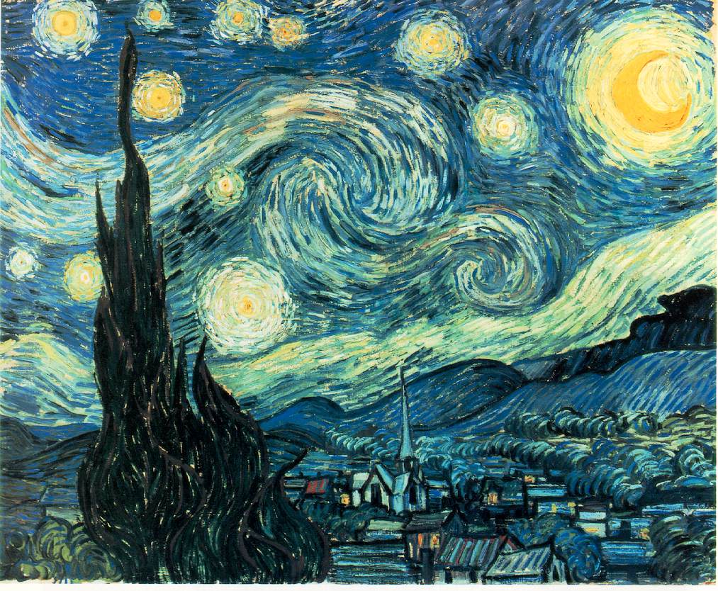
.jpg&action=edit§ion=T-1)
![[3]](https://en.wikipedia.org/wiki/Image:Carta_Marina.jpeg)
 that Debivort did: take individual pictures of pasta noodles and stich them all together into one single picture, so you avoid the flash reflection. howcheng {chat} 20:57, 14 March 2007 (UTC)


.jpg)


 Question: Who left the anonymous vote? I didn't think that was alllowed, anyway, can you clarify, oppose as per nom doesn't make sense, thanks --Benjamint444 23:34, 17 March 2007 (UTC)


