Wikipedia:Graphics Lab/Photography workshop/Archive/Jan 2012
Stale
editResolved
editShylock
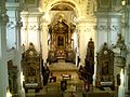
editArticle(s): Shylock
Request: rotate... Kintetsubuffalo (talk) 04:57, 29 December 2011 (UTC)
Graphist opinion(s):
![]() Done: JBarta (talk) 06:16, 29 December 2011 (UTC)
Done: JBarta (talk) 06:16, 29 December 2011 (UTC)
- Thank you!--Kintetsubuffalo (talk) 01:03, 31 December 2011 (UTC)
Tonga
edit


Article(s): Sālote Tupou III, Coronations in Oceania, Tāufaʻāhau Tupou IV, James Egan Moulton
Request: Clean up the first image and make the second image less blurry. And clear up and brigthen the third image a little and also remove the tiny watermark on the bottom right corner; it's a google book label. Thanks.--KAVEBEAR (talk) 06:53, 6 December 2011 (UTC)
Graphist opinion(s):
![]() Partialy done The 1st and 3rd files corrected. PawełMM (talk) 12:12, 26 December 2011 (UTC)
Partialy done The 1st and 3rd files corrected. PawełMM (talk) 12:12, 26 December 2011 (UTC)
Watermark removal
edit-

-
retouched file

Article(s): Johanna Marau Ta‘aroa
Request: Please remove the watermark. Thanks.--KAVEBEAR (talk) 23:19, 25 December 2011 (UTC)
Graphist opinion(s): ![]() Request taken by PawełMM.
Request taken by PawełMM.
![]() Done: Done as requested. PawełMM (talk) 14:55, 31 December 2011 (UTC)
Done: Done as requested. PawełMM (talk) 14:55, 31 December 2011 (UTC)
- Could you upload over the original not make a new file?--KAVEBEAR (talk) 15:40, 31 December 2011 (UTC)
 Redone: File overloaded as requested. PawełMM (talk) 04:35, 1 January 2012 (UTC)
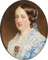
Oval crop
edit


.jpg)


Article(s): Kamehameha IV, Kanaina, Lunalilo, Thomas Nettleship Staley, Bernice Pauahi Bishop, Charles Reed Bishop, Kekūanāoa, John Papa Īī, Kamāmalu
Request: Oval crop tiny black line at edge of oval... KAVEBEAR (talk) 05:55, 30 December 2011 (UTC)
Graphist opinion(s): ![]() Request taken by PawełMM.
Request taken by PawełMM.
![]() Done:Done as requested. PawełMM (talk) 13:03, 31 December 2011 (UTC)
Done:Done as requested. PawełMM (talk) 13:03, 31 December 2011 (UTC)
Susan Walker Fitzgerald
edit.jpg)
Article(s): Susan Walker Fitzgerald
Request: Found this. It's a nice image badly in need of some TLC. (Grab hi-res tiff from LoC) JBarta (talk) 02:25, 31 December 2011 (UTC)
Graphist opinion(s):![]() Done Centpacrr (talk) 14:04, 31 December 2011 (UTC)
Done Centpacrr (talk) 14:04, 31 December 2011 (UTC)
Well done. JBarta (talk) 22:52, 31 December 2011 (UTC)
Deep Throat restoration
edit-
 Poster for 1972 pornographic film Deep Throat
 -
 Restored
 -
 File:DeepThroat.jpg
small image (with hands) -
 Alternative version

.png)


Article(s): Deep Throat (film)
Request: Restore the poster, using the version already in the article as a guideline. If completed, please replace the old FUR image with the free image. Crisco 1492 (talk) 08:58, 21 December 2011 (UTC)
Graphist opinion(s):
- Done —Quibik (talk) 20:10, 21 December 2011 (UTC)
- What about the hands? You did a fine restoration job, but I think it would be even better with a nice hand job as well. JBarta (talk) 22:13, 21 December 2011 (UTC)
- Actually, in all seriousness, while the restored image is certainly of higher quality and higher resolution than the small image, I think the small image is a nicer picture for the article. It has the hands extending above the top border and the feet resting on the T. It looks like this restored poster was simply a re-working of the smaller image. JBarta (talk) 22:24, 21 December 2011 (UTC)
- I do agree that the smaller version looks much better (aside from the quality, of course). It's a fair use image though and the only justification for using FU images is that no free alternatives exist... so, that won't work. About the hands: I considered adding them, but I didn't like the idea of combining two (very different size) images to create an ugly franken-poster. You may of course add them, if you feel like it. I'd have nothing against that. However, the best option would be using a proper version of that image, if possible, like this one. The pre-70s US copyright notice system is not too clear to me, though. Could someone (Crisco 1942, I'm looking at you) please confirm or refute that image's public domain-ness? —Quibik (talk) 23:09, 21 December 2011 (UTC)
- Pre 1977 US work with no copyright notice = Public domain. I asked at MCQ a while back for the poster for Faster Pussycat! Kill! Kill!, and they said it would be safe to assume that there will not be a copyright notice on the back of a poster. Any digitization of a 2-dimensional PD work of art is also PD, per Wikimedia's ruling. Crisco 1492 (talk) 01:31, 22 December 2011 (UTC)
- Thanks for the answer! I finally got around to uploading and cleaning up the alternative version. Here it is: File:Deep Throat poster 2.jpg. —Quibik (talk) 17:17, 30 December 2011 (UTC)
- Since the ourside of the image/poster is white, do you think it a good idea to give it a one or two pixel light gray outline to set it off? I did that once for a magazine cover and it turned out pretty well. JBarta (talk) 23:15, 30 December 2011 (UTC)
- I like your idea, but I would rather use CSS to accompish this. Luckily, {{Infobox film}} already has a
borderparameter which does exactly what you described. —Quibik (talk) 12:37, 31 December 2011 (UTC)- The CSS solution is an idealogical rather than practical solution. The CSS solution sounds nice, but is not always available (the gallery above being a perfect example). The old fashioned way works just as well, works every time, works everywhere, is dead simple and doesn't require anything more from the editor. JBarta (talk) 22:42, 31 December 2011 (UTC)
- Ok, I added an 8px-wide border to the image. —Quibik (talk) 01:41, 2 January 2012 (UTC)
- The CSS solution is an idealogical rather than practical solution. The CSS solution sounds nice, but is not always available (the gallery above being a perfect example). The old fashioned way works just as well, works every time, works everywhere, is dead simple and doesn't require anything more from the editor. JBarta (talk) 22:42, 31 December 2011 (UTC)
- I like your idea, but I would rather use CSS to accompish this. Luckily, {{Infobox film}} already has a
- Since the ourside of the image/poster is white, do you think it a good idea to give it a one or two pixel light gray outline to set it off? I did that once for a magazine cover and it turned out pretty well. JBarta (talk) 23:15, 30 December 2011 (UTC)
- Thanks for the answer! I finally got around to uploading and cleaning up the alternative version. Here it is: File:Deep Throat poster 2.jpg. —Quibik (talk) 17:17, 30 December 2011 (UTC)
- Pre 1977 US work with no copyright notice = Public domain. I asked at MCQ a while back for the poster for Faster Pussycat! Kill! Kill!, and they said it would be safe to assume that there will not be a copyright notice on the back of a poster. Any digitization of a 2-dimensional PD work of art is also PD, per Wikimedia's ruling. Crisco 1492 (talk) 01:31, 22 December 2011 (UTC)
- I do agree that the smaller version looks much better (aside from the quality, of course). It's a fair use image though and the only justification for using FU images is that no free alternatives exist... so, that won't work. About the hands: I considered adding them, but I didn't like the idea of combining two (very different size) images to create an ugly franken-poster. You may of course add them, if you feel like it. I'd have nothing against that. However, the best option would be using a proper version of that image, if possible, like this one. The pre-70s US copyright notice system is not too clear to me, though. Could someone (Crisco 1942, I'm looking at you) please confirm or refute that image's public domain-ness? —Quibik (talk) 23:09, 21 December 2011 (UTC)
- Actually, in all seriousness, while the restored image is certainly of higher quality and higher resolution than the small image, I think the small image is a nicer picture for the article. It has the hands extending above the top border and the feet resting on the T. It looks like this restored poster was simply a re-working of the smaller image. JBarta (talk) 22:24, 21 December 2011 (UTC)
- What about the hands? You did a fine restoration job, but I think it would be even better with a nice hand job as well. JBarta (talk) 22:13, 21 December 2011 (UTC)
Date Line
editArticle(s): Date Line
Request: fix perspective... Kintetsubuffalo (talk) 14:52, 30 December 2011 (UTC)
Graphist opinion(s):
There is a copyright issue with that file that should be resolved first. Besides, it's a piss poor photo that serves no useful purpose. That image should really be yanked from the article. JBarta (talk) 15:32, 30 December 2011 (UTC)
- I went ahead and removed it from the article myself. Apparently this image has been deleted at least once before (under a different name) for copyright issues. It was just an eyesore in the article (my opinion). JBarta (talk) 15:44, 30 December 2011 (UTC)
Watermark removal
edit-
 The siege of Sparta (272 BC) by the army of King Pyrrhus of Epirus

Article(s): History of Sparta, Pyrrhus of Epirus, Siege of Sparta
Request: Please remove the watermark.Andres rojas22 (talk) 23:26, 31 December 2011 (UTC)
Graphist opinion(s):
- This version is better and easier to remove watermark from. If Quibik is around, his extraction of the original jpg from the zoomable preview would help a lot (I can get high-res version, but can not guarantee it is the original jpg, and here the higher resolution, the better). Materialscientist (talk) 00:51, 1 January 2012 (UTC)
- You probably had the Dezoomify script (this, for anyone wondering) in mind. Unfortunately, Allposters.com does not use Zoomify, so that script will not work. I did find an alternative way to retrieve a reasonably large unwatermarked version. It is slightly blurrier than the watermarked version, though, so combining these two versions is a good idea. I wrote a JavaScript script (a bookmarklet) that gets both the watermarked and unwatermarked large images, in case anyone might want to get any other images from there:
javascript:r = /http:\/\/imagecache5d\.allposters\.com\/watermarker\/([^.]+)\.\D+(\d+)\D+(\d+)/.exec(document.body.innerHTML); if (!r) {alert("Failed to find the link. Sorry.");} else {window.open(r, Math.random()); window.open("http://frame.allposters.com/frameimagehandler/universal/frameimage.jpg?frame=[FAP:0+PRT:[PRW=" + r[3] + "|PRH=" + r[2] + "|PIP=\\" + r[1].replace(/-/g, '\\') + ".jpg]+QLT:101+MXW:" + r[3] + "+MXH:" + r[2] + "]", Math.random());} void(0);
- And another one for art.com, since it is pretty much the same website:
javascript:r = /popHighzoomImage\(([^,]+),([^,]+),[^,]+,'-?([^.]+)/.exec(document.body.innerHTML); r2 = /http:\/\/cache2\.artprintimages\.com\/p\/LRG\/([^\/]+\/[^\/]+\/[^\/]+)/.exec(document.body.innerHTML); if (!r || !r2) {alert("Failed to find the link. Sorry.");} else {window.open("http://imagecache5d.art.com/watermarker/" + r[3] + ".jpg", Math.random()); window.open("http://frame.artprintimages.com/frameimagehandler/universal/frameimage.jpg?frame=[FAP:0+PRT:[PRW=" + r[1] + "|PRH=" + r[2] + "|PIP=\\" + r2[1].replace(/\//g, '\\') + ".jpg]+QLT:101+MXW:" + r[1] + "+MXH:" + r[2] + "]", Math.random());} void(0);
- Simply execute them from the browser's address bar on an image description page. —Quibik (talk) 01:20, 2 January 2012 (UTC)
- Thanks! There is some difference between yours and watermarked version, perhaps also in color levels. For this image, the difference in sharpness/pixelation is too small (that I would bother with removing watermark and combining them :-). Materialscientist (talk) 01:44, 2 January 2012 (UTC)
- Oh, I probably should have been more clear. By "combining these two versions is a good idea" I meant the two images that are opened by the script: a clean one and a watermarked one. Or am I misunderstanding you? —Quibik (talk) 02:03, 2 January 2012 (UTC)
- Thanks! There is some difference between yours and watermarked version, perhaps also in color levels. For this image, the difference in sharpness/pixelation is too small (that I would bother with removing watermark and combining them :-). Materialscientist (talk) 01:44, 2 January 2012 (UTC)
- You probably had the Dezoomify script (this, for anyone wondering) in mind. Unfortunately, Allposters.com does not use Zoomify, so that script will not work. I did find an alternative way to retrieve a reasonably large unwatermarked version. It is slightly blurrier than the watermarked version, though, so combining these two versions is a good idea. I wrote a JavaScript script (a bookmarklet) that gets both the watermarked and unwatermarked large images, in case anyone might want to get any other images from there:
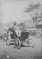
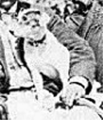
Rick Perry
edit-
 Texas governor Rick Perry

Article(s): Fed Up! Our Fight to Save America from Washington
Request: Please remove the microphone in front of his shirt. William S. Saturn (talk) 04:43, 3 January 2012 (UTC)
Graphist opinion(s): ![]() Request taken by PawełMM.
Request taken by PawełMM.
![]() Done: Done as requested. PawełMM (talk) 09:41, 3 January 2012 (UTC)
Done: Done as requested. PawełMM (talk) 09:41, 3 January 2012 (UTC)
- Thank you.--William S. Saturn (talk) 21:50, 3 January 2012 (UTC)
Al Piechota
edit-
Al Piechota playing for the Davenport Blue Sox in 1933
Article(s): Al Piechota
Request: Crop and remove watermark. Albacore (talk) 11:46, 3 January 2012 (UTC)
Graphist opinion(s):
![]() Done: JBarta (talk) 18:55, 3 January 2012 (UTC)
Done: JBarta (talk) 18:55, 3 January 2012 (UTC)
- Thanks. Albacore (talk) 21:16, 3 January 2012 (UTC)
Shore Line Electric Railway
edit-
 Map of part of Shore Line Electric Railway

Article(s): Norwich and Westerly Railway plus others currently in draft
Request: Restore - correct misalignments, fill in gaps with blank map, and maybe restore a bit of lettering? I did a temporary cut-and-paste job to correct the worst misalignments, but I lack skill to truly restore the map. I can try for a slightly clearer scan if that will help, but the original image in the book I scanned from has these defects and I don't have access to the original. Pi.1415926535 (talk) 01:31, 5 January 2012 (UTC)
- Never mind. I found a PDF online that happens to include an original version of the map. Pi.1415926535 (talk) 02:25, 5 January 2012 (UTC)
Graphist opinion(s):
Cathedral
edit-
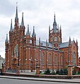 Remove...

Article(s): Cathedral of the Immaculate Conception of the Holy Virgin Mary (Moscow)
Request: ...cars; (brighten it up, so it won't be looking so depressing); retouch nave's wall; remove the spotlight in front of the wall. Thanks.♫GoP♫TCN 18:07, 2 January 2012 (UTC)
Graphist opinion(s):
![]() Done As requested. nagualdesign (talk) 06:43, 3 January 2012 (UTC)
Done As requested. nagualdesign (talk) 06:43, 3 January 2012 (UTC)
- Thanks. Can you remove the other car? That would be excellent. ♫GoP♫TCN 12:57, 3 January 2012 (UTC)
Don Laughlin
edit-
 Don Laughlin (left)
 -


Article(s): Don Laughlin
Request: Crop. 12.204.247.9 (talk) 07:40, 5 January 2012 (UTC)
Graphist opinion(s):
![]() Done: Done as requested. PawełMM (talk) 09:00, 5 January 2012 (UTC)
Done: Done as requested. PawełMM (talk) 09:00, 5 January 2012 (UTC)
Ross Perot
edit-
 Ross Perot portrait

Article(s): United States presidential election, 1992, United States presidential election, 1996
Request: Please can you brighten and clear up the image. Peter (talk) 23:13, 1 January 2012 (UTC)
Graphist opinion(s):![]() Done Centpacrr (talk) 23:24, 1 January 2012 (UTC)
Done Centpacrr (talk) 23:24, 1 January 2012 (UTC)
Poster fixes
edit-
 Poster for Mutiny on the Bounty (1962) Done
 -
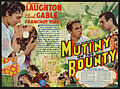 Poster for Mutiny on the Bounty (1935) Done
 -
 Poster for Billy Rose's Jumbo Done
 -
 Poster for Long Day's Journey into Night Done

.jpg)


Article(s): Mutiny on the Bounty (1962 film), Mutiny on the Bounty (1935 film), Billy Rose's Jumbo, Long Day's Journey into Night (1962 film)
Request: Clean it up; fix some creases and folds. There may be a couple more to follow. Crisco 1492 (talk) 03:40, 2 January 2012 (UTC)
- K, that's it. Crisco 1492 (talk) 05:09, 2 January 2012 (UTC)
Graphist opinion(s): ![]() Request taken by PawełMM.
Request taken by PawełMM.
![]() Done: Done as requested. PawełMM (talk) 16:21, 2 January 2012 (UTC)
Done: Done as requested. PawełMM (talk) 16:21, 2 January 2012 (UTC)
Cropping
editArticle(s): List of Silent Hill, Silent Hill 2, and Silent Hill 3 characters
Request: The bottom row of panels as well as the logo and the panels on which the logo lies (the one with the person wearing a cap and the one at its left) need to be cropped; the bottom row and the panels with the logo depict characters who aren't covered by the article. Also, the third row should be moved a little to the right after the crop, to be uniform, so that there are gaps both left and right, not only right. Hula Hup (talk) 21:24, 5 January 2012 (UTC)
Graphist opinion(s):
I'm finding your instructions a little confusing. Which rows/images do you wish to KEEP? – JBarta (talk) 01:01, 6 January 2012 (UTC)
- Re: The whole first and second rows, and from the third row keep only the 4 panels from the left (this means that I'd like the 2 far right panels, which are covered by the logo, to disappear). After this crop, there will be a gap to the right of the third row, caused by the disappearance of the 2 far right panels; I'd like the third row (which, by then, should only contain the 4 panels from the left) to be moved a little to the right, so that there are 2 gaps equal in size to its left and to its right, not just one to its right. Is it possible that the gaps will be black in color to match the black background or I'm asking too much? Hula Hup (talk) 02:03, 6 January 2012 (UTC)
- Done: Removed the characters you requested and rearranged so that everything is even and spaced out nicely. Hope it works for you. – JBarta (talk) 15:21, 6 January 2012 (UTC)
- I'm very afraid this is not what I requested. The characters are messed up now; in the original version of the image, the first row had the characters of the first game in the series, the second row had the second game's characters, and the third row had the third game's (the ones covered by the logo and the fourth row's didn't belong to any of these 3 games, that's why I wanted them to be gone). If you could (without changing the character order) repeat the same process, but magnify the third row after the crop to the point that it is even with the first and second rows, instead of creating 2 gaps to the left and to the right, I'm done. Hula Hup (talk) 20:38, 6 January 2012 (UTC)
- It didn't occur to me that they were in any particular order, sorry. I gave it another whirl. Does that do it for you? – JBarta (talk) 21:37, 6 January 2012 (UTC)
- I'm very afraid this is not what I requested. The characters are messed up now; in the original version of the image, the first row had the characters of the first game in the series, the second row had the second game's characters, and the third row had the third game's (the ones covered by the logo and the fourth row's didn't belong to any of these 3 games, that's why I wanted them to be gone). If you could (without changing the character order) repeat the same process, but magnify the third row after the crop to the point that it is even with the first and second rows, instead of creating 2 gaps to the left and to the right, I'm done. Hula Hup (talk) 20:38, 6 January 2012 (UTC)
- Perfect. Thank you very much. Hula Hup (talk) 21:42, 6 January 2012 (UTC)
Mark Ferguson
edit
Article(s): Mark Ferguson
Request: Please can you crop Mark Ferguson, the man, white shirt.Rain the 1 04:25, 6 January 2012 (UTC)
Graphist opinion(s):
![]() Request taken by Fallschirmjäger. 11:46, 6 January 2012 (UTC)
Request taken by Fallschirmjäger. 11:46, 6 January 2012 (UTC)
![]() Done Sorry Fallschirmjäger! nagualdesign (talk) 11:48, 6 January 2012 (UTC)
Done Sorry Fallschirmjäger! nagualdesign (talk) 11:48, 6 January 2012 (UTC)
- No worries! Fallschirmjäger ✉ 11:50, 6 January 2012 (UTC)
Hurricane damage
edit
Article(s): U.S. Virgin Islands
Request: Badly overexposed. Looks terrible in thumbnail. Rmhermen (talk) 01:34, 7 January 2012 (UTC)
Graphist opinion(s):![]() Done Centpacrr (talk) 06:53, 7 January 2012 (UTC)
Done Centpacrr (talk) 06:53, 7 January 2012 (UTC)
Haalelea's Feather Cape
edit-
 Done
Done -
 Done Like this?
 -

-
 Done
Done
.jpg)

.jpg)
-coloured.png)
Article(s): Haalelea, Featherwork, ʻahuʻula, Feather cloak
Request: Anyway to colorize this drawing of a Hawaiian feather cloak? KAVEBEAR (talk) 10:49, 24 December 2011 (UTC)
Graphist opinion(s): How does that look (above)? I took this image as a guide and did whatever I felt like doing. There wasn't much specified in the brief. Here's a little Christmas present if you (or anyone else) wants to give it a fiddle. (By which I mean do the other one!) :-) nagualdesign (talk) 05:49, 25 December 2011 (UTC)
- Thanks!--KAVEBEAR (talk) 06:18, 25 December 2011 (UTC)
- Can someone else do the other one?--KAVEBEAR (talk) 20:02, 28 December 2011 (UTC)
- Done PawełMM (talk) 11:50, 8 January 2012 (UTC)
Archibald Cleghorn with family and grandchildren
edit.jpg)
Article(s): James Harbottle Boyd
Request: Please remove the crack down the middle of this photograph and attempt to repair the chip off the side of it. Thanks. KAVEBEAR (talk) 05:14, 8 January 2012 (UTC)
Graphist opinion(s):
- Could you please not crop or tamper with the coloring of the photograph, just fix the damages without cropping it. The coloring edit should come after the first part (so it can be stored in the history) and I don't believe any cropping is neccessary except a tiny part that isn't the image on the left. Thanks.--KAVEBEAR (talk) 07:15, 8 January 2012 (UTC)
- Done: Done as requested. PawełMM (talk) 10:10, 8 January 2012 (UTC)
- Redone:
Black corner restored. Repaired without cropping the right side.PawełMM (talk) 12:05, 8 January 2012 (UTC)
Maria II of Portugal
edit-
 Maria II, 1836
 -
 Maria II, 1852


Article(s): Maria II of Portugal
Request: Please remove the paintings' frame and create a new .png file with translucid background just like in this picture. Lecen (talk) 23:51, 6 January 2012 (UTC)
Graphist opinion(s):
![]() Done Centpacrr (talk) 07:22, 7 January 2012 (UTC)
Done Centpacrr (talk) 07:22, 7 January 2012 (UTC)
- Thank you! They are perfect! --Lecen (talk) 12:23, 7 January 2012 (UTC)
Darwin Rebellion
edit-
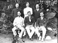 Elected members of the Palmerston District Council in 1909.
 -
 Harold Nelson (sitting, second from left) and H.E. Carey (sitting, third from left) in 1919.


Article(s): Darwin Rebellion
Request: Would you please crop the bottom of both photographs to remove the writing. Thanks... Spy007au (talk) 05:59, 7 January 2012 (UTC)
Graphist opinion(s):![]() Done Centpacrr (talk) 07:02, 7 January 2012 (UTC)
Done Centpacrr (talk) 07:02, 7 January 2012 (UTC)
Remove arm
edit.jpg)
Article(s): Kaukuna Kahekili
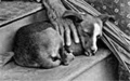
Request: Could someone remove the arm on the left "without cropping" the image. Thanks. KAVEBEAR (talk) 20:56, 18 December 2011 (UTC)
Graphist opinion(s):
- Wait could you also remove the black spot where her elbow use to be, the part above where the arm use to be, and the white spot on the bottom. I'll mark them.--KAVEBEAR (talk) 04:22, 20 December 2011 (UTC)
![]() Done: (truly getting sick of looking at this image) – JBarta (talk) 21:23, 8 January 2012 (UTC)
Done: (truly getting sick of looking at this image) – JBarta (talk) 21:23, 8 January 2012 (UTC)
- Good cause I was getting sick of keeping this unarchived.--KAVEBEAR (talk) 06:44, 9 January 2012 (UTC)
correct spelling
editArticle(s): NA
Request: The creator of File:Qxz-ad75.PNG, used as part of the Wikpedia ad campaign, is ACBest, who is no longer active, and hasn't posted in almost a year. I don't think he or she would mind if someone corrected the spelling of Antarctica (second use) SPhilbrick(Talk) 14:42, 9 January 2012 (UTC)
Graphist opinion(s):
![]() Done: Corrected.-- Obsidi♠n Soul 14:50, 9 January 2012 (UTC)
Done: Corrected.-- Obsidi♠n Soul 14:50, 9 January 2012 (UTC)
- That as fast! Thanks.--SPhilbrick(Talk) 14:53, 9 January 2012 (UTC)
Tamatoa V
edit-
 What the result should hopefully look like
 -


Article(s): Tamatoa V
Request: Could some please tilt the second image so it actually looks flat? Here is three links to how it should look flat [1], [2] and [3]. Then could you oval crop the image and recreate the parts covered by the head of the man on his bottom. . KAVEBEAR (talk) 04:49, 10 January 2012 (UTC)
Graphist opinion(s): ![]() Done: Done as requested. PawełMM (talk) 10:04, 10 January 2012 (UTC)
Done: Done as requested. PawełMM (talk) 10:04, 10 January 2012 (UTC)
- File overwrited as requested. PawełMM (talk) 17:43, 10 January 2012 (UTC)
Henry Adams
edit-

-
 The original image


Article(s): Henry Adams
Request: Crop, remove the shadow caused by the oval rim, and clean up. The pixelation is weird when you zoom in then zoom out. KAVEBEAR (talk) 05:33, 10 January 2012 (UTC)
Graphist opinion(s): There is actually nothing at all wrong or "weird" about this image: it is just a halftone. Also there is no "shadow" caused by an "oval rim". This is instead part of the graduated tone background visible in the rectangularly cropped original photograph (which I have added above) which is a better image anyway. Centpacrr (talk) 07:36, 10 January 2012 (UTC)
Kaiulani
edit-
 Minimal crop, remove number on her left, and the watermark on her right sleeve
 -
 Minimal crop, repair crack and remove copyright sign


Article(s): Kaʻiulani
Request: Do something with them... KAVEBEAR (talk) 03:21, 12 January 2012 (UTC)
Graphist opinion(s): ![]() Request taken by PawełMM.
Request taken by PawełMM.
![]() Done: Done as requested. PawełMM (talk) 08:45, 12 January 2012 (UTC)
Done: Done as requested. PawełMM (talk) 08:45, 12 January 2012 (UTC)
Distracting background
editRequest: Please crop the images tightly in order to get rid of the distracting background. --Leyo 13:43, 12 January 2012 (UTC)
Graphist opinion(s):
But I feel that these backgrounds are not very distracting and the crop is just perfect, execpt the third one, any other say. --Extra 999 (Contact me) 14:46, 12 January 2012 (UTC)
- In the one in the middle for example only the powder is of interest, not the metal tray and surely not the strangely colored background. --Leyo 16:31, 12 January 2012 (UTC)
- First, these images are of very low resolution so any playing with them won't turn out so well. Second, the backgrounds are not "distracting" in my opinion. And third, ain't no way I would crop the middle photo to the little pile of powder. It would look just plain silly. In all three instances, if you want better images, the solution is not to clumsily force these images to your idea of more acceptable, the solution is to find better images. – JBarta (talk) 18:08, 12 January 2012 (UTC)
- Perhaps the first 2 images would benefit from having their backgrounds desaturated? Not sure what would help with the third. Maybe cropping a bit off the bottom. nagualdesign (talk) 22:28, 12 January 2012 (UTC)
- Done as stated. Feel free to revert. These images are pretty poor to start with, especially Radon.jpg. Hopefully I haven't made them any worse. nagualdesign (talk) 23:10, 12 January 2012 (UTC)
- I have to admit... you improved them without making them worse. Good work :-) – JBarta (talk) 23:35, 12 January 2012 (UTC)
- I agree. Thank you. --Leyo 06:55, 13 January 2012 (UTC)
- I have to admit... you improved them without making them worse. Good work :-) – JBarta (talk) 23:35, 12 January 2012 (UTC)
- Perhaps the first 2 images would benefit from having their backgrounds desaturated? Not sure what would help with the third. Maybe cropping a bit off the bottom. nagualdesign (talk) 22:28, 12 January 2012 (UTC)
Albert Speer traveling by plane
edit
Article(s): Albert Speer
Request:Can anything be done with this great image of a brooding, enigmatic Albert Speer, brewing God only knows what behind that forehead? It's so good I'd like it to be as good as it can be. I don't know if it's a featured picture sort of thing but it is still real good. Wehwalt (talk) 21:14, 8 January 2012 (UTC)
Graphist opinion(s):![]() Done Centpacrr (talk) 15:00, 9 January 2012 (UTC)
Done Centpacrr (talk) 15:00, 9 January 2012 (UTC)
Is that the highest resolution that can be had? – JBarta (talk) 21:25, 8 January 2012 (UTC)
- I'll look into how to contact the Bundesarchiv and see if they can give us a higher resolution image.--Wehwalt (talk) 21:32, 8 January 2012 (UTC)
- Thank you Centpacrr, I'm very grateful. Good to see you, it's been a while since we've run into each other.--Wehwalt (talk) 15:18, 9 January 2012 (UTC)
- Glad to help out Wehwalt. This is a wonderful historic image. Centpacrr (talk) 15:22, 9 January 2012 (UTC)
Images with watermarks with multiple uses
edit-
 Used in 6 articles Done
 -
 Used in 4 articles Done
 -
 Used in 3 articles Done
 -
 Used in 3 articles Done Centpacrr


Request: One watermark removal would improve multiple articles. Leyo 16:50, 12 January 2012 (UTC)
Prince Punuarii Teriitapunui
edit-
 Done Can you shave off a tiny bit of the left side. The oval looks disportionate now. Redone
 -
 Done Can you add a little more back to her left side? The oval looks disportionate now. Redone
 -
-


Article(s): fr:Prince Punuari'i Teri'itapunui Pomare, fr:Prince Teri'itua Tuavira Joinville Pomare
Request: Oval crop and recreate some of the covered part of the image and then straighten like File:King Tamatoa V of Raiatea.jpg of the first two images. This is the best resolution and only images of these people out there. Don't create new derivate file, just upload over this one. KAVEBEAR (talk) 00:34, 12 January 2012 (UTC)
- Also is there anyway to add parts of this higher resolution version to the last three images? It's cut off a little bit on the higher resolution version, so you will have to be creative and use parts from the older image too.--KAVEBEAR (talk) 00:44, 12 January 2012 (UTC)
Graphist opinion(s):
![]() Done: The 1st & 2nd done. PawełMM (talk) 12:19, 13 January 2012 (UTC)
Done: The 1st & 2nd done. PawełMM (talk) 12:19, 13 January 2012 (UTC)
- There are other ones at commons:Category:Photographs by Sophia Hoare, if you could take a look and see which you can do and which you can't..--KAVEBEAR (talk) 02:56, 14 January 2012 (UTC).
- Done: Done all in commons:Category:Photographs by Sophia Hoare. PawełMM (talk) 10:03, 14 January 2012 (UTC)
- Thank you.--KAVEBEAR (talk) 08:21, 15 January 2012 (UTC)
Film posters
edit-
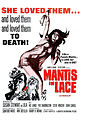 Mantis in Lace Done
 -
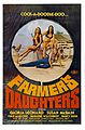 The Farmer's Daughters Done
 -
 The Devil in Miss Jones Done
 -
 Sweet Sweetback's Baadasssss Song Done


Article(s): Mantis in Lace, The Farmer's Daughters (1976 film), The Devil in Miss Jones, Sweet Sweetback's Baadasssss Song
Request: Clean-up: For Mantis in Lace, ensure that the highest quality poster is downloaded from the site (my connection is weird, so it may not be). Remove creases and JPG artifacts. For The Farmer's Daughters, ensure that the highest quality poster is downloaded from the site, clean-up creases and fix jpg artifacts. For the other two, creases and jpg artifacts. Save at the highest quality and overwrite. Crisco 1492 (talk) 08:33, 15 January 2012 (UTC)
- Oh yeah, remove black borders for The Devil in Miss Jones. Crisco 1492 (talk) 08:37, 15 January 2012 (UTC)
Graphist opinion(s): ![]() Request taken by PawełMM.
Request taken by PawełMM.
![]() Done: Done as requested
Done: Done as requested
- Beautiful Crisco 1492 (talk) 14:11, 15 January 2012 (UTC)
Paul-Emile Miot
edit-
 Done
Done -
 Recommend for deletion. (nagualdesign)
 -
 Done: Just reverted to original.
 -
 Done: Just reverted to original.
 -
 Done
Done -
 Done
Done


Article(s): Pōmare IV
Request: Crop and remove graininess which you can detect when you zoom in. Try not to crop the last two but to restore the corners. Thank you. KAVEBEAR (talk) 05:13, 15 January 2012 (UTC)
Graphist opinion(s): IMO these images should be restored to their original resolution (i.e., much smaller size). Even Internet Explorer does a better job at bilinear interpolation than the software that created these 'enlargements'. I'll do the last one to show you what I mean... nagualdesign (talk) 10:00, 15 January 2012 (UTC)
- Okay. Could you do the rest except the first two which are different?--KAVEBEAR (talk) 19:38, 15 January 2012 (UTC)
- Kavebear, Please be aware that bigger isn't always better. My last 2 reverts (see above) were because the newer versions (which you uploaded) were very badly pixelated - which is the very reason that you have asked for them to be restored! May I ask, are scanning these images yourself? Perhaps I could offer you some advice.. nagualdesign (talk) 01:08, 17 January 2012 (UTC)
- I did not scan them myself. They are the exact same size as they were in the pdf file that I took them from and provided on the source section. And I will just crop them myself.--KAVEBEAR (talk) 01:23, 17 January 2012 (UTC)
- Fair dinkum. Just remember to view images at actual size (so you can see the actual pixels) before deciding whether to upload a larger file. ...What happened to the first 2 images? I thought you wanted those retouching? nagualdesign (talk) 01:35, 17 January 2012 (UTC)
- I'll post them seperately another day. Just need clean up some blemishes and scratches...--KAVEBEAR (talk) 00:25, 18 January 2012 (UTC)
- Kavebear, maybe you could use something like this to extract the images from your PDF files? —Quibik (talk) 00:14, 18 January 2012 (UTC)
- What is the difference between that one and this one? --KAVEBEAR (talk) 00:25, 18 January 2012 (UTC)
- I think that Quibik may have hit the nail on the head. There is a difference between the 2 - one's a vector convertor, the other's a jpg extractor. The one that you're using, Kavebear, appears to convert a whole page, including text, into a single jpg (See Rasterisation). Because the resolution of the finished images is much larger than the embedded jpgs the software has to enlarge them - and it's doing a poor job of it. The freeware that Quibik suggested extracts the actual jpg data in its native resolution, without having to rasterise, preserving image quality. nagualdesign (talk) 01:28, 18 January 2012 (UTC) PS. Feel free to post those other 2 images. I was working from last to first (why not!) and was getting around to them. ;-)
- I added them below.--KAVEBEAR (talk) 01:46, 18 January 2012 (UTC)
- I think that Quibik may have hit the nail on the head. There is a difference between the 2 - one's a vector convertor, the other's a jpg extractor. The one that you're using, Kavebear, appears to convert a whole page, including text, into a single jpg (See Rasterisation). Because the resolution of the finished images is much larger than the embedded jpgs the software has to enlarge them - and it's doing a poor job of it. The freeware that Quibik suggested extracts the actual jpg data in its native resolution, without having to rasterise, preserving image quality. nagualdesign (talk) 01:28, 18 January 2012 (UTC) PS. Feel free to post those other 2 images. I was working from last to first (why not!) and was getting around to them. ;-)
- What is the difference between that one and this one? --KAVEBEAR (talk) 00:25, 18 January 2012 (UTC)
- Fair dinkum. Just remember to view images at actual size (so you can see the actual pixels) before deciding whether to upload a larger file. ...What happened to the first 2 images? I thought you wanted those retouching? nagualdesign (talk) 01:35, 17 January 2012 (UTC)
- I did not scan them myself. They are the exact same size as they were in the pdf file that I took them from and provided on the source section. And I will just crop them myself.--KAVEBEAR (talk) 01:23, 17 January 2012 (UTC)
- Kavebear, Please be aware that bigger isn't always better. My last 2 reverts (see above) were because the newer versions (which you uploaded) were very badly pixelated - which is the very reason that you have asked for them to be restored! May I ask, are scanning these images yourself? Perhaps I could offer you some advice.. nagualdesign (talk) 01:08, 17 January 2012 (UTC)
King Miguel I of Portugal
edit-
 King Miguel I
 -
 png file


Article(s): Miguel I of Portugal
Request: Hi, I need a .png version of this file with translucid background like in this picture. Thank you very much, Lecen (talk) 13:50, 15 January 2012 (UTC)
Graphist opinion(s):
![]() Done: Done as requested. PawełMM (talk) 16:20, 15 January 2012 (UTC)
Done: Done as requested. PawełMM (talk) 16:20, 15 January 2012 (UTC)
- Thanks a lot, PawełMM. You did a great job! --Lecen (talk) 16:34, 15 January 2012 (UTC)
- Done Corrected gamma and restored sepia toning of original. Centpacrr (talk) 17:16, 15 January 2012 (UTC)
- Original isn'n sepia. PawełMM (talk) 18:44, 15 January 2012 (UTC)
- Done Redid from original image retaining sepia-like toned paper color. Centpacrr (talk) 17:30, 16 January 2012 (UTC)
- Original isn'n sepia. PawełMM (talk) 18:44, 15 January 2012 (UTC)
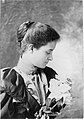
Delta Goodrem
edit-
 Delta Goodrem in Sydney

Article(s): Delta Goodrem
Request: Could a crop be made of her head and shoulders, so the image can be used in the infobox? She seems a little far away at the moment. - JuneGloom Talk 16:30, 16 January 2012 (UTC)
Graphist opinion:![]() Done Centpacrr (talk) 16:43, 16 January 2012 (UTC)
Done Centpacrr (talk) 16:43, 16 January 2012 (UTC)
- Great, thank you! - JuneGloom Talk 16:45, 16 January 2012 (UTC)
Dorence Atwater
edit-
 Oval crop, denoise, and resotre portion of the top of the image.
 -
 I also made this version, with a transparent background. ~nagualdesign
 -
 Clean up the white scratch on the right and any blemishes you see, don't crop
 -
 Clean up some blemishes in the background
 -
 Clean the background, leave the caption, don't crop


Article(s): Dorence Atwater
Request: Requests above. Thank you. KAVEBEAR (talk) 01:36, 17 January 2012 (UTC)
Graphist opinion(s): ![]() Done yesterday, but I couldn't edit this page. nagualdesign (talk) 00:30, 20 January 2012 (UTC)
Done yesterday, but I couldn't edit this page. nagualdesign (talk) 00:30, 20 January 2012 (UTC)
Ryan Kwanten
edit-
 Ryan Kwanten with a fan

Article(s): Ryan Kwanten
Request: Can someone crop this image so that the fan is removed and Ryan Kwanten remains. (Ryan is the guy in the suit)Rain the 1 04:03, 18 January 2012 (UTC)
- Thankyou for taking the request. :)Rain the 1 13:31, 19 January 2012 (UTC)
Graphist opinion(s): ![]() Done. No worries. :-) nagualdesign (talk) 00:31, 20 January 2012 (UTC)
Done. No worries. :-) nagualdesign (talk) 00:31, 20 January 2012 (UTC)
Watermark
edit-
 Done by User:Materialscientist
 -
 Done by User:Quibik


Article(s): New Caledonia
Request: Please remove watermark... KAVEBEAR (talk) 02:08, 15 January 2012 (UTC)
Graphist opinion(s):
Teuira Henry
edit
Article(s): Teuira Henry
Request: Please oval crop this image... KAVEBEAR (talk) 20:01, 20 January 2012 (UTC)
Graphist opinion(s):
![]() Done: Done as requested. PawełMM (talk) 06:50, 21 January 2012 (UTC)
Done: Done as requested. PawełMM (talk) 06:50, 21 January 2012 (UTC)
Theatre incorrectly identified in photo
edit-
 Century Theatre, 555 East Main Street, Ventura, CA

Article(s): Art_Deco
Request: This is the Century movie theater built in the 1990s. The building and a nearby parking garage were designed in the Art Deco style so it is a complement to the architect that it was confused with the 1928 Majestic Ventura Theatre around the corner at 26 South Chestnut Street, Ventura, CA. The photo of the Majestic Ventura Theatre at number 34 on the National_Register_of_Historic_Places_listings_in_Ventura_County,_California is correct. You can also verify the address looking at No. 24 on the CITY OF SAN BUENAVENTURA HISTORIC LANDMARKS & DISTRICTS (PDF). I work nearby so I have first hand knowledge of the two buildings as you can also see using google street view.
Fettlemap (talk) 01:04, 20 January 2012 (UTC)
Graphist opinion(s): That's all very interesting, but what do you want us to do with the photo? nagualdesign (talk) 01:18, 20 January 2012 (UTC)
Fettlemap, you don't necessarily need us. You can remedy the error yourself. Edit the photo description if needed and as you see fit, and if necessary, using the rename template, request a more appropriate name for the image. It would also be helpful to explain what you're doing and why on the image talk page and/or the article talk page. – JBarta (talk) 02:52, 20 January 2012 (UTC)
Err... is this what you had in mind, Fettlemap? I can't see any errors on the pages that either photograph (this or The Majestic) is on, and the photo looks fine. nagualdesign (talk) 04:03, 20 January 2012 (UTC)
- (I have no idea if the photo is incorrect, misnamed, etc. I didn't look into it. Fettlemap however does seem to have an opinion on the matter and I was simply pointing him in the right direction.) – JBarta (talk) 04:58, 20 January 2012 (UTC)
- Sorry JB, I was actually replying to Fettlemap again. My indenting/threading skills leave a lot to be desired. ;-) nagualdesign (talk) 06:12, 20 January 2012 (UTC)
- Yeah, it's pretty complicated ;-) Actually, a bigger faux pas is editing your post (materially) after someone has responded to it. – JBarta (talk) 06:50, 20 January 2012 (UTC)
Thank you for the examples and pointing me in the right direction. I will go ahead and correct the information about the photo. Fettlemap (talk) 16:48, 20 January 2012 (UTC)
poison sign
edit
Article(s): Fluorine
Request: Tilt and flatten. (and anything else you think helps.)TCO (Reviews needed) 06:55, 20 January 2012 (UTC)
Graphist opinion(s):![]() Done Centpacrr (talk) 17:31, 20 January 2012 (UTC)
Done Centpacrr (talk) 17:31, 20 January 2012 (UTC)
- TY, you guys are the best.TCO (Reviews needed) 17:59, 20 January 2012 (UTC)
skeletal fluorisis
edit
Article(s): Fluorine
Request: I need this to fit into a space where I don't have much text to wrap. Please rotate 90 degrees and fix background and hair hanging down so it doesn't make sea-sick. Prefer a "wide" aspect ratio. Save as new file name.TCO (Reviews needed) 07:08, 20 January 2012 (UTC)
Graphist opinion(s):![]() Done Centpacrr (talk) 17:57, 20 January 2012 (UTC)
Done Centpacrr (talk) 17:57, 20 January 2012 (UTC)
- TY, love this desk.TCO (Reviews needed) 18:00, 20 January 2012 (UTC)
- Still don't have room for this, so reverting to old version. May be able to use in future, though.TCO (Reviews needed) 18:06, 20 January 2012 (UTC)
Alex Carter
edit-
 Alex Carter

Article(s): Alex Carter
Request: Could someone please crop the image for use in an ibox. D4nnyw14 (talk) 16:20, 20 January 2012 (UTC)
![]() Done Cropped and removed mic stand from in front of face. Centpacrr (talk) 17:50, 20 January 2012 (UTC)
Done Cropped and removed mic stand from in front of face. Centpacrr (talk) 17:50, 20 January 2012 (UTC)
- Thanks :) D4nnyw14 (talk) 20:05, 20 January 2012 (UTC)
- I tweaked his face a little as well as made the background all lavender. Centpacrr (talk) 20:49, 20 January 2012 (UTC)
Capsule
edit
Article(s): Fluorine
Request: Remove the glare reflection so that text on pill is easier to read. TCO (Reviews needed) 03:03, 21 January 2012 (UTC)
Graphist opinion(s):![]() Done Centpacrr (talk) 04:21, 21 January 2012 (UTC)
Done Centpacrr (talk) 04:21, 21 January 2012 (UTC)
- Perfect. Gracias!!!TCO (Reviews needed) 04:48, 21 January 2012 (UTC)
Hawaiian dogs
edit-

-
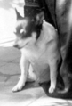 Could you include the background on this one?
 -
-
-
-
-

-

-
-

-


.jpg)


.png)
.png)


Article(s): probable Hawaiian Poi Dog
Request: Please crop out the dogs and upload separate images of them. Thanks. KAVEBEAR (talk) 06:54, 21 January 2012 (UTC)
Graphist opinion(s):
![]() Done: Done as requested. PawełMM (talk) 20:07, 21 January 2012 (UTC)
Done: Done as requested. PawełMM (talk) 20:07, 21 January 2012 (UTC)
- Why png instead of jpg? Could you keep the background on Queen Liliuokalani's dog? Also I fail to mention that are two dogs in the painting with Prince Albert, could you crop a version of the one of the right and name it Albert Kamehameha's dog (2).png. I am not absolutely sure if they are poi dogs or not.--KAVEBEAR (talk) 00:58, 22 January 2012 (UTC)
- PNG because it is a bitmapped image format that employs lossless data compression and some of souce files are rather poor. PawełMM (talk) 09:15, 22 January 2012 (UTC)
- Why png instead of jpg? Could you keep the background on Queen Liliuokalani's dog? Also I fail to mention that are two dogs in the painting with Prince Albert, could you crop a version of the one of the right and name it Albert Kamehameha's dog (2).png. I am not absolutely sure if they are poi dogs or not.--KAVEBEAR (talk) 00:58, 22 January 2012 (UTC)
image layout
edit-
 An 1892 observation of fluorine gas (middle), compared to air (left) and chlorine (right): the observation was done looking down 5 meter long tubes.
 -
 Solid alpha-fluorine's crystal structure: fluorine molecules lie in shingled layers.

|

|
| An 1892 observation of fluorine gas (middle), compared to air (left) and chlorine (right): the observation was done looking down 5 meter long tubes. | Solid alpha-fluorine's crystal structure: fluorine molecules lie in shingled layers. |
Article(s): Fluorine
Request: crop right or pad the left so that the two images have same aspect ratio. (If you can convert to a Wikitable like layout in [4], that would help too, but I might be able to figure out the table code by comparison. Need the aspect ratio work for sure.)TCO (Reviews needed) 16:02, 21 January 2012 (UTC)
Graphist opinion(s):
![]() Done - I added whitespace to pad the left image out, they both the same ratio now. Fallschirmjäger ✉ 21:06, 21 January 2012 (UTC)
Done - I added whitespace to pad the left image out, they both the same ratio now. Fallschirmjäger ✉ 21:06, 21 January 2012 (UTC)
- Added table layout also. Fallschirmjäger ✉ 21:11, 21 January 2012 (UTC)
Alan Halsall and Natalie Cassidy
edit-
 Alan and Natalie at the The Co-operative Group event
 -
 Alan Halsall
 -
 Natalie Cassidy


Article(s): Alan Halsall, Natalie Cassidy
Request: Can 2 crops be made from this image to use on each of the actors articles. Alan Halsall is wearing the Black jacket/coat, Natalie Cassidy is the female on the opposite end.Rain the 1 17:03, 22 January 2012 (UTC)
Graphist opinion(s):
![]() Request taken by Fallschirmjäger. 18:05, 22 January 2012 (UTC)
Request taken by Fallschirmjäger. 18:05, 22 January 2012 (UTC)
- Done - Fallschirmjäger ✉ 18:16, 22 January 2012 (UTC)
- Thankyou very much Fallschirmjäger :)Rain the 1 18:25, 22 January 2012 (UTC)
- Your're welcome. Kind regards, Fallschirmjäger ✉ 21:21, 23 January 2012 (UTC)
- Thankyou very much Fallschirmjäger :)Rain the 1 18:25, 22 January 2012 (UTC)
fix aspect ratios
edit| The fluorides of transition metal elements 25-29 | ||||

|

|

|

|

|
| Manganese difluoride | Iron trifluoride | Cobalt difluoride | Nickel difluoride | Copper difluoride |
Article(s): Fluorine
Request: Please fix so that when displayed in Wikitable, the pictures look same size (and if possible also the tubes are same size). right now, the right most one is bigger and I think the second most right one is also bigger. TCO (Reviews needed) 00:14, 23 January 2012 (UTC)
Graphist opinion(s):
The images can be adjusted as you request. It would be a bit of a pain, but not unduly so. I would ask however if there are any other images in this group that might wish the same treatment? If so, hitting them all at the same time would be a WHOLE lot easier than dealing with more as they trickle out. – JBarta (talk) 00:31, 23 January 2012 (UTC)
- Just these. I think I am the only one using the rotated images (they were rotated just for me, to use in this presentation). I don't plan to rotate or use any of the other ones. I sincerely appreciate the help. It is for a good cause to very efficiently show several things at once and in a natural series!TCO (Reviews needed) 00:35, 23 January 2012 (UTC)
- Done: Also, looking at the article, I think the image gallery layout is all wrong for these images... too many borders. I think a simple borderless table would look good. I've edited the table above. You are welcome to copy that code and paste it in the article if you wish. – JBarta (talk) 15:42, 23 January 2012 (UTC)
- Thanks, much! I will try out the borderless look (agree it looks great here). I definitely want things to look clean and professional, so maybe the borderless is a good approach. I guess I wonder a little about the SVG images that just sort of float don't have a square outline then. But only way to know is to try it. I will apply it to all. If you want to play with it also, in article, feel free. Like for the rocks, actually a bit more framing might even be nice (liked how they looked in gallery, but want stability of a table).TCO (Reviews needed) 18:09, 23 January 2012 (UTC)
SOPA 'infographic' suggestion from editor Cirt.
editArticle(s): SOPA
Request: An editor on the Sopa talkpage mentioned an 'Infographic', showing the 'impact of internet blackout' here and here which by the looks of it is assembled from, or could be assembled from, pictures that are here,. I don't know if it would be easy or hard, or worth it or not, any ideas ? is it worth it ? Penyulap talk 00:46, 22 January 2012 (UTC)
Graphist opinion(s):
Easy, but tedious and of limited and fleeting value. I think a simple bar graph is a much simpler and just as effective way to convey the visual information. I suspect there are Wikipedia graph templates already written that would do nicely. You might also back up the graph with a text-based chart showing in detail who supported and who opposed. This would most definitely be more useful than an illegible cluster of tiny images. The same model can be used for similar issues without needing to whip up a new image every time. – JBarta (talk) 03:28, 22 January 2012 (UTC)
- "Easy, but tedious and of limited and fleeting value." Couldn't have put it better myself. I tried to come up with an analogy involving Sisyphus earlier, but even doing that seemed like a waste of time. nagualdesign (talk) 06:49, 22 January 2012 (UTC)
- That is Brilliant thinking guys, I'll echo your insightful comment to the talkpage for the users there. Penyulap talk 18:17, 23 January 2012 (UTC)
- Actually, I was just about to mark it as resolved, and then I recalled that the impact of the image is provided mainly by the Before the blackout day compared to after the blackout day comparison, which is a static image. So I think I'll leave it open just in case someone thinks so too. Because that'd be one image, with no updates. Penyulap talk 18:28, 23 January 2012 (UTC)
- Sorry, I thought that you were suggesting using wikimarkup to produce a table of small linked images, or regularly updating such a table to show how the vote is swinging. If you just want to use a single image, and the image is copyright free, you could upload it, then if you want some of the whitespace removing (to make the photographs proportionally larger) you could post it here. I'd do the editing for you, I just don't enjoy trying to work out copyright issues. nagualdesign (talk) 23:47, 23 January 2012 (UTC)
- Actually, if you really want to whip this thing up (the image Penyulap refers to is almost certainly copyrighted) one way to go about it might be to make a table on your user (sub)page that is large enough to be legible, then make a screen capture of it. The image(s) can then be placed in the article at reduced size allowing the reader to click on it for the full size image(s). That would at least solve the legibility problem. I would advise against using the table itself in the article because of it's sheer size, and number of images. I would also suggest you leave the table on your user subpage just in case you need to make any corrections later. If you do decide to dive into this, I shudder at the amount of tedious labor that lies ahead of you. You're a more dedicated Wikipedian than me ;-) – JBarta (talk) 12:53, 24 January 2012 (UTC)
- Aww shucks :) I was just trying to find the easiest path for the other editors idea, I just know where to find the experts is all :) Penyulap talk 15:47, 24 January 2012 (UTC)
improve (lighten?) background
edit-
 original
 -
 cropped
_gives_a_Fluoride_treatment_to_a_patient_during_a_Continuing_Promise_2009_medical_civil_service_projec.jpg)
_gives_a_Fluoride_treatment_to_a_patient_during_a_Continuing_Promise_2009_medical_civil_service_projec_(cropped).jpg)
Article(s): Fluorine
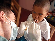
Request: I like the picture of the man and the boy and that we can see the fluoride goop (that is the point). Background seems a little dark or distracting. If you can do anything to improve, 'preciated. (sorry, the request is not more definite, just see if any manuipulation is warranted. I have to display this small in article, so I like it to be clean and attention on the figures and the fluoride. TCO (Reviews needed) 20:12, 23 January 2012 (UTC)
Graphist opinion(s):
My own opinion is that the image is fine just as it is. That said, I made a cropped version... a little tighter on the kid. Maybe that will do it for you without fiddling with a perfectly good image ;-) – JBarta (talk) 20:45, 23 January 2012 (UTC)
- Cool. I just wanted to ask. I think I will stick with the uncropped for now. Like seeing both figures. Thanks man.TCO (Reviews needed) 21:00, 23 January 2012 (UTC)
- I've lightened the image, adjusted the gamma, and slightly cropped the right side while retaining both figures in full. See if that makes it any better for you. If not, revert to the original image. Centpacrr (talk) 22:20, 23 January 2012 (UTC)
- Thanks man. I can't see a difference, actually. Am leaving your modified version as current. Thanks again. Peace.TCO (Reviews needed) 22:24, 23 January 2012 (UTC)
- To see a difference you probably should reload the page once of twice so that your browser displays the new version instead of the old one in your computer's cache. Centpacrr (talk) 22:28, 23 January 2012 (UTC)
- Thanks man. I can't see a difference, actually. Am leaving your modified version as current. Thanks again. Peace.TCO (Reviews needed) 22:24, 23 January 2012 (UTC)
- Peachy, now the little black boy is a little quadroon. Centpacrr, do you ever just decide an image is good just as it is, or do you have the uncontrollable urge to fiddle with every single one that passes within reach? – JBarta (talk) 22:37, 23 January 2012 (UTC)
- I must be a fiddler too, because I like the new lighter version. Looks like a black kid with light on his face, doesn't seem to have changed skin color. Anyhow, peace please. If the image people start hating me, that will be everyone at Wiki down on me. ;-) TCO (Reviews needed) 22:47, 23 January 2012 (UTC)
- I wouldn't call you a fiddler... at this moment simply an enabler ;-) – JBarta (talk) 23:00, 23 January 2012 (UTC)
- TCO you have done absolutely nothing "wrong" or inappropriate here, and your requests will always be welcome and most appreciated. Please don't allow anything said by others in here drive you away or make this an uncomfortable experience for you. You originally asked for this image to be lightened which I did after after you had rejected the cropped version which was perfectly appropriate on your part as the requester. As I mentioned in my note above, you should also feel free to revert my version back to the original if you think it is not an improvement. That being the case, I really don't know what User:JBarta's issue is here. Digital image manipulation is a subjective "art" in which each of its practitioners are bound to have different views on what they think looks best. Each is, of course, perfectly entitled to his or her own views of that as am I. That being the case, the tone of how JBarta expressed his personal disagreement with my approach in his comment above is thus puzzling and ultimately unhelpful. (Calling a requester an "enabler" because he liked one version over another seems particularly inappropriate.) This project is not a "competition" with "winners and loser" -- at least not to me -- so in the future I would ask all contributors to please respect and assume good faith on part all the others to the project as I always try to do myself. Centpacrr (talk) 23:35, 23 January 2012 (UTC)
- Yes, my "tone" can be a little abrasive. I've heard that once or twice. I'd apologize, but what's the sense? I wouldn't really mean it and I'd just do it again another time. (I'm reminded of the guy who got thrown out of anger management classes... for being angry.) Hopefully the good outweighs the bad and the occasional help I volunteer makes up for my disagreeable disagreeing. And no TCO, you didn't do anything wrong... it's all Centpacrr's fault ;-) – JBarta (talk) 23:56, 23 January 2012 (UTC)
I have gotten HUGE HELP from each of you. (JBarta just did a bunch of assists for me. He and I just like to joke around about things. He's the pretty girl at the bar and I'm the fat friend...we make jokes like that. ;-))
I want to keep the light color. I know the argument that it is a false manipulation, but the issue is that people are looking at it in article and it is small and embedded in text and seen on a computer screen(probably a flat panel display), so if it is a dark blotch, they may pass on looking at it. Like it clean and simple (so light is good).
I'm not even joking (don't hurt me Hammer!) but as long as we are "cheating", could you please cut the chair out that is above the man's face and just clone in some background or the like? TCO (Reviews needed) 00:03, 24 January 2012 (UTC)
- OK, give me a few minutes. Centpacrr (talk) 00:11, 24 January 2012 (UTC)
- Without wishing to take sides I think that the lightened version is pretty awful. The adjustment has brought out some horrible banding on the floor and walls, and accentuated the colour artifacts in the boy's face and the man's hair. I also think that lightening the tone of coloured skin is a minefield. In this instance the photograph is well exposed (though perhaps taken from too close up) and the boy is a very natural tone. Even the flouride has changed so that it looks more like urine! I also disagree with removing the chair - it's a good way of setting a scene and the alternative (more floor?) would add nothing. I'll give it a subtle tweek myself. ..Not to scoff at Centpacrr's efforts! ;-) nagualdesign (talk) 00:23, 24 January 2012 (UTC)
- One of the mistakes that people make is to worry too much about how a thumbnail looks... sometimes to the detriment of the full size image. A thumbnail is just that, a thumbnail to be clicked on for the full image. If the full image suffers because you think a thumbnail looks better, then you have done a disservice to Wikipedia (in my abrasive opinion of course) – JBarta (talk) 00:26, 24 January 2012 (UTC)
- Neutral background version uploaded as requested. TCO, please feel free to accept or reject it. Centpacrr (talk) 00:40, 24 January 2012 (UTC)
- I like the modified version. Thanks, man. (no offense to others that I have huge respect for). I just value the appearance in thumb. Have a busy article and cleaner, more simple pics help me. Again, mea culpa for the manipulation, but I like the effect in context. Now heading out to lift weights...peace.TCO (Reviews needed) 00:43, 24 January 2012 (UTC)
- Well that just went from bad to terrible. It's taking everything I've got to hold back and not revert the thing... – JBarta (talk) 00:47, 24 January 2012 (UTC)
- Centpacrr, with all due respect, I would just clone the floor around to remove the chair, leaving the wall and other cute details (yes, there are some difficult spots, and not removing the chair is not a bad option :-). The blue background makes it look unrealistic - like a blue-screen shot staged for a movie, while the past background was very casual. Materialscientist (talk) 00:58, 24 January 2012 (UTC)
- Well that just went from bad to terrible. It's taking everything I've got to hold back and not revert the thing... – JBarta (talk) 00:47, 24 January 2012 (UTC)
- Not sure what that blue background is supposed to achieve! I've uploaded my own VERY SUBTLY adjusted image. The point, I think, is to remove artifacts and help focus the viewer's attention on the salient areas. The slight sharpening of an image may also help to improve the thumbnail, too. Each to his own, perhaps - revert if you wish. 'Peace out!' or some such. ;-) nagualdesign (talk) 01:18, 24 January 2012 (UTC)
- The neutral background version is what the requester asked for because it is the best fit for the way he is using it in his article. As he stated above, he wants a "neutral background" so that what is being illustrated (and the purpose of this image is to be an "illustration", not a "picture") is not lost in the thumbnail version on the page (see his comment above). Since this is TCO's illustration that he placed in his article, why not let him decide how he wants to use it to illustrate the point he is making instead of constantly second guessing what he as the requester wants. Again show a little good faith in TCO's judgement or you are just going to drive him and others away. Entirely too much kerfuffle has been made about this so please just give it a rest and TCO decide what he wants to use and respect his decision. He now has a variety of versions to pick from. Once he does so, leave it at that instead of trying to constantly impose personal views on his original work. I personally do not intend to do anything further on this particular illustration and I don't see why anybody else, except TCO, should either. Centpacrr (talk) 01:35, 24 January 2012 (UTC)
- "Since this is TCO's illustration that he placed in his article" -- There's that ownership issue rearing its ugly head again. Haven't we bed that one down yet? – JBarta (talk) 02:14, 24 January 2012 (UTC)
- The neutral background version is what the requester asked for because it is the best fit for the way he is using it in his article. As he stated above, he wants a "neutral background" so that what is being illustrated (and the purpose of this image is to be an "illustration", not a "picture") is not lost in the thumbnail version on the page (see his comment above). Since this is TCO's illustration that he placed in his article, why not let him decide how he wants to use it to illustrate the point he is making instead of constantly second guessing what he as the requester wants. Again show a little good faith in TCO's judgement or you are just going to drive him and others away. Entirely too much kerfuffle has been made about this so please just give it a rest and TCO decide what he wants to use and respect his decision. He now has a variety of versions to pick from. Once he does so, leave it at that instead of trying to constantly impose personal views on his original work. I personally do not intend to do anything further on this particular illustration and I don't see why anybody else, except TCO, should either. Centpacrr (talk) 01:35, 24 January 2012 (UTC)
- With all due respect Centpacrr, I did read the request and I compared all versions of the image before chiming in. And without wishing to sound egotistical, I have considerable experience of retouching, so when someone asks for a specific image adjustment I often offer the benefits of my 'wisdom' instead. I mean no disrespect when I say that a chromakey blue background is far from neutral. Anyway, I have uploaded my own effort, as you have done, and I don't intend to do anything more. There is no kerfuffle here. nagualdesign (talk) 02:34, 24 January 2012 (UTC)
- I have to say Nagualdesign, I'm not liking your edit much either. It's oversharpened and there are now white spots around the kids eyes. Seriously now, there is nothing wrong with the original image (other than somewhat high jpg compression). Can we at least agree that the original image is perfectly fine? Once we do that, then maybe we can claw our way up to telling the requester his request is flawed. Just because someone makes a request, that doesn't mean it's a good idea. And being the supposed "graphics experts" it seems to me that it's OUR responsibility to suggest what should or should not be done and offer our reasons why. – JBarta (talk) 03:55, 24 January 2012 (UTC)
- Fair comment. And I totally agree that the original image is fine. I was trying to find a happy medium between the thumbnail and full-size image - trying to improve the thumbnail without deteriorating the full-size - without being too brutal (and without changing the boy's ethnicity - another thing we agree on!) as I interpreted the request to mean "make the people stand out more from the background. Perhaps I did go a little too far with the sharpening, but I must say that I was quite pleased with my blurring of the background. (I was trying to reduce the apparent focal depth, and hide the jaggies in the background.) Just because someone makes a request, that doesn't mean it's a good idea. Yes, that's what I was trying to say above. nagualdesign (talk) 09:24, 24 January 2012 (UTC)
- By "his" article I mean that of the editors who have commented here he is the only one with a history of contributing to the article and its development. He is also the one who posted the image and asked for help with it to best use as an illustration. He asked for a more neutral background and I provided what I thought he wanted to which he replied "I like the modified version. Thanks, man. (no offense to others that I have huge respect for). I just value the appearance in thumb. Have a busy article and cleaner, more simple pics help me." Because of his intimate connection to, manifested interest in, and established status as a developer of the article, I think TCO's view as to how to use the illustration deserves defference of everyone in here just as I would deffer to any other editor in the same circumstances.
- As for background in digital image restoration and "retouching" I have been doing this professionally for more than fifteen years as you can see from my website. I repeat, however, this is not a "competition" so please don't treat is as such. TCO brought the illustration here and he should therefore be the final arbiter as to which one best serves the purpose that he is trying to achieve. As I have said several times now, he is free to accept or reject either of my two versions, those of any other contributor, or to use the original. But the choice should be up to him as the original requester and the party with the greatest interest in its use without that being hijacked by anyone else. Centpacrr (talk) 03:35, 24 January 2012 (UTC)
- I'm not sure why you thought I was treating this as a competition. I thought your original attempt was a bit slapdash is all, and I was merely trying to offer my own suggestion. To upload it I necessarily had to 'overwrite' yours, but I said beforehand what I was going to do and why, and the revert button is still fully operational. Seriously Centpacrr, nobody is having a go at anyone here and there's no need to get your hackles up. I'm sure you must agree that the 'lightened as requested' image was not one of your best. I totally agree that TCO should be free to choose whichever image, too (hence offering a choice), but I strongly disagree with the idea of "the party with the greatest interest" and especially with the word "hijacked"! Wikipedia is a collaborative effort, so I've said and done my bit. I was just trying to offer a 'third way', not play piggy in the middle. I don't want to get into an argument, thanks. nagualdesign (talk) 09:24, 24 January 2012 (UTC)
- I was only looking to provide the original requester what he had asked for. When I did I then noted above "Neutral background version uploaded as requested. TCO, please feel free to accept or reject it." Three minutes later TCO replied in this thread "I like the modified version. Thanks, man. (no offense to others that I have huge respect for). I just value the appearance in thumb. Have a busy article and cleaner, more simple pics help me." which seemed to resolve the matter to his satisfaction. I would have had no problem whatsoever if TCO had rejected this or my earlier option which he also said he liked better than the original image.
- My issue instead is with the dismissive and eldering tone taken by another editor who had commented to me (after his version had been rejected earlier by the requester) that "Peachy, now the little black boy is a little quadroon. Centpacrr, do you ever just decide an image is good just as it is, or do you have the uncontrollable urge to fiddle with every single one that passes within reach?" This comment is what "got my hackles up" as I found its tone to be disrespectful, condescending, and inconsistent with the collaborative spirit of the Wikipedia project. What struck me as "hijacking" was ignoring the requester's acceptance and preference for a neutral background illustration by it subsequently being reverted to what is essentially the original version that TCO had found wanting for the reasons he stated above. Centpacrr (talk) 11:06, 24 January 2012 (UTC)
- I'm pretty sure that JB's comments, "I wouldn't call you a fiddler... at this moment simply an enabler" and "no TCO, you didn't do anything wrong... it's all Centpacrr's fault" were lighthearted and firmly tongue-in-cheek, and his other observations were quite valid. Sometimes it's best to 'conscientiously object' to a request, especially when it comes to altering skin tone. Concepts such as not wanting to look at a "dark blotch" and liking it "clean and simple" obstensibly walk a fine line between acceptability and you-know-what. Anyway, you've said your piece several times now, let's just forget about the whole thing, eh? Kind regards, nagualdesign (talk) 11:54, 24 January 2012 (UTC)
- I have no problem with differences in views among editors, only with the condescending and eldering tone with which they were expressed in this and a few previous instances by a small number of editors. I believe that all parties are now aware, however, that such an approach will not work in discussing WP issues with me and trust that it will no happen in the future. Thank you for your follow up here as I enjoy contributing my skills and experiences to this area on WP as I would be disappointed if I felt forced to decide to leave because of an uncollegial atmosphere. Centpacrr (talk) 12:40, 24 January 2012 (UTC)
- Yes, I had to 'bitch slap' JB myself on day one. (I'm exaggerating here for comic effect!) He can be a very rude bwai sometimes. I quite like his humour though, and his candor, and you can't have candor without sometimes being condescending. Never mind, eh? :-) Also, I think that you'd uploaded your
chromakeyneutral version whilst I was still working on mine, so when I uploaded mine and came back here it may have looked like I'd ignored TCO's acceptance and just reverted your efforts. That wasn't the case at all, but I apologise for any confusion caused. Anyway, TCO seems to have made his mind up and it looks like I won, so screw you, assholes! (I jest!) nagualdesign (talk) 13:14, 24 January 2012 (UTC)
- Yes, I had to 'bitch slap' JB myself on day one. (I'm exaggerating here for comic effect!) He can be a very rude bwai sometimes. I quite like his humour though, and his candor, and you can't have candor without sometimes being condescending. Never mind, eh? :-) Also, I think that you'd uploaded your
- Bitch slap? There's a personal attack in there somewhere. Might even be a little eldering. Such an approach will not work with me... – JBarta (talk) 13:35, 24 January 2012 (UTC)
- I was trying to sound American. African-American I suppose. It all came across as terribly English though didn't it, what what? Seriously though, do try to be less uncollegial, old chap. You are anaspeptic, frasmotic, even compunctuous to have caused Centerparcs such pericombobulation. nagualdesign (talk) 13:52, 24 January 2012 (UTC)
- Centpacrr will come through this just fine. No worries. And I always wondered... are black people in England also African-American? Or maybe they are African-English? It's all so confusing. (And British humor is lost on we Ameicans. You made me look up words I've never heard only to learn they are from a TV show I've never seen. You Brits are a goofy bunch.) – JBarta (talk) 14:24, 24 January 2012 (UTC)
- There's every kind of black person in England, from Indians to West Indians, but they're mostly descended from the waves of immigrants that came over in the past 60 years. Although there was a thriving slave trade in the UK (Liverpool docks are riddled with slave tunnels) once upon a time, there's very little evidence left. I suppose most Africans in the UK went home or emigrated to other countries, whereas in America they were kind of stranded, so they just asserted their American nationality. Also, any Africans that come to the UK now know exactly which country they came from, so they call themselves Nigerians or Eritreans or whatever. ...If you're interested, check out this YouTube video, which features Hugh Laurie (Dr Gregory House) and Rowan Atkinson (Mr Bean) in their native attire (circa 1987). We all dressed like that in those days. nagualdesign (talk) 15:16, 24 January 2012 (UTC)
Boyd, Brodie, Kibbey, Sloan, Baylor
edit-
 Clean up some minor blemishes and dust on this photograph
 -
 Oval crop
 -
 Oval crop
 -
 Clean up noise and repair rim


Article(s): James Harbottle Boyd, Alexander Oswald Brodie, Joseph Henry Kibbey, Richard Elihu Sloan, John Baylor
Request: Request next to images... KAVEBEAR (talk) 05:43, 24 January 2012 (UTC)
Graphist opinion(s): ![]() Request taken by PawełMM.
Request taken by PawełMM.
![]() Done: Done as requested. PawełMM (talk) 21:05, 24 January 2012 (UTC)
Done: Done as requested. PawełMM (talk) 21:05, 24 January 2012 (UTC)
Watermarks Removal
edit-
 David Palmer
 -
 David Palmer
 -
 James Willstrop
 -
 Lee Beachill


Article(s): David Palmer, James Willstrop
Request: Appreciate if the watermarks on each picture could be removed. Thanks a lot in advance. Arteyu ? Blame it on me ! 15:09, 24 January 2012 (UTC)
Graphist opinion(s):![]() Done Centpacrr (talk) 19:18, 24 January 2012 (UTC)
Done Centpacrr (talk) 19:18, 24 January 2012 (UTC)
- Thanks man! (: Arteyu ? Blame it on me ! 09:05, 25 January 2012 (UTC)
fluorine piping in the lab
edit-
 Nickel tank and piping for laboratory fluorine (Original)
 -

-
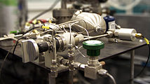 Done by nagualdesign.
 -
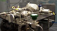 Done by PawełMM

.jpg)


Article(s): Fluorine
Request: The shiny tank and the valves and pipes in foreground are the object of attention. Wonder if some manipulation can be done to reduce clutter apart from them. Maybe get rid of the air can to left, stick a blackboard on the wall behind, which is a posterboard now, etc. Use best judgment, but trying to focus on the tank and piping. I guess still making it obvious that it is a lab is fine, just wonder about the other clutter if it is a distraction. TCO (talk) 03:41, 25 January 2012 (UTC)
Graphist opinion(s):
Here we go again ;-) I have to say, that your approach of wishing to manipulate these images in this fashion is unacceptable in my opinion. The result is a visibly doctored image that is inferior to the original. The fact that some editors may attempt to accommodate your wishes in this regard is not entirely helpful. That said, a bit of rotation in this instance *would* be helpful, and that I'm willing to do cheerfully. Rotation would indeed make it a better image. – JBarta (talk) 03:59, 25 January 2012 (UTC)
- Done: If there are specific items you wish to draw attention to in the image, you can do that quite easily in the image caption. – JBarta (talk) 04:13, 25 January 2012 (UTC)
- Thanks, man.TCO (talk) 04:16, 25 January 2012 (UTC)
- I disagree that wishing is unacceptable. I'd always recommend asking, provided that you are willing to take "no" as an answer under advisement. Conversely, I think that even a salesman should be willing to say "no" sometimes, if it's the right thing to do, but should always try to accommodate a client's wishes. In this instance, imagine if the photograph had been taken under exactly the same conditions but with a larger apperture (+shorter exposure) so that the background was all bokehed. That would have satisfied TCO's request. Now, creating a good depth map and using it to apply a lens blur in Photoshop can simulate this effect quite admirably (depending on the skill of the artist). The 'loss of information' involved in this process, given the purpose, would not equate to an inferior image. Quite the opposite, in fact. Also, half the fun of helping out here is to challenge myself, to try and increase my abilities, and because no money changes hands and edits can always be reverted there's tremendous freedom to experiment, IMO. And I always retouch photographs under a self-imposed Hippocratic Oath, so there's no need to admonish me. I'd only ignore you anyway! ;-) nagualdesign (talk) 05:32, 25 January 2012 (UTC)
- I've seen too many "improvements" actually make the image worse. I imagine the editor also suspects he's made it worse, but so wants to whip out his skillz that his objectivity gets skewed. Further, a grateful and encouraging requester simply exaggerates that loop. In my opinion digital improvement, correction and restoration are generally good things here, and digital manipulation and alteration are generally bad. Some may suggest it's purely subjective, and to a small extent it is... but largely, it's not. I think the best image improvements are ones that you don't even realize are there. At any rate, I saw this request as the start of a pattern that I thought was not good and wished to make my thoughts known. – JBarta (talk) 06:36, 25 January 2012 (UTC)
- I've made a study, TCO, to see if this helps meet your needs. You are, of course, free to reject it. Centpacrr (talk) 07:14, 25 January 2012 (UTC)
- While that image does look quite "doctored" it's actually not that bad. I'm wondering about the coloring though. It's quite different than the original and is, dare I say, misrepresentative. Veers into the territory of "art" rather than remaining "encyclopedic". I might also suggest, that since it is a derivative of a commons image, the best practice would be to upload it to commons as a derivative of the original rather than to Wikipedia as an isolated image. – JBarta (talk) 07:26, 25 January 2012 (UTC)
- This is only a study for TCO to consider to see if this approach might help illustrate what he wants to show. It is not necessarily a "finished" image, and if it does not suit his purposes I intend to request its speedy deletion. Centpacrr (talk) 07:52, 25 January 2012 (UTC)
I've uploaded my own efforts, as I described above. I've uploaded it to a new file (including intermediate images) so that I'm not 'overwriting' anyone elses image, and I repeat, as before, that I'm not trying to get into a pissing contest here. Nor am I ignoring Centpacrr's effort, which he uploaded whilst I was still at work. Nice aspect ratio, by the way - "The Golden Ratio"? ;-) Use it or don't use it, I had fun trying. Kind regards, nagualdesign (talk) 07:44, 25 January 2012 (UTC)
- Now that's not bad at all! Just when I think I have the world figured out, someone like you comes along and shows me that half the time I don't know what I'm talking about. Good job. – JBarta (talk) 07:56, 25 January 2012 (UTC)
- Cheers. It took a few attempts to get the depth map right, because when you dial in the lens blur and hit 'go' it takes a few minutes to run - only to find out that you've missed something. The final depth map (which I also uploaded) isn't that intuitive, and the finished image isn't particularly realistic, but a blind man on a galloping horse wouldn't be able to tell that there's been any manipulation, eh? What say you, TCO? nagualdesign (talk) 08:10, 25 January 2012 (UTC)
- I've just read your comment which you'd removed. You should have left it - your opinion is perfectly valid. Anyway, I just wanted to say that 'a blind man on a galloping horse' would be highly unlikely to notice any manipulation, or anything else for that matter! It would, however, be stretching it to claim that anyone else wouldn't spot the difference. nagualdesign (talk) 09:47, 25 January 2012 (UTC)
- Cheers. It took a few attempts to get the depth map right, because when you dial in the lens blur and hit 'go' it takes a few minutes to run - only to find out that you've missed something. The final depth map (which I also uploaded) isn't that intuitive, and the finished image isn't particularly realistic, but a blind man on a galloping horse wouldn't be able to tell that there's been any manipulation, eh? What say you, TCO? nagualdesign (talk) 08:10, 25 January 2012 (UTC)
I appreciate all the help guys (and feel a little guilty for how much resources I consume at this desk, which I will keep doing as long as I get away with it!) Also, this is one desk that is pretty low drama and I am enough involved with other drama. Really love the specialists here and hope I can keep on good terms with all.
I prefer all the cropped ones because of the concentration on the stuff that is relevant to my article text. The Flickr uploader cared about all the aspects of the shot (including the air can), but I am using what is free and available (and there is not a lot) to show what I care about, so minimizing the air can, the background, the apparatus in upper right (which I am not even sure has anything to do with F) is helpful to me.
If I wanted to be super picky, I would ask for some amalgamation of the three cropped ones as they all have features I like. That said, honest I think we are spending enough time on this already. There are lots of other people that don't even do any graphics requests and I have burned up a lot of work time with an image that is pretty minor in the setting of my article. I'll just play with the 3 crops and pick one.
I hope I don't turn JB into hating me or reverting or edit warring my document. I know he knows a lot and value it. I wasn't kissing his ass when I said thank you on the wonderful work on the tables...I really meant the appreciation. I could not have done what he did...and what he did made my article look more organized.
I am trying to contribute and think I have done a lot to make fluorine article better (which is a huge view article and very important to education and even industry). I DO want to get others ideas and such...at the same time, I kind of think that articles benefit from at least pseudo owners. (I guess I am Wiki politically incorrect.) There are vast stretches of very important articles (huge viewing) that are far from completed compositions and I think allowing the person working on them some latitude is the best policy. The edit warring can be a real turnoff (for instance, I avoid any article with a name war or other things like that).
P.s. And this is minor (as I had space for this image) but in general wide aspect shots are preferred because they fit better within text wrapping.
TCO (talk) 15:54, 25 January 2012 (UTC)
- Here's a random comment by an editor who happened to see this discussion. It appears that File:Lab fluorine piping cropped.jpg is the image that's currently in the Fluorine article and I perceive that it's the best image in terms of blurring out the irrelevant background. Could anything be added to the figure caption to state what that apparatus is actually doing? Otherwise the picture risks being perceived as eye candy. We know that handling fluorine is difficult, but you can handle it with the right metals. So what task does this apparatus actually succeed in doing? The line 'An angled view of some shiney valves and small tanks and hoses' seems like it's good for alt text but not for any actual explanation. Thanks, EdJohnston (talk) 17:48, 25 January 2012 (UTC)
- I have some content from Shriver's Inorganic Chem (has a half page talking through all the piping for F2 lab work). Let me see what I can do. (otherwise, I guess we could cut it.) TCO (talk) 18:43, 25 January 2012 (UTC)
Miles Higson, Gemma Pranita and PJ Brennan
edit-
 Miles Higson
 -
 Gemma Pranita
 -
 PJ Brennan


Article(s): Miles Higson, Gemma Pranita and PJ Brennan
Request: With Miles Higson could you crop to the right, up to his hands. With Gemma Pranita can you make a crop suitable for an infobox focusing on the upper half of her. With PJ Brennan can you crop the young lady, could you also rotate him to make him more vertical.Rain the 1 18:10, 26 January 2012 (UTC)
- Thankyou Centpacrr for carrying out all three. :)Rain the 1 20:59, 26 January 2012 (UTC)
Graphist opinion(s):![]() Done Centpacrr (talk) 20:51, 26 January 2012 (UTC)
Done Centpacrr (talk) 20:51, 26 January 2012 (UTC)
Danny Mac
edit-
 Danny Mac

Request: Could this image be cropped to the man and slightly rotated. Thanks D4nnyw14 (talk) 22:57, 22 January 2012 (UTC)
![]() Done: I took the easy way out. Seems reasonably ok. I can't help but wonder if that girl knows half her snaps end up on Wikipedia... with her cropped out of them. (Bless her heart.) – JBarta (talk) 00:18, 23 January 2012 (UTC)
Done: I took the easy way out. Seems reasonably ok. I can't help but wonder if that girl knows half her snaps end up on Wikipedia... with her cropped out of them. (Bless her heart.) – JBarta (talk) 00:18, 23 January 2012 (UTC)
- Thanks that's great, yeah shes knows that most of her photos end up here and that she gets cropped :P D4nnyw14 (talk) 15:39, 23 January 2012 (UTC)
- I don't know anything about the show, but seeing as she's such a huge fan and seeing as her little bit helps promote the show and its actors, I think it would be cool in the extreme to see her get a bit part in one of the episodes. Maybe someone familiar with the show could try to make it happen. Just a thought... – JBarta (talk) 17:09, 23 January 2012 (UTC)
About NR Murthy
edit-
Description of image
Article(s): N. R. Narayana Murthy
Request: Remove the lower portion of the body, ensure that the face appears much bigger, since its a biography.--Kkm010* ۩ ۞ 18:24, 25 January 2012 (UTC)
Graphist opinion(s): ![]() Done by nagualdesign (talk) 19:39, 25 January 2012 (UTC)
Done by nagualdesign (talk) 19:39, 25 January 2012 (UTC)
- Thanks.--Kkm010* ۩ ۞ 08:53, 26 January 2012 (UTC)
Simple crop
edit-
 Two images combined in one

Article(s): National Register of Historic Places listings in Wisconsin
Request: Please chop off the bottom half, leaving the whole trail image but getting rid of the people. This double image came from a US government source; when I downloaded it, I had no way to download just the trail scene. Image quality is poor because it was a bitmap; I would have uploaded as a bitmap and requested a conversion, but unfortunately bitmaps aren't allowed. Nyttend (talk) 04:43, 26 January 2012 (UTC)
Graphist opinion(s):
![]() Done Image quality is poor because somewhere along the line someone saved it as a highly compressed jpeg. Saving as a bitmap or being a bitmap has no effect one way or another on image quality. – JBarta (talk) 05:06, 26 January 2012 (UTC)
Done Image quality is poor because somewhere along the line someone saved it as a highly compressed jpeg. Saving as a bitmap or being a bitmap has no effect one way or another on image quality. – JBarta (talk) 05:06, 26 January 2012 (UTC)
- Done: Enhanced a little more. PawełMM (talk) 07:36, 26 January 2012 (UTC)
Hey Quibik! The FFT you ran on the final image is good. Would you mind sharing your technique with us? I've read a few methods and there are a lot of plug-ins available but yours seems particularly impressive, not least because of its subtlety. nagualdesign (talk) 11:01, 26 January 2012 (UTC)
- I wondered the same thing. Digging into it, I think I figured out what he did. Using GIMP, I think he did a wavelet decompose and did FFT on the lowest wavelet (correct terms?) But there's where he lost me. How did he know to smooth the areas he did? What was the thinking behind it? (I barely know what I'm doing... sometimes I feel like a guy trying to do brain surgery with a wooden spoon.) – JBarta (talk) 12:39, 26 January 2012 (UTC)
- What I meant about image quality is that the source image (although named ".jpg") is a bitmap, and before uploading it I had to convert it into a jpg in Windows Paint, which obviously isn't very good for preserving image quality. Thanks for the help! Nyttend (talk) 01:55, 27 January 2012 (UTC)
- Both images referenced on the image description page ([5],[6]) are in fact jpgs. In making my edit, I grabbed the larger image directly from the source web site, bypassing whatever you had done in Paint. At any rate, the image quality is poor because someone saved it at high jpg compression well before you did anything with it. – JBarta (talk) 03:16, 27 January 2012 (UTC)
- What I meant about image quality is that the source image (although named ".jpg") is a bitmap, and before uploading it I had to convert it into a jpg in Windows Paint, which obviously isn't very good for preserving image quality. Thanks for the help! Nyttend (talk) 01:55, 27 January 2012 (UTC)
Duke Kahanamoku
edit-

-
 Remove cut off individual at right with background instead

.jpg)
Article(s): Duke Kahanamoku
Request: Please clean up minor blemishes and specks. KAVEBEAR (talk) 17:46, 26 January 2012 (UTC)
Graphist opinion(s): ![]() Done the second one. Might benefit from some FFT filtering ..if only I knew a good method. ;-) nagualdesign (talk) 23:02, 26 January 2012 (UTC)
Done the second one. Might benefit from some FFT filtering ..if only I knew a good method. ;-) nagualdesign (talk) 23:02, 26 January 2012 (UTC)
- I think it is a pencil drawing, so it's okay.
![]() Done t'other one. nagualdesign (talk) 23:16, 26 January 2012 (UTC)
Done t'other one. nagualdesign (talk) 23:16, 26 January 2012 (UTC)
- Redone: Cleaned. PawełMM (talk) 13:00, 27 January 2012 (UTC)
- You've worked on the wrong version, Pawel. The point was to remove the cut-off individual on the right. Besides which, you won't see much improvement trying to remove noise from an image that's only a few dozen dots wide. The FFT filter I mentioned was to remove periodic patterns - those faint little squares whose edges you can see overlaid across the image. Could somebody please FFT filter the version I did and upload it, or else just revert. nagualdesign (talk) 01:33, 28 January 2012 (UTC)
- Redone once again: Cleaned the right version. PawełMM (talk) 07:17, 28 January 2012 (UTC)
- You've worked on the wrong version, Pawel. The point was to remove the cut-off individual on the right. Besides which, you won't see much improvement trying to remove noise from an image that's only a few dozen dots wide. The FFT filter I mentioned was to remove periodic patterns - those faint little squares whose edges you can see overlaid across the image. Could somebody please FFT filter the version I did and upload it, or else just revert. nagualdesign (talk) 01:33, 28 January 2012 (UTC)
Ugly spots
editArticle(s): Diana Hayden
Request: There are spots in this edited picture, whereas in the original version there are none. Please get rid of them by starting from the original version. --Leyo 16:05, 27 January 2012 (UTC)
Graphist opinion(s):
![]() Done: (Spots were in the original as well) – JBarta (talk) 18:14, 27 January 2012 (UTC)
Done: (Spots were in the original as well) – JBarta (talk) 18:14, 27 January 2012 (UTC)
Danny Mac, Matt Milburn, Sikander Malik and Kieron Richardson
edit-
 Danny Mac
 -
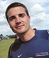 Matt Millburn
 -
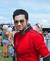 Sikander Malik
 -
 Kieron Richardson


Article(s): Danny Mac, Matt Millburn, Sikander Malik and Kieron Richardson
Request: Could these images be cropped to the males in each image and then rotated so they are less off centre. I'm not sure if the image of Sikander Malik will be to close to the girl to be able to be cropped, it was when i attempted it, if it is then leave it. Thanks D4nnyw14 (talk) 00:57, 28 January 2012 (UTC)
Graphist opinion:![]() Done Centpacrr (talk) 02:14, 28 January 2012 (UTC)
Done Centpacrr (talk) 02:14, 28 January 2012 (UTC)
- Thanks for that, the Sikander Malik crop is great. D4nnyw14 (talk) 13:16, 28 January 2012 (UTC)
Fix tilted horizon
edit-
Monsoon clouds over Howrah Bridge, Kolkata
-
 Kolkata South Central CBD
 -
 View from South City Mall
 -
 India Education
 -
 Kolkatavsnl
.jpg)


Article(s): Kolkata
Request: Would be great if the horizon was made level. Any other colour/contrast/brightness fixes welcome. Saravask 06:48, 28 January 2012 (UTC)
Graphist opinion(s):![]() Done Centpacrr (talk) 07:20, 28 January 2012 (UTC)
Done Centpacrr (talk) 07:20, 28 January 2012 (UTC)
- Edit looks as good as it's going to get. Wonder if you could do the same for four more: File:Kolkata South Central CBD (11).jpg, File:View from South City Mall.jpg, File:India Education .jpg, and File:Kolkatavsnl.JPG. I realise that these are not the best images, but they are all to be found in the same FA. Thanks again. Saravask 07:39, 28 January 2012 (UTC)
- Done Centpacrr (talk) 10:47, 28 January 2012 (UTC)
- Great. Thanks for your help. Saravask 03:46, 29 January 2012 (UTC)
Toronto subway car: color distortion
edit-
 Toronto Subway Train Type H4 (not H2) Interior

Article(s): H-series (Toronto subway car), Toronto subway and RT rolling stock, and several on non-English Wikipedias
Request: For some reason the color in this image is significantly exaggerated. I've just done a web search for other images of these cars (which were just retired from service) and This one from a web publication best shows what they really looked like. Please adjust the color in the Wikipedia image to resemble the other one.
Note: This is a shared IP address; please do not respond to this IP address's talk page, as I probably won't see it. Just please fix the image, or don't, as you see fit. 142.205.241.254 (talk) 23:54, 27 January 2012 (UTC)
Graphist opinion(s):![]() Done Please advise if this accurately reflects the correct hues. (If the colors appear unchanged just reload the page to be sure that you are no longer seeing the original version still stored in your browser's cache.)Centpacrr (talk) 00:16, 28 January 2012 (UTC)
Done Please advise if this accurately reflects the correct hues. (If the colors appear unchanged just reload the page to be sure that you are no longer seeing the original version still stored in your browser's cache.)Centpacrr (talk) 00:16, 28 January 2012 (UTC)
- Added note: Since posting the adjusted image I have shown both versions to a friend in Toronto who told me that some of the older versions of this model of subway car had red seats so the original version of the image may have been an accurate representation of the particular car photographed. Centpacrr (talk) 01:15, 28 January 2012 (UTC)
- Chalk me up as thinking the original is almost certainly representative of the colors at that time and place. I think the original photo is fine, though maybe could stand an ever-so-slight desaturation. Reminds me of the blond girl issue a while back. – JBarta (talk) 01:41, 28 January 2012 (UTC)
- My friend from Toronto told me that my color corrected version is more representative of how the majority of these cars appeared when taken out of service so that one would seem to be preferable to the older saturated one. Centpacrr (talk) 02:23, 28 January 2012 (UTC)
- It's not just a matter of saturation, it's a matter of distinctly different colors. We have to ask ourselves, as an encyclopedia, do we owe the reader unadulterated photos, or doctored images showing things as we think they ought to be? I might also suggest that a clear photo of the car at a particular time and place is a reliable source (as WP defines it) and a friend of an editor is not. I think if it's felt the original photo is somehow misrepresentative, then a better solution than altering the photo is to find another photo that is believed to be more representative. In the meantime, the photo caption or description can explain that not all seats were red (or they are no longer red) if that's considered an important note. – JBarta (talk) 02:52, 28 January 2012 (UTC)
- I have tweaked the coloring of the seats so that it most closely matches that in all the other images I have been able to find of these cars. I have not found any other image matching the reddish tinting in the original version, and my friend in Toronto has not been able to be very specific as to what he means by "red seats" in older cars as he only remembers them as a child. Also the coloring in the original image seems to be unreliable as the yellow partitions by the doors are also different (tending orange) then those in any other images which also indicates that the colors in original picture are not accurate. The current version is thus the one that is best supported by the universe of available comparative images of the interiors of these now retired Toronto subway cars and needs no further adjustment. Centpacrr (talk) 04:14, 28 January 2012 (UTC)
- I tend to agree with Centpacrr here. There's nothing to say that the original image hasn't been doctored in some way, or that the whitebalance and other factors are a bit off (it's cetainly a little over-saturated). Provided that we are conscientious in our 'doctoring' - performing our due diligence in an attempt to be more truthful - we needn't worry about the provenance of a may-or-may-not-be reliable source. The camera lies. ..But it's when editors veer into non-reality that JB and I begin to agree that less is usually more. nagualdesign (talk) 06:10, 28 January 2012 (UTC)
- Couple comments.... Wikipedia (for better or worse), is more interested in verifiability than "truth". This is very important. Also, viewing the exif data of the photo we can see it was taken in 2006 by what appears to be a reasonably decent camera and no mention is made on the flickr page of altering the colors. The logical and reasonable assumption is that the photo accurately captures what was on that car on that date (plus some probable post-processing to enhance the colors). Now, if you wish to alter the image colors materially for whatever reason, I suppose that's fine, but at the very least it should be uploaded as a separate image and such modifications clearly noted on the image description page. – JBarta (talk) 08:37, 28 January 2012 (UTC)
- Making any such an assumption seems to me to be neither logical nor reasonable as there is no way to tell how white balance, color temperature, and/or any other adjustable parameter had been set when the image was made let alone how the raw digital file may have been manipulated subsequently. (The fact that the partitions are pale orange instead of yellow clearly indicates that the colors in the original posted file are false, and the exif data also shows that the file had been processed by Adobe Photoshop Elements 4.0 Windows.) All that I did to the image was adjust the hues to conform as closely as I could to those in all the other online images that I could find of the same type of Toronto subway car (such as this image) which I used as a guide to verify the accuracy of these adjustments. That, after all, is what the editor who posted the image had requested in the first place. Centpacrr (talk) 09:25, 28 January 2012 (UTC)
- I found this. I would concede that this orange color could very well have been the color of the seats before the flickr photographer messed with the coloring. If you were to change the colors to match these images and note on the image description page what you did, why you did it and include a link to the images I mentioned, then that would be perfectly acceptable as far as I'm concerned. – JBarta (talk) 10:52, 28 January 2012 (UTC)
- Those are among the several images I used as a guide as well as this one. Centpacrr (talk) 11:03, 28 January 2012 (UTC)
- But the seats in your current edit are distinctly brown. Can you change it to more orange as in the photos I mention (or even the one you mention). I stress orange over brown because I did notice a few references here and there to the old "orange bench seats". And in the link I just posted, if you scroll down there are some closeup shots of the seats which show them as definitely orange. Can you mimic that color? – JBarta (talk) 11:13, 28 January 2012 (UTC)
- Much better, though to my eye not quite getting the orangey color of the other photos. I took the liberty of making my own edit. Hopefully it captures the colors correctly. I also followed your suggestion in picking up the spilled coffee cup. Further, I edited the image description page so anyone wondering why the colors were changed from red to orange will get an explanation. – JBarta (talk) 01:18, 29 January 2012 (UTC)
- In situations like this it's often best not to judge colour by eye. Human colour perception can be highly fallible. I've uploaded a version which I made with the assistance of the eyedropper tool and Info box (in Photoshop). That way I could read off the values in multiple locations as I was tweeking the adjustment, and make sure they accurately reflect the colours in one of the other photos. By 'reflect' I mean that it's also necessary to take the ambient lighting into account. Good call on the seat colours. Shame we had to upload so many different versions though. Little by little we progress. nagualdesign (talk) 04:02, 29 January 2012 (UTC)
- The variations in shading in the images of the vinyl seat covering of this H4 car is all speculative, of course, as there were 78 of them built in 1974-75 and most remained in constant service for over 35 years. With three-and-a-half decades of wear, repair, replacement during routine maintenance, and periodic refurbishment, it is perfectly possible if not likely that the seats in this fleet could have looked quite different over the years. That being the case, any one of these versions (except probably for the original from flickr) is likely as "accurate" as any of the others and thus further speculative tweaking would pretty much be a waste of time. Centpacrr (talk) 05:28, 29 January 2012 (UTC)
- Whilst I broadly agree with everything that you're saying I think it fair to point out that if we are going to 'transplant' colour from one source to another then we should do so as accurately as possible and hope that the source is good, otherwise we are simply producing a 3rd colour which is pure invention. nagualdesign (talk) 05:46, 29 January 2012 (UTC)
- Please see the original posted request above. The requester pointed out that the seat color in the original flickr image was clearly way out of range and thus asked that it be adjusted to resemble as closely as possible that in an image representative of its known color range and that's all that I did. I wasn't trying to "invent" anything. The only "absolutes" in color are the wavelengths of the light (400 - 700 nanometers) that each absorbs and/or reflects. Everything else is the result of each individual's subjective perception and interpretation. Centpacrr (talk) 18:57, 29 January 2012 (UTC)
- Whilst I broadly agree with everything that you're saying I think it fair to point out that if we are going to 'transplant' colour from one source to another then we should do so as accurately as possible and hope that the source is good, otherwise we are simply producing a 3rd colour which is pure invention. nagualdesign (talk) 05:46, 29 January 2012 (UTC)
- The variations in shading in the images of the vinyl seat covering of this H4 car is all speculative, of course, as there were 78 of them built in 1974-75 and most remained in constant service for over 35 years. With three-and-a-half decades of wear, repair, replacement during routine maintenance, and periodic refurbishment, it is perfectly possible if not likely that the seats in this fleet could have looked quite different over the years. That being the case, any one of these versions (except probably for the original from flickr) is likely as "accurate" as any of the others and thus further speculative tweaking would pretty much be a waste of time. Centpacrr (talk) 05:28, 29 January 2012 (UTC)
- In situations like this it's often best not to judge colour by eye. Human colour perception can be highly fallible. I've uploaded a version which I made with the assistance of the eyedropper tool and Info box (in Photoshop). That way I could read off the values in multiple locations as I was tweeking the adjustment, and make sure they accurately reflect the colours in one of the other photos. By 'reflect' I mean that it's also necessary to take the ambient lighting into account. Good call on the seat colours. Shame we had to upload so many different versions though. Little by little we progress. nagualdesign (talk) 04:02, 29 January 2012 (UTC)
- Much better, though to my eye not quite getting the orangey color of the other photos. I took the liberty of making my own edit. Hopefully it captures the colors correctly. I also followed your suggestion in picking up the spilled coffee cup. Further, I edited the image description page so anyone wondering why the colors were changed from red to orange will get an explanation. – JBarta (talk) 01:18, 29 January 2012 (UTC)
- But the seats in your current edit are distinctly brown. Can you change it to more orange as in the photos I mention (or even the one you mention). I stress orange over brown because I did notice a few references here and there to the old "orange bench seats". And in the link I just posted, if you scroll down there are some closeup shots of the seats which show them as definitely orange. Can you mimic that color? – JBarta (talk) 11:13, 28 January 2012 (UTC)
- Those are among the several images I used as a guide as well as this one. Centpacrr (talk) 11:03, 28 January 2012 (UTC)
- I found this. I would concede that this orange color could very well have been the color of the seats before the flickr photographer messed with the coloring. If you were to change the colors to match these images and note on the image description page what you did, why you did it and include a link to the images I mentioned, then that would be perfectly acceptable as far as I'm concerned. – JBarta (talk) 10:52, 28 January 2012 (UTC)
- Making any such an assumption seems to me to be neither logical nor reasonable as there is no way to tell how white balance, color temperature, and/or any other adjustable parameter had been set when the image was made let alone how the raw digital file may have been manipulated subsequently. (The fact that the partitions are pale orange instead of yellow clearly indicates that the colors in the original posted file are false, and the exif data also shows that the file had been processed by Adobe Photoshop Elements 4.0 Windows.) All that I did to the image was adjust the hues to conform as closely as I could to those in all the other online images that I could find of the same type of Toronto subway car (such as this image) which I used as a guide to verify the accuracy of these adjustments. That, after all, is what the editor who posted the image had requested in the first place. Centpacrr (talk) 09:25, 28 January 2012 (UTC)
- Couple comments.... Wikipedia (for better or worse), is more interested in verifiability than "truth". This is very important. Also, viewing the exif data of the photo we can see it was taken in 2006 by what appears to be a reasonably decent camera and no mention is made on the flickr page of altering the colors. The logical and reasonable assumption is that the photo accurately captures what was on that car on that date (plus some probable post-processing to enhance the colors). Now, if you wish to alter the image colors materially for whatever reason, I suppose that's fine, but at the very least it should be uploaded as a separate image and such modifications clearly noted on the image description page. – JBarta (talk) 08:37, 28 January 2012 (UTC)
- I tend to agree with Centpacrr here. There's nothing to say that the original image hasn't been doctored in some way, or that the whitebalance and other factors are a bit off (it's cetainly a little over-saturated). Provided that we are conscientious in our 'doctoring' - performing our due diligence in an attempt to be more truthful - we needn't worry about the provenance of a may-or-may-not-be reliable source. The camera lies. ..But it's when editors veer into non-reality that JB and I begin to agree that less is usually more. nagualdesign (talk) 06:10, 28 January 2012 (UTC)
- I have tweaked the coloring of the seats so that it most closely matches that in all the other images I have been able to find of these cars. I have not found any other image matching the reddish tinting in the original version, and my friend in Toronto has not been able to be very specific as to what he means by "red seats" in older cars as he only remembers them as a child. Also the coloring in the original image seems to be unreliable as the yellow partitions by the doors are also different (tending orange) then those in any other images which also indicates that the colors in original picture are not accurate. The current version is thus the one that is best supported by the universe of available comparative images of the interiors of these now retired Toronto subway cars and needs no further adjustment. Centpacrr (talk) 04:14, 28 January 2012 (UTC)
- It's not just a matter of saturation, it's a matter of distinctly different colors. We have to ask ourselves, as an encyclopedia, do we owe the reader unadulterated photos, or doctored images showing things as we think they ought to be? I might also suggest that a clear photo of the car at a particular time and place is a reliable source (as WP defines it) and a friend of an editor is not. I think if it's felt the original photo is somehow misrepresentative, then a better solution than altering the photo is to find another photo that is believed to be more representative. In the meantime, the photo caption or description can explain that not all seats were red (or they are no longer red) if that's considered an important note. – JBarta (talk) 02:52, 28 January 2012 (UTC)
- My friend from Toronto told me that my color corrected version is more representative of how the majority of these cars appeared when taken out of service so that one would seem to be preferable to the older saturated one. Centpacrr (talk) 02:23, 28 January 2012 (UTC)
- Chalk me up as thinking the original is almost certainly representative of the colors at that time and place. I think the original photo is fine, though maybe could stand an ever-so-slight desaturation. Reminds me of the blond girl issue a while back. – JBarta (talk) 01:41, 28 January 2012 (UTC)
@142.205.241.254, if the image definitely shows a Type H4 (and not a Type H2) it may be appropriate to request that the image be renamed. Unfortunately I can't remember how to do it and you (not being autoconfimed) might not be allowed. Perhaps you could tell us how you know that it isn't a H2, and somebody might be able to assist. nagualdesign (talk) 05:00, 29 January 2012 (UTC)
- Anyone can request a rename by inserting a {{rename}} template but only a filemover can actually rename the file and only if it follows the rename guidelines. If the name is misrepresentative of what the image actually is, then that's a perfectly valid reason. Before requesting a rename however it would be good to not only be sure, but to offer some sort of evidence that it's actually misnamed. Once a rename template is placed, it takes anywhere from a couple hours to a couple days for a filemover to wander over and either perform the rename, or remove your request with a reason why. – JBarta (talk) 06:55, 29 January 2012 (UTC)
- This is the original poster at a different (also shared) IP address. Thanks for the work, folks. On the monitor I'm now using the colors are a bit less saturated and it does look as though the one I first provided as a comparison sample was undersaturated (although the original version was clearly too saturated, as I said). Just shows how hard this sort of thing can be. Anyway, the present version is good, or at least close enough.
- As to the title of the page, I will tag it for renaming as suggested.
- Most of the current Toronto subway trains have red seats, but none of the H-series ever did. If someone is remembering an early train with red seats it would be the G-series (Toronto subway train).
- 65.94.114.170 (talk) 01:17, 4 February 2012 (UTC)
Image modification
edit-
 1
1 -
 2
2 -
 3
3 -
 4
4 -
 cropped file #4


Article(s): N. Chandrasekaran, Adi Godrej, Prithviraj Chavan and Gautam Adani
Request:
- 1) For N. Chandrasekaran remove excess materials and ensure that the face appears bigger in his biography.
- 2) For Adi Godrej remove excess materials and ensure that the face appears bigger in his biography.
- 3) For Prithviraj Chavan remove excess materials and ensure that the face appears bigger in his biography.
- 4) For Gautam Adani, remove Timothy Roemer and make sure that Gautam Adani's overall appearance and the face appears bigger in his biography.--Kkm010* ۩ ۞ 11:12, 29 January 2012 (UTC)
Graphist opinion(s): ![]() Request taken by PawełMM.
Request taken by PawełMM.
![]() Done: Done as requested. PawełMM (talk) 14:53, 29 January 2012 (UTC)
Done: Done as requested. PawełMM (talk) 14:53, 29 January 2012 (UTC)
- Thanks!--Kkm010* ۩ ۞ 04:09, 30 January 2012 (UTC)
Untilt two photos
edit-
 Chinese New Year in Calcutta Done
 -
A broadcasting tower above the Golf Green neighbourhood

Article(s): Kolkata
Request: Would be grateful if these could be rotated until level. Second one is from a previous request; I just noticed it has a horizon that is still not true. Thanks. Saravask 11:34, 29 January 2012 (UTC)
Graphist opinion(s):
The horizon and tower in the second image are almost perfectly horizontal and vertical (within a small fraction of a degree). It looks tilted because of an optical illusion set up by the angle of the buildings and structures in the foreground. – JBarta (talk) 11:57, 29 January 2012 (UTC)
- Right before I posted this reply, I scrolled the thumbnailed second image up until the horizon was flush against the top edge of my web browser's viewport—it was definitely tilted, because the horizon and edge where not parallel--off by a few degrees. Perhaps because of failure to cache-purge, I still saw the previous unrotated image. Then, I clicked to view the full-size image page; it was perfectly level. So the image wasn't purged/refreshed by the browser. Thanks for your help. Saravask 17:04, 29 January 2012 (UTC)
Amalienborg and Marble Church picture
edit-
 Amalienborg and the Marble Church seen with the Amalie Garden in the foreground

![[1]](http://blog.mailasail.com/etoiledelune/377/image/jpgZ4YmhMnfEg.jpg)
![[2]](http://tahitipresse.pf/wp-content/uploads/2009/02/020820092100375050871183255.jpg)
![[3]](http://a10.idata.over-blog.com/600x424/3/67/91/14/divers/tah---musee-de-tahiti-6.jpg)
![[5]](http://www.fs.fed.us/r9/ssrs/attachments/3871.jpg)
![[6]](http://www.fs.fed.us/r9/ssrs/originals/3871.jpg)
Article(s): Copenhagen
Request: Please can you brighten this image (or just the sky). Peter (Talk page) 20:23, 29 January 2012 (UTC)
Graphist opinion(s):![]() Done Centpacrr (talk) 20:34, 29 January 2012 (UTC)
Done Centpacrr (talk) 20:34, 29 January 2012 (UTC)
- Thanks! Peter (Talk page) 20:46, 29 January 2012 (UTC)