Wikipedia:Graphics Lab/Illustration workshop/Archive/Jul 2011
 | This page, part of the Graphics Lab Wikiproject, is an archive of requests for July 2011. Please do not edit the contents of this page. You can submit new requests here. |
Stale
Please convert this logo from .png to .svg

Article(s): Bollywood Xplorer
Request: Please Please convert to svg. Thanks. Amanrajveer (talk) 07:38, 9 June 2011 (UTC)
Graphist opinion(s):
Blake River Megacaldera Complex
Article(s): Blake River Megacaldera Complex
Request: The article could use some graphics as I plain to start improving the article for GA or even FA. There is five graphics here on page 77 that would be useful to show how the volcano formed. Figure 8 on page 72 would be good to illustrate the volcano's structure. Volcanoguy 07:29, 26 May 2011 (UTC)
Graphist opinion(s): All graphics mentioned inside the pdf file are bitmaps, so SVG extracting is not possible. Taking them as png is pretty easy, do those images have any copyright problem? If not I will be happy to help Ufo karadagli (talk) 21:36, 1 June 2011 (UTC)
- The content is copyrighted as far as I'm aware of. I might not be getting the picture, but the graphics in the pdf file should still be possible to extract. A way to extract them is by pressing F3 on the keyboard while looking at the pdf file graphic then paste that part of the pdf file on Microsoft paint or whatever else there is. It's not possible to start it that way? Volcanoguy 22:24, 1 June 2011 (UTC)
- That was what I meant by taking them as PNG. Then tracing must be done to create the SVG version. Real problem is the copyright. As far as I know fair-use is not applicable here we need permission. Ufo karadagli (talk) 04:16, 2 June 2011 (UTC)
Revectorization of a flag!

Article(s): Only Unity Saves the Serbs
Request: In need of re-vectorization,cause it is easy to put a border around it Please check your commons talk page for the request i made Drax90 (talk) 14:30, 23 June 2011 (UTC)
Graphist opinion(s): What exactly is the problem with this one? It seems to be small enough in size. NikNaks talk - gallery 12:11, 25 June 2011 (UTC)
- In future, feel free to reply in this section so it is visible. I don't understand why the border template is relevant. Does this flag need a border for it to be correct? NikNaks talk - gallery 16:05, 25 June 2011 (UTC)
- I think maybe s/he wants a border around the flag to be part of the file, because of the white stripe, instead of having to place the border manually every time using a template? I'm just guessing?... But uploaded images shouldn't have borders, so... Yeah, I don't know. -MissMJ (talk) 21:31, 27 June 2011 (UTC)
- In future, feel free to reply in this section so it is visible. I don't understand why the border template is relevant. Does this flag need a border for it to be correct? NikNaks talk - gallery 16:05, 25 June 2011 (UTC)

Article(s): KF Tirana
Request: Please vectorise the logo. Vinie007 19:16, 24 June 2011 (UTC)
Graphist opinion(s):
Leśmian's autograph

Article(s): Bolesław Leśmian
Request: Could you please redraw the autograph from a book page. Thanks. Vearthy (talk) 21:51, 29 June 2011 (UTC)
Graphist opinion(s): Is this fine? – ∃ Aditya 7 ¦ 04:26, 30 June 2011 (UTC)
- No, it's not really. I'd like it clean and sharp, saved as vector file. That would be fine, even great. Vearthy (talk) 15:08, 1 July 2011 (UTC)
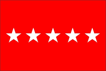
Serbian Empire Flag

Article(s): Serbian Empire
Request: Needs fixing the feather ornament on flag,several missing, If you can see the feathers on eagle you will notice that a part on centre is missing,check the centre of the eagle Drax90 (talk) 08:12, 1 July 2011 (UTC)
Graphist opinion(s): As I asked on Commons, what exactly needs changing? NikNaks talk - gallery 19:04, 1 July 2011 (UTC)
Redraw as SVG the Pernambuco map
-
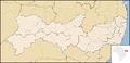 PNG map.
 -
 SVG map.
 -
 SVG map of other Brazilian state, such example for follow the standard.


Article(s): Pernambuco and a lot of other articles with this and derivate works.
Request: Redraw as SVG. Please, follow the name File:Pernambuco MesoMicroMunicip.svg. Luan (discussão) 05:50, 19 June 2011 (UTC)
Graphist opinion(s):
Military logos
File:AFP 3D.png, File:Rparmy.gif, File:PN Seal.png, File:PAF Seal.png, File:Tenteradaratlogo.jpg, File:Logo-Indonesian Navy.jpg


Request: Redraw as SVG. Kungfu2187 (talk) 01:51, 19 June 2011 (UTC)
Graphist opinion(s):
Victorize the Victorious logo
Article(s): Victorious
Request: Please redraw this logo as SVG. Simon.hess (talk) 06:10, 23 June 2011 (UTC)
Graphist opinion(s):
Resolved
Request for "Armenian dram" currency sign (typography)
-
 Armenian dram sign

Article(s): See Armenian dram sign, Armenian dram, Currency sign
Request: Could someone create the "Armenian dram" currency sign?
- the Armenian sign shape exists since 1995, see pls the picture at http://en.wikipedia.org/wiki/Armenian_dram_sign. Nrahehinak (talk)
Backgrounds
- Clearly, it is a typographic character. It is not in Unicode (has no Unicode ID).
- The symbol's placement into Unicode is in the process. Nrahehinak (talk)
- Armenian dram sign says: The graphics of the symbol is based on the shape of the first letter of Armenian word "դրամ" (money, pronounced as "dram"). This points to U+0564 դ ARMENIAN SMALL LETTER DA, or the upper case variant U+0534 Դ ARMENIAN CAPITAL LETTER DA. Main feature is the double stroke.
- Design considerations, sketches and current usages (e.g. on banknotes) are provided in WP articles mentioned.
- Currently, as an approaching image, a lookalike character is used, U+0534 Դ ARMENIAN CAPITAL LETTER DA.
- Example, another currency sign by file only, not in font (yet):
 (Image:Indian rupee sign.svg).
 - Suggested name: since it is a currency sign, I suggest the filename to be "Armenian dram sign" (plus extension as appropriate). The word "dram" should be lowercase as it is a currency name.
-DePiep (talk) 13:04, 29 June 2011 (UTC)
Graphist opinion(s): Is this correct? – ∃ Aditya 7 ¦ 15:31, 29 June 2011 (UTC)
- Thank you. Well, clearly the left parts of the double bar are cut off (missing). We could take that as a designers freedom (OK then). If a typographer, or an Armenian state writing guarding policeman, says it's not done, we should decline (not OK then). I say: OK, let's use it. It sure is better than the replacement alphabetic letter. If copyrights are OK, then upload it. -DePiep (talk) 15:46, 29 June 2011 (UTC)
- There is a designers freefom, of course. However, it is neccesary to follow the core shape; the sign without left bars is not what intented for the sign. Besides, there is a number of font styles, which have won the international competiton, and which include Armenian dram sign. Also, the government of Armenia selected already the font styles for the official usage. Nrahehinak (talk)
- Here it is: Image:Armenian dram sign.svg Mark this section with
{{resolved|1=~~~}}if you're satisfied. – ∃ Aditya 7 ¦ 16:34, 29 June 2011 (UTC)
Request help making table look prettier
| Model | A300 | A310 | A320 | A330 | A340 |
|---|---|---|---|---|---|
| Previous designation(s) | – | B10 | SA1, SA2, SA3 | TA9 (B9) | TA11 (B11) |
| Introduced | 1972 | 1983 | 1988 | 1993 | 1993 |
| Body | Wide | Wide | Narrow | Wide | Wide |
| Engines | Twinjet | Twinjet | Twinjet | Twinjet | Quadjet |
| Range | Short–medium | Medium–long | Short–medium | Medium–long | Long |
Article(s): A330
Request: Make table stand out from the page, look more like a graphic or a table in Powerpoint. Note, the article this would help is in FAC right now. I would put this image at the very beginning of the body text. The Background and Development sections are pretty dry and confusing with all the plane types and with the discussion in a narrative, that includes name changes of the designs. I think a basic graphic, centered, at the start of that section would give the reader a little bit of a refuge if he gets confused about all the different planes and their names. My preference would be to keep it as a table, for editability, but add some formatting somehow, but it would not kill me to just convert it to an image.TCO (talk) 03:18, 30 June 2011 (UTC)
Graphist opinion(s):
![]() Done Okay, how's this? P.S.: Minor nitpick, but it'd be great if we didn't assume that the reader of an article is male ("if he gets confused"). Women read Wikipedia too. *waves* :) -MissMJ (talk) 05:03, 30 June 2011 (UTC)
Done Okay, how's this? P.S.: Minor nitpick, but it'd be great if we didn't assume that the reader of an article is male ("if he gets confused"). Women read Wikipedia too. *waves* :) -MissMJ (talk) 05:03, 30 June 2011 (UTC)
- If you want it as an editable SVG image, how about this? Image will help avoid the clutter of a table. – ∃ Aditya 7 ¦ 05:18, 30 June 2011 (UTC)
- I don't think making tables an image (SVG or otherwise) is a good approach to take. Firstly, although SVGs are editable, your average editor probably wouldn't know how to go about it, which will lead to a million edit and translation requests over here. Tables are much more easy to edit, and for translation purposes, can be just copy pasted with the contents changed even by someone who hasn't got a clue how table code works. Secondly, we have to consider the issue of accessibility. Unnecessarily locking away information in an image means screen readers will not be able to easily access it. A formatted table, though not as useful to someone who is blind as to those who are sighted, for example, can at least be read as text. -MissMJ (talk) 05:30, 30 June 2011 (UTC)
- If you want it as an editable SVG image, how about this? Image will help avoid the clutter of a table. – ∃ Aditya 7 ¦ 05:18, 30 June 2011 (UTC)
- Table is better for me on Wiki. Obviously if we were putting together an annual report or something then a finished image allows more prettiness. But this helps me if a year is off. Also, there are other articles with later generations of aircraft that would build off of this one (didn't want the later generations in this article, but A350 and A380 articles would have expanded tables.)TCO (talk) 05:34, 30 June 2011 (UTC)
Hey, TCO, I'm moving the discussion about the table changes from my talk page to here, so it can all be in a central place. I'm not sure what you mean about the "double-lining of the cell content" (the white borders, maybe? sadly the CSS wasn't doing what it should there), but once I centered it, it helped legibility to stretch the table, so I increased the width to 75%. -MissMJ (talk) 05:42, 30 June 2011 (UTC)
- Looks great! (I meant the line breaks within cells, but they're gone anyway, from what you did. ALL DONE! Merci beacoups!TCO (talk) 05:46, 30 June 2011 (UTC)
Royal Standards of Albania
-
Prince's Standard
-
Princess' Standard
-
Crown Prince's Standard
Article(s): Principality of Albania
Request: Vectorise please, many thanks TRAJAN 117 (talk) 16:57, 11 June 2011 (UTC)
Graphist opinion(s): The source image is low resolution considering the amount of detail it contains. The information required to vectorise it is not there. For example, the symbol on the central shield is an undefined pixel blur. 83.216.149.7 (talk) —Preceding undated comment added 16:29, 28 June 2011 (UTC).
- The symbol on the central shield is a peacock [1]. TRAJAN 117 (talk) 21:34, 28 June 2011 (UTC)
![]() Request taken by Pbroks13. 01:34, 2 July 2011 (UTC)
Request taken by Pbroks13. 01:34, 2 July 2011 (UTC)
![]() Done Sorry if it is not the best quality, but it was really hard to see any detail. Let me know if thats good! --Pbroks13talk? 16:34, 3 July 2011 (UTC)
Done Sorry if it is not the best quality, but it was really hard to see any detail. Let me know if thats good! --Pbroks13talk? 16:34, 3 July 2011 (UTC)
- Well done, many thanks. TRAJAN 117 (talk) 19:09, 3 July 2011 (UTC)
Flag of the United Tribes of Fiji 1865-1867
.svg)
Article(s): Flag of Fiji
Request: Please make the black part blue. KAVEBEAR (talk) 18:36, 2 July 2011 (UTC)
Graphist opinion: Which shade of blue will be required? Derfel73 (talk) 19:13, 2 July 2011 (UTC)
Magpul PDR
-
 Thin lines should be semi-bolded.
Article(s): Magpul PDR
Request: Thin lines should be semi-bolded. Kungfu2187 (talk) 12:40, 29 May 2011 (UTC)
Graphist opinion(s):![]() Request taken by Ufo karadagli.. OCK (t·c) 23:11, 17 June 2011 (UTC)
Request taken by Ufo karadagli.. OCK (t·c) 23:11, 17 June 2011 (UTC)
 Done: File replaced. Hard work. If it is ok, mark this section as resolved using
 {{resolved|1=~~~}}. OCK (t·c) 23:53, 17 June 2011 (UTC)
Animated files
-
 DIRECTM16.gif
 -
 PISTONM16.gif


Request: Should be matched to the image edited by User:Astatine211. Kungfu2187 (talk) 01:48, 11 June 2011 (UTC)
Graphist opinion(s): So, what you only want is to increase delay of the last frame in PISTONM16.gif, in order to make it readable? OCK (t·c) 00:00, 17 June 2011 (UTC)
- Done. File replaced. I think this was what you want. It now animates in thumbnails too. OCK (t·c) 07:07, 17 June 2011 (UTC)
Colorblindness improvement
-
 A diagram of national economies during the Great Depression
 -


Article(s): Great Depression
Request: Due to colorblindness issues, I can't fully understand this image. Could someone please add the first letter of each country's name (or two, for US and UK) to the left end of each line? I could do this in Microsoft Paint, except if I were able to distinguish the colors properly, I wouldn't have realized that this image needed improvement. Nyttend (talk) 23:08, 11 June 2011 (UTC)
Graphist opinion(s):
Actually there is no need. Top to bottom order of lines at the very left of the graph matches with the top to bottom order of countries in the legend. OCK (t·c) 06:59, 12 June 2011 (UTC)
- When a colorblind person tells you that a diagram isn't legible, the correct response isn't "yes it is," it's to fix the diagram.
- I took NikNaks93's SVG and made the line differentiation more clear (no need to make the graph even busier by putting country labels next to the lines). Is this better, Nyttend? -MissMJ (talk) 22:15, 26 June 2011 (UTC)
I've converted it to an SVG and moved the labels to the lines themselves. I've also tried to fix the scale. NikNaks talk - gallery 15:59, 25 June 2011 (UTC)
Re-Vectorization

Article(s): Burger Chef, Burger Time
Request: Please re-trace the above SVGs based on [2] and [3] Connormah (talk) 21:12, 18 June 2011 (UTC)
Graphist opinion(s): ![]() Found the Burger Chef logo at Brands of the World. Uploaded the origianl EPS here; Converted it to SVG with Illustrator 15.1.0 and uploaded here. —∃ Aaditya 7 17:45, 24 June 2011 (UTC)
Found the Burger Chef logo at Brands of the World. Uploaded the origianl EPS here; Converted it to SVG with Illustrator 15.1.0 and uploaded here. —∃ Aaditya 7 17:45, 24 June 2011 (UTC)
Getty Images & Crytek
-
PNG
-
 SVG
SVG -

Article(s): Getty Images & Crytek
Request: Redraw as SVG. PD Text Image except Crytek logo. Remove (R) on Crytek logo. Kungfu2187 (talk) 13:32, 19 June 2011 (UTC)
Graphist opinion(s): ![]() Request taken by Jovianeye.. Getty SVG
Request taken by Jovianeye.. Getty SVG ![]() Done and is on commons. Regarding Crytek, it is recommended to leave the (R) as it is, since the logo is trademarked. --Jovian Eye talk 14:12, 19 June 2011 (UTC)
Done and is on commons. Regarding Crytek, it is recommended to leave the (R) as it is, since the logo is trademarked. --Jovian Eye talk 14:12, 19 June 2011 (UTC)
- The ® mark may be removed because it is not a part of the logo. The only thing we want in the image is the logo and not any description of the logo. The fact that it is trademarked is supposed to be indicated using Trademark or Trademarked or SVG logo on its file page. We cannot expect the readers to find if there is an unregistered trademark (™), registered trademark (®), unregistered service mark (℠) in the image, can we? —∃ Aaditya 7 18:34, 20 June 2011 (UTC)
- Regarding the registered and trademarked symbols, I think they should be retained. If the company has published the logo with these symbols next to it, then I feel they should be kept. (For more legal advice, I think it would be a good idea to ask Wikimedia's Legal Counsel) --Jovian Eye talk 18:46, 23 June 2011 (UTC)
Magpul PDR
Article(s): Magpul PDR
Request: Another image related to this weapon contains thin lines should be semi-bolded. Kungfu2187 (talk) 08:20, 26 June 2011 (UTC)
Graphist opinion(s): ![]() The stroke width in the original image is 1 pt, I made it 1.5 pt in this one. – ∃ Aditya 7 ¦ 09:30, 26 June 2011 (UTC)
The stroke width in the original image is 1 pt, I made it 1.5 pt in this one. – ∃ Aditya 7 ¦ 09:30, 26 June 2011 (UTC)
Morris Air Logo
Article(s): Morris Air
Request: Ive tried vectorizing this logo. But, I am already not satisfied with the result. So, I am requesting someone else to complete this logo. The file is on commons and feel free to upload over it. Here are some sources to guide you File:MorrisAir1993-1logo.jpg, 2, 3, 4. Jovian Eye talk 19:54, 26 June 2011 (UTC)
Graphist opinion(s): ![]() Done Thanks you very much...any chance someone can add the text from the examples posted? Preferably in blue? Connormah (talk) 02:31, 1 July 2011 (UTC)
Done Thanks you very much...any chance someone can add the text from the examples posted? Preferably in blue? Connormah (talk) 02:31, 1 July 2011 (UTC)
Pindad

Article(s): Pindad
Request: It should be matched to the logo seen on their website. Should include the wordmark. Kungfu2187 (talk) 08:18, 26 June 2011 (UTC)
Graphist opinion(s): ![]() Done I redrew the whole thing as an SVG. The text isn't exactly the same, but I don't think its a big issue. Will that work for you? --Pbroks13talk? 17:39, 3 July 2011 (UTC)
Done I redrew the whole thing as an SVG. The text isn't exactly the same, but I don't think its a big issue. Will that work for you? --Pbroks13talk? 17:39, 3 July 2011 (UTC)
File:Myrrha Gavotte 3.mid
-
Myrrha Gavotte (piano) by Sousa
-
Converted to ogg.
Request: Convert to ogg as requested by EN Featured Sounds director (being voted on now)... TCO (talk) 22:10, 28 June 2011 (UTC)
Graphist opinion(s): ![]() Done Derfel73 (talk) 22:19, 1 July 2011 (UTC)
Done Derfel73 (talk) 22:19, 1 July 2011 (UTC)
Arabic Wikiversity
-
 Arabic Wikiversity logo
 -
 Arabic Wikiversity logo 135x135
Article(s): None
Request: Please resize this image as 135x135 to be used as the logo of Arabic Wikiversity. Meno25 (talk) 16:25, 9 July 2011 (UTC)
Graphist opinion(s):
![]() Done Derfel73 (talk) 16:40, 9 July 2011 (UTC)
Done Derfel73 (talk) 16:40, 9 July 2011 (UTC)
Minor fix to teamwork barnstar
-
 Teamwork barnstar

Article(s): Lots of user talk pages
Request: Just need this SVG fixed so that the main star isn't cut off at the bottom. You could either move the star up slightly or extend the crop boundary at the bottom. Kaldari (talk) 17:25, 8 July 2011 (UTC)
Graphist opinion(s):
I'll talk to the original artist on Commons and see if they still have the original SVG (which is not on enwiki or Commons). Pi.1415926535 (talk) 21:17, 9 July 2011 (UTC)
- Oops, I didn't even notice it wasn't an SVG :P Kaldari (talk) 05:01, 10 July 2011 (UTC)
- Done. . --Antonu (talk) 11:28, 10 July 2011 (UTC)
- Thats weird, I have uploaded a new version, but still displays the old one :( --Antonu (talk) 13:23, 10 July 2011 (UTC)
- Wait a few days. Your browser may just be pulling up the old image from memory. It looks good from here, so thanks! Pi.1415926535 (talk) 22:05, 10 July 2011 (UTC)
Upper Deck Logo
Article(s): Upper Deck
Request: Is it just me or why doesn't the gradient render? Connormah (talk) 00:35, 12 July 2011 (UTC)
Graphist opinion(s):The tools that MediaWiki uses has some technical limitations. Read How SVGs work in MediaWiki. Wikipedia is also having some issues generating thumbnails of images. – ∃ Aditya 7 ¦ 07:02, 12 July 2011 (UTC)
![]() Done Wiki doesn't do a good job of rendering certain things that can be done with vector graphics. I simplified it and it should work now! Pbroks13 (talk) 17:03, 12 July 2011 (UTC)
Done Wiki doesn't do a good job of rendering certain things that can be done with vector graphics. I simplified it and it should work now! Pbroks13 (talk) 17:03, 12 July 2011 (UTC)
Nicole Hollander
Article: Nicole Hollander
Request: Please whiten background.Fitzfulke (talk) 08:50, 12 July 2011 (UTC)
Graphist opinion(s):
![]() Request taken by The Pink Oboe.
Request taken by The Pink Oboe. ![]() Done
Done
- I've also converted the file to png format and reduced the resolution which was far too high for a FUR image. I've put the jpg file up for speedy deletion accordingly. I've also changed the article to the png version. --The Pink Oboe (talk) 11:02, 12 July 2011 (UTC)
The texts look strange
-
 The previev and smaller renderings mess up top left text

Article(s): Airbus A380
Request: Please fix the messed up town names and the text. maybe you could clarify the line types --84.44.232.133 (talk) 18:47, 12 July 2011 (UTC)
Graphist opinion(s):
![]() Request taken by MissMJ.
Request taken by MissMJ.
![]() Done -MissMJ (talk) 04:07, 13 July 2011 (UTC)
Done -MissMJ (talk) 04:07, 13 July 2011 (UTC)
spread numeric table
| X | XX | HX | BX3 | AlX3 | CX4 |
|---|---|---|---|---|---|
| F | – | 159 | 574 | 645 | 582 |
| Cl | 243 | 428 | 444 | 427 | 327 |
| Br | 193 | 363 | 368 | 360 | 272 |
| I | 151 | 294 | 272 | 285 | 239 |
Article(s): Fluorine
Request: Spread numeric data apart by widening columns. Probably ~100% wider columns. Any other little prettiness allowed also, but main concern is that this reads so dense right now and not sure how to change column width. (It is for a worthwhile article, being prepped for FAC. TCO (reviews needed) 19:49, 12 July 2011 (UTC)
- Umm...if you could make some of the gridlines non-displaying as well, might help decruftify. Thinking, delete all the column lines and just show row lines at the top of the table, below the header row, and then at the very bottom.TCO (reviews needed) 20:07, 12 July 2011 (UTC)
Graphist opinion(s):
![]() Done Okay I know there's whack lines in between the columns at the top and I'm digging around to see if they can be fixed, because nothing I do seems to take. -MissMJ (talk) 21:12, 12 July 2011 (UTC)
Done Okay I know there's whack lines in between the columns at the top and I'm digging around to see if they can be fixed, because nothing I do seems to take. -MissMJ (talk) 21:12, 12 July 2011 (UTC)
- Thank you, kindly. Added in article.TCO (reviews needed) 22:33, 12 July 2011 (UTC)
Neiman Marcus Logo
Article(s): Neiman Marcus
Request: Can anyone with a clue of how to work PDF2SVG (or any method of converting fonts to outlines before opening up the document) extract the Neiman Marcus logo (which is in a font, strangely enough) from [4]? Thanks. Connormah (talk) 18:37, 12 July 2011 (UTC)
Graphist opinion(s): To be able to convert the extracted font to an outline one would need to have the original font in the first place. The listed font in the PDF is, unsurprisingly, "NeimanMarcus". So I suspect it's a custom font made especially for NM. So basically you're on a hiding to nothing if you want the font in pristine vector form without tracing it. --The Pink Oboe (talk) 19:16, 12 July 2011 (UTC).
- I've seen this done before, namely by User:Svgalbertian, unfortunately, he won't take requests now, which is why I brought it here. He/she did it with the logo of YYC and Capital Power Corporation and it worked out great. Can anyone attempt the PDF2SVG process? I haven't been able to get it to work. --CMAH (Connormah's Sock) 20:00, 12 July 2011 (UTC)
- That's because they're normal, 'standard' fonts. PDFs can be opened in Illustrator or InDesign so that you have direct access to the text, but only if you have the actual font on your system. Although the font is actually embedded in the PDF it's nigh on impossible to export that font for use as the PDF doesn't contain all the font information. I was able to open the pdf in Illustrator but all I could get was a generic font version because I didn't have the full font on my system. --The Pink Oboe (talk) 21:31, 12 July 2011 (UTC)
- Right, but could anyone give the link I posted above a shot? Or if anyone could locate a PDF with outlines of the logo, even better (haven't been able to find anything). Connormah (talk) 00:11, 13 July 2011 (UTC)
- I can't access the link you posted, but have had success with this type of process in the past using the Free Software program 'fontforge'. There's something of a tutorial about how to extract fonts here. If you can get a free software program to display the PDF correctly, there's a really good chance you'll be able to extract the data from it using another freely available program. gringer (talk) 06:08, 13 July 2011 (UTC)
- Right, but could anyone give the link I posted above a shot? Or if anyone could locate a PDF with outlines of the logo, even better (haven't been able to find anything). Connormah (talk) 00:11, 13 July 2011 (UTC)
- That's because they're normal, 'standard' fonts. PDFs can be opened in Illustrator or InDesign so that you have direct access to the text, but only if you have the actual font on your system. Although the font is actually embedded in the PDF it's nigh on impossible to export that font for use as the PDF doesn't contain all the font information. I was able to open the pdf in Illustrator but all I could get was a generic font version because I didn't have the full font on my system. --The Pink Oboe (talk) 21:31, 12 July 2011 (UTC)
- I've seen this done before, namely by User:Svgalbertian, unfortunately, he won't take requests now, which is why I brought it here. He/she did it with the logo of YYC and Capital Power Corporation and it worked out great. Can anyone attempt the PDF2SVG process? I haven't been able to get it to work. --CMAH (Connormah's Sock) 20:00, 12 July 2011 (UTC)
![]() Done. Hurray! Here it is: File:Neiman Marcus logo.svg. Here is the font that was embedded in the PDF: NeimanMarcus.ttf
Done. Hurray! Here it is: File:Neiman Marcus logo.svg. Here is the font that was embedded in the PDF: NeimanMarcus.ttf
I used the color (#5C5B5B) that the logo on the official website (www
- That's cool. I did a Google search for ways to extract a font from a pdf and everything I found said it couldn't be done. Obviously they were all referring to a Windows system. I'm just trying to install FontForge under Cygwin to see if I can get that functionality. If I can then it will improve invaluable as I get given a lot of PDFs, from clients, to work with and waste countless hours trying to find relevant fonts. Now if I can just take that font direct from the pdf it will be so much easier. Having said that it is still true that even though the font is embedded in the pdf not all the font info is embedded with it. I'll just have to see if the missing parameters affects my work. Also, thanks for the font Aditya, I can add it to the 250k I already have access to! 250k fonts and I still didn't have the font required, sheesh! --The Pink Oboe (talk) 14:18, 13 July 2011 (UTC)
- LMAO. After all that have you actually looked at the font in close up? The font file is actually a Helvetica derivative with the N and M characters replaced with a scanned and dodgily traced version of the NM logo. All in all our traces would more than likely have been a better quality. Ya gotta larf! --The Pink Oboe (talk) 14:30, 13 July 2011 (UTC)
- So, this request is now
{{resolved}}, isn't it? Any more font extraction requests? – ∃ Aditya 7 ¦ 14:36, 13 July 2011 (UTC) Just a note from a graphic designer that deals with typeface licensing on a regular basis: the Neiman Marcus font is proprietary and licensed only to Neiman Marcus for use. So please don't be going out there using it for random things, and certainly not for commercial purposes, as Neiman Marcus could very well sue you for infringement if you get caught and they feel like it. This goes for all proprietary fonts, and fonts that are sold, as opposed to freely licensed. For example, if you don't have Mac OS and didn't pay for a Helvetica license, but just downloaded it from somewhere, you've technically stolen the font from the type foundry that created it, and could be sued for it. Something as ubiquitous as Helvetica you would most likely get away with, but the more exclusive the font—such as one created specifically for the use of one company—the more likely you are to invite trouble for yourself. -MissMJ (talk) 19:37, 13 July 2011 (UTC)
- As a layout designer of 25+ years I concur, yet that said I've never yet met a designer who, when given the choice of completing a job (and therefore getting paid) and downloading/using an unlicensed font to do it versus hunting out and buying a font and missing a deadline, chose the latter. Personally I'm lucky in having access to a large collection courtesy of my employer. As for nicking and using the NM font, well that isn't likely any time soon. It only has two characters. N = the complete word "Neiman" and M = "Marcus" (or the other way round, I forget).
- So, this request is now
- LMAO. After all that have you actually looked at the font in close up? The font file is actually a Helvetica derivative with the N and M characters replaced with a scanned and dodgily traced version of the NM logo. All in all our traces would more than likely have been a better quality. Ya gotta larf! --The Pink Oboe (talk) 14:30, 13 July 2011 (UTC)
- On a brighter note FontForge works perfectly fine under Cygwin and extracted the above font quite easily. So that's me sorted the next time I get an emergency job involving a pdf and an embedded font! --The Pink Oboe (talk) 00:36, 14 July 2011 (UTC)
- Logos aren't usually in fonts when I try to find them in PDFs, I must say...thanks for the help, guys. Resolved now. Connormah (talk) 01:21, 14 July 2011 (UTC)
- Guys, I think fair use of copyrighted fonts is acceptable. Since fonts are not too different from images to have different laws, and fair use of copyrighted images is legal. What do you think? – ∃ Aditya 7 ¦ 04:54, 14 July 2011 (UTC)
- For Wikipedia purposes, it's fine, fair use would apply. I was just saying, since the font was being linked to up there and people were talking about adding it to their vast collections and so forth, that in general fonts are subject to licensing, and if the license isn't free, be careful. Depending on who decides to pursue it, you might find yourself the target of some cease and desist notices... -MissMJ (talk) 07:23, 14 July 2011 (UTC)
- Guys, I think fair use of copyrighted fonts is acceptable. Since fonts are not too different from images to have different laws, and fair use of copyrighted images is legal. What do you think? – ∃ Aditya 7 ¦ 04:54, 14 July 2011 (UTC)
- Logos aren't usually in fonts when I try to find them in PDFs, I must say...thanks for the help, guys. Resolved now. Connormah (talk) 01:21, 14 July 2011 (UTC)
- On a brighter note FontForge works perfectly fine under Cygwin and extracted the above font quite easily. So that's me sorted the next time I get an emergency job involving a pdf and an embedded font! --The Pink Oboe (talk) 00:36, 14 July 2011 (UTC)
Ottoman Tughras
-
 Tughra of Abdülhamid II
 -
 Vector
 -
 Tughra of Mehmed V
 -
 Vector
 -
 Tughra of Mehmed VI
 -
 Vector


Article(s): Abdülhamid II, Mehmed V, Mehmed VI
Request: Vectorise, many thanks. TRAJAN 117 (talk) 17:36, 15 July 2011 (UTC)
Graphist opinion(s):![]() Done
Done
- Many thanks. TRAJAN 117 (talk) 19:58, 18 July 2011 (UTC)
Signatures of Tamehameha
-
 Done
Done
Article(s): many
Request: Please create a svg image of these signatures and remove letters unrelated to the name out and change the JPG images to a white background. Thanks.KAVEBEAR (talk) 11:52, 12 July 2011 (UTC)
Graphist opinion(s): Facsimile signature of Kamehameha II (Tamehameha).jpg ![]() Done Angelus (talk) 15:42, 18 July 2011 (UTC)
Done Angelus (talk) 15:42, 18 July 2011 (UTC)
Manhattan Project site map tweak

Article(s): Manhattan Project
Request: Please change the Alabama town from Sylacauga to Childersburg. TCO (reviews needed) 19:24, 26 July 2011 (UTC)
Graphist opinion(s):
![]() Request taken by Pi.1415926535.Pi.1415926535 (talk) 21:11, 26 July 2011 (UTC)
Request taken by Pi.1415926535.Pi.1415926535 (talk) 21:11, 26 July 2011 (UTC)
- Sorry. Please leave it as is (there was a kerflutter around the right name and we are back to Sylacauga.TCO (reviews needed) 21:51, 26 July 2011 (UTC)
- Okay, no prob. Hadn't gotten around to it yet. Pi.1415926535 (talk) 22:03, 26 July 2011 (UTC)
- Sorry. Please leave it as is (there was a kerflutter around the right name and we are back to Sylacauga.TCO (reviews needed) 21:51, 26 July 2011 (UTC)
Historical Flags
-
 done
done -
 Done
Done -
 Done
Done -
 Done
Done -
 Done
Done -
 Done
Done -
 Done
Done
.svg)


.svg)


Article(s): Flag of Fiji, Marquesas Islands, and more
Request: Make them better like what was done to File:Flag of Fiji (1865–1867).svg. Sorry for not being clear. I know that I'm not to descriptive of what I want, but I'm not sure exactly what I want other than better. KAVEBEAR (talk) 06:40, 25 July 2011 (UTC)
Graphist opinion(s): Okay, I've done the geometric ones. What program are you using to make these? I would recommend simply requesting here in future, or, if you have some time, learning the basics of something like Inkscape. :) NikNaks talk - gallery 11:00, 25 July 2011 (UTC)
- I'll take the remaining one if that's okay, as I'm already working on some Fiji flags so have most of the elements needed already? --The Pink Oboe (talk) 11:54, 25 July 2011 (UTC)
- Done, even though I had to create the crown myself (and I ain't very good at drawing!) --The Pink Oboe (talk) 13:06, 25 July 2011 (UTC)
- I left out another one. Also why did you minimize the arms on the first flag?--KAVEBEAR (talk) 17:12, 25 July 2011 (UTC)
- I didn't, I just changed the flag size to the usual 2:1 ratio. If you would like to tell me the correct proportions then I will happily make the necessary changes. --The Pink Oboe (talk) 17:22, 25 July 2011 (UTC)
- I actually have no idea about proportions since I didn't create them. I found them on a site for historical flags and converted them myself; I wasn't really even sure on the licensing. But the central arms on your version seems much smaller than the original. I google search other version and the arms with the dove and crown covers most of the flag. It would look more historically accurate for the sizes to match.
- My bad, I've just realised that all the other Fiji flags above are 3:2 (I've just been working on Fiji ensigns and they were all 2:1). Accordingly I've corrected the flag. I hope it's okay now. --The Pink Oboe (talk) 01:41, 26 July 2011 (UTC)
- And just out of interest, how are you converting the original raster files to these nan-standard svg files? What software are you using? --The Pink Oboe (talk) 17:26, 25 July 2011 (UTC)
- I used an online svg converter.
- PS One more thing if you can and you are not to busy can you look over Category:Historical flags of French Polynesia for some other flags, I uploaded, and fix them.
- PPS Also can you help me create some flags: Flag for the Tahiti Protectorate 1842-1843, variant of the Flag of Bora Bora (1820-1845), and a variant of the Flag of Tahiti (1822-1829). Also some other Hawaiian flags I found on this site, we still don't have the Kuhina Nui flag, the Hawaiian Naval flag, and the other personal flags of other members of the Hawaiian royal family. Hope this isn't too much.--KAVEBEAR (talk) 23:40, 25 July 2011 (UTC)
- I'll have a look at the above, I can't see it being a problem. As for the online converter, I'd not bother. It isn't vectorising the files, All it's doing is is giving each pixel a vector co-ordinate. This is not the same as being a vector file, it's also why the files are so large. Most users here use Inkscape for their vector graphics/autotracing. It's free, although the learning curve isn't! Though personally I hate the program and prefer to use Adobe Illustrator. Have a try, we all started by not knowing what the hell we were doing. --The Pink Oboe (talk) 01:41, 26 July 2011 (UTC)
- I actually have no idea about proportions since I didn't create them. I found them on a site for historical flags and converted them myself; I wasn't really even sure on the licensing. But the central arms on your version seems much smaller than the original. I google search other version and the arms with the dove and crown covers most of the flag. It would look more historically accurate for the sizes to match.
- I didn't, I just changed the flag size to the usual 2:1 ratio. If you would like to tell me the correct proportions then I will happily make the necessary changes. --The Pink Oboe (talk) 17:22, 25 July 2011 (UTC)
- I left out another one. Also why did you minimize the arms on the first flag?--KAVEBEAR (talk) 17:12, 25 July 2011 (UTC)
- Done, even though I had to create the crown myself (and I ain't very good at drawing!) --The Pink Oboe (talk) 13:06, 25 July 2011 (UTC)
-
 Done
Done -
 Done
Done -
 Done
Done -
 Done
Done -
 Done
Done -
 Done
Done -
 Done
Done -
 Done
Done -
 Done
Done -
 Done
Done -
 Flag of the Tahiti Protectorate 1842-1843
 -
 Flag of Tahiti since 1880
 -
 Flag of Kingdom of Hawaii (1816-1845)
 -
 Variant of the Flag of Bora Bora (1820-1845)
 -
 Variant of the Flag of Tahiti (1822-1829)


.svg)

.svg)


.svg)
.svg)
.svg)
.gif)
.gif)
.gif)
![[3]](http://web.archive.org/web/20041111214507/http://www.geocities.com/burgerchef_jeff/bc_logo_80.gif)
.jpg)
- The color red in the last one is too dark.--KAVEBEAR (talk) 16:06, 27 July 2011 (UTC)
- Huh? They're all the same shade of red, ie #C00. --The Pink Oboe (talk) 20:21, 27 July 2011 (UTC)
- Oh you fixed it already.
- The canton on the Flag of the Tahiti Protectorate 1842-1843 seems a little out of proportion.
- Can you create the last two flags that variant of the Flag of Bora Bora (1820-1845), and a variant of the Flag of Tahiti (1822-1829)?
- Also you probably didn't have to create the last two Hawaiian flags since we already have them on the commons, and the flag for Tahiti after 1880 is actually synonymous to Flag of France and not a seperate flag since it was a French colony.--KAVEBEAR (talk) 21:59, 27 July 2011 (UTC)
- And if you can't do the other flags (personal flags of Hawaiian royals) then tell me and I'll make a new seperate request for them since they require a lot of drawing for the crowns and coat of arms.--KAVEBEAR (talk) 22:28, 27 July 2011 (UTC)
- Huh? They're all the same shade of red, ie #C00. --The Pink Oboe (talk) 20:21, 27 July 2011 (UTC)
- ^ Greenwood & Earnshaw 1998, p. 804.