Wikipedia:Graphics Lab/Photography workshop/Archive/Nov 2011
Stale
edit
Article(s): India
Request: On my MacBook glossy screen with matte protector (so not a professional display) cranked up to maximum brightness, I'm seeing crushed blacks marring the ediface, particularly on the lower RHS. Also seeing weird darkened halos (artifacts?) fringing some of the clouds. Would be grateful if an expert can take a look and clean up any issues they can identify in order to raise its enc value. Saravask 02:46, 11 October 2011 (UTC)
Graphist opinion(s):
- I am bad with colors, but tried to improve. Materialscientist (talk) 04:54, 11 October 2011 (UTC)
- Well, maybe the colour/crushed blacks thing is secondary. The real killer here are those strange dark patches around the clouds, which are still glaringly obvious in the edit. Also, on my screen, the saturation/contrast tweak killed off much of the sculpture detail viewable in thumbnail--and makes it look sort of faded and not "true-to-life" in colour profile--the original looked better IMO.
- So maybe the original yellowish colour profile, which seemed to more closely resemble that of the other images at the Brihadeeswarar Temple, should be restored, and just the sky/cloud artifacts should be resolved? It looks rather washed out now, and a simple crop can take care of the flat black area as a last resort. But if there is a colour expert who thinks the original strong blue/yellow tones are actually not true-to-life, then that's a different matter perhaps. Saravask 05:21, 11 October 2011 (UTC)
- The original was obviously overcontrasted that broke the color balance everywhere. I probably reduced saturation too much, and the yellowish tint can be easily restored (via saturation option). My concern was not the yellow per se, but the balance between the tower and the right part. Skies remain a problem, and the easiest fix might be to copy/paste them from another image, but then the point is why using this broken image when there are so many alternatives available, for such a general article as India? Materialscientist (talk) 05:36, 11 October 2011 (UTC)
- This 768 × 1,024 image is what was at India before. I found this new thing at Flickr, and liked that it had much higher resolution. I'm not concerned per se about having garishly exaggerated yellows/blues or keeping it overcontrasted--just that it accurately represents the subject and lacks artefacts. But if the new image is flawed beyond repair, we can restore the original image if you think it is more realistic and higher enc. I didn't realise that the sky artefacts were not straightforward to fix. Again, I'm not an expert. Saravask 05:45, 11 October 2011 (UTC)
- I restored the unbroken original (no artefacts/crushing/clipping apparent) per your advice. I'd be glad if you could fix any obvious problems you spot with it, since that one will likely stay. Thanks for your help with the other one. Saravask 06:30, 11 October 2011 (UTC)
- This 768 × 1,024 image is what was at India before. I found this new thing at Flickr, and liked that it had much higher resolution. I'm not concerned per se about having garishly exaggerated yellows/blues or keeping it overcontrasted--just that it accurately represents the subject and lacks artefacts. But if the new image is flawed beyond repair, we can restore the original image if you think it is more realistic and higher enc. I didn't realise that the sky artefacts were not straightforward to fix. Again, I'm not an expert. Saravask 05:45, 11 October 2011 (UTC)
- The original was obviously overcontrasted that broke the color balance everywhere. I probably reduced saturation too much, and the yellowish tint can be easily restored (via saturation option). My concern was not the yellow per se, but the balance between the tower and the right part. Skies remain a problem, and the easiest fix might be to copy/paste them from another image, but then the point is why using this broken image when there are so many alternatives available, for such a general article as India? Materialscientist (talk) 05:36, 11 October 2011 (UTC)
Underberg
edit-

-
 remove background


Article(s): Underberg
Request: Please remove etching on glass. Leave wooden countertop (with the shadows of objects on it) but remove the black plate on the right corner. Make kitchen background neutral beige or something like that. Tilt image slightly to make fully horizontal. Second image remove background, tilt slightly. Thank you. Gryffindor (talk) 09:49, 12 October 2011 (UTC)
Graphist opinion(s):
I'm perfectly willing to isolate objects, (such as the vases you snapped in the museum) but you're asking for quite a bit here. Wouldn't it be easier (not to mention a better utilization of other people's time) to simply take the picture in a way that's more pleasing to you? Then we just cut it out and we're done with it. JBarta (talk) 10:23, 12 October 2011 (UTC)
Also, the whole business of trimming away backgrounds and leaving shadows doesn't work so well (which you might remember from past requests). I would also suggest the same goes for removing partial backgrounds and leaving the table it's sitting on. In my opinion, the best route to go is to take a picture of an object in the position and at the angle you wish. Preferrably with as few reflections and shadows as possible. Then we simply cut the object out with a white, black or neutral background and it's done. Quality image with a minimum of fuss. JBarta (talk)
- Yes, but I didn't take that picture, it's from Flickr. Could you at least remove the etching from the glass? Gryffindor (talk) 09:45, 13 October 2011 (UTC)
- Removed the writing on the glass. No problem. I also rotated it so items are vertical. JBarta (talk) 15:00, 13 October 2011 (UTC)
- Yes, but I didn't take that picture, it's from Flickr. Could you at least remove the etching from the glass? Gryffindor (talk) 09:45, 13 October 2011 (UTC)
- And just to show you the results of cropping out these particular items as you suggest, here is a rough crop. The one on the left looks horrible. The green box is presentable, but I think it looks better in natural surroundings. Sometimes a photo of a static object looks best just leaving it alone. JBarta (talk) 15:31, 13 October 2011 (UTC)
- And as I think about it, leaving the background helps give a feeling of scale (more or less). With no background, there is nothing else in the image that gives the the reader a sense of how large or small the item is. JBarta (talk) 17:10, 13 October 2011 (UTC)
Clean up
edit


Article(s): Kekūanāoa, Keelikōlani
Request: Clean up images... KAVEBEAR (talk) 05:55, 17 October 2011 (UTC)
Graphist opinion(s):
 Done. Materialscientist (talk) 08:25, 17 October 2011 (UTC)
- There is still some noise and damage on the suit of the last image.--KAVEBEAR (talk) 08:49, 17 October 2011 (UTC)
- Tidied a bit more. No time for the whole suit. Sorry. Materialscientist (talk) 09:03, 17 October 2011 (UTC)
- There is still some noise and damage on the suit of the last image.--KAVEBEAR (talk) 08:49, 17 October 2011 (UTC)
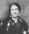
Rookes 1853
edit-

-
 Remove minor line I noted


Article(s): Grace Kamaikui, Queen Emma of Hawaii, Thomas Charles Byde Rooke
Request: Clean up either from the pdf or this current version which is originally from here... KAVEBEAR (talk) 03:25, 20 October 2011 (UTC)
Graphist opinion(s):
- On No. 1: Either I'm missing something trivial, or they downscaled pdfs at the server - I had better resolution previously (but deleted the pdf on my PC). They also disable wayback machine for the server. Materialscientist (talk) 11:26, 20 October 2011 (UTC)
- What?--KAVEBEAR (talk) 22:02, 21 October 2011 (UTC)
- At some point, you've asked to tidy the individual crops of the group shown on the left, and I reuploaded/recropped them from the source, because your uploads were too pixelated. I asked about the group photo, got no reply, and deleted the pdf on my PC. Yesterday I went to the source and found that the pdf resolution apparently became lower (if I'm not glitching). I couldn't scan for old copies with the wayback machine because ulukau.org disallows that. I normally hesitate working on a low-res copy knowing that there are better options somewhere on the web. Materialscientist (talk) 05:11, 22 October 2011 (UTC)
- Oh that's too bad then. I'm still not sure what mean with the wayback machine and all... Could you just tidy the minor streak that is noted on the second image then?--KAVEBEAR (talk) 22:45, 23 October 2011 (UTC)
- At some point, you've asked to tidy the individual crops of the group shown on the left, and I reuploaded/recropped them from the source, because your uploads were too pixelated. I asked about the group photo, got no reply, and deleted the pdf on my PC. Yesterday I went to the source and found that the pdf resolution apparently became lower (if I'm not glitching). I couldn't scan for old copies with the wayback machine because ulukau.org disallows that. I normally hesitate working on a low-res copy knowing that there are better options somewhere on the web. Materialscientist (talk) 05:11, 22 October 2011 (UTC)
- What?--KAVEBEAR (talk) 22:02, 21 October 2011 (UTC)
Retouch map
edit
Article(s):
Request: Replace name of "Libyan Arab Jamahiriya" in the upper left box and below again on the world map into a simple "Libya". Gryffindor (talk) 15:10, 25 October 2011 (UTC)
Graphist opinion(s):
That file has no source or author info. Suggest fixing that first. JBarta (talk) 23:43, 25 October 2011 (UTC)
Randy Johnson
edit-
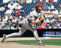 Image of the Big Unit

Article(s): Randy Johnson
Request: Is there a way to reduce the shadow in this picture? – Muboshgu (talk) 03:16, 18 October 2011 (UTC)
Graphist opinion:
- Which shadow, and why? Materialscientist (talk) 03:54, 18 October 2011 (UTC)
- Mainly the shadow under the brim of his hat that obscures his eyes. If anything could be done to reduce the shadow on his legs, I think that would benefit as well. As to why, Randy Johnson is one of the all time greats, and as you can see on the file's description page, this image is used on a lot of pages that talk about his impact on the game. Further, although I'm only starting to read into it, I wonder if reducing the shadow would make this a featured picture candidate. – Muboshgu (talk) 13:39, 18 October 2011 (UTC)
- I think this picture is fine just the way it is. Messing with the shadows won't improve anything and might make the photo look a little funky & unnatural. Sometimes leaving an image alone is the wisest choice. This is one of those times. JBarta (talk) 19:57, 20 October 2011 (UTC)
- I forgot about this one and quickly tried to lighten the face. Noise is horrible and thus as Jbarta said, the gain would be marginal, at significant effort (further brightening requires facial reconstruction from a separate face-profile photo - the eye area details are just absent). I saved my edit, partly to add jpeg compression (it was zero), and thus the file loads faster, but feel free to revert. Materialscientist (talk) 07:34, 24 October 2011 (UTC)
- The full file size doesn't affect how fast an image loads in an article. Thumbnails are generated which are separate smaller versions of the main file. It is these smaller versions that appear in the article, not the 4MB full size original. Even the image page itself (the page you get when you click on a thumbnail) uses a large thumnail (for large images) rather than the original image. And if by chance someone continues clicking through to grab that original image, with broadband connections being the norm rather than the exception, a 4MB file will come in mere seconds. JBarta (talk) 17:58, 26 October 2011 (UTC)
- All true, but. When I want to see a large WP file (like this one) our firewall software (rather common soft from McAfee) does not allow showing the image but saves it instead. Also, wikipedia servers connection is often slow these months (this affects image down/upload). Materialscientist (talk) 22:47, 26 October 2011 (UTC)
- Wikipedia does have peak load times like any other web site. That's immaterial. And if your firewall software save jpgs over a certain size rather than simply displaying them in the browser, I'd imaging that's something you can change or configure. In my experience that is not normal behavior and a 4MB jpg is hardly an unusual or rare occurance. 40MB maybe, but not 4MB. JBarta (talk) 23:09, 26 October 2011 (UTC)
- That's not a local firewall, and this is a recent worldwide tendency, setting filters (they start from adult site filtering and then configure other "user-assisting" settings) going up to country levels. Our limit is around 1Mb (yeah, ridiculous), but it is floating. Materialscientist (talk) 23:21, 26 October 2011 (UTC)
- You say "our limit".... who is "our"? JBarta (talk) 00:57, 27 October 2011 (UTC)
- That's not a local firewall, and this is a recent worldwide tendency, setting filters (they start from adult site filtering and then configure other "user-assisting" settings) going up to country levels. Our limit is around 1Mb (yeah, ridiculous), but it is floating. Materialscientist (talk) 23:21, 26 October 2011 (UTC)
- Wikipedia does have peak load times like any other web site. That's immaterial. And if your firewall software save jpgs over a certain size rather than simply displaying them in the browser, I'd imaging that's something you can change or configure. In my experience that is not normal behavior and a 4MB jpg is hardly an unusual or rare occurance. 40MB maybe, but not 4MB. JBarta (talk) 23:09, 26 October 2011 (UTC)
- All true, but. When I want to see a large WP file (like this one) our firewall software (rather common soft from McAfee) does not allow showing the image but saves it instead. Also, wikipedia servers connection is often slow these months (this affects image down/upload). Materialscientist (talk) 22:47, 26 October 2011 (UTC)
- The full file size doesn't affect how fast an image loads in an article. Thumbnails are generated which are separate smaller versions of the main file. It is these smaller versions that appear in the article, not the 4MB full size original. Even the image page itself (the page you get when you click on a thumbnail) uses a large thumnail (for large images) rather than the original image. And if by chance someone continues clicking through to grab that original image, with broadband connections being the norm rather than the exception, a 4MB file will come in mere seconds. JBarta (talk) 17:58, 26 October 2011 (UTC)
- I forgot about this one and quickly tried to lighten the face. Noise is horrible and thus as Jbarta said, the gain would be marginal, at significant effort (further brightening requires facial reconstruction from a separate face-profile photo - the eye area details are just absent). I saved my edit, partly to add jpeg compression (it was zero), and thus the file loads faster, but feel free to revert. Materialscientist (talk) 07:34, 24 October 2011 (UTC)
- I think this picture is fine just the way it is. Messing with the shadows won't improve anything and might make the photo look a little funky & unnatural. Sometimes leaving an image alone is the wisest choice. This is one of those times. JBarta (talk) 19:57, 20 October 2011 (UTC)
- Mainly the shadow under the brim of his hat that obscures his eyes. If anything could be done to reduce the shadow on his legs, I think that would benefit as well. As to why, Randy Johnson is one of the all time greats, and as you can see on the file's description page, this image is used on a lot of pages that talk about his impact on the game. Further, although I'm only starting to read into it, I wonder if reducing the shadow would make this a featured picture candidate. – Muboshgu (talk) 13:39, 18 October 2011 (UTC)
Signature clean up
editArticle(s): Kekāuluohi
Request: Clean up these signatures... KAVEBEAR (talk) 00:30, 30 October 2011 (UTC)
Graphist opinion(s):
Cedar Walton
edit
Article(s): 12 Songs of Christmas (Etta James album), Blue Gardenia (album), Cedar Walton
Request: Is there a way to reduce the noise in this picture? I was asked to make this request during my good article nomination of the Blue Gardenia article. This image is currently used in three articles. Thank you for any assistance. --Another Believer (Talk) 15:05, 1 November 2011 (UTC)
Once an image file has noise introduced into it, you basically have two choices... noisy or blurry. The most common method for "fixing" a grainy image is to apply some manner of smoothing filter to it. Noise is smoothed away (more or less), but now it's blurry. Personally I don't think that's an improvement so you won't find me doing it much. It's like painting a face on a horses ass. It's still a horses ass... only now it looks like someone tried to paint a face on it. So my advice is to either deal with the grainy photo... or look for a better one. JBarta (talk) 16:35, 1 November 2011 (UTC)
- Ok, thanks. Just thought I would ask. --Another Believer (Talk) 23:39, 1 November 2011 (UTC)
Chaning Pictures on Aafia Siddiqui's Article
edit-
This is a photo with her hair covered.
-
Another photo with her hair covered. (In Islam the hair must be covered, so showing photos of her hair uncovered is not good)
Article(s): Aafia Siddiqui
Request: Replace the Images with Aafia Siddiqui's hair uncovered with these hair-covered pictures please... 99.6.148.87 (talk) 15:11, 5 November 2011 (UTC)
Graphist opinion(s):
This request is probably better directed here. Good luck. JBarta (talk) 18:10, 5 November 2011 (UTC)
Coins of the Hawaiian dollar
editArticle(s): Coins of the Hawaiian dollar, Hawaiian dollar
Request: Can someone upload most of these images in these two articles onto the common? KAVEBEAR (talk) 02:12, 2 November 2011 (UTC)
Graphist opinion(s):
Well, the license on those is awfully sketchy; unless you can prove that they're definitively free-use and not fair use (and since they were taken from an outside source, free use is not entirely likely because the photographer has copyright even though the coins themselves are PD-1923) I'm not touching them. But if you think they're okay, then get a TUSC account and use Commonshelper. Pi.1415926535 (talk) 02:00, 23 November 2011 (UTC)
Resolved
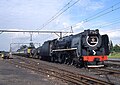
editSAR Class 18 (2-10-2)
edit-
 SAR Class 18
.jpg)
Article(s): South African Class 18 2-10-2
Request: Remove inscription please. André Kritzinger (talk) 14:18, 30 October 2011 (UTC)
Graphist opinion(s):
![]() Done: JBarta (talk) 15:01, 30 October 2011 (UTC)
Done: JBarta (talk) 15:01, 30 October 2011 (UTC)
- Thank you! André Kritzinger (talk) 15:22, 30 October 2011 (UTC)
White placard
edit
Article(s): Manipuri dance
Request: Please remove the white placard hanging on the upper part and make black just like the background. Gryffindor (talk) 07:38, 25 October 2011 (UTC)
Graphist opinion(s):
Indonesian minister
edit-
 Indonesian Minister of Justice and Human Rights Amir Syamsuddin

Article(s): Amir Syamsuddin
Request: Remove boom (microphone) Crisco 1492 (talk) 07:38, 1 November 2011 (UTC)
Graphist opinion(s):
![]() Done: JBarta (talk) 12:03, 1 November 2011 (UTC)
Done: JBarta (talk) 12:03, 1 November 2011 (UTC)
- Awesome! Great work, as usual Crisco 1492 (talk) 12:46, 1 November 2011 (UTC)
From dark haired to blond
edit-

-
 As a blonde
 -
 Pi's serious attempt

.jpg)

Article(s): Princess Maria Amélia of Brazil
Request: This is Princess Maria Amélia, sister of Emperor Pedro II of Brazil. She was blond haired, but for some reason, perhaps the low quality of the scan, she looks dark haired in this painting. Does someone would like to try out if she could indeed look blond? Lecen (talk) 19:37, 18 October 2011 (UTC)
Graphist opinion(s):
![]() Done: JBarta (talk) 20:21, 18 October 2011 (UTC)
Done: JBarta (talk) 20:21, 18 October 2011 (UTC)
- It would look great nowadays, but not in the middle of the 19th century... --Lecen (talk) 20:43, 18 October 2011 (UTC)
 I think JBarta was attempting to point out the somewhat ridiculous nature of the request; she's brunette in the painting not because of the scan quality, but because the artist painted her that way. As to why, you will need to take it up with one Mr. Friedrich Dürck. Maybe she dyed her hair prior to sitting for the portrait. -MissMJ (talk) 21:11, 18 October 2011 (UTC)
- Here's my serious attempt. Not quite realistic, but a try. Entertaining, anyway. Pi.1415926535 (talk) 21:13, 18 October 2011 (UTC)
- Okay, then. Thank you all. Pi.1415926535, I appreciate your eagerness to help. Regards, --Lecen (talk) 21:15, 18 October 2011 (UTC)
- Here's my serious attempt. Not quite realistic, but a try. Entertaining, anyway. Pi.1415926535 (talk) 21:13, 18 October 2011 (UTC)
- I was struck by how much younger she looks with the new hairstyle. And "ridiculous" is a little strong. I'd say "innocently misguided". Another thing to consider is that "blond" is often used to describe hair that looks downright brown. JBarta (talk) 21:44, 18 October 2011 (UTC)
- As I recall, in Latin world "blond" often refers to any natural hair color which is not black. Kind of bichromatic classification. :-) Materialscientist (talk) 05:55, 21 October 2011 (UTC)
- Indeed. My version ended up with rather yellow hair. I know there are Photoshop tools that do impressive things with hair color, but it's probably best to simply keep the original here. Pi.1415926535 (talk) 22:18, 18 October 2011 (UTC)
- I was struck by how much younger she looks with the new hairstyle. And "ridiculous" is a little strong. I'd say "innocently misguided". Another thing to consider is that "blond" is often used to describe hair that looks downright brown. JBarta (talk) 21:44, 18 October 2011 (UTC)
- "My old man used to say, before he left this shitty world"... a tool is only as good as the idiot behind it. JBarta (talk) 13:43, 19 October 2011 (UTC)
- And in this case, a clueless Pi with GIMP nets you bright yellow hair! Pi.1415926535 (talk) 15:47, 19 October 2011 (UTC)
Nick Pickard and Chris Fountain
edit-
 Nick Pickard
 -
 Chris Fountain Done


Article(s): Nick Pickard, Chris Fountain
Request: Could these images of British actors Nick Pickard and Chris Fountain have the girl cropped out of them and as close a fit to a infobox as possible. Thanks.D4nnyw14 (talk) 16:24, 19 October 2011 (UTC)
Damn, this chick gets around... JBarta (talk) 17:46, 19 October 2011 (UTC)
Did Chris Fountain. The other (to do well) requires more time and talent than I possess. JBarta (talk) 18:02, 19 October 2011 (UTC)
- Thanks and she does a bit :P D4nnyw14 (talk) 11:51, 20 October 2011 (UTC)
Photo debris removal
edit-
 Photo 1
 -
 Photo 2


Article(s): Interstate 135
Request: If possible please clean up/remove the debris from the windshield. Also note that Photo 1 has graffiti on the sign on the left, so that should be left during cleanup. Thanks in advance, Ks0stm (T•C•G•E) 23:03, 4 October 2011 (UTC)
Graphist opinion(s):
This spot is for opinions, so I'll let one fly. I passed on this last time because it's a moderate amount of work for basically zero benefit. They are highway signs... nothing special. Cleaning all the rain drops doesn't markedly improve them or increase their encyclopedic value. JBarta (talk) 00:17, 21 October 2011 (UTC)
- Done Although JBarta has a point, I took this on to flex my stamp-tool muscle (if such an expression makes sense). I've overwritten the files with the new versions. Cheers! -- Orionist ★ talk 16:46, 2 November 2011 (UTC)
Taj Mahal—vanishing point and rule of thirds cropping
edit-
 Taj Mahal in Agra.
 -
 cropped & centered


Article(s): Taj Mahal
Request: Please see this comment. I'm wondering if a new cropped version of this image—at a difference filename, perhaps "Taj Mahal, Agra, India edit3.jpg"—could lop off enough of the sky and sides so that the image obeys the rule of thirds and adheres to classical Renaissance proportioning WRT positioning of the vanishing point. The framing of the end result could more resemble that in ![]() , so that the Taj itself does not look somewhat distant and lost in thumbnail view. Any other colour/miscellaneous fixes welcome. Saravask 14:42, 22 October 2011 (UTC)
, so that the Taj itself does not look somewhat distant and lost in thumbnail view. Any other colour/miscellaneous fixes welcome. Saravask 14:42, 22 October 2011 (UTC)
Graphist opinion(s):
![]() Done: Doesn't quite follow the "rule of thirds", but it's now centered and has a more visually appealing crop. Beautiful photo by the way. JBarta (talk) 16:57, 22 October 2011 (UTC)
Done: Doesn't quite follow the "rule of thirds", but it's now centered and has a more visually appealing crop. Beautiful photo by the way. JBarta (talk) 16:57, 22 October 2011 (UTC)
- Thanks again, Jbarta. If we at Talk:India end up switching to anything based on
 (which, going off how the discussion is trending so far, looks likely), I'll try to have the "edit3" be it. I'm assuming you didn't trim more sky for aesthetic reasons, which is fine. The "edit3" looks great as is. Saravask 13:09, 23 October 2011 (UTC)
- One of my favorite quotes is "Rules are for when the brains gives out." If we followed the rule of thirds exactly, we would have lopped off the top of the main dome. If we bent the rules and used the main platform of the structure as the horizon, the photo would still be cropped right at the top of the main spire. Personally I don't think that would look so hot. So we fiddle and adjust and come up with something that looks generally pleasing... not too high, not too low, not to far and not too near. And exactly centered, which I believe makes a big difference. This was the result. (The photo was already rotated to perfectly level and was taken from the precise center of the scene... that makes a big aesthetic difference as well.) JBarta (talk) 18:04, 23 October 2011 (UTC)
Cleanup
edit-
 Gabe Paul

Article(s): Gabe Paul
Request: I think the compression is somewhat off, as I took this from a PD movie and the whole image seems a bit squished. Also, if the image could be lightened a little (although not so much that it looks really artificial) that would be great. Thanks. Delaywaves talk 22:04, 24 October 2011 (UTC)
Graphist opinion(s):
![]() Done: JBarta (talk) 00:25, 25 October 2011 (UTC)
Done: JBarta (talk) 00:25, 25 October 2011 (UTC)
Remove timestamp
edit-
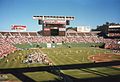 Jack Murphy Stadium 1987

Article(s): Qualcomm Stadium
Request: Please remove the timestamp at the bottom-right corner of the image. Delaywaves talk 16:01, 29 October 2011 (UTC)
Graphist opinion(s):
![]() Done: JBarta (talk) 22:39, 29 October 2011 (UTC)
Done: JBarta (talk) 22:39, 29 October 2011 (UTC)
Pls Remove Watermark
edit-
 The Batasia Loop
Article(s): Indian Railways , Darjeeling, Darjeeling Himalayan Railway, Northeast Frontier Railway Zone (India)
Request: please remove the watermark, i don't know will the license he selected allow so..... Rahulpattuvam talk 14:41, 30 October 2011 (UTC)
Graphist opinion(s):
![]() Done: JBarta (talk) 15:06, 30 October 2011 (UTC)
Done: JBarta (talk) 15:06, 30 October 2011 (UTC)
Kain O'Keeffe, Jessica Tovey, Kate Ritchie, Demi Harman
edit-
 Kain O'Keeffe
 -

-
 Jessica Tovey
 -
-
 Kate Ritchie
 -

-
 Demi Harman
 -


Article(s): Kain O'Keeffe, Jessica Tovey, Kate Ritchie and Demi Harman
Request: From the first one can you crop Kain, the second can you crop Jessica, the third can you crop Kate - can you make them asif they were going to be used in an info box, so they are square and focus on the faces. The same with Demi, she needs the focus bringing on her upper half of her body and a lot of the crow and person infront of her cutting. RaintheOne BAM 01:20, 2 November 2011 (UTC)
Graphist opinion(s):
- Done. These are quick cuts, thus corrections and suggestions are welcome. Materialscientist (talk) 02:15, 2 November 2011 (UTC)
- Thankyou again, they are okay, much prefer the second crop of Demi. :)RaintheOne BAM 11:33, 2 November 2011 (UTC)
Kānāwai Māmalahoe
edit
Article(s): Kānāwai Māmalahoe
Request: Crop. KAVEBEAR (talk) 06:46, 2 November 2011 (UTC)
Graphist opinion(s):
Emperor Pedro I of Brazil
edit-
 Emperor Pedro I of Brazil

Article(s): Pedro I of Brazil
Request: Please, first, remove all text from the painting. Second, remove the vertical line to left of the picture. Third, remove the 2 "holes" near his ear. Fourth, could something be done about the background to make it easier to distingish his hair like in this variant? Fourth, fix anything else you might notice. Thank you very, very much, Lecen (talk) 17:51, 2 November 2011 (UTC)
Graphist opinion(s):
You do realize that article already contains four portraits of the (adult) Pedro? How many more does the article need? By the way, while the text can be removed fairly easily, getting the hair to stand out more would take more than simple manipulation. The color difference between the hair and the background is just too slight. JBarta (talk) 23:41, 2 November 2011 (UTC)
- Hi, Jbarta. I'm going to replace the painting in the infobox with this one. I will also start improving and expanding the article as I done with others relate dto Brazilian imperial history. About the improvements in the painting itself, whatever is too hard to be done, then ignore it. Don't worry about it. Regards, --Lecen (talk) 00:10, 3 November 2011 (UTC)
- Fair enough. I uploaded two edits, the first simply removing the text. The second attempting to enhance the image (unfortunately this is not a very good image to start with). The enhancement is questionable, but I think it's a slight improvement. If you feel the same, fine. If not, just revert it back to the cleaned version. JBarta (talk) 01:34, 3 November 2011 (UTC)
- You did just great, Jbarta. Its looks wonderful. Far better than I hoped. Thank you very much! You were very helpful as always! Kind regards, --Lecen (talk) 02:12, 3 November 2011 (UTC)
- Blessed are the people who are easy to please.... JBarta (talk) 03:51, 3 November 2011 (UTC)
- You did just great, Jbarta. Its looks wonderful. Far better than I hoped. Thank you very much! You were very helpful as always! Kind regards, --Lecen (talk) 02:12, 3 November 2011 (UTC)
- Fair enough. I uploaded two edits, the first simply removing the text. The second attempting to enhance the image (unfortunately this is not a very good image to start with). The enhancement is questionable, but I think it's a slight improvement. If you feel the same, fine. If not, just revert it back to the cleaned version. JBarta (talk) 01:34, 3 November 2011 (UTC)
Image of Antioch
edit-
 Abraham Ortelius's view of Antioch
 -


Article(s): Antioch
Request: Remove crease Crisco 1492 (talk) 16:05, 2 November 2011 (UTC)
Graphist opinion(s):
- Done + uploaded another version, maybe it needs tweaking for levels. Materialscientist (talk) 06:24, 3 November 2011 (UTC)
- Perhaps. I do not know what the original colours were. Crisco 1492 (talk) 23:26, 3 November 2011 (UTC)
Centering crop and turn black and white
edit

Article(s): Albert Kamehameha
Request: Centering crop and turn black and white... KAVEBEAR (talk) 01:13, 3 November 2011 (UTC)
Graphist opinion(s):
Lahaina and Coronation
edit-
-
 There are two other versions in the file history, pick the best one and clean that one up

.jpg)
Article(s): Lahaina, Coronations in Oceania
Request: Clean up... KAVEBEAR (talk) 02:14, 2 November 2011 (UTC)
Graphist opinion(s):
- Done. Materialscientist (talk) 07:14, 3 November 2011 (UTC)
- Anyway to remove the creasings on the first image?--KAVEBEAR (talk) 20:43, 5 November 2011 (UTC)
- If you mean the sky, I tried, but there is not much I can do with my skills and time available. Materialscientist (talk) 09:13, 6 November 2011 (UTC)
- Anyway to remove the creasings on the first image?--KAVEBEAR (talk) 20:43, 5 November 2011 (UTC)
Clean up images
edit-
 Clean up, crop some more and turn black and white
 -
 Clean up and remove wave patterns
 -
 Clean up and remove noise


Article(s): Rainilaiarivony, William DeWitt Alexander, Keoni Ana, Queen Emma of Hawaii, Hānaiakamālama
Request: Clean up. Thanks.. KAVEBEAR (talk) 23:44, 5 November 2011 (UTC)
Graphist opinion(s):
- Done. The last one is tricky. Materialscientist (talk) 08:59, 6 November 2011 (UTC)
Pacific Southwest Airlines Flight 1771
edit
Article(s): Pacific Southwest Airlines Flight 1771
Request: straighten back to horizontal, this is *not* a picture prior to the crash, and it is unencyclopedic and in poor taste to have it appear thus... Kintetsubuffalo (talk) 12:07, 6 November 2011 (UTC)
Graphist opinion(s):
- Done. Materialscientist (talk) 12:30, 6 November 2011 (UTC)
- That was fast, thank you!--Kintetsubuffalo (talk) 14:20, 6 November 2011 (UTC)
CurtisNeeley
editArticle(s): Brazil
Request: Do something with them...
Graphist opinion(s):
Please remove the personal username CurtisNeeley from the file history of
http://en.wikipedia.org/wiki/File:Figurenude_by_CN_Foundation_2005.jpg
I have sued GOOG for returning this nude image (and others) in image searches by minors in school for my name. The "CN Foundation" attribution is preferred but GOOG still displays this image due to the CurtisNeeley username in the file history. This case is fully briefed and before an Eighth Circuit Panel of judges to be ignored or redefine copyrite for the United States.
I am trying to remove all rational for returning nudity for my name to my children and others while at school in any way I can. CurtisNeeley (talk) 22:43, 6 November 2011 (UTC)
- This is nothing that can be done from here; Firstmost the image is on commons, and second, such request I think only the tech can handle. →AzaToth 22:57, 6 November 2011 (UTC)
- I deleted the first upload, then restore the information and had it uploaded under a different name. User:Zscout370 (Return Fire) 23:05, 6 November 2011 (UTC)
- Thank you very much.CurtisNeeley (talk) 23:31, 6 November 2011 (UTC)
Kaiulani, Rainivoninahitriniony
edit-
 Crop away caption and sides
 -
 Turn black and white
 -
 Turn black and white
 -
 Turn black and white
 -
 Just remove hole, nothing more
 -
 Oval crop
 -
 Oval crop
 -
 Determine which one is better and edit the one that is


.jpg)


.jpg)
Article(s): Rainivoninahitriniony, Liliuokalani, Walter M. Gibson, Kaʻiulani, Necker Island (Northwestern Hawaiian Islands), Queen Emma of Hawaii
Request: Do something with them... KAVEBEAR (talk) 16:30, 6 November 2011 (UTC)
Graphist opinion(s):
- Done. I chose the last one. Materialscientist (talk) 08:07, 7 November 2011 (UTC)
- Can you use this version for the image on Gibson for resolution purposes?--KAVEBEAR (talk) 08:02, 7 November 2011 (UTC)
Choris and Hula
edit


,_Temple_du_Roi_dans_la_baie_Tiritat%C3%A9a_(c._1816,_published_1822).jpg)

.jpg)

Article(s): Louis Choris, Hula
Request: Crop but leave the captions and plate number. Thanks.. KAVEBEAR (talk) 20:15, 6 November 2011 (UTC)
Graphist opinion(s):
- Why keeping unreadable text? It will be preserved in the old image version and can be typed in the image caption. Materialscientist (talk) 07:08, 7 November 2011 (UTC)
- I guess.--KAVEBEAR (talk) 08:03, 7 November 2011 (UTC)
- Anything?--KAVEBEAR (talk) 15:50, 7 November 2011 (UTC)
- I'm not sure what "I guess" means above. Materialscientist (talk) 23:28, 7 November 2011 (UTC)
- A reluctant okay. :)--KAVEBEAR (talk) 23:34, 7 November 2011 (UTC)
- Could you not crop that much on the second to the last image and leave some more space? It seems to be too close of a crop--KAVEBEAR (talk) 00:33, 8 November 2011 (UTC)
- Done. Yes, that crop was a bit too tight. Materialscientist (talk) 00:53, 8 November 2011 (UTC)
- Could you not crop that much on the second to the last image and leave some more space? It seems to be too close of a crop--KAVEBEAR (talk) 00:33, 8 November 2011 (UTC)
- A reluctant okay. :)--KAVEBEAR (talk) 23:34, 7 November 2011 (UTC)
- I'm not sure what "I guess" means above. Materialscientist (talk) 23:28, 7 November 2011 (UTC)
- Anything?--KAVEBEAR (talk) 15:50, 7 November 2011 (UTC)
- I guess.--KAVEBEAR (talk) 08:03, 7 November 2011 (UTC)
Captain Cook
edit
Article(s): James Cook
Request: Can you crop away the frame and upload this one to the common de:Datei:Elisabeth Cook.jpg? . KAVEBEAR (talk) 04:28, 7 November 2011 (UTC)
Graphist opinion(s):
- Done both. Materialscientist (talk) 07:04, 7 November 2011 (UTC)
Here, lizard lizard lizard
edit
Article(s): El Hierro Giant Lizard
Request: Remove the reflection, and crop the image to focus on the lizard Crisco 1492 (talk) 09:22, 7 November 2011 (UTC)
Graphist opinion(s):
- Done. I took an easy way and tweaked the wall instead. I didn't crop the details on the left and right because they seem quite useful. Do you need a DYK mugshot (i.e. 100x100 px image)? Materialscientist (talk) 09:56, 7 November 2011 (UTC)
- For once no, actually. I was thinking that this would be a better infobox picture than the current one. Looks great! Crisco 1492 (talk) 10:41, 7 November 2011 (UTC)
Margot Robbie
edit-
 Margot Robbie at the 2011 Logie Awards
 -
 Done
Done

.jpg)
Article(s): Margot Robbie
Request: Please can you make a seperate crop of this image please. Focusing on the upper half of her body to her head. She is also quite off center here. I'd like to use it in another article where I'd like the portion to be better.RaintheOne BAM 00:53, 9 November 2011 (UTC)
Graphist opinion(s):
Dust and watermark
edit-
 25NC3422 Done
 -
 25NC 3410 Done
 -
 4E E237 Done
.jpg)
_a.jpg)

Article(s):
South African Class 25NC 4-8-4
South African Class 4E
Request: Please remove scanned dust spots and watermark. If the quality of the 4E picture can be improved too, I'll appreciate it. (But I have my doubts....) André Kritzinger (talk) 16:13, 9 November 2011 (UTC)
Graphist opinion(s):
- Thanks! André Kritzinger (talk) 18:09, 9 November 2011 (UTC)
Teapot
editArticle(s): Palace Hotel, San Francisco
Request: Requesting that the text be removed and a reasonable amount of space around the image be maintained. Because of the text removal, the background would either need to be restored, or replaced entirely. I believe the background is already not original to the photo, so your call, I suppose. Thanks! SchuminWeb (Talk) 04:57, 8 November 2011 (UTC)
Graphist opinion(s):
![]() Done: Left the red background... thought it looked rather nice. A simple single color would probably be more encyclopedic, but who says we can't be stylish from time to time? Also, the original image had a "shadow" (probably photoshopped). Reproducing such a digital shadow, while possible, is not something I can do with any competence... so I didn't try. JBarta (talk) 22:13, 8 November 2011 (UTC)
Done: Left the red background... thought it looked rather nice. A simple single color would probably be more encyclopedic, but who says we can't be stylish from time to time? Also, the original image had a "shadow" (probably photoshopped). Reproducing such a digital shadow, while possible, is not something I can do with any competence... so I didn't try. JBarta (talk) 22:13, 8 November 2011 (UTC)
- Looks wonderful! Thanks much! SchuminWeb (Talk) 22:17, 8 November 2011 (UTC)
- I have restored my original illustration which contains text that identifies what it is and why it is significant. SchuminWeb, having someone alter an image to materially change its meaning -- especially doing so "behind the back" of its creator and original uploader -- is totally unacceptable behavior and again shows an apparent lack of understanding of how WP is meant to operate as a community, not a fiefdom. If you had some issue or question about this illustration (not "photo"), you knew perfectly well that I created it as you had just moved it to Commons (along with many of my other images) and also how to get in touch with me. Centpacrr (talk) 23:09, 8 November 2011 (UTC)
- Working through some WP:OWN issues, Centpacrr? SchuminWeb (Talk) 02:50, 9 November 2011 (UTC)
- Centpacrr, I understand why you would put the descriptive text in the image. Your intention is good. However, it is preferred that any descriptive text go into an image caption or the image description page rather than the image itself. This is for a few reasons... it makes it easy to translate that description into multiple languages, it makes the text available to search engines, it makes the description easier to change or update, etc, etc. Given those considerations, I think you'll agree that text based, rather than image based descriptions are the way to go. By all means, add pertinent information to the image description page. It would also be helpful to add a few categories to the description page as well. This way the image gets grouped with similar or related images. JBarta (talk) 03:11, 9 November 2011 (UTC)
- I think SchuminWeb sees it as a teapot, and Centpacrr as a poster. Centpacrr is the uploader. As an admin here SchuminWeb could show an example of tolerance and collaboration. Proposal: JBarta can upload his version as a derivative on Commons, and SchuminWeb can revert himself. I think we shall all benefit from this. Peace. Materialscientist (talk) 03:20, 9 November 2011 (UTC)
- Centpacrr, I understand why you would put the descriptive text in the image. Your intention is good. However, it is preferred that any descriptive text go into an image caption or the image description page rather than the image itself. This is for a few reasons... it makes it easy to translate that description into multiple languages, it makes the text available to search engines, it makes the description easier to change or update, etc, etc. Given those considerations, I think you'll agree that text based, rather than image based descriptions are the way to go. By all means, add pertinent information to the image description page. It would also be helpful to add a few categories to the description page as well. This way the image gets grouped with similar or related images. JBarta (talk) 03:11, 9 November 2011 (UTC)
- My issue here is that this materially changes the illustration by deleting text that identifies the teapot as being from the original Palace Hotel and thereby obscuring its meaning and significance as being a very rare "survivor" of the 1906 San Francisco earthquake and fire which destroyed the 1875 Palace. This is not a matter of WP:OWN, but instead restoring what, as its creator, I consider to be an essential part of the overall illustration (as opposed to a "photo") which identifies what it is if and when it is used outside of Wikipedia. I might add that significant changes were also made to the artistic elements of the illustration by altering the background which have nothing to do with the text. What I also object to is the way that SchuminWeb went about this. He knows perfectly well who created the illustration, but instead of contacting me with whatever concern he may have had he instead went behind my back and had it modified without having any idea of why it was the the way it was. It is arbitrary and unilateral behavior like this that eventually drives editors away from contributing to WP as being not worth the aggravation. Centpacrr (talk) 03:37, 9 November 2011 (UTC)
- Centpacrr, you're hanging on to the notion that descriptive text ought to be in this image. It's really not a useful thing to hang onto. And how someone might use an image outside of Wikipedia has no bearing on how images should be used inside Wikipedia. Also, you mention "artistic elements" outside of the text. I assume you mean the shadows, etc. It would be supremely useful if you would recreate that image with those artistic elements, but leave out the descriptive text. That certainly would be better than my edit. That combined with your description on the image description page (and adding categories) would be very useful, completely in line with WP policies and certainly wouldn't be objected to by anyone. JBarta (talk) 04:07, 9 November 2011 (UTC)
- Centpacrr, if you license your images under a free license, we do not need your permission to modify files that you have uploaded. Remember the old line in the edit box: "If you do not want your writing to be edited mercilessly and redistributed at will, then do not submit it here." If you don't like others making modifications to images you have uploaded per the free license you have released them under, you are more than welcome to upload your images to Flickr under an all-rights-reserved or otherwise more restrictive license rather than here. SchuminWeb (Talk) 06:39, 9 November 2011 (UTC)
- The objection I had was that the way the illustration was altered changed its meaning. I have now created a new version that illustrates the teapot as well as the original Palace Hotel's crest (which also appears on the teapot) and logotype, and added that information to the file's host page. In the future if you have some issue with one of my illustrations then please have the courtesy to contact me with your concerns instead of seeking to have someone else alter it without my knowledge and without knowing why it was created the way it was and thus changing its meaning as you did in this case. Centpacrr (talk) 19:26, 9 November 2011 (UTC)
- You really do need to work through your issues with WP:OWN, because no one needs either to seek or receive your permission to modify the images, and your addition of unencyclopedic material is quickly becoming disruptive. So stop it already. If you do not want your writing to be edited mercilessly and redistributed at will, then do not submit it here. SchuminWeb (Talk) 21:54, 9 November 2011 (UTC)
- Apparently you have not read either this illustration's description on the file's host page or its caption in the gallery. This new illustration is meant to show three things, not just one. It illustrates: 1) the "crest" of the original Palace Hotel; 2) the logotype the original hotel used, and; 3) the individual silver service teapot from the original Palace Hotel. This is not an "unencyclopedic" illustration as all three of these elements could legitimately have their own separate illustrations in the gallery, but as they are related I have combined them in a single illustration. With respect, sir, it is your constant interference in this matter that has become "disruptive" editing, and your behavior towards both me and other editors constitutes exactly the kind harassment that drives good contributors away from the project. This is not only unacceptable when practiced by regular editors, but is especially egregious and oppressive when it comes from an Admin. Remember that WP Admins are the servants of WP's editors - not their masters - and as such they are held to a higher standard of accountability because of the powers they have been entrusted with by the community." Centpacrr (talk) 23:23, 9 November 2011 (UTC)
- You know, I was happy to get out of this, but I'll jump back in because I'm getting a little irritated with your ridiculous thrashing about. Let's be perfectly clear and honest here. Based on your image of the teapot and keys and your little advertisment on the description page (Original digital illustration created by User:Centpacrr (DigitalImageServices.com)) it seems to me that your intent (in this instance) is not only to provide encyclopedic content, but also to advertise your graphic talents for either gain or ego. And throwing a fit suggesting you might take your ball and go home if other editors don't play by your rules is a whine older than the hills. It doesn't do you any service. I implore you as a fellow editor to hold yourself to a higher standard and knock it off already. Just upload purely encyclopedic images and leave the artistic showcasing to your own web site. JBarta (talk) 00:20, 10 November 2011 (UTC)
- I agree that adding that link was overtop and removed it. Materialscientist (talk) 00:36, 10 November 2011 (UTC)
- While we're arguing this, perhaps someone would care to explain how this is not a derivative work of two copyright images taken from this website, or even wholely lifted from this? Crisco 1492 (talk) 00:57, 10 November 2011 (UTC)
- I agree that adding that link was overtop and removed it. Materialscientist (talk) 00:36, 10 November 2011 (UTC)
- You know, I was happy to get out of this, but I'll jump back in because I'm getting a little irritated with your ridiculous thrashing about. Let's be perfectly clear and honest here. Based on your image of the teapot and keys and your little advertisment on the description page (Original digital illustration created by User:Centpacrr (DigitalImageServices.com)) it seems to me that your intent (in this instance) is not only to provide encyclopedic content, but also to advertise your graphic talents for either gain or ego. And throwing a fit suggesting you might take your ball and go home if other editors don't play by your rules is a whine older than the hills. It doesn't do you any service. I implore you as a fellow editor to hold yourself to a higher standard and knock it off already. Just upload purely encyclopedic images and leave the artistic showcasing to your own web site. JBarta (talk) 00:20, 10 November 2011 (UTC)
See above, "ThePalaceHotel.org" is my own website and has been 100% created by myself alone. Centpacrr (talk) 05:21, 10 November 2011 (UTC)
- thepalacehotel.org is owned by Centpacrr. (Do a whois on the web site). Interesting copyright question though. The images may not be his to give. JBarta (talk) 01:17, 10 November 2011 (UTC)
- I personally created all of the illustrations of items (PH teapot, PH keys, CPRR button, etc) from my personal collections that I uploaded them to Wikipedia and did so in order to share them online with others who may be interested as they are not on public display. I also own the domain ThePalaceHotel.org (which is registered to my d/b/a "Cooper-Clement Associates" aka "CCA") which hosts my non-commercial, freely available on-line illustrated history of the Palace Hotel which has been up since 2003 and which currently contains more than 125 historic images and illustration as well as a brief written history of all three Palace Hotels that have been in San Francisco. The purpose that I have built and maintained this free site for more than eight years and at my own expense is also to share the many items about this iconic historic hotel from my private collections which are not otherwise available to the public. Any illustrations that I have uploaded to WP which appear on that (or other non-commercial history sites which I may have permitted to use them) were all created from scratch by me alone and thus I am their copyright holder. Centpacrr (talk) 03:38, 10 November 2011 (UTC)
- I found this which supports my belief that part of your motivation here is to advertise your graphic services. Specifically addressing the teapot and copyright questions, did you take the original photo of the teapot yourself? If not, where did you get it? If you did take it, is the teapot itself part of your collection? The original photo of it? The digital composite of it? JBarta (talk) 03:53, 10 November 2011 (UTC)
As noted elsewhere, DIS is inactive and has not accepted any online business in more than five years. I took all the pictures of the teapot whihc has been in my collection since I acquired it on eBay in 2001. The original illustration was created in 2003 for my ThePalaceHotel.com free online PH history site or more then three years before I ever even heard of Wikipedia. Centpacrr (talk) 07:30, 10 November 2011 (UTC)
- Materialscientist, while the link does appear to violate both WP:LINKSTOAVOID and WP:PROMOTION, you're sidestepping the main issue which is his adding unencyclopedic content to the images, thinly disguised as added encyclopedic content. That's the real problem. In addition, I believe you're adding to the problem by suggesting there is no right or wrong, can't we just get along, and goodness, we don't want to upset this editor because he may pack his bags and deny WP his valuable services. Reading some of his talk page archives, this sort of thing seems to be an ongoing issue with this editor. He has carved out his own little playground on WP and is eager to defend it. I think some of your recent efforts have simply thrown gas on that fire. JBarta (talk) 01:11, 10 November 2011 (UTC)
- Odd how he lists it as coming from the Cooper Collection... If he were to upload higher resolution images, or images that don't seem to be derivative works of online files, the copyright issues would be much clearer. Regarding the teapot, the logo itself should be PD (hotel was founded over 100 years ago). However, the image of the teapot itself must be taken by the photographer; derivative works of PD three dimensional works of art are still propriety to the photographer. Perhaps he owns the copyright to the files recently deleted, but as he does not upload high resolution files and the images are located on copyrighted websites, he has a heavy burden of evidence to show it. Crisco 1492 (talk) 01:30, 10 November 2011 (UTC)
- Materialscientist, while the link does appear to violate both WP:LINKSTOAVOID and WP:PROMOTION, you're sidestepping the main issue which is his adding unencyclopedic content to the images, thinly disguised as added encyclopedic content. That's the real problem. In addition, I believe you're adding to the problem by suggesting there is no right or wrong, can't we just get along, and goodness, we don't want to upset this editor because he may pack his bags and deny WP his valuable services. Reading some of his talk page archives, this sort of thing seems to be an ongoing issue with this editor. He has carved out his own little playground on WP and is eager to defend it. I think some of your recent efforts have simply thrown gas on that fire. JBarta (talk) 01:11, 10 November 2011 (UTC)
I do not upload high resolution versions of my own images and illustrations to WP because I am contributing them for the purpose of web viewing only. I generally upload my own images at roughly 600 to 1,000px wide which is more than adequate for that purpose. I do not freely license high resolution versions to WP (or anywhere else) as I am not interested in having third parties exploit them to make high quality prints for profit.
As for the original teapot photograph from which the crest/logotype/teapot illustration was created, that was also taken be me as were every other image (other then historic PD ones) that I have contributed to WP. Despite the unsupported claims of SchuminWeb, none of my uploads have been derived from the non-free works of others. As for other sites on which my work appears, all of those sites (other than WP) either belong to me, belong to my family, are social networking sites like Facebook, are railroad history photo sites like NE Rail, or the images have been filched from one of my sites without my knowledge or consent. Anything I have contributed to WP, however, has either been in the public domain or I am the owner its copyright. Centpacrr (talk) 05:49, 10 November 2011 (UTC)
- That's fair enough. That settles copyright questions as far as I'm concerned. JBarta (talk) 05:58, 10 November 2011 (UTC)
- It seems Centpacrr is also Mr Cooper of The Cooper Collection. This is stated here. At the risk of being nitpicky, he states the digital image was created by him... not that the photo was taken by him. He states that it's from his "private collection". Is the object itself part of his private collection, or just the "digital image"? He could have lifted the image from God knows where, given it a nice background and called it part of his "Cooper Collection". JBarta (talk) 03:25, 10 November 2011 (UTC)
Just to add information for anyone following this discussion, Centpacrr has uploaded a duplicate of the above teapot image and has substituted this new file into the article. JBarta (talk) 03:00, 10 November 2011 (UTC)
- The reason I have done this is that it is a different illustration -- and has a different name -- then either my original illustration or the one the others replaced it with. In addition to the teapot the new illustration contains the original Palace Hotel's "crest" as well as its logotype in order to illustrate all thee of these related items in one image as opposed to making three images. (The crest in the new illustration is the same as the crest on the teapot which is very hard to make out.) The earlier image is called "Palace Hotel Silver Teapot c1900.jpg" and as far as I am concerned that Commons file can be deleted as obsolete. The new illustration is called "Original Palace Hotel (SF) crest, logotype, & teapot.jpg" and is very different from the plain one of just the teapot that SchuminWeb keeps reverting the Commons file to. Centpacrr (talk) 05:12, 10 November 2011 (UTC)
- Now you're just being duplicitous. The new image is a duplicate of the old image. Rather than deal with the issues of the image, you upload a duplicate and declare the old one all of a sudden "obsolete"? What on earth do you have against simply uploading a simple image of a teapot without all the fluff? People do that everyday on WP... they snap a picture of something and upload it. Images full of added crap like yours often get deleted or modified as being unencyclopedic. I realize you're trying to make a buck, but WP is not an advertising vehicle nor a showcase for your artistic skills. If you also want to illustrate the hotel's crest and logo, then upload separate encyclopedic images of each. JBarta (talk) 05:45, 10 November 2011 (UTC)
A) I am not being duplicitious here. I uploaded the new version with the new name to en.Wikipedia when SchuminWeb again reverted my new one on Commons to the teapot alone image. After I reverted it back to the new one on Commons, I then decided to just upload the new version on en.Wikipedia with the new name so that people who visit it know that it is intended to illustrate three things, not just one. I put the three elements in one picture because they are related. The crest on the teapot is almost impossible to make out so that is why I added the detailed version to the illustration. The original Palace Hotel logotype identifies where the teapot came from. Please tell me exactly how you think that is "unencyclopedic". (WP:UNENCYC actually says that "Unencyclopedic" is an empty argument. It means "not worthy of being included in an encyclopedia", which is synonymous with "should not be included" or "I want it deleted". So when you use it as a justification for deleting something, it's a circular argument: "Delete, because it should be deleted". This is just repeating yourself. What we want to know are your reasons why the article shouldn't be included in Wikipedia. Simply answer the question, What guidelines does it violate, and how?)
- I read WP:UNENCYC and it seems you're correct. "Unencyclopedic" is not a valid position. Further I've found no specific guidline that is violated by this image as it is now other than my charge of self-promotion/advertising which you refute (though I noticed in the new image you snuck your website URL back in after Materialscientist removed it from the old image). JBarta (talk) 07:55, 10 November 2011 (UTC)
- Wikipedia:Arguments to avoid in deletion discussions is a non-policy essay, i.e. the musings of one or more editors. Considering that our purpose here is to build an encyclopedia, "unencyclopedic" is a perfectly valid reason for deletion for locally-hosted images that are not used on userpages, because there is no reason to keep an image around on en.wiki if it is unsuitable for inclusion in an encyclopedia. SchuminWeb (Talk) 18:21, 10 November 2011 (UTC)
- Thank you for pointing out the difference between essay and policy. Would you agree that "unencyclopedic" is largely a subjective judgement? One editor says it's encyclopedic and another says it's not. Then what? Further, regarding this specific image, is there any WP policy or guideline that would frown on such a composite illustration rather than a more plain photo? JBarta (talk) 19:06, 10 November 2011 (UTC)
- Wikipedia:Arguments to avoid in deletion discussions is a non-policy essay, i.e. the musings of one or more editors. Considering that our purpose here is to build an encyclopedia, "unencyclopedic" is a perfectly valid reason for deletion for locally-hosted images that are not used on userpages, because there is no reason to keep an image around on en.wiki if it is unsuitable for inclusion in an encyclopedia. SchuminWeb (Talk) 18:21, 10 November 2011 (UTC)
B) I'm sure lots of folks just "snap a picture of something and upload it" but that does not make for high quality illustrations. Why one thinks "snapshots" are good and "high quality" is crap is beyond me.
C) As I have said several times before -- DIS has not been an active online business since before I even heard of Wikipedia, and I have not accepted any online business for it for more than five years.
D) And finally this is exactly what I meant by the kind of thing that drives good contributors away from WP. Having to spend hours "defending" my contribution of a single illustration in a gallery of twenty from a gaggle of wikilawyers just isn't worth it. Why should I put up with all this just because I am willing to share with the community an image of a rare historical artifact without being called "duplicitous", "disruptive", a "vandal", a "plagiarist", and who knows what else? I don't know why you can't just accept my judgment of what the illustration should include, appreciate my "gift", and leave it at that. Really! Centpacrr (talk) 06:31, 10 November 2011 (UTC)
- There is a short answer to this all, it is a wiki which nearly anyone can and may edit. People disagree on things. There are several hot battles between our finest editors going on right now, rolling front and back core WP articles, wasting time and nerves. I think we should be more attentive and accepting to the opinions of others ... and perhaps clean up the gallery in Palace Hotel, San Francisco per WP:IG ;-). Materialscientist (talk) 06:46, 10 November 2011 (UTC)
- Materialscientist, I think you should be the first one to jump into that article and perhaps clean up the gallery per WP:IG Be sure to come back and let everyone know how it goes ;-) (Truth be told, I'm a supporter of robust and plentiful galleries, probably moreso than WP:IG suggests.) JBarta (talk) 07:22, 10 November 2011 (UTC)
- I would like to have all those image in one category on Commons. This category is already linked in the article. The recent WP policy is to move as many images as possible to Commons, and resistance to bots is futile :-). Thus Centpacrr is encouraged to upload the images there directly - having half images here and half on Commons is inconvenient for linking. Right now I can't make time for image editing or uploads. Materialscientist (talk) 08:05, 10 November 2011 (UTC)
- Not to worry, Materialscientist and Jbarta, to make everybody happy and to avoid having to waste anymore my time (and Wikipedia's server space) in here, I have simply deleted the teapot and a variety of my other images which I'll just say are "unencyclopedic". (Some of them are only "snapshots" anyway.) Not all will be lost, however, as I'll just use the new crest/logotype/teapot illustration to my own PH history site where it can be seen at full size and won't be in further danger of being arbitrarily altered. You should thus feel free to speedy delete the teapot files in both Commons and en.Wikipedia as being "orphaned". Centpacrr (talk) 08:13, 10 November 2011 (UTC)
- I don't delete orphaned files with a valid license :), but if you want them deleted, just tag them with some
{{Db}}template, like db-author. Materialscientist (talk) 08:25, 10 November 2011 (UTC)
- I don't delete orphaned files with a valid license :), but if you want them deleted, just tag them with some
- Not to worry, Materialscientist and Jbarta, to make everybody happy and to avoid having to waste anymore my time (and Wikipedia's server space) in here, I have simply deleted the teapot and a variety of my other images which I'll just say are "unencyclopedic". (Some of them are only "snapshots" anyway.) Not all will be lost, however, as I'll just use the new crest/logotype/teapot illustration to my own PH history site where it can be seen at full size and won't be in further danger of being arbitrarily altered. You should thus feel free to speedy delete the teapot files in both Commons and en.Wikipedia as being "orphaned". Centpacrr (talk) 08:13, 10 November 2011 (UTC)
- I would like to have all those image in one category on Commons. This category is already linked in the article. The recent WP policy is to move as many images as possible to Commons, and resistance to bots is futile :-). Thus Centpacrr is encouraged to upload the images there directly - having half images here and half on Commons is inconvenient for linking. Right now I can't make time for image editing or uploads. Materialscientist (talk) 08:05, 10 November 2011 (UTC)
- Materialscientist, I think you should be the first one to jump into that article and perhaps clean up the gallery per WP:IG Be sure to come back and let everyone know how it goes ;-) (Truth be told, I'm a supporter of robust and plentiful galleries, probably moreso than WP:IG suggests.) JBarta (talk) 07:22, 10 November 2011 (UTC)
Thanks. Centpacrr (talk) 08:27, 10 November 2011 (UTC)
- Your images are quite valuable and I hope you'll consider moving them to commons and making sure they are properly categorized. Though as I said earlier, my own personal preference is for robust galleries, so if you wished to still leave them in the gallery, you wouldn't get much objection from me. I suspect you probably wouldn't get much objection from Materialscientist either seeing as he's so busy at the moment. Regarding the notorious teapot image, all along I thought something like this would be perfect. And the deleted key image is also valuable, though I'd prefer if you just limited it to a nice picture of the keys. Also, the logos you placed on the teapot image are valuable, though personally I would prefer simple high quality black and white images (a high quality png with a transparent background would be especially welcome.) I understand you have ideas of what makes a good encyclopedia image, but keep in mind that others have ideas as well. Sometimes it's good to defer to other ideas if you think they are better ideas. If you don't, well then you don't. JBarta (talk) 09:07, 10 November 2011 (UTC)
NOTE The teapot's Commons file has now been deleted at my request. Centpacrr (talk) 19:42, 10 November 2011 (UTC)
- Are you going to upload a less controversial image of the teapot or are you sticking with "my way or the highway"? JBarta (talk) 19:48, 10 November 2011 (UTC)
- The illustration "Original Palace Hotel (SF) crest, logotype, & teapot.jpg" is available on en.Wikipedia but is currently not in use in any articles. Centpacrr (talk) 20:19, 10 November 2011 (UTC)
- Maybe I should have been more specific... are you going to upload something like this? And are you going to upload what I suggested above? That would be supremely useful, unimpeachably encyclopedic and almost certainly wouldn't cause a stir from other editors. JBarta (talk) 21:01, 10 November 2011 (UTC)
- The "plain" teapot is posted on Commons here. Centpacrr (talk) 02:06, 11 November 2011 (UTC)
- Um, it's nice, but I was rather thinking of an image the size of the other teapots you uploaded. C'mon, don't be difficult like this... it's really not becoming. JBarta (talk) 02:16, 11 November 2011 (UTC)
- The "plain" teapot is posted on Commons here. Centpacrr (talk) 02:06, 11 November 2011 (UTC)
- Maybe I should have been more specific... are you going to upload something like this? And are you going to upload what I suggested above? That would be supremely useful, unimpeachably encyclopedic and almost certainly wouldn't cause a stir from other editors. JBarta (talk) 21:01, 10 November 2011 (UTC)
- The illustration "Original Palace Hotel (SF) crest, logotype, & teapot.jpg" is available on en.Wikipedia but is currently not in use in any articles. Centpacrr (talk) 20:19, 10 November 2011 (UTC)
I really don't know how I am being "difficult" and/or "unbecoming" by contributing at no charge an illustration that I created. This is the illustration you asked for and linked to above with some of the background trimmed away. I am not really interested in licensing a larger version of the "plain" teapot, however, as it's not an image I am happy with or ever intended to release into the public domain. I have nonetheless posted this version here as a courtesy. If anyone really wants to use it in a gallery, it would actually be displayed smaller than this anyway. Centpacrr (talk) 02:45, 11 November 2011 (UTC)
- Fair enough. Nevermind then. Carry on.... JBarta (talk) 02:47, 11 November 2011 (UTC)
Anaheim Stadium 1986
edit-
 Anaheim Stadium 1986

Article(s): Angel Stadium of Anaheim
Request: If possible, please improve the color of the photo, especially the sky, which is currently an unnatural yellowish color. Also, if possible, please increase contrast between the sky and the stadium, especially the large white "A" over the Marlboro sign, which is currently barely visible. If it helps, the original, uncropped version of this image is in the file history. Thanks. Delaywaves talk 00:43, 31 October 2011 (UTC)
Graphist opinion(s):
I played with this a bit and got nowhere near a significant improvement. Anything is possible, so I suppose with enough skill, time, artistic ability and desire this image could be made good again. Unfortunately, I fall short on all four. JBarta (talk) 11:41, 31 October 2011 (UTC)
- OK, that's no problem. I'll try messing with it a little. Delaywaves talk 15:07, 31 October 2011 (UTC)
- How's this? Centpacrr (talk) 07:28, 12 November 2011 (UTC)
Bismuth Crystal
edit-
 The chemical element bismuth as a synthetic made crystal

Article(s): Bismuth
Request: I feel that the shadow beneath the crystal is distracting the beauty. Extra 999 (Contact me + contribs) 02:16, 10 November 2011 (UTC)
Graphist opinion(s):
I disagree. I think the shadow gives the crystal dimension and mass. I think it's fine just the way it is. And being a featured picture on both en:WP and commons, not to mention a picture of the day, I would argue the WP community in general also likes the image exactly as it is. JBarta (talk) 02:28, 10 November 2011 (UTC)
Grand coat of arms of the Empire of Brazil
edit-
 Grand coat of arms of the Empire of Brazil

Article(s): Empire of Brazil
Request: Please, remove the two crossing scepters in the coat of arms. They did not exist back then. Also, the green fabric in the crown is supposed to be red, such as in this picture. If possible, create the newer version in another file. Thank you very much, Lecen (talk) 10:56, 10 November 2011 (UTC)
Graphist opinion(s):
As it's an SVG image, this is better posted to the Illustration Workshop. I would remove it from here and post it to there. JBarta (talk) 18:19, 10 November 2011 (UTC)
- Done - Even so I've recoloured it and removed the scepters. Fallschirmjäger ✉ 20:32, 10 November 2011 (UTC)
- Almost perfect! I forgot to mention that you should have recolored both crowns! --Lecen (talk) 20:49, 10 November 2011 (UTC)
- No worries. Recoloured the other one too. Fallschirmjäger ✉ 22:03, 10 November 2011 (UTC)
- Almost perfect! I forgot to mention that you should have recolored both crowns! --Lecen (talk) 20:49, 10 November 2011 (UTC)
CAUTION: Grand coat of arms of the Empire of Brazil (Restored Version)
editExcuse me but you're wrong!
Article(s): Empire of Brazil
Request: Please, remove the two crossing scepters in the coat of arms. They did not exist back then. Also, the green fabric in the crown is supposed to be red, such as in this picture. If possible, create the newer version in another file. Thank you very much, Lecen (talk) 10:56, 10 November 2011 (UTC)
Response: The crest of the version presented is the 2nd Empire: Emperor Dom Pedro II. And yes the two scepters are provided. Another point: the imperial crown of Brazil has green cloth. The red version're spread coat is an adaptation of the Crown Prince of Portugal (Prince of Brazil), designed by the painter Jean-Baptiste Debret, which was later replaced by the Imperial Crown of Brazil, this one in green cloth as the flag of the Empire of Brazil on display at the Imperial Museum of Petrópolis.Another source that can be used in reference to the color of the fabric is available in the carriage of the Emperor Dom Pedro II exposed in the same imperial museum.
-
Restored Version:Grand coat of arms of the Empire of Brazil
References:
Two Scepters: Coat Arms post in Carriage of the Emperor Dom Pedro II - Museum of Petrópolis, Brazil: http://maniamuseu.wordpress.com/2010/12/14/carruagem-de-d-pedro-ii-restaurada/
Green Color of the Imperial Crown: http://www.heraldica.net.br/2_1_real_brasil.htm http://monarquia-siga.blogspot.com/
Michael Wilbon and Gene Wojciechowski
edit-
 Remove Wojciechowski's head at left of image Done
 -
 Remove Wilbon's head at right Done


Article(s): Michael Wilbon, Gene Wojciechowski
Request: If possible, please remove the tiny bit of Wojciechowski's head from the first image, and Wilbon's head from the second image. If this is impossible or it winds up looking very artificial, it's OK to leave as it is. Delaywaves talk 03:35, 11 November 2011 (UTC)
Graphist opinion(s):
Stephanie Waring
edit-
 British actress Stephanie Waring

Article(s): Stephanie Waring
Request: Could you crop the image to make it more suitable for a blp box. It doesn't have to be to tight a crop but enough to remove some of the background. Thanks D4nnyw14 (talk) 16:19, 11 November 2011 (UTC)
![]() Done: JBarta (talk) 17:31, 11 November 2011 (UTC)
Done: JBarta (talk) 17:31, 11 November 2011 (UTC)
- Thankyou D4nnyw14 (talk) 17:45, 11 November 2011 (UTC)
Ka'ahumanu Church landscape
edit-
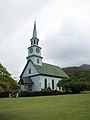 Image of the church, with foreground.

Article(s): Kaahumanu Church
Request: Can that cone in the foreground be removed? It looks out of place in the picture. Cesario (JPN) (talk) 19:16, 11 November 2011 (UTC)
Graphist opinion(s):
![]() Done - Cleaned up the lawn in general. Looked like trash? Gopher holes? 4-wheeler tracks? Anyhow, all cleaned up. If only real life were that easy. JBarta (talk) 20:20, 11 November 2011 (UTC)
Done - Cleaned up the lawn in general. Looked like trash? Gopher holes? 4-wheeler tracks? Anyhow, all cleaned up. If only real life were that easy. JBarta (talk) 20:20, 11 November 2011 (UTC)
- Um, not to be picky, but the cone is still there in the picture.--Cesario (JPN) (talk) 10:32, 12 November 2011 (UTC)
- You might be looking at some cached version. Materialscientist (talk) 10:37, 12 November 2011 (UTC)
- Yeah, I figured it out. My apologies. And Thank You. --Cesario (JPN) (talk) 10:39, 12 November 2011 (UTC)
Remove pole, cleanup
edit-
 McNichols Sports Arena

Article(s): McNichols Sports Arena
Request: I realize this may be very difficult, but if possible, please remove the large light pole at the forefront of the image. Also, a cleanup to remove the various blemishes and scratches would be great. Thanks. Delaywaves talk 04:57, 12 November 2011 (UTC)
Graphist opinion(s):Pole removed and retouched. Centpacrr (talk) 06:25, 12 November 2011 (UTC)
- Thanks, from an unusual angle - for saving me from temptation :-D. (I saw how, and wanted to jump in, while I should really do something else right now). Materialscientist (talk) 06:38, 12 November 2011 (UTC)
Jennifer Metcalfe
edit
Article(s): Jennifer Metcalfe
Request: Could you make this suitable for a blp box please. Thanks D4nnyw14 (talk) 20:36, 12 November 2011 (UTC)
![]() Done: JBarta (talk) 00:43, 13 November 2011 (UTC)
Done: JBarta (talk) 00:43, 13 November 2011 (UTC)
- Omg haha, the subject isn't her arse unfortunately :P D4nnyw14 (talk) 00:54, 13 November 2011 (UTC)
- Gave it another shot. JBarta (talk) 17:19, 13 November 2011 (UTC)
- Thankyou :) D4nnyw14 (talk) 19:31, 13 November 2011 (UTC)
Waders in flight
edit-
 Mixed waders (predominately Godwit) flying into roost in Roebuck Bay, Western Australia

Article(s): Bird migration, Wader, Sandpiper, Godwit, Roebuck Bay, List of Ramsar sites in Australia
Request: Improve image quality, clarify detail Marj (talk) 22:33, 17 November 2011 (UTC)
Graphist opinion(s):
Increased the contrast a little. Makes it "pop out" a little more. Is that what you were looking for? JBarta (talk) 23:45, 17 November 2011 (UTC)
- Yes, thanks, the details of the individual birds are now a little easier to make out Marj (talk) 23:48, 17 November 2011 (UTC)
Remove text
edit-
 Emperor Franz Joseph I

Article(s): Franz Joseph I of Austria
Request: Hi, could the text at the bottom be removed? Thanks, Lecen (talk) 01:39, 19 November 2011 (UTC)
Graphist opinion(s):![]() Done Centpacrr (talk) 02:23, 19 November 2011 (UTC)
Done Centpacrr (talk) 02:23, 19 November 2011 (UTC)![]() Done: JBarta (talk) 02:25, 19 November 2011 (UTC)
Done: JBarta (talk) 02:25, 19 November 2011 (UTC)
Seems we did this file at the same time. Sorry. JBarta (talk) 02:27, 19 November 2011 (UTC)
- Thank you both! I'm very pleased. Kind regards, --Lecen (talk) 02:34, 19 November 2011 (UTC)
Indiana Evans and Mark Furze
edit-
 Indiana Evans
 -
 Mark Furze
 -
 Done
Done


Article(s): Indiana Evans, Mark Furze
Request: I saw these images in the commons, of two cast members from Home and Away. The file was originally one but was split on upload. Could you mae a new picture or kind of like restore the old one where they were in the picture together? It would be so useful for this article I'm working on.RaintheOne BAM 01:14, 20 November 2011 (UTC)
Graphist opinion(s):
Franz Joseph I of Austria
edit-
-
 His signature
 -
 His signature (.png file)

Article(s): Franz Joseph I of Austria
Request: Well, I'd like to see the name in the photo removed. Perhaps also some kind of overall improvement in the photo? If possible. I need a .png file of his signature with no background just like in this picture. Thank you very much! Lecen (talk) 19:43, 20 November 2011 (UTC)
- I might be crazy but everytime I look at the photo I get the impression that there is a kind of rainbow throughout, like it had come from a poor scan. --Lecen (talk) 21:01, 20 November 2011 (UTC)
- Centpacrr, it's almost perfect. However, I wanted a signature with no background just like in this picture. --Lecen (talk) 22:54, 20 November 2011 (UTC)
- Your original request was a bit unclear to me as I did not notice the link to the Princess Maria image and thus thought you were referring to the Franz Josef image. I did not understand that by "no" background you meant a "transparent" background. I have converted the signature to that format and uploaded it. Centpacrr (talk) 00:04, 21 November 2011 (UTC)
- Centpacrr, it's almost perfect. However, I wanted a signature with no background just like in this picture. --Lecen (talk) 22:54, 20 November 2011 (UTC)
Graphist opinion(s):![]() Done
Done
Plan 9
edit-
 Poster for Plan 9 from Outer Space

Article(s): Perhaps Plan 9 from Outer Space
Request: Fix scratches and fold lines Crisco 1492 (talk) 00:40, 10 November 2011 (UTC)
Graphist opinion(s):
I'm curious... I see two uploads from you minutes apart on Nov 9. The first was the original at 3.92 MB, then you overwrote it with seemingly the same file at 1.12 MB. Is there any difference between the files other than resaving at a higher jpg compression? Also, the stated source of the image is different than your upload. You modified the original before uploading it? I ask because your uploaded version is pretty heavily contrasted compared to the source. And lastly, since we already have a nice image of this movie poster that is used in the article, why would we bother screwing around with this one? JBarta (talk) 18:48, 10 November 2011 (UTC)
- If I remember correctly, the first file showed up as failed last time. The brighter movie poster is because that's what the original was, based on a look at Amazon and other film poster sellers. Not sure what happened to the source. Crisco 1492 (talk) 01:41, 21 November 2011 (UTC)
Rebecca Breeds
edit-
 Rebecca Breeds at the 2011 Sexy People Party

Article(s): Rebecca Breeds
Request: As usual, the subject is somewhat off center. Can she be cropped the the upper half of her body to her head and centered. :)RaintheOne BAM 18:49, 13 November 2011 (UTC)
Graphist opinion(s):![]() Done Cropped as requested. Centpacrr (talk) 19:07, 13 November 2011 (UTC)
Done Cropped as requested. Centpacrr (talk) 19:07, 13 November 2011 (UTC)
Remove person
edit-
 Pedro Gomez 2011.

Article(s): Pedro Gomez (journalist)
Request: Please remove the person visible just above Gomez's head. Thanks. Delaywaves talk 01:27, 19 November 2011 (UTC)
Graphist opinion(s):
![]() Done: JBarta (talk) 02:15, 19 November 2011 (UTC)
Done: JBarta (talk) 02:15, 19 November 2011 (UTC)
Keith Duffy
edit
Article(s): Keith Duffy
Request: Could you crop the image to a closer fit of his face so its suitable for a blp box. Thanks D4nnyw14 (talk) 22:28, 19 November 2011 (UTC)
Graphist opinion(s):![]() Done Cropped as requested. Centpacrr (talk) 22:44, 19 November 2011 (UTC)
Done Cropped as requested. Centpacrr (talk) 22:44, 19 November 2011 (UTC)
- Thanks, don't know if its possible but does anyone think they could try to make the blurring less prominent? thanks D4nnyw14 (talk) 11:41, 20 November 2011 (UTC)
- All in all, this is a rather poor photo of a person for use in an infobox. The blurring (caused by someone very close to the camera being caught in the picture) is merely a minor secondary issue. Hopefully a better photo can be found. To directly answer your question... *anything* can be done. The real question is, is the improvement really worth the time and effort? From my perspective, regarding this particular photo, the answer is no. (Of course, others may feel differently and fix it up as you wish. Good luck.) JBarta (talk) 20:31, 20 November 2011 (UTC)
- I didn't think anything could be done so just leave it. Thanks D4nnyw14 (talk) 21:11, 20 November 2011 (UTC)
- All in all, this is a rather poor photo of a person for use in an infobox. The blurring (caused by someone very close to the camera being caught in the picture) is merely a minor secondary issue. Hopefully a better photo can be found. To directly answer your question... *anything* can be done. The real question is, is the improvement really worth the time and effort? From my perspective, regarding this particular photo, the answer is no. (Of course, others may feel differently and fix it up as you wish. Good luck.) JBarta (talk) 20:31, 20 November 2011 (UTC)
Indonesian beer
edit-
 A bottle and mug of Bintang Beer

Article(s): Bintang Beer
Request: Tilt-correct. If possible, touch-up the blown highlights on the bottle and mug Crisco 1492 (talk) 01:37, 21 November 2011 (UTC)
Graphist opinion(s):Fixed tilt but I'm unclear about what you mean by "blown highlights". Centpacrr (talk) 03:30, 21 November 2011 (UTC)
- The pure white caused bhy the flash reflecting off the condensation. I think that's what it's called. Crisco 1492 (talk) 23:20, 21 November 2011 (UTC)
- Once a part of an image has been blown all the way to pure white (255,255,255) there is no detail to recover. It's just one solid color. Sometimes there is some faint detail that can be enhanced, but in this photo, such as the handle on the mug and the brightest bits of reflection, it's simply pure white. Lost or desired detail would need to be redrawn or cloned. The white bits of reflection would need to be edited out. In some areas this is not a problem. In the more complex areas such as the label, it may be more trouble than it's worth. Verdict... unless someone wants to dig into a photo of a beer bottle for a while, we'll just have to live with it as it is. It's really not so bad. JBarta (talk) 19:50, 22 November 2011 (UTC)
- Yeah, it's a decent shot from a midrange camera. No need for anyone to go overboard cleaning up the blown highlights, wouldn't matter anywhere except FP. Crisco 1492 (talk) 10:00, 23 November 2011 (UTC)
- On a number of occasions I've seen requests to improve an image with the intent to make it featured picture worthy. Personally, I think this is largely a waste of time and a poor allocation of volunteer time. The standards for a featured picture are pretty high and a featured picture usually starts off being a great image rather than an average image trying to be great. I think it's far more useful to take faulty ordinary images and improve them to an encyclopedic standard rather than rummaging around for decent (but average) images where we might make miniscule and tedious improvements for no other purpose than *maybe* having a shot at a featured picture tag. JBarta (talk) 11:49, 23 November 2011 (UTC)
- Agreed wholeheartedly. I generally do basics (cropping and colour adjustments) myself before uploading, but a couple of things like getting rid of distractions in the background are beyond my capabilities. Crisco 1492 (talk) 15:15, 23 November 2011 (UTC)
- Once a part of an image has been blown all the way to pure white (255,255,255) there is no detail to recover. It's just one solid color. Sometimes there is some faint detail that can be enhanced, but in this photo, such as the handle on the mug and the brightest bits of reflection, it's simply pure white. Lost or desired detail would need to be redrawn or cloned. The white bits of reflection would need to be edited out. In some areas this is not a problem. In the more complex areas such as the label, it may be more trouble than it's worth. Verdict... unless someone wants to dig into a photo of a beer bottle for a while, we'll just have to live with it as it is. It's really not so bad. JBarta (talk) 19:50, 22 November 2011 (UTC)
Film poster clean-up
edit-
 Poster for Island of Lost Men

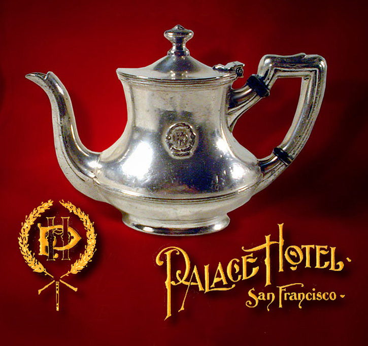
_crest,_logotype,_%26_teapot.jpg)
Article(s): Island of Lost Men
Request: Please clean up dirt and fold lines Crisco 1492 (talk) 02:05, 26 November 2011 (UTC)
Graphist opinion(s):![]() Done Centpacrr (talk) 05:05, 26 November 2011 (UTC)
Done Centpacrr (talk) 05:05, 26 November 2011 (UTC)
- That's beautiful. Thanks. Crisco 1492 (talk) 07:25, 27 November 2011 (UTC)
- However, if possible could you touch up the fold near the cast's names and in the illustration? Crisco 1492 (talk) 07:31, 27 November 2011 (UTC)