Wikipedia:Graphics Lab/Map workshop/Archive/Dec 2009
Stale edit
Okinawa Prefecture edit
-
 Looks like the inset is the part of the main map that is cut off

Article(s): Okinawa Prefecture
Request: this help desk post points out an issue someone here may be able to fix.
The inset of the map has a colored section, presumably the entire Okinawa Prefecture, but the main portion of the map isn't a larger version of the colored section, it is the main part of Japan. This doesn't match what I would assume to be standard convention for insets and color-coding. Could someone take a look at this and improve the presentation? Wouldn't you normally do this the other way around? Have an inset of all of Japan, with the Okinawa Prefecture highlighted, then the main part of the map showing a larger version of the Prefecture? SPhilbrickT 12:30, 1 October 2009 (UTC)
- This is a map of Japan. The inset shows the Ryukyu Islands, a chain of islands between Japan and Taiwan. The pink area is Okinawa Prefecture. The largest pink island is Okinawa Island.
- Most maps of Japan show the Ryuku islands as an inset, because of scale issues; the islands are about half-way between mainland Japan and Taiwan.
- Our convention regarding prefectures is to show our standard map of Japan, with the prefecture highlighted in pink.
- The uppermost islands in the inset are not pink, because they fall within the Kagoshima Prefecture - and if you compare the map of that prefecture (shown here), it should make more sense.
- Please note that there may be confusion here, because;
- Okinawa Prefecture is a governmental region, consisting of hundreds of islands.
- Okinawa Island is the largest, most populated island.
- As an aside, Okinawa has a culture and heritage of its own, quite distinct from mainland Japan. It has lots of Americans (large military base), great SCUBA diving, and the best beef in the world.[Chzz 1] Chzz ► 17:15, 1 October 2009 (UTC)
- ^ According to user:chzz, a wholly biased and unreliable source
- I note that the convention for Alaskan Islands is different, viz Amatignak Island (pictured), , Amaknak Island, Unalaska, Alaska. That convention seems less confusing. Why one convention for islands, and another convention for prefecture?--SPhilbrickT 20:01, 1 October 2009 (UTC)

 Location in Alaska
- I note that the convention for Alaskan Islands is different, viz Amatignak Island (pictured),

Graphist opinion(s):
Map of Gulf of Mexico and surrounding areas edit
Article(s): Tiber oilfield
Request: I'm writing an article on the new Tiber oilfield in the Gulf of Mexico. The Gulf has a wide range of oilfields and reservoirs, and I'd like to have a map showing the Gulf and surrounding land areas, and the locations of the major fields and features. Maybe I'll do an article oilfields of the Gulf of Mexico some time, if it doesn't exist.
Problem is there isn't a good base map to work from. The graphic needs to be ~ 1000 wide or so, to accommodate the annotations that might exist. It needs to show state and national boundaries, the 5 - 10 most major US cities, and ideally very basic landscape type, and cover the entire Gulf and Florida, and also a considerable part of the continental land and Atlantic area on all 4 sides. Any coloring needs to be light greyscale or pastel, suitable for symbols and text to be written over it.
At a pinch, I can annotate it myself (crudely). Any chance of help? I'm not sure what information to provide. Thanks! FT2 (Talk | email) 22:29, 2 September 2009 (UTC)
Graphist opinion(s): File:Gulf_Coast_Platforms.jpg may be useful, though I realise it is too localised and bright for this purpose. Certes (talk) 22:45, 2 September 2009 (UTC)
- I looked; it doesn't cover the entire area of the gulf, is too bright, and has existing annotations. FT2 (Talk | email) 23:05, 2 September 2009 (UTC)
How about  ? If you want lighter colouring, that can be done; I also did not include national borders yet, assuming the audience to be a bit familiar with the area. (As a cartographer, it annoys me a bit that I can't include a scale bar - if anyone has recommendations for this issue, I'd be most happy!) Classical geographer (talk) 21:29, 4 October 2009 (UTC)
"Homeschool Legality-World.svg" not consistent with Homeschooling article edit

Article(s): Homeschooling
Request: The map should be updated based on the information in the article (which I believe is more correct). In particular, the article states that homeschooling is legal in Norway and Finland. 212.251.240.102 (talk) 22:21, 3 October 2009 (UTC)
Graphist opinion(s): If you're an expert on the issue, User:212.251.240.102, could you provide a list of changes that have to be made to the map? The actual changes are easy to make, it's finding out what is to be done that takes a lot of time & energy, which I personally rather put into mapmaking than into factfinding... Classical geographer (talk) 13:02, 5 October 2009 (UTC)
- The map above matches the table in Legality of Homeschooling, which covers more countries than Homeschooling. The two articles conflict in several ways and I have no idea which is correct. Talk:Homeschooling#International homeschooling has another credible table. I doubt we can improve the map with any confidence until the subject experts reach a consensus. I've placed a message on Talk:Homeschooling#Legality of Homeschooling. Certes (talk) 23:36, 12 October 2009 (UTC)
Chinese Provinces edit
-
 Blank World Political Map

Article(s): Administrative divisions of China
Request: Convert to the map projection used by the blank map in the image shown which is an editable blank world political map. I just need the outlines of the provinces so that it fill fit and conform to the editable blank world map that Wikipedia has.
Graphist opinion(s): I don't understand this. Why does the map need to conform to the world map? Do you want the provinces drawn on a world map? Classical geographer (talk) 08:32, 29 October 2009 (UTC)
Resolved edit
Free City of Danzig edit
-
 Map of the Free City of Danzig in 1939, showing neighbouring European states.

Article(s): Free City of Danzig
Request: Hi, requesting several changes. Currently, Germany is shown in a rather confusing way, with the main part of Germany labelled "German" and the East Prussia exclave labelled "Empire". Would it be possible to colour this map (and possibly put it into the SVG format) and either clearly label the German territory to show it's all part of one state, or scrap the labelling entirely and add a colour code. The region labelled "Memel T." in the top right of the map is the Klaipėda Region, and should be shown by that name. Thanks, 84.92.117.93 (talk) 22:40, 19 November 2009 (UTC)
Graphist opinion(s): A rough coloured version (but not SVG yet) is below. (User:Classical geographer)
- Something like this -Justass (talk) 00:16, 21 November 2009 (UTC)
- Much better! I'll remove my image. Classical geographer (talk) 17:13, 21 November 2009 (UTC)


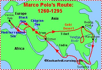
Travels of Marco Polo edit
Article(s): Marco Polo
Request: The current travel map of Marco Polo we have now, I think can be better. I would like for this map to be in an SVG format, translated into English, and colored. Thanks in advance. Here are some other maps, that you can base off: 1, 2, 3. Thanks! Connormah (talk) 22:48, 14 October 2009 (UTC)
Graphist opinion(s):
I found this map very useful too, though it differs from the maps you suggested as to the cities Polo actually visited. I've made the following map, with as a background ![]() (of which the yellow background might be expanded to all visible land). Although the map does not show Venice, it does show both Accra and Constantinople. Classical geographer (talk) 22:51, 29 October 2009 (UTC)
(of which the yellow background might be expanded to all visible land). Although the map does not show Venice, it does show both Accra and Constantinople. Classical geographer (talk) 22:51, 29 October 2009 (UTC)
- Can't say much about the correctness of the content, probably editors of the Marco Polo article can help with that. If known, it would be great to see dates/years indicating the time Marco Polo spend at a city and the (rough?) extension of major powers at the time. An example of what it could look like is this map. As for the map itself, all land should be in the same color and the arrow indicating north must be removed as it does not make sense and is misleading. For better text placement, you could try to align the text (e.g. Chengdu right-aligned, Ormuz left-aligned and Samarkand centered). Still the wikipedia svg-renderer might mess up the text, so your safest bet is to transform all text to paths (in inkscape via "Path->Object to Path") which would give you proper rendering but more difficult text modifications later on. bamse (talk) 14:27, 5 November 2009 (UTC)
-
 New map. (Having some problems with the fonts, unfortunately. Suggestions?)
 -
 PNG version.


- I've done an update; aligning the fonts improved things somewhat. I've also created a PNG, which I prefer; but the svg allows further edits if others want to improve this map. Classical geographer (talk) 20:50, 11 November 2009 (UTC)
Map of France edit
-
 Map showing the territory of the French Republic

Article(s): France
Request: Hi, I was looking at this map and I was wondering if anything could be done about how French Polynesia was represented? Currently, its shown as a large blue block on the left, which makes it look a bit like a very large island. Could a more subtle way of showing these small islands be used, such as circling them? Thanks, 84.92.117.93 (talk) 15:46, 8 November 2009 (UTC)
Graphist opinion(s):
- I will try to fix this. I might map the map a vector image while I'm at it. Nimbusania talk 04:40, 9 November 2009 (UTC)
- Thanks, also might be worth labelling Metropolitan France too at the same time. 84.92.117.93 (talk) 19:29, 9 November 2009 (UTC)
MARC train system map edit
-
 Part of the area, shown in too much detail for this purpose
 -
 new map


Article(s): MARC Train
Request: I think it would benefit the article to have a map like this one here or maps like you see for other regional rail providers like the Long Island Rail Road which could be either a fairly geographically accurate map or a schematic (although a schematic makes less sense in this case since it is a far less complex system then the LIRR). gren グレン 05:46, 27 November 2009 (UTC)
Graphist opinion(s): See also File:BaltimoreLightRail.svg shown above. Would something in a similar style be acceptable? Certes (talk) 16:15, 7 December 2009 (UTC)
A schematic map could also be made via templates as on Virginia Railway Express. I think the article could benefit from having both a schematic showing the stations and a geographical map to show the extent of the lines, I note that Long Island Rail Road does both.Kmusser (talk) 19:14, 7 December 2009 (UTC)
MARC | |||||||||||||||||||||||||||||||||||||||||||||||||||||||||||||||||||||||||||||||||||||||||||||||||||||||||||||||||||||||||||||||||||||||||||||||||||||||||||||||||||||||||||||||||||||||||||||||||||||||||||||||||||||||||||||||||||||||||||||||||||||||||||||||||||||||||||||||||||||||||||||||||||||||||||||||||||||||||||||||||||||||||||||||||||||||||||||||||||||||||||||||||||||||||||||||||||
|---|---|---|---|---|---|---|---|---|---|---|---|---|---|---|---|---|---|---|---|---|---|---|---|---|---|---|---|---|---|---|---|---|---|---|---|---|---|---|---|---|---|---|---|---|---|---|---|---|---|---|---|---|---|---|---|---|---|---|---|---|---|---|---|---|---|---|---|---|---|---|---|---|---|---|---|---|---|---|---|---|---|---|---|---|---|---|---|---|---|---|---|---|---|---|---|---|---|---|---|---|---|---|---|---|---|---|---|---|---|---|---|---|---|---|---|---|---|---|---|---|---|---|---|---|---|---|---|---|---|---|---|---|---|---|---|---|---|---|---|---|---|---|---|---|---|---|---|---|---|---|---|---|---|---|---|---|---|---|---|---|---|---|---|---|---|---|---|---|---|---|---|---|---|---|---|---|---|---|---|---|---|---|---|---|---|---|---|---|---|---|---|---|---|---|---|---|---|---|---|---|---|---|---|---|---|---|---|---|---|---|---|---|---|---|---|---|---|---|---|---|---|---|---|---|---|---|---|---|---|---|---|---|---|---|---|---|---|---|---|---|---|---|---|---|---|---|---|---|---|---|---|---|---|---|---|---|---|---|---|---|---|---|---|---|---|---|---|---|---|---|---|---|---|---|---|---|---|---|---|---|---|---|---|---|---|---|---|---|---|---|---|---|---|---|---|---|---|---|---|---|---|---|---|---|---|---|---|---|---|---|---|---|---|---|---|---|---|---|---|---|---|---|---|---|---|---|---|---|---|---|---|---|---|---|---|---|---|---|---|---|---|---|---|---|---|---|---|---|---|---|---|---|---|---|---|---|---|---|---|---|---|---|---|---|---|---|---|---|---|---|---|---|---|---|---|---|---|---|---|---|---|---|---|---|---|---|---|
| |||||||||||||||||||||||||||||||||||||||||||||||||||||||||||||||||||||||||||||||||||||||||||||||||||||||||||||||||||||||||||||||||||||||||||||||||||||||||||||||||||||||||||||||||||||||||||||||||||||||||||||||||||||||||||||||||||||||||||||||||||||||||||||||||||||||||||||||||||||||||||||||||||||||||||||||||||||||||||||||||||||||||||||||||||||||||||||||||||||||||||||||||||||||||||||||||||
| |||||||||||||||||||||||||||||||||||||||||||||||||||||||||||||||||||||||||||||||||||||||||||||||||||||||||||||||||||||||||||||||||||||||||||||||||||||||||||||||||||||||||||||||||||||||||||||||||||||||||||||||||||||||||||||||||||||||||||||||||||||||||||||||||||||||||||||||||||||||||||||||||||||||||||||||||||||||||||||||||||||||||||||||||||||||||||||||||||||||||||||||||||||||||||||||||||
We seem to have two parts to this request.
- Schematic diagram:
 Request taken by Certes.. (talk) 02:06, 8 December 2009 (UTC)
Click [show] to expand {{MARC Line map}}. Comments are welcome, especially on where to add bridges etc. →
- It would be cool to make the individual lines collapsible like they are in VRE, as for other features I can speak to the Brunswick line, since that's actually my commute - there is a major bridge across the Monocacy River between Dickerson and the Point of Rocks/Monocacy split; there is a tunnel under Catoctin Mountain between Point of Rocks and Brunswick. There is a tunnel and then a bridge over the Potomac River between Brunswick and Harpers Ferry. Kmusser (talk) 14:25, 8 December 2009 (UTC)
- If you wanted to try and squeeze on transfer points to other rail systems: transfer to Baltimore Light Rail at Penn Station, Camden station; to Washington Metro at Union Station, Silver Spring, Rockville, College Park, Greenbelt, New Carrollton; to VRE at Union Station; to Amtrak at Union Station, Rockville, Harpers Ferry, Martinsburg, New Carrollton, BWI, Penn Station, and Aberdeen. Kmusser (talk) 14:38, 8 December 2009 (UTC)
- Thank you for the comments. Diagram changed. I've added those interchanges, but not described them, as the article text already explains them in more detail than could fit in the diagram. Certes (talk) 15:40, 8 December 2009 (UTC)
- Nice, for the other lines, I don't think the Camden line has any significant bridges, but the Penn line almost certainly does, if I get a chance to take a look at a map I'll see where those are. Kmusser (talk) 16:59, 8 December 2009 (UTC)
- The big Penn Line bridges are Gunpowder River between Martin airport and Edgewood; Bush River (Maryland) between Edgewood and Aberdeen; and Susquehanna River between Aberdeen and Perryville. Kmusser (talk) 23:09, 8 December 2009 (UTC)
- Penn rivers added. Shall we put this template into the article now, even if there may be a few details to complete? Certes (talk) 23:30, 8 December 2009 (UTC)
- I think it's good to go. Kmusser (talk) 14:30, 9 December 2009 (UTC)
- Diagram added to MARC Train's infobox. I think the schematic part is now Done. Certes (talk) 00:53, 10 December 2009 (UTC)
- I think it's good to go. Kmusser (talk) 14:30, 9 December 2009 (UTC)
- Penn rivers added. Shall we put this template into the article now, even if there may be a few details to complete? Certes (talk) 23:30, 8 December 2009 (UTC)
- Thank you for the comments. Diagram changed. I've added those interchanges, but not described them, as the article text already explains them in more detail than could fit in the diagram. Certes (talk) 15:40, 8 December 2009 (UTC)
(outdent)Supplemental request. I've actually removed the diagram, as MARC Train, I believe, is the wrong place for it. Unlike VRE, each MARC line (Brunswick, Camden and Penn) has its own, separate article. Also, unlike VRE, the only shared station on the lines is Washington Union Station. As such, I request that the single diagram be split into three, and each individual diagram be placed at the appropriate article, as is also done for the various lines of New Jersey Transit Rail Operations or Metro-North. I'd try it myself, buy every time I start editing a route diagram, I screw it up. By some miracle, I sometimes fix 'em, but not having the usual editing softwareakes it a tedious process. oknazevad (talk) 22:05, 17 December 2009 (UTC)
- I've tidied up the separate line diagrams {{MARC Brunswick Line}}, {{MARC Camden Line}} and {{MARC Penn Line}}. Certes (talk) 00:37, 18 December 2009 (UTC)
So what shall we do with {{MARC Line map}} as shown above right? It is currently unused. I think it is worth one line in the MARC Train infobox in a collapsed state (simply saying MARC Train Service [show]), but I'll nominate it for deletion if that's the consensus. Certes (talk) 12:34, 19 December 2009 (UTC)
- Well, my request for a split was based on the standard practice at the other northeast commuter roads, which don't have combined diagrams, so I think it has served its purpose. I do thank younfor the efforts, though. The map additions look great. oknazevad (talk) 13:41, 19 December 2009 (UTC)
Bordeaux (minor fixes) edit
-
 Image
Image

Article(s): Tramway de Bordeaux
Request: If you notice the Green line C box is shifted a little left of the other two boxes. Could you make sure all boxes align and are equidistant from each other? gren グレン 06:27, 17 December 2009 (UTC)
Graphist opinion(s): ![]() Done An easy one. Kmusser (talk) 16:47, 17 December 2009 (UTC)
Done An easy one. Kmusser (talk) 16:47, 17 December 2009 (UTC)
Warring States Period edit
Note: This request was moved from the Illustration workshop to the Map workshop. Ivan Akira (talk) 06:52, 28 December 2009 (UTC)
-

-
 Image in PNG format without watermark and the solid borders removed by Bility.


Article(s): Warring States period
Request: definitely remove watermarking and border, maybe pngify or svgify if you have time, thank you... Chris (クリス • フィッチュ) (talk) 11:48, 21 December 2009 (UTC)
Graphist opinion: ![]() Done
Done
- There is shadowing along the borders that would take off too much of the image to crop, but here is the image in PNG format without watermark and the solid borders removed: File:China Warring States Period.png. — Bility (talk) 21:34, 24 December 2009 (UTC)
- Oh yeah, this request belongs to Map workshop, so I will moved this request there, and this request is resolved I think. Ivan Akira (talk) 06:45, 28 December 2009 (UTC)