Wikipedia:Graphics Lab/Image workshop/Archive/Jun 2009
 | This page, part of the Graphics Lab Wikiproject, is an archive of requests for June 2009. Please do not edit the contents of this page. You can submit new requests here. |
Stale
University of Valle Maps
Article(s): University of Valle#Campus
Request: Greetings. I'm completing the university article, and I would like to add the maps for the two largest campus, that are available in these websites as PDF files: Melendez Campus and San Fernando Campus. Both maps are in Spanish, and I'll be glad to help in the translation of the names. Regards, Andremun (talk) 00:32, 26 April 2009 (UTC)
Graphist opinion: Here they are as PNGs: [1] [2]. But before I go ahead and upload/translate them, what is the licensing for each of these? Paranomia (talk) 13:20, 26 April 2009 (UTC)
This is what Goldsztajn found out about the Colombian Copyright, Law, 28/01/1982, No. 23, regarding a previous project:
Article 41. Any person shall be allowed to reproduce the Constitution, laws, decrees, ordinances, orders, regulations and other administrative texts and judicial decisions, subject to the obligation to abide strictly by the official edition, and provided that such reproduction is not prohibited.
The university is a public institution, and because of that, its materials can be thought as administrative documents. Also, I don't know if these can be vectorized, and the background color or texture changed. Regards -Andremun (talk) 16:02, 26 April 2009 (UTC)
- No worries, I already have vector versions - I just uploaded them as PNG to avoid rendering errors. Also, I'm assuming that we're still abiding strictly by the official edition when translating/tweaking these maps, right? Anyway, here they are: Image:Melendez Campus.svg and Image:San Fernando Campus.svg. You can translate them with this tool, or you can manually post the translations and I'll do my best to change it. I also strongly recommend you use PNG versions once everything is translated. Cheers, Paranomia (talk) 21:00, 26 April 2009 (UTC)
- I see why you suggest to use PNG. These files are quite large. I tried to use the tool that you suggested, but it seems that I messed up a bit. I will upload them translated, and some editing must be done to organize them, specially the font size. I'm not sure what you mean by "abiding strictly", but I think for presentation, some edits have to be made. Thanks for the work so far! Regards -Andremun (talk) 21:43, 26 April 2009 (UTC)
- Hello. I've uploaded the new versions for the Image:Melendez Campus.svg and Image:San Fernando Campus.svg. If for some reason, they appear in spanish, please click in the image to see the translation. Regards -Andremun (talk) 05:20, 29 April 2009 (UTC)
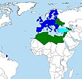
Nagy Lajos királyságai.JPG
-
 Kingdoms of Nagy lajos (Louis I of Hungary) or Poland and Hungary in 1360.

Article(s): Louis I of Hungary
Request: Hello! I would like to request some help from the editors. Is it possible to create "modern" image from it, something like this one [3] or make a new one form this blank Europe map? [BlankMap-Europe.png] Thank you very much! Description: The "red line" marks the borders of Hungary and Poland (under personal union), "Lengyel Királyság" means: Kingdom of Poland, Magyar Királyság means: Kingdom of Hungary. "Hűbéres and húbéres területek" are the yellow areas, they are the vassal states of Hungary (Moldavia, Wallachia, Bosnia, and Serbia). Yellow line: border of the vassal states.Baxter9 (talk) 21:22, 10 May 2009 (UTC)
Graphist opinion:
Convert the first & the 2nd file to SVG
-
 Penang state in red (PNG)
 -
 Sarawak state in red (PNG)
 -
 Selangor state in red (SVG)
 -
 Penang state in red (SVG)
 -
 Sarawak state in red (SVG)
Article(s): Penang
Request: I want the Penang map & the Sarawak map(the first & the 2nd file) to be converted into SVG similar the third file. Thanks Arteyu ? Blame it on me ! 03:35, 16 May 2009 (UTC)
Graphist opinion: Done, with border colors standardized to WP:WPMAP guidelines. I can't vouch for the accuracy of the original SVG's outlines, though. Fvasconcellos (t·c) 15:36, 16 May 2009 (UTC)
- Wow, thats great. Thanks ! Arteyu ? Blame it on me ! 16:56, 16 May 2009 (UTC)
Map of Europe and North Africa
-
 Map 1: should be improved (svg)
 -
 Map 2: should be superseded
by map 1 (jpg) -
 Map 2a: should be superseded
by map 1 (png)


Article(s): Union for the Mediterranean, European Neighbourhood Policy etc.
Request: Can someone improve map 1, so that it's possible to use it not only for the Union for the Mediterranean but also for other European organizations like shown on map 2? (The countries / objects are not defined properly.) Kolja21 (talk) 03:12, 15 May 2009 (UTC)
Graphist opinion: It takes a lot of time to trace all national borders by hand. But I have done it with all EU member states in this map (you can redefine the crop in Inkscape). If you want a template blank map where this has been already done for all countries, chech out File:Location European nation states.svg (though that map isn't as big geographically). Do you want a specific map or just a perfect blank map? - SSJ ☎ 15:56, 15 May 2009 (UTC)
- A perfect blank map would be perfect ;-) Your Europe and world maps are great, but a "perfect" one for Europe and North Africa is missing. --Kolja21 (talk) 16:42, 15 May 2009 (UTC)
Started to work my way through Inkcape and it seems not to be needed to trace all national borders (in map 1) again. Isn't there a way to rearrang groups / objects? Since the map is needed primarily to show foreign relations of the EU the main block is o.k. --Kolja21 (talk) 14:24, 17 May 2009 (UTC)
Chinese character SVG
Article(s): Chinese classifier
Request: In the past, User:Ch1902 here was able to make File:Chinese character Cheng.svg, an svg image of a Chinese character, based on the MingLiU font. I'm wondering if he or anyone else here can do the same these two characters [4][5], using the "Unicode standard" glyph. Putting them next to each other in the same image, or making two separate images, are both fine—they're the same word, just one is a simplified character and one is a traditional character. If it helps, the discussion at the last time an image like this was made is at Wikipedia:Graphic Lab/Image workshop/Archive/Apr 2009#Chinese character, if you want to see how they did it then. rʨanaɢ talk/contribs 15:26, 18 May 2009 (UTC)
Graphist opinion: There you go. Done as two separate images with not much white space either side so they can be placed next to each other manually. — ₪₪ ch1902 ₪₪ 19:41, 18 May 2009 (UTC)
- Thanks! Both look great. rʨanaɢ talk/contribs 19:56, 18 May 2009 (UTC)
Actually, as it turns out, the use of a "+" character in the name seems to prevent the images from working correctly in the {{double image}} template. Since you uploaded them on commons, do you think you could rename them (or just upload them under new names and delete the current ones)? rʨanaɢ talk/contribs 20:08, 18 May 2009 (UTC)
Cold War (1947–1953)
-
 Description of image
 -
 First draft


Article(s): Cold War (1947–1953)
Request: The map needs some colour changes to be introduced into the Cold War (1947–1953) article. Concretely, (i) Albania's colour should be the same as that of the other Eastern bloc countries; (ii) the NATO countries should be coloured with different tints of blue to reflect the steps of the alliance's formation. Five countries that signed the Treaty of Brussels (the core of future NATO): Belgium, the Netherlands, Luxembourg, France and the United Kingdom should have the most deep colour; other NATO founders, United States, Canada, Portugal, Italy, Norway, Denmark and Iceland, should be a little bit brighter; then Grece and Turkey should follow; FRG, that joined NATO only in 1955 should be light blue. The colour of neutral countries should be left unchanged. (iii) The legend should be modified accordingly (without giving too much details).
Thank you in advance.
Paul Siebert (talk) 03:37, 19 May 2009 (UTC)
Graphist opinion(s):![]() Request taken by Goldsztajn., I'll do this given I did the original map.--Goldsztajn (talk) 03:49, 19 May 2009 (UTC)
Request taken by Goldsztajn., I'll do this given I did the original map.--Goldsztajn (talk) 03:49, 19 May 2009 (UTC)
- It would be nice to add West-Berlin, even if it is only a dot. (The territory was, of cause, not USSR-aligned.) --Kolja21 (talk) 22:39, 20 May 2009 (UTC)
- Here's a first draft; not sure about the range...should US and Canada be included? What about colour scheme? Again neutral countries not so sure about? Swizterland and Finland are pretty clear, but the others...? And Spain...not really neutral, but not officially part of anything at this stage. No West Berlin yet, but will include. --Goldsztajn (talk) 08:27, 22 May 2009 (UTC)
A fluer de lys
-

-
 for reference
 -
 for reference


Articels: A template and some others on a town in NY.
Request: SVGify; note this is not the official logo, but a version of a commonly used identifyer. 76.117.247.55 (talk) 17:36, 22 May 2009 (UTC)
Oppinion: Whoever eventually takes this may like to refer to Fleur-de-lis.svg and Fleur-de-lis-fill.svg. —Vanderdecken∴ ∫ξφ 20:01, 22 May 2009 (UTC)
Urdu alphabet / Devanagari
-
 Urdu Alphabet (grainy)
 -
 Test svg character
 -
 Test first two lines svg


Article(s): Urdu
Request: Could we make the Urdu script scale properly? SVG would be great, of course... but, a PNG where the Urdu script can scale to the proper size would be great. gren グレン 00:37, 11 May 2009 (UTC)
Graphist opinion(s): ![]() Request taken by Goldsztajn. Hi, a little complicated this request, but I've had a try and came up with the "be" character (although the Devanagari part is not quite correct yet). Nevertheless it's doable for me, I'll just be a little slow. Without the Devanagari phonetics it would be easier... :) Regards --Goldsztajn (talk) 10:08, 11 May 2009 (UTC)
Request taken by Goldsztajn. Hi, a little complicated this request, but I've had a try and came up with the "be" character (although the Devanagari part is not quite correct yet). Nevertheless it's doable for me, I'll just be a little slow. Without the Devanagari phonetics it would be easier... :) Regards --Goldsztajn (talk) 10:08, 11 May 2009 (UTC)
- Looks very good to me... and I see nothing wrong with the Devanagari (the loop closes in the PNG but not the SVG... but, that seems a matter of font and not of correctness). Thank you for working on this. I think it will be useful to have an SVG... unless you think it's better just to put this on the page in a table not using an image. But, Images are nice because you can print them out more easily. gren グレン 10:25, 11 May 2009 (UTC)
- It was ok, but not perfect as the accent on the Devanagari character was not displaying in the proper place, but with this second test file I seem to have solved that and now have all the Urdu/Hindi characters and accents displaying properly...just need to get English correct! --Goldsztajn (talk) 00:50, 12 May 2009 (UTC)
- First line completed, with diacritics and correct English.--Goldsztajn (talk) 09:30, 13 May 2009 (UTC)
- Second line completed, but a few problems with Hindi phonetics line...slowly, but surely... --Goldsztajn (talk) 04:25, 18 May 2009 (UTC)
- It's looking good. Obviously a lot crisper than it was. The thing and I may be able to figure this out by changing the font is to make it a more Nastaʿlīq looking script where it goes from upper right to lower left rather than the more typically Arabic naksh. But that's a matter of style. But, the Devanagari was definitely the most difficult part for me so thank you very much for that part. gren グレン 15:11, 24 May 2009 (UTC)
- Personally, I'm not such a fan of the Persian caligraphic font styles to illustrate letters because IMHO it makes it much harder for those not familiar with Arabic script to view. To me it is a bit like illustrating the English alphabet to non-Latin familiar viewers using a Gothic script, rather than a basic sans serif script. Anyway, I've tried it with a slightly different less Nakshish font, which gives a bit more sense of the caligraphic....Let me know what you think.--Goldsztajn (talk) 07:00, 25 May 2009 (UTC)
- It's looking good. Obviously a lot crisper than it was. The thing and I may be able to figure this out by changing the font is to make it a more Nastaʿlīq looking script where it goes from upper right to lower left rather than the more typically Arabic naksh. But that's a matter of style. But, the Devanagari was definitely the most difficult part for me so thank you very much for that part. gren グレン 15:11, 24 May 2009 (UTC)
- Second line completed, but a few problems with Hindi phonetics line...slowly, but surely... --Goldsztajn (talk) 04:25, 18 May 2009 (UTC)
- First line completed, with diacritics and correct English.--Goldsztajn (talk) 09:30, 13 May 2009 (UTC)
- It was ok, but not perfect as the accent on the Devanagari character was not displaying in the proper place, but with this second test file I seem to have solved that and now have all the Urdu/Hindi characters and accents displaying properly...just need to get English correct! --Goldsztajn (talk) 00:50, 12 May 2009 (UTC)
- Looks very good to me... and I see nothing wrong with the Devanagari (the loop closes in the PNG but not the SVG... but, that seems a matter of font and not of correctness). Thank you for working on this. I think it will be useful to have an SVG... unless you think it's better just to put this on the page in a table not using an image. But, Images are nice because you can print them out more easily. gren グレン 10:25, 11 May 2009 (UTC)
Sherbrooke, QC Flag

-
 SVG COA
.svg)
Article(s): Sherbrooke
Request: Could someone convert the flag to SVG using elements of the SVG COA? Thanks. Connormah 03:53, 25 May 2009 (UTC)
Graphist opinion(s):
Prussia
-
 Expansion of Prussia

Article(s): Prussia
Request: Could someone convert it to SVG? Thanks Arteyu ? Blame it on me ! 07:14, 25 May 2009 (UTC)
I-TEC Logo SVG
Article(s): Indigenous People’s Technology and Education Center
Request: Please vectorize this image, a non-free logo currently in JPG, so as to be in compliance with WP:IUP#FORMAT. Thanks much! Vicenarian (T · C) 15:51, 4 June 2009 (UTC)
- If the vectorization will make the logo look bad, don't worry about it. Thanks!
::(How do I officially withdraw a request?)
Vicenarian (T · C) 14:38, 6 June 2009 (UTC)
- I've marked the request stale, as the requestor; that seems to be the procedure.
Vicenarian (T · C) 22:23, 9 June 2009 (UTC)
Graphist opinion(s):It seems to me like converting to SVG will remove details, not conserve them. --Blacklemon67 (talk) 21:05, 4 June 2009 (UTC)
- I don't think that's going to be easy to vectorize with those blurs in the background (I could be wrong though). 76.117.247.55 (talk) 23:33, 5 June 2009 (UTC)
Convert this to SVG

Article(s): Cooper Car Company
Request: An SVG of this defunct car company's logo would be greatly appreciated, with the actual logo centered. Thanks in advance. Connormah 02:34, 25 May 2009 (UTC)
Graphist opinion(s): I am not sure if non-free media can be redone in this way, especially in in infinitely scalable format. You may want to wait for someone else to see if we can do that. --Sushiflinger (Goldblattster) (talk!) 02:42, 25 May 2009 (UTC)
- We can do it. I've seen logos of other defuntc car comoppanies (non-free), the Commonwealth Games (above), the NHL, and Dell done, so they CAN be done. Connormah 13:16, 25 May 2009 (UTC) —Preceding unsigned comment added by Connormah (talk • contribs)
- The current (Wikiwide) idea seems to be that if the SVG was created freely (IE. Not derived from a copyrighted work) and is used correctly (Like any other fair use image), it'll be OK. If you have conscientious scruples about it (Pretty common with this type of request), feel free to pass on it. 76.117.247.55 (talk) 17:45, 27 May 2009 (UTC)
Terrible Quality PNG Flag

Article(s): Whitehorse, Yukon
Request: The quality of this image is brutal. Please repair, a SVG would be nice... Connormah (talk) 22:36, 23 May 2009 (UTC)
Graphist opinion(s):
I agree the quality is bad, but without far higher quality source art converting it to SVG won't be possible. — raeky (talk | edits) 00:48, 29 May 2009 (UTC)
Alphabets
-
 Alphabet W
 -
 Alphabet I
 -
 Alphabet N
 -
 Alphabet E


Article(s): Portal:Wine
Request: Need to be vectorized. Convert them to SVG pls. Thanks. Arteyu ? Blame it on me ! 10:49, 26 May 2009 (UTC)
- Also, if can, please convert all of the alphabets (from A to Z) to SVGs. Arteyu ? Blame it on me ! 10:51, 26 May 2009 (UTC)
Graphist opinion(s): Do they have to be in that font?--Sushiflinger (Goldblattster) (talk!) 14:02, 26 May 2009 (UTC) Erm? do we really need letters as images? who not just ordinary text? →AzaToth 17:25, 26 May 2009 (UTC)
- That's what I thought when I first saw this. --Blacklemon67 (talk) 22:42, 26 May 2009 (UTC)
- Please try to take a look at Portal:Wine, the file (W,I,N,E) and then only you will understand. The current file is in PNG, I need a scalable image (SVG) so that it would look nicer. Please also take a look at the portal discussion page so that you can have a better idea of why i need it in SVG. Arteyu ? Blame it on me ! 07:30, 27 May 2009 (UTC)
Well, you didn't answer my question. --Sushiflinger (Goldblattster) (talk!) 00:56, 28 May 2009 (UTC)
- Yes Arteyu ? Blame it on me ! 05:14, 28 May 2009 (UTC)
- Hmm, I don't think that I need the image anymore. But you can still convert it if want to. Azatoth already changed them into font (: Arteyu ? Blame it on me ! 05:16, 28 May 2009 (UTC)
- Yes Arteyu ? Blame it on me ! 05:14, 28 May 2009 (UTC)
Ok. Well I can't, anyway, since I don't have that font in my collection. --Sushiflinger (Goldblattster) (talk!) 14:06, 28 May 2009 (UTC)
Indianapolis Seal
Article(s): Indianapolis
Request: SVG please. Smaller one here. Connormah 23:28, 26 May 2009 (UTC)
Graphist opinion(s):
Going to need a MUCH better source image to convert this to vector art. There is so much missing detail in the provided source it would be impossible to make an accurate vector version. Sorry. — raeky (talk | edits) 00:46, 29 May 2009 (UTC)
ABC 1957 logo

Article(s): American Broadcasting Company logos, Ozark Jubilee
Request: Convert to SVG. I would but I can't handle the different font. --Blacklemon67 (talk) 20:48, 30 May 2009 (UTC)
Graphist opinion:
Make the background trasparent
-
 Mask for composite icons
 -
 Alternate (non-mask) ball


Article(s): Huge number of link
Request: Could someone please make this file transparent, File:Soccerball mask.svg ? As for the soccerball, I want the background to be transparent because it take up spaces. If it can't be transparent, maybe any of you can help me to cut a bit the white background so that it fits the soccerball size. The file is from commons, and if any of you know any help pages that you think you can forward this question to, fell free to do it. Arteyu ? Blame it on me ! 10:21, 15 May 2009 (UTC) I think you doesn't have to make it trasparent, better to cut a bit the white background so that it fits the soccerball size, do not make it transparent. Thanks Arteyu ? Blame it on me ! 22:21, 15 May 2009 (UTC)
Graphist opinion: While I can't help with this request myself, I should point out that this template is used in {{Soccer icon}} which is in turn used in a multitude of stub templates. The background cannot be transparent because the ball is, and trimming too much of the whitespace may have an adverse effect. However, I do agree that the template is less than perfect; while it may prevent the need to have individual icons for each and every country, the end result is rather more cumbersome than an individual icon would be. PC78 (talk) 14:33, 16 May 2009 (UTC)
- It's okay if it cannot be done. But the image just take up so much spaces. I hope that some of you can figure out how a new file can be made without taking up spaces (that can replace this one that is being used on stubs. Thanks anyway (: Arteyu ? Blame it on me ! 17:01, 16 May 2009 (UTC)
- There's a soccer ball already avaliable with a transparent background, no shading on the ball. It looks like it was shaded previously, then reverted. gringer (talk) 02:49, 25 May 2009 (UTC)
- BTW, if you're interested in how this mask soccer ball is used, see one of the linked pages. gringer (talk) 02:51, 25 May 2009 (UTC)
- Yeah, thanks for the helpful information Arteyu ? Blame it on me ! 10:58, 26 May 2009 (UTC)
- I don't see why a little of the white space can't be trimmed off the sides. Looking at the pages it is used on you can see that, unlike other stub icons, it appears a little further to the left. Should be simple to just trim some off the sides, nothing fancy.75.93.119.255 (talk) 13:38, 14 June 2009 (UTC)
- Yeah, thanks for the helpful information Arteyu ? Blame it on me ! 10:58, 26 May 2009 (UTC)
Dublin, Ireland GFX
-
 Flag of Dublin
 -
 Location of Dublin
 -
 Flag of Dublin, two towers burning (variation)
 -
 Use the harp from here


Article(s): Dublin
Request: Convert to SVG Connormah (talk) 21:50, 19 May 2009 (UTC)
Graphist opinion(s):Seems there is a different Dublin flag in Commons also available, however this one has two towers burning rather than three and a very different green. Some clarification on this issue would be helpful.--Goldsztajn (talk) 08:41, 22 May 2009 (UTC)
- I also found a SVG of the harp, I'll add it to the gallery above. Connormah (talk) 22:13, 23 May 2009 (UTC)
- Please see if you can find clarification on the colours and towers. Thanks. --Goldsztajn (talk) 23:02, 23 May 2009 (UTC)
Simple request.
-
 Yemen COA

Article(s): Yemen
Request: Reduce stroke, and, the sides look a bit grainy, can it be fixed? Thanks. Connormah (talk) 02:51, 1 June 2009 (UTC)
Graphist opinion(s):
Spanish East Indies

Article(s): Spanish East Indies
Request: English language variant, clean so doesn't look like photocopy from a text... Chris (クリス • フィッチュ) (talk) 13:04, 1 June 2009 (UTC)
Graphist opinion:
The original map in JPEG is wrong
-
 Penang state map

Article(s): Penang
Request: Hi! It's me again. I just want to point out that the location name for the file above is wrong. Firstly, the island part of the state is not called "Pulau Penang" as in the map. The actual name of island part is "Pulau Pinang" (in Malay) or "Penang Island" (in English). The peninsular part of the state is known as "Seberang Perai", not "Penang" as stated in the map. The state as a whole is known as "Penang" in English. Another mistake that I've seen in the map is with the name of the capital of Penang. It should be "Georgetown", doesn't have any spaces between the "George" and the "Town" word.
My request is to create two map similar to that in PNG or SVG with no road lines (the lines in white and gray).
First map in detail: To create a new Penang map with no location names (no font at all & no road lines). If can don't make it black and white. Make it in colour. Also, I don't want the compass (the North locator or whatever you call it to be in the map).
Second map in detail: To create a new Penang map with location names (only state the Penang Island part, the Seberang Perai part and the George Town capital). Also, if can don't make it black and white. Make it in colour.
And if possible can you also make a map showing only the Penang island? I want to put it on this article — Penang Island.
That's all, thanks (: Arteyu ? Blame it on me ! 19:43, 16 May 2009 (UTC)
Graphist opinion: Making an attempt at this now. --James Chenery (talk) 19:42, 23 May 2009 (UTC)
- Thank you. At last there is someone Arteyu ? Blame it on me ! 06:55, 25 May 2009 (UTC)
- I have made a start on this request, and will try to finish it this week.--James Chenery (talk) 18:00, 2 June 2009 (UTC)
- Thank you. At last there is someone Arteyu ? Blame it on me ! 06:55, 25 May 2009 (UTC)
Canadian Election Maps
-
 2006 Canadian Federal Election
 -
 2nd image (If there is one)
 -
2004 Canadian Federal Election
-
2000 Canadian Federal Election
-
1997 Canadian Federal ELection


-
 Base off this file
 -
 Base off this file


Article(s): 2006 Canadian Federal Election, 2004 Canadian Federal Election...etc.
Request: Please make SVGs of the PNGs listed above using the SVG files for a template thst I have provided above. Thanks. Connormah (talk) 00:18, 2 June 2009 (UTC)
Graphist opinion(s):
College seal and 2 logos


Article(s): Eastern Nazarene College
Request: Can these be made into .svg? I don't know how to do it myself. I tried learning, but I didn't understand and I don't think I have the right software. 74.240.161.84 (talk) 23:05, 2 June 2009 (UTC)
- That last image is no image; did you forget a .png or similar? Thanx, 76.117.247.55 (talk) 01:01, 3 June 2009 (UTC)
- I did. Sorry. Fixed. 74.240.161.84 (talk) 03:58, 3 June 2009 (UTC)
Zagreb Flab
Article(s): Zagreb
Request: SVG please. I attempted, but it is downright brutal. Connormah (talk) 03:27, 3 June 2009 (UTC)
Graphist opinion(s):
Coat of Arms Requests
-
 Burkina Faso COA
 -
Benin COA
-
 Cote d'Ivoire COA


Article(s): Burkina Faso, Cote d'Ivoire, Benin
Request: Please vectorise. Connormah (talk) 17:21, 31 May 2009 (UTC)
Graphist opinion(s): Here you go! Sodacan (talk) 22:19, 3 June 2009 (UTC)
- Thanks, Sodacan! The others would be great if they can be done, but if not, thats fine. Thanks again! Connormah (talk) 01:51, 4 June 2009 (UTC)
-
 Coat of Arms of Cote d'Ivoire from 2002 onwards
.svg)
Median arcuate ligament syndrome
-
 Generally pretty ugly.
 -
 Ditto.


Article(s): Median arcuate ligament syndrome (in my sandbox until I have some better diagrams)
Request: I drew these myself in Inkscape with zero knowledge of how to do this sort of thing, and well, the result makes that pretty clear. :-) I'd love if someone could clean these up a bit and output in SVG. I can provide additional (non-free) source images if the images I drew aren't clear enough. Thanks a ton. David Iberri (talk) 18:11, 3 June 2009 (UTC)
Graphist opinion(s): UTC)
- Visually, the pictures look fine; nice clean lines with not too much detail, just a little bit shaky on the finer scale of lines. If you drew these in Inkscape, where are the SVG files? It would be much easier to work from those. Something like clicking on the curves and simplifying (ctrl + l) would probably make them look better. Alternatively, change into node mode (F2), click on a node in a squiggly part of the picture, then delete the node (delete key). gringer (talk) 05:12, 4 June 2009 (UTC)
Ntv7


Article(s): Ntv7
Request: Can you convert both to PNG (or maybe SVG) with higher quality ? Also, please eliminate the background. I can't find a better logo from the search engine Arteyu ? Blame it on me ! 05:26, 4 June 2009 (UTC)
Graphist opinion(s):
Coat of arms of Burma/Myanmar
-
 Coat of arms of Burma/Myanmar
.png)
Article(s): Burma, Government of Burma etc...
Request:
Main request: Make the background transparent.
Optional extra: Convert into an SVG. Obviously if it is made into an SVG then the background should be transparent anyway. Thanks--23230 talk 16:10, 3 June 2009 (UTC)
Graphist opinion:
.svg)
- If you can, the text should probably be written (I know that's been done here before with the Algerine coat). 76.117.247.55 (talk) 23:34, 5 June 2009 (UTC)
Yugoslav People's Army
-

-

-
 Use these colors
.svg)
Article(s): Yugoslav People's Army
Request: Vectorize (use the colors of the flag). PRODUCER (talk) 15:05, 4 June 2009 (UTC)
Graphist opinion(s):
Biafra coat of arms
Article(s): Biafra
Request: color, other African coat of arms can be used for natural coloration... Chris (クリス • フィッチュ) (talk) 15:33, 5 June 2009 (UTC)
Graphist opinion:
Resolved
Put the 1885 word on the SVG file
-
 Old Luton Town FC Logo — In SVG, Higher quality
 -
New Luton Town FC Logo — In PNG, Lower quality

Article(s): Luton Town F.C.
Request: The SVG file that I've uploaded had couple of minor mistakes that you can only see when you zoom it. Can any of you correct the mistakes ? And can any of you put the 18 85 word on the first file so that it would look like the new Luton Town logo. Thanks
Graphist opinion:
![]() Request taken by raeky.: Point out exactly what mistakes you want fixed in finer detail and I'll see what I can do. I'll add the date later this evening. — raeky (talk | edits) 20:45, 27 May 2009 (UTC)
Request taken by raeky.: Point out exactly what mistakes you want fixed in finer detail and I'll see what I can do. I'll add the date later this evening. — raeky (talk | edits) 20:45, 27 May 2009 (UTC)
- On the B alphabet (Football word), there is a very little portion of the purple colour, would you mind to erase it? There is also two other portion of the purple colour on the body of the logo. Those are very minor and could only be seen when you zoom at it (It looks like the one on the B alphabet).
I would also want you to fix the W alphabet (TO"W"N), the part where it looks like an X and the upper part of it intersects (the transparent part inside the upper X) it does not look sharp enough. Thats all. Thanks (: Arteyu ? Blame it on me ! 05:41, 28 May 2009 (UTC)
![]() Done Added the date, tried to pick a font somewhat similar, removed two of those purple splotches and couldn't find anymore, made the W a bit sharper corners in the area I think you was talking about. Anything else? — raeky (talk | edits) 13:38, 29 May 2009 (UTC)
Done Added the date, tried to pick a font somewhat similar, removed two of those purple splotches and couldn't find anymore, made the W a bit sharper corners in the area I think you was talking about. Anything else? — raeky (talk | edits) 13:38, 29 May 2009 (UTC)
- Wow! This is really nice! My friend would be happy when he/she knew it, Thanks ! Arteyu ? Blame it on me ! 18:34, 29 May 2009 (UTC)
1946 ABC Logo
Article(s): American Broadcasting Company logos
Request: Convert to a SVG. The copyright on this image is expired, as it was created in 1946. Connormah 00:50, 26 May 2009 (UTC)
Graphist opinion(s):
![]() Request taken by Blacklemon67.
Request taken by Blacklemon67.
- Ok, done. I just don't know how to remove that box. --Blacklemon67 (talk) 23:25, 26 May 2009 (UTC)
There you go, its been fixed. --Pbroks13talk? 05:45, 29 May 2009 (UTC)
- Thanks, can we mark this as done, Connormah? —Preceding unsigned comment added by Blacklemon67 (talk • contribs) 11:07, 29 May 2009 (UTC)
J.W. W. Birch
-
J. W. W. Birch photo
-
Png format with better border
Article(s): J. W. W. Birch
Request: Make the oval edge looks better. Arteyu ? Blame it on me ! 10:08, 28 May 2009 (UTC)
Graphist opinion(s):
It's probably sufficient as it is for being a gif. Gif's are by nature low resolution and the way transparencies work with a gif you need hard edges not soft edges, so you can't have blended soft edges on a transparency with a gif. If for example the original image was around before it was cropped with an oval in gif format someone could make a PNG version with a much softer transparency... but for a gif I think it's probably as good as it gets. — raeky (talk | edits) 00:45, 29 May 2009 (UTC)
- Can you can help me to upload a new version of it in PNG? Arteyu ? Blame it on me ! 07:20, 29 May 2009 (UTC)
- There you go! --Blacklemon67 (talk) 11:04, 29 May 2009 (UTC)
 Done I added another png version that has transparency layer. — raeky (talk | edits) 14:03, 29 May 2009 (UTC)
- Wow, thanks! to both of you :D Arteyu ? Blame it on me ! 18:29, 29 May 2009 (UTC)
- There you go! --Blacklemon67 (talk) 11:04, 29 May 2009 (UTC)
- Can you can help me to upload a new version of it in PNG? Arteyu ? Blame it on me ! 07:20, 29 May 2009 (UTC)
Article(s): Valenciennes FC
Request: My request this time is quite simple, I just want somebody to eliminate the very thin white vertical line on the middle of the logo and replace it with any red color on the logo (on the right or left) Arteyu ? Blame it on me ! 18:25, 1 June 2009 (UTC)
Graphist opinion:
- Done I kept both colors, just faded them with a gradient. How's that? ZooFari 22:33, 1 June 2009 (UTC)
- Hey, it looks great ! Thanks Arteyu ? Blame it on me ! 10:09, 2 June 2009 (UTC)
The "Baker" shot of Operation Crossroads, at the Bikini Atoll, 1946
-
 The "Baker" shot of Operation Crossroads, at the Bikini Atoll, 1946
.jpg)
Article(s): Operation Crossroads
Request: Needs some some restoration love, as per: Wikipedia:Featured_picture_candidates/Crossroads_Baker — raeky (talk | edits) 04:59, 26 May 2009 (UTC)
Graphist opinion(s):
![]() Done →AzaToth 18:16, 26 May 2009 (UTC)
Done →AzaToth 18:16, 26 May 2009 (UTC)
 Not done Needs restoration work—scratch, dust removal mainly—before its FPC nom can be unsuspended. wadester16 | Talk→ 19:42, 26 May 2009 (UTC)
- I disagree. The hi-res version doesn't appear in the article and the smallness of the dust makes removing it tedious and unneeded. --Blacklemon67 (talk) 22:51, 26 May 2009 (UTC)
- It's restoration was suggested during a featured picture nomination, so the "tedious" work is in fact needed. The picture's subject and quality deserves it. It's a poor argument to say it's not worth restoring a historic photograph like this because it's only seen in a small version in the article. — raeky (talk | edits) 00:44, 27 May 2009 (UTC)
- This restoration is not for the article; it's for an FPC nomination. As it stands, this will not get thru FPC successfully. wadester16 | Talk→ 04:25, 27 May 2009 (UTC)
- I disagree. The hi-res version doesn't appear in the article and the smallness of the dust makes removing it tedious and unneeded. --Blacklemon67 (talk) 22:51, 26 May 2009 (UTC)
Anyone going to take this on? — raeky (talk | edits) 14:05, 29 May 2009 (UTC)
- Or this?--HereToHelp (talk to me) 12:42, 31 May 2009 (UTC)
Restored by Victorrocha. wadester16 05:56, 3 June 2009 (UTC)
Multiple independently targetable reentry vehicle
-
 A diagram of an ICBM launch from the time a missile leaves the silo to the time the warheads hit the earth.

Article(s): LGM-30 Minuteman, Multiple independently targetable reentry vehicle
Request: Dhatfield suggested I take this here, so here I am. This image failed an FPC candidacy for reasons outlined here. I'd like to have the problems resolved so as to take another shot at FPC status. TomStar81 (Talk) 13:04, 3 June 2009 (UTC)
Graphist opinion(s):
![]() Request taken by Martin23230.: I'll have a go at doing this.
From what I can see, the concerns are:
Request taken by Martin23230.: I'll have a go at doing this.
From what I can see, the concerns are:
- Show the missile leaving the silo at stage one.
- Label the missile shroud on the left hand side.
- Remove the shroud from stage two.
- Show the level of the atmosphere and when the missile exits and re enters.
1, 2 and 3 I can do, however I need some more information for 4. Where about is the atmosphere level? I would guess it leaves between stages 3 and 4 and re-enters just after stage 7, however I would want to get it confirmed. --23230 talk 16:26, 3 June 2009 (UTC)
- Fine, here you go, changes made.--23230 talk 16:05, 4 June 2009 (UTC)
- I think you should make the atmosphere a slight gradient, before falling off where the atmosphere is. --Blacklemon67 (talk) 21:12, 4 June 2009 (UTC)
Felipe Menegaz.PNG
-
My name
-
SVG Version
Article(s): User:Felipe Menegaz
Request: SVGfy, please! Felipe Menegaz 01:32, 5 June 2009 (UTC)
Graphist opinion(s): I'll do this. Is this a specific font I can use? Connormah (talk) 02:11, 5 June 2009 (UTC)
- The font family is Vivaldi. Regards; Felipe Menegaz 02:24, 5 June 2009 (UTC)
- I'll get to it. Connormah (talk) 02:39, 5 June 2009 (UTC)
- How's this? Connormah (talk) 02:44, 5 June 2009 (UTC)
- Perfect! Thank you; Felipe Menegaz 15:28, 5 June 2009 (UTC)
- How's this? Connormah (talk) 02:44, 5 June 2009 (UTC)
- I'll get to it. Connormah (talk) 02:39, 5 June 2009 (UTC)
SVG Crop

Article(s): Buffalo
Request: Crop the image...I can't seem to get it. Connormah (talk) 02:38, 5 June 2009 (UTC)
Graphist opinion(s): ![]() Done There you go! --Blacklemon67 (talk) 21:33, 5 June 2009 (UTC)
Done There you go! --Blacklemon67 (talk) 21:33, 5 June 2009 (UTC)
Signiature of Edward VIII

Article(s): Emperor of India, King-Emperor, Royal sign-manual, Edward VIII of the United Kingdom.
Request: SVG please.--SelfQ (talk) 19:47, 26 May 2009 (UTC)
Graphist opinion(s):

I vectored it from this source, doesn't have the VIII thingie at the end though, if you find a larger version of the signature you linked to I could try from that, but the quality wasn't high enough to vector the one you gave as an example. — raeky (talk | edits) 00:58, 27 May 2009 (UTC)
- FWIW, that isn't "VIII" at the end, it's "RI", as in Rex Imperator. King Edward VIII was King of England and Emperor of India. Likewise, Elizabeth II signs her name "Elizabeth R" (No "I" because she's not Empress of India). See Royal sign-manual, etc. The better signature you found was of Edward, Duke of Windsor, long after he'd abdicated. To the extent that it's used in most of those articles, the "Edward RI" version is important. I suppose that means continuing to seek a better copy. Will Beback talk 23:41, 27 May 2009 (UTC)
- Unfortionately, that or someone with the ability to actually forge it close enough to be scanned and digitized. Although I didn't dig too deeply into finding another version, just a quick google image search. If someone finds a better source to bitmap trace, that would be good. Such low quality images though either you have to basically redraw it from hand to be similar or settle for very poor quality. — raeky (talk | edits) 05:27, 28 May 2009 (UTC)
- Done Cropped and vectorized directly from File:Edward abdication.png. It's still not a very good trace, but better than working from File:Signature of Edward VIII.png would've been. —Ilmari Karonen (talk) 08:26, 6 June 2009 (UTC)
1968 Illinois earthquake
-
 Original
 -
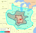 Converted to SVG


Article(s): 1968 Illinois earthquake
Request: Convert to SVG, please. ResMar 00:36, 30 May 2009 (UTC)
Graphist opinion(s):![]() Request taken by Mononomic. (I'm going to use a base from a different map, but it should turn out OK. Give me ±1 hr, and I'll be back. Mononomic (talk) 02:37, 5 June 2009 (UTC))
Request taken by Mononomic. (I'm going to use a base from a different map, but it should turn out OK. Give me ±1 hr, and I'll be back. Mononomic (talk) 02:37, 5 June 2009 (UTC))
- In progress. Remaking using a standard blank map. Check back in 24 hours, and I'll have something for you. Any specific color requests or additions/deletions? Mononomic (talk) 03:30, 5 June 2009 (UTC)
White House Floorplans
-
 White House Complex
 -
 Ground floor
 -
 State floor
 -
 Second floor (residence)
 -
Done White House Complex SVG
-
Done by ZooFari
-
 Done by ZooFari
 -
Done by ZooFari


Article(s): White House
Request: Vectorize, please. wadester16 06:03, 31 May 2009 (UTC)
Graphist opinion(s):
- What font would you like? ZooFari 15:19, 31 May 2009 (UTC)
- Done I completed File:WHComplex.SVG. I could not retain the font. I also do not have enough time to do the others, maybe someone else...? --Sushiflinger (Goldblattster) (talk!) 15:33, 31 May 2009 (UTC)
Zoofari: I used Andalus font. --Sushiflinger (Goldblattster) (talk!) 15:35, 31 May 2009 (UTC)
- Just a couple notes: The East Colonnade is not labeled and "Colonnade" is spelled wrong in "West Colonade" [sic]. Also you're missing an "e" in "Jacqueline". Additionally, it looks like the font for "Executive Residence" is smaller than the others. Maybe it's just an eye trick, but if it is different, can you make it the same as the rest?wadester16 17:33, 31 May 2009 (UTC)
- Right now it looks kind of jank, but I really need to go right now. Feel free to revert it for now, (or another graphist to fix it) but I will fix it later. ZooFari 18:27, 31 May 2009 (UTC)
- You still spelled "colonnade" wrong: two N's and one L. 66.194.177.114 (talk) 17:00, 1 June 2009 (UTC)
- Right now it looks kind of jank, but I really need to go right now. Feel free to revert it for now, (or another graphist to fix it) but I will fix it later. ZooFari 18:27, 31 May 2009 (UTC)
- I finished the second one. To prevent me from overwhelming (because I had to start all over like 2 times because of my stupid Inkscape),
I will leave the others to other graphists.If no one takes action, then I guess I will do them myself. Wadester, how is that? ZooFari 03:44, 2 June 2009 (UTC)- Looks GREAT! Not to complain (:-)), but don't you now have a template to work from to do the others? wadester16 04:14, 2 June 2009 (UTC)
- Okay, done with the next one. How's that? ZooFari 23:45, 2 June 2009 (UTC)
 Fixed Oops, forgot. I will see if I get to the last one today. BTW, you forgot to sign. ZooFari 01:17, 3 June 2009 (UTC)
Now that work is done at your talk page, I will go ahead and start vectoring the last png. Hopefully it will be finished by the end of today. ZooFari 00:47, 5 June 2009 (UTC)
Palin Nowhere 99901.jpg
-
 Sarah Palin with Nowhere Alaska shirt

Article(s): Sarah Palin, Gravina Island Bridge
Request: It looks like this image was edited to tone down the glare from the background (I assume; no summary given with the new version). Unfortunately the new version looks unnatural and strangely colored (purple!). Could someone use the original and retouch this image with a bit more finesse? - Gump Stump (talk) 23:20, 4 June 2009 (UTC)
Graphist opinion(s): ![]() Done All it needed was some love from the curves filter. --Blacklemon67 (talk) 21:41, 5 June 2009 (UTC)
Done All it needed was some love from the curves filter. --Blacklemon67 (talk) 21:41, 5 June 2009 (UTC)
- Very nice, thank you! - Gump Stump (talk) 22:21, 5 June 2009 (UTC)
- Note: Was a bit too red and blues were too saturated as well. Reworked image and uploaded an original size an decided afterwords to run it over with a cropped 3 by 2 ratio. Also, note that they are sitting in front of a blue table with strong back lighting - which brings out some blue reflection on them - these are the natural colors at the scene. JaakobouChalk Talk 23:47, 7 June 2009 (UTC) +n 23:50, 7 June 2009 (UTC)
Vitalia Diatchenko
-
 Vitalia Diatchenko photo
 -
 Cropped image


Article(s): Vitalia Diatchenko
Request: My request is simple, crop it. I don't want to see the clay court or the ruse open word, I want to see Vitalia only. Thanks Arteyu ? Blame it on me ! 02:27, 8 June 2009 (UTC)
Graphist opinion(s): ![]() Done Here you go, cropped as requested, hope this is ok. Tango22Talk
Done Here you go, cropped as requested, hope this is ok. Tango22Talk
- Yeah, thank you (: Arteyu ? Blame it on me ! 11:52, 8 June 2009 (UTC)
Simple svg-ify
-
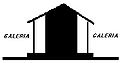 Galleried house
 -
 SVG Version


Article(s): Jesuit Missions of the Chiquitos
Request: Recreate as svg and remove/replace Spanish text. bamse (talk) 01:26, 10 June 2009 (UTC)
Graphist opinion(s):
![]() Request taken by Connormah.
Request taken by Connormah.
Here you go. What do you think? Connormah (talk) 02:19, 10 June 2009 (UTC)
CGF Logo
Based on the requester's comment, BOLDly marking this done. 76.117.247.55 (talk) 19:09, 11 June 2009 (UTC)
Article(s): Commonwealth Games
Request: Can any of you convert this logo to Svg? Please also do make it transparent. If you could not make it transparent in Svg, feel free to do it in Png, I just want it to be transparent. Thanks Arteyu ? Blame it on me ! 05:39, 19 May 2009 (UTC)
Graphist opinion(s): The image is on Wikipedia only under a fair use rationale--link to it, don't display it here. - Gump Stump (talk) 06:55, 19 May 2009 (UTC)
- This also means we can't do anything to it. We're not allowed to manipulate copyrighted images, especially to an infinitely scalable format. —Vanderdecken∴ ∫ξφ 17:18, 20 May 2009 (UTC)
- Are you sure? I know I've seen logos, etc. vecorized here. 76.117.247.55 (talk) 17:34, 22 May 2009 (UTC)
- The Graphic Lab never vectorises copyrighted works as a matter of policy, thought not all logos are copyrighted, and some are of a simplicity and lack of originality that they cannot be copyrighted (such as the logo of House, House logo.svg), so you may have seen vectorised logos around Wikipedia. —Vanderdecken∴ ∫ξφ 20:16, 22 May 2009 (UTC)
- Are you sure? I know I've seen logos, etc. vecorized here. 76.117.247.55 (talk) 17:34, 22 May 2009 (UTC)
- I notice we did Dell and, appropriately to this request, the NHL. I also note the templates on those images, especially {{SVG-Logo}}, which suggest there is no problem with SVGing copyrighted logos. 76.117.247.55 (talk) 01:18, 24 May 2009 (UTC)
- Converted, just because it was composed of simple elements and geometric shapes, so fairly easy to do. gringer (talk) 09:40, 25 May 2009 (UTC)
- Gee, thanks. The SVG look so much better than the original. Thank you again Arteyu ? Blame it on me ! 09:10, 26 May 2009 (UTC)
Easy SVG (Not even copyrighted!)
76.117.247.55 (talk) 19:07, 11 June 2009 (UTC)
-
 AT keyboard port
 -
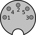 Done by ZooFari


Articels: AT keyboard
Request: SVGify. 76.117.247.55 (talk) 22:47, 30 May 2009 (UTC)
Oppinion:
- That's a 5, not a 6. 76.117.247.55 (talk) 19:59, 1 June 2009 (UTC)
- One question: Are the two shapes parts of circles or ellipses? I know the original isn't very clear, but I think they are supposed to be circular. 76.117.247.55 (talk) 16:00, 2 June 2009 (UTC)
- Not sure, the large one overall is an eclipse, while the pins are circles. I think I made the bottom half-circle cutout eclipse too. Is that what's wanted? ZooFari 19:18, 2 June 2009 (UTC)
- Lacking an actual copy of the standard, I can't really say if they should be circular or not, I just seemed to remember they were both round (The connector and notch). 76.117.247.55 (talk) 23:38, 5 June 2009 (UTC)
- Not sure, the large one overall is an eclipse, while the pins are circles. I think I made the bottom half-circle cutout eclipse too. Is that what's wanted? ZooFari 19:18, 2 June 2009 (UTC)
- I've made it circular and increased stroke. ZooFari 04:41, 10 June 2009 (UTC)
- One question: Are the two shapes parts of circles or ellipses? I know the original isn't very clear, but I think they are supposed to be circular. 76.117.247.55 (talk) 16:00, 2 June 2009 (UTC)
Done! 76.117.247.55 (talk) 19:07, 11 June 2009 (UTC)
SWFC
-
 SVG Version
Article(s): SWFC
Request: SVGify it, someone should be able to do it Arteyu ? Blame it on me ! 18:38, 9 June 2009 (UTC)
Graphist opinion(s):
![]() Request taken by Connormah.
How's this? Connormah (talk) 03:29, 10 June 2009 (UTC)
Request taken by Connormah.
How's this? Connormah (talk) 03:29, 10 June 2009 (UTC)
- Wow, nice! Thanks! But can you make the font looks bigger (I mean the Tier 1 (Divison 1/Premier) word and so on)? Thanks (: Arteyu ? Blame it on me ! 04:19, 10 June 2009 (UTC)
- Hm, how's this? Connormah (talk) 22:58, 10 June 2009 (UTC)
- Wow, kewl! Thanks (: Arteyu ? Blame it on me ! 05:58, 11 June 2009 (UTC)
- Hm, how's this? Connormah (talk) 22:58, 10 June 2009 (UTC)
- Wow, nice! Thanks! But can you make the font looks bigger (I mean the Tier 1 (Divison 1/Premier) word and so on)? Thanks (: Arteyu ? Blame it on me ! 04:19, 10 June 2009 (UTC)
SALightIntersection
-
 A traffic light intersection in South Australia

Article(s): List of variations in traffic light signalling and operation
Request: I've rotated this image a few minutes ago using IrfanView 4.20 "fine rotation" but now it's blurry... Seems I've made something wrong, probably used the wrong graphic software :-/ Could someone please take the orinal image and rotate it so it doesn't get blurry? Thanks, Scriberius (talk) 10:48, 7 June 2009 (UTC)
Graphist opinion(s): Not much of an original but made the correction requested. JaakobouChalk Talk 00:53, 8 June 2009 (UTC)
- Thanks for your work! That request is resolved for me. --Scriberius (talk) 20:27, 8 June 2009 (UTC)
File:3rd Infantry Division DUI.svg SVGify
{{resolved}} Resolution removed by User:Jamesontai to request rework.
-
 3rd Army Infantry Division Distinction Unit Insignia
 -

Article(s): 3rd Infantry Division (United States)
Request: Please SVGify. Thanks! :D - Jameson L. Tai talk ♦ guestbook ♦ contribs 19:37, 8 June 2009 (UTC)
Graphist opinion(s): ![]() Done Svg-ified and made transparent. AndrewrpTally-ho! 00:45, 10 June 2009 (UTC)
Done Svg-ified and made transparent. AndrewrpTally-ho! 00:45, 10 June 2009 (UTC)
- Um, no. Why is the SVG so blurry, and when I scale it, it's like a raster? Me thinks you're taking shortcuts. Connormah (talk) 02:09, 10 June 2009 (UTC)
- May I request a rework? The one above (here) looked a lot better... - Jameson L. Tai talk ♦ guestbook ♦ contribs 04:04, 10 June 2009 (UTC)
- Also, the white patches inside the insignia are not supposed to be transparent... Thanks. - Jameson L. Tai talk ♦ guestbook ♦ contribs 04:05, 10 June 2009 (UTC)
- May I request a rework? The one above (here) looked a lot better... - Jameson L. Tai talk ♦ guestbook ♦ contribs 04:04, 10 June 2009 (UTC)
- That's not an SVG, it's a bitmap in an SVG container - it doesn't scale, and it has all the quality problems and imperfections of the original. Somebody else retrace as a proper SVG please. —Vanderdecken∴ ∫ξφ 09:13, 12 June 2009 (UTC)
- I'll do it later today. Autotracing doesn't work well either; raster-to-vector conversion is rarely an improvement unless it's redone by hand with Bézier curves. Fvasconcellos (t·c) 13:28, 12 June 2009 (UTC)
- Thanks guys, just letting you guys know that I am still watching this request. :) - Jameson L. Tai talk ♦ guestbook ♦ contribs 06:48, 13 June 2009 (UTC)
- I'll do it later today. Autotracing doesn't work well either; raster-to-vector conversion is rarely an improvement unless it's redone by hand with Bézier curves. Fvasconcellos (t·c) 13:28, 12 June 2009 (UTC)
Hockey Current Event Icon
-
 SVG
SVG

Article(s): Template:Current NHL season
Request: SVGify. Redraw the puck in a nuvola apps style fashion, please. Connormah (talk) 03:27, 2 June 2009 (UTC)
Graphist opinion(s):
![]() Request taken by Pbroks13.
How's that? --Pbroks13talk? 22:38, 13 June 2009 (UTC)
Request taken by Pbroks13.
How's that? --Pbroks13talk? 22:38, 13 June 2009 (UTC)
Manchester City FC
-
Manchester City FC Logo
Article(s): Manchester City F.C.
Request: The logo is in SVG (the secondthird newest version 15:15, June 2, 2009, not the one as seen above, click on the image and save the second newest version of it) uploaded by me, the only mistake that I can see is with the black line behind the M.C.F.C word, it should be like this [6], please refer to MCFC official website for further assistance [7]. Arteyu ? Blame it on me ! 15:27, 2 June 2009 (UTC)
After done fixing it, can you put the Comment as: Per request by Arteyu ? Thanks Arteyu ? Blame it on me ! 21:33, 2 June 2009 (UTC)
Graphist opinion(s):
![]() Request taken by Certes.
Request taken by Certes.
New version shown above: let's hope this one's acceptable. I also widened the shield edge and star border slightly to match the PNG more closely. Certes (talk) 17:08, 14 June 2009 (UTC)
- Wow! Thanks! Great job pal! Arteyu ? Blame it on me ! 19:01, 14 June 2009 (UTC)
Dallas Seal (Should be easy)
-
 Seal of Dallas, Texas
 -
 Seal of Dallas.svg
 -
 Flag of Dallas.svg


Article(s): Dallas
Request: Vectorise, and upload to commons. This shouldn't be that hard. Thanks in advance! Connormah (talk) 02:39, 4 June 2009 (UTC)
Graphist opinion(s): I found a better version (gif) thats higher quality, but I'm not able to make a good SVG from it. Might work until a SVG version is made/found. — raeky (talk | edits) 03:50, 14 June 2009 (UTC)
- Done --Svgalbertian (talk) 17:04, 14 June 2009 (UTC)
Correcting arrangement of English text on a language map of China
-
 Primary branches of Chinese

Article(s): Spoken Chinese
Request: Please do what is needed so that "THE LANGUAGES SINITIC" will be displayed as "THE SINITIC LANGUAGES".
Wavelength (talk) 23:25, 12 June 2009 (UTC)
I meant that the words are incorrectly displayed in the article Spoken Chinese (at least, on the web browser that I am using).
-- Wavelength (talk) 04:47, 14 June 2009 (UTC)
Graphist opinion(s):
- It already says "THE SINITIC LANGUAGES". Maybe a graphist came by and fixed it, but forgot to leave a note? ZooFari 03:55, 13 June 2009 (UTC)
- I reproduced this problem: the text looked fine on .SVG page but was rendered incorrectly when displayed within WP page. Fixed by making "THE SINITIC LANGUAGES" a single text element rather than three. Perhaps the problem was intermittent or depended on some variable such as browser (I use Firefox 3). Wavelength, can you also see the text correctly now? Certes (talk) 10:05, 14 June 2009 (UTC)
- Yes, I can. Thank you for your help. -- Wavelength (talk) 14:00, 14 June 2009 (UTC)
COA of the Federated States of Micronesia
-

-
SVG

Article(s): Federated States of Micronesia
Request: Vectorize please.. Connormah (talk) 02:00, 6 June 2009 (UTC)
Graphist opinion(s):
![]() Done --Pbroks13talk? 23:49, 15 June 2009 (UTC)
Done --Pbroks13talk? 23:49, 15 June 2009 (UTC)
Weight loss pyramid
-
Weight loss pyramid
-
 Done by ZooFari

Article(s): Weight loss
Request: Please SVGify. Fortuynist (talk) 01:45, 14 June 2009 (UTC)
Graphist opinion:
![]() Request taken by ZooFari.
Request taken by ZooFari.
- How's that? Also, I dispute the license. Are you sure the source you provided doesn't have the image copyrighted? ZooFari 03:38, 14 June 2009 (UTC)
- That's good. The website linked does not have an actual pyramid or picture, only information and services which mostly duplicates the text on article Healthy diet. The pyramid itself, and the arrows are simple geometry, and have been PD'd by the user. Fortuynist (talk) 13:52, 14 June 2009 (UTC)
4th Infantry Division DUI SVGify please?
-
 US Army 4th Infantry Division Distinction Unit Insignia
 -
 SVG
SVG


Article(s): 4th Infantry Division
Request: SVGify please? Thank you so much! - Jameson L. Tai talk ♦ guestbook ♦ contribs 16:00, 2 June 2009 (UTC)
- It looks awesome. Thank you so much! 163.118.222.98 (talk) 19:54, 3 June 2009 (UTC)
Graphist opinion(s):
![]() Done, how's this? Fvasconcellos (t·c) 20:56, 2 June 2009 (UTC)
Done, how's this? Fvasconcellos (t·c) 20:56, 2 June 2009 (UTC)
Clearing the circuit backlog
Article(s): All in Zobel network.
Request: I'll give a barnstar to the one(s) who clear this category up (12 images in total). Convert to SVG, upload at commons (but keep the rasters here as requested by the uploader), and update the articles they are in. They are simple lines that are very easy to do (I could do them myself but I'm quite busy), however, please don't trace bitmap these. Feel free to ask me questions. ZooFari 20:38, 12 June 2009 (UTC)
Graphist opinion(s): I can do some. Connormah (talk) 04:07, 13 June 2009 (UTC)
- Alright, here's an example of one. How does it look? I'll get to the others ASAP. Connormah (talk) 04:32, 13 June 2009 (UTC)
- I just found out that some are already done. I'll do the ones that haven't. Connormah (talk) 04:51, 13 June 2009 (UTC)
- Looks good, but there seems to be a line error in both of them. Maybe it is just the thumb, but the line looks shifted (near the humps). Also, it would be pleasant if you can update the ones you didn't do in the articles. ZooFari 04:53, 13 June 2009 (UTC)
- ZooFari, the line shifts were in the original PNGs... I couldn't tell if they were just lossy compression artifacts, or what not, so I'll wait for a word on that. It wouldn't be that hard to fix, though. I'll get them into articles once I finish. --Connormah (talk) 04:57, 13 June 2009 (UTC)
- Well that's awkward. Keep them for now. The other images seem to have them too, and somewhat seems it was meant on purpose. Also, I was referring to the SVGs you didn't make. If they aren't updated in the articles, I'd like those updated too. Thanks for the work, I'm too busy to vector them myself. ZooFari 05:04, 13 June 2009 (UTC)
- ZooFari, the line shifts were in the original PNGs... I couldn't tell if they were just lossy compression artifacts, or what not, so I'll wait for a word on that. It wouldn't be that hard to fix, though. I'll get them into articles once I finish. --Connormah (talk) 04:57, 13 June 2009 (UTC)
- Looks good, but there seems to be a line error in both of them. Maybe it is just the thumb, but the line looks shifted (near the humps). Also, it would be pleasant if you can update the ones you didn't do in the articles. ZooFari 04:53, 13 June 2009 (UTC)
- I just found out that some are already done. I'll do the ones that haven't. Connormah (talk) 04:51, 13 June 2009 (UTC)
- I was already converting the first three images (Zobel*.svg, not listed below) when this request appeared. After discussion with Spinningspark I think we have acceptable versions of those images now. They're hand-coded, in case anyone wishes to use them as templates for the others. Note that the subscripts only work in certain browsers, e.g. Opera and IE+ASV; all text appears on the baseline in Firefox[8] and even Inkscape. Certes (talk) 12:32, 13 June 2009 (UTC)
- Hi, thanks for the work you are doing on this guys, and my apologies for the mess on this article. It was created in three waves using different graphics tools each time, (slowly getting better). I no longer have professional design tools available (I no longer do that kind of work) and it took a while for me to acquire the right toolkit for internet work. However, I have reverted the latest batch, I did not think they were acceptable. Can I suggest that you template the updates on one of the more recent, better, diagrams in the article such as File:Bridge T with non-ideal inductor.svg? The resistors are zig-zag US style instead of boxes. SpinningSpark 13:16, 13 June 2009 (UTC)
- Shall I take a look at the rest of the PNGs or is someone else tackling them? File:Bridge T with non-ideal inductor.svg looks great but a bit large at 41KB. By the way, I always thought of the zig-zag resistors (with three points each way) as a global standard, with the box style as a valid but old-fashioned alternative. UK magazine Everyday Electronics used zig-zags since 1971 and its successor Everyday Practical Electronics still does. Which symbol do we want for impedances in Zobel network or don't we care as long as it's consistent? Certes (talk) 15:33, 13 June 2009 (UTC)
- If it's too large there must be something unecessary in there, just copy and paste the bits that are useful. The zig-zag is not a global standard, you have it the wrong way round, it used to be everyone used zig-zag but the official standard in Europe is now the IEC standard which uses a box. At least that was the case when I graduated (all the exams had boxes) and as far as I know nothing has changed since. However, zig-zag is used in the US and is still widely understood (and even preferred) amongst engineers in the UK. I started off doing Wikipedia diagrams with resistor=boxes, because I assumed that was the global standard, until I realised that was confusing many Americans. Since I actually prefer the zig-zags and since the era I write about uses those symbols it seemed sensible to me to change to zig-zag. There is no reason that Wikipedia should standardise on one region's standards. This has been discussed at Wikipedia Electronics but the consensus was that they don't much care and are not going to impose a standard of their own. This does not apply to the first two diagrams you did by the way, which are impedances (Z), not resistances (R), and it universally agreed that impedances should be boxes. SpinningSpark 16:58, 13 June 2009 (UTC)
- Thanks, I'll take a look at the other images now. As all the existing SVGs have zig-zag resistances, I'll draw mine that way. It seems a useful way to distinguish resistance from impedance within this article, even if it's not a universal convention. I'll put them on Commons and move my previous efforts 1 2 3 there too. Certes (talk) 18:02, 13 June 2009 (UTC)
- If it's too large there must be something unecessary in there, just copy and paste the bits that are useful. The zig-zag is not a global standard, you have it the wrong way round, it used to be everyone used zig-zag but the official standard in Europe is now the IEC standard which uses a box. At least that was the case when I graduated (all the exams had boxes) and as far as I know nothing has changed since. However, zig-zag is used in the US and is still widely understood (and even preferred) amongst engineers in the UK. I started off doing Wikipedia diagrams with resistor=boxes, because I assumed that was the global standard, until I realised that was confusing many Americans. Since I actually prefer the zig-zags and since the era I write about uses those symbols it seemed sensible to me to change to zig-zag. There is no reason that Wikipedia should standardise on one region's standards. This has been discussed at Wikipedia Electronics but the consensus was that they don't much care and are not going to impose a standard of their own. This does not apply to the first two diagrams you did by the way, which are impedances (Z), not resistances (R), and it universally agreed that impedances should be boxes. SpinningSpark 16:58, 13 June 2009 (UTC)
- Shall I take a look at the rest of the PNGs or is someone else tackling them? File:Bridge T with non-ideal inductor.svg looks great but a bit large at 41KB. By the way, I always thought of the zig-zag resistors (with three points each way) as a global standard, with the box style as a valid but old-fashioned alternative. UK magazine Everyday Electronics used zig-zags since 1971 and its successor Everyday Practical Electronics still does. Which symbol do we want for impedances in Zobel network or don't we care as long as it's consistent? Certes (talk) 15:33, 13 June 2009 (UTC)
- Hi, thanks for the work you are doing on this guys, and my apologies for the mess on this article. It was created in three waves using different graphics tools each time, (slowly getting better). I no longer have professional design tools available (I no longer do that kind of work) and it took a while for me to acquire the right toolkit for internet work. However, I have reverted the latest batch, I did not think they were acceptable. Can I suggest that you template the updates on one of the more recent, better, diagrams in the article such as File:Bridge T with non-ideal inductor.svg? The resistors are zig-zag US style instead of boxes. SpinningSpark 13:16, 13 June 2009 (UTC)
- I've now converted most of the images. Comments welcome, especially on:
- Spinningspark has kindly
offered to sendsent me data behind the three PNG graphs so these can be replicated more accurately and easily than by measuring the PNG. Unfortunately I will have limited time available for WP for the next week or so; please feel free to take over or wait until I return. Certes (talk) 15:57, 14 June 2009 (UTC)
All the PNG circuits and graphs are now converted, with consistent backgrounds which are easier on the eye. Suggestions for improvement would be welcome. I have removed the gallery, as the SVG versions it contains are no longer used in this article. Certes (talk) 14:44, 22 June 2009 (UTC)
Seth Kinman's bar
-
 1889 photo of barroom interior

![[1]](http://img141.imageshack.us/img141/2339/mapv.png)
![[2]](http://img408.imageshack.us/img408/6813/map2.png)
![[3]](https://en.wikipedia.org/wiki/File:Map_of_Hungary_in_1490.png)
_EN.svg)
.jpg)
![[6]](http://blogs.manchestereveningnews.co.uk/the_urban_warrior/Manchester-City.png)
_Bridge.svg)
_Transfer.svg)
_Bridge_T.svg)
_Bridge.PNG)
_Transfer.PNG)
_Bridge_T.PNG)
_Practical_Bridge_T.PNG)
_Balanced_Bridge_T.PNG)
_Balanced_Zobel_half_section.PNG)
Article(s): Seth Kinman
Request: Black edge needs to be trimmed, can anything be done with the horizontal crack/fold in the middle? Window glare. The 3 chairs, Grizzly Bear head, and photo (upper right between the antlers) are all important to the image. Smallbones (talk) 16:42, 18 June 2009 (UTC)
Graphist opinion:![]() Done I tagged the image for deletion, uploaded it to commons (as it should be on commons), and then cropped the commons image. --Sushiflinger (Goldblattster) (talk!) 20:52, 22 June 2009 (UTC)
Done I tagged the image for deletion, uploaded it to commons (as it should be on commons), and then cropped the commons image. --Sushiflinger (Goldblattster) (talk!) 20:52, 22 June 2009 (UTC)
- Great! Not sure why the new pix doesn't show up in the article, but I think that may happen after the old pix is deleted. Quibbles: the "border" could be trimmed back a bit more to the actual photograph. I suppose there isn't anything you can do about the window glare or the crack/fold in the middle? Thanks again. Smallbones (talk) 21:58, 22 June 2009 (UTC)
![]() Done
Done![]() Done. I cropped the image more. If the image is not appeaing in the article, try clearing your cache. Anyway, I don't know how to touch up the line in the middle. Perhaps someone else will know.--Sushiflinger (Goldblattster) (talk!) 17:18, 23 June 2009 (UTC)
Done. I cropped the image more. If the image is not appeaing in the article, try clearing your cache. Anyway, I don't know how to touch up the line in the middle. Perhaps someone else will know.--Sushiflinger (Goldblattster) (talk!) 17:18, 23 June 2009 (UTC)
- Fantastic!! It is now appearing in the article. Please excuse my quibbling. Smallbones (talk) 17:38, 23 June 2009 (UTC)
Clean up this SVG
Article(s): Simpson's
Request: Can someone help me make these edges smooth, instead of pixelated? Thanks. Connormah (talk) 23:43, 25 June 2009 (UTC)
Graphist opinion(s):
![]() Request taken by ZooFari.
Request taken by ZooFari.
![]() Done How's that (Okay, it is not that accurate, but that's what's expected from a bad SVG)? ZooFari 01:39, 27 June 2009 (UTC)
Done How's that (Okay, it is not that accurate, but that's what's expected from a bad SVG)? ZooFari 01:39, 27 June 2009 (UTC)