Wikipedia:Graphics Lab/Image workshop/Archive/Jul 2009
 | This page, part of the Graphics Lab Wikiproject, is an archive of requests for July 2009. Please do not edit the contents of this page. You can submit new requests here. |
Stale
Millennium '73
Graphist opinion(s):
-
 Border removal/cleanup
 -
 Version with border removed
 -


Article(s): Millennium '73
Request: As requested at Wikipedia:Featured_article_candidates/Millennium_'73/archive2. Otterathome (talk) 10:15, 25 May 2009 (UTC)
- GrahamColm removed the borders from the Astrodome image. I'm not sure what other cleanup is required. Will Beback talk 22:15, 25 May 2009 (UTC)
Graphist opinion(s): I've cleaned up the poster image as much as possible, removed noise & JPEG artefact. There isn't really much more that can be done to improve it, considering it started at a low quality. Tango22Talk 22:16, 09 June 2009 (UTC)
Yugoslavia


Article(s): Yugoslavia
Request: Convert to SVG and use a updated style like in the second image. PRODUCER (talk) 17:12, 9 June 2009 (UTC)
Graphist opinion(s):
Transparent background
Article(s): Penang FA
Request: Make the logo background transparent. Thanks Arteyu ? Blame it on me ! 09:07, 10 June 2009 (UTC)
Graphist opinion(s):
![]() Request taken by Quasar Jarosz.
Request taken by Quasar Jarosz.
- How is that? Quasar (talk) 13:31, 10 June 2009 (UTC)
- Yeah, that looks great. Thanks pal (: Arteyu ? Blame it on me ! 05:35, 11 June 2009 (UTC)
- Well, it got removed for being non-free and linked from a page that isn't an article (is there no exception for this type of work?) but the updated version is still there. Quasar (talk) 15:01, 10 June 2009 (UTC)
- What do you mean by not linked to any appropriate article ? Yes, I agree that the Penang FA page isn't referenced but still qualify under WP:N. And why do you totally remove the File link above, should put the NFCC template instead Arteyu ? Blame it on me ! 05:35, 11 June 2009 (UTC)
- It probably got removed because it was at Commons. All non-free images should stay here. ZooFari 17:05, 10 June 2009 (UTC)
Benghazi Mu'tamarat Sha'bia
-
 Map of administrative subdivisions in Benghazi

Article(s): Benghazi
Request: Please vectorise this JPEG image and make it SVG. External division lines should be thicker than internal division lines.Jaw101ie (talk) 09:47, 4 June 2009 (UTC)
Graphist opinion(s):
I've copied the following from my talk page, because it seems more relevant here gringer (talk) 01:35, 12 June 2009 (UTC):
Can you please have a look at my Benghazi Benghazi Mu'tamarat Sha'bia map on Wikipedia:Graphic Lab/Image workshop? It seems like it might have been forgotten? thanks a lot... Jaw101ie (talk) 06:53, 11 June 2009 (UTC)
- I'm not likely to work on this, as I have other things to do at the moment. However, I can offer a few suggestions as to why it isn't being snatched up by other people:
- This isn't a completely trivial vector conversion, due to JPEG artefacts and complex elements in your map.
- Doing this "properly" would require going back to official maps of the area, and the source is not hyperlinked in the original picture
- Some lines are smooth, others are jagged with sharp corners, and some have varying thickness (i.e. borders are unclear). This inconsistency doesn't seem like what was intended in the picture
- There is an overlap of a few line segments at the top of region 23, resulting in a cross shape, which is unlikely to be wanted in the final version
- There's usually no need to go back to user talk pages to ask for something on Wikipedia:Graphic Lab/Image workshop to be done, that's the point of the page. If you have an issue with something not being done, mention it on the Image workshop page, so that other people can understand your concerns. gringer (talk) 01:35, 12 June 2009 (UTC)
Yekaterinburg Coat of Arms
-
 Vectorize, please.
 -
 Use elements from this flag.
_(1998)_HIgh_Res.jpg)
.svg)
Article(s): Yekaterinburg
Request: Can someone vectorize the coat of arms using the elements from the flag? Thanks. Connormah (talk) 00:34, 17 June 2009 (UTC)
Graphist opinion(s):
Oklahoma City memorial panoramic shots
On a recent road trip, I took some pictures of the Oklahoma City National Memorial for use in this panorama. I thought it was pretty good, but when I nominated it at Wikipedia:Featured picture candidates/Oklahoma City memorial, people pointed out several stitching errors (as well as an overexposure). I'd like someone who's better with Hugin than I am to take another whack at this one. I have the original shots here.
I also have a second set of panoramic shots here if someone wants to stitch those together as well. Raul654 (talk) 20:28, 5 June 2009 (UTC)
Article(s): Oklahoma City National Memorial
Request: Stitch the two above sets together with a minimum of stitching errors. Correct the overexposed building, if possible. Raul654 (talk) 20:29, 5 June 2009 (UTC)
Graphist opinion: I get a 403 forbidden error when I try to access the images. --Blacklemon67 (talk) 21:29, 5 June 2009 (UTC)
- My bad. I've fixed it. Raul654 (talk) 21:35, 5 June 2009 (UTC)
- *Poke*. Anyone planning to do this one? Raul654 (talk) 07:10, 17 June 2009 (UTC)
- I think unless the pictures was taken with a proper pano-head then it's nearly impossible to put back together without some stitching errors. Secondly the overexposed building is forever lost, once the detail is blown out you can't get it back. If you shot in RAW that might be different. — raeky (talk | edits) 15:00, 17 June 2009 (UTC)
- *Poke*. Anyone planning to do this one? Raul654 (talk) 07:10, 17 June 2009 (UTC)
Fixing line
-
 Road sign
 -
 SVG'd
SVG'd


Article(s): Hundreds of articles
Request: My request is quite easy, just fix the black lines & make it looks nicer. Don't convert it so SVG because it is being used in hundreds of articles. Arteyu ? Blame it on me ! 11:49, 5 June 2009 (UTC)
Graphist opinion(s): I think we should convert to SVG. Isn't there a bot that does the image changes? --Blacklemon67 (talk) 21:25, 5 June 2009 (UTC)
- It will be easier probably to convert it to SVG, and then if you like the new look, save it as a PNG. Also note that the reason it's used so many places is because it's used in templates like {{Malaysian Expressway System}}. It will be extremely easy to replace it with an SVG then; I've done similar things many times. 76.117.247.55 (talk) 23:31, 5 June 2009 (UTC)
- In that case, someone needs to do the changing --Blacklemon67 (talk) 00:01, 8 June 2009 (UTC)
- Hey, and there are 35 other file similar to that but I cant paste all of them here. Here's an example File:Mes-e2.png - only change the number "2" to other numbers 3,4,5,6...36 if you want to view it. It will be great if you can SVGify all of them. But i really don't think that it need to be SVGified because SVG image won't look good on thumbnail. I would consider you fixing the PNGArteyu ? Blame it on me ! 01:56, 8 June 2009 (UTC)
- If you're going to SVG this you might as well SVG all the ones linked on {{Malaysian Expressway System}}. — raeky (talk | edits) 03:01, 8 June 2009 (UTC)
- Isn't it possible to have SVGs with parameters? So [[File:Mae-e.svg|50px|E1|Test]] would yield
 --Blacklemon67 (talk) 11:11, 8 June 2009 (UTC)
- Isn't it possible to have SVGs with parameters? So [[File:Mae-e.svg|50px|E1|Test]] would yield
- Pls see the request Wikipedia:Graphic_Lab/Image_workshop#Passing_the_parameter--Naveenpf (talk) 10:17, 18 June 2009 (UTC)
- If you're going to SVG this you might as well SVG all the ones linked on {{Malaysian Expressway System}}. — raeky (talk | edits) 03:01, 8 June 2009 (UTC)
Ntv7
Article(s): Ntv7
Request: Is it possible to fix this image? There are small light black lines between the grey that can be seen within the "7" word. There are also some on the other part of the image. Arteyu ? Blame it on me ! 10:22, 18 June 2009 (UTC)
Graphist opinion(s):
Temple plan
Article(s): Shin-Yakushi-ji
Request: Could a wikigraphist create two plans (or one) based on [1]? The first plan shows the temple grounds. Trees, water and the "WC" can be dropped. The second plan shows the main building. In the center of the main building there is a big sitting Buddha (Yakushi Nyorai) [2] surrounded by twelve standing statues. [3] A blank plan would do or I could help with the translation of the labels. bamse (talk) 16:46, 18 June 2009 (UTC)
Graphist opinion(s):
Royal Canadian Air Force COA
Article(s): Royal Canadian Air Force
Request: Please vectorize. Connormah (talk) 23:11, 18 June 2009 (UTC)
Graphist opinion(s):
US Infantry Badges
-
 13th Airborne Div. Patch
 -

-

-

-

-


Article(s): 5th Infantry Division (United States), 13th Airborne Division (United States), 24th Infantry Division (United States), 38th Infantry Division (United States), 42nd Infantry Division (United States) ......
Request: Please vectorize. Take your time, do them as you please. Thanks in advance. Connormah (talk) 23:31, 18 June 2009 (UTC)
Graphist opinion(s):
Nuvola Icons - Vectorize


Article(s): Many
Request: Can these be vectorized? Thanks. Connormah (talk) 03:56, 19 June 2009 (UTC)
Graphist opinion(s):
SVG Fix
-
 Yemen COA

Article(s): Yemen
Request: Reduce stroke, and, the sides look a bit grainy, can it be fixed? Thanks. Connormah (talk) 02:51, 1 June 2009 (UTC)
Graphist opinion(s):
Sport Current Event Icons
-
 Golf Current Event
 -
 Volleyball Current Event
 -
 Basketball Current Event
 -
 Cricket Current Event
 -
 AFL Current Event


Refs:
-
 You may pull the basketball from here
 -
 You may refer to this tennis ball for the baseball one
 -
 Use the CE clock from here.


-
 Golf
Golf -
 Volleyball
 -
 Baseball
 -
 Basketball
 -
 Cricket
 -
 AFL
AFL -
 Squash
 -
 Curling
 -
 Hockey
 -
 Boxing
 -
 Swimming
 -
 Athletics
 -
 Lacrosse


Article(s): Template:Current sport
Request: Vectorize please. I'd prefer that the volleyball one is entirely redrawn (the volleyball) to fit with the nuvola style. You may use the images I have provided (SVGs) as references, or in the case (AKA the basketball) combine with the current event clock to make the icon. Thanks in advance! Connormah (talk) 03:57, 14 June 2009 (UTC)
Graphist opinion(s):
![]() Request taken by Pbroks13.
Will that work? --Pbroks13talk? 08:00, 15 June 2009 (UTC)
Request taken by Pbroks13.
Will that work? --Pbroks13talk? 08:00, 15 June 2009 (UTC)
- Wow, great! Arteyu ? Blame it on me ! 10:01, 15 June 2009 (UTC)
- Woah, thanks a bunch, Pbroks! Connormah (talk) 13:37, 15 June 2009 (UTC)
- Hm, one problem, though. Some of them aren't showing up in their pages for me. Is it just me, or is there some sort of problem? Connormah (talk) 13:41, 15 June 2009 (UTC)
- I'm not sure, everything is looking good to me. Maybe try purging your cache? --Pbroks13talk? 17:46, 15 June 2009 (UTC)
- Hm, one problem, though. Some of them aren't showing up in their pages for me. Is it just me, or is there some sort of problem? Connormah (talk) 13:41, 15 June 2009 (UTC)
- Woah, thanks a bunch, Pbroks! Connormah (talk) 13:37, 15 June 2009 (UTC)
- Wow, great! Arteyu ? Blame it on me ! 10:01, 15 June 2009 (UTC)
I had another similar request, can someone create a 'Squash current event' image? Arteyu ? Blame it on me ! 10:14, 16 June 2009 (UTC)
- Hows that? --Pbroks13talk? 19:36, 16 June 2009 (UTC)
- Awesome, I'll add it to the template. Pbroks, would you mind doing a curling one, with a black curling stone, with a yellow/red handle in nuvola? Thank you so much in advance. Connormah (talk) 01:14, 17 June 2009 (UTC)
- Wow, awesomeness, thanks pal (: Arteyu ? Blame it on me ! 07:06, 17 June 2009 (UTC)
- Awesome, I'll add it to the template. Pbroks, would you mind doing a curling one, with a black curling stone, with a yellow/red handle in nuvola? Thank you so much in advance. Connormah (talk) 01:14, 17 June 2009 (UTC)
Curling done. Good? --Pbroks13talk? 18:47, 17 June 2009 (UTC)
How about creating current image for popular and core sports such as athletics, boxing, hockey & swimming ? Another thing is, can you make the basketball image better or make it similar to the PNG, with better lines & gradients to suit template & pages? If not I think better to stick to the PNG because it looks better (although that it isn't scalable). Arteyu ? Blame it on me ! 10:03, 18 June 2009 (UTC)
- I don't know what you mean, but the basketball one is very similar to the PNG to me. BTW, could you make the curling stone handle a tad bit brightwer, as well? Thanks. Connormah (talk) 13:13, 18 June 2009 (UTC)
- Okay, I made the boxing one; the hockey one I already made before. I'll get to the swimming one later. Also, what do you mean by "athletics"? In regards to the basketball, what do you mean? The gradients match, so I'm kind of confused. --Pbroks13talk? 18:29, 18 June 2009 (UTC)
- Pbroks, if you can, may I request a lacrosse one as well? Connormah (talk) 19:36, 18 June 2009 (UTC)
- Thanks, the basketball image looks better now (: Ohh, athletics in this case refer to Track and field athletics, you can get take the image from here File:Athletics pictogram.svg. And Pbroks, can you also please fix the volleyball lines ? Thanks Arteyu ? Blame it on me ! 06:26, 19 June 2009 (UTC)
- Pbroks, if you can, may I request a lacrosse one as well? Connormah (talk) 19:36, 18 June 2009 (UTC)
+ swimming and athletics. --Pbroks13talk? 23:09, 19 June 2009 (UTC)
- Looks great! Arteyu ? Blame it on me ! 06:05, 22 June 2009 (UTC)
Panorama of Maiden Castle
-
 A panorama of the interior of Maiden Castle
 -
 Edited
 -
 Reduced seams and white space
Article(s): Maiden Castle, Dorset
Request: The article is currently a Featured Article candidate and an editor has commented that the image needs the colours tweaking. At the moment, it's very clear that the panorama is several different images stuck together and the different light levels is a bit distracting. I uploaded this from flickr and don't have the originals as I didn't take them. If anyone could help out it would be very much appreciated. Cheers, Nev1 (talk) 17:01, 20 June 2009 (UTC)
Graphist opinion: I think I might be able to cut the picture up and then re stitch it to make it look better then touch it up. I'll work on it later today :). Irunongames • play 17:39, 20 June 2009 (UTC)
- That would be great if you could :-) Nev1 (talk) 18:45, 20 June 2009 (UTC)
- Their seems to have been some error in the program that made it. I used Gimp to try to get it out until I found the right balance but their was some sort of trasniton that I didn't see zooming. Is this good enough? If not I'll work on it tonight. Also when I tried hugin again it showed a fragment in the left hand corner where their is a small triangle missing but then it disappeared.Irunongames • play 18:43, 21 June 2009 (UTC)
- I've worked on the latest version by Irunongames to reduce the seams breaking up the image and filled in the white space, hows this? It is much harder to tell now that it was produced from several images. Tango22Talk 21:32, 22 June 2009 (UTC)
- Their seems to have been some error in the program that made it. I used Gimp to try to get it out until I found the right balance but their was some sort of trasniton that I didn't see zooming. Is this good enough? If not I'll work on it tonight. Also when I tried hugin again it showed a fragment in the left hand corner where their is a small triangle missing but then it disappeared.Irunongames • play 18:43, 21 June 2009 (UTC)
Flag of Richmond BC

-
 Base off of

Article(s): Richmond, Flag of Richmond, British Columbia
Request: Could an SVG version be made of the flag? Thanks in advance. Connormah (talk) 05:23, 30 June 2009 (UTC)
Graphist opinion(s):
Coat of arms of the Republic of Macedonia
-
![[SVG version] We, at the Macedonian Wikipedia and on Commons in general, are facing one problem concerning the Coat of Arms of the Republic of Macedonia. The problem is in the design of the COA in the only SVG version existing on Commons (and being used everywhere). The particualr problem are the colours of the COA and the star that could be found at the top of the emblem. Below is a description of the problem in details.](//upload.wikimedia.org/wikipedia/commons/thumb/6/6a/Coat_of_arms_of_North_Macedonia.svg/112px-Coat_of_arms_of_North_Macedonia.svg.png) [SVG version]
[SVG version]
We, at the Macedonian Wikipedia and on Commons in general, are facing one problem concerning the Coat of Arms of the Republic of Macedonia. The problem is in the design of the COA in the only SVG version existing on Commons (and being used everywhere). The particualr problem are the colours of the COA and the star that could be found at the top of the emblem. Below is a description of the problem in details. -
 The coat of arms as it should be
(unfortunately, only in GIF)
![[SVG version] We, at the Macedonian Wikipedia and on Commons in general, are facing one problem concerning the Coat of Arms of the Republic of Macedonia. The problem is in the design of the COA in the only SVG version existing on Commons (and being used everywhere). The particualr problem are the colours of the COA and the star that could be found at the top of the emblem. Below is a description of the problem in details.](/wiki/File:Coat_of_arms_of_North_Macedonia.svg)

Article(s): Republic of Macedonia, Coat of arms of the Republic of Macedonia and many other politics and government related articles.
Request: As you can see, the problem is in the colours of the COA and in the star that is at the top of the emblem. First of all the colour of the opium poppy is wrong, it is not light brown, but dark brown. Secondly, the colour of the lines that come out of the spikes should be dark grey and the last problem concerning the colours is the colour of the sky. Besides the colours, there is another problem with star. As you can see, the star in the current version is bordered with yellow lines, but it should not. There should be a white line that goes near the borders of the star.
We have tried to correct this problem, but without any success. Since your team has excellent results concerning the vector images, we hope that you will solve our problem. We need a new SVG coat of arms, a modified version of the existing one, in accordance to the instructions, i.e. to look as close as possible to the GIF version (right).
That the coat of arms should look indeed like we are claiming testify these links to official government websites, where you can see what we mean in each case (plus the passports).
Please contact me here on my talk page on en. wiki for any queries, or even on mk.wiki, where I am administrator Б. Јанкулоски. I would be very greatful to know how the work is going. Thank you very much in advance B. Jankuloski (talk) 11:53, 1 July 2009 (UTC)
Graphist opinion(s):
- Is that better? I changed the star, background and poppies.--23230 talk 16:37, 1 July 2009 (UTC)
- It is perfect according to me. Danke and regards,--MacedonianBoy (talk) 17:06, 1 July 2009 (UTC)
- The outer line(in red) for the star should be fixed. Thanks Arteyu ? Blame it on me ! 17:59, 1 July 2009 (UTC)
- It is perfect according to me. Danke and regards,--MacedonianBoy (talk) 17:06, 1 July 2009 (UTC)
Shrink fair-use image

Article(s): Order of the Stick, Characters of the Order of the Stick
Request: Found this fair-use image, needs to be shrunk (probably to about 66% of the current size...so far it is only used at about 50% of the current size, at least on my browser, but I guess some wiggle room should be left). Unfortunately, right now the only 'image editing' software I have is MS Paint, and this is a .gif; if I try saving as .gif in Paint it loses most of the color. Should be easy to shrink, though, for anyone who has photoshop. (Barring that, I could always just delete the whole thing and upload a .jpg version instead, since .jpg is no problem for me.) rʨanaɢ talk/contribs 15:18, 17 June 2009 (UTC)
Graphist opinion: Seems ZooFari (talk · contribs) shrunk this by half; would you call this {{resolved}}? wadester16 05:38, 6 July 2009 (UTC)
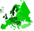
2009 flu pandemic in South America
-
 Current map

-
 Example map

-
 Argentina
 -
Bolivia
-
 Brazil
 -
 Chile
Chile -
 Colombia
 -
 Ecuador
 -
 Guyana
 -
 Paraguay
 -
 Peru
Peru -
 Suriname
 -
 Uruguay
 -
 Venezuela


Article(s): 2009 flu pandemic in South America and 2009 flu pandemic by country
Request: South American map is going to be entirely black, could someone create a map like this? Felipe Menegaz 16:00, 6 July 2009 (UTC)
Graphist opinion:
SVG Gone Screwy

Article(s): Coquitlam
Request: I recently made this SVG image, but all of my objects went all messed up, and strewn everywhere. Can somebody be so kind and fix it? Thanks. File:Coquitlam BC-flag.png for reference. Connormah (talk) 19:01, 7 July 2009 (UTC)
Graphist opinion(s):
Resolved
Particles of the standard model (easy color tweak)
-
 The particles of the Standard Model

Article(s): Quark (amongst others, currently an FAC)
Request: Apparently the purple is hard to distinguish from the blue for some people who have a hard time distinguishing between purple and blue. So if you could pick a color scheme which passes all the accessibility test, that would be nice. Headbomb {ταλκκοντριβς – WP Physics} 22:10, 26 June 2009 (UTC)
Graphist opinion(s):
![]() Request taken by ZooFari.
Request taken by ZooFari.
- That's the best one for Deuteranope. However, it is displayed with different contrast, not hue. ZooFari 00:20, 27 June 2009 (UTC)
- User is satisfied with it, so I guess that's a resolved. Thanks! Headbomb {ταλκκοντριβς – WP Physics} 05:59, 28 June 2009 (UTC)
University of Oslo seal
![]() Done
Done
-
 Seal of the University of Oslo (1842)
 -
 SVG seal with text on curve (does not render)


Article(s): University of Oslo
Request: File:Seal_of_the_University_of_Oslo.jpg is from 1842 and in the public domain, but in very low quality. If someone could redraw it in better quality, without background, it would be great - a free version of the university seal, that can be uploaded to Commons and used on other projects which do not allow fair use, would be greatly appreciated. The seal shows Apollo with the Lyre, and the text is "UNIVERSITAS REGIA FREDERICIANA". Also see the modern (non-free, fair use) version here (but the new image should be based on the free 1842 version). JY890 (talk) 00:11, 30 April 2009 (UTC)
Graphist opinion: Quality is too low. Any higher quality links/scans possible? JaakobouChalk Talk 00:52, 10 May 2009 (UTC)
- A better quality version of the free 1842 version isn't available, but check out this drawing of the seal, used in a 1926 Festschrift, which is almost the same. A redrawed version doesn't have to be 100 % identical to the 1842 version, the important thing is the motive (Apollo with the Lyre), and the text UNIVERSITAS REGIA FREDERICIANA. JY890 (talk) 21:38, 10 May 2009 (UTC)
- Would have it finished, if text on paths was supported for SVG. Can't be bothered to position every letter separately. Would a png do? OrangeDog (talk • edits) 21:34, 28 May 2009 (UTC)
- I'll add the letters if you would upload. --Blacklemon67 (talk) 20:55, 30 May 2009 (UTC)
- Would have it finished, if text on paths was supported for SVG. Can't be bothered to position every letter separately. Would a png do? OrangeDog (talk • edits) 21:34, 28 May 2009 (UTC)
- Thanks for the great work so far. Now only the letters need some adjustment (the letters are visible at [4], but does not render when included in articles. The text should be moved a little to the right, with "Regia" on the top. Btw., could future versions by uploaded to commons.wikimedia.org rather than en.wikipedia? JY890 (talk) 19:56, 7 June 2009 (UTC)
- I uploaded a png version at commons (File:University of Oslo seal 1842.png) to be used in articles for the time being. It possibly has a white background, I don't know how to make it transparent. JY890 (talk) 00:22, 8 June 2009 (UTC)
- I uploaded a png Transparent Background version of this image at commons. (File:University_of_Oslo_seal_1842_Transp_bkgnd.png)
--Dreamweaver3959 (talk) 04:43, 11 June 2009 (UTC)
Dwarf planet
-
GIF
-
PNG
Article(s): Dwarf planet
Request: Please make the outer (the round or the circle) shape looks better. It would also look better if you convert it to PNG and make the background transparet. Thanks Arteyu ? Blame it on me ! 11:33, 16 June 2009 (UTC)
- This request is similar to the File:Jww Birch.png Arteyu ? Blame it on me ! 10:07, 18 June 2009 (UTC)
Graphist opinion(s):
![]() Done Not sure what you meant about making the "shape look better", but I converted the image to PNG and made the background transparent.
Done Not sure what you meant about making the "shape look better", but I converted the image to PNG and made the background transparent.
BTW, the trick I usually use for cases like this one is, briefly:
- Use the magic wand tool to select the background only.
- Expand the selection by one pixel to include any anti-aliased pixels between the object and the background.
- Apply "Color to alpha" only to the selected area.
- Test on different backgrounds to see how the result looks. You may need to blend some of the background color back into the semitransparent pixels: you can do this by converting the transparency to a layer mask, creating another layer below with the same mask but filled with the background color, and then adjusting curves for the mask of the lower layer until it looks good (you generally want a strongly S-shaped curve).
—Ilmari Karonen (talk) 15:47, 26 June 2009 (UTC)
- Wow! It looks better now, thanks :D Arteyu ? Blame it on me ! 16:51, 28 June 2009 (UTC)
Trans March logo
Article(s): Trans March
Request: Logo of group. I'm technically challenged though i imagine this is pretty easy. Could you please crop this? Any other changes needed to improve it are also welcome. -- Banjeboi 01:31, 29 June 2009 (UTC)
Graphist opinion(s):
- Perfecto! Thank you so much! -- Banjeboi 16:58, 29 June 2009 (UTC)
SVG Removing Whitespace


Article(s): ichannel
Request: I can't seem to remove the clipping masks without ruining the image. I want to remove the whitespace without ruining the logo. єmarsee • Speak up! 01:53, 30 June 2009 (UTC)
Graphist opinion:
![]() Request taken by Pbroks13.. I'll take this one, I;m actually going to redo pretty much the whole thing... the file is way crazy and way too big. --Pbroks13talk? 02:17, 30 June 2009 (UTC)
Request taken by Pbroks13.. I'll take this one, I;m actually going to redo pretty much the whole thing... the file is way crazy and way too big. --Pbroks13talk? 02:17, 30 June 2009 (UTC)
![]() Done --Pbroks13talk? 03:59, 30 June 2009 (UTC)
Done --Pbroks13talk? 03:59, 30 June 2009 (UTC)
Flag of Burnaby, BC

Article(s): Burnaby
Request: Can someone clean this image up so it is less grainy/possibly convert to SVG? Connormah (talk) 00:28, 20 June 2009 (UTC)
Graphist opinion(s):
![]() Done --Pbroks13talk? 00:11, 30 June 2009 (UTC)
Done --Pbroks13talk? 00:11, 30 June 2009 (UTC)
Flag of the Reformed Government of the Republic of China
-
 SVG this flag please.
 -
 Use this to start from
 -
 SVG flag

.svg)

Article(s): Reformed Government of the Republic of China + related.
Request: SVG please. You can use the 1912 ROC flag to work from.
The Chinese characters read: "Peace, National Construction (和平建國)"--SelfQ (talk) 23:29, 1 July 2009 (UTC)
Graphist opinion: Hows that? --Pbroks13talk? 01:55, 2 July 2009 (UTC)
- Perfect, thank you :D --SelfQ (talk) 09:14, 2 July 2009 (UTC)
- I declared it not perfect though-- the typeface of the Chinese characters are different.--Samuel di Curtisi di Salvadori 09:23, 2 July 2009 (UTC)
- If you can give me the font type, I'll be glad to fix it, otherwise it is good enough. --Pbroks13talk? 17:43, 2 July 2009 (UTC)
- I declared it not perfect though-- the typeface of the Chinese characters are different.--Samuel di Curtisi di Salvadori 09:23, 2 July 2009 (UTC)
Stupid auto-archiver... >.< File:3rd Infantry Division DUI.svg -> SVG again
-
 3rd Infantry Division Insignia
 -
SVG

Article(s): 3rd Infantry Division (United States)
Request: Properly SVGify this image please? Note a previous SVG was performed (see last request) and was poorly done. I {{tl}} the resolved template but the archiving bot apparently doesn't know to ignore those... - Jameson L. Tai talk ♦ guestbook ♦ contribs 08:19, 16 June 2009 (UTC)
Graphist opinion(s): Hows that? --Pbroks13talk? 01:36, 18 June 2009 (UTC)
- The bottom part looks like a tad bit of the circle is cut off, can that be fixed? — raeky (talk | edits) 01:53, 18 June 2009 (UTC)
- Oh sorry. Fixed. --Pbroks13talk? 04:22, 18 June 2009 (UTC)
- Theres like a light gray fill in all the "dragon" parts in the original png, the svg should reflect that. — raeky (talk | edits) 05:26, 18 June 2009 (UTC)
- Agreed, besides the light grey, it looks awesome! :) - Jameson L. Tai talk ♦ guestbook ♦ contribs 06:35, 18 June 2009 (UTC)
- I added the light grey. Is this okay? Connormah (talk) 23:21, 18 June 2009 (UTC)
- Absolutely amazing. Thank you very much! :D 97.100.142.72 (talk) 05:37, 25 June 2009 (UTC)
WOW; I didn't realize what that was an image of with the raster. Good work! 76.117.247.55 (talk) 01:49, 29 June 2009 (UTC)
Earl Holliman

Article(s): Earl Holliman
Request: rotate to straight... Chris (クリス • フィッチュ) (talk) 05:19, 6 July 2009 (UTC)
Graphist opinion: ![]() Done. wadester16 05:29, 6 July 2009 (UTC)
Done. wadester16 05:29, 6 July 2009 (UTC)
-
 Image of Jeremy Gable

Article(s): Jeremy Gable
Request: Please rotate upright a bit, crop as needed and any other clean-up to help this image get all pretty and such. Thank You!!! -- Banjeboi 08:45, 6 July 2009 (UTC)
Graphist opinion(s):
![]() Done I would have kept it like it is, but anyway, this is the largest you can go (without white edges) --Sushiflinger (Goldblattster) (talk!) 15:10, 6 July 2009 (UTC)
Done I would have kept it like it is, but anyway, this is the largest you can go (without white edges) --Sushiflinger (Goldblattster) (talk!) 15:10, 6 July 2009 (UTC)
- It was just at such a severe angle - I appreciate your work - very nice job! -- Banjeboi 22:27, 6 July 2009 (UTC)
Penang Map
-
 Plain Penang map
 -
 Penang map with labels


Article(s): Penang & Georgetown, Penang
Request: I believe both of the images were created using Adobe Illustrator that leaves a large size of transparent background around it. Would someone do me a favour by removing it (the transparent background on both of the images)? And there are also another minor mistake on File:Penang-labels.svg. The "n" word was hidden, can someone make it visible by moving the whole word to the left a bit? Please do not remove the big black dot. Thanks
Ohh, almost forgot, fyi this is the map that I've requested a month ago on GL. Arteyu ? Blame it on me ! 17:03, 28 June 2009 (UTC)
Partly done: I've removed the borders. I moved "George Town" left a bit: it still looks wrong on the description page File:Penang-labels.svg but good (rendered in Firefox 3) when you click on the image there. I think this is renderer-specific (and text-anchor="rightend" doesn't seem to help). I suspect we need to replace 'MyriadPro-Regular' by one of the Meta:SVG fonts - any suggestions, Arteyu? Can someone else fix this better, or must we give up and move the name above/below the dot? Certes (talk) 10:27, 29 June 2009 (UTC)
- Yes, you may do it as you please. The Georgetown word can be moved to the top or to the bottom of the big dot, or you can also change the font type. It's up to you (: Arteyu ? Blame it on me ! 18:04, 29 June 2009 (UTC)
- "George Town" now moved above the dot, so it can grow as long as it likes. Maybe one day we will be able to do this better with a {{Location map}}. Certes (talk) 20:16, 29 June 2009 (UTC)
- Thank you pal Arteyu ? Blame it on me ! 07:36, 30 June 2009 (UTC)
- "George Town" now moved above the dot, so it can grow as long as it likes. Maybe one day we will be able to do this better with a {{Location map}}. Certes (talk) 20:16, 29 June 2009 (UTC)
- Yes, you may do it as you please. The Georgetown word can be moved to the top or to the bottom of the big dot, or you can also change the font type. It's up to you (: Arteyu ? Blame it on me ! 18:04, 29 June 2009 (UTC)
File:Kernow lb.png - SVGification
-
 This is File:Kernow lb.png a map about the language shift of the Cornish language. It's grainy, poorly coloured, unclear and needs SVGification...
 -
 ...The colours and look of this map may be a possibe way to redesign the image?
 -
 ...Or this is another (preferable) one which is simillar and ideally would be used as the basis for a new map.
 -
 ...this is a map of Cornwall in SVG (without the Isles of Scilly and the rest of England) which could be used to speed things up?


Article(s): Cornish people, Cornish language and West Country dialects (may also be used for History of Cornwall and Anglo-Cornish dialect)
Request: A newer, sharper, clearer SVG image would be more befitting to the forthcoming, revamped version of the Cornish people article. There are other maps of Cornwall (for reference) here. The content of the map is verifiable, and is based on a page in "K. George, Cornish, in: M. Ball (ed.), (1993) The Celtic Languages".
Notice: The place names are in the Cornish language and should be in English (for the English WP). Truru should be spelt Truro, Pensans should be spelt Penzance and please ignore "Foath". --Jza84 | Talk 13:38, 3 July 2009 (UTC)
Graphist opinion(s):
![]() Request taken by Joowwww.
Request taken by Joowwww. ![]() Done
Done
Something like this? File:Cornish language shift.svg --Joowwww (talk) 10:39, 7 July 2009 (UTC)
Intercosmos logo
-
 East German postage stamp containing the Intercosmos logo.
 -
 Finished SVG logo.


Article(s): Intercosmos
Request: I was wondering if someone could possibly extract the Intercosmos logo at the bottom right of this image and turn it into a decent SVG, please? Many thanks in advance, Colds7ream (talk) 21:02, 7 July 2009 (UTC)
Graphist opinion(s): ![]() Request taken by Mononomic.. Sure. I'll be back soon. Mononomic (talk) 19:20, 10 July 2009 (UTC)
Request taken by Mononomic.. Sure. I'll be back soon. Mononomic (talk) 19:20, 10 July 2009 (UTC)
- How's this? Mononomic (talk) 20:21, 10 July 2009 (UTC)
- That's brilliant, thanks very much indeed! :-) Colds7ream (talk) 22:04, 11 July 2009 (UTC)
Vectorization request

-
 Completed

Article(s): Raleigh, North Carolina
Request: Please vectorize...this flag is in horrible quality, and a re-draw would be incredibly beneficial. Connormah (talk) 17:14, 4 July 2009 (UTC)
Graphist opinion(s):
Simple SVG Convert
-
 Coat of Arms of Stokke
 -
Vector by ZooFari

Article(s): Stokke
Request: Please convert to SVG. Connormah (talk) 22:55, 14 July 2009 (UTC)
Graphist opinion(s):
![]() Request taken by ZooFari. ZooFari 07:19, 15 July 2009 (UTC)
Request taken by ZooFari. ZooFari 07:19, 15 July 2009 (UTC)
![]() Done How's that? ZooFari 22:48, 15 July 2009 (UTC)
Done How's that? ZooFari 22:48, 15 July 2009 (UTC)
Problems with PNG, JPG works


Materialscientist has the problem that his PNG graphics are not displayed as thumbs. If he uploads the same image as a JPG, everything is fine. See details on my user talk page. Does anyone have a solution to this problem? (It already occurred when the images servers here did not have problems as they do now.) --Leyo 16:20, 16 July 2009 (UTC)
Graphist opinion(s):
 Request taken by Petteri Aimonen.. Error is visible at http://upload.wikimedia.org/wikipedia/en/thumb/1/1d/Cr3C2structure.png/120px-Cr3C2structure.png. Apparently imagemagic does not like that image. Will check the file against PNG specification. --Petteri Aimonen (talk) 18:16, 19 July 2009 (UTC)
Error creating thumbnail: convert: Expected 4 bytes; found 0 bytes `/mnt/upload5/wikipedia/en/1/1d/Cr3C2structure.png'.
convert: Read Exception `/mnt/upload5/wikipedia/en/1/1d/Cr3C2structure.png'.
convert: Corrupt image `/mnt/upload5/wikipedia/en/1/1d/Cr3C2structure.png'.
 Done: The PNG file is corrupt: it does not have required IEND-chunk at the end [6]. Which program did you use to create it? --Petteri Aimonen (talk) 18:56, 19 July 2009 (UTC)
- The crystal structures are created with ViewerLite 4.2 (accelrys.com, 2001) - can't avoid using that program for now. Then they are processed with another soft, usually ACDSee 3.0 (1999) or GIMP 2.2. Processing is just crop and resize. Some other PNGs (e.g. File:HARDCOMP.PNG) are created in Origin 3.5 (again, old 16 bit soft), exported into BMP and then converted to PNG with ACDsee 3.0 (GIMP crashes upon conversion).
- Important is not the image itself, but that I did and will produce dozens-hundreds of such. So far I use JPG and sporadically get comments "please convert to SVG or PNG". A word of advice would be appreciated (no, can't install any soft on my PC). Thank you. Materialscientist (talk) 23:20, 19 July 2009 (UTC)
- GIMP crashing upon conversion sounds a bit strange. However, all your images seem to be broken in the same way. Because you do not want to install any software, I made a script: http://koti.kapsi.fi/jpa/stuff/other/addpngend.cgi . You can upload your image there, then it will offer to download a fixed version. Note that this does not fix anything else than missing IEND chunk. --Petteri Aimonen (talk) 14:30, 20 July 2009 (UTC)
- Tested. Works. Many thanks! I naively though GIMP crashed because of missing IEND. I might install software, but not any. Which program can fix this ? Materialscientist (talk) 23:33, 20 July 2009 (UTC)
- Atleast my GIMP 2.6 opens those files and "Save as" fixes the problem. --Petteri Aimonen (talk) 04:31, 21 July 2009 (UTC)
Coat of arms of the College of Arms
-
 Coat of arms of the College of Arms
 -
 SVG version


Article(s): College of Arms
Request: Hello. There are SVG versions of all of the arms of the officers within this authority (compare scanned versions to SVG versions), but the arms of the College itself can only be found on this illustration taken from this 16 century roll of arms. As far as Wikimedia is concerned, the status of this coat of arms is no different from those of its officers. I would much appreciate if we can get a vectorised version of it (if at all possible), especially as it is needed in templates, articles and other places. I am looking forward to your feedback. Thank you B. Jankuloski (talk) 04:46, 8 July 2009 (UTC)
- Is anyone going to comment on this one at all? It seems that participants are just avoiding it, for some reason. I would appreciate at least some feedback. --B. Jankuloski (talk) 01:23, 11 July 2009 (UTC)
- Not able to SVGify this myself, but User:Pbroks13 is an extremely talented graphicist who may be able to tackle this one (in time?). Failing that, it may be worth asking the Wikipedia:WikiProject Heraldry and vexillology --Jza84 | Talk 01:32, 11 July 2009 (UTC)
- Thank you very much for the efforts. There is no time limit as such, I just wanted basic feedback, to know where I stand. You can work on it for as long as it takes and your time permits, I am grateful for the help. --B. Jankuloski (talk) 05:58, 11 July 2009 (UTC)
- This is most impressive. I am not a graphicist myself, but I can still appreciate the difficulty of my request and how mafnificently it is done. Many thanks to Pbroks13, his future is bright! --B. Jankuloski (talk) 06:33, 21 July 2009 (UTC)
Graphist opinion(s):
![]() Request taken by Pbroks13.
Request taken by Pbroks13.
- Okay, its done. What do you think? --Pbroks13talk? 06:21, 20 July 2009 (UTC)
- Wow, that's very impressive, IMO. Kaldari (talk) 18:52, 20 July 2009 (UTC)
- Thank you. --Pbroks13talk? 17:30, 21 July 2009 (UTC)
- Wow, that's very impressive, IMO. Kaldari (talk) 18:52, 20 July 2009 (UTC)
Restaurant Icon
-
 Bad quality JPG
 -
SVG by ZooFari

Article(s): Restaurant stub template
Request: Can this be SVG'd? Connormah (talk) 17:50, 22 July 2009 (UTC)
Graphist opinion(s):
![]() Request taken by ZooFari.
Request taken by ZooFari.
![]() Done How's that? ZooFari 19:45, 22 July 2009 (UTC)
Done How's that? ZooFari 19:45, 22 July 2009 (UTC)
Baltimore Tram improvements
-
 Baltimore Tram network 1945
 -
 SVG by ZooFari


![[4]](https://upload.wikimedia.org/wikipedia/en/d/d2/Apollo_seal.svg)
Article(s): Maryland Transit Administration
Request: I would love to see this image "cleaned up". That could mean a lot of things from complete SVGing of the map to just a removal of the really bad fonts and drop shadows. Obviously, it would be best to have clean lines without text running over them and proper format (PNG, SVG). Any improvement would be great and hopefully we will eventually get a decent Baltimore street car article going. gren グレン 09:11, 24 July 2009 (UTC)
Graphist opinion(s):
![]() Request taken by ZooFari.
Request taken by ZooFari. ![]() Done I wasn't able to fix some of the overlapping issues, as there was no other way, but I was able to do some. How's that? ZooFari 06:43, 26 July 2009 (UTC)
Done I wasn't able to fix some of the overlapping issues, as there was no other way, but I was able to do some. How's that? ZooFari 06:43, 26 July 2009 (UTC)
- Also, I used red for the lines, as it is better to distinguish them from the text, IMO. I can change to black if that doesn't work for you. ZooFari 06:45, 26 July 2009 (UTC)
- Nice work. Can the "N: not to scale: schematic reproduction(?)" bottom left be removed or is it better to translate it? Certes (talk) 19:04, 26 July 2009 (UTC)
- I actually think a fork between the Dutch version and an English might be nice? You can keep that as is and use it on the Dutch pages to replace their version. On the English page I think it would be great to add a little key / infobox on the bottom left that said "not to scale" / Baltimore Traction Company / tram network / 1945 however all of that fits best.
- I can't define what is or what should be there, or what needs translation. The "Baltimore Traction Company Trammnet 1945" was removed, since we don't need the title within the diagram. That's not part of any legend. However I did think about the lower left text. Should I take Certes's suggestion? ZooFari 06:09, 27 July 2009 (UTC)
- You're right, it doesn't need to be in the diagram and I don't know what the colors meant specifically in the original diagram to make a key based on colors. (It's line name, street name, and something else). As for the lower left. You can decide whether to put "not drawn to scale" or just remove it completely. But, I'd upload the edited version into a new file on Wikimedia so the Dutch can still use their version with the Dutch text if they want. I tend to think it doesn't need "not drawn to scale" since it is rare for diagrams of this size to be to scale but I'll let you use your judgment.
- One thing I forgot to mention was "Eutow". I am pretty sure that was a typo in the Dutch version for Eutaw street which is a street right in downtown Baltimore. I tried searching for any references to Eutow but I couldn't find any so I think you're safe to change it to Eutaw. The same goes (but with a lesser degree of certainty) for PATA ... which I think is referring to Paca St. right West of Eutaw. This map shows both of them side by side just as on the diagram. And Cilmor should most likely be Gilmor... just give me a quick reply whether you want to change them or not. Since you used <text> elements I can easily go in and change any references to that and I'm going to try to go to my university's library and find a good book to check any of these references out. Hmm, and this map from the BTCO site seems to corroborate my guesses. I will look into this more when I am less tired. gren グレン 08:00, 27 July 2009 (UTC)
- I can't define what is or what should be there, or what needs translation. The "Baltimore Traction Company Trammnet 1945" was removed, since we don't need the title within the diagram. That's not part of any legend. However I did think about the lower left text. Should I take Certes's suggestion? ZooFari 06:09, 27 July 2009 (UTC)
- I actually think a fork between the Dutch version and an English might be nice? You can keep that as is and use it on the Dutch pages to replace their version. On the English page I think it would be great to add a little key / infobox on the bottom left that said "not to scale" / Baltimore Traction Company / tram network / 1945 however all of that fits best.
- Nice work. Can the "N: not to scale: schematic reproduction(?)" bottom left be removed or is it better to translate it? Certes (talk) 19:04, 26 July 2009 (UTC)