User talk:MissMJ/Archive 2
| This page is an archive of past discussions. Do not edit the contents of this page. If you wish to start a new discussion or revive an old one, please do so on the current talk page. |
Invitation to join WikiProject United States

Re: For WikiProject Asian Americans
One more comment, sorry. --RightCowLeftCoast (talk) 07:27, 9 June 2011 (UTC)
"Slightly different" color, wings, crowns, ....

You can remove this notice at any time by removing the {{Talkback}} or {{Tb}} template.
--Antidiskriminator (talk) 09:16, 10 June 2011 (UTC)
- I mentioned your username here--Antidiskriminator (talk) 09:42, 10 June 2011 (UTC)
- Than you for your clarification. --Antidiskriminator (talk) 22:20, 10 June 2011 (UTC)
Map Request
Hi, is there any chance you could attempt to draw an SVG map based off of [1] (first image) and somehow loosely base it off File:Canada blank map.svg or any other map that me be useful in Commons:Category:SVG maps of Canada? Thanks in advance. Connormah (talk) 04:13, 11 June 2011 (UTC)
- Hm, I'll see what I can do. Since that map is copyrighted, I can't just duplicate it, but I could attempt to recreate it using descriptions of the accident in the article and on that website. It'll just depend on what kind of base map I'll be able to find and whether it will have the needed cities. -MissMJ (talk) 23:55, 13 June 2011 (UTC)
- No problem, do take your time. Thanks again. Connormah (talk) 23:57, 13 June 2011 (UTC)
- Okay, the file is here: File:Canoerivertrainwreck.svg. I didn't add Gosnell because I couldn't find it on any maps. Let me know if you want any changes. -MissMJ (talk) 03:33, 15 June 2011 (UTC)
- Neither could I, frankly. I will see if I can find any original CNR maps, but in the meantime, thanks! I'm very grateful to you.--Wehwalt (talk) 12:25, 15 June 2011 (UTC)
- One slight change, I would move the village of Jasper onto the train line, at the heart of the curve right there.--Wehwalt (talk) 12:37, 15 June 2011 (UTC)
- D'oh! I knew there was something I forgot to do before uploading. For some reason, in the maps I got, the train tracks didn't line up with the city, but they quite obviously do on Google Maps. -_-' Fixed. -MissMJ (talk) 18:29, 15 June 2011 (UTC)
- It is all good. I plan to go there in September and take photos (there is a cairn, apparently, and the inscription is very simple so no copyright problems) and perhaps I can locate Gosnell. If I gave you latitude and longitude per my GPS, could you add it?--Wehwalt (talk) 18:38, 15 June 2011 (UTC)
- Hm, I'm not sure. I've just started using this map software thing and I only know the basic basics. As it is, the current file has had any geospatial information stripped from it the second I exported it as an SVG and started fixing colors/path appearances/etc. in Illustrator, so even if I did find a way to use GPS coordinates to add Gosnell to the data sets, I'd have to either A. re-export the map and fix it all over again, or B. look at where the location is and just... eyeball it on the SVG. >_> But if I'd be doing the latter, I wouldn't necessarily have to figure out whether this map software can use GPS coordinates, I'd just need to find any kind of way to look them up on a map and see where the point is. TL;DR: it may be possible? -MissMJ (talk) 19:02, 15 June 2011 (UTC)
- Actually, I've just found a map online here. I am slightly dubious about both the source and the copyright (if it was "created" in 1950, it would be PD in Canada only). Your map, though, is for sure needed, as my image could wind up getting deleted, or someone might object in review. Copyright can suck sometimes. (and this after I spent days hunting on Google! I found a link from a link from a link).--Wehwalt (talk) 19:34, 15 June 2011 (UTC)
- Yeah, the source of that is dubious, though it does look old enough. But, quite frankly, I don't think it's a particularly good map for the purpose of showing the location of the crash; there is so much extra information on there as to make one go cross-eyed looking at it... -MissMJ (talk) 19:45, 15 June 2011 (UTC)
- Actually, I've just found a map online here. I am slightly dubious about both the source and the copyright (if it was "created" in 1950, it would be PD in Canada only). Your map, though, is for sure needed, as my image could wind up getting deleted, or someone might object in review. Copyright can suck sometimes. (and this after I spent days hunting on Google! I found a link from a link from a link).--Wehwalt (talk) 19:34, 15 June 2011 (UTC)
- Hm, I'm not sure. I've just started using this map software thing and I only know the basic basics. As it is, the current file has had any geospatial information stripped from it the second I exported it as an SVG and started fixing colors/path appearances/etc. in Illustrator, so even if I did find a way to use GPS coordinates to add Gosnell to the data sets, I'd have to either A. re-export the map and fix it all over again, or B. look at where the location is and just... eyeball it on the SVG. >_> But if I'd be doing the latter, I wouldn't necessarily have to figure out whether this map software can use GPS coordinates, I'd just need to find any kind of way to look them up on a map and see where the point is. TL;DR: it may be possible? -MissMJ (talk) 19:02, 15 June 2011 (UTC)
- It is all good. I plan to go there in September and take photos (there is a cairn, apparently, and the inscription is very simple so no copyright problems) and perhaps I can locate Gosnell. If I gave you latitude and longitude per my GPS, could you add it?--Wehwalt (talk) 18:38, 15 June 2011 (UTC)
- D'oh! I knew there was something I forgot to do before uploading. For some reason, in the maps I got, the train tracks didn't line up with the city, but they quite obviously do on Google Maps. -_-' Fixed. -MissMJ (talk) 18:29, 15 June 2011 (UTC)
- One slight change, I would move the village of Jasper onto the train line, at the heart of the curve right there.--Wehwalt (talk) 12:37, 15 June 2011 (UTC)
- Neither could I, frankly. I will see if I can find any original CNR maps, but in the meantime, thanks! I'm very grateful to you.--Wehwalt (talk) 12:25, 15 June 2011 (UTC)
- Okay, the file is here: File:Canoerivertrainwreck.svg. I didn't add Gosnell because I couldn't find it on any maps. Let me know if you want any changes. -MissMJ (talk) 03:33, 15 June 2011 (UTC)
- No problem, do take your time. Thanks again. Connormah (talk) 23:57, 13 June 2011 (UTC)
Re: Crown of Castile
You can remove this notice at any time by removing the {{Talkback}} or {{Tb}} template.
- Presidentman talk·contribs Random Picture of the Day (Talkback) 11:31, 11 June 2011 (UTC)
Skanderbeg COA
I've found the source for that previous figure. It is the book "Skenderbeu" by Kristo Frasheri link. The picture is in page 214. It is carved in the tomb of Constantino Castriota the son of Gjon Kastrioti II the son of Skanderbeg. Constantino Castrioti became the bishop of Isernia and died in 1500 link. According to the author it was his grandmother Donika Kastrioti who ordered the coat of arms to be on his tombs.
There are some interpretations on this COA. According to Frasheri the star was white (not yellow, in fact I don't know who claims this?). The same opinion here.
The above magazine has interpreted the figure which is present which I've linked before and is present in the page 214 of the book "...The field is filled with dots which in Heraldic means gold-yellow color. In the middle of the field there is black doubleheaded eagle with opened wings. Over the heads of the eagle there are two small crowns. Above there is a triangle designed with horizontal lines which in heraldic mean blue color. In the middle of this triangle there is a white hexagonal star..." link
I can confirm that this is the case of this figure. It has dots in the field and horizontal lines in the triangle. However I have to look further on that. For the moment the only things not controversial are the black color of the eagle and the white color of the star. Could you make these changes please? Aigest (talk) 14:36, 13 June 2011 (UTC)
- Wait, so the color of the shield isn't red but... yellow? o_O Lord. Okay, I'll make the star white and attempt to redraw the wings so that they point down: no promises as to how well that will turn out; there don't seem to be any wings-down eagles in the SVG coat of arms categories on Commons that I can use. Should I keep the triangle blue and the shield red, or just make them transparent for now? I wonder if anybody who reads Albanian can be found in the vicinity of the Library of Congress to go look at this Kristo Frasheri book (call no.: DR960 .F73 2002 [2]) and see what it says... -MissMJ (talk) 23:55, 13 June 2011 (UTC)
- Changed the shape of the wings and the color of the star. Added book and journal (+image of the family seal) source information to the description. -MissMJ (talk) 01:40, 14 June 2011 (UTC)
- That was the interpretation of the design in that magazine. That was referring to one of the designs, actualy the one found on Scanderbeg nephew grave. Kristo Frasheri in his books mentions many forms. There were others where apart double headed eagle, lions and sometimes even tulips were included. They were later transformations of his descendants which wanted to increase the prestige of the family. Frasheri in his book (page 210) says that the first notices of Scanderbeg flag come from his first biographer Marin Barletius which was an adolescent when Scanderbeg died in 1468. Barletius words in Latin are "…et reliqui Epirotici generis mox abiecta Amurathis memoria nouuam ducem et nota olim signa aquilasq; (nam rubea vexilla nigris et bicipitibus distincta aquilis (id gentis insigne e rat) gerebat Scanderbegus)” so red banner, black eagle, distinct wings. In another occasion in his book (during Skanderbeg's Italian expedition) Barletius says that Albanian soldiers had small red banners with double headed eagles in their shoulders. For the banner we can be sure that the color of the eagle is black and the background was red. For the star used in his seal and even in flag(according to some) we can be sure also that it was white. However I am not sure about the shield, there are many lated designs which differ significantly from each other (the only thing in common being double-headed eagle). There is a book "Albanian Heraldics" by Gjin Varfi link which is an appropriate source for such things. The book is in Albanian. If you are interested in the design presented in Kristo Frasheri page 214 (it shows also Scanderbeg insignia presented in Scanderbeg personal bible), please provide me an email so I can send you the designs. Actually the design is this but it has dots on the background and horizontal lines in the trianlge above(as descripted in the magazine). However in the meantime I will look for the book of Varfi (there are other books in Albanian on that issue however). Thank you again for your efforts. Regards Aigest (talk) 07:49, 14 June 2011 (UTC)
- P.S. According to Eqrem Vlora the flag used in the Albanian Declaration of Independence, was donated to him by one of Scanderbeg descendants Alandro Kastrioti and it was a red banner with double headed eagle. Another version of that story tells that the flag was brought by Albanian patriots here an image. Anyway doubleheaded eagle appears first in Scanderbeg documentation in 1451. Before that the COA of Kastrioti family (in the times of Gjon Kastrioti) probably showed a man with long hair dressed in toga. (Varfi page 27 according to forums) I have to check that. Aigest (talk) 08:30, 14 June 2011 (UTC)
- I think it would be helpful if you could put any useful information you find as to different versions/interpretations/etc. in the "Coat of arms" section of Kastrioti family (properly cited, of course), which can then be linked in the "Description" or "Source" field of the image. That way it will be possible to have some kind of a picture for articles where it's useful, while still acknowledging that it's not the definitive version and that there is no knowledge/consensus about certain elements that are present on or missing from it. -MissMJ (talk) 17:48, 14 June 2011 (UTC)
- Changed the shape of the wings and the color of the star. Added book and journal (+image of the family seal) source information to the description. -MissMJ (talk) 01:40, 14 June 2011 (UTC)
I again mentioned your name here--Antidiskriminator (talk) 20:06, 13 June 2011 (UTC)
Re: Sri Lanka Railways Map
Hi, thanks for creating the map. Unfortunately, I haven't been able to be present on Wiki until now, so I didn't realise there was a duplicate entry. Many thanks once again. --RaviC (talk) 21:21, 13 June 2011 (UTC)
Cookie

This cookie is in appreciation of helping WikiProject Asian Americans in creating a map for use by it. --RightCowLeftCoast (talk) 02:08, 15 June 2011 (UTC)
Pedro Álvares Cabral
Hi, MissMJ. I really appreciate your help with Pedro Álvares Cabral's painting. However, the smaller version of this picture has a better color scheme. The newer one you uploaded has a different skin tone on Cabral, for example. He looks too tanned. Is there anyway you could fix it? Regards, --Lecen (talk) 01:38, 16 June 2011 (UTC)
- I have an idea for you: increase the brightness of your monitor. You will find that all of the sudden, he will start looking a lot less tan. ;) But in all seriousness, I don't understand what your goal is: to make him ghostly white?... His skin tone right now looks quite within the normal range of color for a Caucasian individual, and the color scheme of the current image isn't particularly far off from the link to the photograph of the painting that you provided in your original request. I disagree that the smaller version has a better color scheme. The colors there are garish. However, even if they were closer to the real painting—which, if you have easy access to as a source for these minute color judgments, I suggest you take your own photo of—the awful grainy and blurry quality of the image makes it a much less desirable option for use in a featured article than the current iteration.
- I'll try to make his sleeve and vest(?) redder and his skin lighter, but in order to not lose the information in the rest of the image, it will involve more precise retouching. However, quite frankly, because of the differences in color display among computer screens and the differences in the way people see color, these slight adjustments are a kind of a waste of any graphist's time. -MissMJ (talk) 20:45, 16 June 2011 (UTC)
- In that case, I don't want you to have so much work. I'm really sorry for having bothered you and I really appreciate your effort to help me. Even more since you volunteered yourself. However, the lower resolution version has a color scheme which is more similar to the original painting (and no, it's not color display on my computer, brightness of my monitor, or similar). This other painting by the same author which also despicts Cabral may help you understand. Please, do not feel bad for what I've sad. I'm really grateful for what you've done. But I don't want you to take so much time to work on the painting. It would be unfair. Kind regards, --Lecen (talk) 22:04, 16 June 2011 (UTC)
QGis tutorials
Love you(r work) ! That a so nice surprise to see a so complete copyedit AND improvement ! I see that you dogged into the links, found some documentations, so nice. Wonderful. I wish to continue to work with you. Talk later about this one month(?)/summer(?) project. Yug (talk) 05:52, 11 June 2011 (UTC)
German Empire state flag
Hi! I would like to ask you if you may put the coat of arms of German Empire to the centre of German Empire flag Drax90 (talk) 17:33, 24 June 2011 (UTC)
- Please link me to the images of the coat of arms and the flag so that I can know exactly what you're talking about and whether I can do it or not. -MissMJ (talk) 22:20, 26 June 2011 (UTC)
- http://en.wikipedia.org/wiki/File:Flag_of_the_German_Empire.svg <------the flag
- http://en.wikipedia.org/wiki/File:Imperial_Coat_of_arms_of_Germany_%281889%E2%80%931918%29.svg <------coat of arms — Preceding unsigned comment added by Drax90 (talk • contribs) 06:01, 27 June 2011 (UTC)
- This should be simple to do. Could you please tell me what file name to upload the new image under, what the new flag is (that is, what should I put in the description?), and which article this is for? -MissMJ (talk) 06:15, 27 June 2011 (UTC)
- It is the state flag of German Empire,so you can put it in german flags gallery Drax90 (talk) 10:30, 27 June 2011 (UTC)
- Oh wait, I found this in a category: File:Reichskolonialflagge.svg. Is this what you need? -MissMJ (talk) 21:45, 27 June 2011 (UTC)
- NoDrax90 (talk) 05:40, 28 June 2011 (UTC)
- Alright, here you go: File:German Empire state flag.svg. -MissMJ (talk) 05:30, 29 June 2011 (UTC)
- NoDrax90 (talk) 05:40, 28 June 2011 (UTC)
- Oh wait, I found this in a category: File:Reichskolonialflagge.svg. Is this what you need? -MissMJ (talk) 21:45, 27 June 2011 (UTC)
- It is the state flag of German Empire,so you can put it in german flags gallery Drax90 (talk) 10:30, 27 June 2011 (UTC)
- This should be simple to do. Could you please tell me what file name to upload the new image under, what the new flag is (that is, what should I put in the description?), and which article this is for? -MissMJ (talk) 06:15, 27 June 2011 (UTC)
I could have sworn I wrote you...
I guess I didn't. Thank you for your beautiful work! Do you take requests?--Kintetsubuffalo (talk) 12:45, 25 June 2011 (UTC)
- You're welcome! Though I can't say I recall working on anything for you? It gets hard to keep track of, after a while. xD Um, sort of? I can't guarantee that I'll be around to get to a request in a timely manner, so you may be better off placing it over at the Graphic Lab where there's more of a chance someone would get to it. But if you don't mind waiting (since I sometimes don't check Wikipedia for days) go ahead and ask me personally and I'll see what I can do. -MissMJ (talk) 22:27, 26 June 2011 (UTC)
- I don't mind waiting, they're backlogged and you do beautiful work! I noticed you are Russian, I lived out there two years so it is an area I care about. If you get a chance, could you look at these? Most just need SVGified, some have specific corrections needed in their pages.
- File:National Association of Russian Explorers.png:
 Done — I couldn't tell what the thing in the middle was. I know it says Peter I's crest in the description, but it looks to be a very simplified version and there's just not enough information there to properly redraw it. -MissMJ (talk) 05:34, 13 July 2011 (UTC)
- File:National Association of Russian Explorers.png:
- I don't mind waiting, they're backlogged and you do beautiful work! I noticed you are Russian, I lived out there two years so it is an area I care about. If you get a chance, could you look at these? Most just need SVGified, some have specific corrections needed in their pages.
- Found three good variants at http://www.google.com/search?hl=en&pq=ten+hostel+osaka&xhr=t&q=peter+i+monogram&cp=16&bav=on.2,or.r_gc.r_pw.&biw=1018&bih=566&um=1&ie=UTF-8&tbm=isch&source=og&sa=N&tab=wi#um=1&hl=en&tbm=isch&sa=1&q=peter+great+monogram&oq=peter+great+monogram&aq=f&aqi=&aql=&gs_sm=e&gs_upl=4880l6164l0l7414l5l5l0l0l0l0l192l682l1.4l5&bav=on.2,or.r_gc.r_pw.&fp=227593b4d57ca217&biw=1018&bih=566 --Kintetsubuffalo (talk) 14:46, 17 July 2011 (UTC)
- File:Chief Russian Scout Medal (National Organization of Russian Scouts).png
- File:Russian Scout Jamboree Moscow 2000.png:
 Not done — The image is tagged with {{Non-free Scout logo nocontent}}. Furthermore, the center is so small and detailed that I can't figure out what's there and how to trace it. -MissMJ (talk) 06:46, 17 July 2011 (UTC)
- This one is at http://www.google.com/search?hl=en&pq=ten+hostel+osaka&xhr=t&q=peter+i+monogram&cp=16&bav=on.2,or.r_gc.r_pw.&biw=1018&bih=566&um=1&ie=UTF-8&tbm=isch&source=og&sa=N&tab=wi#um=1&hl=en&tbm=isch&sa=1&q=kremlin+clipart&oq=kremlin+clipart&aq=f&aqi=&aql=&gs_sm=e&gs_upl=87976l89376l0l106445l15l2l0l0l0l0l0l0ll0&bav=on.2,or.r_gc.r_pw.&fp=227593b4d57ca217&biw=1018&bih=593 --Kintetsubuffalo (talk) 15:06, 17 July 2011 (UTC)
- Since none of these is exactly like the image in the center, they don't really help. Even if it's possible to redraw it, there's still a lot of fuzzy detail as a result of the embroidery, that would take a ridiculous amount of work to figure out. And since the image is tagged with that template, there's a high chance it will be deleted. -MissMJ (talk) 06:47, 20 July 2011 (UTC)
- File:Network Russia Scout Fellowship (Russian).png: Done -MissMJ (talk) 06:39, 17 July 2011 (UTC)
- Beautiful, thank you!--Kintetsubuffalo (talk) 15:08, 17 July 2011 (UTC)
- File:Network Russia Scout Fellowship (Russian).png:
- File:Brotherhood of Orthodox Scouts.png: Done — Fixed the transparency. However this has been tagged with {{Non-free Scout logo nocontent}}. -MissMJ (talk) 06:54, 17 July 2011 (UTC)
- File:Brotherhood of Orthodox Scouts old.png: Not done — Also tagged with {{Non-free Scout logo nocontent}}. -MissMJ (talk) 06:54, 17 July 2011 (UTC)
- File:National Organization of Russian Scouts Centenary.png: Done — Fixed the transparency. Whoever made these into pngs didn't really know what s/he was doing... -MissMJ (talk) 07:02, 17 July 2011 (UTC)
- Thanks for the fixes!--Kintetsubuffalo (talk) 15:08, 17 July 2011 (UTC)
- File:Brotherhood of Orthodox Scouts.png:
- File:Organization of Russian Young Pathfinders.png: Not done — Not sure what I'm supposed to do here? Image looks fine. But also tagged with {{Non-free Scout logo nocontent}}. -MissMJ (talk) 07:06, 17 July 2011 (UTC)
- File:Russian Association of Girl Scouts.png: Not done — There seems to be a duplication issue with File:Russian Association of Girl Scouts button.png, which is also under discussion for potentially violating Wikipedia:NFCC. Once all the discussion surrounding these is resolved, I can clean it up. -MissMJ (talk) 06:47, 20 July 2011 (UTC)
- File:Russian Association of Scouts-Navigators.png: Not done — As a matter of personal policy, I've decided not to create SVG files of non-free content as I don't believe they meet Wikipedia:NFCC. There doesn't seem to be solid consensus on this subject (most recently discussed here) so you can probably find someone who's willing to do it. -MissMJ (talk) 06:47, 20 July 2011 (UTC)
- File:Organization of Russian Young Pathfinders.png:
- Thank you so much for having a look!--Kintetsubuffalo (talk) 16:09, 30 June 2011 (UTC)
- No problem! One thing though: I've never been really clear on whether the vectorization of non-free images is actually allowed/needed. Since part of the fair use rationale is that the image in question is of a low enough resolution, creating an SVG seems counter-intuitive to me, since that would be creating a file with basically an infinite resolution, which is pretty obviously a copyright violation. I can clean these up, but I'm not sure about uploading SVGs of them. Also, a number of these files seem to be tagged with Template:Non-free Scout logo nocontent and it would be pointless to clean them up just to have them deleted, so I'll hold off on those for now. -MissMJ (talk) 05:34, 13 July 2011 (UTC)
- Thank you for the cleanups! Every bit helps!--Kintetsubuffalo (talk) 14:41, 17 July 2011 (UTC)
- No problem! One thing though: I've never been really clear on whether the vectorization of non-free images is actually allowed/needed. Since part of the fair use rationale is that the image in question is of a low enough resolution, creating an SVG seems counter-intuitive to me, since that would be creating a file with basically an infinite resolution, which is pretty obviously a copyright violation. I can clean these up, but I'm not sure about uploading SVGs of them. Also, a number of these files seem to be tagged with Template:Non-free Scout logo nocontent and it would be pointless to clean them up just to have them deleted, so I'll hold off on those for now. -MissMJ (talk) 05:34, 13 July 2011 (UTC)
Requesting a favor...
Hi, MissMJ. Since you made a wonderful job in Pedro Álvares Cabral's picture, I saw that you are the only person to whom I could request a new favor. I'm interesting in working on the article about Maximilian I of Mexico and I would like to use this photo of him. It's small, it's quality isn't that great and has a yellow tone above. Is there anyway you can improve it? Perhaps even enlarge it? In case you accept doing it, know that there is no hurry. You may take as long as you need to start improving the picture. If you're not interested, don't bother. Anyway, I'd like to thank you in advance. Kind regards, --Lecen (talk) 23:54, 26 June 2011 (UTC)
- But the article already has a good quality, public domain image of him: File:Maximilian I of Mexico portrait standing.jpg. What does the image you are looking to improve show that isn't already covered by the image already in the article? -MissMJ (talk) 01:11, 27 June 2011 (UTC)
- Because I want to use the article in another part of the article once I'm finished with it. I plan to make it just like another article which I made a FA, the one about Pedro II of Brazil. But don't feel obliged to work on the picture if you don't want to. Regards, --Lecen (talk) 01:18, 27 June 2011 (UTC)
- Okie-doke. I just want to make sure that an image I work on will be useful before I spend time on it, but if that other article is any indication, it'll be a part of something great! How's the image now? -MissMJ (talk) 04:27, 27 June 2011 (UTC)
- Not trying to be a dick, but could you upload a new version of the photo exactly as the one you uploaded but with its original colors (that "yellowish" tone) so that I can compare? P.S.: I noticed that you "removed" his hair from the top of his head. He looks bald now... --Lecen (talk) 11:45, 27 June 2011 (UTC)
- Here's the yellow version: http://i.imgur.com/hvdax.jpg (I didn't want to upload a duplicate to Commons), minus the background extension I did, since I painted it in black and white.
- Not trying to be a dick, but could you upload a new version of the photo exactly as the one you uploaded but with its original colors (that "yellowish" tone) so that I can compare? P.S.: I noticed that you "removed" his hair from the top of his head. He looks bald now... --Lecen (talk) 11:45, 27 June 2011 (UTC)
- Okie-doke. I just want to make sure that an image I work on will be useful before I spend time on it, but if that other article is any indication, it'll be a part of something great! How's the image now? -MissMJ (talk) 04:27, 27 June 2011 (UTC)
- Because I want to use the article in another part of the article once I'm finished with it. I plan to make it just like another article which I made a FA, the one about Pedro II of Brazil. But don't feel obliged to work on the picture if you don't want to. Regards, --Lecen (talk) 01:18, 27 June 2011 (UTC)
- Was that hair? He looks bald to me in this picture and I thought that grainy spot on his head was just noise/dust/scratches from the dodgy image quality. Oops. I could bring it back, but it'd just look like a random fuzzy spot on his head... Much like it does on the original. >_> -MissMJ (talk) 21:17, 27 June 2011 (UTC)
Well, he was getting bald by then, like his elder brother, Franz Joseph I of Austria. I hope you don't get mad, but I would prefer if you keep the image with its original tone, yellow. Is there anyway you could make the gray area above him on the same color? Since the other pictures of him that I will use also have this yellowish tone typical of old photos, I want to keep them all alike. Also, this painting here was based on this photograph which I asked you to improve. This other photo was taken at the same time as it too. Perhaps it might help you? I really appreciate what you're doing, MJ. Thank you very much, --Lecen (talk) 21:42, 27 June 2011 (UTC)
- Okay, I've restored the yellow tone and his... "hair." >_> It seems like that painter took a lot of artistic license there. Unless the flash was so bright and the camera sensitivity so low (which is entirely possible) that whatever wisps he had up there just didn't show up on photo. -MissMJ (talk) 02:57, 29 June 2011 (UTC)
Q-GIS lesson
Hi, MissMJ. I saw the recently created QGIS lesson for creating topographic maps. Hopefully it will be easier to follow than the partially translated, partially completed GRASS tutorials that I think Sting originally wrote. I asked Yug about accessing the ETOPO1 files but he's travelling and can't really help, although he did tell me that you copyedited and tested it. Hopefully you'll be able to give me a more thorough answer.
From what I understand, ETOPO1 is the best source for bathymetric shadows, right? I know that NASA's SRTM3 doesn't do bathymetry, anyways. So, I've looked at http://www.ngdc.noaa.gov/mgg/global/global.html but I can't figure out which link I'm supposed to click on to get the required data. The tutorial only says Please download a grid-registered, georeferenced tiff in either Ice Surface or Bedrock and unzip it into your Data_ETOPO1 folder. So would that be under the "Download Whole-World Grids" section? What about if my map area is for a smaller region, say an island in the Pacific? Is the Whole-World grid still necessary or are we able to specify a certain area?
Hope you can help answer my questions. All the best, Matthewedwards : Chat 04:42, 29 June 2011 (UTC)
- Yes, ETOPO1 is good for bathymetric shadows. Natural Earth has files for bathymetry as well (look under Raster Data Themes). And yes, the NOAA site is bloody confusing—yay government web design. You are correct, the download links are under the "Download Whole-World Grids." Pick whether you want the ice surface or bedrock surface—though I suppose if you're ultimately looking for oceans, it doesn't matter much—and then click on the "georeferenced tiff" link that is next to "grid-registered." This will download the file for the whole planet.
- There does seem to be a way to specify just a section of the file, but you need to know what you're doing. If you look under "Custom Grids," it says you could use the Grid Translator to pick out a specific area. But I haven't got a clue how to use it, so unfortunately can't be of much help to you there. -MissMJ (talk) 05:00, 29 June 2011 (UTC)
- Thank you, and thanks for replying so quickly. :) I wondered if the Design-a-Grid table is what I needed. User:Sting gave me some instructions for it on my French talk page (fr:User talk:Matthewedwards#Re: Bathymetry) in English, but I still found it way too complicated; perhaps you might be able to figure it out if you get a spare hour or so. At the time I was working with GRASS, so For the “Grid Format”, using GRASS with “Multiple formats using GDAL”, “Binary Raster Format” with “ASCII Header” should work might not be correct, but it could be worth a try. Also, File:Topographical map of the Antipodes Islands in English.svg is what I managed to do using GRASS, 3DEM, Inkscape, GIMP, etc etc. I've never been happy with the massive amount of pale blue so if these tutorials work out I'll be very happy! :) Matthewedwards : Chat 05:18, 29 June 2011 (UTC)
- No probs! I don't know that the binary format works with QGis. I remember being confused as to which ETOPO1 file to download, and although I had a hunch it would be the TIFF, I tried a couple of the other formats as well (including binary), and they wouldn't open. I'm just a beginner at all this mapping stuff, so I have no idea what the difference is between the formats.
- I hope there's enough ocean depth data around that island to make all the trouble you're going through for it worth it. >_> -MissMJ (talk) 05:36, 29 June 2011 (UTC)
- I'm sort of a beginner too. I understand most of GRASS now, at least in respect to the tutorials Wikipedia has -- no doubt there's a whole lot more I'm unaware of. If QGis is as easy as this tutorial makes it to be, I hope to get the hang of it pretty quickly. Hopefully Yug will be able to complete the 2nd and 3rd tutorials in the near future.
- I think that even if there isn't enough data, it will still be a positive learning experience which hopefully will lead to bigger and better maps. One good thing is that QGis seems to output the map as a raster file. GRASS outputs each elevation as a separate vector file, and when I tried making a map of Ireland, Inkscape kept crashing with all those different vector layers. (PS, no need to "Talkback" on my talkpage, I've added your page to my watchlist.) Matthewedwards : Chat 05:50, 29 June 2011 (UTC)
- If you get GRASS, I don't think you're allowed to call yourself a beginner. I looked at that thing, went "aieeeeeee!" and promptly ran away in the other direction. QGis can do vector output as well, but its SVG export is quite dodgy—it's nice enough to warn you about it though—and requires some major subsequent fixing.
- I hope there's enough ocean depth data around that island to make all the trouble you're going through for it worth it. >_> -MissMJ (talk) 05:36, 29 June 2011 (UTC)
- Inkscape crashes loading the topography of Ireland?... The country's not that big—though it may be that hilly. I'll wager a guess and say it's because GRASS created many unnecessary points on each shape. That is certainly a problem with the QGis SVGs; I've found myself running quite a good bit of path simplify on those (don't know if Inkscape has an equivalent function). -MissMJ (talk) 06:18, 29 June 2011 (UTC)
- Yes, very hilly in places. Simplifying the paths does help, but it's a bit of trial-and-error because it's very easy to gerneralize them and lose the desired shape. I wouldn't be surprised if it's my computer that's half the problem though. It's pretty old now, from 2004 and still running XP, with a 2.8GHz processor and 768MB ram. Matthewedwards : Chat 06:31, 29 June 2011 (UTC)
- Oh, it's definitely the RAM then. XP is totally fine and the processor should be enough, but that RAM is kinda dismal for heavy graphics work. I'm running 7 on a 2.5GHz, but with 4GB of memory, and it copes pretty dang well with the ridiculous files I occasionally throw at it. -MissMJ (talk) 06:41, 29 June 2011 (UTC)
- Yes, very hilly in places. Simplifying the paths does help, but it's a bit of trial-and-error because it's very easy to gerneralize them and lose the desired shape. I wouldn't be surprised if it's my computer that's half the problem though. It's pretty old now, from 2004 and still running XP, with a 2.8GHz processor and 768MB ram. Matthewedwards : Chat 06:31, 29 June 2011 (UTC)
- Inkscape crashes loading the topography of Ireland?... The country's not that big—though it may be that hilly. I'll wager a guess and say it's because GRASS created many unnecessary points on each shape. That is certainly a problem with the QGis SVGs; I've found myself running quite a good bit of path simplify on those (don't know if Inkscape has an equivalent function). -MissMJ (talk) 06:18, 29 June 2011 (UTC)
- (For SVG output in QGis, install SVGsimple plugin :
- QGis > Plugins > Fetch plugins > (activate all repositories) > look for "SVG" > clic on SVGsimple (or a close name) > install)
- Then : QGis > Plugins > SVGsimple (or close name) > (manage to output your map). PS: I'm a beginner becoming master : ]
- Yug (talk) 19:00, 29 June 2011 (UTC) )
- Hi, Yug, thanks for the tip! I plan on really playing around with the software this weekend so I'll definitely do this, too. MissMJ, you're making me jealous! If I upload the file would you be willing to d/l it and work your magic in simplifying the paths for me? Matthewedwards : Chat 06:26, 30 June 2011 (UTC)
- Sure. I know that in the past, changing the path accuracy as little as 1-2% down from the original removed as many as half the points in a shape, so that should make the file considerably easier for Inkscape to parse. Assuming it doesn't freak out at an SVG coming out of Illustrator. >_> -MissMJ (talk) 07:18, 30 June 2011 (UTC)
- Thanks. I'll see what I can get done before I pass it on to you. By the way, do you know what the plan is for the GRASS tutorials? Have they been superceded by the Q-Gis ones or would it be better to get them completed and give potential graphists the option of using either software? Matthewedwards : Chat 06:23, 1 July 2011 (UTC)
- The main objective is to provide an alternative to Sting's GRASS tutorial. But QGis seems powerful, easy to learn, so we will likely push farer and thus superceded the GRASS tutorials. However, both will stay available. Yug (talk) 11:18, 2 July 2011 (UTC) (still in trip)
- OK. I tried playing around with Quantum yesterday but I'm not sure how I feel about it yet. When the lessons describe fully how to import SRTMs and naturalearth data I might start to prefer it, but so far the lesson only details ETOPO and the scale for that data not good for anything other than large countries or continents. Matthewedwards : Chat 21:22, 2 July 2011 (UTC)
- The main objective is to provide an alternative to Sting's GRASS tutorial. But QGis seems powerful, easy to learn, so we will likely push farer and thus superceded the GRASS tutorials. However, both will stay available. Yug (talk) 11:18, 2 July 2011 (UTC) (still in trip)
- Thanks. I'll see what I can get done before I pass it on to you. By the way, do you know what the plan is for the GRASS tutorials? Have they been superceded by the Q-Gis ones or would it be better to get them completed and give potential graphists the option of using either software? Matthewedwards : Chat 06:23, 1 July 2011 (UTC)
- Sure. I know that in the past, changing the path accuracy as little as 1-2% down from the original removed as many as half the points in a shape, so that should make the file considerably easier for Inkscape to parse. Assuming it doesn't freak out at an SVG coming out of Illustrator. >_> -MissMJ (talk) 07:18, 30 June 2011 (UTC)
- Hi, Yug, thanks for the tip! I plan on really playing around with the software this weekend so I'll definitely do this, too. MissMJ, you're making me jealous! If I upload the file would you be willing to d/l it and work your magic in simplifying the paths for me? Matthewedwards : Chat 06:26, 30 June 2011 (UTC)
NaturalEarth data is imported the same way as ETOPO, but most of it is vector, so just do Add Vector Layer. If you've got layers that are all the same scale, all of the borders/shading/etc. will match up. Not sure about SRTM; I think tile stitching is described in lesson 2? -MissMJ (talk) 21:42, 2 July 2011 (UTC)
- Matthew, download your raster/vector data (SRTM), and load them into QGis in the same way than ETOPO (the example for raster) or NaturalEarth data (example for vector). While it's not convenient to make a pure click-after-click tutorial, the tutorial provide the main examples, and QGis is confirmed powerful. So it worth to tinker and dig in. Yug (talk) 08:49, 5 July 2011 (UTC)
Thanks, miss

'preciate picking it up!
You have an impressive portfolio and I really appreciate your ethic of wanting to help the articles that matter!
I think Wiki actually does pretty decent in photos and text, but that we miss a trick a lot of times in thinking of the pics as decoration. Not enough charts, diagrams, and the like. Really sometimes having a flow chart to refer to or the like can really make some text that would be daunting more engaging. It's kind of a vague thought but something I want to explore more in the articles I work on. Like in "Painted turtle" I did a graphic that shows top and bottom of each subspecies in an organized manner (well...I got someone to put it together!) but really helps versus pure text or scattered photos.TCO (talk) 04:41, 30 June 2011 (UTC)
- I agree, the wall-o'-text with a pretty picture or two approach is most definitely not the best way to go about an article, especially for highly technical topics. I can eat table code and general formatting for breakfast though, so if you need help, shoot me a message and I'll take a look. -MissMJ (talk) 05:17, 30 June 2011 (UTC)
- Glad to find a sympathetic soul!
- Table looks MUCH IMPROVED with the colors! I guess a couple requests if possible (if you think they help reader.)
- Stretch it so that we have less of the double-lining of the cell content (I will display centered on-top anyway, so costs me little)
- Center the cell contents
- Table looks MUCH IMPROVED with the colors! I guess a couple requests if possible (if you think they help reader.)
A barnstar for you!

|
The Graphic Designer's Barnstar |
| If there is one person who deserves it, it's you! Thanks for everything! - Lecen (talk) 00:52, 1 July 2011 (UTC) |
Wind around highs/lows
Original here.
- I don't think we need this graphic for the time being, but if you want to create a more meteorologically correct one to replace that bad graphic, go right ahead. You never know what you're going to need on here. I think someone hastily created that image just so it could be in the article, but since it was completely wrong, the image was quickly removed. Thegreatdr (talk) 13:15, 1 July 2011 (UTC)
- So in order for it to be correct, the inner/outer blue and red colors need to be swapped? -MissMJ (talk) 21:46, 2 July 2011 (UTC)
- The wind circulation around the highs is correct. Wind flow is inward in counterclockwise for lows in the Northern Hemisphere and inward and clockwise for lows in the Southern Hemisphere. Thegreatdr (talk) 22:51, 2 July 2011 (UTC)
- So in order for it to be correct, the inner/outer blue and red colors need to be swapped? -MissMJ (talk) 21:46, 2 July 2011 (UTC)
More table help please, miss
In this soon to be FAC, want the table font and rowheight shrunk about 80%. Not sure how to do that.[3]
TCO (reviews needed) 02:47, 11 July 2011 (UTC)
- Thanks. I will look at what you did and try to learn! TCO (reviews needed) 03:57, 11 July 2011 (UTC)
- You're welcome! ^_^ -MissMJ (talk) 05:27, 11 July 2011 (UTC)
- Donno if I'm being lazy, but that looks like a lot of formatting (wow), and wondered if you could basically do some similar shrink for "cost" at the end of Manhattan Project? Height is the big issue, with text wrap hard when small content there. I know you like importance, so this is an FAC and high hit count.TCO (reviews needed) 09:16, 11 July 2011 (UTC)
- Sorry, didn't notice this until now. Made it as small as it can get while still being legible. Some tricks I use is adding code in a style=" " tag next to class="wikitable":
- font-size: changes the size of the font (obviously). It looks like default font size in a table is 10pt, so you can fudge verticality a little by making it 9pt or even 8pt if you really need to (but that's kinda small, in my opinion). Ex.: font-size: 9pt;
- line-height: this can eat away at a lot of the vertical space. It governs the space between lines. If you were to set 9pt font-size and 9pt line-height on a paragraph of text, the lines would be right on top of each other. Setting 10pt line-height would give 1pt of space between the lines, and so on. I usually set line-height to be 1pt more than whatever font-size I've chosen, that way the height of the rows is squished to as low as it can go. Ex.: line-height: 10pt;
- width: a way to make the columns wider if they're feeling a bit squished. I use a percent value and kinda guess at the beginning as to the number, then adjust it from there. Ex.: width: 25%;
- margin-top: can be used to remove that annoying space that gets added above the table title. Set it to 0. Ex.: margin-top: 0px;
- Sorry, didn't notice this until now. Made it as small as it can get while still being legible. Some tricks I use is adding code in a style=" " tag next to class="wikitable":
- Donno if I'm being lazy, but that looks like a lot of formatting (wow), and wondered if you could basically do some similar shrink for "cost" at the end of Manhattan Project? Height is the big issue, with text wrap hard when small content there. I know you like importance, so this is an FAC and high hit count.TCO (reviews needed) 09:16, 11 July 2011 (UTC)
- You're welcome! ^_^ -MissMJ (talk) 05:27, 11 July 2011 (UTC)
- And if you want to get a bit crazy with borders, colors, etc., you can remove class="wikitable" altogether to start with a blank table where you can add your own borders and backgrounds and such. I just still haven't figured out the problem with the annoying white space it refuses to remove; need to dig in some stylesheets. -MissMJ (talk) 02:26, 13 July 2011 (UTC)
Thank you for the tutorial. I went in and tweaked the title, and also widened it a bit (to get even more favorable text wrap). Looks much improved! Not so white space! TCO (reviews needed) 04:14, 13 July 2011 (UTC)
- Need more help I guess. Now my title is hidden behind the table.
- For Manhattan Project. Sorry.TCO (reviews needed) 05:21, 13 July 2011 (UTC)
New state flag request!
Hi!! Its me again with the new request: could you put on the centre of this flag: http://en.wikipedia.org/wiki/File:Civil_Flag_of_Serbia.svg this coat of arms: http://en.wikipedia.org/wiki/File:Coat_of_arms_of_Serbia.svg — Preceding unsigned comment added by Drax90 (talk • contribs) 13:51, 11 July 2011 (UTC)
- What article will this be used in? It doesn't seem like the last flag I did is linked in any article... :( -MissMJ (talk) 02:33, 13 July 2011 (UTC)
- On the kingdom of serbia page Drax90 (talk) 17:37, 14 July 2011 (UTC)
- There is already a flag exactly like this in both PNG and SVG formats: File:State Flag of Serbia (1882-1918).png and File:State Flag of Serbia (1882-1918).svg. Please check the categories on Commons next time to make sure what you're asking for doesn't already exist. ^_^ -MissMJ (talk) 20:04, 14 July 2011 (UTC)
- On the kingdom of serbia page Drax90 (talk) 17:37, 14 July 2011 (UTC)
OK but could you make this alternate state flag:http://en.wikipedia.org/wiki/File:Flag_of_Serbia_and_Montenegro.svg by putting in centre this coat of arms:http://upload.wikimedia.org/wikipedia/commons/thumb/3/31/Coat_of_arms_of_Serbia_and_Montenegro.svg/2000px-Coat_of_arms_of_Serbia_and_Montenegro.svg.png — Preceding unsigned comment added by Drax90 (talk • contribs) 14:29, 21 July 2011 (UTC)
Canoe River map
A question has been asked about if the map you were kind enough to do for Canoe River train crash is unsuitable for Commons, why it should be usable on en:wiki at all. here. Could you please reply there? All the best,--Wehwalt (talk) 14:06, 12 July 2011 (UTC)
Fluorine table mismatch
Hey, I'm sorry to bug you, but I think we should probably take the table you just did (bond energies) and make it match the format of the table you did earlier (Solar system occurence). I can live with the column lines, was the spreading, I needed most. Possible? P.s. Sorry for the re-work. TCO (reviews needed) 01:01, 13 July 2011 (UTC)
- Sure thing; did you want to highlight the Fluorine row in yellow as well? -MissMJ (talk) 01:30, 13 July 2011 (UTC)
- I'm a little torn. (yellow is our "halogen" color and all of those are halogens.) Let's try it, just on F though. I guess italics too, so the access people don't get mad at me. I can figure out enough to change it later if needed. I'm a slow learner, but am starting to get some stuff done by copying things I see in edit window!TCO (reviews needed) 02:38, 13 July 2011 (UTC)
- Thanks for all you do. Saw you working with Wehwalt. He's tops here. You've had a busy day!TCO (reviews needed) 02:38, 13 July 2011 (UTC)
- Well, I picked yellow for the other table because the colors in the infobox/for that periodic column are yellow, so I figured it should match. I guess it makes more sense for the other table than this one, since none of the other elements there are from the halogens column. I don't know what other color would be appropriate though. -MissMJ (talk) 02:47, 13 July 2011 (UTC)
- Looks good. I tweaked the one table to be italics now (can't use bold for the other as side is bold). It's like a jigsaw puzzle. Thanks again for your super expertise. I will try to learn too!TCO (reviews needed) 04:11, 13 July 2011 (UTC)
- Well, I picked yellow for the other table because the colors in the infobox/for that periodic column are yellow, so I figured it should match. I guess it makes more sense for the other table than this one, since none of the other elements there are from the halogens column. I don't know what other color would be appropriate though. -MissMJ (talk) 02:47, 13 July 2011 (UTC)
- Thanks for all you do. Saw you working with Wehwalt. He's tops here. You've had a busy day!TCO (reviews needed) 02:38, 13 July 2011 (UTC)
- I'm a little torn. (yellow is our "halogen" color and all of those are halogens.) Let's try it, just on F though. I guess italics too, so the access people don't get mad at me. I can figure out enough to change it later if needed. I'm a slow learner, but am starting to get some stuff done by copying things I see in edit window!TCO (reviews needed) 02:38, 13 July 2011 (UTC)
Vector non-free images!
There already are too many vector images in Wikipedia that are copyrighted! Evidently, Wikimedia foundation can be sued for distributing copyrighted images in the highest quality possible:∞*∞ resolution. Perhaps no one does that because Wikipedia serves a noble cause. I personally want Wikipedia to be in possession of these copyrighted images which greatly add to the quality of the encyclopedia. We should take up this issue with the legal committee of Wikimedia foundation (in the hope that we will be able to find a justification for continuing our vectorization drive). In the worst case we will have to rasterize all the vector non-free images in Wikipedia to a suitable resolution! We will have to, either start to Imagine a world in which every single person on the planet is given free access to the sum of all free human knowledge!? or amend the law! – ∃ Aditya 7 ¦ 15:41, 17 July 2011 (UTC)
Map making
Hello MissMJ, I'm partially back to the QGis tutorials. So did you ouput something using QGis ? whatever the level, it would be good that you upload it, and state to me the layers you were and were not able to generate. I may tinker the tutorials or change my focus accordingly. Yug (talk) 20:11, 19 July 2011 (UTC)
Map for Age of consent
Hi, I was wondering if you could take this request?Wikipedia:Graphic_Lab/Map_workshop#Map_for_Age_of_consent Because I see that you have responded there. Or if not, if you know an editor who'd be up to it? The problem is, I've posted the request on the 19th, and there still is no response, and that map is quite needed. I'd like to be able to do it myself, but I don't know how. In regard to the countries where the laws vary by region, we could simply assign a legend color for "varies by state/province/region/territory" (while using this map - File:BlankMap-World6, compact.svg) and then have detailed maps for the US, Mexico and Australia. Thanks. 188.25.163.195 (talk) 02:46, 28 July 2011 (UTC)
- OK, I posted below a table with the ages, I used the table from the ISO 3166-1 alpha-2 article, (if I understand correctly this is what you were asking for?)
- Now there are a few things.
- First, the countries which have "must be married" as an age of consent should have a specific color for them, and this color should be used for all of them (what the other map did was to assign them the minimum age of marriage as an age of consent, and then mark them with a bullet to specify that marriage is needed; this approach was not a good one for 2 reasons: 1 the minimum age of marriage is not clear cut - many countries demand parental and court permission witch is often taken on a case by case basis and 2. more importantly: the minimum age of marriage is not necessary the age of consent for sex, some court cases have allowed very young girls to marry, but specified that the marriage could not be consumed until the girl is sufficiently physically developed). Therefore these countries should simply have a legend color for "must be married".
- Now you asked about age 9. The fact is the only country marked with this age of consent on the existing map is Yemen. However Yemen is a country where marriage is required for legal sex, therefore it will be marked as "must be married" (Yemen is also currently discussing raising its marriageable age to 18 years, under international pressure). Therefore we don't need a legend color for 9 (all other countries are currently puberty/12+), what is needed is a legend color of "less than than 12". It won't be used for any country on this map, but it's necessary to have it as a legend color just in case (laws always change).
- So the map legend would look something like ": puberty, less than 12, 12, 13, 14,......18, 19, 20, 21+, must be married, varies by state/province/region/territory, no information, no law (currently there is no country to be marked with "no law" -ie, where it is clearly known that there isn't an age of consent; there are just countries with "no information", ie. we don't have any data one way or another).
- Anyway I hope this helped.Thanks.188.25.163.101 (talk) 00:54, 29 July 2011 (UTC)
- Okay, that clears up the whole age 9 thing. But, um, instead of the table (yikes that takes up a lot of room D:), can I just get a list? Like:
- puberty: xx, xx, xx, ...
- less than 12: xx, xx, xx, ...
- 12: xx, xx, xx, ...
- Ah OK, so something like this?
list of country codes
|
|---|
|
- OK, that's it. There are no countries currently with "less than 12", 21+, and "no law", but these should be kept in the map legend just in case (laws always change). Bolivia is the only country with "puberty" (the other jurisdictions are Mexican states, but Mexico is a "varies by state/province/region/territory" country). — Preceding unsigned comment added by 188.25.163.101 (talk • contribs) 05:44, 29 July 2011 (UTC)
Great work! Thanks!
In regard to the US and Mexico, we actually do have a continental map - http://commons.wikimedia.org/wiki/File:Age_of_Consent_-_north_america2.png - but it needs a small correction of a few inaccuracies:
- Yucatán is 13 (not 12 as it is shown on the currant map)
- Zacatecas is 13 (not 12)
- Michoacán is 12 (not 18)
The legend of that map must be modified too, it says "13 (none at present)" and this must be modified to 13. (there are two Mexican states with this age of consent!).
So maybe you could make these modifications to that map?188.25.163.68 (talk) 22:43, 29 July 2011 (UTC)
- That map is in PNG format. I was talking about making an SVG (I don't know why one wasn't made to begin with), so that it can be easily editable in the future, and wouldn't need to be translated. Right now, that map can't be made bigger to more clearly see the laws in small states, and in order to change colors I would need to actually look up where those states are, instead of just changing the codes around in an SVG. So if you can give me a list like the one above but using the codes for U.S. states (US-AL for Alabama and so on) and Mexican states (MX-YUC for Yucatán and so on), then I can make a proper map. -MissMJ (talk) 23:03, 29 July 2011 (UTC)
- OK, here's the list:
list of country codes
|
|---|
|
- — Preceding unsigned comment added by 188.25.163.68 (talk • contribs) 12:14, 29 July 2011 (UTC)
- Done:
-
 North America
 -
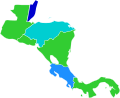 Central America
 -
 Caribbean


.png)
.png)
.png)
.svg)
You should come hang out with us on the internetz!
Hi! I wanted to let you know that we have created an IRC channel for "countering systemic bias one new editor at a time", aka closing the gender gap! Come hang out at #wikimedia-gendergap if that subject interests you. We hope this channel can serve as a safe haven to hang out, talk about Wiki, brainstorming, increasing women's participation in Wikimedia, article alerts and foster friendships. I hope you join us! (And if you need any IRC help, just let me know!) See you there! SarahStierch (talk) 22:27, 21 August 2011 (UTC)
Survey
Hi MissMJ!
I have put together a survey for female editors of Wikipedia (and related projects) in order to explore, in greater detail, women's experiences and roles within the Wikimedia movement. It'd be wonderful if you could participate!
It's an independent survey, done by me, as a fellow volunteer Wikimedian. It is not being done on behalf of the Wikimedia Foundation. I hope you'll participate!
Just click this link to participate in this survey, via Google!
Any questions or concerns, feel free to email me or stop by my user talk page. Also, feel free to share this any other female Wikimedians you may know. It is in English, but any language Wikimedia participants are encouraged to participate. I appreciate your contributions - to the survey and to Wikipedia! Thank you! SarahStierch (talk) 06:12, 2 October 2011 (UTC)
A request...
Hi, MissMJ. It's good to see you again. If you have the time and also the interest, could you please take a look at Wikipedia:Graphic Lab/Photography workshop#From dark haired to blond? Kind regards, --Lecen (talk) 20:46, 18 October 2011 (UTC)
Карта Баланканчи
Здравствуй! Посмотри это [4] — Preceding unsigned comment added by Странник27 (talk • contribs) 12:55, 19 October 2011 (UTC)
![[4]](https://ru.wikipedia.org/wiki/%D0%92%D0%B8%D0%BA%D0%B8%D0%BF%D0%B5%D0%B4%D0%B8%D1%8F:%D0%9A_%D1%83%D0%B4%D0%B0%D0%BB%D0%B5%D0%BD%D0%B8%D1%8E/12_%D0%BE%D0%BA%D1%82%D1%8F%D0%B1%D1%80%D1%8F_2011#.D0.A4.D0.B0.D0.B9.D0.BB:.D0.91.D0.B0.D0.BB.D0.B0.D0.BD.D0.BA.D0.B0.D0.BD.D1.87.D0.B0.jpg)
A favor... again
Hi, MJ. I uploaded a picture which I want to place it in the infox of Pedro I of Brazil. I was wondering, if you have the interest amd patience, if you could help me by doing something about its background so that his hair can be distinguished from it. Any other improvement to the picture's quality would be very, very welcome. Kind regards, - --Lecen (talk) 19:45, 4 November 2011 (UTC)
Gallery
I saw your fine Standard Model of Elementary Particles and want to know, if there is a (wiki-)gallery where we can admire your whole work?--46.115.37.176 (talk) 15:14, 14 December 2011 (UTC)
| This page is an archive of past discussions. Do not edit the contents of this page. If you wish to start a new discussion or revive an old one, please do so on the current talk page. |