Wikipedia:Graphics Lab/Map workshop/Archive/Nov 2009
Stale edit
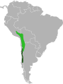
Hawaiian Crow range Map edit
-

-
 Base off


Article(s): Hawaiian Crow
Request: Please create a vector version of this map. Connormah (talk) 16:50, 7 August 2009 (UTC)
Graphist opinion(s):
Mauritius Map edit
-
 Location of Mauritius

Article(s): Mauritius
Request: Please vectorize. Connormah (talk) 17:40, 7 August 2009 (UTC)
Graphist opinion(s):
Darwin suburb highlight maps
-
 Darwin OSM base map
 -
 Subdivisions of Darwin
 -
 Subdivisions of Darwin (svg version)


Article(s): City of Darwin The graphics folks of the de-WP created the subdivision map for Darwin, Northern Territory. However, there are no articles in the de-WP for individual suburbs of Darwin in the de-WP yet, so a request for the creation of individual locator maps on this basis won't be honored there.
Request: Please make 41 locator maps, one for each of the 41 individual suburbs, by highlighting the respective suburb in a bright color, to be used in the individual suburb articles:
| Chan Ward | Lyons Ward | Richardson Ward | Waters Ward |
|---|---|---|---|
|
|
and perhaps four more ward maps (although we don't have ward articles yet.)--Ratzer (talk) 14:58, 9 August 2009 (UTC)
Graphist opinion(s):
- I've uploaded the svg version from the German graphics folks for everyone who will be interested for this task. --Chumwa (talk) 21:31, 23 August 2009 (UTC)
Odysseus edit
-
Description of image
-
2nd image (If there is one)
-
Don't request too many at once, though
Article(s): Brazil
Request: Odysseus is supposed to be from Ithaka, not from Cephallenia as shown on the map. Mechoulas (talk) 20:53, 9 August 2009 (UTC)
Graphist opinion(s):
Union for the Mediterranean map edit
-
 Image showing members of the Union for the Mediterranean, with EU countries in blue and non-EU in dark green
.svg)
Article(s): Union for the Mediterranean
Request: Change the colour of Albania, Bosnia and Herzegovina, Croatia, Israel, Monaco, Montenegro and Turkey to a third colour (maybe yellow or red?), so blue can be for EU countries and dark green for Arab League states. Right now, the dark green makes Albania, Croatia etc look like they are Arabic countries. Libya, in stripes, should stay as it is. Thanks, YeshuaDavid • Talk • 14:14, 17 August 2009 (UTC)
Graphist opinion(s): So if I see this correctly, the map currently has two colour categories (member states that are EU members, and member states that aren't) plus a shade for observers (only Libya, which is not a member of the EU, and therefore green). There is a different categorization; the Arab League. Many of the non-EU members in the Mediterranean Union are members of the Arab League. Yet although the article at Union_for_the_Mediterranean#Members gives Arab League flags for some countries in the same position as the EU flags, the Arab League does not seem to be involved in the Mediterranean Union, at least not in the way the EU (financially) is. Is that correct? Moreover, it only makes sense to use different (non-shaded) colours if memberships are exclusive; couldn't a country be in theory both a member of the EU and of the Arab League? In short, I think changing the legend to reflect the division EU/non-EU members more clearly makes more sense than adjusting the map - even though doing so would be quite easy. Classical geographer (talk) 20:06, 17 August 2009 (UTC)
- As it stands, there is an ongoing proposal to admit all Arab League states, even ones that don't border the Mediterranean, in the same way all EU states are included regardless of geography. As it stands though, the Arab states don't have any particular right to membership, and I'm not sure if the Arab League have any involvement in the running ofthe UfM. With regard to being a member of both, that would almost certainly be impossible, given the various agreements and treaties that Arab and EU states commit to, such as the Schengen Agreement. If you think the map should list all non-EU countries together, the map should be changed so the colour used isn't dark green, which is obviously derived from the Flag of the League of Arab States. YeshuaDavid • Talk • 16:57, 18 August 2009 (UTC)
WAGGGS-WOSMWestHemMap-World.svg edit
-
 change map perspective
 -
 according to this perspective, or blank map of the World "Pacific Ocean centered" at http://english.freemap.jp/world_e/8.html
 -
 This might be a better projection (and a smaller file size, no Antarctica but no scout units there either). Admittedly not Pacific Ocean centered but you want, I guess, Asia and Europe and as much of Greenland as possible dropped.
 -
 Stab just to check whether this is going in the right direction. Another stab.


Article(s): various in several languages, Western Hemisphere Region (World Association of Girl Guides and Girl Scouts), Interamerican Scout Region (World Organization of the Scout Movement)
Request: change map perspective according to the Miller projection... Chris (クリス • フィッチュ) (talk) 18:01, 20 August 2009 (UTC)
Graphist opinion:
See third map for possible starting point. --Erp (talk) 01:54, 24 August 2009 (UTC)
- Thanks, but it needs to be Pacific-centric. It doesn't have to be the whole world, the second map can be trimmed down to the same geographic range as the first. Chris (クリス • フィッチュ) (talk) 05:06, 24 August 2009 (UTC)
- I should point out that the second map is over 11MB in size which strikes me as a bit on the big side (strikes my inkscape as being a beast also). (The third map is a bit under 1.5MB which is still biggish). Is there a particular reason for the pacific centering so I know what else to consider when looking at options? --Erp (talk) 07:23, 24 August 2009 (UTC)
- The sizing can be changed by you to anything you like, you can scale to fit, I just need that map's continental shapes and Pacificentricity (hey, I just made a new word!) :) . The reason for it covering the Pacific is that US territories and aligned nations fall under both the GSUSA and the BSA. Chris (クリス • フィッチュ) (talk) 07:36, 24 August 2009 (UTC)
- The "Pacificentrification" (Pacificentritude? Pacifinaceousness? Pacifinocity? LOL) is perfect, but the reason the perspective is important is the second map is closest to both logos for the Western Hemisphere Region (World Association of Girl Guides and Girl Scouts) and the Interamerican Scout Region (World Organization of the Scout Movement), as well as its Asian counterparts. Chris (クリス • フィッチュ) (talk) 15:29, 25 August 2009 (UTC)
- Ok I've done a bitmap trace of the file at http://english.freemap.jp/world_e/8.html However I am not at all sure of the copyright status of the original (and I don't read Japanese). If this looks ok to you (barring colors), you should probably check the copyright status. Assuming that is ok, I can then work on the rest. I will note this is now under 1MB in size. --Erp (talk) 21:23, 26 August 2009 (UTC)
- Emma, I appreciate your hard work on this, but I think you're working too hard. You can seriously both trim down and rescale the second map to a size you like, and it's already on Wikipedia. But outline maps can't be copyrighted, nobody owns the shapes of continents. Chris (クリス • フィッチュ) (talk) 17:20, 28 August 2009 (UTC)
- 11MB is huge for what will be a simple map with not much detail and we should be avoiding large files in wikipedia without cause. I ran it through a program (scour) to try to bring it down in size and it was still several MB (and Inkscape on my machine still choked on it). Clipping won't cut much because it is a SVG file not a bitmap file. Admittedly I've not worked much with SVG files but that is my understanding. Now there may be tricks I'm unaware of. --Erp (talk) 01:00, 29 August 2009 (UTC)
Oregon Provisional Government edit

Article(s): Provisional Government of Oregon
Request: combine maps in Wikified style... Chris (クリス • フィッチュ) (talk) 09:17, 23 August 2009 (UTC)
Graphist opinion: Hmm what do you mean by combined? You want it to be a terrain map with political boundaries on it? Do you know of a map you want it to look like? TastyCakes (talk) 15:36, 25 August 2009 (UTC)
- No, border map with pinpointed cities marked, sorry. Chris (クリス • フィッチュ) (talk) 17:25, 28 August 2009 (UTC)
India state maps edit
-
 Current example map for Tamil Nadu
 -
 From commons, possibly too plain?
 -
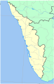 Kerala, like this?


Article(s): Various states of India such as Kerala
Request: Hi!! I was wondering if you could produce a set of decent svg blank maps of Indian states in the style of File:Pakistan location map.svg but for the states. You see, the maps of Indian states are generally of a poor standard and are too colorful for push pin and we definitely need standardised replacements. Also is there any chance you could create a svg map of Russia like File:Pakistan location map.svg? Himalayan 15:37, 29 August 2009 (UTC)
Graphist opinion:
I've reformatted the request into proper format and added a few current examples. I assume you want the districts uncolored (but outlined?) and the rivers but not other features. You have looked at the commons:Category:WikiProject India State Maps.--Erp (talk) 18:53, 29 August 2009 (UTC)
Yes they are too plain. The maps need to display the districts anyway... Himalayan 14:11, 31 August 2009 (UTC)
Azerbaijan Khanates edit
-
 Azerbaijan Khanates

Article(s): Karabakh Khanate etc.
Request: I'll use it in a lot of khanate pages. Please only SVG ification. I'll translate it.--Gökçe Yörük (talk) 11:56, 7 September 2009 (UTC)
Graphist opinion(s):
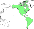
Blank map of North America edit
Hello, I'm hoping to make a map of the route of the Keystone Pipeline currently under construction. The pipeline runs through several Canadian provinces and US states, so I need a blank map that contains both of these. Unfortunately the only one I can find is this one, which is huge and gives me strange rendering problems in inkscape. Does anyone know if there is a blank map somewhere that shows US and Canadian states/provinces but isn't so detailed? Thanks a lot. TastyCakes (talk) 21:21, 8 September 2009 (UTC)
California county map (labeled and colroed) edit
-
 My attempt
 -
 Original SVG image I based mine off of
 -
 Initial jpeg image in use
 -
 PNG export from illustrator.
.svg)
.svg)

.png)
Article(s): Northern California, Southern California, and Template:WikiProject California
Request: The two article and the template use crops of the initial jpeg map. I tried coloring in an existing SVG map, but am having an issue with the fonts no longer staying in place. In addition to the coloring I duplicated individual county images, cropped and recolored borders, then overlaid to get coastal counties to have different boundaries. An export from within Illustrator to PNG appears normal, but something needs tweaking in the SVG. I was hoping someone could let me know what I need to adjust to return the fonts to normal, and any other issues I need to address. I was planning to eventually use File:Map of USA with state names.svg to get a similar image with the other states and Mexico to match the initial image. Any help would be appreciated. -Optigan13 (talk) 08:26, 9 September 2009 (UTC)
Graphist opinion(s):
- MediaWiki does have a few problems rendering text in SVGs but I think in this case it's more likely to be the choice of fonts that's the problem. You seem to be using MyriadPro-Cond for the text in the map, which is a rather unusual font that Wikipedia (and most users) don't have. I would suggest using Arial Narrow (to keep the same look) or failing that one of the Bitstream Vera fonts. One other small thing: Nevada county seems to be missing the border on its right-hand edge (on the right-hand side of California just above the corner). Time3000 (talk) 09:31, 9 September 2009 (UTC)
Gyeongju maps edit
-
 Principal mountains and drainage patterns of Gyeongju. Mountains of 500 to 700 m (1,600 to 2,300 ft) are in green, those taller than 700 m (2,300 ft) in violet. The rest three are in gray.
 -
 Location map
 -
 Maps of Gyeongju's subdivisions


Article(s): Gyeongju
Request: The maps do not look professional and grouped images are not SVG file, so if anyone takes these, please change the colors nicely and change them to SVG file. I want the three to look tied together. Caspian blue 00:42, 17 September 2009 (UTC)
Graphist opinion(s):
Beirut Locator Map edit
-
Description of image
-
2nd image (If there is one)
-
Don't request too many at once, though
Here is the best color coded map of Beirut i could find on the web color coded map
Article(s): Beirut
Request: Hi guys thank you for your much appreciated time and effort, I would like to request a Locator map for Beirut, believe me i have tried to create one myself but i could not find a tutorial and it seemed so complicated. We need this map since we have many articles relating to Beirutine venues In Wikipedia:WikiProject Lebanon and we cannot use the sole Locator map in our wikiproject for this end (we only have a map of Lenbanon). Although a map with administrative partitions would be nice, these are not necessary Thank you for your feedback and helpEli+ 08:11, 21 September 2009 (UTC)
Graphist opinion(s):
- The biggest problem is one of copyright... we need a map that is of free copyright since we can't just trace that map you linked since it is likely under copyright. Maybe OSM has a decent map? gren グレン 13:19, 23 September 2009 (UTC)
1660 Polish Russian War edit
-
Non-free map of the 1660 campaign only to base our on (reduced to be unreadable already and to be deleted soon, please use source here
-
 1654-1667 war map (missing years and such on the arrows)

Article(s): Russo-Polish War (1654–1667)
Request: A map needed for the war article to replace our 1660 campaign map. It's a relatively simple map this time. Piotr Konieczny aka Prokonsul Piotrus| talk 16:18, 24 September 2009 (UTC)
Graphist opinion(s):
Sassanid Empire map edit
Article(s): Sassanid Empire and many others related to it, such as Roman-Persian Wars
Request: Based on several users' requests at Talk:Sassanid Empire to replace the current, grossly inaccurate map of the Empire's extent by a new accurate map. Since maximum-extent maps seem to be favoured, two different maps, for the 270s (when the Sassanids reached their maximum extent in Central Asia) and for 620 (when they reached their maximum success against the Byzantines) should be created. Sources: 620, 270, overall extent & influence. The map on the 270s should include Mesopotamia as fully Sassanid. The map for 620 should include the territories east of the 5th-6th century Byzantine border as fully Persian, and Syria, Palestine, Egypt and eastern Anatolia shaded (under occupation), as in the example given above. Ideally, the base map should be topographic. For any further questions, please contact me. Regards, Constantine ✍ 17:03, 26 September 2009 (UTC)
Graphist opinion(s):
Resolved edit
PA Districts edit
-
 District 1
 -
 District 2


Article(s): Pennsylvania's congressional districts
Request: District 2 has a little slice taken out of the Eastern Philadelphia along the river. The District map has the outline but in the wrong color. Is there anyway someone could use the little bit of District 1 to complete the District 2 image? (It's missing because the original map had a little inset.) gren グレン 13:34, 29 October 2009 (UTC)
Graphist opinion(s): Hopefully this is what you're looking for! Note that the changes sometimes don't appear right away so you might need to refresh the page to see them...
![]() Done - Nimbusania talk 02:21, 31 October 2009 (UTC)
Done - Nimbusania talk 02:21, 31 October 2009 (UTC)
- Thank you, that looks great, not like a piece of the picture was arbitrarily cut off! gren グレン 04:38, 1 November 2009 (UTC)
Map of World's adoption of OpenDocument format edit
-
 The base of the map I believe to be appropriate.
 -
 Officially approvedMandatory standard (Nato)


Article(s): OpenDocument adoption will simply profit from a map, showing worldwide adoption of the standard.
Request: I would like to request a world map, showing the countries which adopted the standard. I already tried to make one, but failed miserably. It would like to suggest the aforementioned base-map, since it includes the micro-states. BloodIce (talk) 13:43, 6 November 2009 (UTC)
- Is this as simple as marking every country listed on OpenDocument adoption with the same colour? If not, we'll need someone to interpret the article and create several lists, e.g. Red: (UK, France); Green: (China, USA); ... Marking parts of countries, e.g. colouring Andalusia but not the rest of Spain, is possible but more awkward. Certes (talk) 19:14, 8 November 2009 (UTC)
- I see at least a map supporting the statement "OpenDocument has been officially approved by national standards bodies of Brazil, Croatia, Ecuador, Hungary, Italy, Malaysia, South Korea, South Africa and Sweden". On the same map with different colour or on completely different map, the countries which governmental institutions are required to use ODF could be marked. Actually I do not think that a specific part of a state should be marked (regardless if it is Andalusia or Paraná). That is just a personal point of view. Other comments and suggestions are welcomed I guess. BloodIce (talk) 12:07, 9 November 2009 (UTC)
Graphist opinion(s):
Loihi Map edit
-
 Loihi Seamount relative to Hawaii
 -
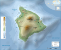 This SVG may help.
 -
 Highlighting Loihi


Article(s): Loihi
Request: SVGify ResMar 00:28, 3 March 2009 (UTC)
Graphist opinion: Is just highlighting it on the topographic map good enough? Example added. Kmusser (talk) 22:14, 3 March 2009 (UTC)
- Looks very nice to me, but User:Resident_Mario should decide. Something went wrong with the legend in the process of translation. bamse (talk) 22:32, 3 March 2009 (UTC)
- Legend fixed. Kmusser (talk) 22:51, 3 March 2009 (UTC)
- Awesomness- MUCH better then the GIF. One thing though. At 300px (standard map infobox size), the blue triangle is hardly visible. Can you increase the size of the blue "volcano" icon and the text around it? Then you could remove the ugly red O. Hope I'm not asking too much :). Cheers, ResMar 22:06, 4 March 2009 (UTC)
- Legend fixed. Kmusser (talk) 22:51, 3 March 2009 (UTC)
map of cologne electorate? 16th century edit
-
 Old map of Electorate of Cologne (note that North is to the right
 -
 Map created for the Cologne War article
 -
 A locator map of the Electorate


Article(s): Cologne War
Request: Need a map of the electorate of Cologne. I've tweaked an old map above but I am unskilled at these things. It needs a professional, and would benefit from someone who could make a map that would take out a lot of the details of this old map, and leave in some specific details. I can help, but I cannot do the graphics parts. Even a general map showing the boundaries and neighboring states would help, since the concept of "electorate" was different in 1585 than it is now. Auntieruth55 (talk) 20:04, 27 July 2009 (UTC)
Anyone, please??????Auntieruth55 (talk) 18:35, 25 August 2009 (UTC)
Map needs to show:
Outline of three regions of the Electorate (Oberstift, Niederstift, County of Vest) (Vest=portions of Westphalia)
Names of adjoining/adjacent territories
Rivers and prominent geological features
Names of the following towns (where there were battles)
- Godesburg
- Rheinberg
- Bonn
- Dietkirch
- Gelsenkirchen
- Alast (Alost)
- City of Cologne (separate from the Electorate, the city was not part of the Elector's domain, although it was the location of his cathedra)
- Neuss
- Werl
- Duetz
- Kettwig
- Nijmegen
- Hulchrath
- Hamm
Graphist opinion(s): Well I'm by no means an expert, but I'll try and trace out the salient parts of this map as an SVG. TastyCakes (talk) 22:24, 26 August 2009 (UTC)
- Thank you, one of the historical mapmakers is going to take care of this. Auntieruth55 (talk) 14:55, 17 September 2009 (UTC)
DC Circulator edit
-
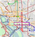 SVG version
 -
 PNG version


Article(s): DC Circulator
Request: I would like to see a map for DC Circulator. There is no basis image but using http://www.openstreetmap.org/ of Washington, DC with the data points from the Google Map at http://www.dccirculator.com/ (where we go menu, system map) could make a decent map with all free sources or some modifications could be made to their official PDF which unfortunately is not released under any license. The map should probably be simplified but I think this would be useful since this is a heavily used service and important part of the DC transit system. Possibly a "full map version" and a "simplified easy to see with landmarks version could be used. I'd like a graphists opinion at least :) gren グレン 23:45, 16 August 2009 (UTC)
Graphist opinion(s): I'll see if I can do something with this. Kmusser (talk) 15:16, 17 September 2009 (UTC)
- ok, made an attempt using openstreetmap. The SVG version has a lot of artifacts from openstreetmap, if an SVG expert could clean it up a little I'd greatly appreciated. Exported as a PNG I don't think it looks too bad. Kmusser (talk) 19:27, 17 September 2009 (UTC)
Zoomed in location map for coastal area in Western Australia edit
-
 Current location map for WA
 -
 Rough and ready location map for Shark Bay


Article(s): Userspace for the moment, but once rewrites are complete: HMAS Sydney (1934), German auxiliary cruiser Kormoran, Battle between HMAS Sydney and German auxiliary cruiser Kormoran, Search for HMAS Sydney and German auxiliary cruiser Kormoran.
Request: I'm working on userspace rewrites of Battle between HMAS Sydney and German auxiliary cruiser Kormoran and related articles. For these, I want a map of the area which is compatible with {{location map}} (and subtemplates) on which I can plot various items for different articles/sections (i.e. where the rafts were found, location of the wrecks, etc).
File:Western Australia location map.png is too "zoomed out" for what I need, and many of the coordinates are off the left (ocean) edge of the map. Can someone generate a map of the Carnarvon-Shark Bay area, with a bit of sea room on the left edge, which is compatible with "location map"? A list of coordinates relevant to this map can be found here. Thanks in advance. -- saberwyn 23:34, 12 November 2009 (UTC)
Graphist opinion(s):
I have uploaded File:Shark Bay location map.png. By simple interpolation, I reckon the co-ordinates for your {{Location map wherever}} are: top=-23.182321, bottom=-26.942253, left=109.990368, right=114.428595. The change of scale has made it look rather jagged, but it has more detail than any free SVG of the area I can find. Feel free to remove the inset (or ask me to) if it is unhelpful or gets in the way of the dots' legends. Certes (talk) 11:22, 13 November 2009 (UTC)
Alternatively, we could start with one of the maps in the Shark Bay article, but I don't think the colours and projections they use are standard for location maps, and they may not extend quite far enough north. Certes (talk) 11:29, 13 November 2009 (UTC)
The map you have uploaded does nicely. Thank you -- saberwyn
Byzantine themes of south Italy edit
Article(s): Longobardia, Lucania (thema), Ducato di Calabria,
Request: A SVG (and free) version of this map, please. Thank you.GJo (talk) 21:02, 27 October 2009 (UTC)
Graphist opinion(s):
-
 Map of southern Italy under Lombard and Byzantine rule.

How about this? Classical geographer (talk) 23:13, 12 November 2009 (UTC)
- Thank you for the map. It's possible to move the northern border of theme of Lucania? I believe that the right side is too far north.GJo (talk) 09:20, 13 November 2009 (UTC)
- Nice map ! ^0^y the Map workshop become great ! I encourage you to use naming convention of the Wikipedia:WikiProject_Maps/Conventions/Historical_maps :
- → File:{Subject name in English} {Year} map.svg (or png)
- that's better for people downloading the maps ;) Yug (talk) 07:49, 14 November 2009 (UTC)
- Thanks for your comments, Yug - I wasn't aware of those conventions, and they seem to make sense. As for the northern border, GJo, where should it go? I have now drawn it along the river Bradano, as indicated as a historic border in the Lucania article. Classical geographer (talk) 10:50, 14 November 2009 (UTC)
Nord Stream pipeline edit
Article(s): Nord Stream
Request: The current map doesn't show the territorial borders and the EEZ borders. It is also inaccurate and lacks detail. E.g. it now looks as if the pipeline would run over Öland, which it won't. Could someone please create a new map based upon this excellent (but unfortunately copyrighted map) [1]. Thanks in advance. The Illusional Ministry (talk) 20:33, 8 November 2009 (UTC)
-
 The Nord Stream article now uses this map,
 -
 which is a derivative of this map.


Graphist opinion(s):
- Note that the image above is missing source details thus be careful about derivatives. /Lokal_Profil
Chinchilla Range Map edit

Article(s): Chinchilla
Request: Convert to SVG & un-uglify. Connormah (talk) 14:49, 10 November 2009 (UTC)
Graphist opinion(s):
I found a better source map here The Exptirpation and Current Status of the Wild Chinchillas Chinchilla langigera and C. brevicaudata. I can fix a new svg map from that source this weekend. The Illusional Ministry (talk) 22:51, 12 November 2009 (UTC)
- I have now made svg maps, but for some resons a black block appears in the western part o Brazil. Maybe someone with more svg skills could fix that? The Illusional Ministry (talk) 18:40, 21 November 2009 (UTC)
- I was able to get it, for things like that it's often easy to find them using a text editor than in Inkscape. Kmusser (talk) 14:52, 24 November 2009 (UTC)
- Thanks a lot.The Illusional Ministry (talk) 21:12, 24 November 2009 (UTC)
- I was able to get it, for things like that it's often easy to find them using a text editor than in Inkscape. Kmusser (talk) 14:52, 24 November 2009 (UTC)
-
 Range of Chinchilla lanigera and Chinchilla brevicaudata.
 -
 Range of Chinchilla lanigera.
 -
 Range of Chinchilla brevicaudata.


Poesten Kill (creek) edit

Article(s): Poesten Kill (yes, redlink), currently at User:UpstateNYer/Poesten Kill
Request: I've begun an article on a local creek and would like to see a map of its course added in the article. The creek is fully contained within Rensselaer County, starting at Dyken Pond (42°43′2.77″N 73°25′40.58″W / 42.7174361°N 73.4279389°W) and ending at the Hudson River in Troy, New York (42°43′14.6″N 73°41′54.02″W / 42.720722°N 73.6983389°W). I've noticed that the creek is well mapped by the USGS on their topo maps (if the link works, it's here). The topo maps also clearly depict the Poesten Kill's main tributaries: Bonesteel Creek, the Quaken Kill, and Sweet Milk Creek. Is it possible to add these waterways (and Dyken Pond) to the base map of File:RensselaerCounty Brunswick.svg (removing the red)? upstateNYer 23:34, 15 November 2009 (UTC)
Graphist opinion: Done. file:poestenkillmap.png Kmusser (talk) 01:52, 25 November 2009 (UTC)
North Shore of Chicago Map edit

.svg)
![[1]](http://www.nord-stream.com/fileadmin/Dokumente/3__PNG_JPG/5__Picture_Lib/Nord_Stream_The_Planned_Pipeline_Route_RGB.jpg)
Article(s): North Shore (Chicago)
Request: The map doesn't look professional. Please help me make a better looking version of this map. 24.12.234.123 (talk) 05:26, 19 September 2009 (UTC)
Graphist opinion: Completed by User:MapMaster Kmusser (talk) 20:49, 29 December 2009 (UTC)