Wikipedia:Graphics Lab/Map workshop/Archive/March 2014
 Resolved Map recreation
edit
Resolved Map recreation
edit
-
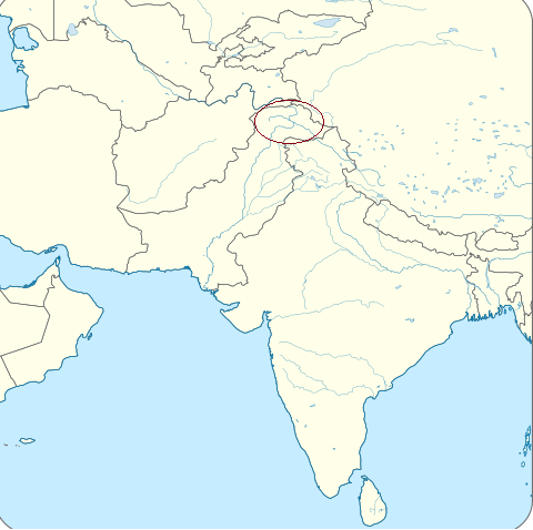
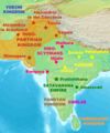 Indo-Parthian Kingdom
 -
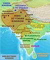 Indo-Scythian Kingdom
 -
 Blank Map


Article(s): Indo-Scythians, Indo-Parthian Kingdom
Request:
- Hello. The two maps mentioned above need to be made wikipedia friendly. Their current form is tedious, and boundaries are inaccurate. Please recreate them by drawing these kingdoms on the given blank map. Its a simple cartography task. Details later. Thanks -- Fasi100 (talk) 17:19, 21 March 2014 (UTC)
Graphist opinion(s):
Indo-Parthian edit
 Request taken by DLommes (talk) 19:08, 28 March 2014 (UTC).: Here is a first version. Please give feedback. Thanks.
- Indo-Parthian Kingdom: Starting off with the given blank map, all you have to do is draw the territory and label the capital cities.
- Territory: Ignore the above Indo-Parthian Kingdom map. The accurate territories are: given on this link. If you want source of this image, here it is. Kindly be very sensitive to the territorial details,
- City Labels: Only label the following cities: Taxila and Kabul. Represent these cities by yellow dots as shown in this map
- Map Label: The overall map label i.e. the words "Indo-Parthian Kingdom" should be written in black font, in a single line, and somewhere in the Arabian Sea on the map.
Thanks. --Fasi100 (talk) 16:17, 29 March 2014 (UTC)

- I made a version, and as your wish i uploaded them to http://imgur.com/823zLBo - However, i did not include a map label, and will not do so, as MOS:MAP advises against it. Map labels can be added as captions in the article. DLommes (talk) 20:33, 29 March 2014 (UTC)
- Its very close. Please include Kabul inside the territory. No capital is half-in half-out of its kingdom.
- Non-capital cities: Kindly add the following cities: Arachosia, Minnagara and Sagala. Their locations can be seen in this map. Represent these cities by small dots like "Arachosia" is represented in this this map.
- Territory: When I said "be sensitive to territory", I didn't mean you have to follow the curve literally. It just meant include the geographical areas which original map includes, and exclude the ones it excludes. Please straighten up the "ups and down" in the curve a bit, and bring some beauty to it as shown in this map. I hope you won't mind the successive tweaks. Lastly, please adjust this "Wikipedia" watermark to a place outside the territorial markings of the draft. Thanks. --Fasi100 (talk) 09:14, 30 March 2014 (UTC)
- It would have been nice to know the cities you wanted included beforehand. I actually deleted some of these cities yesterday, just to re-draw them today. Inefficient.
- I thought "be sensitive to territory" means follow the outline exactly. I spend quite a bit of time tracing the image you provided exactly. Once again, please give more precise instructions. This is also the reason why Kabul is outside the territory.
- I added the cities you requested, smoothed the curves of the territory, and slightly expanded it to include Kabul. Here is the new version: http://imgur.com/0daNmw0 I will keep the watermark as long as it is on imgur. On Wikipedia, I will of course remove it.DLommes (talk) 17:50, 30 March 2014 (UTC)
- I made a version, and as your wish i uploaded them to http://imgur.com/823zLBo - However, i did not include a map label, and will not do so, as MOS:MAP advises against it. Map labels can be added as captions in the article. DLommes (talk) 20:33, 29 March 2014 (UTC)
Its complete, and its perfect. You are speedy and talented. Thank you for this. Just add the label to Indus River, and please go ahead and upload it. As for inefficiency (in instructions for cities and territory), I totally take the blame, and apologize for that. I wish Wikipedia had a chat feature for faster and smoother communications. Anyway, I will try to be precise next time.
Lastly, I would request you to reconsider your decision of taking "Indo-Parthian Kingdom" legend out of the image. I totally understand that MOS:MAP states it as redundant. But aren't all MOS:MAP rules aimed at bringing order, beauty and quality to a Wikipedia page? Wikipedia maps are used on other sites, social networks, books, magazines and journals; taking legends out of maps only make the useless for other platforms. MOS:MAP guidelines are not Copyright Laws that need to be deployed in all strictness. The rest I leave on you.
Once you're done uploading that, I will leave the instructions for the other map: The "Indo-Scythian Kingdom" map. Thanks. --Fasi100 (talk) 18:26, 30 March 2014 (UTC)

Indo-Scythian edit
SO, now to your instructions on this one. Please be as precise and as comprehensive as you can. Thank you very much.DLommes (talk) 19:13, 30 March 2014 (UTC)
- Source map: File:Indo-ScythiansMap.jpg.
- Territories: Notice that there are two distinct areas: Settle Kingdom Area (fixed line) and Non-settled Expeditions Area (dotted line). Since plain surface is used on Wikipedia to denote a usual territory, please represent non-settle areas by a granular texture/surface (like in an earlier version of this image). This distinction between two areas is very very important, and should be made visible to Wikipedia users. The mere difference in color and opacity levels of two areas will not be enough!
- Capital Cities: Capitals of this kingdom are Sigal, Taxila and Mathura. Represent them like the capitals of this map.
- Non-Capital Cities: Arachosia, Sagala, Minnagara, Pataliputra, Ujjain and Barigaza. So there are two sets of non-capital cities i.e. those that fall under settled territory, and those that fall in Non-settled territory. The colors these two sets of cities should be different from each other, as in this map.
- Label the Indus river.
- Font Size: For ALL cities, please increase the font size from what you used in this map. Make the labels more visible.
- Color: Represent settled area by green and non-settled by any color other than pink.
Thanks. --Fasi100 (talk) 22:12, 30 March 2014 (UTC).
- i changed your bullets into a numbered list to make it easier to reply.
- regarding (1) - please explain why the "granular texture/surface" is important to you. it was, in fact, me who removed that texture from the image you linked. it seemed unnecessary, and so i simplified. i would very much like to understand your motivation.
- what does the "granular texture" mean to you and why do you want it in the map?
- would an area with big "polka dots" be aequivalent to you?
- would a striped area be aequivalent?
- regarding (5) - do you wish for me to increase the font-size in the last map as well?
- regarding (6) - what is the reason for this request? your request directly contradicts my intuitive idea of following the color scheme of the earlier maps.
- regarding (1) - please explain why the "granular texture/surface" is important to you. it was, in fact, me who removed that texture from the image you linked. it seemed unnecessary, and so i simplified. i would very much like to understand your motivation.
- thanks. DLommes (talk) 23:05, 30 March 2014 (UTC)
- - Regarding (1): In simple terms, non-settled areas are areas where the kings led expeditions to; they couldn't annex those areas. These areas were NOT part of their kingdoms. That's why I don't want to represent them in the same way as the settled areas. By granular texture I mean a sort of a sprinkling of TINY polka dots. No big polka dots; no striped area.
- - Regarding (5): Yes please. That would be great.
- - Regarding (6): I don't want people to mix Indo-Scythian Map with Indo-Greek Map. They are both present side by side in History of Pakistan, and look similar in shape. A difference in colors of non-settled areas of the two will do the job. Thanks. --Fasi100 (talk) 00:12, 31 March 2014 (UTC)
- i changed your bullets into a numbered list to make it easier to reply.
User:DLommes Haven't heard from you in a while. I hope everything is alright. --Fasi100 (talk) 13:47, 2 April 2014 (UTC)
- I am back. And here is my first draft: http://imgur.com/kk6JDVj (I am still figuring out how to best deal with your "granular" request. Stay with me on this one. I promise I will deal with it. So far, please give me feedback.--DLommes (talk) 20:59, 2 April 2014 (UTC)
- Some improvements in Territory: It included all of present-day Sindh. Also, Taxila is located at the bank of Indus River. Please recheck its location. And the tip of the curve above Taxila needs to be moved to left; the peak of the curve should be at Indus River line. I hope you get it. The rest is good. --Fasi100 (talk) 22:11, 2 April 2014 (UTC)
- @Fasi100 Update: http://imgur.com/v288dQp - The location of Taxila was copied from the map you gave me, where it is marked in between Indus and its tributaries. There are lots of other maps on wikipedia (e.g. the map a bit down in the Taxila article) which show it there. I moved it according to your request, but (if you are right) you should perhaps collect a list of maps where Taxila is off and request correction here. Please tell me if the new version is good.--DLommes (talk) 12:45, 3 April 2014 (UTC)
- DLommes Mainland territory is good to go. Please make prominent the Indus River label. Regarding non-settled areas: Please choose another color since blue is also the color of sea. And of course, the granular surface issue persists; hope you'll find a good solution to that.
- On different note, when/if you increase the font-size of city labels in Indo-Parthian Kingdom map (as discussed earlier), please also make two other minor changes. i) Crop the whole map to this frame and ii) Make prominent the label of Indus River. --Fasi100 (talk) 14:14, 3 April 2014 (UTC)
- @Fasi100 Take a look: http://imgur.com/a/B3BSv (this is an album with two images) Cheers.--DLommes (talk) 12:11, 4 April 2014 (UTC)
- DLommes Great. Please go ahead and upload the one featuring polka dots. Secondly, before marking this thread as Done, please don't forget to make the said changes to File:IndoParthianKingdom.svg.
- Also, Polka dot solution can be applied to File:IndoGreekKingdomAndCampaigns.svg along with two improvements: i) fix the blur ii) increase fontsize of city labels Cheers. --Fasi100 (talk) 12:37, 4 April 2014 (UTC)
- @Fasi100 Take a look: http://imgur.com/a/B3BSv (this is an album with two images) Cheers.--DLommes (talk) 12:11, 4 April 2014 (UTC)
- @Fasi100 Update: http://imgur.com/v288dQp - The location of Taxila was copied from the map you gave me, where it is marked in between Indus and its tributaries. There are lots of other maps on wikipedia (e.g. the map a bit down in the Taxila article) which show it there. I moved it according to your request, but (if you are right) you should perhaps collect a list of maps where Taxila is off and request correction here. Please tell me if the new version is good.--DLommes (talk) 12:45, 3 April 2014 (UTC)
- Some improvements in Territory: It included all of present-day Sindh. Also, Taxila is located at the bank of Indus River. Please recheck its location. And the tip of the curve above Taxila needs to be moved to left; the peak of the curve should be at Indus River line. I hope you get it. The rest is good. --Fasi100 (talk) 22:11, 2 April 2014 (UTC)
- I am back. And here is my first draft: http://imgur.com/kk6JDVj (I am still figuring out how to best deal with your "granular" request. Stay with me on this one. I promise I will deal with it. So far, please give me feedback.--DLommes (talk) 20:59, 2 April 2014 (UTC)


Stale edit
Resolved edit
Literacy rates map edit
-
 The old "2011" outdated map

Article(s): List of countries by literacy rate
Request:
- I'm requesting an updated/new map of literacy rates in the world. I attempted making a map in 2011 but have come across some errors, with others saying it is not correct. I would like to request an updated or entirely new map with 2013 statistics. One source could be the 2013 UN Human development report [1] (starts at page 182 I think), but looking at it now it seems those are from 2010. If anyone knows of a source which lists recent literacy rates that would be great. If possible, I would like the map to be svg. Thank you in advance. Turn➦ 10:37, 12 March 2014 (UTC)
Graphist opinion(s):
- Sorry, seems out of scope here. Come back when you have the updated data pleasee—Love, Kelvinsong talk 20:53, 15 March 2014 (UTC)
-
 Map of Grande-Île

Hi, I am looking for a map in English (British) like the Google maps one please, preferably with a little window showing where the island is in relation to France. Thanks, Matty.007 11:37, 1 March 2014 (UTC)
- Request taken by Victor Treushchenko (talk) 23:11, 15 March 2014 (UTC).
 Done, I also did some improvement to the article Grande-Île, Normandy by adding an infobox and a location map of France. --Victor Treushchenko (talk) 16:42, 16 March 2014 (UTC)
Kentucky time zone boundary edit
Article(s): Time in Kentucky
Request: Please produce an SVG of Kentucky counties showing the time zone for each. You can start with any county map; File:Map of Kentucky highlighting Edmonson County.svg is the first one that comes to mind. The following counties are on the border (links lead to maps):
All of these counties, plus everything to the east, are on Eastern Time; everything to the west is on Central Time. I'm basing this on the "Time zone" chunk of each county's infobox, but it's officially stipulated in this US government document. Nyttend (talk) 01:59, 10 March 2014 (UTC)
Graphist opinion(s):
![]() Done: File:Kentucky time zones.svg -- [[ axg // ✉ ]] 20:48, 11 March 2014 (UTC)
Done: File:Kentucky time zones.svg -- [[ axg // ✉ ]] 20:48, 11 March 2014 (UTC)
Discrimination against atheists edit
-
 Free and EqualMostly SatisfactorySystematic DiscriminationSevere DiscriminationGrave Violations
 -


Article(s): Discrimination against atheists and perhaps others.
Request:
- Color world map according to Freedom of Thought Report 2013 -- Muhammed Kabir (talk) 17:29, 9 March 2014 (UTC)
Graphist opinion(s):
- Unfortunate I'm getting a database error trying to access the site. -- [[ axg // ✉ ]] 20:54, 11 March 2014 (UTC)
- Done Please add category and discriptions in other languages Victor Treushchenko (talk) 19:51, 13 March 2014 (UTC)
Map of 2014 Ukrainian RSA occupations edit

Article(s): 2014 Ukrainian revolution, 2014 Ukrainian Regional State Administration occupations
Request: Please vectorise this map. Make it easy to edit because the details on the map can change at any time. If possible, please translate the map into Russian and Ukrainian. If you want to do any other improvements, please do so. 109.78.205.73 (talk) 00:24, 2 March 2014 (UTC)
It's better if the request follow the standard code using the New Request link above [2] which also include signing it. I'm not personally comfortable doing work to an anonymous requester. --Goran tek-en (talk) 11:18, 3 March 2014 (UTC)
- I've made an attempt of vectorizing the map. Both the text and colouring can be easily changed. File:Regional Administration seizures in Ukraine.svg -- [[ axg // ✉ ]] 14:11, 3 March 2014 (UTC)
Hindu Heritage Centre Location Map edit
-
 Map of Canada and Ontario

Article(s): [[3]]
Request:
- We need a location map to help readers understand where the Hindu Heritage Centre is in Ontario. If you could put a location dot on Mississauga on the map I have listed above that would be highly appreciated
Graphist opinion(s):
- Done The template Template:Infobox Mandir offers an easy option for doing it. I have added a map of Ontario to the article. --Victor Treushchenko (talk) 22:22, 16 March 2014 (UTC)
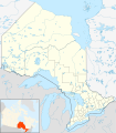
Pocahontas Coalfield Boundary edit
Article(s): Pocahontas Coalfield
Request: Please produce an SVG of the West Virginia and Virginia Counties below. These will be the map for the Pocahontas Coalfield.
All of these counties, comprise the Pocahontas Coalfield . Refs are provided within article Coal town guy (talk) 16:37, 11 March 2014 (UTC)
Graphist opinion(s):
- @Coal town guy: Done
 —Love, Kelvinsong talk 23:41, 12 March 2014 (UTC)

Catch-a-click area edit
A different issue: catch-a-click. Two templates are used (code copy, bad): {{NFPA 704}} →
| NFPA 704 fire diamond | |
|---|---|

{{NFPA-chembox}} → {{NFPA-chembox|F=4}}
Article(s):
- Top: see Lead#Health effects.
- Bottom: see the ammonia infobox.
Request: This is a safety sign for chemicals (NFPA 704). Ideally, the diamond has this: when clicking on a colored area, it links to a page (that's four different ones). Numbers can be added. (Clicking on that number will lead to a specific page (section). The number clicking is basic wikilinks, OK.) But how to catch a click per square? Can we position a transparent diamond there? As it is now, clicks outside of a border can be a (wrong) hit too. -DePiep (talk) 20:18, 18 March 2014 (UTC)
Graphist opinion(s):
- I think you are in the wrong place. This is the map workshop. Maproom (talk) 07:16, 19 March 2014 (UTC)
- ...but FYI you can do it with an imagemap and polygons. ► Philg88 ◄
 talk 08:04, 19 March 2014 (UTC)
- ...but FYI you can do it with an imagemap and polygons. ► Philg88 ◄
![]() Done
Done
Distribution of Gold's Tree Cobra edit

Article(s): Pseudohaje goldii
Request: I would like the above blank map to show the distribution of the Gold's Tree Cobra based on this map shown here. I would like the the colour used to be red, thanks. --Dendro†NajaTalk to me! 12:59, 1 March 2014 (UTC)
- Do you want the background and dark grey colouring to remain? -- [[ axg // ✉ ]] 21:07, 11 March 2014 (UTC)
- Yes, please leave the background and dark grey colouring the same. Thanks. --Dendro†NajaTalk to me! 14:56, 21 March 2014 (UTC)
- Done File:P-Africa Gold's tree cobra area.svg -- [[ axg // ✉ ]] 16:49, 21 March 2014 (UTC)
- Yes, please leave the background and dark grey colouring the same. Thanks. --Dendro†NajaTalk to me! 14:56, 21 March 2014 (UTC)
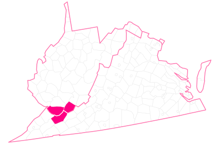
Sevastopol within the Crimean peninsula edit
-
 Map of all the subdivisions that compose the Crimean peninsula. Sevastopol is the southwestern division.
 -
 Map showing the difference between the Autonomous Republic of Crimea and Sevastopol (they are different separate entities).


Article(s): Sevastopol
Request:
- I need a map based on the first picture where Sevastopol is in red while the borders of the subdivisions of the Autonomous Republic are NOT shown. The map's purpose will be to denote where Sevastopol is within the Crimean peninsula without showing any unnecessary clutter. —Ahnoneemoos (talk) 02:09, 21 March 2014 (UTC)
Graphist opinion(s):
![]() Done—
Done—
—Love, Kelvinsong talk 18:55, 21 March 2014 (UTC)
- @Kelvinsong: Really neat map. I just think that the surrounding areas are a little to light to be easily seen. You might have a really good display where the effect is not noticeable. --Tobias1984 (talk) 22:37, 21 March 2014 (UTC)
- Thank you! I agree with Tobias, Crimea is so light that it's difficult to see that Sevastopol is actually contiguous. But this is a free service so I will just use it anyway... unless you would like to improve it? *hint hint* —Ahnoneemoos (talk) 00:11, 22 March 2014 (UTC)
- By the way, coloring the ocean is very important too as Sevastopol is a maritime city whose whole economy is based on military seaports and seaport trade. —Ahnoneemoos (talk) 00:32, 22 March 2014 (UTC)
- Done—Love, Kelvinsong talk 17:43, 22 March 2014 (UTC)
Fix map for European countries with Burger King franchises edit
-
 This claims to be a map of European countries with Burger King franchises, but is in fact a map of all European countries.
.svg)
Article(s): List of countries with Burger King franchises
Request: This image is used in List of countries with Burger King franchises#Europe. It is incorrect because it shows every European country as coloured, while not all of them have Burger King franchises. It should be redone to have only the countries with Burger King franchises coloured green. See the section I have linked here for a list of such countries. (Note: Please do not actually edit this file, as it's used in a load of other articles. Make a new file instead.) -- JIP | Talk 17:18, 4 February 2014 (UTC)
Graphist opinion(s):
- JIP I'm sure you would get a better response if you added a list of the countries to be REMOVED from Europe as that probably is less then those who has BK. It's always great to add a list so that we don't have to spend time finding out which information to use on a page with a lot of information. We prefer to do just the graphic work, not searching for info. Hope you understand. --Goran tek-en (talk) 14:34, 21 February 2014 (UTC)
- OK, I did the background research myself, leaving you graphist guys to concentrate on the graphics. Please remove these countries:
- Abkhazia
- Albania
- Armenia
- Belarus
- Belgium
- Bosnia and Herzegovina
- Croatia
- Cyprus
- Estonia
- Greece
- Iceland
- Kazakhstan
- Kosovo
- Latvia
- Liechtenstein
- Lithuania
- Luxembourg
- Moldova
- Monaco
- Montenegro
- Nagorno-Karabakh
- Northern Cyprus
- Romania
- San Marino
- Serbia
- Slovakia
- South Ossetia
- Transnistria
- Ukraine
- Vatican City
- Entries in italics are disputed territories in countries that don't have Burger Kings and should be removed. I haven't included similar territories in countries that have Burger Kings. JIP | Talk 16:15, 21 February 2014 (UTC)
- OK, I did the background research myself, leaving you graphist guys to concentrate on the graphics. Please remove these countries:
![]() Request taken by Goran tek-en (talk) 16:43, 21 February 2014 (UTC).
Request taken by Goran tek-en (talk) 16:43, 21 February 2014 (UTC).
- Argh! Please don't remove Denmark or Georgia! That was a mistake on my part. JIP | Talk 20:42, 21 February 2014 (UTC)
- JIP This only concern Europe, don't you want a map which only shows Europe? --Goran tek-en (talk) 11:08, 22 February 2014 (UTC)
- Well, many other continents on the page also have an image that shows an entire hemisphere, so I'm really OK either way. JIP | Talk 11:49, 22 February 2014 (UTC)
- I couldn't find a base map showing both the hemisphere and was divided into countries in Europe so I ended up with a European map. It's not just the easy countries to find. Now you can look at a draft. It's large in px so you will probably have to download it to look at it. Give me feedback on it, thanks. --Goran tek-en (talk) 19:39, 26 February 2014 (UTC)
- Well, many other continents on the page also have an image that shows an entire hemisphere, so I'm really OK either way. JIP | Talk 11:49, 22 February 2014 (UTC)
- JIP This only concern Europe, don't you want a map which only shows Europe? --Goran tek-en (talk) 11:08, 22 February 2014 (UTC)
I have changed that now and then I will need the following;
- Name of the file
- Description
- Category/ies
to be able to upload it as a new file. --Goran tek-en (talk) 12:28, 27 February 2014 (UTC)
- OK, here is the information:
- File name: BK Europe.png or BK Europe.svg, depending on which format you are using
- Description: Map of countries in Europe with Burger King locations
- Categories: If you are uploading directly to the English Wikipedia, you don't need any. If you are uploading to Commons, use "Locator maps of Europe" and "Burger King maps".
- Hope this helps. JIP | Talk 06:54, 28 February 2014 (UTC)
- OK, here is the information:
Thanks that was excellent. Now you can find it here: BK Europe. --Goran tek-en (talk) 18:24, 1 March 2014 (UTC)
![]() Done
Done
Indo Greek Empire map. edit

Article(s): Indo-Greek Kingdom
Request:
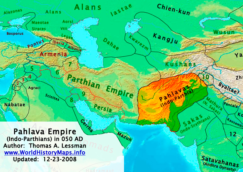
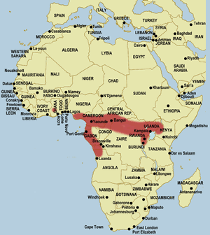
- The map shown above is too tedious to look at and comprehend. There is no sense of context and clarity. I would like someone to recreate a map of Indo-Greek Kingdom with modern boundaries and rivers in the background; just like any other good map on Wikipedia. Here are some basic instructions to begin with: The frame of map should go beyond modern-day India and Pakistan, and cover vast areas of Afghanistan, Iran, China and Central Asia; to get the context right. Mainland territories to be colored, conquest territories to be depicted by granular texture. Important rivers and cities to be labelled. More instructions/discussions during the process. Looking forward. Thanks -- Fasi100 (talk) 09:56, 3 March 2014 (UTC)
Graphist opinion(s):
- Request taken by Goran tek-en (talk) 11:20, 3 March 2014 (UTC). But it will take a few days before I can start on it if that's OK, otherwise someone else has to take it and that's just fine with me. --Goran tek-en (talk) 11:20, 3 March 2014 (UTC)
- Sure, go ahead. Take your time. Thanks. --Fasi100 (talk) 11:26, 3 March 2014 (UTC)
- So then we will have to start with the area.
- Look at this suggestion of the area and tell me if/how you would like it to be changed?
- This is just to get the area right from the beginning. --Goran tek-en (talk) 17:14, 6 March 2014 (UTC)
- Sorry for late reply. Next time please tag me in the comment so I get a notification. I would like the frame to include more of Central Asia & Iran, and exclude of Eastern China, Burma and Arabian Peninsula. Also, it is a bit rotated which makes it confusing; should be like a normal map with regards to orientation. Thanks. --Fasi100 (talk) 06:30, 8 March 2014 (UTC)
- Fasi100 It's not a late replay to me, no problem.
- Look at this new version maybe you have to reload the page and give me feedback and answers as below.
- To me all of Iran is there.
- Do you want me to remove the Arabian Peninsula but keep the left edge of the map? Otherwise I don't understand, because it will cut of some of Iran if I move the left edge towards right?
- This map is what is used on Commons for this area. Look a bit down in this search result and you can see they are all the same.
- I compared to the image you added above and there is a difference of about 9 degrees in rotation. I have adjusted the map I use so far for this and uploaded so you can see if this is what you want rotated 9dg
- Do you want it to be an orthographic projection like this one Central Asia (orthographic projection)?
- The orthographic projection does not include rivers, lakes, is not that detailed and the countries is not areas of them self. To me it will give a map that is not that good as what the one I'm using right now can give, but that's up to you. You know how it will be used, I don't. I hope you don't think I'm to difficult to work with but it's REALLY important to get this right so I don't have to redo a lot of work later on. --Goran tek-en (talk) 17:41, 8 March 2014 (UTC)
- Fasi100 It's not a late replay to me, no problem.
- Sorry for late reply. Next time please tag me in the comment so I get a notification. I would like the frame to include more of Central Asia & Iran, and exclude of Eastern China, Burma and Arabian Peninsula. Also, it is a bit rotated which makes it confusing; should be like a normal map with regards to orientation. Thanks. --Fasi100 (talk) 06:30, 8 March 2014 (UTC)
- So then we will have to start with the area.
- Sure, go ahead. Take your time. Thanks. --Fasi100 (talk) 11:26, 3 March 2014 (UTC)
- The map you showed has many flaws, the biggest of which is its rotation; its dizzying frankly. So lets ignore it. I've found a blank map that can serve better. Here, take a look: File:Blank map world gmt (simplified).svg.
This map has two small problems. One is the inaccuracy of rivers, and other is the presence of checkered grid scale. I hope both can be fixed, but even if they can't be, i would still prefer it. As for the frame size, here is the exact frame I want: Photobucket. And no you are not difficult to work with; you've been amazing with the details. Regards. --Fasi100 (talk) 09:17, 9 March 2014 (UTC)- Fasi100 As I wrote before that map was just to show the area. It was a png from the svg file and therefore it will be dizzy if you enlarge it. It was not the real file that I work with.
- This map File:Blank map world gmt (simplified).svg won't open in Inkscape (it's an old Illustrator file) and maybe someone can fix that but I found a pdf of about the same file. It's REALLY big in many ways but now I barley managed to remove all the stuff I don't need on it. So now you can look at this draft. It's also a png and not the real file (there are reasons for me showing just this) but it contains the same info. So just tell me if this is good for you. --Goran tek-en (talk) 15:57, 9 March 2014 (UTC)
- Frame is good to go. Please apply slight correction to the part of Indus River in Gilgit–Baltistan. Make it like its in this: File:Map for Gupta Empire and tributaries.svg. After that, please upload this frame as a blank map; it will be used in many other maps of the region. Thanks. --Fasi100 (talk) 01:38, 10 March 2014 (UTC)
- Fasi100 As I wrote before that map was just to show the area. It was a png from the svg file and therefore it will be dizzy if you enlarge it. It was not the real file that I work with.
- The map you showed has many flaws, the biggest of which is its rotation; its dizzying frankly. So lets ignore it. I've found a blank map that can serve better. Here, take a look: File:Blank map world gmt (simplified).svg.
Fasi100 Now you can look at this draft and tell me if the river is OK now?
You could also begin to tell me what you want from the old map and what you want changed and so on, thanks. --Goran tek-en (talk) 18:53, 10 March 2014 (UTC)
- Goran tek-en Not its not. Here's the Wrong one, here's the right one. If I can explain it in word, its just a single river line and it has no branches.
Here are the details: Label the settled areas as Indo-Greek Kingdom, and the non-settled areas Possible Extent of Expeditions. Represent the settled areas by Plain Texture and non-settled ones by Granular Texture; the colors of both areas should be contrasting.
As for the four capital cities, label them as: Alexandria in the Caucasus, Taxila, Sagala,Pushkalavati. Other than that, label the following cities: Alexandria on the Indus, Arachosia, Demetrias in Patalene, Pataliputra, Barygaza, Mathura and Ujjain.
There should be three sets of cities in terms of representation on the map: Capitals, Non-capitals in the settled areas & Non-capitals outside settled area.
The "dot" representing capitals should stand out from other two sets in terms of size, appearance and color.
All non-capital "dots" should be of same small size but settled and non-settled ones should have different color. -- Fasi100 (talk) 03:10, 11 March 2014 (UTC)
- Fasi100 Thanks for the clear instructions on the river. I don't understand which areas you refer to as settled areas and the non-settled areas, sorry but I have no knowledge of this. You would have to give me what color and border it has in the image you provided. --Goran tek-en (talk) 19:01, 13 March 2014 (UTC)
- Goran tek-en Here: photobucket, Red represents settled area whereas Brown represents non-settled area. Thanks. ---Fasi100 (talk) 02:27, 14 March 2014 (UTC)
- Fasi100 Look at this draft now probably you have to reload the page.
- I didn't know if you wanted the areas to reach out into the sea as in the original image. If not just tell me and I will cut them by the coastline.
- I couldn't find Pushkalavati on the original image, you have to locate it for me (couldn't find a map in your link).
- Give me feedback, thanks. --Goran tek-en (talk) 19:24, 15 March 2014 (UTC)
- Goran tek-en Areas should stop at coastline. Pushkalavati is modern-day Charsadda. Draft looks great. Please note that Sagala is inside Pakistan. Secondly, please increase the size of capital dots and give them a color different than ones already used. Thirdly, here is a rough sketch of textures I want for two sets of areas: Pink represents plain, Red represents granular. My granular one is not very appealing since I drew it in MS Paint. I hope you can do better.
- I didn't know if you wanted the areas to reach out into the sea as in the original image. If not just tell me and I will cut them by the coastline.
- Fasi100 Look at this draft now probably you have to reload the page.
- Goran tek-en Here: photobucket, Red represents settled area whereas Brown represents non-settled area. Thanks. ---Fasi100 (talk) 02:27, 14 March 2014 (UTC)
Fasi100 I'm sorry to trouble you with all my questions but what do you mean by;
- Please upload the blank frame on...
- Is that the blank map or just the outer line (frame), and in which file format svg or what?
- Do you want it uploaded on commons because then you will have to give me the needed info for it, or just a link so you can download it?
- Also please give me the link of PDF...
- Do you want just the frame, nothing else?
Sorry to be so hard on this but it can be really hard to understand what another person means, very often there are many options. --Goran tek-en (talk) 12:56, 16 March 2014 (UTC)
- I need this map (in svg format) in a blank form i.e. with modern boundaries and river but without the current territorial representation of Indo-Greek Empire. I need it uploaded on Commons so that others can make use of it and draw empires on it. Blank maps don't need much info for upload, just describe them as a map showing part of Asia or something explanatory like that.
- PDF: In earlier thread, you said you've found a PDF file of a blank World Map that meets our requirements (borders and river). Since the current frame on which you are working is extracted from that pdf World Map, I would like you to upload that parent file on Wikipedia so others can use it.
- So essentially I want you to upload two versions of the same file: one is full version and other is selected frame version. The purpose is to enable others to use them readily.
- Your questions don't bother me at all. But I have to say, this map is taking a bit longer than usual. Regards. --Fasi100 (talk) 15:53, 16 March 2014 (UTC)
- The svg file Blank rivers lakes boundries asia.
- The pdf is already on commons Blank map world gmt.
- Sorry it takes time but I prefer to get the right info first. I have had to redraw to many maps/illustrations because I didn't have enough or the wrong info. It doesn't feel good for me to waste time like that so I therefore ask in advance, that's me. --Goran tek-en (talk) 18:09, 16 March 2014 (UTC)
- Fasi100 Now map there is a new DRAFT, reload the page to look at.
- The granular you made is made in a bitmap program and Inkscape is a vector program and they work very different. Therefore it's hard to achieve what you want and I hope this is OK. Get back to me. --Goran tek-en (talk) 19:10, 16 March 2014 (UTC)
- Thank you for the blank maps. Regarding granular texture, I think you have it right this time. You just have to remove hard boundaries of the non-settled (pink) areas. See I want a stark distinction between settled and non-settled areas. That can only be achieved by leaving the boundaries of non-settled ones loose. Similarly, remove the hard boundaries of the square in the legend "Possible extent of Expeditions". Thanks. --Fasi100 (talk) 03:19, 17 March 2014 (UTC)
- Fasi100 What name should I give it as I can't use the same as the jpg (IndoGreekCampaings.jpg)? --Goran tek-en (talk) 18:34, 18 March 2014 (UTC)
- Thank you for the blank maps. Regarding granular texture, I think you have it right this time. You just have to remove hard boundaries of the non-settled (pink) areas. See I want a stark distinction between settled and non-settled areas. That can only be achieved by leaving the boundaries of non-settled ones loose. Similarly, remove the hard boundaries of the square in the legend "Possible extent of Expeditions". Thanks. --Fasi100 (talk) 03:19, 17 March 2014 (UTC)
- Fasi100 Now map there is a new DRAFT, reload the page to look at.
Now you can find it here IndoGreekKingdomAndCampaigns. --Goran tek-en (talk) 15:24, 20 March 2014 (UTC)
- Thank you very much. The end result of this svg doesn't show grains. I am uploading a JPEG/PNG version of this to make them visible. I hope it will be okay with you. --Fasi100 (talk) 08:26, 21 March 2014 (UTC)
![]() Done
Done
Map for Gupta Empire showing its tributaries. edit

Article(s): Gupta Empire
Request:
- The map here shows the maximum extent of Gupta Empire. While it works for the main wiki article on the subject, but it misses the tributary states. In writing history of modern-day Pakistan, Nepal and Bangladesh, the tributary states must be highlighted. Please see attached image and sources of the map I require:
'Map and Text Sources'
- http://www.p12.nysed.gov/ciai/socst/ghgonline/turnpoint/tp18.html (see left panel image)
- http://xenohistorian.faithweb.com/india/in01.html (see map under heading "The Gupta Empire")
'Text Sources'
- http://www.ibiblio.org/britishraj/Jackson2/chapter11.html (page 255)
- http://upscportal.com/civilservices/Study-Material/Indian-History-pg19 (read under the heading "SAMUDRAGUPTA ")
-- Fasi100 (talk) 19:46, 20 February 2014 (UTC)
Graphist opinion(s):
- Fasi100 I would be glad to help you but I don't really understand why you provide the text information because I know nothing of this subject so it gives me nothing.
- At this link http://xenohistorian.faithweb.com/india/in01.html (see map under heading "The Gupta Empire") I can find a map which showes the tributary states, is this what you want? --Goran tek-en (talk) 14:44, 21 February 2014 (UTC)
- Goran tek-en Yes sir, that's what I want. Text sources were just for additional verifications. I would be grateful if you can draw these map not only against the backdrop of national boundaries, but also river systems as depicted in figure https://en.wikipedia.org/wiki/File:Indiarivers.png (no names needed, just rivers depicted by blue lines. And you can ignore the rivers outside the extent of the Gupta Empire). Also, kindly highlight the locations of Pataliputra, Ayodhya and Taxila with small dots.
![]() Request taken by Goran tek-en (talk) 11:04, 22 February 2014 (UTC).
Request taken by Goran tek-en (talk) 11:04, 22 February 2014 (UTC).
- Fasi100 Now you can look at this draft. Give me feedback on it, thanks. It's large in px so you will probably have to download it to see it in hole. --Goran tek-en (talk) 17:34, 27 February 2014 (UTC)
- Goran tek-en Its great. Just a couple of thing I must point out.
- First: While staying in the current frame, please make the boundaries of Pakistan, Afghanistan, Nepal, China and Myanmar complete.
- Second: Kindly increase the contrast between blue and light blue. The difference between tributary states and mainland territories should be visible even on the highest zoom level.
- Third: Kindly label the following: Three cities, the Indus river, the Ganges river; and significantly increase the font size of current labels i.e. "Gupta Empire" & "Gupta Tributary States". Also please correct the typo. Many thanks. --Fasi100 (talk) 20:09, 27 February 2014 (UTC)
- Now you can look at this new draft, you have to update the page to get the new version, give me feedback.
- Eventually I will need the following;
- Name of the file
- Description
- Category/ies
- to be able to upload it as a new file or if you want me to upload it as a version of the existing you have to tell me. --Goran tek-en (talk) 12:49, 28 February 2014 (UTC)
- Its almost complete. Just a couple of tweaks with labels. The legend "Three cities" is not required; instead label the cities right where the dots are. These were important cities, so if you can increase the size of dots and make them red, it would be great. Also, kindly increase the font of "Indus" and "Ganges" river so they are readily comprehensible. I would be grateful if you can move the legend ("Gupta Empire" & "Gupta Tributary States") to the right and towards the center; somewhere below the space of Bangladesh. Lastly, the ocean is blue, and so are the states and tributaries - making the map all bluish. If you can do it easily, please change the color of the latter two. And yes, upload it as a version of the original one. Regards. --Fasi100 (talk) 21:11, 28 February 2014 (UTC)
- New version new draft, maybe you have to reload the page to get the new version. I also made a bitmap 220px like the standard thumbnail look here. Give me feedback, thanks. --Goran tek-en (talk) 13:29, 1 March 2014 (UTC)
- Its complete and perfect. However, the bitmap version is not helpful since its all blurry. I have little knowledge of image formats, so its up to you to decide which one to upload. I guess the ideal image will carry the quality of svg format and size of the original one ([File:Gupta Empire 320 - 600 ad.PNG]). And one last thing: Just change the legend "Gupta Tributary States" to simply "Tributary States". Many thanks for bearing with me and implementing all the tweaks and enhancements. Regards. --Fasi100 (talk) 21:17, 1 March 2014 (UTC)
- New version new draft, maybe you have to reload the page to get the new version. I also made a bitmap 220px like the standard thumbnail look here. Give me feedback, thanks. --Goran tek-en (talk) 13:29, 1 March 2014 (UTC)
- Its almost complete. Just a couple of tweaks with labels. The legend "Three cities" is not required; instead label the cities right where the dots are. These were important cities, so if you can increase the size of dots and make them red, it would be great. Also, kindly increase the font of "Indus" and "Ganges" river so they are readily comprehensible. I would be grateful if you can move the legend ("Gupta Empire" & "Gupta Tributary States") to the right and towards the center; somewhere below the space of Bangladesh. Lastly, the ocean is blue, and so are the states and tributaries - making the map all bluish. If you can do it easily, please change the color of the latter two. And yes, upload it as a version of the original one. Regards. --Fasi100 (talk) 21:11, 28 February 2014 (UTC)
- Now you can look at this new draft, you have to update the page to get the new version, give me feedback.
- Third: Kindly label the following: Three cities, the Indus river, the Ganges river; and significantly increase the font size of current labels i.e. "Gupta Empire" & "Gupta Tributary States". Also please correct the typo. Many thanks. --Fasi100 (talk) 20:09, 27 February 2014 (UTC)
I think you misunderstood me a bit. I will of course upload the svg version as this is to prefer as an "image mother" and then you make different versions from that. The bitmap was just to show you what the standard thumbnail at wikimedia looks like. I did some last minute adjustments to the font size (increased) so that it's redable at the thumbnail and there fore I had to move the names of the rivers. If you don't like it just tell me and I will do changes.
It's no problems with yours "tweaks and enhancements", it's you who has asked for this request and the one who knows what you need. I'm just trying to fulfill your wishes. You never gave me info for the upload so you will probably have to check the file and see what to add/change, thanks.
Map for Gupta Empire and tributaries
![]() Done --Goran tek-en (talk) 15:30, 2 March 2014 (UTC)
Done --Goran tek-en (talk) 15:30, 2 March 2014 (UTC)
Red Fort edit

.svg)
.svg)
Article(s): Red Fort
Request:
- Please convert this map into svg. The colours of the lawns, water, the buildings, etc. can be found here on the second page [4]. The legend should not be included, I will add that to the description page. The missing Salimgarh Fort at the top should be added however, based on the pdf document. There are also some features on the pdf which are more correct than this current map. -- Gryffindor (talk) 22:35, 21 December 2013 (UTC)
Graphist opinion(s):
:![]() Request taken by Cloudlet (talk) 23:24, 21 December 2013 (UTC).
Request taken by Cloudlet (talk) 23:24, 21 December 2013 (UTC).
![]() Request taken by Goran tek-en (talk) 17:37, 26 December 2013 (UTC).
Request taken by Goran tek-en (talk) 17:37, 26 December 2013 (UTC).
![]() Question: How do you want it to look;
Question: How do you want it to look;
- Like a line drawing similar to File:Handbooktravelle00john 0356.jpg
- Or like a colored kind of painting similar to page 2 in the pdf
--Goran tek-en (talk) 19:09, 26 December 2013 (UTC)
- The second option please. Gryffindor (talk) 12:40, 2 January 2014 (UTC)
- Thanks for that. I have now done all the "lines" and you can have a look at draft here.
- You wrote something about some features which is more accurate in the pdf.
- You have to tell me exactly what, because I have zero knowledge of this?
- Do you want some of the surrounding added also?
- I want you to really to check the draft now so that I will get it right before I start to add color. --Goran tek-en (talk) 13:27, 2 January 2014 (UTC)
- Some of the lines are not quite correct, such as in the Methab Bagh. I have found on page four a higher resolution [5]. For the buildings, please put them alphabetically like A or B and for the courtyards starting from the outside (left to right), numbers like 1 and 2. The surroundings should be added. Thank you. Gryffindor (talk) 18:57, 3 January 2014 (UTC)
- Now you can have a look here and then give me feedback.
- As for the numbering and buildnings you have to give me much more detailed instructions. I know nothing of this and I can't read on the image. --Goran tek-en (talk) 15:59, 8 January 2014 (UTC)
- Now you can have a look here and then give me feedback.
- Thanks for that. I have now done all the "lines" and you can have a look at draft here.
@Gryffindor: I need your feedback as above if you want me to be able to complete your request, thanks. --Goran tek-en (talk) 17:04, 17 January 2014 (UTC)
- hi Goran tek-en, sorry I just saw your message now. There is something odd with the map that I gave you here [6] on page four, it looks like the gate structures were included with a side view, to make it apparent they are gates. Also the courtyard with the arches can be seen from the sides in the main courtyard. Could you replace the side-view gates with grey blocks instead and remove any side-views? It should look similary to the old map. The scale of feet and the north direction should also be included.
- The canal in the upper right hand part should be a straight line. You can see it here on Google Maps [7].
- For the names and numbers of the places, please orientate yourself on the old map. I will send you an email with the detaied changes. Gryffindor (talk) 00:14, 21 January 2014 (UTC)
- @Gryffindor: I think I understood most of it and you can look at the draft here, maybe you need to reload the page to get the new image.
- You had two 11 in your list;
- 12 should be 11
- 10 should be 11
- Give me feedback on this, thanks. --Goran tek-en (talk) 14:28, 23 January 2014 (UTC)
- @Gryffindor: I think I understood most of it and you can look at the draft here, maybe you need to reload the page to get the new image.
- For the names and numbers of the places, please orientate yourself on the old map. I will send you an email with the detaied changes. Gryffindor (talk) 00:14, 21 January 2014 (UTC)
- Hi, I have made the changes necessary in a png file, since I am not familiar with svg. I hope you can read it. I have uploaded it here File:Plan of the Red Fort.png. This is a local file, after we are done here I will delete it. Thank you. Gryffindor (talk) 15:29, 10 February 2014 (UTC)
Now there is a new version up for you to check, new version, maybe you need to reload the page to get the new image, get back to me with feedback.
Eventually I will need the following;
- Name of the file
- Description
- Category/ies
to be able to upload it as a new file or if you want me to upload it as a version of the existing you have to tell me. --Goran tek-en (talk) 19:31, 10 February 2014 (UTC)
- Hi. A couple of things: the courtyard/square between 2 and 3 is still showing these funny arches or holes on the upper part, it should just be a solid wall/line. The same applies to lines between 3 leading to Z and and running underneath 11. The blue water canal/line between 10 and 12 should be a straight line, not intersected by rectangles. The words "Zer Jharokha" should be right next to number 8, basically in-between 9 and 7. The orange structure between 4 and R needs to be removed. The only bridge leading to S needs to be the same width from each side, not the trapezoid shape it currently has. S is not an island but the tip of a peninsula, so the backland in white should show. The line running all the way between 4 and 12 should be red, in the png it's maybe not that easy to see. The name of the river Yamuna should be more spread out. Please check my png file carefully for comparison, the svg should look exactly like the png. Thank you. Gryffindor (talk) 21:24, 11 February 2014 (UTC)
- @Gryffindor: New version, maybe you need to reload the page to get the new image. It's very hard for me to check every little detail and compare to your png, I do my best but you have to tell me what to change at this stage. Hope that's OK with you. Before you told me the canal should be a straight line but on the png it's not so I'm not sure of which is the right, I kept it straight so you have to tell me if I should change again. Get back to me, thanks. --Goran tek-en (talk) 20:00, 13 February 2014 (UTC)
- I haven't got the feedback I needed so I have now uploaded the current version Red Fort drawing. If you want me to do any changes further on just contact me, thank. --Goran tek-en (talk) 14:24, 21 February 2014 (UTC)
- Hi there, sorry but I have been busy. I made some changes on the png file and wrote the notes on it. Thank you. Gryffindor (talk) 16:37, 21 February 2014 (UTC)
- Great, thank you very much. Gryffindor (talk) 21:32, 7 March 2014 (UTC)
- Hi there, sorry but I have been busy. I made some changes on the png file and wrote the notes on it. Thank you. Gryffindor (talk) 16:37, 21 February 2014 (UTC)
- I haven't got the feedback I needed so I have now uploaded the current version Red Fort drawing. If you want me to do any changes further on just contact me, thank. --Goran tek-en (talk) 14:24, 21 February 2014 (UTC)
- @Gryffindor: New version, maybe you need to reload the page to get the new image. It's very hard for me to check every little detail and compare to your png, I do my best but you have to tell me what to change at this stage. Hope that's OK with you. Before you told me the canal should be a straight line but on the png it's not so I'm not sure of which is the right, I kept it straight so you have to tell me if I should change again. Get back to me, thanks. --Goran tek-en (talk) 20:00, 13 February 2014 (UTC)
A request from the talk page to add maps indicating the locations of the spring training sites for Major League Baseball teams that train in Florida (nicknamed the Grapefruit League) and Arizona (nicknamed the Cactus League) respectively. Previous maps of these were deleted, and the page is poorer for it. The Arizona one should probably be zoomed in on Phoenix, as all the teams are within the metro area, but the Florida one would need more area covered. Thanks. oknazevad (talk) 16:32, 25 February 2014 (UTC)
- I reply to this in order to not mark it as stale. I can imagine doing this at some later point in time. But as it is a lot of work, i am asking: Is this really needed? Does this really make the article much better? I am not a football fan, so i am asking naively.--DLommes (talk) 16:12, 30 March 2014 (UTC)