Wikipedia:Graphics Lab/Images to improve/Archive/Nov 2007
 | This page, part of the Graphics Lab Wikiproject, is an archive of requests for November 2007. Please do not edit the contents of this page. You can submit new requests here. |
 Done Coat of arms of the Federation of Rhodesia and Nyasaland
-

-
 for lion in the middle of shield
.svg)
.svg)
Article(s): Coat of arms of the Federation of Rhodesia and Nyasaland
Request: cleanup and SVGify -- Chris 06:47, 25 October 2007 (UTC)
Graphist opinion:
|
Looking at the rate of progress on the emblems above, and the quality of this bitmap, I'd be surprised if it gets any attention soon. I might be a bit of a radical in this opinion, but I don't think -all- emblems should be svgified. Some, like this one, are better as bitmaps IMHO. But I'm just a junior member, and I can't speak for the other wikigraphists. --Slashme 16:34, 25 October 2007 (UTC)
Don't jump to conclusions based on my Triestian[sic] request; I had neglected to provide information requested. Also, check out (one of) the best SVGs ever, Image:UK Royal Coat of Arms.svg that was done (and pretty quickly!) here. 68.39.174.238 19:21, 26 October 2007 (UTC)
1.4 MB [1] compared to 2.34 MB. I'd say that was a good deal. [1] I removed some stray code and re-uploaded it, it is now 1.4mb > Rugby471 talk ⚔ 18:00, 30 October 2007 (UTC)
|
Here's a start... -- Kaboom88 06:00, 1 November 2007 (UTC)
Might get some elements from this image Image:Flag of the Federation of Rhodesia and Nyasaland (1953–1963).svg. > Rugby471 talk ⚔ 17:48, 2 November 2007 (UTC)
- I found a close bird and a close big cat, both at the ostentatious Image:Coat of arms of Zambia.svg and Image:Malawi coa.png, as well as a 50 year old badge Image:Scouting in Nyasaland historic badge.png, which I have a larger one somewhere. Found the antelopes Image:Rhodesiancoatofarms.GIF Chris 05:41, 3 November 2007 (UTC)
- Thanks Cronholm for running with the torch! Chris 16:13, 14 November 2007 (UTC)
- It's still rough...Anything out there with higher quality? —Cronholm144 22:16, 14 November 2007 (UTC)
- Thanks Cronholm for running with the torch! Chris 16:13, 14 November 2007 (UTC)
- I checked and checked and got a jumbo-sized bag o' nothin'. What do you feel is still to be done? Chris 22:28, 14 November 2007 (UTC)
- Oh, well if you look close at the svg or the gif the features are basically undefined blobs, but if you think that is okay I'm okay too. The real reason I said it is incomplete is because I used the tracing tool (sort of) in inkscape when making the catfishbird and I think I could probably tweak a few things. But again, if your good so am I. Cheers—Cronholm144 00:55, 15 November 2007 (UTC)
- I am most pleased-it's vivid, faithful to the one image we can find through exhaustive searching, loses the graininess and scales well. I vote complete, and as always am most thankful to you. Chris 02:50, 15 November 2007 (UTC)
- Oh, well if you look close at the svg or the gif the features are basically undefined blobs, but if you think that is okay I'm okay too. The real reason I said it is incomplete is because I used the tracing tool (sort of) in inkscape when making the catfishbird and I think I could probably tweak a few things. But again, if your good so am I. Cheers—Cronholm144 00:55, 15 November 2007 (UTC)
Done Wikimedia Foundation Ad Banner
-
 New Banner Design
Article(s): All of them, everywhere. God help us all.
Request: Far from an ordinary request, but this seems a good place to solicit help. As some of you may know, Wikipedia:Fundraising redesign is working on replacing the ugly pink banner which has been forced upon us as part of the 2007 Foundation fundraising campaign. A mock-up of the current replacement design is shown above. For more details of the current status see Wikipedia:Fundraising redesign#New Prototype. A semi-functional banner prototype and the related art files can be found at [1]. So, please make it better, since the not-logged-in world will have to live with some form of banner through late December. Dragons flight 08:55, 30 October 2007 (UTC)
Graphist opinion: I'm marking done, as they seem to have handled it by themselves. > Rugby471 talk ⚔ 08:32, 24 November 2007 (UTC)
Done Wilsonian Armenia map improvement

Article(s): Wilsonian Armenia
Request: Please lighten water/age staining; darken map details for legibility; and/or convert to a modern graphic map. -- Chris 20:54, 3 November 2007 (UTC)
Graphist opinion: How's this? > Rugby471 talk ⚔ 07:38, 4 November 2007 (UTC)
- That is a _huge_ improvement, whatever you did, that's amazing. Plus, it doesn't load funny when you click on the image now. It used to show a bunch of horizontal lines for a few moments, that would go away.
- Any chance of getting the darkness out of the top area, or some of the oil staining from the right side?
- Thank you so much! Chris 07:57, 4 November 2007 (UTC)
- How's this ? > Rugby471 talk ⚔ 08:38, 4 November 2007 (UTC)
- That is amazing, and once again I bow to your Dalai Graphic Lamaness! Thou rocketh! Chris 09:14, 4 November 2007 (UTC)
Done Coat of arms of Christmas Island
Article(s): Coats of arms of dependent territories, others
Request: This image scales badly, can something be done? -- Chris 21:32, 3 November 2007 (UTC)
Graphist opinion: Wikipedia has a few problems with GIF scaling for some reason. I made the interior opaque. Is that any better? The next easiest option would be to reupload it as a PNG, which would probably give a slightly smaller file size and make the border scale better. A considerably harder option would be an SVG conversion, but it wouldn't really be worthwhile, and I don't think it's necessary. CountingPine 00:22, 4 November 2007 (UTC)
- I've tried it out on a couple different computers, even the image here loses all black bordering and the stars look like those crumbly Danish butter cookies. Yummy, but they don't scale well either. ;) Chris 05:38, 4 November 2007 (UTC)
- (but the outline on the right side does show up, so that is better) Chris 05:39, 4 November 2007 (UTC)
- I went ahead and made an SVG. > Rugby471 talk ⚔ 08:11, 4 November 2007 (UTC)
- That is far better, thank you both! Chris 08:17, 4 November 2007 (UTC)
- I went ahead and made an SVG. > Rugby471 talk ⚔ 08:11, 4 November 2007 (UTC)
Done Mars surface ages
Article(s): Geology of Mars
Request: The "pic of the day" brought me to this monster. I don't know what all can be done, it is the same size at the original NASA site, but I figure you guys might have ideas. -- Chris 21:10, 3 November 2007 (UTC)
Graphist opinion:
- This looks like a scan from a book. It might not even be a free image; this page says:
| “ | Because of a mix-up in record keeping, many of the images, photos, and illustrations in the tutorial that are not in the public domain may not be credited, or if so, are not properly credited. If you are the source of any such illustrations and you wish to have your desired credit (name, organization, etc.) applied to the image(s), or you choose not to have the illustration(s) used in this tutorial, please notify the writer, Nicholas M. Short, at the email address given near the bottom of this page. See also the what's new page in the 'front' folder. | ” |
- There are some e-mail links on that page and at the bottom of this page that might be worth contacting. —Ilmari Karonen (talk) 21:34, 4 November 2007 (UTC)
Marking done due to unknown copyright and very bad quality scan > Rugby471 talk ⚔ 08:33, 24 November 2007 (UTC)
Done Easy flag for SVGification


Articles: Bubi and some other long page name.
Request: SVGification 68.39.174.238 01:11, 4 November 2007 (UTC)
Opinion: I'm on it! --Slashme 08:30, 5 November 2007 (UTC)
- Svgified as well as I could without second-guessing the PNG too much. I'm sure those black spots should be symmetrical, though, shouldn't they? And what exactly is going on with that blotch at the top of the brown device? --Slashme 09:34, 5 November 2007 (UTC)
- Unfortunately FotW, the only apparent source for this rarely seen flag, is extremely sparse. All they have is this image and no explanation for what those things are. Anyway, thanx. 68.39.174.238 17:58, 5 November 2007 (UTC)
Someone want to mark this done? It's not going to get any better unless someone can come up with what those things in the canton actually are. 68.39.174.238 19:02, 10 November 2007 (UTC)
Done Asian Lesbian Film and Video Festival Poster
Article(s): Lesbian, Asian Lesbian Film and Video Festival
Request: Can it be cropped and enhanced a bit so the actual poster is the full focus? Maybe reduce the reflection in the window (I hope this is a good challenge and not a headache) Thank you! Benjiboi 12:59, 4 November 2007 (UTC)
Comments:
- I'd just like to note that I don't think that's a free image: since the poster is the main subject, the photograph is a derivative work of the poster, and therefore non-free. That said, you might well have a case for fair use of it in the Asian Lesbian Film and Video Festival article, but you'd have to write a rationale for it. —Ilmari Karonen (talk) 20:00, 4 November 2007 (UTC)
- Well I started this one, got quite a fair bit of it done nicely... But I'm not going to spend any more time on this unless someone offers to write the whole fair use licence thing. I've had enough of my images removed by that stupid rule.XcepticZP 21:02, 4 November 2007 (UTC)
- Well this wasn't my original image to begin with so not sure I should alter someone else's license tag. Is there an example of verbiage that is successful that I can reference? Benjiboi 06:28, 5 November 2007 (UTC)
- My friend, if I had such an example, I would have done it myself... And I wouldn't hate this fair-use non-sense :) XcepticZP 07:45, 5 November 2007 (UTC)
- Well this wasn't my original image to begin with so not sure I should alter someone else's license tag. Is there an example of verbiage that is successful that I can reference? Benjiboi 06:28, 5 November 2007 (UTC)
- Well I started this one, got quite a fair bit of it done nicely... But I'm not going to spend any more time on this unless someone offers to write the whole fair use licence thing. I've had enough of my images removed by that stupid rule.XcepticZP 21:02, 4 November 2007 (UTC)
- For some examples, see WP:NFURG and the pages linked from there, including Category:Non-free media rationale templates, Wikipedia:Use rationale examples and User:ESkog/Rationales. —Ilmari Karonen (talk) 20:49, 5 November 2007 (UTC)
- Thank you! I've updated and added specific fair-use rationale; please let me know if it doesn't meet the standard or if I've misplaced it, etc. Thank you for your time on this. Benjiboi 01:15, 6 November 2007 (UTC)
Graphist opinion: Great stuff... I'll finish this in the morning! XcepticZP 18:33, 6 November 2007 (UTC)
- Ok, image is done. Hope you like! Any suggestions for further editing, just lemme know! XcepticZP 17:09, 9 November 2007 (UTC)
- I was, and still, on break but wanted to thank you for your work on this - looks great! Benjiboi 14:06, 12 November 2007 (UTC)
Done Vietnamese Scout Association

Article(s): Vietnamese Scout Association
Request: merge the two, as the correct emblem has scroll and trefoil, but we do not have a light clean copy -- Chris 19:43, 4 November 2007 (UTC)
Graphist opinion:
- I don't understand what exactly you'd like us to do here? Do you want us to fix up the second image so it resembles the first picture's colour? XcepticZP 21:04, 4 November 2007 (UTC)
- Yes, a fusion of the two-the brightness and crispness of the first but with the added elements of the second. Chris 23:58, 4 November 2007 (UTC)
- Done. -- Kaboom88 01:43, 5 November 2007 (UTC)
- Yes, a fusion of the two-the brightness and crispness of the first but with the added elements of the second. Chris 23:58, 4 November 2007 (UTC)
- That is really close, and beautiful work as always, thank you!; however the red and the green need to be much lighter like the first one. Also, there are diacritical marks over the letters. It should be Sắp Sẵn, except in capital letters. Chris 06:23, 5 November 2007 (UTC)
- I fixed the first one (I don't know what I was thinking there).
- On the second one, I changed it to reflect the badge more (it's appearance is quite decieving on how easy it should be to draw). On the scripting, I agree that it should read "Sắp Sẵn" in caps, but these markings are not in the original. I can also only find à Á in the character map. I'm also a little confused about the colors for the second one. You want the red and green from the first one to be used in the second one, right? Only asking because they of course appear quite a bit darker than the colors in Image:Vietnam1loghdcopy.jpg, and even if the picture was altered or if the original badge in the picture was stained or something, I don't think they would change as much as you are saying. -- Kaboom88 08:58, 6 November 2007 (UTC)
- Yes, please use the lighter green and lighter red for all badges, it shows up much better. Thanks again! Chris 09:09, 6 November 2007 (UTC)
- These are beautiful, thank you gentlemen! Trying them on several different monitors, the light red may actually be too light against the gold details. For contrast sake, can we try a couple of notches back up, but not yet to the deep brick red? Thank you! Chris 05:13, 7 November 2007 (UTC)
- Found a better monitor, it's beautiful, done! Chris 22:30, 7 November 2007 (UTC)
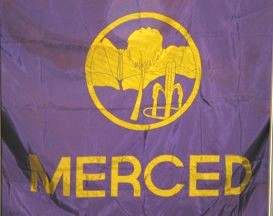
Done Merced flag
Article(s): Merced, California
Request: Making the flag of Merced like this TøW€®MªN ™ answer me 17:53, 5 November 2007 (UTC)
- I would check that licence tag first... 68.39.174.238 18:02, 5 November 2007 (UTC)
- How?! It's some city logo! 68.39.174.238 15:31, 6 November 2007 (UTC)
- So a city is not under the USA Government? Bah...
- How?! It's some city logo! 68.39.174.238 15:31, 6 November 2007 (UTC)
If u don't want to do it, just tell it... TøW€®MªN ™ answer me 15:37, 6 November 2007 (UTC)
- A city is not part of the Federal government, so there's no guarantee as to its copyright status unless its clearly old enough to have a lapsed copyright. 68.39.174.238 20:31, 6 November 2007 (UTC)
Graphist opinion: I'd say that the source image is way to small for those little details. Grass, palm tree, and fountain are not defined at all. Unless you want green and blue blobs. XcepticZP 18:31, 6 November 2007 (UTC)
Marking done, image was deleted anyway > Rugby471 talk ⚔ 08:35, 24 November 2007 (UTC)
Done Sistema de Integración Centroamericana
-
 Source Image
 -
 SVG version


Article(s): used by the Central America WP
Request: You guys are the image gods and goddesses, can this be made, uh, lighter, crisper, somehow just less ungainly? It took someone a lot of hard work, it's just missing the Je ne sais quoi -- Chris 08:05, 8 November 2007 (UTC)
- Looks to me like the colors are too close to each others for their own good. Circeus 17:37, 8 November 2007 (UTC)
- Too similar in tone, I mean... Circeus 02:34, 10 November 2007 (UTC)
Graphist opinion:
- Done the conversion. Any colour changes needed? XcepticZP 00:10, 12 November 2007 (UTC)
- Good work! I don't know about the colours but there is an "n" missing in "centroamerica". Maybe the text should align better with the circle, though it does not in the original either. Bamse 00:43, 12 November 2007 (UTC)
- I just Googled and found this website http://www.sica.int/ which shows a lighter logo, and includes the Dominican Republic. Chris 01:20, 12 November 2007 (UTC)
- I fixed the colors, made them more pleasant. I fixed the typo and I adjusted the text to fit the circle perfectly. XcepticZP 12:32, 12 November 2007 (UTC)
- I just Googled and found this website http://www.sica.int/ which shows a lighter logo, and includes the Dominican Republic. Chris 01:20, 12 November 2007 (UTC)
- Good work! I don't know about the colours but there is an "n" missing in "centroamerica". Maybe the text should align better with the circle, though it does not in the original either. Bamse 00:43, 12 November 2007 (UTC)
- Still needs the Dominican Republic in the top right. Chris 15:46, 12 November 2007 (UTC)
- Splendid! I would call that done. Is there a bot we can use to overwrite the original? This is used hundreds of times. Chris 22:30, 14 November 2007 (UTC)
- Actually, all those pages used a template. If you change the template, then all those pages will have the new pic aswell. "Template:WikiProject_Central_America" Go ahead and look on the svg version of the image. They're all there!! Hehe... Glad you like! XcepticZP 17:45, 15 November 2007 (UTC)
- Splendid! I would call that done. Is there a bot we can use to overwrite the original? This is used hundreds of times. Chris 22:30, 14 November 2007 (UTC)
Done Triangle SVG (math)

Article(s): Law of cosines, Heron's formula
Request: The generated PNG version of this image has the "c" at the bottom cropped. Also, in article pages it looks a little crammed without padding (e.g. in Law of cosines). Is it possible to tell the software to add padding, or should the padding be part of the SVG file? -- Ddxc 02:39, 12 November 2007 (UTC)
Graphist opinion:
- I added a very slight margin by scaling the figure in Inkscape. Is it good now? —Ilmari Karonen (talk) 07:38, 12 November 2007 (UTC)
- Awesome, thanks! -- Ddxc 20:44, 13 November 2007 (UTC)
Done Khmer Rouge
-
 Rework
 -
Tone

Article(s): Khmer Rouge
Request: Can you folks clean the chatter out of this photo, as you did such a nice job with the film festival photo? -- Chris 03:29, 15 November 2007 (UTC)
Graphist opinion: Cropped, desaturated (the color in the reflections just distracting, not adding anything. Lowered the reflections here and there. Cheers, Ryo 03:53, 15 November 2007 (UTC)
- Brought down filesize, added a bit of tone to the third image. The original photo is in pretty bad shape, mayhap a bit of weathering color will draw the mind away from it a bit. Ryo 04:01, 15 November 2007 (UTC)
- That's about the best you can get from that source image. Unless you can get a better photo of that photo, which I doubt would be easy. Ryo did a nice job for ya! XcepticZP 09:28, 15 November 2007 (UTC)
- Brought down filesize, added a bit of tone to the third image. The original photo is in pretty bad shape, mayhap a bit of weathering color will draw the mind away from it a bit. Ryo 04:01, 15 November 2007 (UTC)
- Thank you Ryo! I appreciate it, and will implement it. You guys do great stuff! Chris 03:33, 16 November 2007 (UTC)
Done Image to Wiki Text Table
Article(s):Incarceration
Request: -- Could someone please convert this to a wiki table? It would fit into the page much better than an image like this. A border around it would be nice as well. Thanks in advance! XcepticZP 11:55, 15 November 2007 (UTC)
Graphist opinion: I'm on it. It will be easy to cut and paste from the pdf... --Slashme 13:34, 15 November 2007 (UTC)
- Wow, that was fast... And good! I tried looking for the pdf but I couldn't find it. Mind posting the link? XcepticZP 17:54, 15 November 2007 (UTC)
- It is linked in the original image, at http://www.ojp.usdoj.gov/bjs/pub/pdf/pjim05.pdf Cheers, Ryo 19:03, 15 November 2007 (UTC)
| Number of persons held in State or Federal prisons or in local jails, 1995-2005 | ||||||
|---|---|---|---|---|---|---|
| Prisoners in custody | ||||||
| Year | Total inmates in custody | Federal | State | Inmates held in local jails | Incarceration ratea | |
| 1995 | 1,585,586 | 89,538 | 989,004 | 507,044 | 601 | |
| 2000b | 1,935,753 | 133,921 | 1,176,269 | 621,149 | 683 | |
| 2001b | 1,961,247 | 143,337 | 1,180,155 | 631,240 | 685 | |
| 2002b | 2,033,331 | 151,618 | 1,209,640 | 665,475 | 701 | |
| 2003b | 2,081,580 | 161,673 | 1,222,135 | 691,301 | 712 | |
| 2004b | June | 2,129,802 | 169,370 | 1,239,656 | 713,990 | 725 |
| December | ... | 170,535 | 1,244,311 | ... | ||
| 2005b | June 30 | 2,186,230 | 175,954 | 1,255,514 | 747,529 | 738 |
| Percent change, 6/30/04-6/30/05 |
2.6% | 3.9% | 1.3% | 4.7% | ||
| Average annual change, 12/31/95 - 6/30/05 |
3.4% | 7.4% | 2.5% | 3.9% | ||
| Note: Jail counts are for midyear (June 30) and exclude persons who were supervised outside of a jail facility. State and Federal prisoner counts for 1995-2003 are for December 31. | ||||||
| ...Not available. | ||||||
| aPersons in custody per 100,000 residents in each reference year. | ||||||
| bTotal counts include Federal inmates in non-secure privately operated facilities: 6,143 in 2000, 6,192 in 2001, 6,598 in 2002, 6,471 in 2003, 6,786 (June) and 7,065 (December) in 2004, and 7,233 in June, 2005. | ||||||
- Thanks, Slashme, for wikifying the chart. How did you do it? There are innumerable charts in the public domain in federal government PDF documents that people can use. I would like to use your method. Are there free tools for doing it?
- I took the liberty to fix the header in the chart. I also moved the "Not available" line up a bit to its previous location, but kept the row you created for it.
- I copied the wiki chart to commons:Image:USA. Prisoners 1995 to 2005.gif so that people have a choice of GIF, HTML, and wikicode versions of the chart. --Timeshifter (talk) 10:34, 17 November 2007 (UTC)
| header 1 | header 2 | header 3 |
|---|---|---|
| row 1, cell 1 | row 1, cell 2 | row 1, cell 3 |
| row 2, cell 1 | row 2, cell 2 | row 2, cell 3 |
—Preceding unsigned comment added by XcepticZP (talk • contribs) 21:26, 17 November 2007
- Thanks. I know about the table button on the toolbar. I also know about this HTML to wiki converter:
- http://www.uni-bonn.de/~manfear/html2wiki-tables.php
- I was wondering how one gets the table out of the PDF file, and into either HTML or wikicode without manually copying each cell? I only have the free Adobe Acrobat Reader. --Timeshifter (talk) 00:25, 18 November 2007 (UTC)
- I opened the pdf in Adobe Reader and used the text tool to copy the text, and pasted it into gvim, then did a search-and-replace to change tab characters to | characters, and then added the rest of the wikitable formatting by using the table button in the wikipedia editor to generate a template. Then I cut and pasted the table into the wikipedia edit box, and fixed up what wasn't right by hitting "preview", then fixing in the edit box until it came out OK. Sure, much slower than cutting and pasting a gif, but just look at the result (which even blind people can use, another reason not to put text as an image). Also see how the text changes size depending on your browser settings, how the table is still usable in text browsers and mobile devices, and how it changes size to fit different window sizes. --Slashme (talk) 06:52, 19 November 2007 (UTC)
- Thanks for explaining your method. GIFs, wikitables, etc. all have their uses. People in a hurry will copy the table from the PDF, and then paste it into an image editor. Then they can convert the table into other formats,... GIF, SVG, etc. depending on their needs. People can start with a GIF, and put it in an article. People outside wikipedia are much more likely to use the GIF. Little skill and time involved in copying a GIF to a blog, web page, MySpace, etc.. Tables are very difficult, though, for most editors at first. People can always add the HTML table later, or they can link to it, with a note saying something like "to enlarge the table, click it." --Timeshifter (talk) 02:32, 21 November 2007 (UTC)
Done The Lion and Sun

Article(s): The Lion and Sun
Request: lighten and bring out detail -- Chris (talk) 06:35, 17 November 2007 (UTC)
Graphist opinion: Okay, i'll set on this (BTW this would have been useful when making that Iran Scout Emblem wouldn't it :-) ) > Rugby471 talk ⚔ 08:02, 17 November 2007 (UTC)
- How's this? > Rugby471 talk ⚔ 08:10, 17 November 2007 (UTC)
- Wonderful, amazing, how do you do that? Can the haunches also be brightened a bit? Thank you! Chris (talk) 17:37, 17 November 2007 (UTC)
- The first edit was actually quite simple. GIMP > Tools > Color Tools > Levels > Auto. Done !. How's the second, was it what you wanted ? > Rugby471 talk ⚔ 19:20, 17 November 2007 (UTC)
- Wonderful, amazing, how do you do that? Can the haunches also be brightened a bit? Thank you! Chris (talk) 17:37, 17 November 2007 (UTC)
- I can't get the cache to refresh, it still shows up dark. I will check it at the library. Thanks! Chris (talk) 19:47, 17 November 2007 (UTC)
- Guess what I forgot to do? Thanks! Chris (talk) 04:06, 21 November 2007 (UTC)
Done Nyasaland flag
-
 SVG
SVG -
Use this as the base for the new one
.svg)
Article(s): Federation of Rhodesia and Nyasaland, among others
Request: this version has been tagged possibly nonfree for months, can a free SVG version be made, and Wikified? (that is, remove the beveling along the edges, it looks like it was used as a button or something, and the format matches no other on Wikipedia) -- Chris 19:51, 10 November 2007 (UTC)
I'm sure it could just be a lightly modified version of this > Rugby471 talk ⚔ 07:50, 11 November 2007 (UTC)
Graphist opinion:
- The shield itself is significantly different, used only to represent Nyasaland, now Malawi. Each of the three component colonies added to the shield for the Federation, hence the similarity. Chris 08:12, 11 November 2007 (UTC)
(or are you saying that should be used as the base for the new one?) Chris 08:18, 11 November 2007 (UTC)
- Yeah :-) > Rugby471 talk ⚔ 09:59, 11 November 2007 (UTC)
- Bueno. :) Chris 10:36, 11 November 2007 (UTC)
I had a go, but I can't get the cheetah right, is there any higher-res cheetah I could use as base ? > Rugby471 talk ⚔ 17:39, 12 November 2007 (UTC)
- Got one decent hit through pages of Googling. There are a couple of better larger variants at http://www.crwflags.com/fotw/flags/mw_his.html but I don't know what the licensing is on them so I didn't upload them. Chris 03:24, 13 November 2007 (UTC)
- Got a decent cheetah, here again, not going to upload it but it gives a larger picture, wrong direction. http://www.clipartguide.com/_pages/0060-0502-2417-5547.html Chris 09:18, 16 November 2007 (UTC)
:::Could someone else have a go at this cheetah, (not very good at drawing animals :-) ) > Rugby471 talk ⚔ 09:10, 17 November 2007 (UTC)
Found out, the animal was actually a Leopard, searched for that and based it on a few images, however all the spots aren't there, another librsvg bug. Will have a look at it in the morning :-) > Rugby471 talk ⚔ 19:55, 17 November 2007 (UTC)
Solved it, just didn't use patterns this time. How is it? > Rugby471 talk ⚔ 13:19, 18 November 2007 (UTC)
- Adorable! :) But the leopard should be standing atop the rocks, not getting there. Chris (talk) 17:10, 18 November 2007 (UTC)
- This Okay? > Rugby471 talk ⚔ 17:32, 18 November 2007 (UTC)
- Close enough for government work, given the scale it will be used on. Thank you! Chris (talk) 03:39, 19 November 2007 (UTC)
Done Flag of Erie County
Article(s): Erie County, Pennsylvania
Request: Is it possible for someone to create SVG of this. I've tried, but I always give up halfway through. -- Dtbohrertalk•contribs 23:39, 21 October 2007 (UTC)
Graphist opinion:
Can we contact The Erie County Flag Foundation and find out the flag's copyright, etc? Adam Cuerden talk 01:49, 22 October 2007 (UTC)
- Would they know anything? --Dtbohrertalk•contribs 02:49, 22 October 2007 (UTC)
- I *think* they're the copyright holder on the flag. Adam Cuerden talk 23:39, 22 October 2007 (UTC)
- I would've thought that the county or the government of the county would be the copyright holder. --Dtbohrertalk•contribs 23:45, 22 October 2007 (UTC)
- I *think* they're the copyright holder on the flag. Adam Cuerden talk 23:39, 22 October 2007 (UTC)
- Done : I find it impossible to make the raster ship graphic into svg, so it may need some svg improvements--Kalphite (talk) 01:41, 27 November 2007 (UTC)
Incarceration rates, totals, etc.
Moved to Wikipedia_talk:Graphic_Lab#Incarceration_rates.2C_totals.2C_etc.
Done EAF
Article(s): Alpha Kappa Alpha
Request: Would like this logo of an organization's program fixed to a .png. Thanks. Miranda 04:31, 24 November 2007 (UTC)
- Would like to see gray on the streaks instead of pink and green. Also, would like the image centered and larger. Miranda 05:22, 24 November 2007 (UTC)
Updated Graphic:
NOTE: I recieved a notice regarding the lack of a copyright license for these images. One needs to be added. —Preceding unsigned comment added by Kilojake (talk • contribs) 04:52, 25 November 2007 (UTC)
Since I had to redraw the file anyway, I included an SVG file. If any edits need to be made they can be done in Adobe Illustrator with the SVG file
This is my first graphic for the Graphic lab, so let me know if I did anything incorrectly!
Kilojake (talk) 04:12, 25 November 2007 (UTC)
Graphist opinion:
- OMG that is perfect! But, the files need to be deleted off of commons. The logo is a fair use image. Miranda 09:18, 25 November 2007 (UTC)
- I can upload the second one and credit this to you. Thanks so much! Miranda 09:21, 25 November 2007 (UTC)
- Images are deleted on Commons. Miranda 11:51, 25 November 2007 (UTC)
- I can upload the second one and credit this to you. Thanks so much! Miranda 09:21, 25 November 2007 (UTC)
Done Akaregion

Article(s): Alpha Kappa Alpha
Request: Would like this image slowed to about 100 - 150 ms per frame for older users. Miranda 06:42, 24 November 2007 (UTC)
- This good? > Rugby471 talk ⚔ 08:12, 24 November 2007 (UTC)
- Yes, thanks so much! Miranda 08:34, 24 November 2007 (UTC)
Done Holodomor
Article(s): Holodomor
Request: lighten, work your magic-- Chris (talk) 13:15, 24 November 2007 (UTC)
Graphist opinion: Lightened and got rid of the over exposure. How is it ? > Rugby471 talk ⚔ 08:04, 25 November 2007 (UTC)
- That's killer! Can a little of the unnecessary page space on the edges be trimmed off, and/or the image rotated a couple degrees clockwise, so the sides are a little more equal? Thanks! Chris (talk) 08:10, 25 November 2007 (UTC)
- Like this? > Rugby471 talk ⚔ 08:33, 25 November 2007 (UTC)
- Indeed, thank you sir! Chris (talk) 22:56, 25 November 2007 (UTC)
- Comment: I've proposed a minor unrelated change to this at the bottom. -- Ddxc (talk) 11:10, 26 November 2007 (UTC)
Done Iceland WWII Scouting
-
 Line Styles for Chris

Article(s): Bandalag íslenskra skáta
Request: Enlarge and SVGify. Kaboom88 gave it a whirl, it's really just too small. Kaboom88 can get the easy shapes (the outer fleur-de-lis, half-moon and bar below it), the remaining inner fleur-de-lis and triangles aren't detailed enough. -- Chris (talk) 05:39, 25 November 2007 (UTC)
Graphist opinion: I uploaded an enlarged version (horrible though it may be) giving the details better than the first. > Rugby471 talk ⚔ 07:50, 25 November 2007 (UTC)
- Oh, and the text reads ÍSLAND in caps. Chris (talk) 02:54, 28 November 2007 (UTC)
I'll get this one. --Slashme (talk) 15:19, 29 November 2007 (UTC)
- Thank you! Chris (talk) 15:37, 29 November 2007 (UTC)
Well, here is my attempt. I hope you like it. --Slashme (talk) 16:17, 29 November 2007 (UTC)
- Oops, fix some glitches... By the way, I'm not sure of my copyright info, so anyone who knows better is welcome to edit it.--Slashme (talk) 16:27, 29 November 2007 (UTC)
- That is beautiful, thank you! Three points:
- there seems to be a section of blank space below the badge, saved into the graphic. can that be cut out?
- there are little partial splits on the left and right petals below ÍSLAND, like the one coming partway down the center petal, can you put that in?
- this badge has not been used since the late 1940s, so it should be okay on copyright
Thank you so much! Chris (talk) 16:41, 29 November 2007 (UTC)
Ah, yes, I see those now. Added them. Also changed linecap to "round" for a better look. --Slashme (talk) 16:54, 29 November 2007 (UTC)
- What's "linecap"? Chris (talk) 22:20, 29 November 2007 (UTC)
If you look at the splits on the petals, you'll see that the ends of the lines are rounded. That's the effect of setting the "linecap" attribute of the line to "round". The other options are "square" and "butt".--Slashme (talk) 05:02, 30 November 2007 (UTC)
- Beautiful, I can see it now, it's perfect, marking it done, thank you!
- btw, what is "butt"? two rounded ends? ;) Chris (talk) 05:18, 30 November 2007 (UTC)
T3h l0l!!! See the gallery for what the different line styles do. --Slashme (talk) 09:11, 30 November 2007 (UTC)
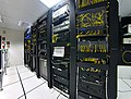
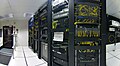
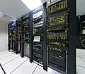
Done Lens distortion in datacenter photo
-

-
 edit, some distortion remaining
 -
 cropped
 -
 Mercator projection, cropped
 -
 Rectilinear projection, 145° by 115°
 -
 Rectilinear projection, cropped
 -
 Even tighter crop
 -
 Rectilinear, line of sight rotated 10° right


.svg)
Article(s): Structured cabling, Data center
Request: It would be great if someone could fix the lens distortion. I don't know if that's possible at all though — I tried using Gimp's Lens Distortion filter, but didn't succeed (I'm not a graphics expert though). -- Ddxc (talk) 07:23, 26 November 2007 (UTC)
Graphist opinion:
Without some correction software dedicated to this specific lens it's never* going to have nice, vertical edges, but I've had a go at making it look more "natural", also cropped and sharpened it.
*Someone here may well have something which gives better results, I'm uploading this just in case it's the only offer you get :o)--mikaultalk 12:40, 26 November 2007 (UTC)
- Wow, that's pretty sweet already. Out of curiosity, what tool did you use for that?
- Is it possible that some of the sharp corners at the bottom are artifacts caused by your software? They don't seem to be in the original. (Not saying that you should invest more time in the image, it's probably best to just find a better replacement on Commons.) -- Ddxc (talk) 13:41, 26 November 2007 (UTC)
- It's basically the Spherize filter in Pshop in reverse, plus a bit of fiddling about. I really didn't have high hopes and it's not much better than I thought it would be.. the corners are bits of the extreme edge of the fisheye curve which the filter missed. No fisheye is truly spherical so the bits of this one that aren't turn out wobbly-looking. The worst can be cropped out, which is about as far as it's worth taking, I think. I prefer the fisheye, personally, but each to their own :o) --mikaultalk 19:03, 26 November 2007 (UTC)
- I've got the image loaded and aligned in hugin, and can give you just about any projection at all. Unfortunately, the one thing I can't provide is a rectilinear projection of the entire 180° fisheye photo — it just isn't geometrically possible. I did upload a cropped Mercator projection, which I think looks pretty nice. What do you think? —Ilmari Karonen (talk) 19:58, 26 November 2007 (UTC)
- I've added two rectilinear variants. The 145° by 115° version is about as wide as I can make it — you can already see significant blurring and distortion on the sides, and it doesn't get any better from there. The other, manually cropped variant has less distortion, but also a much narrower view. —Ilmari Karonen (talk) 20:31, 26 November 2007 (UTC)
- ...and a third one, cropped to show the rack only. —Ilmari Karonen (talk) 20:34, 26 November 2007 (UTC)
- And one more, this time with a slightly changed perspective. —Ilmari Karonen (talk) 22:21, 26 November 2007 (UTC)
- The last one's great, nice work! --mikaultalk 23:32, 26 November 2007 (UTC)
- And one more, this time with a slightly changed perspective. —Ilmari Karonen (talk) 22:21, 26 November 2007 (UTC)
- ...and a third one, cropped to show the rack only. —Ilmari Karonen (talk) 20:34, 26 November 2007 (UTC)
- I've added two rectilinear variants. The 145° by 115° version is about as wide as I can make it — you can already see significant blurring and distortion on the sides, and it doesn't get any better from there. The other, manually cropped variant has less distortion, but also a much narrower view. —Ilmari Karonen (talk) 20:31, 26 November 2007 (UTC)
Done Removing black edges/corners
Article(s): Holodomor
Request: I'm kinda new to this... Is it (generally) a good idea to replace black edges or corners with transparency, like here? And would it be OK to just overwrite the first image with the second one? -- Ddxc (talk) 11:10, 26 November 2007 (UTC)
Graphist opinion: In my opinion, I would keep both separate, leaving a link on both Image Pages to the other, and then put the white one in the article since it matches the background best. > Rugby471 talk ⚔ 17:07, 26 November 2007 (UTC)
- Cool, done. Thanks! -- Ddxc (talk) 19:53, 26 November 2007 (UTC)
maybe also you could to use "skew" or "distorce"- photoshop, for to show the map more regular —Preceding unsigned comment added by 201.53.64.185 (talk) 17:21, 6 December 2007 (UTC)
Done London Midland PDF
-
Total routes (pdf file)
Article(s): London Midland
Request:
- This is a pdf map of the whole london Midland network. Could this be converted to SVG andimproved. It is not yet being used in an article. Thanks, Dewarw 16:56, 26 October 2007 (UTC)
Graphist Opinion:
- I converted it to svg version. Thanks to Illustrator's built in support for pdf files :). You will however, need to fix the license on the image I uploaded, as the license is not correct. Hope you like! XcepticZP 14:32, 30 October 2007 (UTC)
I am afraid, that the new version is a infringement of copyright! The image needs to be improved (changing the layout, colours etc.) to remove this copyright status. It cannot look exactly like the original. This is a priority as it needs to be sorted soon otherwise the image will be deleted! Thanks, Dewarw 21:21, 31 October 2007 (UTC)
- Image has been altered, removed the titles off of it, and changed the entire color scheme. XcepticZP 07:52, 2 November 2007 (UTC)
The image still needs improvements, as it still may be copyrighted. Dewarw 20:18, 5 November 2007 (UTC)