Wikipedia:Graphics Lab/Images to improve/Archive/Dec 2006
 | This page, part of the Graphics Lab Wikiproject, is an archive of requests for December 2006. Please do not edit the contents of this page. You can submit new requests here. |
 Done Eutrophication mechanism


Article
Eutrophication
Requested work
Plop, I haven't abilities to make an SVG from that, with Inkscape, but I found this pic in Wikipedia and I think she can be better in a scalable format. If you improve it, please tell me, then I will thanks the graphist. Thanks jd ❂ 03:00, 9 December 2006 (UTC)
Wikigraphists Opinion
- The version by Lycaon is excellent, although the text could IMO be a little bigger for readability. —Ilmari Karonen (talk) 17:57, 10 December 2006 (UTC)
- Amazing svg (the lycaon's one) ! I also really like the salvor's crab :] Yug 19:00, 10 December 2006 (UTC)
- Wow that looks great! So great that I will actually nom it for FPC :) --antilived T | C | G 05:47, 12 December 2006 (UTC)
- Amazing svg (the lycaon's one) ! I also really like the salvor's crab :] Yug 19:00, 10 December 2006 (UTC)
- A bit late: thank you very much :) jd 13:58, 3 March 2007 (UTC)
Done Child labour
-
 (in English)
 -
 Alternative proposition 1
 -
 Alternative 2 (Wiki positive norm)
 -
 Alternative 3 (Wiki negative norm)


Article(s): Child labour
Request : Hello graphists. I found this image, SVG, which should be better in wikipedia if changed into Blue. Several kind of blue or grey will be better for Wikipedia than this current rainbow. User Talk:Korrigan 03:20, 9 December 2006 (UTC)
- Hey, what the f*** ? I did not make this request, which comes from User:Yug. The original image (copyrighted, from which fr:user:Historicair made this picture) was actually in shades of blue and grey which made it hard to read, which is why I asked for better colors. Please Yug, don't post requests on behalf of other users, especially when it doesn't express their views :-( le Korrigan bla 12:23, 10 December 2006 (UTC)
- Korrigan : the lab is starting, I just had build some request for the english Lab~~ Yug (talk) 13:05, 10 December 2006 (UTC)
- This is fine. Please sign them with your name and not mine, then. le Korrigan bla 13:08, 10 December 2006 (UTC)
- Korrigan : the lab is starting, I just had build some request for the english Lab~~ Yug (talk) 13:05, 10 December 2006 (UTC)
Graphist opinion:
- I find the colored image just fine myself, but since you asked, I made Image:Child labour gray.svg for you. It was a trivial change, anyway; the hardest part was uploading the new version. —Ilmari Karonen (talk) 12:20, 10 December 2006 (UTC)
- Thansk for your image Ilmari, I added it to the gallery. I also made 2 others trivial versions :]. I made them according with the mapping convention. For such topic (Work of children), I think the best one to illustrate the article is the Alternative 3, with red gradiants. Yug (talk) 13:26, 10 December 2006 (UTC)
Done Tropical cyclone
-
 Original
 -
Proposition 1 (Mats Halldin)
-
 Proposition 2 (Mats Halldin)


Article(s): Tropical cyclone, Atlantic Multidecadal Oscillation
Request: If it could be possible to convert this to an SVG for legibility and clarity, it would be really great. Titoxd(?!?) 22:22, 10 December 2006 (UTC)
Graphist opinion :
- If some do this job, please upload the new image on commons. Yug (talk) 00:01, 11 December 2006 (UTC)
- Ok, I've done a SVG copy and uploaded it to Commons. I also did a black and white version which I tried to keep more simple. I'm a bit new with SVG, so please don't hesitate to suggest any changes.
- / Mats Halldin 06:47, 12 December 2006 (UTC)
- Awesome! The only thing I see is that the new image doesn't have the caption on the top, but that's small. It's much clearer now. Thanks! Titoxd(?!?) 06:58, 12 December 2006 (UTC)
- I could add the caption if that is what you want. My idea was that the caption was unnecessary in the image itself. Captions normally should go in... well ...the caption. :)
- / Mats Halldin 09:39, 12 December 2006 (UTC)
Done Leefgebied (Vulpes cana)
.jpg)
.png)
.svg)
Article(s): Vulpes cana
Request: In found this map in an user gally, I this that a better map is welcome (bigger), this one is not really convenient. Yug (talk) 23:59, 10 December 2006 (UTC)
Graphist opinion :
- Is there more precise information available on the range? The red section can certainly be enlarged and cleaned up a bit, but if the original range description can be posted, it might be better to use that instead. This says its range is "Afghanistan, Iran, Pakistan, and Turkmeania, Israel and Oman"... is that appropriate to use? --Interiot 02:51, 12 December 2006 (UTC)
- I did a direct enlargement from the original, but per above, it may be better if the range can be more accurately defined. --Interiot 04:58, 12 December 2006 (UTC)
- I did another attempt, limiting the continents this time and in SVG. -- Lycaon 11:38, 12 December 2006 (UTC)
- I did a direct enlargement from the original, but per above, it may be better if the range can be more accurately defined. --Interiot 04:58, 12 December 2006 (UTC)
- Thanks each of you, that's exactly what it was need to do. I will use the .png one. As tlak in the Lycaon's talk page, for such maps, which are already big maps, and which will be everytime reduced, the svg version (more than 1.000 Ko) seem not to be really convenient.
- Moreover, I restored the full World size, which is more convenient to compare the animal habitat with the world. Thanks Interior :] Yug (talk) 14:41, 16 December 2006 (UTC)
Done Old newspaper image
-
 Original
 -
 Cleaned up by Canley


Article:Hariot Hamilton-Temple-Blackwood, Marchioness of Dufferin and Ava
Request: Is it possible to make this look a bit more like a good quality photo? It's a newspaper copy of an engraving and is very dark and dingy. Thanks for any help.--HJMG 09:46, 11 December 2006 (UTC)
Graphist opinions and comments :
- Brilliant - a huge improvement - many thanks! --HJMG 12:48, 11 December 2006 (UTC)
- Quick and pretty : perfect :] Yug (talk) 21:20, 11 December 2006 (UTC)
- There were some irregularities in the background near her eye and chin that I found pretty distracting, so I fixed that. It's a fairly minor change to the background only, so I uploaded over Canley's version, but feel free to revert and I can upload as a separate file. --Interiot 05:18, 12 December 2006 (UTC)
- That's better, those irregularities were bugging me too! --Canley 08:27, 12 December 2006 (UTC)
- Couldn't a much better quality image be derived if you started with the one at http://bibnum2.banq.qc.ca/bna/illustrations/high/595.jpg ? - Bevo 18:38, 14 December 2006 (UTC)
- That's better, those irregularities were bugging me too! --Canley 08:27, 12 December 2006 (UTC)
- There were some irregularities in the background near her eye and chin that I found pretty distracting, so I fixed that. It's a fairly minor change to the background only, so I uploaded over Canley's version, but feel free to revert and I can upload as a separate file. --Interiot 05:18, 12 December 2006 (UTC)
- Quick and pretty : perfect :] Yug (talk) 21:20, 11 December 2006 (UTC)
- "595.jpg" is 512x768px/124kb while "Marchioness of Dufferin and Ava.png" is 889x1287px/966kb, so probably not.
- / Mats Halldin 09:21, 15 December 2006 (UTC)
- http://bibnum2.banq.qc.ca/bna/illustrations/detail/595.jpg (1024x1536px) is what I should have proposed as an alternative image to be cleaned up. - Bevo 17:32, 15 December 2006 (UTC)
- OK, my ambition is to give it a try, please be patient. Next week maybe.
- / Mats Halldin (talk) 19:00, 17 December 2006 (UTC)
- No need, they have the exact same amount of detail (open both up in an editor as two different layers and align them, and you'll see). The resolution difference is only due to the cropping of the border (which is basically necessary) and a little bit extra of the background cropped from the top (which is perhaps subjective, but I agree with whoever cropped it that way). --Interiot 23:14, 17 December 2006 (UTC)
- I can't explain it, but last week I saw a much inferior rendering of the Wikipedia version of this image than I do this morning. What I saw last week had no fineline detail, yet this morning I agree that the detail in the two images are equivalent, so there's no need to redo the touch-up. I'd sure like to know what changed to allow me to see a more faithful version of the image. - Bevo 15:51, 18 December 2006 (UTC)
Done Map Tamana en.png
-
 original
 -
 SVG version


Article(s): Tamana, Kumamoto
Request : Yug (talk) 17:27, 11 December 2006 (UTC)
Please, convert in SVG, upload on wiki commons as Map_of_Tamana.svg and replace the current pic in the article.
If you want to make international version, have a look to this page. thx
- Asked by - lyhana8 (Talk) 15:13, 11 December 2006 (UTC)
What about Image:KumamotoMapCurrent.png and the numerous children in commons:Category:Maps of Kumamoto prefecture? It seems foolish to only replace one of them... Circeus 00:58, 17 December 2006 (UTC)
- The request was only for one of them. It easy, but of course repetitive, to do it a lot of time. I'll try to see if I can find a way to pseudo-automate this. Anyone knows if I need a bot to upload a series of files?
- / Mats Halldin (talk) 18:58, 17 December 2006 (UTC)
- Ok, there are now SVGs for all the PNGs in that category. I produced and uploaded them manually, so I still need to teach myself how to automate repetitive tasks like this one. The entire list:
- Image:Kumamoto Prefecture shadow picture.svg
- Image:KumamotoMapCurrent.svg
- Image:Map Amakusa en.svg
- Image:Map Arao en.svg
- Image:Map Aso en.svg
- Image:Map Hitoyoshi en.svg
- Image:Map Kami-Amakusa en.svg
- Image:Map Kikuchi, Kumamoto en.svg
- Image:Map Kumamoto en.svg
- Image:Map Minamata en.svg
- Image:Map Tamana en.svg
- Image:Map Uki en.svg
- Image:Map Uto en.svg
- Image:Map Yamaga en.svg
- Image:Map Yatsushiro en.svg
Graphist opinion :
I think this image is already pretty good and doesn't need to be improve. If someone want do so... ? Yug (talk) 21:19, 11 December 2006 (UTC)
- My image looks like a blank space on commons and when I click on it here on Wikipedia. Why? Is there something wrong whith my SVG?
- / Mats Halldin 21:20, 12 December 2006 (UTC)
- I tried resaving it and uploading a new version but it didn't work. The image itself opens fine in a browser, but the Wikipedia and Commons display is blank. --Canley 07:51, 13 December 2006 (UTC)
- Odd, it works today!?! Thanks, whatever you did.
- / Mats Halldin 10:42, 13 December 2006 (UTC)
Done Image:Jinfengopteryx-scale.png
-
 original
 -
 svg by Interiot


Article(s): need for next image's creations, to make other image showing the scaleof such animals.
Request : We need to have only this man. So my request is to Extract the man, make an SVG, and upload it with the name "Wikiman 1m80.svg". All my thanks to the graphist who do that. Yug (talk) 22:53, 11 December 2006 (UTC)
Graphist opinion :
- How's that? --Interiot 04:08, 12 December 2006 (UTC)
- Many thanks ! this svg man will be really more convenient to use that Jinfengopteryx-scale.png ! thanks. Yug (talk) 10:24, 12 December 2006 (UTC)
- On Commons, I opened a commons:Category:Graphic_tool, where we can put all our.. Graphic tools. Yug (talk) 10:45, 12 December 2006 (UTC)
- Many thanks ! this svg man will be really more convenient to use that Jinfengopteryx-scale.png ! thanks. Yug (talk) 10:24, 12 December 2006 (UTC)
Relationship between dBu and dBm
Article(s): None yet
Request : The ≈ and = are not in line with the rest of the text, and the subscript on "rms" isn't showing up. I know I can "fake it" and make it look as desired, but it renders correctly in Inkscape. I'd like to figure out how to get it to render the same on the server. — Omegatron 02:21, 12 December 2006 (UTC)
Graphist opinion : Wouldn't it be best just convert the text into paths as there aren't that many texts anyways? --antilived T | C | G 05:37, 12 December 2006 (UTC)
- That's a possibility, of course, but that's what I mean by "faking it". Why convert text to paths when what you really want is text? It renders fine in Inkscape. — Omegatron 20:18, 12 December 2006 (UTC)
- Check the Village Pump... probably something up with the SVG rendered in MediaWiki. Titoxd(?!?) 02:11, 13 December 2006 (UTC)
- That's a possibility, of course, but that's what I mean by "faking it". Why convert text to paths when what you really want is text? It renders fine in Inkscape. — Omegatron 20:18, 12 December 2006 (UTC)
- You can fix it yourself. At the moment, the SVG explicitly demands font-family "Bitstream Vera Sans". Change that to Arial (with a backup of sans-serif, for safety). --KSmrqT 00:15, 14 December 2006 (UTC)
- Interesting. I fixed that problem myself with someone else once. :-) Must be an Inkscape thing. Even when I specify the font as Sans in Inkscape, it still says Bitstream Vera Sans in the XML.
- I take it subscripts aren't supported by rsvg? — Omegatron 01:08, 20 December 2006 (UTC)
- Actually, that doesn't seem to fix it. The equals and approx signs are still off from where they should be. Also Inkscape and rsvg differ on how they render right-aligned text with spaces at the end (Inkscape moves it to the left, rsvg does not). Also the subscript. I guess I'll just go with the convert to path idea, even though I dislike it. :-\ — Omegatron 01:25, 20 December 2006 (UTC)
- Yeah, subscripts work in Inkscape, but you can only do it via GUI, not keyboard. Use alt-arrows to move one or more letters around. But Inkscape's subscripts don't render correctly in rsvg either, so yeah, convert them to paths unfortunately. --Interiot 02:47, 20 December 2006 (UTC)
- Actually, that doesn't seem to fix it. The equals and approx signs are still off from where they should be. Also Inkscape and rsvg differ on how they render right-aligned text with spaces at the end (Inkscape moves it to the left, rsvg does not). Also the subscript. I guess I'll just go with the convert to path idea, even though I dislike it. :-\ — Omegatron 01:25, 20 December 2006 (UTC)
- That's not a subscript; that's moving the letters around. Subscript is not yet implemented in Inkscape (tspans). Is it implemented in rsvg? — Omegatron 15:32, 20 December 2006 (UTC)
- Subscripts are implemented in Inkscape. Ctrl-u, then type in the unicode value for the character you want. It's fugly, but it does give you true unicode subscripts (superscripts, Greek, whatever you want) Niels Olson (talk) 22:47, 31 March 2009 (UTC)
Done Map of East Timor
-
 Original request
 -
 An existing map with more detail
 -
 New map based on the Factbook map (SVG)
 -
 New map based exactly on the Factbook map (SVG)
 -
 New map based on Image:CIA-TimorLeste.jpg and Image:Timor.png.


Article(s): Geography of East Timor, List of cities in East Timor, Jaco (East Timor) and a few others
Request: This map from the World Factbook is used in quite a few geography pages about East Timor. Sadly, the map is poor resolution, quality, and the city/town names are unclear. I don't know much about picture editing but hopefully this map can be fixed up. Thank you, this is a great project. Bobo is soft 03:22, 12 December 2006 (UTC)
Graphist opinion:
- Perhaps Image:CIA-TimorLeste.jpg is a suitable replacement? In any case, it's of a higher resolution, and any changes needed should probably be based off of that. --Interiot 09:12, 12 December 2006 (UTC)
- Hope you like the SVG-version I just created. --Xerxes2k 09:57, 12 December 2006 (UTC)
- Nice one! You're too quick, I did one as well! --Canley 12:28, 12 December 2006 (UTC)
- I was less quick, but here you've got a jpg aswell.
- / Mats Halldin 12:49, 12 December 2006 (UTC)
Requester's comment: WOW! Awesome everyone, thanks for redrawing this map.
- Xerxes2k, your map is good except you forgot the scale and bolding the town names.
- Canley, excellent map, exactly what I was hoping for.
- Mats Halldin, amazing map with great drawing and color use. It will be extra useful since you based it off both maps.
Thanks again, Bobo is soft 22:58, 12 December 2006 (UTC)
- External comments
- I tried replacing the old image with the new and, for some reason, it will NOT display in mediawiki at 250px. 249 and 251 pixels work alright, but not 250... I have no experience with .SVGs, so someone else should investigate.
Done Haeckel's Discomedusa
-
 Original, cleaned up by Ilmari Karonen
 -
 Clean-up background by Mats Halldin


Article(s):
Request: ragesoss 04:25, 12 December 2006 (UTC)
General cleanup; this is probably the most well-known and significant image from Ernst Haeckel's Kunstformen der Natur (6 other images from which are featured), but it's too messy to become an FP in its present state. This version has been fiddled with using Picasa; I can provide the original scan if needed.
Graphist opinion:
Hm, I hope this is where I should put my comment. Anyway, I cleaned up the image sort of quick and dirty mostly using filters in Photoshop. If you take a close look at the clean-up version you'll find spots that the filters didn't get right. I've never seen the original, let me know if this is in the right direction. The tentacles on the far left should probably be less blue, but I didn't want to "repaint" the image.
/ Mats Halldin 09:31, 12 December 2006 (UTC)
- I've uploaded another cleaned-up version here made in the GIMP. What I did was I first constructed a crude mask of the figures, scaled down the image and used the Resynthesizer plugin to remove the figures. I then scaled the resulting "blank page" up again and inserted it as a new layer in "divide" mode, thus removing the shadows and the paper color. I also selectively blurred a copy of the page and, using the difference of the blurred version and the "blank page" as a mask (after levels adjustment), combined the blurred version with the original so that the background was blurred but the figures stayed crisp; this got rid of the dust and paper grain in the background.
- When you cleanup an image with the same file format (here : .jpg) : feel free to upload the new image up on the old one, with the same name. That's more convenient. Yug (talk) 10:47, 12 December 2006 (UTC)
- Yeah, Resynthesizer is useful, thanks for that tip (though it's pretty CPU/RAM hungry). The latest image would probably look better if its black levels were corrected. (the "2" for instance is pretty faint for being black) I tried doing basically the opposite thing (generate a black mask to multiply by), but Resynthesizer stalls. --Interiot 12:52, 12 December 2006 (UTC)
- Really great work! I really wished I took the time to get started with GIMP.
- / Mats Halldin 13:25, 12 December 2006 (UTC)
- I don't think it needs levels adjustment so much as sharpening; there's no way to make the numbers much darker by global color changes alone, since they're only about 25% gray. I've reuploaded a version with a bit of unsharp masking applied, after grain extraction to avoid sharpening the noise. I'll see if I can improve it further yet. (As for using Resynthesizer for cases like this, the trick is to scale down the image a lot first; this speed up the process significantly, makes it less likely to fail, and you don't want to resynthesize the high-frequency components anyway. I used a 1:5 scaling for this image, but 1:10 would probably have worked just as well.) —Ilmari Karonen (talk) 18:42, 12 December 2006 (UTC)
- Since the division operation is used, it's inevitable that some blacks are going to be brightened, and it'd be nice if there was a way to pin both ends (black and white) at the right spot. While the lines are the most obvious issue with black balance, I was wondering if applying a similar correction to the nearby color patches might make them look better too. But these are minor quibbles, I don't know if it'd actually look better (or if readers could tell the difference with so many monitors being calibrated so differently). --Interiot 19:31, 12 December 2006 (UTC)
- I think I've got it now. What it took was some serious unsharp masking in darken-only mode to bring out the edges. I usually tend to be very careful with the unsharp mask, since it's so easy to ruin an image by overusing it, but in this case it seems to be just what the image needed. The image actually did already have a pretty good color distribution, it was just the edges that lacked contrast. —Ilmari Karonen (talk) 21:10, 12 December 2006 (UTC)
Thanks! It looks great.--ragesoss 18:30, 13 December 2006 (UTC)
- Aha, the technique Ilmari Karonen used to generate the white-map (filling in the background where the foreground previously was) is called "inpainting" ([1], scroll down). There are various algorithms people have implemented, from simple to very complex and surprisingly accurate. Other FLOSS plugins/apps include [2] [3] [4]. What a useful thing to learn. --Interiot 20:43, 15 December 2006 (UTC)
Since everyone seems more or less happy with my latest version, I've now reuploaded it over the original and tagged the working copy for deletion as a duplicate. —Ilmari Karonen (talk) 18:43, 21 December 2006 (UTC)
Apprentice questions:
I've corrected vignettes like this before... When there's a white background, I've been able to use it as something to calibrate against, but the method I've used is pretty clumsy. Does anybody have tips on correcting this vignette? --Interiot 06:20, 12 December 2006 (UTC)
Done Giant Frog
-
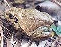
-
 Colors fixed, scratches removed.


Article(s): Giant Frog
Request: liquidGhoul 14:35, 12 December 2006 (UTC) This was sent to me, and I think it was a scan of a washed out photo. I don't currently have the tools to fix it, and I probably wouldn't do it in the right way. To see what colour the frog should be, check out this (brown one, not the green one). Thanks, and great work with the project. --liquidGhoul 14:35, 12 December 2006 (UTC)
Graphist opinion:
- The color-balance is fixed now, but if someone has Healing Brush, there are a couple scratches that could be cleaned up. --Interiot 17:43, 12 December 2006 (UTC)
I uploaded a new version. I'm not sure I did get the colors right.
/ Mats Halldin 17:55, 12 December 2006 (UTC)
Also, to remove the scratches I used the clone and blur tools a lot. While this probably doesn't mater for the background it might have altered the head of the animal a bit, especially between the eyes. I choosed to leave some traces of the scratches there, in order not to alter the frog to much.
/ Mats Halldin 19:09, 12 December 2006 (UTC)
- Thanks guys. I have put it in the article, looks great! --liquidGhoul 22:21, 12 December 2006 (UTC)
Done Climate
-

-
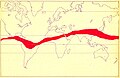
-
 Help file
 -
 ITCZ january-july.png


Article(s): relate to Climatology and Tropical climate, uploaded on commons 5 five minutes ago. [but I don't understant what is ZICT.]
Request: I don't know what is his graphic software but that's probably not The GIMP. Which software society may sell such graphic soft ?. Some one may help ? The request is to merge the both map, up on the grey conventionnal world map. The first red area into red, the second area into blue. <please> Yug (talk) 17:19, 12 December 2006 (UTC) <help to find the answer : M-----O-T>
Graphist opinion:
- Probably it is a translation in a Romance language of Intertropical Convergence Zone. Titoxd(?!?) 20:12, 12 December 2006 (UTC)
- That seem right : ZICT in french => Zone Intertropical de Convergeance.
- I propose to name it with the english name : Image:ITCZ january-july.png Yug (talk) 21:20, 12 December 2006 (UTC)
- It's usually referred to as the ITCZ, though, so that may be a better name. Titoxd(?!?) 21:53, 12 December 2006 (UTC)
- Ok, I did a simple blank map with the derived curves. Let me know if you want the colors different or have some labels and such stuff added to it.
- / Mats Halldin 10:25, 13 December 2006 (UTC)
- That's perfect ! Many thanks, I will say to the former uploader that we made a new image from his 2 maps. Yug (talk) 11:39, 13 December 2006 (UTC)
- In the pacific ocean area, can you add : "January ITCZ" on the blue layer, and "July ITCZ" on the red layer. And that's finish. Yug (talk) 11:41, 13 December 2006 (UTC)
- It's usually referred to as the ITCZ, though, so that may be a better name. Titoxd(?!?) 21:53, 12 December 2006 (UTC)
Done Baylor seal
Image:Baylor seal.gif (linked rather than displayed because it's fair use)
Article(s):Baylor University & Baylor Law School
Request: Please remove the background so the seal is on a transparent background.NMajdan•talk 18:03, 12 December 2006 (UTC)
Graphist opinion:
- Done Done (there are two versions in history: one with the inside of the logo transparent, which makes MediaWiki generate really bad thumbnails; and one with only the outside of the logo transparent). --Interiot 18:27, 12 December 2006 (UTC)
 Thanks. The inside of the logo should be white and the outside transparent, so this is perfect. I may be bringing more here soon.--NMajdan•talk 19:36, 12 December 2006 (UTC)
Done Image:Cat5-plain-dot.svg


Article(s): Category 5 cable, pinout
Request: Needs to be converted to SVG. Here's some similar images, in case anyone feels like enhancing it a bit: [5] [6] [7]. --Interiot 20:53, 12 December 2006 (UTC)
Graphist opinion:
- First, we clean it up slightly. I've uploaded a PNG of the JPG, and am working on making it SVG now. Titoxd(?!?) 02:33, 13 December 2006 (UTC)
- Titoxd, are you still working on this or should I do a try?
- / Mats Halldin 00:55, 14 December 2006 (UTC)
- Horribly stuck with SVG (I really haven't tried doing an SVG before this...), so if you want to try, sure, have a go at it. Titoxd(?!?) 21:28, 14 December 2006 (UTC)
- I made an SVG version (not identical, but of the same information), but I don't know how to upload it.
- http://nick.industrialmeats.com/cat5-plain.svg ChaosNil
- You can upload it at Special:Upload. You can fill in the information in the form there, and if you need any help doing so, you can just ask back here too. Titoxd(?!?) 21:28, 14 December 2006 (UTC)
- Great! Thanks! Added to the list above. ChaosNil 21:34, 14 December 2006 (UTC)
- Excellent. One little request: instead of outlining the color of a wire in the white/color wires, can you make it use blocks instead? (I mean, similar to Interiot's second link.) I ask because it is difficult to see the thin color borders at thumbnail resolution. Titoxd(?!?) 23:35, 14 December 2006 (UTC)
- Certainly, its just a lot more work :) I'll try to figure out a good way to do that. ChaosNil 23:47, 14 December 2006 (UTC)
- Excellent. One little request: instead of outlining the color of a wire in the white/color wires, can you make it use blocks instead? (I mean, similar to Interiot's second link.) I ask because it is difficult to see the thin color borders at thumbnail resolution. Titoxd(?!?) 23:35, 14 December 2006 (UTC)
- Great! Thanks! Added to the list above. ChaosNil 21:34, 14 December 2006 (UTC)
- You can upload it at Special:Upload. You can fill in the information in the form there, and if you need any help doing so, you can just ask back here too. Titoxd(?!?) 21:28, 14 December 2006 (UTC)
Uploaded distinctive striped version. ChaosNil 00:06, 15 December 2006 (UTC)
- Good work! I'll be working a lot this weekend, so I'm not likely to get much done here until next week. As we aren't overvelmed by requests at this time, maybe we should try to flirt around some. Neutrality made several re-creation requests of historical maps, for example. Also, I think the Receding glacier image should be possible to be turned into a SVG. Maybe I'll try that on monday.
- / Mats Halldin 08:51, 15 December 2006 (UTC)
- Agreed, good work. Yeah, I can start adding a few to the queue too. I think it's more useful to turn things into SVG when they really need to be converted just to be able to have different captions on them for other languages (or it's otherwise clear that the image would need to be routinely modified). The maps idea sounds good though... I think we should encourage listing off-site (non-free) images that should be recreated here (eg. maps, diagrams, etc). --Interiot 19:20, 15 December 2006 (UTC)
- I took a stab at the Charlameign map, but converting maps to SVG seems like an incredible amount of work, especially since the base map template and the historical maps seem to be in different projections. Too bad we don't have the GIS data for the historical maps , we could just use one of the many free GIS systems. I'll stick to diagrams. ChaosNil 19:39, 15 December 2006 (UTC)
- Having written a few articles (in Swedish) on Frankish kings and seen a few related maps, I think it is fair to think of these borders as estimations. Anything that "look similar" is problably just as reliable. Knowledge of where a limited number of old French cities are located is problably the only requirement to get it right. Do your best!
- / Mats Halldin (talk) 19:54, 17 December 2006 (UTC)
- I took a stab at the Charlameign map, but converting maps to SVG seems like an incredible amount of work, especially since the base map template and the historical maps seem to be in different projections. Too bad we don't have the GIS data for the historical maps , we could just use one of the many free GIS systems. I'll stick to diagrams. ChaosNil 19:39, 15 December 2006 (UTC)
- Agreed, good work. Yeah, I can start adding a few to the queue too. I think it's more useful to turn things into SVG when they really need to be converted just to be able to have different captions on them for other languages (or it's otherwise clear that the image would need to be routinely modified). The maps idea sounds good though... I think we should encourage listing off-site (non-free) images that should be recreated here (eg. maps, diagrams, etc). --Interiot 19:20, 15 December 2006 (UTC)
Done Image:SmithCastle.jpg
-
 Original JPG
 -
 Genuine fake
 -
 Retouched by Canley


Article(s): Smithsonian Institution Building
Request: Is it possible to take out the constuction sign and barrels? Or do I need to drive back to D.C. and take another picture? Also, the Date stamp could stand to be cropped out or removed. CJC47 23:24, 12 December 2006 (UTC)
Graphist opinion:
Ok, I did what I could. You should upload your images in a better resolution, if nothing else to make life easier for bastards like myself to fake thing around. There wasn't enough pixels in the photo to do a lot, so I didn't manage to make the left sidewalk symmetric to the right one. If you do use this version make sure to tell your audience it is digitaly altered. Personally I recommend a new trip to Washington D.C. instead.
Also, when possible avoid taking pictures of buildings in shadow, it tends to look like the first scene in a tragic movie.
/ Mats Halldin 08:17, 13 December 2006 (UTC)
- Ooh, same time! OK, I've tried retouching out the roadworks sign and the barrels, and the datestamp. Had a lot of trouble with the curved corner of the lawn - normally I would have flipped one side over but both sides had something obscuring them... so the corner is kind of sharp. Could be painted in by hand if anyone wants to improve it further? I see Mats has done one as well, maybe someone could combine them - they look very similar actually! --Canley 08:33, 13 December 2006 (UTC)
- Indeed, we did the same work at the same time. I also felt that rebuilding the left corner correctly was to much work. When I have a second look at it, maybe we both should have lightened up the building a bit. Also, I think there should be a second black signpost to the left of the main gate, which we both left out. If CJC47 upload the image in higher resolution it might be easier to do something more with it. I really do hope he/she do make a second trip to Washington D.C.
- / Mats Halldin 09:09, 15 December 2006 (UTC)
- I found that the french are using a system to let each other know that someone else is working on a request by simply throwing in a {{je prends|Name}} which renders as "
 Pris en charge par 'Name'". I suggest we use the same system here to avoid this sort of "edit conflicts".
 - / Mats Halldin 10:41, 15 December 2006 (UTC)
University Seals
- Image:Kuseal.gif (linked rather than displayed because of fair use)
- Image:Seal lg.gif (linked rather than displayed because of fair use)
- Image:TTs.gif (linked rather than displayed because of fair use)
PNG versions:
- Image:Kuseal.png (linked rather than displayed because of fair use)
- Image:Seal lg.png (linked rather than displayed because of fair use)
- Image:TTs.png (linked rather than displayed because of fair use)
Article(s): University of Kansas, Kansas State University, Texas Tech University, List of Texas Tech University people
Request: Needs transparent background.NMajdan•talk 14:54, 13 December 2006 (UTC)
Graphist opinion:
- I tried to get the transparency to look nice in the GIFs but couldn't get rid of the aliasing effects. Instead, I've replaced the images with PNG versions (and will delete the originals as orphan fair use). I've also removed the image from the "list of TT people" page, since it was only used decoratively there. —Ilmari Karonen (talk) 16:26, 13 December 2006 (UTC)
- ( note : if in futur the G.Lab is overbooked, I think we shouldn't cleanup fair use images, which are useable only on wiki-en, and which may be outlaw some years later. Yug (talk) 18:34, 13 December 2006 (UTC) )
- Agree, fair use stuff is low priority. But simple fixes like these ones are ok to bring up at this time. Good work anyway, Ilmari Karonen.
- / Mats Halldin 20:08, 13 December 2006 (UTC)
Done Navy Midshipmen logo
Image:United State Naval Academy Logo-sports.gif (linked rather than displayed because of fair use)
Article(s): Navy Midshipmen football
Request: Needs transparent background.NMajdan•talk 15:58, 13 December 2006 (UTC)
Graphist opinion:
Voilá, transparent background.
/ Mats Halldin 21:09, 13 December 2006 (UTC)
Charles Bridge Statue

Article(s): [Article(s) the image is or will be illustrating]
Request: Shagmaestro 18:34, 13 December 2006 (UTC)
- Apologies for not finishing the request the first time! I wonder if an experienced editor could quickly go over this for colour, sharpness, and anything else that can be done. It is OK, but I think it might need a little general work. I know that's ambiguous, but I come to the lab because I have no idea what an image needs, myself! Shagmaestro 18:39, 13 December 2006 (UTC)
Graphist opinion:
- And the request is "Shagmaestro", so we have to "Shagmaestro" the image. Yug (talk) 18:37, 13 December 2006 (UTC) [Shagmaestro, can you explain what you want in the Request field.]
- Note that the image is currently a featured picture candidate on commons, so there's no glaring issues with it. --Interiot 19:36, 13 December 2006 (UTC)
- There is nothing obviously, technically wrong with this image, but images of artworks should have a neutral angle and should depict the entire work of art. The pun with a finger pointing to the moon is simply not enough to make a good photo. If this image didn't make it as featured on Commons, it is because of this. I could spend some time tweaking the light and other things, but I really don't see why. Please let us know if there is something more specific you would like us to do.
- / Mats Halldin 20:19, 13 December 2006 (UTC)
Done Angle of attack vs. Lift
-
 Original JPG
 -
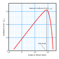 SVG by ChaosNil


Article(s): Stall (flight)
Request: Most obviously, it shouldn't be JPG. But it's also a central part of the stall article, which has many interwikis, and needs to be able to have its captions changeable for internationalization. Could be PNG if a blank version were provided (the "stall angle" inside the grid isn't easy to replace), but it's probably best as SVG. de:Bild:Auftriebsbeiwert.jpg is the German translation of this (with an additional useful caption that falls inside the grid). --Interiot 20:57, 15 December 2006 (UTC)
Graphist opinion:
- I can't even figure out how to create a uniform line grid in Inkscape... is there an easy way to create one? --Interiot 20:57, 15 December 2006 (UTC)
- Wouldn't this be better done in gnuplot or something? Maybe rlplot which seems to ouput SVG. ChaosNil 21:33, 15 December 2006 (UTC)
- To create a uniform line grid, use Effects > Render > Grid. It fills the selected object (usually a rectangle) with a new object which is a grid, according to parameters such as spacing and line width. Alternatively, use the Object > Pattern > facilities; but be aware that deficient SVG renderers cannot handle patterns. --KSmrqT 22:07, 15 December 2006 (UTC)
- Ahh, a new feature I had to upgrade to be able to see. Thanks for the tip. --Interiot 01:10, 16 December 2006 (UTC)
- I already have a grid so I might as well finish it. ChaosNil 22:16, 15 December 2006 (UTC)
- Done! ChaosNil 22:58, 15 December 2006 (UTC)
- Beautiful, thanks. --Interiot 01:10, 16 December 2006 (UTC)
- Done! ChaosNil 22:58, 15 December 2006 (UTC)
Done Single Malt Scotch Regions
-
 Briangotts's PNG
 -
 SVG
SVG


Article(s):
- Islay whisky
- Single malt Scotch
- Highland Single Malts
- Speyside Single Malts
- Island Single Malts
- Campbeltown Single Malts
- Lowland Single Malts
Request: Pstuart84 Talk 15:22, 15 December 2006 (UTC)
Graphist opinion:
- Request from the Wikipedia:Graphic Lab/Maps. I think Pstuart84 want a standardisation (the colors are ugly, and really not ¨wiki like¨) -- - lyhana8 (Talk) 00:04, 16 December 2006 (UTC)
- I converted to SVG, and used the color scheme at /Maps. I don't know if I'm happy with the colors, but it's difficult because there are 8 different regions, 6 of which closely mingle with each other. --Interiot 17:46, 16 December 2006 (UTC)
- That's an enormous improvement. It was just a map that seemed so out of keeping with wikipedia and I had only recently stumbled across Graphic Lab, so I made the request. Quite fair to say that the request should be more specific, though the new version makes it clear that it was obvious what was required. At what point should I go about replacing the PNG with the new SVG in the various articles? Pstuart84 Talk 23:59, 16 December 2006 (UTC)
- Pstuart84: Whenever you think your request have been fullfilled. The SVG can always be updated after having repaced the present map. If you feel anything should be changed, just let us know. Everything is new on this page, so no one really knows yet.
- / Mats Halldin (talk) 02:40, 17 December 2006 (UTC)
- The legend will need changing on the svg picture page and a number of the articles. Can 'light blue' simply refer to two different regions or should the svg be changed so that each region is a different colour? Pstuart84 Talk 12:20, 17 December 2006 (UTC)
- They are a different shade of blue, both mentioned in the color scheme at Wikipedia:Graphic Lab/Maps.... it's hard to find unique colors. I changed Speyside to red since that's mentioned at /Maps... I don't like red, but it is the most important region on the map, so maybe that'll work. --Interiot 21:32, 17 December 2006 (UTC)
- The legend will need changing on the svg picture page and a number of the articles. Can 'light blue' simply refer to two different regions or should the svg be changed so that each region is a different colour? Pstuart84 Talk 12:20, 17 December 2006 (UTC)
- That's an enormous improvement. It was just a map that seemed so out of keeping with wikipedia and I had only recently stumbled across Graphic Lab, so I made the request. Quite fair to say that the request should be more specific, though the new version makes it clear that it was obvious what was required. At what point should I go about replacing the PNG with the new SVG in the various articles? Pstuart84 Talk 23:59, 16 December 2006 (UTC)
- I converted to SVG, and used the color scheme at /Maps. I don't know if I'm happy with the colors, but it's difficult because there are 8 different regions, 6 of which closely mingle with each other. --Interiot 17:46, 16 December 2006 (UTC)
- I've changed the png for the svg in all the articles. That means the png now only appears on this page. Does that mean the PNG should be deleted or does it simply sit on the server not being used? Forgive a newbie for all his questions! That's such an improvement though, thanks for all your hard work interiot. Pstuart84 Talk 23:15, 17 December 2006 (UTC)
- No problem, happy to help out. A lot of such images have been left under Category:Obsolete images (in this case, its subcategory Category:Images made obsolete by an SVG version)... if the PNG is definitely no longer needed, it could be IFD'd, sure. --Interiot 23:26, 17 December 2006 (UTC)
- I've recolored the image, since I frankly found the version with colors from Wikipedia:Graphic Lab/Maps clashing and hard to read. Improvements are welcome, of course. I also turned the legend into a transcludable subpage, so that the next person to change the colors won't have to edit every article the image is used in. —Ilmari Karonen (talk) 13:54, 18 December 2006 (UTC)
- Thank you. I was really struggling to find acceptable colors for some reason. Your selection looks great. --Interiot 20:05, 18 December 2006 (UTC)
Done Receding glacier
-
 original
 -
 vectorized by Lycaon


Article(s):
Request: Lycaon 16:47, 16 December 2006 (UTC)
- Convert to svg
Graphist opinion:
- I saw this challenge somewhere above, so... Lycaon 16:47, 16 December 2006 (UTC)
- Once again, very very nice work! --Interiot 17:06, 16 December 2006 (UTC)
- Really, really nice... Yug (talk) 22:35, 16 December 2006 (UTC) Thanks
- Indeed, great work! Keep it up.
- / Mats Halldin (talk) 19:04, 17 December 2006 (UTC)
- Really, really nice... Yug (talk) 22:35, 16 December 2006 (UTC)
- Once again, very very nice work! --Interiot 17:06, 16 December 2006 (UTC)
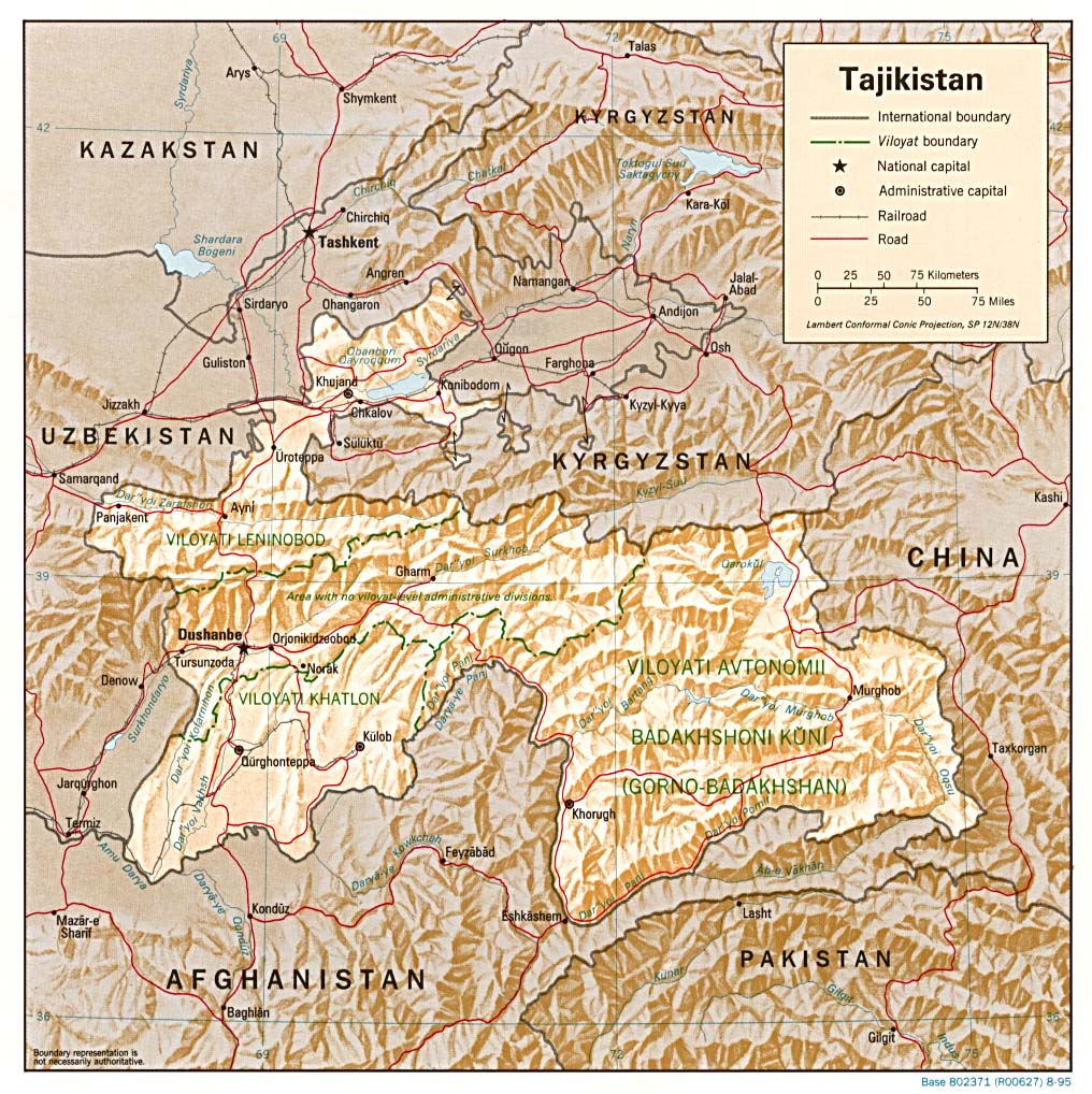
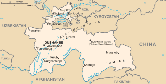
Pamir
-
 use this one, but make it bigger.
 -
 Demis map of Pamir.
 -
 SVG, work in progress.
 -
 Location map.
 -
 No background


Article(s):
- Pamir (moutains), Tajikistan, afghanistan, and Pakistan, History of China.
Request: Make a free map showing the localisation of Pamir mountains. The Pamir mountains seem to be 'the West of himalaya'. They are on Tajikistan, afghanistan, and Pakistan. If possible with the main riviers.
- http://www.pamirs.org/images/maps/pamir-gr.jpg : show the pamir topography (the white area).
- http://www.geckomaps.com/d/Pamir_Map_e.html
- http://www.pamirs.org/images/maps/tajikistan_gbao.gif (with riviers)
- http://www.lib.utexas.edu/maps/commonwealth/tajikistan_rel_95.jpg (relief, showing how are the montains)
- http://www.lib.utexas.edu/maps/cia06/tajikistan_sm_2006.gif (CIA map)
Yug (talk) 02:28, 17 December 2006 (UTC)
Graphist opinion:
I've been working on this for a few hours now. Pamir-gr.jpg contains a lot of interesting information, but also some problems. There are a lot of "Pik Lenin", "Pik Moscow", and "Pik Revolution" etc on that map. I seem resonable that the names of these mountains have changed. Should I just add those names to the map and let someone else update the SVG?
/ Mats Halldin (talk) 14:29, 18 December 2006 (UTC)
- The names may have changed, or they may not have. I'd suggest using them and noting in the image description that the names are from the Soviet era. Someone who knows the current situation can always fix it later. (Besides, any map will be outdated eventually anyway, so one might as well look at the issue from a historical perspective — if the names are not correct any more, at least they were, presumably, correct at some point.) —Ilmari Karonen (talk) 15:53, 18 December 2006 (UTC)
- Ok, I just add the names present in the map, then. I've been both sick and double-working this week and will be busy doing so until Xmas, so hopefully I'll be back doing all the things I hope to get time to do within soon. Anyway, I've tried to use Image:Map of Pamir-demis.png as an inlink in the map with no success. Is Mediawiki stopping this or what? My SVG-code is looking ok, imo.
- / Mats Halldin (talk) 23:56, 18 December 2006 (UTC)
- I gave up trying to link to the Demis map and made it embedded instead. This makes the SVG file more than 1 Mb, it might be better to make the map a PNG. I'll be adding information to it during a few days. It still needs some tweaking to.
- / Mats Halldin (talk) 10:34, 19 December 2006 (UTC)
I just realized that the pamir-gr.jpg is not PD and that I've been creating a copyvio. < stupid me > So instead I created a slightly unconventional location map. I've uploaded it with and without a Demis map as background. Let me know what you think.
/ Mats Halldin (talk) 13:47, 20 December 2006 (UTC)
Done Dental caries
-
 original
 -
 Lycaon's version (PNG)
.jpg)

Article(s):
Request: Honestly, I am not sure what is the best way to improve this photograph, but a different background and removing the shadow if possible may improve things. Again, I am not sure how feasible it would be to change the background, or what background color would be best. My worry is that too light a color (white) would make it difficult to distinguish the borders of enamel, but I have not seen many images with a dark background. My first intinct would be to suggest a light blue background, but I willingly would defer to a graphist's suggestion. Thanks in advance. Dozenist talk 17:49, 17 December 2006 (UTC)
Graphist opinion:
A transparent background should probably be the best. Even if we generally think of theeth as white they aren't often really white, and this one isn't for sure. I don't think a white background should cause any problems in this case. However, a near-black background is probably advisable if the request is to make that thooth look white.
/ Mats Halldin (talk) 19:09, 17 December 2006 (UTC)
- Like I said, I am very open to suggestions since this is not my area of expertise. I know most teeth are not truly white, but my worry (which may be unfounded) was that the top edges of enamel may be too translucent for a white background. Nonetheless, I am glad you do not think that is the case, and any magic you all can do on this picture would be much appreciated!!!! - Dozenist talk 20:43, 17 December 2006 (UTC)
- I had a go at it with a transparent BG (BTW, not that easy with that magenta BG, throwing a pink cast over every shiny edge...). Lycaon 21:55, 17 December 2006 (UTC)
- It looks great! Much, much better than the original picture. Thanks a ton..... and, I promise not to take any future photographs with a pink background. Trust me, it was a long time ago and pink wax was the closest thing I could find that would would contrast the tooth. Your hard work is much appreciated. - Dozenist talk 23:09, 17 December 2006 (UTC)
- I had a go at it with a transparent BG (BTW, not that easy with that magenta BG, throwing a pink cast over every shiny edge...). Lycaon 21:55, 17 December 2006 (UTC)
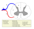
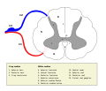
Done Spinal cord
-
 #1
#1 -
 #1, SVG
 -
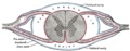 Illustration of spinal cord from Gray's Anatomy
 -
 #2, Latin SVG
 -
 #2, English SVG
 -
#3, original PNG
-
 #3, German SVG
 -
 #3, English svg


Article(s):
- Spinal cord ;
- Spinal cord, Posterior horn, Central canal, Posterior funiculus, Anterior funiculus, Lateral funiculus, Anterior horn (spinal cord), Posterior median sulcus ;
- Grey matter, Central canal, Rexed laminae, Nucleus proprius.
Request: Convert to SVG, align legend, upload them all on commons aim to be use on other wiki (ala french)
- add the legend;
- externalisation (as text) or integratoin on the scheme of the legend, you can choose ;
- translation, i think from german ;
Thank - lyhana8 (Talk) 16:24, 18 December 2006 (UTC)
Graphist opinion:
Image 1
I've traced the PNG using Inkscape, but at the moment it isn't very meaningful. If someone were to provide some labels, I'd be happy to put them on. Time3000 13:48, 20 December 2006 (UTC)
- There are some labels in the illustration from Gray's Anatomy above. How ever, the PNG/SVG is derived from this image and could be improved considerably. The details in the present illustration are so poor, I'm not sure where to add any labels.
- / Mats Halldin (talk) 15:34, 20 December 2006 (UTC)
Done Image 2
How's that? I don't know what the numbers actually refer to, perhaps some of the lines could be removed if there's a larger region that the text can be moved over. --Interiot 01:15, 19 December 2006 (UTC)
- My attempt to English translations:
- / Mats Halldin (talk) 14:20, 19 December 2006 (UTC)
Done Image 3
I recreated the SVG. If someone will provide the English translations, I can add those to the SVG. If someone else adds the translations, please upload as a different SVG, since the current one is in use at de:Rückenmark. --Interiot 21:19, 18 December 2006 (UTC)
- Attempt to English translations:
- Substantia gelatinosa (no translation needed, could be: (Central) gelatinous substance (of spinal cord)
- Nucleus proprius (no translation needed)
- Ncl. dorsalis - Dorsal nucleus (of spinal cord)
- Ncl. intermediolateralis - Intermediolateral nucleus
- motorische Kerne des Vorderhorns - motoneurons (or motor neurons) of the anterior horn
- Canalis centralis - Central canal
- Schichtengliederung (Laminae) - Laminae
- Kerngebiete (Nuclei) - Nuclei
- * auch Ncl. thoracicus posterior bzw. Stilling-Clarke - * Posterior thoracic nucleus or Column of Clarke
- / Mats Halldin (talk) 13:54, 19 December 2006 (UTC)
- Thanks, I posted an English version and replaced the PNGs here with it. --Interiot 16:36, 19 December 2006 (UTC)
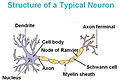
Done Neuron
-
 Original JPG
 -
 SVG
SVG


Article(s): Axon, Brain, Dendrite, Myelin, Neuron, Schwann cell, Axon hillock, Soma (biology)
Request: Remove header and convert to SVG, both to get rid of the JPG artifacts, and to make it easier to further translate (there are at least 5 translations... many with additional JPG artifacts). --Interiot 02:57, 19 December 2006 (UTC)
Graphist opinion:
- Note: I was the one who converted this file to SVG. Hopefully this'll do some good. Feel free to leave any suggestions with me -- dhp1080 (u·t·c) 04:19, 19 December 2006 (UTC)
- Fast response, thanks. --Interiot 05:00, 19 December 2006 (UTC)
Done The Turk's Knight's Tour
-
 BDJ's Knight's tour
 -
 Available image of Knights tour
 -
 SVG created with a perl script
 -
 Animated GIF, just for fun


Article(s): The Turk, possibly also useful at Knight's tour.
Request: I have an image in a book I'm using regarding the pattern that the Turk used when completing the Knight's tour. Using the image from the book would, at worst, be a copyvio and, at best, a replaceable fair use. If I were able to provide the pattern for the tour (either from the book or through accepted chess patterns), would someone be able to make an image similar to the one at the knight's tour article for me with the correct pattern? Keep in mind - the pattern itself is not a copyvio, obviously, and if it's somehow unique to the Turk, the pattern itself would be in the public domain by now, as the Turk was destroyed in the 1880s and the originators died before then, so copyright shouldn't be an issue here. --badlydrawnjeff talk 14:50, 20 December 2006 (UTC)
Graphist opinion:
Maybe it's just me, but I don't understand your request. Wikipedia already have an illustration of the Knight's tour. Is the pattern in your book different from this one? It looks like a simple illustration to do and both illustrations should be made SVGs. So, please explain what the pattern looks like. Maybe you could provide a list of moves (eg A1-B3-A5- etc)?
/ Mats Halldin (talk) 15:17, 20 December 2006 (UTC)
- It's much less complex than I'm making it. The pattern in the book is completely different from the one we have, and is not the general pattern the book cites as a typical tour for subject. When I get home, I can do the list of moves (although I'm very chess-dumb) or provide the source image this would derive from, whatever works. --badlydrawnjeff talk 15:38, 20 December 2006 (UTC)
- Given the pattern, creating an SVG similar to the image above should be a fairly trivial; in fact, this sounds like a nice exercise in hand-coding SVG. —Ilmari Karonen (talk) 16:16, 20 December 2006 (UTC)
- I'll upload a picture onto my webspace of it tonight as a template to see what I'm talking about, then. I'm so graphically impaired... --badlydrawnjeff talk 16:25, 20 December 2006 (UTC)
- In the mean time, I wrote a simple perl script to generate such images from a list of squares, so you can easily make as many tours as you want: just feed it a list of squares and it spits out a nice SVG ready to upload. —Ilmari Karonen (talk) 17:49, 20 December 2006 (UTC)
- How hard would it be for a perl newb like me? --badlydrawnjeff talk 18:39, 20 December 2006 (UTC)
- You can run it from the toolserver at the moment... see here. It's best if your browser can view the generated SVG directly (eg. either via a plugin in MSIE, or Firefox v2+ supports it directly). --Interiot 21:03, 20 December 2006 (UTC)
- Excellent. I'll be on a FireFox browser tonight and tomorrow night, so I'll post here when it's complete in the event you need to pull it off the server. --badlydrawnjeff talk 21:07, 20 December 2006 (UTC)
- Once you're viewing the final graphic, you should be able to just File > Save it as a .svg on your local drive, and then upload it as you normally would. --Interiot 21:16, 20 December 2006 (UTC)
- Excellent. I'll be on a FireFox browser tonight and tomorrow night, so I'll post here when it's complete in the event you need to pull it off the server. --badlydrawnjeff talk 21:07, 20 December 2006 (UTC)
- You can run it from the toolserver at the moment... see here. It's best if your browser can view the generated SVG directly (eg. either via a plugin in MSIE, or Firefox v2+ supports it directly). --Interiot 21:03, 20 December 2006 (UTC)
- How hard would it be for a perl newb like me? --badlydrawnjeff talk 18:39, 20 December 2006 (UTC)
- In the mean time, I wrote a simple perl script to generate such images from a list of squares, so you can easily make as many tours as you want: just feed it a list of squares and it spits out a nice SVG ready to upload. —Ilmari Karonen (talk) 17:49, 20 December 2006 (UTC)
- I'll upload a picture onto my webspace of it tonight as a template to see what I'm talking about, then. I'm so graphically impaired... --badlydrawnjeff talk 16:25, 20 December 2006 (UTC)
- Given the pattern, creating an SVG similar to the image above should be a fairly trivial; in fact, this sounds like a nice exercise in hand-coding SVG. —Ilmari Karonen (talk) 16:16, 20 December 2006 (UTC)
- Just for the heck of it, I made an animated GIF version. Since I already had the code to generate the frames, animating it was pretty straightforward. Too bad MediaWiki doesn't support animated SVG... —Ilmari Karonen (talk) 00:00, 21 December 2006 (UTC)
- You two are quite possibly my favorite people ever right now. The program was perfect and, after a few missteps, I got the proper one in. So thanks! It's on the far left.--badlydrawnjeff talk 01:39, 21 December 2006 (UTC)
- You know, looking at your image, I realized the one case I hadn't really considered was a cyclic tour. Having the dot and the arrow superimposed like that doesn't look all that nice. I'm not sure what to do about it, though. One option would be to move the arrow back a bit, but that means I'd also have to adjust the length of the last line segment; in its current position, the arrow quite nicely hides the end of the line. Still, it's doable. The other option would be to just dispense with the arrow entirely if the line ends coincide. —Ilmari Karonen (talk) 14:38, 21 December 2006 (UTC)
- I very nearly stopped it from ending at the start point, but I felt the need for it to be cyclical overrode that. I personally like highlighting the start/end point to show how the source got there, but if a better way is figured out, I have absolutely no opposition. --badlydrawnjeff talk 14:45, 21 December 2006 (UTC)
- You know, looking at your image, I realized the one case I hadn't really considered was a cyclic tour. Having the dot and the arrow superimposed like that doesn't look all that nice. I'm not sure what to do about it, though. One option would be to move the arrow back a bit, but that means I'd also have to adjust the length of the last line segment; in its current position, the arrow quite nicely hides the end of the line. Still, it's doable. The other option would be to just dispense with the arrow entirely if the line ends coincide. —Ilmari Karonen (talk) 14:38, 21 December 2006 (UTC)
- You two are quite possibly my favorite people ever right now. The program was perfect and, after a few missteps, I got the proper one in. So thanks! It's on the far left.--badlydrawnjeff talk 01:39, 21 December 2006 (UTC)
The animated gif looks great, but could use a slight speed up, in my opinion. Circeus 00:20, 24 December 2006 (UTC)
Done Watermark removal
-
 original, with white bg by Ilmari Karonen
 -
 PNG by Vanderdecken


Article(s): Korean Pottery: Categorized by Periods
Request: MECU≈talk 03:11, 21 December 2006 (UTC)
Graphist opinion:
- Crop the text off, or paint it over with the background color, that's all that's needed? --Interiot 03:27, 21 December 2006 (UTC)
- I've got this one. —Vanderdecken∴ ∫ξφ 11:57, 21 December 2006 (UTC)
- Howzat? The edges are a bit jaggy - the original wasn't cut out too wonderfully in the first place. —Vanderdecken∴ ∫ξφ 12:47, 21 December 2006 (UTC)
I've reuploaded a version with a white background and no text over the original. I tried to otherwise keep the differences to a minimum; in particular, the colors of the bowl itself are exactly the same as before. I couldn't get a clean transparent background without either aliasing or halos, but I believe a white background should be fine for this. (The original image, by the way, had apparently been saved at maximum JPEG quality. Given the amount of noise in the original, I felt that 95% quality was more than sufficient, and cut the file size to less than half. Uploading images at a high quality is good, yes, but everything has its limits.) —Ilmari Karonen (talk) 15:46, 21 December 2006 (UTC)
For the record, the steps I used were:
- Clone the image layer, use the channel mixer to pull the background of the original to white while keeping the other colors as close to original as possible (red channel as is, green +10% red, blue +50% red if I remember correctly).
- Select the background in the clone layer, expand selection by two pixels, convert selection to layer mask and blur the mask a few times.
- Adjust the color curves for the mask to get a nice transition with minimal color errors and halos. Flatten and save.
(There were a few other things I tried that didn't work out, but that's the essence of what I finally ended up doing.) —Ilmari Karonen (talk) 16:03, 21 December 2006 (UTC)
By the way, are we now expected to clean up all the other images at Korean Pottery: Categorized by Periods too? —Ilmari Karonen (talk) 15:48, 21 December 2006 (UTC)
- That article may be deleted and moved to Wikibooks, and the images along with it (to Commons) soon, so I suggest you leave it for a while. The article's obviously not at home on Wikipedia, and the creator (or creators, the user (MVCOL) is two people, the ones named in the watermark) is a newbie to WP. They might already be annoyed that one of the images has been altered, so let me liaise with them for a while. —Vanderdecken∴ ∫ξφ 11:38, 22 December 2006 (UTC)
- If the alteration of the original is an issue, feel free to revert it. The modified version will still be there in the history. —Ilmari Karonen (talk) 15:07, 22 December 2006 (UTC)
Done Louisiana region map
-
 Original
 -
 A blank (no text) version
 -
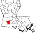 The SVG map used as a template to create the PNG's
 -
 SVG version


Article(s):
- Louisiana
- List of regions of the United States
- New Orleans metropolitan area
- North Louisiana
- Central Louisiana
Request: This is something I "threw together" to replace a fair use map lifted from http://ccet.louisiana.edu/03a_Cultural_Tourism_Files/01.00_The_Land.html There are some issues with the borders in some places when viewed in full size, some of the text (especialy the greater New Orleans area) is hard to read at thumbnail size, and naturaly it ought to be a SVG (don't have any suitable software for that at the moment). Sherool (talk) 07:40, 21 December 2006 (UTC)
Graphist opinion:
- I uploaded an SVG. I just copied the Ilmari Karonen's colors from the Single Malt Scotch map above. I also changed the borders to white, because otherwise it's difficult to get the Greater New Orleans text to contrast with both the mishmash of lots of black borders and the white background outside the state. That region's border is a little harder to see in the thumbnail, but I think it's more important to be able to see the text. (and at full scale, it's easy to see both) --Interiot 20:23, 21 December 2006 (UTC)
- Looks good to me, you do "loose" the tiny islands off Greader New Orleans with the white borders though, but I guess they are not the most critical detail on a map who's focus is the regions. --Sherool (talk) 08:30, 22 December 2006 (UTC)
- I tweaked the islands, they should be a fair bit more visible now (in the larger version at least). --Interiot 09:12, 22 December 2006 (UTC)
Done Picatinny rail diagram
-
Original image
-
 SVG Conversion

Article(s):
Request: Reasonably simple technical drawing, ideal candidate for the SVG treatment 151.44.163.107 08:17, 21 December 2006 (UTC)
Graphist opinion:
- Redrew by hand the diagram. --Andrew c 17:47, 21 December 2006 (UTC)
- Very nice. --Interiot 19:04, 21 December 2006 (UTC)
- Thanks. Do you think I should have put it on a white background? --Andrew c 19:53, 21 December 2006 (UTC)
- I would omit the caption and make the linework of the actual rail a little thicker, as it tends to confuse with the markers. Also, the angle guidelines don't seem to "connect" to the slopes on the rail they refer to --KJK::Hyperion 06:43, 24 December 2006 (UTC)
- There's a small mistake on the SVG - before the M in a circle in the top right corner should read .006 not .010. Pstuart84 Talk 20:16, 21 December 2006 (UTC)
- Ack, good catch. I'll fix that in about 6 hours.--Andrew c 20:57, 21 December 2006 (UTC) ok, it's fixed but the thumbnails haven't updated yet.--Andrew c 14:56, 22 December 2006 (UTC)
- The thumbnail is still not correct - this will mislead anyone who doesn't open the source image file. What's the fix? Pstuart84 Talk 21:27, 3 January 2007 (UTC)
- This is the usual thumbnail-caching bug we've been seeing lately: if an image is reuploaded or purged while the proxy notification system is down for some reason, the proxies will continue to serve old thumbnails even though the central image server believes they've been properly purged. I've tried to fix the thumbs I could find for this image, but if you keep seeing stale thumbnails and reloading the page doesn't help, do this:
- Go to http://commons.wikimedia.org/w/thumb.php?f=M1913A_Rail_CrossSection.svg&w=120, replacing "120" with the width of the stale thumbnail in pixels.
- After repeating the previous step for all the broken thumbnail sizes, go to http://commons.wikimedia.org/w/index.php?title=Image:M1913A_Rail_CrossSection.svg&action=purge, and reload if necessary.
- The same trick should work for any image that's showing stale thumbnails. If even this doesn't help, go pester the server admins on #wikimedia-tech at IRC, or post to the technical village pump; in that case, the odds are the proxy notification is broken again and someone needs to go fix it. —Ilmari Karonen (talk) 02:19, 4 January 2007 (UTC)
- This is the usual thumbnail-caching bug we've been seeing lately: if an image is reuploaded or purged while the proxy notification system is down for some reason, the proxies will continue to serve old thumbnails even though the central image server believes they've been properly purged. I've tried to fix the thumbs I could find for this image, but if you keep seeing stale thumbnails and reloading the page doesn't help, do this:
- Thanks for the great info. Knowing is half the battle!--Andrew c 02:33, 4 January 2007 (UTC)
Done Slate in Wales
-
 Original image
 -
 SVG version
 -
 Alternative colour version
 -
 White background, patch colors slightly tweaked


Article(s):
Request: This map, used in a featured article, is not in the SVG format. To remedy this problem, perhaps someone could use this blank map Image:Gb4dot.svg as a starting point. Thanks in advance! --Zantastik talk 07:49, 23 December 2006 (UTC)
Graphist opinion: I've created this SVG from the map you suggested, but the areas of slate are not shown in very high resolution on the original, and so probably won't be particularly accurate on the SVG. Does anyone know where the data for the original map originally came from? Time3000 15:32, 23 December 2006 (UTC)
- Posted a message on the user's talk page. I think the source is a book, to judge from the article. The user isn't always online, so we'll see if we get a timely response or not. And thanks!:) --Zantastik talk 19:38, 23 December 2006 (UTC)
- The map is based on a map in Richards, Alun John 1995 Slate quarrying in Wales Gwasg Carreg Gwalch. ISBN 0-86381-319-4. However his map does not show the slate areas in very high resolution either. Rhion 21:14, 23 December 2006 (UTC)
- I can't easily get hold of a copy of that, and if it's also quite low resolution then it's probably not worth it. I had a look round on the internet for anything that might help, but I couldn't find anything that could be remotely useful. The map is still reasonably OK, so it's probably easiest just to leave it like it is, unless someone with the book (or something else) wants to improve it. Time3000 15:45, 24 December 2006 (UTC)
- Looks great to me. Given the information available it's the best one can do with this request, imo. But wouldn't the SVG be better with another background? The light grey colour in the PNG looks better to me.
- / Mats Halldin (talk) 19:05, 29 December 2006 (UTC)
- Not a graphist, but the grey certainly makes for a better contrast in thumbnail. Circeus 19:13, 29 December 2006 (UTC)
- OK, I've recoloured using similar colours to the original (they are in fact slightly lighter, which in my opinion looks better). I've also moved the key down slightly, so that the island just off the northern peninsula isn't obscured. Time3000 18:25, 30 December 2006 (UTC)
- Not a graphist, but the grey certainly makes for a better contrast in thumbnail. Circeus 19:13, 29 December 2006 (UTC)
- I can't easily get hold of a copy of that, and if it's also quite low resolution then it's probably not worth it. I had a look round on the internet for anything that might help, but I couldn't find anything that could be remotely useful. The map is still reasonably OK, so it's probably easiest just to leave it like it is, unless someone with the book (or something else) wants to improve it. Time3000 15:45, 24 December 2006 (UTC)
- Comment. There's a suggested colour scheme here. Pstuart84 Talk 21:30, 3 January 2007 (UTC)
- I've uploaded a version with white water and 25% gray land areas as recommended on the map page. I also tweaked the patch colors slightly, though I'll leave it to others to decide whether that's an improvement or not. I've made the rivers white as well; I tried using the recommended blue shade, but didn't like the result at all. —Ilmari Karonen (talk) 01:49, 4 January 2007 (UTC)
- That looks good, though I have to say that I prefer the blue background - the grey and white seem slightly sterile. But here isn't the place to debate that. The rivers definitely look better than they would if they were blue, though I'm not sure about the bright blue Silurian colour... Time3000 16:39, 4 January 2007 (UTC)
- I've uploaded a version with white water and 25% gray land areas as recommended on the map page. I also tweaked the patch colors slightly, though I'll leave it to others to decide whether that's an improvement or not. I've made the rivers white as well; I tried using the recommended blue shade, but didn't like the result at all. —Ilmari Karonen (talk) 01:49, 4 January 2007 (UTC)
- Good work! I think we can consider this request fulfilled.
- / Mats Halldin (talk) 06:26, 5 January 2007 (UTC)
Done Map of Islay
-

-
 Cropped and recolored from Image:Gb4dot.svg


Article(s):
Request: Would be improved by conversion to SVG and wikipedia map colours. Pstuart84 Talk 18:24, 6 January 2007 (UTC)
Graphist opinion:
Done Requesting SVG for Image:Scoutsgreengoldnoscroll.png
-

-

-
 Recoloured


Article(s): Used as the primary WikiProject logo for WP:SCOUT
Request: Would someone be willing to create an SVG version of this image? Thanks. --BigDT 22:18, 8 January 2007 (UTC)
Graphist opinion: Do you have a not so dithered version available? It's hard making out the details and picking the right colour. --antilivedT | C | G 23:19, 9 January 2007 (UTC)
- I it was originally done to look like the texture of a patch. I think that is the reason it is dithered like that ... I will reference this question at the project talk page. Thanks. --BigDT 16:39, 10 January 2007 (UTC)
One SVG. Time3000 12:05, 10 January 2007 (UTC)
- Realised that the colours weren't quite right when you look at the two alongside each other, so I've created another version which corrects this. I think that's about as close as I can get because (as Antilived says) the dithering is a problem. Time3000 16:16, 10 January 2007 (UTC)
- Wow ... that is beautiful. Thank you - I'm going to bring this to WP:SCOUT for consideration. --BigDT 16:36, 10 January 2007 (UTC)
Done Location map for South Crofty
-
 Demis map of Cornwall
 -
 Available location map
 -
 Finished map


Article(s): South Crofty, possibly Mining in Cornwall
Request: Unknown user through Mats Halldin (talk) 11:41, 15 December 2006 (UTC)
Graphist opinion:
I found this request on Requested and orphan maps#Individual articles. I uploaded the demis map of Cornwall above but failed to locate this old mine. The closest I got was this JPG. Maybe someone else can find this mine and produce a SVG location map "showing where South Crofty is located in Cornwall and Cornwall's location in Europe"? There are a few maps in commons:Category:Maps of Cornwall that might be useful.
Mats Halldin (talk) 11:41, 15 December 2006 (UTC)
- Hmmm, I tried to find anyone who might know where South Crofty is located without success. Maybe we should add a {{did_not}} here?
- / Mats Halldin (talk) 06:32, 5 January 2007 (UTC)
- I went ahead and made one based on the Demis map, considering the subject it's probably appropriate to keep the relief as the background and leave as PNG. Kmusser 02:44, 12 January 2007 (UTC)
Done Defense of marriage amendments by type
-

-
 Animation


Article(s): Defense of marriage amendment and to be used on the soon to be created List of defense of marriage amendments by type (if we can't think of a better title); currently in my sandbox. The file is hosted at the commons.
Request: I would like an animated gif showing the progression of adoption of defense of marriage amendments by states in the U.S. over time based on the color scheme used in the above map (so that the different types of amendments are represented). For example, I envision the gif beginning with Hawaii and Alaska colored first and a caption of "1998", as that was the year with those two states first adopted amendments. Nebraska would be added to the others in the next part of the animation, which would be labeled "2000". I hope this description is clear enough, please let me know if it's not. Here is the full list:
1998
- Alaska
- Hawaii
2000
- Nebraska
2002
- Nevada
2004
- Mississippi
- Missouri
- Montana
- Oregon
- Alabama
- Arkansas
- Georgia
- Kentucky
- Louisiana
- Michigan
- North Dakota
- Ohio
- Oklahoma
- Utah
2005
- Kansas
- Texas
2006
- Colorado
- Tennessee
- Idaho
- South Carolina
- South Dakota
- Wisconsin
- Virginia
· j e r s y k o talk · 19:15, 8 January 2007 (UTC)
Graphist opinion:
How's that? Time3000 17:58, 11 January 2007 (UTC)
- That's badass :) Thank you very much! · j e r s y k o talk · 02:53, 12 January 2007 (UTC)
- Actually, i think it should show the years. Without them... It doesn't do much.Circeus 02:14, 13 January 2007 (UTC)
Languages of Europe
-
 Blank map of Europe (png)
 -
 Blank map of Europe (svg)
 -
 Another blank SVG
 -
 Low resolution first attempt by Time3000
 -
 New SVG (work in progress)
 -
 New SVG (as of 27th Dec. 2006, 1230 UTC) with added namespace info
 -
 Another attempt (rendering problems)
 -
 png conversion of the previous one


.png)
Articles:
- Europe
- Languages of Europe
- Demographics of Europe
- Alphabetic list of living languages in Europe
- List of language families
Request: --Missmarple 15:53, 15 December 2006 (UTC)
- Request from the Wikipedia:Graphic Lab/Maps. -- - lyhana8 (Talk) 00:04, 16 December 2006 (UTC)
- What exactly is the request here? âLarry V (talk | contribs) 21:30, 16 December 2006 (UTC)
- I really don't know, some users just put that here and believe that we know everything. Are we strong like that ? ;] Yug (talk) 22:34, 16 December 2006 (UTC)
- Probably vectorisation and a better visual aspect. Keep in mind that SVGs are multilingual. Click that link for instructions on how to make them that way :) --Zantastik talk 01:45, 17 December 2006 (UTC)
- I apologize for not writing my request, but I'm not very good with the terminology... I think this should be converted to SVG and something should also be done with all the text surrounding the image because it certainly doesn't belong there. Regards, --Missmarple 08:31, 17 December 2006 (UTC)
- I was going to work on this, but I couldn't find an already existing SVG image of a map of Europe with political boundaries. So I started working on that, but before I get too far, I wanted to see if anyone knew of such a map that already existed? --Andrew c 17:46, 17 December 2006 (UTC)
- Here is a blank map of Europe. I'm to tired to work on this today, but I might have a look at it tomorrow.
- / Mats Halldin (talk) 18:41, 17 December 2006 (UTC)
- Thanks for the map, I also uploaded what I have so far. I feel the detail on my version is superior, but it may be much harder to edit (well, using illustrator's live paint feature, its easy to fill in color, but I'm not sure how well it will work in Inkscape). I'll keep plugging away on this then.--Andrew c 15:36, 18 December 2006 (UTC)
- I've created a map based on the first svg template, but the detail is very low, and there are no 'combined language' areas as on the original. I've tried to base the colours roughly on the jpeg, but they're not entirely accurate. It also needs some labels, but I don't have time to do that now. Time3000 16:36, 19 December 2006 (UTC)
- Wow, I didn't notice until now but Image:BlankMap-Europe.svg is pretty messed up, I'd try using the other blank svg as a base instead. Other than the problems in the base map and needing labels added it looks good. Kmusser 17:43, 19 December 2006 (UTC)
- Yeah, there seem to be a lot of very mediocre SVG maps out there. Wikipedia:Blank maps recommends Image:BlankMap-World6.svg which contains more detail... you'll have to remove all the non-europe stuff, but it still has more detail. --Interiot 18:17, 19 December 2006 (UTC)
- Wow, I didn't notice until now but Image:BlankMap-Europe.svg is pretty messed up, I'd try using the other blank svg as a base instead. Other than the problems in the base map and needing labels added it looks good. Kmusser 17:43, 19 December 2006 (UTC)
- I was going to work on this, but I couldn't find an already existing SVG image of a map of Europe with political boundaries. So I started working on that, but before I get too far, I wanted to see if anyone knew of such a map that already existed? --Andrew c 17:46, 17 December 2006 (UTC)
- I really don't know, some users just put that here and believe that we know everything. Are we strong like that ? ;] Yug (talk) 22:34, 16 December 2006 (UTC)
- What exactly is the request here? âLarry V (talk | contribs) 21:30, 16 December 2006 (UTC)
- Low res map of Europe can not be used. Languages don't stop at borders. Belgium, e.g. is completely wrong: it is now shown as french, while 65% of it's inhabitants speak dutch (I for one). This is going to take a lot more work than just colouring a high res European countries' map... Lycaon 06:36, 20 December 2006 (UTC)
I've now spent a few days producing an acceptable map of Europe for the purpose of creating this lingvistic map. I'm tracing a big Demis map of Europe and I think I will need a few more days before I'm done with it. I'm presenting my work this far above just to let you know that someone is actually working on this request. I will be uploading the finished version when I'm done with it. So stay tuned.
/ Mats Halldin (talk) 16:58, 26 December 2006 (UTC)
Note: This map shows up as a blank image on Commons. The same problem disapeared after a few hours when I created Image:Map Tamana en.svg above. To view the SVG meanwhile you could preview it as a thumbnail. As such SVGs don't seem to work in 250px, of some obscure reason.
/ Mats Halldin (talk) 17:30, 26 December 2006 (UTC)
- I cannot view this in Firefox 2.0.0.1 as an image because of This XML file does not appear to have any style information associated with it. The document tree is shown below. I can view the code though. I haven't tried to open it with inkscape.--Andrew c 20:42, 26 December 2006 (UTC)
- It is fine! It opens in Inkscape and looks very promising, with a high enough resolution. Good job Lycaon 21:51, 26 December 2006 (UTC)
- It won't display in firefox because it doesn't have an xmlns attribute in the svg declaration... I'll upload a 'fixed' version to check if this is the problam with the wiki rendering as well. Time3000 12:30, 27 December 2006 (UTC)
- It seems that adding the xmlns attr. does make it work in firefox, and with the wiki preview. Looking at [8], it seems that this is actually required by the SVG specification, so it's the software being used to create the svg that's at fault - though it's not particularly hard to add in the missing info by hand. Just for camparison, here are the first few lines of the two files:
- It is fine! It opens in Inkscape and looks very promising, with a high enough resolution. Good job Lycaon 21:51, 26 December 2006 (UTC)
Original version
  <?xml version="1.0" encoding="iso-8859-1"?>
  <!DOCTYPE svg PUBLIC "-//W3C//DTD SVG 20000303 Stylable//EN"   "http://www.w3.org/TR/2000/03/WD-SVG-20000303/DTD/svg-20000303-stylable.dtd" [
  <!ENTITY st0 "fill:#000000;stroke:none;">
  <!ENTITY st1 "fill:none;stroke:#000000;">
  <!ENTITY st2 "fill-rule:nonzero;clip-rule:nonzero;fill:none;stroke:#000000;stroke-miterlimit:4;">
  ]>
  <svg  width="5246.135pt" height="3831.265pt" viewBox="0 0 5246.135 3831.265" xml:space="preserve">
'Fixed' version
  <?xml version="1.0" encoding="iso-8859-1"?>
  <!DOCTYPE svg PUBLIC "-//W3C//DTD SVG 20000303 Stylable//EN"   "http://www.w3.org/TR/2000/03/WD-SVG-20000303/DTD/svg-20000303-stylable.dtd" [
  <!ENTITY st0 "fill:#000000;stroke:none;">
  <!ENTITY st1 "fill:none;stroke:#000000;">
  <!ENTITY st2 "fill-rule:nonzero;clip-rule:nonzero;fill:none;stroke:#000000;stroke-miterlimit:4;">
  ]>
  <svg  width="5246.135pt" height="3831.265pt" viewBox="0 0 5246.135 3831.265" xml:space="preserve" xmlns="http://www.w3.org/2000/svg">

Map of Europe, 250 pixels. - Ok, I've updated the SVG file with some more coasts and the xmlns tag. The file renders fine on Commons now and seem to work as a 250px thumb as well, so thanks for the tip. I'll be working with Scandinavia now. So if you don't hear from me during a few days, don't think I'm dead, I'm probably just having nightmares about Norway.
- / Mats Halldin (talk) 18:00, 27 December 2006 (UTC)
I did another version from Image:Europe continents.svg. I used that map because in other maps the borders of the pieces of land are not continous, and that difficults to use the "fill" attribute of the objects. Labels are still missing, I will add them later. At the moment I am more worried beause there are some zones that (bilingual regions) where I filled the objects with patterns, and they are not visible in the rendered images :_( Chabacano 13:25, 9 March 2007 (UTC)
- Labels added. There are problems with the png->svg converter. Thus, as a temporal solution I have uploaded a png version with a width of 2000px. (here)Chabacano 16:34, 9 March 2007 (UTC)