Wikipedia:Graphics Lab/Image workshop/Archive/Mar 2009
 | This page, part of the Graphics Lab Wikiproject, is an archive of requests for March 2009. Please do not edit the contents of this page. You can submit new requests here. |
Stale
Korea barnstar
-

-

-
 Composite of images found on User:PC78/notes
 -
 Finished product (so far)

Article(s): WikiProject Korea
Request: Currently there is no barnstar or other award for Korea-related topics, so I would like to request a suitable image. The only stipulation I have is that it in some way incorporates the sam-taeguk symbol (shown above). All other considerations, such as whether or not it uses the original barnstar image, I leave at the discretion of whoever takes up this request, so feel free to go nuts! Thanks in advance. :) PC78 (talk) 15:30, 31 January 2009 (UTC)
Graphist opinion: 'Kay, here's a Composite of stuff found on User:PC78/notes' page. I am an Inkscape begginer, of course, but I hope this looks O.K. Resident Mario (talk) 20:49, 2 February 2009 (UTC)
- Ths is sutibale for a hanging medal. Resident Mario (talk) 19:55, 3 February 2009 (UTC)
- Comment: The bird is quite hard to see red on red... Mangwanani (talk) 20:47, 3 February 2009 (UTC)
- Hope you like it. Maybe the ribbon should be wider? Hard to see? Give me a moment Resident Mario (talk) 20:55, 3 February 2009 (UTC)
- Done Resident Mario (talk) 21:01, 3 February 2009 (UTC)
- Cheers! Not quite what I was after, but I'm sure we can make use of it. Thanks for your efforts (and sorry for the late reply, I've been a bit sidetracked with other stuff). PC78 (talk) 20:00, 6 February 2009 (UTC)
- thank you Resident Mario (talk) 19:00, 7 February 2009 (UTC)
- Done Resident Mario (talk) 21:01, 3 February 2009 (UTC)
Baku Olympic bid logo

Article(s): 2016 Summer Olympics, 2016 Summer Olympics bids and Baku 2016 Olympic bid.
Request: SVGify and upload as "File:Baku 2016 Summer Olympics bid logo.svg" -- Felipe C.S ( talk ) 15:08, 7 February 2009 (UTC)
Graphist opinion:
Fetus
-
 SVG
SVG

Article(s): Abortion
Request: Hello. I made this image from two other images, as indicated at this image's description page. Obviously, I'm not very good at it. :) The color image was made by Andrew c, who may or may not want to help out with this request. If you all can fix this image up, then it may or may not go into the article, seeing as how there has been some disagreement about whether the Abortion article should show what is aborted. (FYI, the fetus at this stage is 1.25 inches from head to rump, so you may want to make it a bit bigger in relation to the rest of the image.) The two horizontal lines should be removed. The thing extending from the belly is the umbilical cord, and it should terminate at the surrounding surface. Incidentally, the white thing at the bottom right corner is a suction tube.
I should prbably mention that the originally-uploaded fetus image from 29 August 2007 had more kilobytes, and was pink-colored.[1] It also had a slight spot in the eye that has been correctly removed, and the lettering has also been correctly removed (however, I'm not so sure that the color should have been removed, but people objected saying it was too cute).Ferrylodge (talk) 20:48, 11 February 2009 (UTC)
Graphist opinion:
- I cannot help with this specific image request because my image is vector and your image is raster. Since mine is a diagram, there is no sense in converting it to raster. Perhaps someone could create an SVG image of a fetus/embryo? I'd recommend using another source image though, if someone is to make one from scratch, as concerns have been raised about File:10 weeks pregnant.png. Anyway, I added details to the embryo in my image per your request (see the two different version in the file history of File:Vacuum-aspiration.svg). I'm sorry that wasn't good enough. These images are related to a very long, ongoing discussion at Talk:Abortion, which means even if an image is created here, there may not be consensus for it's inclusion in that article (something to keep in mind). That said, perhaps having SVG images of various stages of fetal development (4 week, 8 week, 12 week, etc) may be quite helpful to the project as a whole, outside of the image discussions related to the abortion article.-Andrew c [talk] 21:46, 11 February 2009 (UTC)
- Also, we have commons:Category:Anatomical plates and drawings of the pregnancy by User:Miraceti which really could use some jazzing up.-Andrew c [talk] 21:49, 11 February 2009 (UTC)
- Just so others are aware (Andrew c is already aware), when I click on File:Vacuum-aspiration.svg I do not see any fetus. My monitor is a Dell, and seems to work fine for everything else. Even if Andrew c's fetus were visible on all monitors, I still would like an enlargement at the abortion article, and I'm sure that the image I've submitted here must be more detailed than that of Andrew c. So, my request still stands, and I would be grateful for the assistance.Ferrylodge (talk) 21:54, 11 February 2009 (UTC)
- Basically a zoom of the SVG you used and converted to raster. I darkened the fetus by about 10% for a bit more contrast (could a graphist help with the crop, I can never get InkScape to do that correctly). I can't do much with creating a new image from scratch, if this isn't what you want/need I'll happily tag it for deletion and I'm sure one of our talented will whip something up. Hope the issues are resolved and that this helps. §hep • Talk 22:00, 11 February 2009 (UTC)
- Thanks, Shep, that's definitely an improvement, as I can now actually see the fetus. However, the black-and-white image is much more accurate (e.g. a fetus at 8 weeks from fertilization has separate fingers, and has legs between the feet and body). But please don't delete your image just yet, since it may come in handy. Could one of your talented please whip something up using the black-and white fetus and/or the original color version thereof? Thanks. I'd prefer the original color version, and it seems that Andrew c would too, but there has been some controversy about whether color would be better than black and white.Ferrylodge (talk) 22:07, 11 February 2009 (UTC)
- And I'll repeat what I said above, please use a different source image, if possible, perhaps drawing from life. File:9-Week_Human_Embryo_from_Ectopic_Pregnancy.jpg would be good, or you could use a combination of sources from the web as references as long as you make sure it is an original work, not a derivative work (if the source files are copyrighted). www.ehd.org has some really amazing images.-Andrew c [talk] 22:38, 11 February 2009 (UTC)
- Andrew c, I emphatically disagree. The image that you are suggesting is an embryo, not a fetus. Most induced abortions in this world involve a fetus and not an embryo. If you want us to use a real photo of a fetus, then I suppose we could use this one, but we do not have a precise age for it.
- And I'll repeat what I said above, please use a different source image, if possible, perhaps drawing from life. File:9-Week_Human_Embryo_from_Ectopic_Pregnancy.jpg would be good, or you could use a combination of sources from the web as references as long as you make sure it is an original work, not a derivative work (if the source files are copyrighted). www.ehd.org has some really amazing images.-Andrew c [talk] 22:38, 11 February 2009 (UTC)
- Thanks, Shep, that's definitely an improvement, as I can now actually see the fetus. However, the black-and-white image is much more accurate (e.g. a fetus at 8 weeks from fertilization has separate fingers, and has legs between the feet and body). But please don't delete your image just yet, since it may come in handy. Could one of your talented please whip something up using the black-and white fetus and/or the original color version thereof? Thanks. I'd prefer the original color version, and it seems that Andrew c would too, but there has been some controversy about whether color would be better than black and white.Ferrylodge (talk) 22:07, 11 February 2009 (UTC)
- Basically a zoom of the SVG you used and converted to raster. I darkened the fetus by about 10% for a bit more contrast (could a graphist help with the crop, I can never get InkScape to do that correctly). I can't do much with creating a new image from scratch, if this isn't what you want/need I'll happily tag it for deletion and I'm sure one of our talented will whip something up. Hope the issues are resolved and that this helps. §hep • Talk 22:00, 11 February 2009 (UTC)
- Just so others are aware (Andrew c is already aware), when I click on File:Vacuum-aspiration.svg I do not see any fetus. My monitor is a Dell, and seems to work fine for everything else. Even if Andrew c's fetus were visible on all monitors, I still would like an enlargement at the abortion article, and I'm sure that the image I've submitted here must be more detailed than that of Andrew c. So, my request still stands, and I would be grateful for the assistance.Ferrylodge (talk) 21:54, 11 February 2009 (UTC)
- Also, we have commons:Category:Anatomical plates and drawings of the pregnancy by User:Miraceti which really could use some jazzing up.-Andrew c [talk] 21:49, 11 February 2009 (UTC)
- The image that I have requested goes well with your image, because it would look odd to have a drawing in combination with a photo. Moreover, the image I am requesting has been through the wringer, and has been accepted in multiple Wikipedia articles for years. Its description page provides detailed sources for verification of accuracy.
- Recently, I proposed to you having an image of both an embryo and a fetus, but I do not recall you being agreeable. I could still accept that type of solution (i.e. two different enlargements, one for an embryo and one for a fetus). But I cannot agree to your request to have only an embryo, because it would be misleading to Wikipedia readers.Ferrylodge (talk) 22:54, 11 February 2009 (UTC)
- I wasn't saying for someone to superimpose a photo, I was asking for the graphist to make an SVG (aka digital drawing) using different source material than File:10 weeks pregnant.png. I'm not going to debate when an average abortion takes place with you here. I'd simply like for there to be good, SVG drawings of multiple stages of human development (outside of the context of abortion), and if someone is to do this, I'd recommend drawing from life. -Andrew c [talk] 22:59, 11 February 2009 (UTC)
- Look, my request here is specifically for the abortion article. If you would like to make a separate request here at the graphic lab, then please do so. And I already said that drawing from life would be fine with me, if this photo of a fetus is used, instead of a photo of an embryo. Another photo of a fetus (at 8 weeks) is here, and a drawing based on that would be fine too. However, I still think that it would be most efficient for the Graphic Lab to simply use the existing drawing that I provided, which matches up very well with the 8-week photo here.Ferrylodge (talk) 23:02, 11 February 2009 (UTC)
- I wasn't saying for someone to superimpose a photo, I was asking for the graphist to make an SVG (aka digital drawing) using different source material than File:10 weeks pregnant.png. I'm not going to debate when an average abortion takes place with you here. I'd simply like for there to be good, SVG drawings of multiple stages of human development (outside of the context of abortion), and if someone is to do this, I'd recommend drawing from life. -Andrew c [talk] 22:59, 11 February 2009 (UTC)
- Recently, I proposed to you having an image of both an embryo and a fetus, but I do not recall you being agreeable. I could still accept that type of solution (i.e. two different enlargements, one for an embryo and one for a fetus). But I cannot agree to your request to have only an embryo, because it would be misleading to Wikipedia readers.Ferrylodge (talk) 22:54, 11 February 2009 (UTC)
- Your drawing is not in SVG format. My diagram is. Someone is going to have to convert something into SVG format. All I'm saying is that since someone is going to be converting something into SVG format (because you don't like my embryo), then there is better reference material. I didn't mean to hijack your request. I just figured if I voiced my opinion before an image was created, I'd have less reason to oppose further down the line as I could raise my concerns before hand. I'd be glad to back out of this discussion now. -Andrew c [talk] 23:16, 11 February 2009 (UTC)
- Whatever the brave folks at the Graphic Lab do, I hope the result will depict a fetus at 8 weeks (because depicting a later fetus could be just as misleading as depicting an embryo).Ferrylodge (talk) 23:22, 11 February 2009 (UTC)
- Not wanting to get involved in this little "discussion" too much (I don't even understand the problem!), I edited the file shep put up to reduce filesize and complexity. Just clipping doesn't remove the data, it just hides it, and makes it harder to edit, especially if you clip part by part. As long as the clipping path is on top, you can clip it all with one path - just select everything you want to clip and the clipping path, and it is all clipped by the same path. − Inductiveload (talk) 13:27, 14 February 2009 (UTC)
- Forgot to say - you don't need to clip to the page size - Wikimedia does that automatically. Anything that if off the "artboard" in Inkscape will be off the sides of the image. Inductiveload (talk) 13:31, 14 February 2009 (UTC)
- Whatever the brave folks at the Graphic Lab do, I hope the result will depict a fetus at 8 weeks (because depicting a later fetus could be just as misleading as depicting an embryo).Ferrylodge (talk) 23:22, 11 February 2009 (UTC)

(undent)Thanks for the comment, Inductiveload. I'm not sure if the Graphic Lab is still working on this project. Anyway, I made the image at right. If the Graphic Lab is still working on this project, there's no rush. The image at right seems better than both of the images above, for the reasons explained, but maybe the Graphic Lab can make further improvements?Ferrylodge (talk) 00:10, 15 February 2009 (UTC)
Crystal Clear
Article(s): Crystal Clear icon theme
Request: Recreate the image as an SVG. Jacob Hnri 6 (talk) 02:28, 13 February 2009 (UTC)
Graphist opinion: Are any of these used in articles? --gren グレン 03:50, 13 February 2009 (UTC)
- The original source of these actually drew them in SVG and distributes them as PNG. You might be better of asking directly for the originals and if they'd allow us to use them here. − Inductiveload (talk) 13:00, 14 February 2009 (UTC)
Town of Brunswick Seal

Article(s): Brunswick, New York
Request: I'd like to see this vectorized. Hopefully it's large enough. I know it's on fair use right now, so the bot will take it off here (here's a direct [[: Graphist opinion:
- As the website linked to on the image included a newsletter, I was able to use the logo embedded in this PDF document. Logo is greyscale, unchanged from what was in the newsletter. The font for the text is 'Goudy-ExtraBold', and would need to be converted to paths for correct viewing on Wikipedia articles. gringer (talk) 01:05, 16 February 2009 (UTC)
- Mind elaborating? On the homepage of the town itself, the seal is shown. I see now that the bot has found the image, but it can (and should) still be converted to SVG. Any way of doing it based on the town website image or the image on WP? ~ ωαdεstεr16«talkstalk» 07:12, 16 February 2009 (UTC)
- To "get around the bot" we have {{GLNF}} documented above. §hepTalk 08:46, 16 February 2009 (UTC)
- To elaborate / reiterate, on the town website, there was a newsletter which included the logo as greyscale. This was what I used (and I presume what Cradel used) for the SVG file. I presume that the GIF logo on the website was derived from this vector version, or a very similar coloured variant. gringer (talk) 00:14, 17 February 2009 (UTC)
- Mind elaborating? On the homepage of the town itself, the seal is shown. I see now that the bot has found the image, but it can (and should) still be converted to SVG. Any way of doing it based on the town website image or the image on WP? ~ ωαdεstεr16«talkstalk» 07:12, 16 February 2009 (UTC)
This is the best I could do (thanks to the PDF), hope you like it, @gringer: I overwrote your file, hope you don't mind-- CD 16:27, 16 February 2009 (UTC)
- The seal itself is great; looks perfect. Any way of getting closer to the correct font? ~ ωαdεstεr16«talkstalk» 18:18, 16 February 2009 (UTC)
- I went back to my older seal (because it had text, rather than curves), and updated the file to make the colours match the GIF. The font used, as I mentioned earlier, is Goudy ExtraBold, which is not gratis [2]. I found a somewhat equivalent free font called Fradley, which is what I've used for the seal text now. I find the dot position interesting — the GIF on the website has the dots a bit above the centre, while the PDF seal has the dots in the centre. It's hard for me to tell which one of those two representations is the intention of the person/people who designed the seal. gringer (talk) 01:32, 17 February 2009 (UTC)
- I see what you're saying. Those are two completely different designs. The current design is fine. I didn't look so closely at the wording on the PDF. Thanks again for your efforts. ~ ωαdεstεr16«talkstalk» 03:00, 17 February 2009 (UTC)
- I went back to my older seal (because it had text, rather than curves), and updated the file to make the colours match the GIF. The font used, as I mentioned earlier, is Goudy ExtraBold, which is not gratis [2]. I found a somewhat equivalent free font called Fradley, which is what I've used for the seal text now. I find the dot position interesting — the GIF on the website has the dots a bit above the centre, while the PDF seal has the dots in the centre. It's hard for me to tell which one of those two representations is the intention of the person/people who designed the seal. gringer (talk) 01:32, 17 February 2009 (UTC)
Washington County, NY Seal

Article(s): Washington County, New York
Request: Vectorize, please? You may want to see this as well (higher quality, I think, but it's a GIF). The shadow in both versions can be ignored. I think that was a GF addition on the part of some graphic designer there, but in common use, there is no shadow. ~ ωαdεstεr16«talkstalk» 17:27, 17 February 2009 (UTC)
Graphist opinion:
Jean-Hilaire Aubame
-
 Jean-Hilaire Aubame
 -
 REstored version


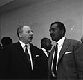
Article(s): Jean-Hilaire Aubame
Request: Could someone crop the black guy in this photo? ~EDDY (talk/contribs/editor review)~ 21:18, 30 January 2009 (UTC)
- Do you mean with the black guy in or out of the crop? ZooFari 01:54, 2 February 2009 (UTC)
- I want to remove the white guy and tagline. ~EDDY (talk/contribs/editor review)~ 00:11, 4 February 2009 (UTC)
Graphist opinion:
- How is that? ZooFari 01:52, 5 February 2009 (UTC)
- Looks like someone else wanted to keep him in gringer (talk) 22:11, 10 February 2009 (UTC)
- here it is, cropped one. ■ MMXXtalk 11:00, 18 February 2009 (UTC)
- Looks like someone else wanted to keep him in gringer (talk) 22:11, 10 February 2009 (UTC)
Doha Olympic bid logo
Article(s): 2016 Summer Olympics, 2016 Summer Olympics bids and Doha 2016 Olympic bid.
Request: SVGify and upload as "File:Doha 2016 Summer Olympics bid logo.svg" -- Felipe C.S ( talk ) 15:08, 7 February 2009 (UTC)
Graphist opinion:
- Looks like this was created on 15th February. gringer (talk) 01:23, 19 February 2009 (UTC)
Prague Olympic bid logo

Article(s): 2016 Summer Olympics, 2016 Summer Olympics bids and Prague 2016 Olympic bid.
Request: SVGify and upload as "File:Prague 2016 Summer Olympics bid logo.svg" -- Felipe C.S ( talk ) 15:08, 7 February 2009 (UTC)
Graphist opinion:
- SVG version created 15 February by Inductiveload. gringer (talk) 01:30, 19 February 2009 (UTC)
Brittonkill School District Seal


Article(s): Brittonkill Central School District
Request: I'd like to see an SVG version of this seal. There are two versions to go by. One is black and white (File:BCSDSealLowRez.png), other grayscale (File:BCSD.png). The grayscale image is correct except for the very thick-lined borders. For those two borders, go by the black and white version. Note that the grayscale version is not used in any articles so it won't last on WP for long. I uploaded it only for use in conversion to SVG. The handwriting above the word "Education" says "HALSE '85". Any questions on what is included in the center, feel free to ask, though I think most of it is pretty identifiable. Thanks very much! ~ ωαdεstεr16«talkstalk» 06:45, 18 February 2009 (UTC)
Graphist opinion:
Commonwealth of Independent States Union of Russia and Belarus
- Move to the Map workshop Yug (talk) 12:02, 21 February 2009 (UTC)
Ordinate label
-
 Graph with ordinate label

Article(s): Neurolinguistics
Request: A reviewer has requested that a label be added to the y-axis. The label should be "Microvolts." (The symbols after the +3 and -3 mean microvolts, so if a label is added then those little symbols could probably be removed and the 3s shifted to the right a bit.) Thanks, rʨanaɢ talk/contribs 07:19, 20 February 2009 (UTC)
Graphist opinion:
- Done. I took the liberty of redoing the X axis labels as text, so that the font was consistent. gringer (talk) 22:54, 20 February 2009 (UTC)
Topography
- Move to the Map workshop Yug (talk) 12:02, 21 February 2009 (UTC)
Map to SVG
- Move to the Map workshop Yug (talk) 12:02, 21 February 2009 (UTC)
Jesuit Missions of the Chiquitos
-
 too dark
 -
 altar too dark, white balance issues


Article(s): Jesuit Missions of the Chiquitos, San Javier, Ñuflo de Chávez, San Rafael de Velasco
Request: Please lighten the dark parts and adjust whitebalance. bamse (talk) 16:38, 21 February 2009 (UTC)
Graphist opinion: Done. How is that? Let me know if you need anything else :) ZooFari 17:55, 21 February 2009 (UTC)
- Thanks, that was fast. I like the first picture. Also the altar in the second is improved, though the walls look a bit too green on my screen. Could you fix this in the second picture? bamse (talk) 20:29, 21 February 2009 (UTC)
Pacific blank wiki map this projection
- Moved to the Map workshop Chris (クリス • フィッチュ) (talk) 07:02, 22 February 2009 (UTC)
Tree of life


Article(s): Evolution among many others.
Request: Can this be given a transparent background please? Thanks! Ben (talk) 19:21, 22 February 2009 (UTC)
Graphist opinion:
- File:Tree of life SVG.svg was converted to svg by LadyofHats so she might be able to do a quick conversion. /Lokal_Profil 23:04, 22 February 2009 (UTC)
- I've attached the output from the iTOL browser, with genome size. To match the coloured PNG (assuming the one with genome size is what you want), the lines will need to be coloured and dots added. I also reverted the February 23rd change for File:Tree of life 1500px coloured.png, because the genome size is included in This file. gringer (talk) 23:59, 22 February 2009 (UTC)
- Actually, I've just realised that you may not want the Tree with genome size, as the Feb 23rd change happened after you submitted this request. gringer (talk) 00:00, 23 February 2009 (UTC)
- So... here's one without the genome size, and with the other text labels. gringer (talk) 02:23, 23 February 2009 (UTC)
- It was the middle one I was after, so thanks for that, it looks great. I have a question though, on the image preview (the page you get by clicking the above image), is it just my machine, or does the preview render mess up the position of some of the labels around the outside? It's no big deal, I was just curious. Cheers, Ben (talk) 17:45, 23 February 2009 (UTC)
- That's a rendering issue in MediaWiki. The version of imagemagick that is used to convert SVG files to PNG doesn't render fonts correctly. In this case, the 'rotated' text appears in the wrong place. The way around this is to convert the text to paths. Unfortunately for this file, that ends up with a rather large file (about 4MB, maybe larger) due to the amount of text in it, so I left it as is. gringer (talk) 00:39, 24 February 2009 (UTC)
- It was the middle one I was after, so thanks for that, it looks great. I have a question though, on the image preview (the page you get by clicking the above image), is it just my machine, or does the preview render mess up the position of some of the labels around the outside? It's no big deal, I was just curious. Cheers, Ben (talk) 17:45, 23 February 2009 (UTC)
- So... here's one without the genome size, and with the other text labels. gringer (talk) 02:23, 23 February 2009 (UTC)
- Actually, I've just realised that you may not want the Tree with genome size, as the Feb 23rd change happened after you submitted this request. gringer (talk) 00:00, 23 February 2009 (UTC)
Peridiole cross section.jpg
-
 A labeled cross section of of a fungal spore-bearing structure.

Article(s): Cyathus
Request: Hi, this is my first request. I drew the picture by hand, then scanned it in, and added labels using Illustrator. Low tech, I know, but my computer graphics skills are next to zero. Anyways, the problem is that while the text looks sharp at full size, it is crappy when viewed as a thumbnail, which I'm thinking would hurt this articles chance for future FC potential. Can this be fixed easily? Sasata (talk) 05:48, 13 February 2009 (UTC)
- Could you list the sources you used to create this so that it would pass verifiability? This way it could be used in a featured article, etc. gren グレン 09:08, 13 February 2009 (UTC)
- Good point. Done. Sasata (talk) 09:26, 13 February 2009 (UTC)
- Now that I've thought about it a while, I'd like to cancel this request. I think the best thing to do is just to learn how to use Adobe Illustrator and make a more professional-looking version from scratch. Thanks anyways. Sasata (talk) 06:01, 23 February 2009 (UTC)
- I recommend [Inkscape] rather than Adobe Illustrator. It's free, and seems to be able to do enough for the purposes of wikipedia drawings. gringer (talk) 09:19, 25 February 2009 (UTC)
- Now that I've thought about it a while, I'd like to cancel this request. I think the best thing to do is just to learn how to use Adobe Illustrator and make a more professional-looking version from scratch. Thanks anyways. Sasata (talk) 06:01, 23 February 2009 (UTC)
Graphist opinion:
Thamarai Namam
-
 Thamarai Namam (PNG)
 -
 Thamarai Namam (SVG)
 -
 Thamarai Namam outline


Article(s): Ayyavazhi series (In Infobox)
Request: I drew this image using Adobe illustrator and saved as a SVG file. The result is the 'flower petals' which I created through mesh (tool) turn rasterised while the remaing 'BG and effects' remains vector while opening the saved file through Internet explorer. So I prefer to go for a PNG. Now I need this image to be changed as a SVG as i wish to nominate it for FPC. Anybody help please if can. Vaikunda Raja (talk) 20:43, 21 February 2009 (UTC)
Graphist opinion:
- Do you still have your SVG? If you do, then it's relatively trivial - uplod that and we can have a look at it. Otherwise, it's a pretty difficult trace that's required. − Inductiveload (talk) 21:50, 21 February 2009 (UTC)
- I'VE uploaded a SVG, please take a look. See the difference; Low resolution of the flower. - Vaikunda Raja (talk) 05:22, 22 February 2009 (UTC)
- Ah pkay, I understand the problem now. Problem is the fact that you are embedding raster images into the vector image. In order for this image to have a shot at FPC is to vectorize the flowers too. --Pbroks13talk? 18:00, 22 February 2009 (UTC)
- I'VE uploaded a SVG, please take a look. See the difference; Low resolution of the flower. - Vaikunda Raja (talk) 05:22, 22 February 2009 (UTC)
- No, basically the whole image is created using vector drawing (Adobe Illustrator) and not a raster. The native Image (Illustrator file) while opened through adobe reader was still seen vector (including flower). But the problem is, as seen here, while saving it as SVG. Is there any way to change every thing to a vector? Can help? Vaikunda Raja (talk) 19:45, 22 February 2009 (UTC)
- Inkscape is able to open some Adobe Illustrator files, I recall something about forced rasterisation in Illustrator when saving as SVG for things that aren't well supported (which seems to have happened here). Perhaps you could provide a link to the original illustrator file, which may be able to be better converted to SVG in inkscape (well, it's worth a shot, I guess). gringer (talk) 10:14, 23 February 2009 (UTC)
- Okey, then can you please provide your e-mail ID so that I shall send it to you? Vaikunda Raja (talk) 11:15, 23 February 2009 (UTC)
- Here you can email me. Send me an email saying its you, then I'll send you one back so you can see my actual email address. --Pbroks13talk? 18:58, 23 February 2009 (UTC)
- I've just uploaded the 'Illustrator file' to your mail. Please take a look, Thanks. - Vaikunda Raja (talk) 07:10, 25 February 2009 (UTC)
- Here you can email me. Send me an email saying its you, then I'll send you one back so you can see my actual email address. --Pbroks13talk? 18:58, 23 February 2009 (UTC)
- Okey, then can you please provide your e-mail ID so that I shall send it to you? Vaikunda Raja (talk) 11:15, 23 February 2009 (UTC)
- Inkscape is able to open some Adobe Illustrator files, I recall something about forced rasterisation in Illustrator when saving as SVG for things that aren't well supported (which seems to have happened here). Perhaps you could provide a link to the original illustrator file, which may be able to be better converted to SVG in inkscape (well, it's worth a shot, I guess). gringer (talk) 10:14, 23 February 2009 (UTC)
- No, basically the whole image is created using vector drawing (Adobe Illustrator) and not a raster. The native Image (Illustrator file) while opened through adobe reader was still seen vector (including flower). But the problem is, as seen here, while saving it as SVG. Is there any way to change every thing to a vector? Can help? Vaikunda Raja (talk) 19:45, 22 February 2009 (UTC)
Okay, here's a problem. When converting this .ai (adobe illustrator) file to inkscape, the roses seem to render pretty odd. The roses are subdivided into 8571 different paths (see image). It would be extremely tedious to piece over 8000 paths together. I don't have adobe illustrator, so someone with it may be able to help you. I'm sorry, but I don't really know where to go from here. --Pbroks13talk? 04:39, 27 February 2009 (UTC)
- No other ways rather than to go with the available PNG? Okey friends, despite the result thanks for all your efforts.
Help for the colourblind
-
Periodic table with elements listed by their radioactivity
-
 SVG including radioactivity found on commons

Article(s): Various
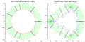
Request: I'm a bit red-green colourblind, and cannot really see the distinctions between some of these colourings. For example, with the seventh period elements I can't be sure what Db, Sg, and Rf are, as it seems that there are three different shades despite there being only two colours — (4) and (5) in the description. I edit PNGs all the time, but as I can't see this one properly, I don't think I'd be able to do it accurately. I see that there are other versions in the file history, but they too are confusing: for example, Tc and Ac look virtually identical, although I'm guessing that they're not. Could this just be reworked to be a little more friendly to people like me? :-) Nyttend (talk) 15:22, 23 February 2009 (UTC)
Graphist opinion:
- That looks like quite a bad image to start with. Have you checked Commons:Category:Periodic_table for anything better? /Lokal_Profil 01:14, 24 February 2009 (UTC)
- I found something that could probably be worked on. gringer (talk) 01:43, 24 February 2009 (UTC)
- Okay, I've now replaced the 'extreme' colour with something different (a dark purple), which according to GIMP should be more easily distinguishable for colourblind people. gringer (talk) 03:43, 24 February 2009 (UTC)
- This is somewhat better; I can tell the difference (with the PNG) without much trouble, although my colourblindness isn't as bad as it is for many red-green colourblind people. I have trouble with the SVG, however: I can just slightly see the greens (U, Cm, and others), but in part because I know how the table should go in general: I expect to find them on the less extreme side of the yellows. I know that there are two colours of reds, and I can slightly tell the difference between Db and Rf, but I can't be sure otherwise. Since you brought up the SVG, could that be redone also? Perhaps have the lighter shade of red turned a little darker, and the darker made into brown, maybe the darkness of the purple? Nyttend (talk) 13:21, 25 February 2009 (UTC)
- If you redo the SVG then please upload under a new name since the current one is used on other Wikkipedias. /Lokal_Profil 19:29, 25 February 2009 (UTC)
- The PNG file hasn't been edited, just the SVG file (which doesn't seem to be linked anywhere except this page). gringer (talk) 20:33, 26 February 2009 (UTC)
- This is somewhat better; I can tell the difference (with the PNG) without much trouble, although my colourblindness isn't as bad as it is for many red-green colourblind people. I have trouble with the SVG, however: I can just slightly see the greens (U, Cm, and others), but in part because I know how the table should go in general: I expect to find them on the less extreme side of the yellows. I know that there are two colours of reds, and I can slightly tell the difference between Db and Rf, but I can't be sure otherwise. Since you brought up the SVG, could that be redone also? Perhaps have the lighter shade of red turned a little darker, and the darker made into brown, maybe the darkness of the purple? Nyttend (talk) 13:21, 25 February 2009 (UTC)
- Okay, I've now replaced the 'extreme' colour with something different (a dark purple), which according to GIMP should be more easily distinguishable for colourblind people. gringer (talk) 03:43, 24 February 2009 (UTC)
- I found something that could probably be worked on. gringer (talk) 01:43, 24 February 2009 (UTC)
Do you think you could suggest hex codes for colours from a page like [this]? I'm struggling with your colour words because they don't quite match what I'm seeing on the SVG and PNG files. The colours from the key in the PNG/SVG file are the following:
- stable — #4545FC (PNG, similar to royalblue #4169E1), #00FFFF (SVG, aqua)
- long decay — #459798 (PNG, similar to seagreen #2E8B57), #00FF00 (SVG, green)
- low health hazard — #F9F398 (PNG, similar to khaki #F0E68C), #FFFF00 (SVG, yellow)
- high risk — #FF7E45 (PNG, similar to coral #FF7F50), #FF6600 (SVG, similar to darkorange #FF8C00)
- highly radioactive — #fd0045 (PNG, similar to crimson #DC143C), #FF0000 (SVG, red)
- extremely radioactive — #a52a2a (PNG, brown), #804080 (SVG, similar to darkorchid #9932CC)
[note: similar colours are my own matching from that link, based on visual + RGB value similarity, which will probably be quite different to yours]
Thanks. gringer (talk) 03:58, 27 February 2009 (UTC)
- It's used on it.wiki on it:Emivita_(fisica). In order to find where Commons images are used you need to go to it's commons page and click on the "check usage" tab. /Lokal_Profil 02:37, 28 February 2009 (UTC)
Somalia map
- Moved to the Map workshop Chris (クリス • フィッチュ) (talk) 03:04, 1 March 2009 (UTC)
Pacific Ring of Fire volcanoes
- Moved to the Map workshop Chris (クリス • フィッチュ) (talk) 03:17, 1 March 2009 (UTC)
South Korea map
- Moved to the Map workshop Chris (クリス • フィッチュ) (talk) 03:19, 1 March 2009 (UTC)
Orthographic maps
- Moved to the Map workshop Chris (クリス • フィッチュ) (talk) 03:22, 1 March 2009 (UTC)
Holy League banner
-
 Banner of the Holy League

Article(s): Holy League (1571), Battle of Lepanto (1571), Battle of Vienna
Request: The banner of the Holy League could use an SVG version. Another (possibly clearer) version of the banner is here. The left shield appears to be the Banner of the Holy Roman Emperor with (possibly) the Arms of Poland superimposed; I believe the bottom shield is the Arms of John of Austria (though since that's a PNG this SVG may be more helpful), and the right shield is probably a version of the winged lion of Venice. The center shield is from Pius V. These are educated guesses based on the states/leaders making up the Holy League; anybody more knowledgeable is welcome to jump in with an opinion. - Gump Stump (talk) 03:33, 1 March 2009 (UTC)
Graphist opinion:
Law & Order: UK
-
 ITV1's promotional image for their new TV series, Law & Order: UK
 -
 manual SVG tracing of the PNG file
 -
 The title for the TV program, NUMB3RS
 -
 SVG version (FreeSans font)
 -
PNG of an exemplar Law & Order: UK intertitle


Article(s): Law & Order: UK
Request: This was originally an embedded image in a Microsoft Word document (a press release). I took a screenshot of the document, and pasted/cropped the resulting image in the GIMP, making the file you see here. I really want the file vectorized (as File:Torchwoodtitle.svg is), and it's driving me nuts. Also, this particular file seems to have a black bit in the red ampersand that I couldn't get rid of, and I'm hoping somebody more skilled than I can. BTW, I'm terribly impressed with the work done by the editors supporting this project. Seeing your work, especially with SVGs (which I'm not even close to grasping yet) and signatures (as above, OMFGWTFBBQAWESOME), has me in awe. — pd_THOR | =/\= | 06:48, 18 February 2009 (UTC)
I've added a second image as it's functionally the same as the first. I add it because it's a point of contention in this FAC. Same request for vectorization w/SVG, plus the removal of the incriminating watermark (which is not a libre element). — pd_THOR | =/\= | 20:56, 19 February 2009 (UTC)
Graphist opinion: It is my understanding that raster images of proprietary fonts are inelligable for copyright, but the vectorized outlines are considered a copyrightable computer program. Therefore an SVG of this image would need a non-free license and fair use rational... but this is a little confusing to me, so I've asked for clarification at commons:Commons talk:Licensing#SVG and fonts. It may be better, IMO, to have a free png than a non-free SVG... -Andrew c [talk] 16:27, 18 February 2009 (UTC)
- It seems that conversation has reached it's functional terminus, determining that Wikipedia:PD#Fonts allows such a conversion to be made. Would you mind reviewing? — pd_THOR | =/\= | 19:57, 19 February 2009 (UTC)
- I'm not sure where this stands now. Seems like one user is pretty sure it's ok and that the Commons is wrong about SVG fonts. Beats me.-Andrew c [talk] 21:51, 19 February 2009 (UTC)
- I did a tracing of the png file. I couldn't find a (free) font that matched (particularly the wide 'W'), so traced with simple line primitives. gringer (talk) 03:55, 20 February 2009 (UTC)
- Very nice, thank you! Any luck with the NUMB3RS one? — pd_THOR | =/\= | 04:10, 20 February 2009 (UTC)
- I had a go. The font looked fairly similar to 'FreeSans', so I've used that. The SVG file has blurring to make things a bit more rounded, but wikipedia doesn't do blurring yet. gringer (talk) 05:57, 20 February 2009 (UTC)
- After noticing the thumbnails had non-existant text, I replaced the blurring with an inset, which seems to work a bit better on the smaller images. gringer (talk) 06:02, 20 February 2009 (UTC)
- I'm sorry, but File:Numb3rs Insignia.svg is not the Numbers logo. It is similar, but it is simply a knock off. This is no way an improvement in any sense. It is infact adding incorrect information. -Andrew c [talk] 22:47, 21 February 2009 (UTC)
- Okay, so you seem to know a bit more than me about typography, and appear to have experience with editing SVG files. You're more than welcome to improve the SVG file so that it is the Numbers logo (it is public domain, after all). gringer (talk) 06:06, 22 February 2009 (UTC)
- I'm sorry, but File:Numb3rs Insignia.svg is not the Numbers logo. It is similar, but it is simply a knock off. This is no way an improvement in any sense. It is infact adding incorrect information. -Andrew c [talk] 22:47, 21 February 2009 (UTC)
- After noticing the thumbnails had non-existant text, I replaced the blurring with an inset, which seems to work a bit better on the smaller images. gringer (talk) 06:02, 20 February 2009 (UTC)
- I had a go. The font looked fairly similar to 'FreeSans', so I've used that. The SVG file has blurring to make things a bit more rounded, but wikipedia doesn't do blurring yet. gringer (talk) 05:57, 20 February 2009 (UTC)
- Very nice, thank you! Any luck with the NUMB3RS one? — pd_THOR | =/\= | 04:10, 20 February 2009 (UTC)
A follow-up, if I may? I just uploaded a screenshot of L&O:UK's title from the now-premiered episode. Would it be possible to use it as a basis for modifying the first UK SVG file to include the duly ratio'd black spacing in the actual show's intertitle? Again, I'm rubbish with SVG; but for those in the know, this seems relatively simple? Thanks!! — pd_THOR | =/\= | 06:33, 24 February 2009 (UTC)
- Okay, last one, I promise. I've added an intertitle for L&O: UK, as I'd like to use it to add to the discussion of the show's production. — pd_THOR | =/\= | 21:28, 25 February 2009 (UTC)
- I've fixed the licensing of the screenshots that showed the media player. §hepTalk 02:04, 2 March 2009 (UTC)
Request for conversion raster to svg
-
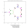
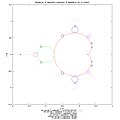 Boundaries of 53 hyperbolic components of Mandelbrot set for periods 1-6
 -
 SVG version, generated by modifying preamble line in code
 -
 External rays and equipotential lines of Mandelbrot set


Article(s): External ray
Request: Is it possible to convert to svg ?
Graphist opinion: --Adam majewski (talk) 22:30, 21 February 2009 (UTC)
- Both seem to come with Maxima source code and according to Wikipedia:How_to_create_graphs_for_Wikipedia_articles#Maxima Maxima has an SVG output option so if anyone has Maxima installed this should be quick work. /Lokal_Profil 22:56, 22 February 2009 (UTC)
- Jeez... I was about to say "I contacted the uploader to see if they could make an SVG" until I just realized that the user making the request IS the uploader. Sorry about that. So, is there an output option for SVG within the program??-Andrew c [talk] 18:04, 23 February 2009 (UTC)
- I made these images with Gnuplot thru Maxima. Gnuplot has svg output, but Maxima draw package (used in these programs) do not. I was trying to make svg images but I have many problems. PNG is easier. So I thought about png2svg conversion. --Adam majewski (talk) 18:34, 23 February 2009 (UTC)
- According to Wikipedia:How_to_create_graphs_for_Wikipedia_articles#Maxima to get SVG output you just set:
[gnuplot_term, ps]
[gnuplot_ps_term_command, "set terminal svg enhanced size 1000 1000 fname 'Times' fsize 36"]
- If you can get svg output direct it's always going to be a lot better quality then any png2svg conversion. /Lokal_Profil 01:09, 24 February 2009 (UTC)
- OK. I will try. I thought that conversion images made from points/lines will be ease. Thx.--Adam majewski (talk) 16:22, 25 February 2009 (UTC)
- If maxima/GNUplot creates the vector image then it uses the data to create it straight of. All png2svg converters (that I know of) just trace the image into vector format. Apart from the filesize issue this normally results in quite poor results. /Lokal_Profil 19:32, 25 February 2009 (UTC)
- I used the code from File:Components1.jpg and produced an SVG file by modifying the preamble as described here. gringer (talk) 04:01, 4 March 2009 (UTC)
Cropping needed


Article(s): Not in any
Request: I need to crop these SVG images, as I recently made the switch from Illustrator CS3 to CS4, somehow CS4 lacks the ability to auto crop SVG images. If someone could tell me the steps to crop the images or do them, I'd appreciate it. Thanks. єmarsee • Speak up! 05:30, 4 March 2009 (UTC)
Graphist opinion: Fixed. I imagine what you would do would go to the document properties, change it to like 175 x 50 and then enlarge or shrink the image to fit the new document box. That is basically what I did to fix these images, but I used inkscape.-Andrew c [talk] 15:03, 4 March 2009 (UTC)
My suggestions about this would be the following (using Inkscape):
- Remove the viewbox attribute — it messes with scaling and is not appropriate for single pictures
- edit -> XML editor (<shift>+<ctrl>+X)
- select top node/layer
- click on viewBox attribute
- click the 'Delete attribute' icon
- Select everything (<ctrl> + A)
- Fit page to selection
- file -> document properties (<shift>+<ctrl>+D)
- click on 'Fit page to selection' button(<alt>+F)
- If necessary, add some blank document space around the border by adding on a few pixels in document properties, then re-center the picture
- Select everything (<ctrl> + A)
- group (<ctrl>+G)
- align (<shift>+<ctrl>+A)
- Relative to: Page
- Center horizontally
- Center on horizontal axis
gringer (talk) 01:37, 5 March 2009 (UTC)
- Thank you. єmarsee • Speak up! 03:53, 5 March 2009 (UTC)
Emblem of ZS "Strzelec" OSW
-
 ZS "Strzelec" OSW
 -
 Shading removed


Article(s): pl:Związek Strzelecki "Strzelec", pl:Związek Strzelecki "Strzelec" Organizacja Społeczno-Wychowawcza
Request: This is an emblem of a modern Polish paramilitary group (legal, apolitical) pl:Związek Strzelecki "Strzelec" Organizacja Społeczno-Wychowawcza. The emblem is a hybrid of the current emblem of the Polish Land Forces and the pre World War II emblem of a similar organisation
  . The logo needs to be altered to look something like this
- the "S" has to be changed to a Times New Roman Font
- the en:Escutcheon (heraldry) needs to be changed to a Swiss Escutcheon
 with a single outline.
 - I would also want to see a second, "clean" version of the emblem without the shading effects, similar to the logo of the Polish Land Forces.

I would do this myself but I lack the necessary graphic skills. I contacted the author of the original graphic but he seems to be busy lately. I will be gratefull for any assistance. 87.207.83.232 (talk) 15:36, 2 March 2009 (UTC)
Graphist opinion:
- The font in the SVG is already Times New Roman. There's a mediawiki rendering issue (old version of ImageMagick) that makes it not appear that way in the thumbnails. This can be worked around by converting text to paths in the SVG file. —Preceding unsigned comment added by Gringer (talk • contribs) 05:51, 4 March 2009 (UTC)
- Have done the shield now, and converted the 'S' to a path. gringer (talk) 05:56, 4 March 2009 (UTC)
- Thanks, en:Kudos to everyone who helped. 87.207.83.232 (talk) 09:44, 5 March 2009 (UTC)
- Looks like the original creator didn't want the shield to be changed to a swiss one. gringer (talk) 02:35, 6 March 2009 (UTC)
- I will talk to him to clear things out there was a misunderstanding earlirer as I had misteken the creator of this image (pl:user:Poznaniak) with a user with a similar user name (pl:user:Poznaniak1975). Had I noticed this mistake earlier I would have asked the creator of this image to make changes. 87.207.83.232 (talk) 13:29, 6 March 2009 (UTC)
- Looks like the original creator didn't want the shield to be changed to a swiss one. gringer (talk) 02:35, 6 March 2009 (UTC)
- Thanks, en:Kudos to everyone who helped. 87.207.83.232 (talk) 09:44, 5 March 2009 (UTC)
- Removed the shading lines, so at least there'll be one version with the swiss shield. gringer (talk) 02:55, 6 March 2009 (UTC)
- Have done the shield now, and converted the 'S' to a path. gringer (talk) 05:56, 4 March 2009 (UTC)
Resolved
Oliver Wendell Holmes, Sr.
-
 Oliver Wendell Holmes, Sr.
 -
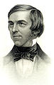

.jpg)
Article(s): Oliver Wendell Holmes, Sr.
Request: Any chance we can get a good crop and straightening of just the portrait from this scanned page. gren グレン 03:48, 13 February 2009 (UTC)
Graphist opinion:
- A very good chance, I'd say. Is that OK? My photoshop skills aren't all that. − Inductiveload (talk) 18:31, 15 February 2009 (UTC)
- Very good, thank you... makes using it as his portrait much easier. gren グレン 02:11, 25 February 2009 (UTC)
Fix streak
-
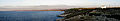 A panorama of the island of Asinara
Article(s): Asinara
Request: This should be a quick one. Can you please erase the streak on the left-center side of the image? Thanks, ResMar 21:56, 23 February 2009 (UTC)
Graphist opinion:Done. ■ MMXXtalk 11:45, 24 February 2009 (UTC)
- OK, thank you very much! Currently on GAN and DYK nom. ResMar 01:47, 26 February 2009 (UTC)
Rio de Janeiro 2016 Ferris wheel
-
 Rio de Janeiro 2016 Ferris wheel
 -
 Rio de Janeiro 2016 Ferris wheel edit


Example:
-
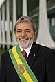 Original picture

Article(s): Rio de Janeiro 2016 Olympic bid
Request: The picture needs noise reduction. Felipe C.S ( talk ) 18:15, 26 February 2009 (UTC)
Graphist opinion: Done. Felipe C.S ( talk ) 23:55, 26 February 2009 (UTC)
Solingen arson attack photo touch-up
-
 Scanned photo with red glare on one side

Article(s): Solingen arson attack of 1993
Request: Any way the red glare or whatever it is can be removed to create a better-looking photo? Thanks in advance! 79.64.251.192 (talk) 19:39, 24 January 2009 (UTC)
Graphist opinion: Removed the glare and improved the contrast. How is it now? Mononomic (talk) 02:46, 31 January 2009 (UTC)
- (Not requester) That looks really good! Would it be possible to un-blowout the sky? Or is it too far gone? §hep • Talk 02:49, 31 January 2009 (UTC)
- Too far gone - I tried. Sorry. Mononomic (talk) 20:30, 2 February 2009 (UTC)
- It is never too far gone to me:) The only unfortunate thing about my changes is that I had to remove the Antenna from the house, as I used the clone tool to clone the sky from different areas of the image. Let me know if this works for you. ZooFari 01:48, 5 February 2009 (UTC)
- Too far gone - I tried. Sorry. Mononomic (talk) 20:30, 2 February 2009 (UTC)
Vancouver SkyTrain (very easy task to do, which can be handled in less than a minute. please just finish this :( )
-
 A map of the Vancouver SkyTrain.
 -
 A map of the Vancouver SkyTrain with only the SkyTrain stations.


Article(s): SkyTrain (Vancouver), List of Vancouver SkyTrain stations
Request: If you look at the images, you'll see that Main Street-Science World has a transfer station on it. The station is a ordinary station, and is not a transfer station, so should be changed to a ordinary station. -- signed by SRE.K.Annoyomous.L.24 (spell my name backwards) at 05:32, 2 January 2009 (UTC)
Graphist opinion: What do ordinary stations and transfer stations look like? Is the first map correct in appearance for all the skytrain stations? gringer (talk) 10:07, 25 January 2009 (UTC)
- This section was probably deleted because I didn't realize I unwatched this page. Anyways, I hope I could still reply to this. Both maps have Main Street-Science World Station as a transfer station. It has a transfer station "thing" that looks like all the other terminals + Broadway and Commericial stations. Original stations are those ones that are like Granville, Nanaimo, and others. I just want the Main Street-Science World Station to have the station changed to an original station, like what it's supposed to be. This is for both the images. Thanks if anyone replys... -- [[SRE.K.A.L.|L.A.K.ERS]] 17:58, 15 February 2009 (UTC)
- Done. − Inductiveload (talk) 18:38, 15 February 2009 (UTC)
- Thank you very much for this. -- [[SRE.K.A.L.|L.A.K.ERS]] 07:29, 2 March 2009 (UTC)
- Done. − Inductiveload (talk) 18:38, 15 February 2009 (UTC)
- Is it resolved then? [|Retro00064 | (talk/contribs) |] 09:59, 3 March 2009 (UTC)
- Yes, it is. -- [[SRE.K.A.L.|L.A.K.ERS]] 18:27, 3 March 2009 (UTC)
- Is it resolved then? [|Retro00064 | (talk/contribs) |] 09:59, 3 March 2009 (UTC)
USMC Insignia
-
 Tiny PNG insignia
 -
 SVG(s) to work from
 -
 Inner part of USMC logo, converted to white/black.


Article(s): United States Marine Corps, Eagle, Globe, and Anchor
Request: This should be a quick one: just a request for a black + transparent version of the USMC insignia (the "Eagle, Globe, and Anchor") which is currently a small PNG. The SVG logo above (or alternate versions linked from its file description page) should be a good head start. - Gump Stump (talk) 04:23, 4 March 2009 (UTC)
Graphist opinion:
- Took the inner part of the SVG file and converted to white/black. gringer (talk) 05:20, 4 March 2009 (UTC)
- Brilliant, thank you. - Gump Stump (talk) 21:22, 4 March 2009 (UTC)
UN member states GIF cleanup

Article(s): United Nations
Request: Could someone please cleanup this GIF? It's kind of jumpy at some parts and very...messy when displayed by the wiki software, in full screen it looks fine. Thanks, §hepTalk 23:26, 4 March 2009 (UTC)
Graphist opinion: Could you clarify that a little? I can't see any messiness or jumpiness. Be warned that GIFs scale quite badly by nature anyway, it'll never thumbnail nicely simply because it's a GIF. —Vanderdecken∴ ∫ξφ 15:38, 5 March 2009 (UTC)
- There's how it renders for me. §hepTalk 02:23, 6 March 2009 (UTC)
- Looks fine for me. This is probably an IE7 rendering issue for animated GIFs. Seems a bit odd that it works in full screen though. gringer (talk) 02:41, 6 March 2009 (UTC)
- Wouldn't it look bad in full screen mode if it was IE7? §hepTalk 02:43, 6 March 2009 (UTC)
- Not quite sure what you mean by full screen mode -- you could mean the browser's full-screen mode, or when viewing the image alone. If the second one, you'd only be able to compare properly if you right clicked on the image and just viewed that. The wikipedia preview will be displaying a different GIF image from the original picture. Also, I've just noticed that your preview image (1280 x 735 pixels) has a different size from mine (800 × 459 pixels). It's possible that the nearest neighbour interpolation being done with the GIF image is causing the ghosting to happen... but I still don't get any of the artefacts you've observed after setting my wikipedia preferences to allow 1280x1024 image preview limits (changing my image preview to 1280 x 735 pixels). gringer (talk) 10:38, 6 March 2009 (UTC)
- So it's on my end. Gotcha. Thanks, §hepTalk 16:37, 6 March 2009 (UTC)
- Not quite sure what you mean by full screen mode -- you could mean the browser's full-screen mode, or when viewing the image alone. If the second one, you'd only be able to compare properly if you right clicked on the image and just viewed that. The wikipedia preview will be displaying a different GIF image from the original picture. Also, I've just noticed that your preview image (1280 x 735 pixels) has a different size from mine (800 × 459 pixels). It's possible that the nearest neighbour interpolation being done with the GIF image is causing the ghosting to happen... but I still don't get any of the artefacts you've observed after setting my wikipedia preferences to allow 1280x1024 image preview limits (changing my image preview to 1280 x 735 pixels). gringer (talk) 10:38, 6 March 2009 (UTC)
- Wouldn't it look bad in full screen mode if it was IE7? §hepTalk 02:43, 6 March 2009 (UTC)
- Looks fine for me. This is probably an IE7 rendering issue for animated GIFs. Seems a bit odd that it works in full screen though. gringer (talk) 02:41, 6 March 2009 (UTC)
Vectorize or PNG-ize these images?
-
JPG 1
-
 SVG 1
SVG 1 -
JPG 2
-
 SVG 2
SVG 2 -
JPG 3
-
 SVG 3
SVG 3


Article(s): Syllable rime
Request: These simple images that I uploaded a long time ago recently got tagged with {{BadJPEG}}, and I unfortunately don't have the software to convert them to anything better. If it's not too much work, though, I just need them converted to svg or png—that doesn't require anything too fancy, hopefully? rʨanaɢ talk/contribs 22:40, 5 March 2009 (UTC)
Graphist opinion:
- Done the third one. gringer (talk) 02:16, 6 March 2009 (UTC)
- Done the others. Just in case you didn't know, Inkscape (what I used to create these) is free gringer (talk) 02:33, 6 March 2009 (UTC)
- Those look good, thank you. And next time I'll try to remember inkscape! rʨanaɢ talk/contribs 15:38, 7 March 2009 (UTC)
Request for conversion
-
 Image for conversion
 -
 SVG image


Article(s): Picture Candidate, Jaw, Moray eel, Pharyngeal jaws
Request: Convert to SVG, or PNG if not possible. Thank you! ZooFari 17:54, 15 February 2009 (UTC)
Graphist opinion: I'll get to work on this one. --Pbroks13talk? 19:12, 16 February 2009 (UTC)
- What do you think of that? --Pbroks13talk? 07:50, 18 February 2009 (UTC)
- Impressive. But it isn't my decision. I'll see how the people at Featured pics like it. In case there is anything they might want to adjust, I will notify you to see if you can do some adjustments. Thanks in advance ZooFari 00:17, 19 February 2009 (UTC)
- Great SVG work ! Yug (talk) 08:35, 19 February 2009 (UTC)
- I'm not sure we should remove labels. The Morey eel may be evident in the context of an article but I would recommend a version with labels... and maybe the normal jaw is self-evident but it seems odd to only label the pharyngeal one. gren グレン 02:22, 25 February 2009 (UTC)
- Impressive. But it isn't my decision. I'll see how the people at Featured pics like it. In case there is anything they might want to adjust, I will notify you to see if you can do some adjustments. Thanks in advance ZooFari 00:17, 19 February 2009 (UTC)
- Yeah, it would look better. [|Retro00064 | (talk/contribs) |] 07:23, 2 March 2009 (UTC)
Deccan Traps
-
 extinction of dinosaurs in Deccan Traps in Western Ghats, India

Article(s): Deccan Traps
Request: Retouche logo at top right and low right corner. (and upload directly over the source file.)
Graphist opinion:Done. ■ MMXXtalk 08:28, 7 March 2009 (UTC)
- Very good. The image is also in featured article Cretaceous–Tertiary extinction event. Thanks. --Snek01 (talk) 09:12, 7 March 2009 (UTC)
- your welcome. ■ MMXXtalk 10:51, 7 March 2009 (UTC)
Luna - Keele - 09.12.08
-
 The Moon from Keele Observatory
 -
 PNG version, levels adjusted


Articles: Once cleaned, could be used in Moon, astrophotography and Keele University articles.
Request: I was wondering if anyone would know how to deal with the light border around the limb on the Eastern half Luna in this image, and also if anything can be done about the brightness rectangles - this is the first image I've ever stitched, and I did my best, but I'm sure someone with more experience would be able to make this image much better! :-) Thanks in advance, Colds7ream (talk) 22:09, 15 February 2009 (UTC)
Graphist opinion:
- The rectangle borders would be easiest to remove from the original sources. If you've got the original images, I'd suggest using hugin for stitching, because it does blending and exposure correction between images to remove the obvious rectangles (a bit tricky to get the hang of, though). You can usually do something like this blending in an image editing program by using a softened eraser on the edges of the top layers. Despite this, that's an impressive stitching for something that's just layered and brightness-adjusted. gringer (talk) 00:50, 16 February 2009 (UTC)
- Many thanks! :-) I'll give that software a go, then, and see what I can do! Colds7ream (talk) 07:41, 16 February 2009 (UTC)
- Well, I gave it a go, and, as you can see, the resulting image is much better! Thanks for the advice! As a result, all I'd like done is the removal of the brighter sections around the limb of the Moon, if anyone would be kind enough to do so for me. Colds7ream (talk) 16:13, 17 February 2009 (UTC)
- The banding is probably a result of what JPEG compression does to high-contrast boundaries (which means it may be able to be dealt with via a huge PNG file), but I'll see what I can do about that. gringer (talk) 22:58, 17 February 2009 (UTC)
- Given that the PNG file wasn't too big, having a similar size to your original JPEG, I've uploaded that to commons. I also adjusted the curves to make the moon surface fit into a black/white gradient. The annoying thing is that the JPEG version of the thumbnails seems to accentuate the craters, which can be quite a nice effect. I suppose now that the outer region is brighter, any ring on a JPEG version would be less obvious. gringer (talk) 23:33, 17 February 2009 (UTC)
- Of the two pngs you uploaded, I think I prefer the first - its less washed out and has less of a 'comet tail' than the second... Colds7ream (talk) 16:01, 19 February 2009 (UTC)
- Okay, have reverted back to the first PNG. Would you prefer some other modification? gringer (talk) 02:57, 20 February 2009 (UTC)
- Thanks, that's brilliant! Just wondering if the slight comet tail effect could be eliminated from that picture too, because otherwise it's perfect! :-) Colds7ream (talk) 14:02, 20 February 2009 (UTC)
- Sorry, not quite sure what you mean by 'comet tail effect'. Could you please explain? gringer (talk) 02:29, 23 February 2009 (UTC)
- There seems to still be a part of the original light banding in the dark area to the west of the terminator, when the image is fully zoomed in? Colds7ream (talk) 14:37, 28 February 2009 (UTC)
- How about that? Now that I look at it again, I see that I was a bit too aggressive with the clipping/erasing of the dark region on the left hand side. gringer (talk) 00:28, 2 March 2009 (UTC)
- Have done a bit less aggressive clipping, and blurred the border. This gives a slight 'atmosphere' on the bright side, but makes the black/dark grey transition much less obvious. gringer (talk) 00:41, 2 March 2009 (UTC)
- Now that looks beautiful. :-D Colds7ream (talk) 00:48, 2 March 2009 (UTC)
- Have done a bit less aggressive clipping, and blurred the border. This gives a slight 'atmosphere' on the bright side, but makes the black/dark grey transition much less obvious. gringer (talk) 00:41, 2 March 2009 (UTC)
- Sorry, not quite sure what you mean by 'comet tail effect'. Could you please explain? gringer (talk) 02:29, 23 February 2009 (UTC)
- Thanks, that's brilliant! Just wondering if the slight comet tail effect could be eliminated from that picture too, because otherwise it's perfect! :-) Colds7ream (talk) 14:02, 20 February 2009 (UTC)
- Okay, have reverted back to the first PNG. Would you prefer some other modification? gringer (talk) 02:57, 20 February 2009 (UTC)
- Of the two pngs you uploaded, I think I prefer the first - its less washed out and has less of a 'comet tail' than the second... Colds7ream (talk) 16:01, 19 February 2009 (UTC)
- Well, I gave it a go, and, as you can see, the resulting image is much better! Thanks for the advice! As a result, all I'd like done is the removal of the brighter sections around the limb of the Moon, if anyone would be kind enough to do so for me. Colds7ream (talk) 16:13, 17 February 2009 (UTC)
- Many thanks! :-) I'll give that software a go, then, and see what I can do! Colds7ream (talk) 07:41, 16 February 2009 (UTC)
Image to be Vectorize File:Mongolian-PRC.png


Article(s): at the moment Names of China and possible of adding on the People's Republic of China article.
Request: Want this script Vectorize into ".svg" for the article due to Commons:Media for cleanup.
Graphist opinion:
- I'll give it a shot. --Slashme (talk) 16:41, 10 March 2009 (UTC)
- Done, please check. I think some of the blobbiness comes from the low-res initial scan, so feel free to fix. --Slashme (talk) 17:15, 10 March 2009 (UTC)
- That looks great thank you no it came out fine. — ASDFGH =] talk? 01:04, 11 March 2009 (UTC)


Article(s): Pet monkey
Request: Crop the image to include just "the man with the hat" and Curious George, the Monkey. Then improve image quality any way you see fit. This will likely be the lede image for a while. -- Banjeboi 13:07, 12 March 2009 (UTC)
Graphist opinion:
- OK, will do. --Slashme (talk) 16:13, 12 March 2009 (UTC)
- Done --Slashme (talk) 16:23, 12 March 2009 (UTC)
- Brilliant! Thank you! -- Banjeboi 13:19, 13 March 2009 (UTC)
- Done --Slashme (talk) 16:23, 12 March 2009 (UTC)
B-Class checklist icons
-

-

-

-
 an attempt
 -


Article(s): {{WPBannerMeta}}
Request: The above icons are used for the B-Class checklist in {{WPBannerMeta}}. It would be ideal if there was also an exclamation mark icon in a similar style, but there does not appear to be one on Commons. Is there any chance someone can create one? PC78 (talk) 14:06, 15 March 2009 (UTC)
Graphist opinion:: What do you think of that? It doesn't have to be yellow. — ₪₪ ch1902 ₪₪ 14:47, 15 March 2009 (UTC)
- Nice! :) The yellow is a bit pale, though. Can you do one in orange like File:Orange x.svg? Cheers! PC78 (talk) 15:04, 15 March 2009 (UTC)
- Sure thing, there you go — ₪₪ ch1902 ₪₪ 15:19, 15 March 2009 (UTC)
- Excellent, many thanks! :) PC78 (talk) 15:21, 15 March 2009 (UTC)
- Just one final requst: can you add some empty space either side of the image to make it 120x120px like the others? That will make it align properly with the others in the template. PC78 (talk) 15:33, 15 March 2009 (UTC)
- Done, both images are square now — ₪₪ ch1902 ₪₪ 16:09, 15 March 2009 (UTC)
- Thanks again! PC78 (talk) 17:44, 15 March 2009 (UTC)
- Done, both images are square now — ₪₪ ch1902 ₪₪ 16:09, 15 March 2009 (UTC)
- Sure thing, there you go — ₪₪ ch1902 ₪₪ 15:19, 15 March 2009 (UTC)
Flags of Provinces of Belgium
Articles: Provinces of Belgium etc
Request: SVG these flags please.
-
 Flag (.gif)
 -
Flag (.svg)
-
 Coat of Arms (.svg)


1. Take the stuff out of the COA to create the flag. please and name the file: Flag of the Province of Liège.svg --SelfQ (talk) 00:03, 26 February 2009 (UTC)
Graphist opinion:![]() Question: For 3. is the exact shape of the coat of arms important? If not, there is File:Héraldique Province BE Brabant Wallon.svg. bamse (talk) 00:21, 27 February 2009 (UTC)
Question: For 3. is the exact shape of the coat of arms important? If not, there is File:Héraldique Province BE Brabant Wallon.svg. bamse (talk) 00:21, 27 February 2009 (UTC)
- While searching for already existing .svg's I seem to have missed that one. Its a good approximation. Thanks for finding it.--SelfQ (talk) 12:25, 28 February 2009 (UTC)
- I did the first. It was not difficult :-) Please check image description and categories. bamse (talk) 14:30, 28 February 2009 (UTC)
- could you remove the rather thick black border around the coa (not completly, just turn it into a line rather then a thick stripe)--SelfQ (talk) 18:32, 28 February 2009 (UTC)
- Better? bamse (talk) 20:33, 28 February 2009 (UTC)
- Much, thanks--SelfQ (talk) 21:45, 28 February 2009 (UTC)
- Better? bamse (talk) 20:33, 28 February 2009 (UTC)
- could you remove the rather thick black border around the coa (not completly, just turn it into a line rather then a thick stripe)--SelfQ (talk) 18:32, 28 February 2009 (UTC)
- I did the first. It was not difficult :-) Please check image description and categories. bamse (talk) 14:30, 28 February 2009 (UTC)
Anyone still willing to do the remaining flag?--SelfQ (talk) 19:38, 13 March 2009 (UTC)
- How's that? I just took the elements from the COA so not sure how appropriate the column and letters is... — ₪₪ ch1902 ₪₪ 13:14, 15 March 2009 (UTC)
- Great, thanks.--SelfQ (talk) 22:59, 16 March 2009 (UTC)
Four Award main award image
-
 The current Four Award
 -
 SVG
SVG


Article(s): Four Award
Request: Create a new award for the project in svg (so that it has a transparent background). You may base yourself on the current award or make something very different. The new award image should...
- Reflect the achievement that implies obtaining the Four Award.
- Be "divided" into 4 "parts", each part representing each requirement for gaining the award.
- Preferably include the icons on the page that represent each requirement (you may use the original featured article star without the circle if you want).
Feel free (but not an urge) to make more than one alternate award design, so that then which will be the project's award image can be decided with more variety available. ♠TomasBat 20:38, 26 February 2009 (UTC)
Graphist opinion: I really like that idea. I'll get to work on it as soon as I can. --Pbroks13talk? 04:00, 27 February 2009 (UTC)
- Well, here's just a vectorized version of the original, if I can come up with any other designs, I'll be sure to let you know. --Pbroks13talk? 21:53, 28 February 2009 (UTC)
- Ok, thanks for the vector version. ♠TomasBat 22:42, 28 February 2009 (UTC)
Endoplasmatic reticulum
-
 Bad quality jpg.
 -
 Close enough SVG version?
 -
 SVG version


Article(s): endoplasmatic reticulum
Request:Almost every cell structure reproduction is in svg, so I'd appriciate if you could make this one as well.
Thanks!
Thanks for your time!
Graphist opinion:
- Found an SVG from a quick search through commons that looks fairly similar to the JPEG. Could probably just delete other cell components if you only want the ER.
"Requester" answer: I'd already seen that one, but the image I request is far more detailed than the other one; it shows vesicles, nuclear pores, IMO the perspective is better.
Thanks for answering my request.
- I'll work on this one. --Pbroks13talk? 04:45, 8 March 2009 (UTC)
How's that for you? --Pbroks13talk? 23:11, 11 March 2009 (UTC)
- That looks great! You've done an incredible job. Thanks a lot.
I've got another question... Could you tell me how do I upload the "endoplasmatic reticulum" page with the SVG version? Thanks again!--winfistalk? 13:16, 12 March 2009 (UTC)
- Yeah, edit the page. Find where it says "Image:Nucleus_ER_golgi.jpg" and replace it with "File:Nucleus ER golgi.svg". Also... I think I've seen your sig somewhere before. Looks familiar... --Pbroks13talk? 15:12, 12 March 2009 (UTC)
- Great work again, Pbroks. Dhatfield (talk) 03:06, 15 March 2009 (UTC)
- Thank you! --Pbroks13talk? 06:56, 17 March 2009 (UTC)
Flags of French Overseas Territories
-
 Flag of the Minister of Overseas France (PNG)
 -
 Flag of the Minister of Overseas France (SVG)


Article(s): French Overseas Territories related
Request: SVG please and name Flag of French Guiana, Flag of Réunion etc --SelfQ (talk) 23:24, 7 February 2009 (UTC)
Graphist opinion: Please note that the French Guiana flag is nominated as a "Possibly unfree image" and should probably be treated as Fair Use only. /Lokal_Profil 23:53, 7 February 2009 (UTC)
- Fair use only was the verdict. /Lokal_Profil 11:23, 11 February 2009 (UTC)
- The Guiana Flag would be hard to vectorize, because of it's peppery splatter design.
- Oh, and to you, Lokal Profil, unless you strictly link to a Wikipedia Policy that clearly states that vector fair-use images are not allowed, we will continue to vectorize fair-use images.
- --[|Retro00064 | (talk/contribs) |] 22:54, 12 February 2009 (UTC)
- I only meant it as a warning. Basically so that you don't accidentally upload it to Commons believing it is free. Also some of the people who help out here are only interested in working with free images. /Lokal_Profil 23:09, 12 February 2009 (UTC)
- You can find a higher resolution Guiana logo at File:Logo 973 guyane.gif--SelfQ (talk) 23:27, 12 February 2009 (UTC)
- If the Overseas Territories flags are to difficult then could someone atleast do the flag of the Minister of Overseas France? its just a square with the french flag in one corner.--SelfQ (talk) 00:16, 26 February 2009 (UTC)
- I'll do it. Do you want the SVG file named something other than "Ministre-DOMTOM.svg"? [|Retro00064|☎talk|✍contribs|] 08:03, 10 March 2009 (UTC)
- Flag of the Minister of Overseas France.SVG would be adecuate thanks.--SelfQ (talk) 17:16, 10 March 2009 (UTC)
- How does that look? [|Retro00064|☎talk|✍contribs|] 00:49, 11 March 2009 (UTC)
- Great, cheers.--SelfQ (talk) 19:27, 13 March 2009 (UTC)
- How does that look? [|Retro00064|☎talk|✍contribs|] 00:49, 11 March 2009 (UTC)
- Flag of the Minister of Overseas France.SVG would be adecuate thanks.--SelfQ (talk) 17:16, 10 March 2009 (UTC)
- I'll do it. Do you want the SVG file named something other than "Ministre-DOMTOM.svg"? [|Retro00064|☎talk|✍contribs|] 08:03, 10 March 2009 (UTC)
- If the Overseas Territories flags are to difficult then could someone atleast do the flag of the Minister of Overseas France? its just a square with the french flag in one corner.--SelfQ (talk) 00:16, 26 February 2009 (UTC)
- You can find a higher resolution Guiana logo at File:Logo 973 guyane.gif--SelfQ (talk) 23:27, 12 February 2009 (UTC)
- I only meant it as a warning. Basically so that you don't accidentally upload it to Commons believing it is free. Also some of the people who help out here are only interested in working with free images. /Lokal_Profil 23:09, 12 February 2009 (UTC)
- --[|Retro00064 | (talk/contribs) |] 22:54, 12 February 2009 (UTC)
Tito
Article(s): Yugo-nostalgia
Request: Remove the border. PRODUCER (talk) 18:10, 17 March 2009 (UTC)
Graphist opinion: One moment please... —Vanderdecken∴ ∫ξφ 11:24, 18 March 2009 (UTC)
- Done. I uploaded over the original image. I also gave the levels and highlights a bit of a tweak to prevent the building at top left and the hair at bottom right being so blown out. —Vanderdecken∴ ∫ξφ 11:40, 18 March 2009 (UTC)
Clapperboard flag icons
-
 clapperboard
 -
 Korea flag
 -
 LGBT flag
 -
 LGBT Film
 -
 Korean Film


.svg)

Article(s): general use (stub templates etc.)
Request: Can someone please whip up a couple of svg clapperboard flag icons similar to File:Argentinefilm.svg but for Korean film and LGBT film using the images above. Thanks in advance! PC78 (talk) 20:48, 17 March 2009 (UTC)
Graphist opinion: There you go :) — ₪₪ ch1902 ₪₪ 21:27, 17 March 2009 (UTC)
- That was quick! :) Cheers! PC78 (talk) 21:32, 17 March 2009 (UTC)
Oscilloscope
-
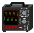 An oscilloscope
 -
 SVG
SVG


Article(s): Oscilloscope and differential power analysis
Request: I was doing an SVG diagram for DPA and I need an SVG picture of an oscilloscope to do it. Something similiar to the above picture, showing the scope and the graphs. Raul654 (talk) 21:48, 17 March 2009 (UTC)
Graphist opinion: I'll get on that as soon as I can. --Pbroks13talk? 22:11, 17 March 2009 (UTC)
- Will that work for you? --Pbroks13talk? 07:39, 18 March 2009 (UTC)

- Yes - I have incorporated your picture into my diagram. Raul654 (talk) 19:42, 18 March 2009 (UTC)
Bosnia and Herzegovina merit
-

-

-
 New
New


Article(s): Wikipedia:WikiProject Bosnia and Herzegovina
Request: Create a new image replacing the EU flag with Bosnia's COA (keep the original shape). PRODUCER (talk) 18:52, 18 March 2009 (UTC)
Graphist opinion: How's that? --Pbroks13talk? 06:33, 19 March 2009 (UTC)
- Sorry for the confusing wording in my request, by original shape I meant the one already used in the Merit Barnstar of the EU, could you brighten it up a bit too. PRODUCER (talk) 12:49, 19 March 2009 (UTC)
- Its okay. How's that? --Pbroks13talk? 17:12, 19 March 2009 (UTC)
- Looks great thanks PRODUCER (talk) 17:25, 19 March 2009 (UTC)
- Its okay. How's that? --Pbroks13talk? 17:12, 19 March 2009 (UTC)
Baltic states map/flag
-

-
 SVG
SVG


Article(s): general use
Request: Can someone please create an svg (and hopefully cleaner) version of this image? Thanks in advance! PC78 (talk) 20:55, 17 March 2009 (UTC)
Graphist opinion:
- This ok? /Lokal_Profil 20:16, 18 March 2009 (UTC)
- Marvelous! Do you think you could give the edges a bit of a trim? Otherwise it's spot on. :) PC78 (talk) 20:28, 18 March 2009 (UTC)
- How do you mean? Do you want the edges (i.e. the black lines) to be thinner? /Lokal_Profil 22:29, 18 March 2009 (UTC)
- No, I mean the empty space top, left and bottom of the map. PC78 (talk) 16:01, 19 March 2009 (UTC)
- Voila. /Lokal_Profil 22:33, 19 March 2009 (UTC)
- Cheers! PC78 (talk) 16:25, 20 March 2009 (UTC)
- Voila. /Lokal_Profil 22:33, 19 March 2009 (UTC)
- No, I mean the empty space top, left and bottom of the map. PC78 (talk) 16:01, 19 March 2009 (UTC)
- How do you mean? Do you want the edges (i.e. the black lines) to be thinner? /Lokal_Profil 22:29, 18 March 2009 (UTC)
- Marvelous! Do you think you could give the edges a bit of a trim? Otherwise it's spot on. :) PC78 (talk) 20:28, 18 March 2009 (UTC)
Conversion to svg

Article(s): Flash (novel)
Request: Convert to svg ♪♫The New Mikemoraltalkcontribs 06:43, 15 March 2009 (UTC)
Graphist opinion: Sorry, but no one is even going to make a slight attempt vectorize that image. SVGs aren't generally made from extremely detailed, real-life images such as that one. --Pbroks13talk? 06:53, 17 March 2009 (UTC)
- Agreed. SVG isn't for book covers, please see WP:IUP#FORMAT. §hepTalk 07:15, 21 March 2009 (UTC)
Yugoslavia
-

-
 Existing SVG


Article(s): Yugoslavia related articles
Request: Please convert it to SVG. PRODUCER (talk) 18:01, 17 March 2009 (UTC)
Graphist opinion: There's already an SVG on Commons :) — ₪₪ ch1902 ₪₪ 19:41, 17 March 2009 (UTC)
Bush Obama Merger
-
 Bush
Bush -
 Obama
Obama -
 Bush Obama Merger


Article(s):
Request: I would like to create a series of userboxes that would link obama and bush. An example would be "This user believes that the policies of Bush and Obama are one and the same" Ideally, I would like to have a picture of obama merged into bush. I was hoping someone could create a higher resolution image/a more "accurate" merger. (This will be something fun to see!) Thanks in advance. Smallman12q (talk) 21:54, 14 March 2009 (UTC)
Graphist opinion: To me, your graphic is just fine. Not sure we should be spending lots of time making a super-high-res version...... Calliopejen1 (talk) 19:40, 15 March 2009 (UTC)
- Something larger would be nice. I didn't think it would be too difficult.Smallman12q (talk) 20:17, 16 March 2009 (UTC)
- I created a higher resolution using 2 different depixlating filters and one sharpening filter. -- penubag (talk) 01:53, 21 March 2009 (UTC)
- Well its not the best, but itll do. I do see that it may not be worth the time to go back and recreate a higher resolution image. Now I'll make a few userboxes.=P Thanks again penubag!Smallman12q (talk) 12:31, 21 March 2009 (UTC)
- It's ~2.5x bigger than the original file so it's bound not to be perfect. You're welcome! -- penubag (talk) 19:12, 21 March 2009 (UTC)
- Thanks!Smallman12q (talk) 01:28, 24 March 2009 (UTC)
- It's ~2.5x bigger than the original file so it's bound not to be perfect. You're welcome! -- penubag (talk) 19:12, 21 March 2009 (UTC)
- Well its not the best, but itll do. I do see that it may not be worth the time to go back and recreate a higher resolution image. Now I'll make a few userboxes.=P Thanks again penubag!Smallman12q (talk) 12:31, 21 March 2009 (UTC)
- I created a higher resolution using 2 different depixlating filters and one sharpening filter. -- penubag (talk) 01:53, 21 March 2009 (UTC)
Problems rendering (?) SVG graph
-
 Graph depicting global employment changes at Unilever from 2000 to 2008

![[1]](https://commons.wikimedia.org/wiki/File:10_weeks_pregnant.jpg)
.svg)
.png)
Article(s): Unilever (not placed yet because of problems)
Request: Apologies as I am new to this....I created this file in Illustrator and while it appears on my computer (Mac OS) correctly spaced, once uploaded to wiki the columns are squeezed to the left. I would appreciate any help in resolving the problem.--Goldsztajn (talk) 13:28, 23 March 2009 (UTC)
Graphist opinion: There you go. I had to convert the text to paths, then squeezed them into place. --Pbroks13talk? 17:00, 24 March 2009 (UTC)
- Thanks!--Goldsztajn (talk) 00:03, 25 March 2009 (UTC)
Cover art for Earl Cain

Article: Earl Cain
Request: Hi. Um, when I uploaded the picture, it was way too big to fit into the article. I was wondering if it would be possible to shrink it. Kaguya-chan (talk) 20:26, 24 March 2009 (UTC)
Graphist opinion: Images are scalable. For instance [[Image:Cain 01 cover.jpg|50px]] will make it 50 pixels wide. So, you can change it using that. gren グレン 21:30, 24 March 2009 (UTC)
- Although the resolution is also high for a fair use image. You should really upload a version at around 300px. Mfield (Oi!) 21:33, 24 March 2009 (UTC)
- Um, I know depressingly little about images, so please excuse the next question... is it possible to change the resolution of the existing picture? Kaguya-chan (talk) 22:55, 24 March 2009 (UTC)
- I resized and replaced it and deleted the high rez revision. Mfield (Oi!) 23:12, 24 March 2009 (UTC)
- Thank you! Kaguya-chan (talk) 23:21, 24 March 2009 (UTC)
- I resized and replaced it and deleted the high rez revision. Mfield (Oi!) 23:12, 24 March 2009 (UTC)
- Um, I know depressingly little about images, so please excuse the next question... is it possible to change the resolution of the existing picture? Kaguya-chan (talk) 22:55, 24 March 2009 (UTC)