Wikipedia:Graphics Lab/Illustration workshop/Archive/May 2013
 | This page, part of the Graphics Lab Wikiproject, is an archive of requests for May 2013. Please do not edit the contents of this page. You can submit new requests here. |
Stale
Bishop coat of arms request
-
 Harry Entwistle coat of arms please change the galero and fiocchi colors to one on the right
 -
 coat of arms for an apostolic protonotary


Article(s): Harry Entwistle
Request: Can some change the galero and fiocchi on Harry Entwistle's coat of arms from black to the ones above. I would be appreciated if someone could make coat of arms and sorry for a long request. (update: I simplified the request) Spongie555 (talk) 04:45, 10 April 2013 (UTC)
Graphist opinion(s):
Svg Request for TMB bank logo
-
 Logo of tmb Bank
Article(s): Tamilnad Mercantile Bank Limited
Request: SVG version for this file... Perumalism Chat 10:39, 11 April 2013 (UTC)
Graphist opinion(s):
- The copyright claim on the raster file is very questionable. Where on the page it links to does it say that this is in the public domain?
- If it really is PD, then we can happily attempt to make our own vector of this, but if it's copyrighted or trademarked, we'll undoubtedly introduce inaccuracies. NikNaks talk - gallery 11:34, 11 April 2013 (UTC)
- This could (and should) be licensed as
{{PD-textlogo}}and{{trademarked}}. At least as long as no OTRS message is available from "TMB Ltd.". I assume there's probably some PDF with vector data around that one could use. This shouldn't be hand-traced. -- Patrick87 (talk) 13:40, 11 April 2013 (UTC)- You mentioned on my talk page that you found a PDF source for the logo. Where is the link however? Did I overlook it? -- Patrick87 (talk) 18:13, 11 April 2013 (UTC)
- This could (and should) be licensed as
Seal of Tamil Nadu
-
 Seal of Tamil Nadu
 -
 English version with better quality
 -
 Traced version


Text: தமிழ் நாடு அரசு வாய்மையே வெல்லும்
Article(s): Seal of Tamil Nadu. etc
Request: It will be so helpful if svg image version is created because it was used in more tan 100 pages Thank you ... Perumalism Chat 10:57, 11 April 2013 (UTC)
Graphist opinion(s):
- I assume the characters around the circle and at the bottom are a script, so it would be very helpful to have those characters as text rather than having to hand-trace them.
- Also, the level of detail of this image is very low, so the detail on the yellow tower can't possibly be recreated, as we can't tell what it is. NikNaks talk - gallery 11:32, 11 April 2013 (UTC)
- Theres a much better verion (with English text) at Tamil Nadu Emblem.png that could be used as a source. I wasn't able to find an official vector version, though. Maybe you could ask the author of the English version if he has a vector file at hand. -- Patrick87 (talk) 23:47, 11 April 2013 (UTC)
NLC logo
-
 nonfree image- logo of neyveli lignite the inner detail can be seen here http://www.jobsvision.co.in/Logos/NeyveliLigniteCorporationLimited.png

Article(s): Neyveli Lignite Corporation
Request:
- Svg coversion of the file the detail in image low so you can click than link to see the inner letter clearly... -- Perumalism Chat 13:17, 13 April 2013 (UTC)
Graphist opinion(s): Please don't link directly to non-free images. ![]() Request taken by NikNaks. NikNaks talk - gallery 15:48, 13 April 2013 (UTC)
Request taken by NikNaks. NikNaks talk - gallery 15:48, 13 April 2013 (UTC)
![]() Done: see File:Neyveli_Lignite_Corporation.svg. Please ensure the non-free use rationale is completed correctly, as I am a novice at that. NikNaks talk - gallery 15:53, 13 April 2013 (UTC)
Done: see File:Neyveli_Lignite_Corporation.svg. Please ensure the non-free use rationale is completed correctly, as I am a novice at that. NikNaks talk - gallery 15:53, 13 April 2013 (UTC)
TaNGeDCo Logo
-
nonfree imagethe words in inner text are Tamil Nadu Generation and Distribution Corporation Limited
Article(s): Tamil Nadu Generation and Distribution Corporation Limited
Request: Svg version of file Thankyou ... -- Perumalism Chat 03:16, 14 April 2013 (UTC)
Graphist opinion(s): I have searched their website and cannot find any PDFs with a vector logo on. They all seem to use a raster file. If someone else wants to have a look, please do, but I don't think we can complete this request. NikNaks talk - gallery 11:00, 14 April 2013 (UTC)
Banners
Article(s): varios
Request: By replacing the text in the banners, some new coat of arms can be created:
- Replace the text in File:Coat of arms of Saint Kitts and Nevis.svg by "Unity in Trinity", and upload the file as File:Coat of arms of Saint Christopher-Nevis-Anguilla (1967-1983).svg.
- Replace the text in File:Coat of arms of Mozambique.svg by "República Popular de Moçambique", and upload it as File:Coat of arms of Mozambique (1982-1990).svg.
- Replace the text in File:Coat of arms of Mozambique (1975-1982).svg by "República Popular de Moçambique" [sic!]
--Antemister (talk) 11:24, 1 April 2013 (UTC)
Graphist opinion(s): ![]() Done
Done
- Your first one already exists as File:Coat of arms of Saint Christopher-Nevis-Anguilla 1967-1983.svg. Fry1989 eh? 15:29, 1 April 2013 (UTC)
It exists, but with a different color shade. Will doing the research, I did not find any source which confirm the color shade of the old version we have. AFter having replaced it, I'll start a DR.--Antemister (talk) 17:34, 1 April 2013 (UTC)
![]() Done--Antemister (talk) 14:20, 21 April 2013 (UTC)
Done--Antemister (talk) 14:20, 21 April 2013 (UTC)
Dozenal multiplication table
-
 Dozenal multiplication table
 -
 Dozenal digit 10 (turned 2)
 -
 Dozenal digit 11 (turned 3)
 -
 "Sans"
 -
 "Sans"
 -
 "Arial"
 -
 "Arial"
 -
 "Times New Roman"
 -
 "Times New Roman"


.svg)
.svg)
.svg)
.svg)
.svg)
.svg)
Article(s): Duodecimal
Request:
- Please vectorise. The font is Times New Roman, bolded in the multiplication table and normal in the digit images. Also create versions with overlines for the digits and a special blue (HTML colour blue) digit 11. -- Double sharp (talk) 14:20, 17 April 2013 (UTC)
- These are intended to be used in text, e.g. 3.184809493
 918664573
 6211 151551 05729290 7809 492... (the base 12 expansion for pi) Double sharp (talk) 14:31, 17 April 2013 (UTC)
| 1 | 2 | 3 | 4 | 5 | 6 | 7 | 8 | 9 | 10 | ||
|---|---|---|---|---|---|---|---|---|---|---|---|
| 2 | 4 | 6 | 8 | 10 | 12 | 14 | 16 | 18 | 1 |
20 | |
| 3 | 6 | 9 | 10 | 13 | 16 | 19 | 20 | 23 | 26 | 29 | 30 |
| 4 | 8 | 10 | 14 | 18 | 20 | 24 | 28 | 30 | 34 | 38 | 40 |
| 5 | 13 | 18 | 21 | 26 | 2 |
34 | 39 | 42 | 47 | 50 | |
| 6 | 10 | 16 | 20 | 26 | 30 | 36 | 40 | 46 | 50 | 56 | 60 |
| 7 | 12 | 19 | 24 | 2 |
36 | 41 | 48 | 53 | 5 |
65 | 70 |
| 8 | 14 | 20 | 28 | 34 | 40 | 48 | 54 | 60 | 68 | 74 | 80 |
| 9 | 16 | 23 | 30 | 39 | 46 | 53 | 60 | 69 | 76 | 83 | 90 |
| 18 | 26 | 34 | 42 | 50 | 5 |
68 | 76 | 84 | 92 | ||
| 1 |
29 | 38 | 47 | 56 | 65 | 74 | 83 | 92 | |||
| 10 | 20 | 30 | 40 | 50 | 60 | 70 | 80 | 90 | 100 |
Graphist opinion(s): Would it be feasible to just create the individual numbers and then use a normal table? And would the font need to change to go into articles (Arial instead of Times for instance)? NikNaks talk - gallery 15:28, 17 April 2013 (UTC)
- Yes, it would be OK to just create the individual digits. I would personally prefer them to look very harmonious with the typed digits (not like the above .pngs where they fall below the line of the other digits). It would also be good if the turned 3 (digit 11) had a straight bottom, not the curved one it currently has, per DSGB conventions. (A chi is sometimes seen for 10, but that can get confusing because it looks like X.) Double sharp (talk) 08:54, 18 April 2013 (UTC)
Here's how the multiplication table looks like with the digit images (current .pngs) Double sharp (talk) 14:23, 18 April 2013 (UTC)
- I've made images for the table based on what looks good on my PC (which is using Arial) although I've also uploaded "Sans" and "Times New Roman" variants depending on what'd be best for most people. I'm assuming the answer would be Sans, but I don't know enough about how the styles work. I'll upload bolded/blue versions of the one that's most useful. NikNaks talk - gallery 16:17, 18 April 2013 (UTC)
- Currently it won't work. As you say all SVGs are rendered as PNG by the Mediawiki software. When specifying "sans-serif" the SVG renderer pics the default font without serifs which is currently "DejaVu Sans". When choosing "Arial" the renderer substitutes it with the space-compatible "Liberation Sans". Both won't look native on all systems, e.g. Windows, though. It's therefore merely a matter of taste which to pick here.
However if at any point the Mediawiki software supports direct embedding of SVGs or if the SVGs are to be used outside Wikipedia, specifiying a generic font family will aid portability (suppose you specify "Arial" and use that on a Linux machine, then it could get replaced with a serif font in the worst case since "Arial" isn't available). You can also specify multiple fonts, e.g.font-family="Liberation Sans,Arial,sans-serif", the SVG renderer always picks the first available (e.g. Arial on Windows) and only uses the generic family if none of the others is available. -- Patrick87 (talk) 17:34, 18 April 2013 (UTC)
- Currently it won't work. As you say all SVGs are rendered as PNG by the Mediawiki software. When specifying "sans-serif" the SVG renderer pics the default font without serifs which is currently "DejaVu Sans". When choosing "Arial" the renderer substitutes it with the space-compatible "Liberation Sans". Both won't look native on all systems, e.g. Windows, though. It's therefore merely a matter of taste which to pick here.
- Arial looks the best. The others are very inconsistent with digit placing on the line. Double sharp (talk) 13:07, 1 May 2013 (UTC)
- I think that might be an error on my part. I was messing with Arial but didn't update the others to compensate. See if they're any more consistent now. I know that the 3s are cut off slightly, but that is easy to fix if you want to use those fonts. NikNaks talk - gallery 13:57, 1 May 2013 (UTC)
- Inverted 3 always looks right. Arial inverted 2 is OK, Sans inverted 2 looks compressed vertically, and Times inverted 2 stretches way below the baseline. Double sharp (talk) 14:30, 1 May 2013 (UTC)
Haha! I knew it was possible without creating prerendered SVGs. What about this solution: 22 33?
It uses pure CSS and should work in all modern browsers. Some older browsers (includeing IE < 9) could have problems, though. You can produce this output with <span style="{{rotate|180}}">2</span>. The template {{rotate}} puts in the necessary CSS for arbitrary rotations, I just updated it a little bit for better Browser compatibility. --Patrick87 (talk) 14:54, 1 May 2013 (UTC)
- Looks great on IE9, which is what I use; however, I'm somewhat apprehensive about using this solution if it might not work for IE(≤8). Double sharp (talk) 10:43, 2 May 2013 (UTC)
- I think this is by far the best solution, but non-compatibility is not ideal. Perhaps we could use an infobox similar to the "Special characters" one to alert readers of potential problems. Compatibility mode in IE9 seems to just not rotate the numbers.
- I only know very vague things about inline CSS; is it possible to check for older browsers within it and swap out a character for one of these images? NikNaks talk - gallery 15:55, 3 May 2013 (UTC)
- I think this would be possible, but could get a little more complex very fast. I think you have to decide whether you want a nice looking native font rendering using CSS (and therefore have compatibility problems with some old browsers) or use prerendered SVGs (therefore not having any compatibility problems but suboptimal rendering on most systems). — Preceding unsigned comment added by Patrick87 (talk • contribs) 16:21, 3 May 2013 (UTC)
Emblems of Tuva
-

-

-

-
 Map
Map
.svg)
.svg)
.svg)

Request:
- We do have these excellent images of the historical emblems of Tuva. But any of them contains a mistake: The maps in the emblems show the current borders of the Tuvan Republic, and not those which were used in that time. The map above shows the 1914 (blue) and the current borders (red). The 1914 borders were revised in 1932 (Mongolia) and 1953 (Russia), respectively. Is it possible to correct the images? The tuvan "peninsula" in the south west was mongolian territory before 1932.-- Antemister (talk) 15:27, 5 May 2013 (UTC)
Graphist opinion(s):
Resolved
Swap labels for dx and dy
-
 Approximating arc length using Pythagoras' Theorem
 -
 SVG
SVG


Article(s): Arc length
Request: The article declares standard usage by saying "We will call the horizontal element of this distance dx, and the vertical element dy." but in the image these labels are reversed. The dx and dy should be swapped in this image to avoid confusion. The image may be redundant for this particular article, in which case it could just be removed, but if other articles also link to it then it should be corrected.
-- 96.48.157.217 (talk) 10:41, 12 April 2013 (UTC)
The description for the image in the article "For a small piece of curve, ∆s can be approximated with the Pythagorean theorem" implies the ds label should be for the curve. Please revise to keep ds in the same location as it was in the original image.
96.48.157.217 (talk) 23:59, 23 April 2013 (UTC)
Graphist opinion(s):
- I've made a vector version with the requested changes. Let me know if there are any errors or if you'd like it changed further. NikNaks talk - gallery 17:17, 12 April 2013 (UTC)
- I'm not sure whether the ds label should be for the portion of curve within the triangle or the straight line which approximates it. I have inquired on the talk page of the article. -- 96.48.157.217 (talk) 14:05, 16 April 2013 (UTC)
- I think it's OK. You could write , were the actual path segment could be labeled . I would leave it out however, since strictly speaking is an infinitesimal small piece of this path and as soon as the piece gets infinitesimally small it is equal to the straight part of the path (that's the trick in the end). -- Patrick87 (talk) 15:45, 16 April 2013 (UTC)


BHEL Logo
-
 Logo of BHEL
 -

Article(s): Bharat_Heavy_Electricals_Limited
Request:
- It will be helpful if you vectorise the file ,the logo on the 4 page of the pdf file will be clear Perumalism Chat 15:51, 17 April 2013 (UTC)
Graphist opinion(s):
- The logo in the PD is rather low quality, but it is a vector and is fine at normal resolution so I've extracted and uploaded it. NikNaks talk - gallery 16:41, 17 April 2013 (UTC)
REC Logo
-
 Logo of Rural Electrification Corporation Limited
 -

Article(s): Rural Electrification Corporation Limited
Request:
- It will be helpful if you vectorise the file... -- Perumalism Chat 16:03, 17 April 2013 (UTC)
Graphist opinion(s):
- I've extracted the logo, but I'm very wary that the license of the raster is wrong so I don't know what to upload this one as. NikNaks talk - gallery 16:47, 17 April 2013 (UTC)
- Probably {{PD-textlogo}} with {{trademarked}} would be OK. --Patrick87 (talk) 16:55, 17 April 2013 (UTC)
![]() Done
Done
vectorise of file
-
nonfree image- logo of Bharatiya Nabhikiya Vidyut Nigam Ltd
Article(s): Bhavini
Request:
- It will be helpful if you vectorise the file, Logo will be clear in the Conner of the 3 page of pdf... -- Perumalism Chat 18:16, 17 April 2013 (UTC)
Graphist opinion(s):
Uranium Corporation of India Logo
-
nonfree image- Logo of Uranium Corporation of India
Article(s): Uranium Corporation of India
Request:
- It will be helpful if you vectorise the file,the logo will be clear in the conner of page 3 ... -- Perumalism Chat 08:41, 18 April 2013 (UTC)
Graphist opinion(s):
Logo of MECON Limited
-
nonfree image- Logo ofMECON Limited
Article(s): MECON Limited
Request:
- Vectorise the image Thankyou... -- Perumalism Chat 11:53, 18 April 2013 (UTC)
Graphist opinion(s):
 Done NikNaks talk - gallery 16:43, 18 April 2013 (UTC)
- Resolved, the new file is at File:MECON logo.svg. --Patrick87 (talk) 00:37, 9 May 2013 (UTC)
Typo

Articles: Moons of Saturn
Request:
- Fix the typo - "Imir" needs to be corrected to "Ymir". And can you change the Y axis so it reads "degrees", not "degree"?
Graphist opinion(s):
![]() Done -- Fulvio 314 12:13, 11 May 2013 (UTC)
Done -- Fulvio 314 12:13, 11 May 2013 (UTC)
- I think something happened that caused it to revert back, I no longer see the changes... 8.2.215.2 (talk)
- Just calm down, sometimes it takes a while for all the caches to refresh. You can always try to add
?action=purgeto the end of the URL to force refreshing of caches. Also make sure to clear/refresh your browsers cache (e.g. holding shift while clicking the refresh button in Firefox). --Patrick87 (talk) 17:45, 11 May 2013 (UTC)
- Just calm down, sometimes it takes a while for all the caches to refresh. You can always try to add
Removing black box arising from flowed text
-
 Map of locations with legend

Article(s): User:Sphilbrick
Request:
- I'm an Inkscape beginner, and cannot figure out something.
- I have a big black box in the image
- I know it is a problem with flowed text, but I have tried:
- Convert to Text
- Unflow
- Removing the text box
- I've tried saving as Inkscape svg and as Plain svg.
- I still have the black box.
- Any suggestions? -- SPhilbrick(Talk) 20:21, 12 May 2013 (UTC)
Graphist opinion(s):
- You actually managed to have an invisible
<flowRoot>left in "layer1". It didn't display any text (therefore invisible in Inkscape) but since the SVG renderer librsvg used in Wikimedia projects doesn't handle flowRoots it displayed the black box in error. --Patrick87 (talk) 21:47, 12 May 2013 (UTC)- I was getting ready to ask you how to remove it, but I see you did it for me. Thank-you. For future reference, should I remove it by using a text editor or is there a way in Inkscape? -- SPhilbrick(Talk)
- You can use the "XML Editor" from the edit menu in Inkscape. However it's often easier to use a text editor if you know what you're searching (e.g. in this case I just searched for the text "flow"). --Patrick87 (talk) 00:03, 13 May 2013 (UTC)
- OK Thanks.--SPhilbrick(Talk) 00:15, 13 May 2013 (UTC)
- You can use the "XML Editor" from the edit menu in Inkscape. However it's often easier to use a text editor if you know what you're searching (e.g. in this case I just searched for the text "flow"). --Patrick87 (talk) 00:03, 13 May 2013 (UTC)
- I was getting ready to ask you how to remove it, but I see you did it for me. Thank-you. For future reference, should I remove it by using a text editor or is there a way in Inkscape? -- SPhilbrick(Talk)
Russian seal (15th century)
-
 Seal of Ivan III of Russia

Article(s): Double-headed eagle, probably useful in a few other articles too.
Request:
- I would like to request a vector version of the eagle half of the seal of Ivan III, for use at Double-headed eagle (and probably anywhere File:Coat of arms of Russia (XV Century).svg is used as well). It might be a good idea to also vectorize the full image for use anywhere the PNG version is currently used. Wilhelm Meis (☎ Diskuss | ✍ Beiträge) 21:07, 22 April 2013 (UTC)
Graphist opinion(s):
- Done I just vectorized the image myself using the online preview version of Vector Magic. Wilhelm Meis (☎ Diskuss | ✍ Beiträge) 01:55, 13 May 2013 (UTC)
.svg)
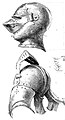
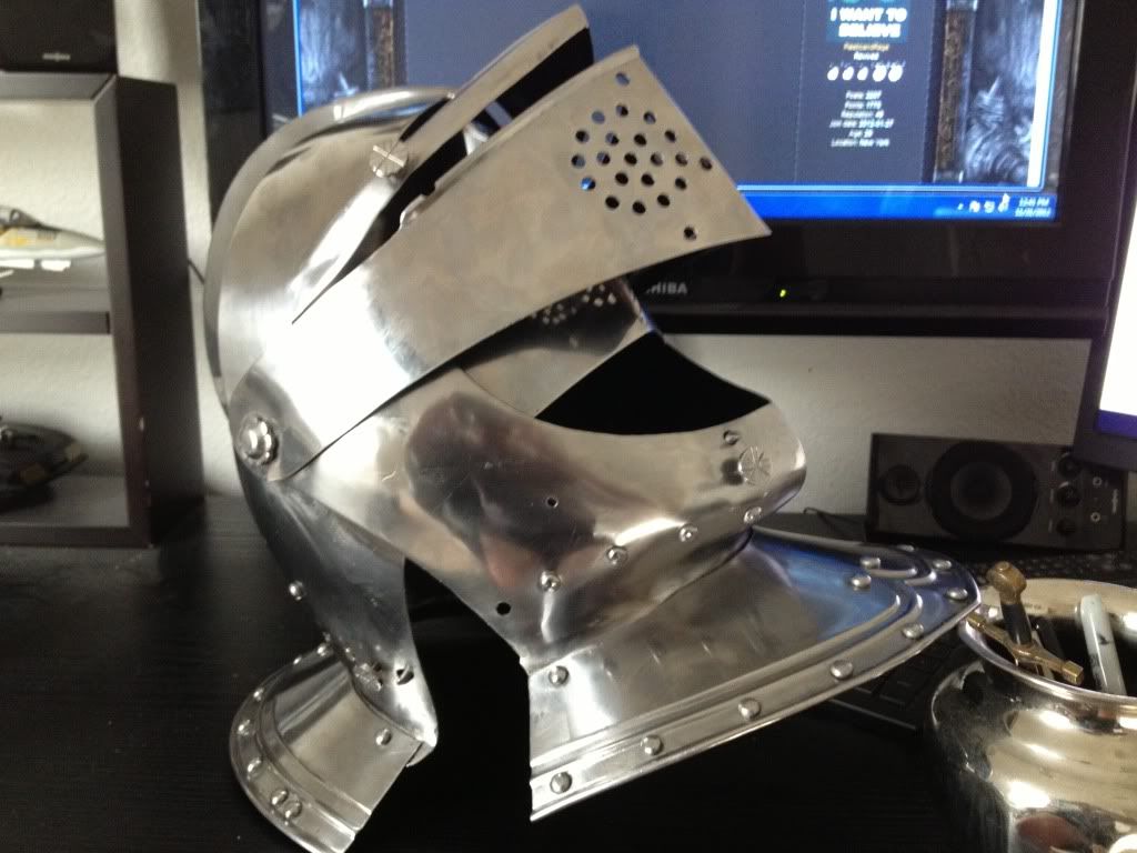
Open visored close helm and armet for functional comparison

 Done – Comparison of close helm and armet in open position. Note the close helm uses a single pivot point for the double visor and bevor, while the armet has hinged cheek plates that lock in place.
-
 Double-visored close helm with upper visor open (right helmet type, wrong position)
 -
 Double-visored sallet with visor open (wrong helmet type, right position)
 -
 Armet fully closed and fully open (bottom half is good for open armet)


Article(s): Armet and Close helmet
Request:
- The above images are more of a reference point than a direct request for vectorization. Here's what I want to do: I'd like to end up with a unified side-by-side comparison image showing a close helm (see first image above for an example) with the visor open and the bevor at least partially open (like this or like this one—see Cavalry helmet), put side-by-side with an open armet (see the lower half of the third image above for a good example of this). If simply cropping the lower half of the armet pictured above and vectorizing that is the easiest way to do the armet, that sounds good to me. The idea is that this side-by-side comparison would show the functional differences between an armet and a close helm, as these are superficially similar helmet types but their differences become apparent in the open position, and this comparative image could be added to both articles. Please let me know if this is feasible. -- Wilhelm Meis (☎ Diskuss | ✍ Beiträge) 21:05, 23 April 2013 (UTC)
Graphist opinion(s):
- Done Took a lot of time, but I figured it out myself. Wilhelm Meis (☎ Diskuss | ✍ Beiträge) 08:00, 13 May 2013 (UTC)
-
 Naval Ensign of Yugoslavia (1943–1949)
.svg)
Article(s): List of Yugoslav flags
Request:
- Changing proportions from 1:2 (actual) to 2:3 (as per source linked at file's description template) -- Nicola Romani (talk) 13:28, 12 May 2013 (UTC)
Graphist opinion(s):
- Done - maybe you could check if there are other errors in some of the flags found in en:List of Yugoslav flags. --Patrick87 (talk) 13:41, 12 May 2013 (UTC)
- Here [1] it seems there was a similar merchant marine flag, same 2:3 proportions as the flag above but no white anchor inside the star. --Nicola Romani (talk) 19:33, 12 May 2013 (UTC)
American Sign Language alphabet
-
 The American manual alphabet in photographs

.svg)
.svg)
.svg)
.svg)
Article(s): American Sign Language
Request:
- Please adjust the color balance and saturation of the individual images so that they all appear to be approximately the same color. Right now, several of them appear washed out, including the images for H, M, N, Q, R, S, and Y. Also please remove the final image for "I Love You" since it is not part of the ASL alphabet. -- Kaldari (talk) 23:14, 18 May 2013 (UTC)
Graphist opinion(s):