Request:
The simple request: Could someone please convert these to SVG?
The complex one: For a really superb job, you could also combine the vertical section and horizontal map into a single illustration (for instance, a box with a quarter removed to show a section). I'm happy to check this for accuracy, so don't worry if you aren't sure of the details.
Graphist opinion(s): Request taken by Goran tek-en (talk) 17:02, 17 April 2014 (UTC).
I will now start to work on the basic image and show you drafts as the work progresses so I will be back, thanks. --Goran tek-en (talk) 17:02, 17 April 2014 (UTC)[reply]
Build a graphic of the Southern Ocean and atmosphere above, combining the vertical and map sections, as in this graph of the Arctic. One vertical section should go through the Atlantic, and the other should go approximately through Tasmania, as in this graph.
Antarctic Coastal Current (counterclockwise around Antarctica, close to the coast, within the Antarctic Divergence). Label with the words "Antarctic Coastal Current, 8 Sverdrups". If this is too long, "EWD, 8 Sv", using the older term, East Wind Drift, would work.
Antarctic Circumpolar Current (clockwise around Antarctica, from the Antarctic Divergence to the Subtropical Convergence; spans the Subantarctic Front and Antarctic Convergence(=Antarctic polar front), as in graph). Label with the words "Antarctic Circumpolar Current, 100-150 Sverdrups". If this is too long, "WWD, 100-150 Sv", using the older term West Wind Drift, would work.
Please note that in the Tasman cross-section, the circles with dots in them mean that the flow is coming out of the page, and show the Antarctic Coastal Current. The circles with crosses across them mean that the flow is going into the page, and show the Antarctic Circumpolar current (imagine photographing a fletched arrow when it is pointing towards you or going away).
Oceanic fronts (lines on the surface where the properties of the sea water suddenly change; the map border between two water masses)
Antarctic Divergence: Hugs the coast, generally within 60S, except where it stretches out around the Ross and Weddell Gyres. Lies between the Antarctic Coastal Current and the Antarctic Circumpolar Current. Water upwells (rises) and diverges at the surface along this line.
The Polar Frontal Zone contains, for purposes of this illustration, two fronts:
Antarctic Convergence: Lies around 50S except in the Pacific, where it is closer to 60S. Along this line, water converges and downwells (sinks)
Subantarctic Front: Between the Antarctic Convergence and the Subtropical Front
Subtropical Front: North of this, you get subtropical waters
Antarctic Bottom Water: Forms near the coast, sinks along the underwater edge of Antarctica and spreads north into all three ocean basins
Circumpolar Deep Water: The big mass of water travelling around Antarctica, never comes to the surface. Upwells at the Antarctic Divergence.
North Atlantic Deep Water: Only shown in the Atlantic section. Comes *from* the north and turns into the Circumpolar Deep Water, never comes to the surface.
Antarctic Surface Water: Is at the surface between the Antarctic Divergence and the Antarctic Convergence. At the Antarctic Convergence, it downwells to make Antarctic Intermediate Water.
Antarctic Intermediate Water: Sinks at the Antarctic Convergence, travels north.
Circumpolar Surface Water: Is at the surface between the Antarctic Convergence and the Subantarctic Front. Sinks at the Antarctic Convergence, turns into Antarctic Intermediate Water.
Subantarctic Water: Is at the surface between the Subantarctic Front and the Subtropical Convergence. Sinks at the Subtropical Convergence and flows north.
Subtropical Water: North of the Subtropical Convergence, flowing southwards at the surface and northwards below.
There is disagreement between the two cross-sectional images here. On the [Tasman cross-section], Subantarctic Surface Water is at the surface between the Subtropical Front and the Subantarctic Front, with the Antarctic Intermediate Water touching the surface between the Subantarctic Front and the Antarctic Convergence. On the Hans Groeber crossection above (Antarctic_bottom_water_hg.png), Subantarctic Surface Water is at the surface between the Antarctic Convergence (labelled "Polar Front") and the Subtropical Front, with the Subantarctic Front as an unlabelled line separating nothing in particular. There seems to be active research and debate about the best way to categorise the water masses here, so I've arbitrarily picked a convention.
Winds
Probably too difficult to show, unfortunately.
Polar Cell: Air sinking over the poles and flowing outwards and westwards at ground level, down off the steep edge of Antarctica, and out as far as the Antarctic Divergence (~60S), then rising up and flowing back to the pole. The surface portion of this loop is called the Polar Easterly Winds.
Ferrel Cell: Air sinks at around 30S, travels southwards and eastwards until it hits the Polar Cell at the Antarctic Divergence. Then it rises and flow back north. The surface portion of this loop is called the Mid-latitude Westerly Winds
Ice
Ice mostly forms next to the continent, then gets blow way to the north, leaving space to freeze more ice. I will can look up exactly how far north the ice gets on average, but I think adding this line would make the map too cluttered.
Bathmetry
The sea floor should be shown in the cross-sections, so that the continental shelf is visible.
For the colourblindness: it strikes me that rather over 5% of Wikipedia editors must be colourblind (given the gender ratio). There is even a Template for it. What we really want is a tag that says "This content needs review by a variety of colourblind people", so editors can tell us what we are doing wrong. One that says "This content is not accessible to a colourblind person (details)" might also be useful. A quick search does not turn up any of these tools, but does turn up a colourblind admin, who has, in the past, requested this kind of help. Nyttend, would you help here? Do these tools sound like a good idea? Were I to ask you nicely in the subjunctive, would you be so kind as to tell me the best way in which they might be made? I do like your subjunctive mood user template.
The current flat map looks good. I really like the different types of dashed lines, and it's pleasant to look at.
I've been thinking about how to display the information better, and I have some simplifications which I think will work. Please let me know if you disagree.
Don't show the zones at all. Keep the different colours and use them for the water masses, which will be labelled in cross-section. This makes the colourblind-friendliness easier, since we can label them directly rather than on a legend.
Instead of showing them on the map view, we could show the currents as arrows sweeping through the cut-out section, from one cross-section to the other (I can send a sketch of this if you like).
I'm afraid that "ACC" seems to be the standard abbreviation for the Antarctic Circumpolar Current. I think your system makes more sense, but the convention clash will confuse people. Could we label the currents in full or using WWD/EWD as above?
Thank you for the amazingly quick reply. Sorry, the image in question is this one. The lines are different, but do the gyres show up as different-coloured areas? Is the text on the arrows legible? HLHJ (talk) 19:30, 29 June 2014 (UTC)[reply]
You're welcome; it's what you get if you ask me when I'm online :-) I doubt anyone will have color issues here, since it's all shades of blue as far as I can see; if you used purple in one place and blue in another, it doesn't affect interpretation, so don't worry about that. I didn't notice that the arrows were labelled until seeing your "Is the text..." question; could the labels be made black and/or white? Just not enough contrast. I'm not quite sure whether the gyros are the same colors as each other, let alone whether they're the same colors as the Polar Frontal Zone. However, this being ocean water, I'm going to assume that the waters in those three areas aren't magically in the same condition, so I think we can go safely without changing any colors aside from the arrow labels. Nyttend (talk) 20:11, 29 June 2014 (UTC)[reply]
Removed the labels for "Zones". I then also removed the corresponding colored areas in the map.
To some extend I think this will become more clear when we add the cross section and the different water masses. Yes if you can make me a sketch that would be very good.
"ACPC/ACC" It will be very hard to add them directly to the map and still make it easy to grasp both as an image and to read. So if you have better or more correct abbrevations I will use that.
Increased contrast on text in arrows. I think it would be very good if you edited the request because for me with zero knowledge there is way to much information. Just give me exactly what I need, thanks.
Hello, Goran tek-en
Thank you very much for all the work you've put into this. I've tried to abbreviate the text, above. Please let me know if there is anything else unclear.
Colours: I don't know why you took out the colours! I thought they were really good. I just suggested not putting the text labels on the zones. Could you put the colours back, please? I think it will really make the cross-sections clearer. I'm sorry for the bad communication.
"Antarctic Divergence": Sorry for the bad link. Your line looks fine. No problems.
"ACPC/ACC" How about WWD/EWD? (West Wind Drift/East Wind Drift?) It's old-fashioned, but short. Is there room on the map or the key to include their sizes (100-150 Sv or Sverdrups for the WWD, and 8 Sverdrups for the EWD)?
The darker text looks good, thank you.
I have drawn a rough sketch and will e-mail it to you within a minute or two.
HLHJ (talk) 15:48, 2 August 2014 (UTC)[reply] @HLHJ: Now I have recovered so much that I can continue to work on your request. It has been moved here to Archive but I can't see why we can't work here. I have gone thru the request and your last notes and have made two drafts (png versions of the svg) for you to look at:
flat is for you to check so we have the right flat map before we go isometric.
cut isometric is so you can check if this is the way you want it to look before I add the vertical stuff. The red line is as I have understood were you want the cut to be, is this correct? Is the placing of the cut right and do you want it to go straight thru the "zero" of south pool? --Goran tek-en (talk) 18:41, 14 November 2014 (UTC)[reply]
That's great, I'm really glad you're better, Goran tek-en. I'm also really impressed that you haven't lost interest!
On the flat map:
It looks good. The flat version is a useful image in its own right. If you'd like me to run it past an experienced oceanographer, I probably can, but it will be next week.
typo on one of the WWD arrows, says "EWD"
could the arrows be outlined in a somewhat darker black to make them more visible?
On the projection:
the cut position is fine. If you wanted to rotate it just enought ot run through the Weddell ice shelf, it would let you see the flow in the area under the ice shelf (which is interesting), but that is not necessary.
is there any way to take off the text (except the degree markers) and put it back on, orthogonally, after the projection? Such that the image will be easy to read and translate/relabel? Now we know what the labels will be, and have a well-labelled flat version, we could leave them off the projection until the final stage.
I don't understand what you mean by this exactly? *the cut position is fine. If you wanted to rotate it just enought to run through the Weddell ice shelf, it would let you see the flow in the area under the ice shelf (which is interesting), but that is not necessary. Can you download the "flat draft" flat draft, reload to get the last one and draw a line as you want the cut then I will put it there and rotate so the cut is facing orthogonally to the view direction if that is what you want. You can send me the image by email.
Hello, Goran tek-en. A line along the longitudes 5W and 175E would be good (a line along 15W and 165E would unfortunately cross some of the land at the edge of the Ross Sea; one along the latitudes 0 and 180 might cross the Ross Gyre). Does the bathymetric cross-section long this line clearly show the continental shelf? If not, 43W-137E might also work.
The side with the Antarctic Penninsula is more interesting, so the other side should be cut away, preferably.
Apologies for not mentioning this earlier, but for the flat map version it might be good to extend the map northwards for about ten degrees and show the tip of Africa. For the cross-section is doesn't matter, since Africa will be cut away.
HLHJ (talk) 21:50, 1 January 2015 (UTC)[reply]
@HLHJ: You can look at the flat map here with the last edits. It's a png just to view. The read line is the cut that you wanted so it's also just to show.
isometric map for you to check so that the cut is the right one. I got confused because your hand sketch cuts thru Australia but that is not the case with your last cut definition.
@Goran tek-en: I'm sorry. I didn't spot that the subtropical front would be hidden in the middle of New Zealand with this cross-section. The direction of the isometric view is good, but the cut is not good, because it will hide the subtropical front.
Options:
We could move the subtropical front south of New Zealand, because sometimes that's where it is.
I've done a bit of research, and I think it would be justifiable to draw the cut line along 0-180 degrees, and just draw the edge of the Ross Gyre a bit further east, so that the cut line does not touch the Ross Gyre. You can smooth out the edges of the gyres if you like; their exact position varies.
We could run the line through Australia like I did in the sketch, slicing through Tasmania and the Filchner Ice Shelf, east of Berkner Island (see map).
I think the first option is the most complicated, but pick the one you think is easiest for you.
The really important requirements are:
the cut line must go through the Atlantic
the cut line must go through the southwest Pacific
the sea floor along the line should show the continental shelf break clearly. I can't be absolutely sure that this will be clear until I see a cross-section bathymetry.
@HLHJ: Actually for me I think #1 is the best if that full files the rest of your wishes. Before I do the work with the cut again I just want you to check as good as you can on this flat map draft. I have moved the subtropical front south of New Zealand and put some blur to the gyres also. Check as good as you can and give me feedback before I continue, thanks. --Goran tek-en (talk) 19:51, 8 January 2015 (UTC)[reply]
@Goran tek-en: That looks good, as best I can tell. Artistically, it also looks very appealing. If you do the bathymetric profile along the cut line next, we can check that that works before you do the projection. Have you got data sources for the height of the ground surface and the ice surface? HLHJ (talk) 20:56, 8 January 2015 (UTC)[reply]
@HLHJ:Now there is a bathymetic draft for you to look at, it takes some time to load. This is what I think all the information you have given me means, but I'm not sure, I have no knowledge of this. When we later on does the projection there is some stuff I will have to change, arrows etc. I also have a profile of the icecap but I don't think I can fit that until we do the projection. So go ahead and give me feedback, anything goes, thanks. --Goran tek-en (talk) 19:57, 5 February 2015 (UTC)[reply]
@Goran tek-en: Sorry for the extremely slow reply. This looks good. I'd suggest four changes.
The into-page arrow in the middle of the Weddell gyre, at the top all by itself, should not be there; the gyre spins on the spot, like a carousel, but does not drift westwards.
The arrow showing AABW sinking to its right, north of the Weddell Gyre, is probably also not a good idea; I think AABW generally forms near the coasts.
The arrow near the bottom of the AABW and north of the Weddel Gyre can be plain horizontal, so it will show that the bottom water flows around the column of the gyre.
The deeper layers of water also flow around New Zealand and still exist at depth to the north of it.
Apart from that, I think it's a good schematic representation; I assume we're not really trying for an accurate vertical scale. Thank you again for your patience.HLHJ (talk) 19:06, 3 May 2015 (UTC)[reply]
@HLHJ: Good to hear from you, I wasn't sure if you still was around here.
Do you mean ABW or actually AABW as you write because I don't have anything named AABW?
I don't really understand your second change. I looked at your sketch again and to me it's there and also at the other side of Antarctic, but maybe I misunderstand. Look at this bathymetic draft and see if you want me to remove the red arrow. Otherwise give me new instructions both on this and the other changes I made.
For the vertical scale. If you want a true vertical scale you will have to give me measurements in relation to something else on the map. I have no idea what so ever how deep the water is there and if we can fit in all the arrows and stuff, get back to me. --Goran tek-en (talk) 13:49, 4 May 2015 (UTC)[reply]
Sorry, AABW=Antarctic Bottom Water. I didn't see that it was labelled "ABW" on the map. "AABW" would probably be better .
The water mass should not move. The red arrow should disappear, but the A(A)BW label should stay. The AABW is there, and on the other side of the Antarctic too, but it only sinks near the continent. Thank you making the arrow red.
Vertical scale much bigger than horizontal scale
The vertical scale would be a lot of work. It would have to be bigger than the horizontal scale, to leave enough space to draw arrows. Here is map data on the vertical scale, to use if you want to:
Thanks, I understand and see how I can use some of the data but not all of it. I will not try to make a true scale on the vertical, we show a process not a true exact thing if I'm not wrong.
I have tried to add the elevation of Antartic in this bathymetic draft and also the ice cape thickness. We don't have a ice cap cut like ours so I have to guess for some parts. Anyway give me feedback on this so we can continue. I have to add small portions so I don't do a lot of work which is wrong. The red line in the middle is just to show the cut for now. This illustration is a bit complicated, but interesting to try to accomplish something you can use. Get back to me, thanks. --Goran tek-en (talk) 19:40, 7 May 2015 (UTC)[reply]
Fair enough; a true bathymetry would be nice, but not essential, and someone can always make a new version if they need it. If you tell me what mapping package you're using, I can see if I can find a bathymetry dataset for it, but otherwise it would b a lot of work. The ice cap is about as tall as the ocean is deep; here is a [map with contours]. A rough horizontal and vertical scale legend, just to show how long a map kilometer is, would be good for the final version.
The water bodies all flow around New Zealand, continuing to the north. If you think that labelling water bodies north of New Zealand as well would make the map clearer, go ahead. Could you please label the Antarctic Intermediate Water? Apart from these minor issues, it looks good; I will run it past a couple of friends just to make sure I haven't made any stupid errors. Could you please check with a couple of people that the way the gyres move is clear to them from the graph? I think it is but I've seen people confused about it from other maps. Thank you, and sorry for my slowness to reply. HLHJ (talk) 12:42, 24 June 2015 (UTC)[reply]
I'm not using any "mapping package" at all, this is all made manually just following your information and the images you provide.
I will ad scale legends after the projection is done, but to me we have to different projections in this image;
First is the flat map which includes the icecap and there we only have a horizontal scale.
Secondly is the bathymetic part which actually holds both horizontal and vertical scale.
If this is not a correct understanding from my side, please tell me.
In the flat map I will have to add the height of the icecap by color in the legend, to my understanding.
You write "The water bodies all flow around New Zealand, continuing to the north", do you mean I should add arrows in the flat map? Otherwise you will have to explain it in more detail for me.
I haven't added the labeling and other stuff yet, I will have to wait until we have done the projection and have the final image. Same with scales and legend.
I now it's hard to make any illustration so that ALL people understand it, it's impossible. I think the movement of the gyres will be easier to understand ones we have done the projection.
I have labelled AAIW.
I will wait for your feedback that the bathymetic part is OK, then I will do the projection and the other stuff, so get back to me, thanks. --Goran tek-en (talk) 19:03, 24 June 2015 (UTC)[reply]
Hello again, Goran tek-en, sorry for the long hiatus. When I said "The water bodies all flow around New Zealand, continuing to the north", I meant that the area north/left of New Zealand is not all STW. Imagine New Zealand was not there. North of where New Zealand was, it would look like a mirror image of the other side of Antarctica. That is what it does look like; the existence of New Zealand doesn't make any difference to the water bodies you are drawing.
I didn't see this before, sorry. Circumpolar Deep Water should be CDW, not CCDW.
It sort of looks like the CSW flows southwards at the surface. Can you chop off the south-pointing arrow where it bends and goes down, and make the horizontal tail disappear, so that it's just a slightly bent little vertical line joining up with the other arrow? You can make the north-pointing CSW arrow a bit longer if you want to fill up the space.
One other change; you quite rightly show the AABW changing colour as you go down. Could you label the topmost part DSW ("Dense Shelf Water") and the bottom part AABW ("Antarctic bottom water")? I think this is better terminology than what I said at first.
The bathymetry looks mostly right. I think the only significant problem is that the continental shelves need to be wider. If you like, I will make a bathymetric/topographic profile along our cut line using QGIS, its profile plugin, and probably actually the ETOPO dataset. Then I can check your bathymetry, or even just post it for you to cut-and-paste if you want to. I will also try and check water mass dimensions; there's some new data sources on this. I probably won't do this right away, though. Don't worry about contour colours for the land; I think the map is good without any.
You are totally right; it's impossible to make an illustration so that all people understand it! I am probably worrying too much about making it exactly right. Even a version without exact bathymetry would be good, and a good contribution to Wikipedia; so if you want to make the shelves wider (maybe estimating depths from this map) and post, do it. We could always add bathymetry to a new version later. HLHJ (talk) 18:37, 10 December 2015 (UTC)[reply]
Dear Soman, it will be better if you use inkscape to handle these vector images (.svg file). Wikimedia prefer vector image rather than raster image. I can make black and white raster (.jpg) version of this image for you. But that will be similar as making a pull cart from Toyota car! --FreemesM(talk)10:26, 16 April 2014 (UTC)[reply]
I downloaded Inkscape, trying to blank it piece by piece, but I have the problem that shades of the old colors remain at the fringes of the borders. Also note that the borders of the 2009 map are no longer in effect, so I removed that image. --Soman (talk) 11:33, 16 April 2014 (UTC)[reply]
Dear Soman, I found this vector image in commons. Please check it- [1] It seems similar as your reference image, but has black background. I can remove the black background, will it meet your necessity? I have made a sample for you [2]. If it works, please let me know, I will upload it on wikimedia commons in .SVG format. Which you can easily edit by using Inkscape. You can check these too [3]--FreemesM(talk)05:03, 18 April 2014 (UTC)[reply]
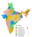
I've also discovered a German-language version of the map that you potentially intended to create. If that's what you wanted originally, we could just translate it and use that map. NikNakstalk - gallery12:50, 17 May 2014 (UTC)[reply]
Thanks! The German map is visually nice, but has some factual errors. There was no 'third front' in this election, so we can just change to three categories (NDA, UPA, Others). We could have a red colour for Left Front/Left Democratic Front (i.e. CPI(M), CPI and two LDF-supported independents in Kerala). 'Indian Nationalist Congress' should be changed to 'Nationalist Congress Party'. We could also have "Other UDF" in the UPA category (IUML, KC(M), RSP). And other NDA (including the Kokrajar seat, and PMK in Tamil Nadu). Or something like that. --Soman (talk) 13:11, 17 May 2014 (UTC)[reply]
I'm a little confused now, as I've just completed a request to create a "house composition" image here (I've also put it in the galelry) and that schematic still has a "third front" on it, although the map has now been updated to remove it. I don't really want to have two diagrams which should be pretty similar ending up with different keys! Perhaps you could discuss it with RaviC? I don't know anything really about Indian politics so I have no idea which of you is more correct! NikNakstalk - gallery13:37, 18 May 2014 (UTC)[reply]
The Third Front doesn't really exist right now, that's true. The legend I provided was just a slightly updated version of the previous legend used on house composition diagrams of the Lok Sabha, and it skipped my mind entirely. Now that the legend has been edited, I don't think there's anything else that needs to be done. --RaviC (talk) 16:09, 19 May 2014 (UTC)[reply]
As I said on your talk page, removing the Third Front means that the "Minority Parties" in red now have no meaning (as they're now in the same category as the grey "Independents and others" but in a different colour). The map also uses some marginally different colours for a few parties. Should we seek to include more parties here (perhaps we could have a cutoff of parties with less than 3, 5 or 7 seats, for instance) and then see how many are in the grey lump? The map uses a very light peachy colour instead of grey, also. NikNakstalk - gallery16:17, 19 May 2014 (UTC)[reply]
Thanks for letting me know about the inconsistency. The legend which I provided isn't mine - it's actually used by all of the other election diagrams, I updated it to try and make the previous diagrams comparable with this one. Unfortunately, the election map doesn't use the standard legend which all of the other diagrams are using here at the English Wikipedia. (I actually had a discussion with the author of this map about the fact that it doesn't show coalition minority partners - so is less accurate than this diagram)..
As a compromise, perhaps colour all of the unaligned parties with less than 3 seats in grey? (A few parties with seats above 3 may need new colours)
 Map of water bodies around Antarctica
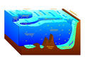 Cross-section of water bodies around Antarctica


 Question: Is my cut good? Before I start with the vertical stuff. --Goran tek-en (talk) 15:34, 5 January 2015 (UTC)


 Need a plain, black & white PNG version of this map
 German language map
 Seats composition


![[1]](https://commons.wikimedia.org/wiki/File:India_encoded.svg)
![[2]](http://i.imgur.com/v2YaAk9.png)