Wikipedia:Featured picture candidates/Campaign button


- Close-up for those who are interested
-
-


- Alts 1 (supplied for voting)
-

-


- Reason
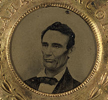
- The United States presidential election of 1860 saw the earliest use of candidate portraits on campaign buttons. This example is a two sided button with a tintype portrait of Abraham Lincoln on one side and a corresponding portrait of his running mate on the reverse. These images have not been restored due to use at the tintype article which compares the durability of this process to other photographic media of the period.
- Articles this image appears in
- United States presidential election, 1860, Political campaign, Tintype, Campaign button, Hannibal Hamlin
- Creator
- Matthew Brady, photographer
- Support as nominator --Durova322 18:44, 7 October 2009 (UTC)
Oppose crop: too tight; loses context. crops out substantial portions of the campaign button. Durova322 18:36, 10 October 2009 (UTC)- Not even being nominated. Papa Lima Whiskey (talk) 00:21, 11 October 2009 (UTC)
- Ah, okay then. Thanks for the supplementary edit. Durova322 01:04, 11 October 2009 (UTC)
- Not even being nominated. Papa Lima Whiskey (talk) 00:21, 11 October 2009 (UTC)
- Support Alt 1 For excellent quality and its obvious historic value. I have a couple questions though:
- How is this a button? Buttons that I know are one sided and have a clip on the back. And if this is what buttons were like then, can it be described in the caption how exactly it was displayed?
- What is the possibility of combining these two photos into one image?
- Is there a possibility of rephotographing the Lincoln one so that it is centered and straightened?
- (1) - Historically, campaign buttons were originally buttons that were sewn into clothing. (2) and (3) - Negligible. Durova322 02:15, 8 October 2009 (UTC)
- But that's not the case for this one. It has an obverse and a reverse, meaning it was meant to be flipped at will, something clothing buttons can't do. It almost looks like it's to be worn around the neck like a medallion. Also, who took the photos? That credit isn't mentioned. upstateNYer 04:11, 8 October 2009 (UTC)
- Comment Agree with UpstateNYer-- Brady may have taken the tintype, but the tintype only takes up a small percentage of the nominated photo. I'd be concerned about the license of the nominated photo. Spikebrennan (talk) 12:58, 8 October 2009 (UTC)
- But that's not the case for this one. It has an obverse and a reverse, meaning it was meant to be flipped at will, something clothing buttons can't do. It almost looks like it's to be worn around the neck like a medallion. Also, who took the photos? That credit isn't mentioned. upstateNYer 04:11, 8 October 2009 (UTC)
- (1) - Historically, campaign buttons were originally buttons that were sewn into clothing. (2) and (3) - Negligible. Durova322 02:15, 8 October 2009 (UTC)
- Comment, how much does the string (and large grey area around it) really aid the understanding of the reader? A closer crop around the button would definitely look better in the various article and be more focused on the topic it's illuminating (the person being depicted, the photography method, etc). The reduced pixel-count and file size of a crop would also help with loading times and make the image more accessible. Guest9999 (talk) 14:28, 8 October 2009 (UTC)
- Comment. I agree they need to be cropped. The string adds nothing to the images, IMO. Kaldari (talk) 19:50, 8 October 2009 (UTC)
- Response to comments The two-sided button and the manner of attachment were elements which I presumed would be understood without need for specific background, but apparently I erred when making that estimate. Here's a quote that gives the basics:
- "From the earliest days of the nation, political trinkets such as clothing buttons...were used during each campaign cycle. Inaugural clothing buttons were produced for George Washington. Campaign medals, often about the size of a quarter, could be drilled or 'holed,' attached to a string, and worn on a man’s lapel. With the expansion of photography in the mid-nineteenth century, ferrotype (an early type of photography) buttons were used. These were followed by cheaper, round, pin-backed buttons or shirt studs that had small photographs of candidates glued onto them. In the 1860 presidential race, this type of “button” was produced for Lincoln, Douglas, Bell, and Breckenridge, the major candidates of that pivotal election."[1]
- This was the oldest photographic button I was able to locate. There were also two photo buttons from the 1864 election which were historically interesting: one was a two sided button with a fragment of antique ribbon through the hole and another was an early stick pin button (which suffered from substantial corrosion). On balance, the encyclopedic value of the Lincoln/Hamlin button seemed greater because 1860 appears to have been the first year in which photographic campaign buttons were used.
- Per the bibliographic notes, these photographs were taken by Library of Congress staff and are US Government public domain. The button manufacturer is not named in the record but obviously passes PD-1923 by a wide margin. It would confuse viewers to composite these photographs, because that would create a misleading impression of two items rather than one. The string provides a visual suggestion of the way the item was worn. If someone really wants to crop and rotate I won't object, but it seems that a two-sided political button makes more sense with the context that the string provides--since people wear political buttons so differently now. Durova322 20:38, 8 October 2009 (UTC)
- Comment I think it would be good to complement each image with a version that shows the portrait portion in greater contrast, i.e. eliminate the dark beige cast on the original print/type. Could potentially be done with a crop, to help loading times. (And yes, I read your comment about the string - note that I'm suggesting an addition, not a replacement.) Papa Lima Whiskey (talk) 15:46, 9 October 2009 (UTC)
- "These images have not been restored due to use at the tintype article which compares the durability of this process to other photographic media of the period." Durova322 06:19, 10 October 2009 (UTC)
- So nothing speaks against providing an alternate version for those that might be interested in it? That's great news, Durova! Thank you. Papa Lima Whiskey (talk) 09:33, 10 October 2009 (UTC)
- "These images have not been restored due to use at the tintype article which compares the durability of this process to other photographic media of the period." Durova322 06:19, 10 October 2009 (UTC)
- Support Original or a less-tight crop than any yet provided only for EV and illustrative merits. They aren't great art, but they are the first or very early in a notable trend, and are ephemera from one of the United States' most important elections. Shoemaker's Holiday Over 213 FCs served 05:17, 10 October 2009 (UTC) [ETA: Crop's too tight. A bit of the string gives context. Weak Oppose Alt 1 Shoemaker's Holiday Over 213 FCs served 06:06, 16 October 2009 (UTC)]
- Support. High encyclopedic value in the articles they are used in. Mostlyharmless (talk) 07:45, 12 October 2009 (UTC)
- Comment. I support the originals. The string is not incidental to these items, and is part of their EV. Only weak support for the crops. Mostlyharmless (talk) 04:33, 15 October 2009 (UTC)
- Oppose I don't doubt the considerable EV but this needs to be presented better. The string is not relevant enough to require so much space and has created a very unbalanced composition in both cases, looking too cropped at the bottom. I'd also suggest the Lincoln side be selected for FP with the reverse (less well-defined, inferior image, etc) kept as a thumb on the description page for ref purposes. edit: I had this in mind. Better, I'd prefer the reverse to be inset into the shot of the front, obscuring some of the string; unusual, sure, but possibly a good solution to some of the concerns above. --mikaultalk 22:16, 14 October 2009 (UTC)
- Comment I'd like to see two alts. One is brightened, the other brightened and cropped. Nezzadar (speak) 01:57, 15 October 2009 (UTC)
- Okay, I've been working as hard as possible on Vauxhall Gardens (see thread below) but will interrupt that per request for an edit to these photos. Durova326 02:15, 15 October 2009 (UTC)
- Oppose per mikaul. Cacophony (talk) 03:23, 15 October 2009 (UTC)
- Weak Support Alts Ahh,I may never be happy. Crop might be a bit too tight, however I support the Alt. Nezzadar (speak) 04:02, 15 October 2009 (UTC)
- Support original. I think the string is important; if we're going to discuss a campaign button we should discuss everything about it, including its manner of being worn or attached to things. The string provides that context. --Ser Amantio di NicolaoChe dicono a Signa?Lo dicono a Signa. 20:12, 15 October 2009 (UTC)
- Comment Appreciating the cropped versions, but still not convinced we have good reason to promote both of these; I don't think we have a precedent for promoting the reverse side of any subject as a separate FP. The closest I can think of is the US Constitution FP which has the first page featured and the other pages (not featured) thumbnailed on its image description page. --mikaultalk 21:12, 15 October 2009 (UTC)
- That's ridiculous. Where there's a completely different photograph on each side, and seeing both sides is necessary to understand the object, it would be highly misleading to show only one side. furthermore, the other pages of the constitution are featured: File:Constitution_Pg2of4_AC.jpg File:Constitution_Pg3of4_AC.jpg File:Constitution_Pg4of4_AC.jpg. It's just Dustybot doesn't copy over the featured set announcement. Shoemaker's Holiday Over 213 FCs served 06:06, 16 October 2009 (UTC)
- What's ridiculous? Im clearly not arguing that the reverse be hidden, just questioning whether it need be promoted in order to feature the front. Also I don't see any mention of promotion of the other pages of the constitution document in the nomination; where was the featured set discussed if not there? mikaultalk 01:25, 17 October 2009 (UTC)
- If you look at the bottom of a file page, it'll list where it's linked. Wikipedia:Featured_picture_candidates/Original_Pages_of_U.S._Constitution is the correct nomination page. Shoemaker's Holiday Over 213 FCs served 02:06, 17 October 2009 (UTC)
- What's ridiculous? Im clearly not arguing that the reverse be hidden, just questioning whether it need be promoted in order to feature the front. Also I don't see any mention of promotion of the other pages of the constitution document in the nomination; where was the featured set discussed if not there? mikaultalk 01:25, 17 October 2009 (UTC)
- That's ridiculous. Where there's a completely different photograph on each side, and seeing both sides is necessary to understand the object, it would be highly misleading to show only one side. furthermore, the other pages of the constitution are featured: File:Constitution_Pg2of4_AC.jpg File:Constitution_Pg3of4_AC.jpg File:Constitution_Pg4of4_AC.jpg. It's just Dustybot doesn't copy over the featured set announcement. Shoemaker's Holiday Over 213 FCs served 06:06, 16 October 2009 (UTC)
Not promoted --Makeemlighter (talk) 06:29, 21 October 2009 (UTC)
- No consensus. +4 -2 for original, +2 -2.5 for alts. Makeemlighter (talk) 06:29, 21 October 2009 (UTC)