Anvil Cumulusnimbus cloud
edit |
 |
 |
I personally like Pano1. For interest I've also uploaded a timelapse of the cloud - but my videocamera hasn't got very good wide angle so it's not very good. See it here --Fir0002 04:19, 23 June 2006 (UTC)
- I agree, I like Pano 1. Both the depth of the clouds into the background and the color of the sky makes it superior, IMO. Staxringold talkcontribs 06:00, 23 June 2006 (UTC)
- Pano 2 More cloud, less sky. They're definitely cumulonimbus, right? :) Stevage 08:10, 23 June 2006 (UTC)
- Pano 1 is better than pano 2. The ground is less dark. Possibly trim the left side to remove the tree in the foreground. -- Chris 73 | Talk 20:38, 23 June 2006 (UTC)
Horse Racing
editTook this set of photos at the annual Tambo Valley Races. As usual they are not in an article yet. These ones are a bit borderline FPC quality, so feel free to say you don't think any are worth nominating.
 |
 |
 |
 |
 |
Personally like no. 5 the best --Fir0002 12:02, 30 July 2006 (UTC)
- I think number 1 would be my pick. I don't think it would do too badly on FPC. I say it's worth a shot. Raven4x4x 12:39, 30 July 2006 (UTC)
- Neither of them are great (especially with the washed out background). If any, 1 or 2 may stand a chance -- Chris 73 | Talk 13:15, 30 July 2006 (UTC)
- I like 1 and 2 very much. 3 doesn't really show the race, 4 obscures the back horse too much, and 5 is too blurry. 2 is good for showing the racing feel, 1 for showing the field. Staxringold talkcontribs 19:25, 30 July 2006 (UTC)
- I too think No 1 is the best. As Chris said the backgrounds look a bit washed out (I know by that time of year the hills/grass here do look pretty sorry, but these almost look like you've done something to the pic - perhaps its the contrast between the green of the track and the dead grass on the hills, I guess they water the track).
- I think No 2 and 3 and even 4 would suffer in FPC because of the sky (which is not visible in 1), and as Stax said, 3's not doing much at all. 5 I think would go down badly because of the blurred finishing post.
- Actually, having looked at it big I do like 1, if you could get that into the Horse Racing article or something like that. Not sure it would get through FPC, but it's very good, and possibly worth a try. --jjron 06:18, 31 July 2006 (UTC)
- Definitely number 1 is the strongest: you can see the *race* (as opposed to two participants), technical quality is excellent (no blurring). While it could have been even better (seeing some spectators, less tight cropping on the left side, a bit more scenery to specifically place the event), I would have no qualms supporting it for FP. Incidentally, you could crop to just the horse on the right of #2 and use it to illustrate gallop - all four hooves off the ground is a nice touch. :) Stevage 08:40, 31 July 2006 (UTC)
Yarra River by night
edit |
 |
 |
 |
 |
A couple of night shots of Melbourne I recently took which I like. The sky has the typical "red glow" of Melbourne by night, which is not ideal but unavoidable. I might try another time at twilight which may fix this.
Personal preference for No. 5 --Fir0002 11:25, 26 August 2006 (UTC)
- Frankly, I think none of them are really featureworthy. They are technically well made, but the subject just is not too thrilling or illustrative. Sorry. -- Chris 73 | Talk 11:46, 26 August 2006 (UTC)
- Nice to see you venture into the big smoke occasionally :) I guess none of them really grabs me either - I have a pretty big collection of similar photos of Lyon and other places myself. I've come to really dislike the effect of long exposures in urban environments, with the super saturated, unearthly colours, punctuated by bright, totally overexposed points of light - if you drop me a line at wiki@stevage.com I'll send you a couple of examples that I've taken. Artistically, I quite like 2/3 and 4 above, but they're not that "encyclopaedic". 5 is far too noisy (obviously because the exposure time was much shorter, maybe 0.25 secs?), and just not a good location imho - the trees which look so gorgeous in the daytime come out dull and ugly, and block most of the view of the skyline. However it's very interesting for me to see the Eureka tower, which when I left was still majorly under construction :) Stevage 11:58, 26 August 2006 (UTC)
- I kind of agree with the above. I think #2 is the best, but dunno how it will fare on FPC. Staxringold talkcontribs 12:02, 26 August 2006 (UTC)
- Ok thanks everyone for your frankness - I honestly appreciate it! I did fear that they were too much just "pretty photos". Ah well, can't always expect to get a shot both artistic and encyclopeadic :-) --Fir0002 12:16, 26 August 2006 (UTC)
- I have to agree - these ones aren't quite featured picture material. Raven4x4x 00:30, 27 August 2006 (UTC)
- Ok thanks everyone for your frankness - I honestly appreciate it! I did fear that they were too much just "pretty photos". Ah well, can't always expect to get a shot both artistic and encyclopeadic :-) --Fir0002 12:16, 26 August 2006 (UTC)
- Number 6 for me. The first pano has a wierd bent look about it. ViridaeTalk 14:02, 26 August 2006 (UTC)
- 1's nice, but I think the riverbank bends too much. Sadly 2 & 3 are spoiled by that ugly flag fencing they've sat there before you even focus on the pic itself. I find the lights too dominant and blurry on 6, while the buildings become lost. So, as with you, if I was going to nominate any of them, it would be 4 or 5, not sure which. The flag fence is still in both of them, but not as prominent as in the panos. --jjron 04:38, 27 August 2006 (UTC)
Sparrows
editQuite a small batch this time:
 |
 |
 |
Personal preference for no. 3 --Fir0002 10:05, 3 October 2006 (UTC)
- I like #3 as well, but I also like the background better on #2 (and not having those little yellow things at the bird's feet). Staxringold talkcontribs 11:02, 3 October 2006 (UTC)
- Preference for #2, even though the tail is out of focus, #3 has somewhat dull colors, and #1 has a not so good background. Not sure if they are indeed featureworthy. Best wishes, -- Chris 73 | Talk 16:32, 3 October 2006 (UTC)
- Clear preference for #2, much better distraction, and love the sharpness of the beak and crumbs thereon! Stevage 20:32, 3 October 2006 (UTC)
- Agree with #2, largely for background issues. I reckon it's worth a shot, perhaps after a bit of a tidy up. --jjron 14:59, 7 October 2006 (UTC)
- Looking at thumbs only, I choose # 2, but in full size, # 3. # 2 has a dirty beak which kills it for me. (Heh, I found your secret voting grounds... ;-) --Janke | Talk 08:13, 8 October 2006 (UTC)
- Thanks everyone, I went ahead and nominated #3 - if that fails I'll have a shot at #2 ;-) --Fir0002 08:36, 10 October 2006 (UTC)
Kangaroo and Joey
edit |
 |
 |
 |
Early morning shot which involved painstaking caution! This are wild animals and at the least provocation will hop off on you! So even with the 200mm on this lens, capturing them in this detail is pretty exceptional IMO.
Personal preference for #2 --Fir0002 08:36, 10 October 2006 (UTC)
- I think the background is quite distracting, but #1 is slightly better IMO. Staxringold talkcontribs 10:48, 10 October 2006 (UTC)
- My pref: Crop the second one so that only the Kangaroo w. baby is in it. The baby looking in our direction adds to the "cuteness factor". Otherwise go for #1, since the third 'roo in #2 is not really needed. -- Chris 73 | Talk 10:53, 10 October 2006 (UTC)
- Personally I like both of them (I know that isn't a helpful comment here!). Chris's suggestion is a good one. Raven4x4x 11:52, 10 October 2006 (UTC)
- #2 would make a better wall print, #1 (or #2 cropped) is better for Wikipedia. If nothing else, portrait orientiation fits into article flow better...Incidentally, what are they exactly, eastern greys? I thought at first they might be wallabies? Stevage 08:29, 11 October 2006 (UTC)
- To be honest I find the background distracting too, especially when you're listing them as 'wild' (I know they are wild, but that stuff makes it look a lot less wild). I like the pictures, but for mine the background distracts as FPCs, which is a shame. Oh, no else has said it, but I'm a little offput by the tail being lost in the long grass (it would have been really great to catch them just as they moved to start hopping when they lean forward and raise their tail).
- I know it's against the flow, but personally I like #2 better as it shows that kangaroos typically hang around in mobs, rather than individually (OK you would need a few more roos perhaps to really show that, but it does at least hint at it). Also that bit of foliage isn't in front of the joey's face in #2, the joey is more clearly in the pouch, and is looking our way. So if the pic is about 'Kangaroo & joey', the joey is a lot stronger in #2. Would however suggest a bit tighter crop to the left to take out that bit of bush. Re Stevage, they look like Eastern Greys to me. --jjron 07:31, 12 October 2006 (UTC)
- On first impressions I'd probably support #2 - the foliage in the foreground isn't ideal but it doesn't significantly obstruct the view. Aside from that minor issue, the composition is pretty strong in #2. Diliff | (Talk) (Contribs) 19:09, 14 October 2006 (UTC)
- Sorry for the delay, here's a cropped version of #2 --Fir0002 07:25, 15 October 2006 (UTC)
- Looks good, I think I'd still prefer the original #2 with the bush on the left cropped out. But isn't the kangaroo tilted by about 1 degree? ;-) Diliff | (Talk) (Contribs) 13:33, 17 October 2006 (UTC)
- ;-) - fortunately I have an alibi, the pic was taken on a slope! Added another edit with the bush cropped --Fir0002 09:50, 21 October 2006 (UTC)
- Looks good, I think I'd still prefer the original #2 with the bush on the left cropped out. But isn't the kangaroo tilted by about 1 degree? ;-) Diliff | (Talk) (Contribs) 13:33, 17 October 2006 (UTC)
- Sorry for the delay, here's a cropped version of #2 --Fir0002 07:25, 15 October 2006 (UTC)
- Given a choice I'd now say #3. Staxringold talkcontribs 12:55, 21 October 2006 (UTC)
- I think that the idea of cropping out the third kangaroo in #2 is best, but otherwise I like #3. NauticaShades 00:28, 22 October 2006 (UTC)
- Re the above - ummmm.....OK. Now, personally I still like the multiple roos, #4 now instead of #2 (the bush is gone and the picture also looks more balanced with a bit more space on the right). If you decide on the basis of what's been said here to go for a single roo with joey, #3 is better than #1. That background still worries me a bit though regardless. --jjron 09:37, 22 October 2006 (UTC)
- I like #3 best, because the kangaroo is looking at the camera, and the third kangaroo isn't there (it extends the picture too much). | AndonicO Talk | Sign Here 17:02, 29 December 2006 (UTC)
90 Mile beach
edit |
 |
 |
 |
 |
 |
Although they are really just generic "beach" shots, I think they convey the atmosphere quite well. Personal preference for #6 --Fir0002 21:42, 26 November 2006 (UTC)
- If you're using this as a generic image for a page like beach, then I'd vote for either #3 or 6 (I like 3 a lil' more). If it's for that particular beach, dunno if any display enough notable features to be FP quality. Staxringold talkcontribs 22:08, 26 November 2006 (UTC)
- Agree, we need a bit more context here. Nice windows wallpapers, but what do they illustrate exactly? Personally I find them all a bit boring except #02. Stevage 02:35, 28 November 2006 (UTC)
- Agree too. All I can see it illustrating is surf foam, perhaps. Pretty but not particularly useful for wikipedia. Diliff | (Talk) (Contribs) 09:23, 28 November 2006 (UTC)
- If you are illustrating the classic beach, then I think six would be best. NauticaShades 09:44, 2 December 2006 (UTC)
- As above, nice images, but not any particular good illustration for any article. Not sure if they are featureworthy. -- Chris 73 | Talk 20:43, 3 December 2006 (UTC)
- Have to agree that I think, while all nice, any would be seriously questioned on encyclopaedic value. My personal favourite is probably #2, which could be quite useful for 'tussock grass' (or whatever that grass is), and that is probably the one I would be most likely to support. Is there an article on surf foam or similar that some of the others could illustrate well? --jjron 09:53, 6 December 2006 (UTC)
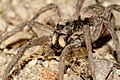
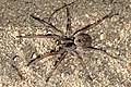
Wolf Spider
edit-
 No. 1
No. 1 -
 No. 2
No. 2 -
 No. 3
No. 3 -
 No. 4
No. 4 -
 No. 5
No. 5 -
 No. 6
No. 6 -
 No. 7
No. 7 -
 No. 8
No. 8 -
 No. 9
No. 9


A large series this time and all (IMO) are quite good which makes a choice hard. My personal favourite is No. 8 --Fir0002 05:52, 28 December 2006 (UTC)
- Tough one. I think the whole body pics won't pass due to depth of view (Sharpness). The other pics may have the problem that they do not show the whole spider. My personal preference would be #4, with an emphasis on visualizing the 8 (?) eyes rather than the whole spider. I think that has a chance for FP status. -- Chris 73 | Talk 08:06, 28 December 2006 (UTC)
- Yes, hard choice. I'd count out 6 (awkward angle, too strong camouflage), and 1 for similar reasons (although I do like the abdomen in full focus). For fairly similar shots, 3, 4, & 7, I think 4 is the best. If you add 9 to that mix, I'd still go for 4. I like 5, but think there's possibly too much out of focus. So that leaves 2, 4, & 8. I like 2, but it has some weakly distracting elements like the grass on the left. To be honest though, I can only split it and 8 on the background, and would probably give 8 a slight edge. 4 would be only if you want the close up of the head I guess. So overall, I'd go for a weak ordering: 8, 2, 4, 5, 7, 9, 1, 3, 6. Tricky! --jjron 12:47, 28 December 2006 (UTC)
- 8 is the best, given the busy background of the rest, but 6 and 5 are also pretty nice. I just dunno if they'll pass, given the combo of background and sharpness issues. Staxringold talkcontribs 18:37, 28 December 2006 (UTC)
- OK thanks everyone, think I'll try with no. 8 for illustrating wolf spider, and might try one of the closeups to illustrate the eyes and face of a spider --Fir0002 02:58, 31 December 2006 (UTC)
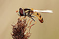
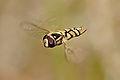
Hoverflies
edit-
 no. 1
no. 1 -
 no. 2
no. 2 -
 no. 3
no. 3 -
 no. 4
no. 4 -
 no. 5
no. 5 -
 no. 6
no. 6 -
 no. 7
no. 7


As mentioned in the nomination, Image:Hoverflies mating midair.jpg is really nice but perhpas not the ideal to illustrate the hoverfly article (it being a better illustration of insect reproduction). So I think one of these could be better suited to illustrate the hoverfly article.
Personal preference for no.1 --Fir0002 02:58, 31 December 2006 (UTC)
- Clear pref for Nr.1, followed by Nr. 3 -- Chris 73 | Talk 09:04, 31 December 2006 (UTC)
- I like 3 the best. 1 is really good, but not so fond of the extreme profile compared to 3. Don't really like the position of the shot in 2, 4 won't load on my computer, 5 doesn't really do it for me. 6 and 7 are 'wow' shots, but don't think they're quite as encyclopaedic as some of the others, esp with the midair mating shot already featured. Any chance of a species ID? --jjron 07:32, 1 January 2007 (UTC)
- 1, I think. Most seem to have some minor technical blemish like excessive sunlight reflection or an unattractive background. Great by mortal standards, good by fir0002 standards :) Stevage 04:00, 9 January 2007 (UTC)