Talk:State Arsenal (Providence, Rhode Island)
Latest comment: 2 years ago by Dr.Swag Lord, Ph.d in topic RfC: Gallery contents and formatting
| This article is rated Start-class on Wikipedia's content assessment scale. It is of interest to the following WikiProjects: | |||||||||||||||||||||||||||||||||||||||||||||||||||||||||||||||||||
| |||||||||||||||||||||||||||||||||||||||||||||||||||||||||||||||||||


RfC: Gallery contents and formatting edit
Which of these two contents and formats for this article's gallery is preferred?
Gallery #1 (in situ)
-
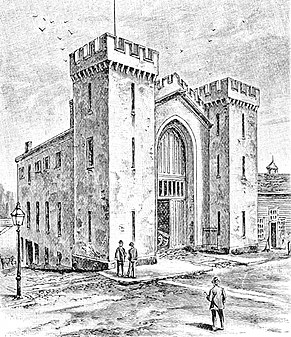
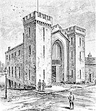 An 1888 engraving of the arsenal
 -
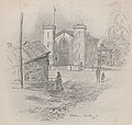
 A 1918 sketch of the building
 -
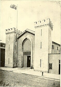
 A 1920 photograph of the arsenal


Gallery #2 (in situ)
-
 An 1888 engraving of the arsenal
 -
 A 1918 sketch of the building
 -
 A 1920 photograph of the arsenal

Beyond My Ken (talk) 02:07, 21 June 2021 (UTC)
- A neutral pointer to this discussion has been placed on the talk pages of the WikiProjects listed above. WP:CANVASSING of individual editors should be avoided. Beyond My Ken (talk) 02:12, 21 June 2021 (UTC)
Survey edit
- #1 - The version of the middle of the three images in Gallery #1 is easier for the reader to see, and all three images are better at the slightly larger size they are presented at in that gallery. Centering the gallery looks neater and more professional. The smaller postage-stamp size of Gallery #2 does the reader a disservice by being so small and cramped. Gallery #2 is at the default size, but, as per WP:Gallery:
- The default size of a gallery should be understood as simply the size that images are presented at if nothing else is specified, not as the preferred size of the images.
- We are given the capability of adjusting the size of images in the gallery for a reason, to better present them to the reader in a form that is easy to see and understand. Gallery #1 performs that task better than Gallery #2. Beyond My Ken (talk) 02:07, 21 June 2021 (UTC)
- I usually don't care for packed galleries, but I am fine with the alternate offered by MB, Gallery #3. Beyond My Ken (talk) 03:35, 21 June 2021 (UTC)
- #3 - looks best to me. MB 02:52, 21 June 2021 (UTC)
- #1 - I prefer No. 1 with a specified fix width. But the specified fixed height should be omitted per WP:IMGSIZE, imo. -Fnlayson (talk) 02:56, 21 June 2021 (UTC)
- The height is not fixed (note that the middle image is not as tall as the other two), the height parameter sets the maximum height with the width that's specified and the aspect ratio unchanged. Beyond My Ken (talk) 03:41, 21 June 2021 (UTC)
- #2 I do not really care about the alignment or using mode=packed so long as it looks good in the article. What I do care about is image size. #2 is slightly too small, but #2 is noticeably improperly large on my browser. ɱ (talk) 14:31, 21 June 2021 (UTC)
- #1 Yes, I agree with -Fnlayson Deathlibrarian (talk) 23:57, 21 June 2021 (UTC)
- #2 Filetime (talk) 18:33, 22 June 2021 (UTC)
- #3 Looks better. BristolTreeHouse (talk) 10:42, 23 June 2021 (UTC)
- #1 Preference on the first one. Sea Ane (talk) 21:16, 23 June 2021 (UTC)
- #1 The nature of the drawings/photograph in this case make the images hard to distinguish when they are made very small. The first options looks better and is more useful, the 2nd option might as well be linked text since you need to click on them to actually see anything. Also, it's not like this is some big, cluttered article. Option 1 looks good at the end of the article. PraiseVivec (talk) 11:29, 25 June 2021 (UTC)
- #3/3A The borders are unnecessary imo. Some1 (talk) 14:19, 1 July 2021 (UTC)
- #3 I generally prefer a packed gallery, especially if there are only a few photos. Dr. Swag Lord (talk) 22:23, 13 July 2021 (UTC)
Discussion edit
Gallery #3 (an alternate offered by MB)
-
 An 1888 engraving of the arsenal
 -
 A 1918 sketch of the building
 -
 A 1920 photograph of the arsenal
- This appears huge on my computer screen, way too improper a size for images on Wikipedia. ɱ (talk) 14:28, 21 June 2021 (UTC)
- Two points:
-
 An 1888 engraving of the arsenal
 -
 A 1918 sketch of the building
 -
 A 1920 photograph of the arsenal
- Beyond My Ken (talk) 23:22, 21 June 2021 (UTC)