Talk:Human/Image
Untitled edit
- Note: This page is for discussing and proposing new ideas regarding the lead image of Human. If you disagree with any of the points made here, feel free to modify or comment or expand upon them.

Some of the editors of the Human article feel that the current image used at the top of the article is sub-optimal; it is a placeholder image used more because it's relatively uncontroversial than because it's ideal. However, we should keep in mind the fact that there are better potential images to adorn the top of the article, and keep our eyes open should such an image ever arise.
In order to focus this long-term search, which can be either passive (just watching out for new images that are uploaded to the Commons) or active (going out and about and trying to take a suitable photograph oneself), we should agree on a set of ideal criteria for such an image. Although we will obviously always end up settling for a sub-optimal image, the more of these criteria an image meets, the better a choice it is for the top of the article. So, an absolutely ideal image for the top of Human would have the following characteristics:
- It would be a very high-quality color photograph, with nice use of framing and an eye-catching (but not disorienting) perspective.
- It would be more vertical than horizontal; an overly wide image is much more problematic than a long image because it will stretch the taxobox and interfere with the page's aesthetics and layout.
- Despite conveying as much important information as possible, it should, above all, not be crowded: simplicity and clarity is one of the most important elements of an informative and eye-catching photograph.
- It should be clearly focused on the human(s) in the shot, with as little as possible background or side-information.
- To facilitate this, the background should be relatively simple, and, preferably, it should be in an urban environment, not a countryside scene, so as to peripherally showcase human-made structures such as buildings in the background.
- It would have 1–3 people focused on in the shot, preferably an adult (35–65 years old) male and female human, accompanied by a male or female child (representing the basic family unit).
- It would depict the human(s) walking, not standing still or sitting or running, in order to demonstrate the typical, two-legged ambulation that characterizes humans and frees their arms for tool-using.
- Accordingly, there would be at least one hand-held tool or device being used by the humans, such as a cell phone. This would emphasize the important aspect of humans that they make constant usage of elaborate tools in day-to-day life, most often manipulated by their hands.
- At least one of the humans would be clearly talking, ideally with accompanying hand-gestures (like pointing off in the distance or making a motion emphasizing a point), in order to demonstrate human communication, another very important aspect of human society.
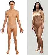
- All of the humans would be clothed, because that's how human beings are most commonly encountered: unclothed depictions should be used at the top of the "biology" section, in order to clearly depict their anatomy, but it is potentially misleading to use such an image as the lead image in the article: even though it is more anatomically informative to have a naked picture, it is less informative regarding human society and culture.
- It must be free-use, not fair-use.
This list should be used to give us a better general idea of what qualities to look for in images. An image doesn't have to meet all the requirements to be sufficient to replace the current pic, but it's certainly something to aim for.
Things the image should not be edit

- Hand-drawn: an illustration is necessarily more stylized and simplified than a photograph, and therefore less valuable as a source of information about what humans look like.
- Black-and-white: for the same reason, a color photograph is superior to a black-and-white one.
- Artsy: although such photographs may be beautiful, they are not as useful as straightforward ones, especially when they sacrifice informational content for style.
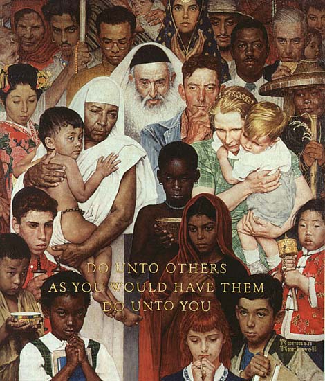
- Intended to represent every group of humans in existence: This is a practical impossibility, and a Neutrality nightmare. Which groups we choose to represent will reflect our biases, not just in that we will favor groups that are more like us, but in that we will try for an image that is diverse in ways that conform to our biases regarding what is important to emphasize. For example, if we try to find an image of every human race, that will just demonstrate Wikipedia's bias that race is one of the most important characteristics of human diversity; in reality, race is a relatively minor factor in human diversity. Likewise, if we try to include a lot of different human faces, it will demonstrate Wikipedia's bias that differences in facial features, rather than body types, is important.
- A collage or crowd shot: Such photographs raise the same neutrality problems as the above, in that we must justify why we chose the specific crowd we did, and why that crowd excludes certain groups. In contrast, simply providing a specific random example of humans, which is not meant to represent every major group of humans, sidesteps such NPOV disputes. Furthermore, such photographs are dramatically less useful or aesthetically pleasing, in that they will need to be shrunk so much that they will seem cluttered and have relatively little clear, important information on what individual humans look like.
- Symbolic or abstract: Attempts to symbolize, rather than directly depict, humanity are useless to readers trying to learn about mankind, and more likely to offend than simple providing a photograph of a human being.
- Fair-use: No matter how high-quality the image is, if it's not free-use, we can't make it the top image for such a high-profile Wikipedia article.
- Misleading or confusing: Above all, the image should not unnecessarily promote misconceptions or ambiguities about humanity.
Discussion edit
I made this page to centralize discussion about possible future images for the top of the Human article; feel free to provide feedback on criticism on the above statements. If you dispute any of the criteria, they may be removed. Also feel free, of course, to propose images that would make excellent replacements for the hand-drawn one above. -Silence 08:00, 26 January 2007 (UTC)
On retaining Pioneer plaque edit
- In my current opinion, the Pioneer image is more desirable for the infobox position of the Human article than would be any photograph that depicts specific humans. Nothing I have seen in the discussion convinces me that any photograph, whether clothed or naked, an individual or a group, would improve the article. The Pioneer image accurately portrays the overall physical form of humans in distinction to other animals, and simultaneously gestures to a significant event in human technology/culture which led to its creation. That latter purpose cannot be served by any photograph that happens to depict particular human individuals (even if that depiction has more anatomical detail than the engraving does). LotLE×talk 16:25, 13 October 2008 (UTC)
- For what it's worth, I disagree with LotLE. The article is about Homo sapiens, not about Pioneer 10 or spaceflight, which presumably are the second purpose you mention, and which have so far had little practical effect on the subject of the article, and no effect at all for most of its evolution. Nor is the article principally about art, if that is what you mean by "a significant event in human technology/culture". There is a certain ironic self-reflexivity in having any artistic depiction of humans there, since it is a human-created and human-reinterpreted image of particular human specimens, and the article asserts that only humans are capable of producing such an image. This reflexivity may make sense in a historical and artistic context such as Vincent van Gogh or even Stanley Spencer, illustrated by a self-portrait, but here is little more than a joke. Objections to the plaque arise from:
- it is an artistic representation, which is very uncommon for any species article, except for some anatomical drawings. As such, it does not allow fair comparison with other species, such as other apes.
- It is very poor as an artistic representation (at least in my opinion and I think of other people objecting to it). The plaque is a rough and hasty engraving, designed mostly to transmit astronomical information (not included on the cropped version) and give a sense of scale of humans against the craft carrying it (partly shown in the background but meaningless to most readers). Despite being intended for a potential extraterrestrial spectator, it uses non-universal line-drawing conventions and perspective. Indeed many readers who have never seen the plaque before may wonder what the image is, or the relevance to the article. And when I first saw it as a child, one thought was "what's that weird line on the blokes' chest? And do they both have moustaches?". It's not even a good depiction of sexual dimorphism (do all males have shorter hair and hold one hand up?). And finally, as any image must, it looks like particular individuals from a particular culture: it may partly be knowing the context, but it's hard to think of them as anything other than Americans of European extraction in the 1970s.
- A slightly obscure objection is that the SVG vector drawing currently, like many line drawings on Wikipedia, does not specify a light background colour. As such, it is invisible on reverse video (light-on-dark text), which is used for high visibility.
- So although the plaque may be appreciated as a refined commentary on writing an article about ourselves, a photo of any ordinary human individual or small group (or if none can be found, even an extraordinary individual like Einstein), devoid of irrelevant and distracting meanings, would be more relevant to and illustrative of the text of the article. --Cedderstk 14:08, 16 October 2008 (UTC)
- I guess my opinion of the Pioneer plaque image has been made clear by now. As well as the complaints that I have aired I also agree with the all of the above. I think it should go. Martin Hogbin (talk) 19:49, 16 October 2008 (UTC)
- This article is actually about humans but the proposals to date want to bias the article to only using photographs in the leader from one subspecies i.e. Homo sapiens sapiens rather than other (extinct) subspecies of Homo sapiens. We can't have the main photo show all species so what the current photo manages to do is highlight what the "sapiens" means in Homo sapiens sapiens. It is Latin for sapere (to know) and so the idea of Homo sapiens is that it is "thinking" (thinking man). Critical to this is tool use and more so the use of technology to inhabit new ecological niches is ultimately what divides us as a species from other species (who just crack open nuts with rocks). Given that the pioneer plaque is the furthest human-made object from this planet, the plaque is as good a representation of the sapien in Homo sapiens sapiens as any and will remain unique for many years yet. Ttiotsw (talk) 02:03, 17 October 2008 (UTC)
Criteria and ideal image edit
Thanks for putting together such an exhaustive set of criteria. In fact you almost suggest a complete specification: a group of three people on a street, one on a phone and the other adult playing with a young child, possibly pointing something out. This should be an easy enough image to produce and upload.
I would say positive criteria 5, 7 and 8 are pretty optional, and question whether a city background is better than a more rural one. In fact, given human history, there are arguments for people with both pre-agricultural and agricultural settings - however, we have representatives of these already. Walking casually or engaged in some manual activity or both would be good, rather than obviously posed or inert. With three people a mixture of skin colour would be possible, even if it's not necessary; it would also be possible to show both sitting and standing full-length poses. Reading a book could be the manual activity, or a collective learning activity would again have a self-reflexive (non-arbitrary) meaning that might appeal, referring to the idea of an encyclopaedia. --Cedderstk 14:34, 16 October 2008 (UTC)
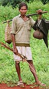
- FWIW, assuming this reaches consensus to use something photographic, I would recommend showing some form of technology which is more common to human history/evolution than a cell phone. For example, one of the figures could be holding a hoe, a water jar, a spear, or something else whose technology goes back thousands of years rather than tens of years. Likewise, a background structure could be something of longer duration, such as a straw building or a tent.
- I find Cedders' earlier points about the Pioneer etching as an artistic composition interesting, and somewhat compelling. However, a photograph is also an artistic composition, so it doesn't entirely avoid that reflexivity issue. Still, while I can't get offended or shocked by a slight absence of pubic hair in the etching (as another editor seems to be), I do recognize that the etching is a pretty stylized depiction where a photograph can be somewhat more "literal". LotLE×talk 16:43, 16 October 2008 (UTC)
I generally support the proposed criteria and agree with Cedders that 7 and 8 are relatively minor. Regarding 10 I think we need one thing or the other - either people clothed according to some relatively common culture or completely natural, with natural length head hair, pubic hair, and the man with a full beard. One criterion that I would add is honesty, the image should not be edited to reflect a particular cultural taboo, but I guess you already know my views on that.
Regarding the negative criteria, I agree with them all except perhaps 3. I think 4 is particularly important. To attempt to show all races and cultures in one image would be a recipe for disaster.Martin Hogbin (talk) 20:05, 16 October 2008 (UTC)
- Points:
- "The Pioneer image accurately portrays the overall physical form of humans in distinction to other animals" - Humans are not flat, black-and-white collections of lines. They have hair, not blob-like balls of goo, on their heads. They have eyes, not black ovals, and mouths, not small mustaches with lines underneath. Their heads are directly attached to their bodies, not separated by an arthropodal body segment at the top of the neck. They have body hair, fingernails, functional genitalia, and, in a surprisingly large number of day-to-day contexts, clothes and other cultural artifacts. You only see the drawings in question as humans because you already know what humans look like from actually seeing them, in all their photographic glory. You filter out the ambiguities and ignore the anomalies because of your own biases and expectations.
- "and simultaneously gestures to a significant event in human technology/culture which led to its creation" - By that logic, a photograph of Adolf Hitler at the top of Human would be inherently better than a photograph of a random person off the street, because Hitler is a culturally significant figure (and much, much more so than the Pioneer Plaque!). But our Human article is about neither nazism nor the Pioneer spacecraft.
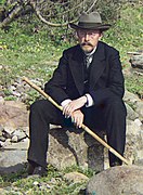
- "(or if none can be found, even an extraordinary individual like Einstein)" - Undesirable. Choosing any inherently noteworthy image, be it of Einstein, Hitler, or the Pioneer plaque, is too much of a distraction. It would be like if our photograph at the top of the Primate article was an image of George W. Bush: despite being completely accurate in that context, such an image, because of its connotations, would cause our readers much confusion and angst. (An image of a random, unspecified human on Primate would make much more sense.)
- "bias the article to only using photographs in the leader from one subspecies i.e. Homo sapiens sapiens rather than other (extinct) subspecies of Homo sapiens." - First, our human article is about modern humans, ergo Homo sapiens sapiens. "Homo sapiens" is for the most part just shorthand for "Homo sapiens sapiens" in this context. Second, all articles on Wikipedia that I know of which discuss a clade of extinct+extant species, use a photograph of an extant species to represent it. Third, if the overwhelming majority of all humans that have ever lived have been Homo sapiens sapiens, not Homo sapiens idaltu, then clearly it is not biased to choose the more common variant over the less common variant.
- "show all species so what the current photo manages to do is highlight what the "sapiens" means in Homo sapiens sapiens." - Homo sapiens is one species, silly. And the drawing (not photo) does not demonstrate any humans thinking. It just shows a crude human caricature.
- "Critical to this is tool use and more so the use of technology to inhabit new ecological niches is ultimately what divides us as a species from other species" - We have thousands of images on Wikimedia Commons which show humans utilizing technology and/or inhabiting ecological niches. This is not one of them. No technology or habitat whatsoever is depicted: the image features no cultural artifacts and its background is a featureless white void.
- "Given that the pioneer plaque is the furthest human-made object from this planet" - Arbitrary and useless criterion. Distance is not an indicator of informational value. Especially for the top of the article, which is specifically and exclusively intended to depict human beings, not to fail to depict human beings in order to show a really far away (and thus actually less relevant and important, not more relevant) artifact. Should we include an image of the largest purple man-made object on the planet? How about an image of the most porous man-made object on the planet? Who the hell cares about distance? If an object is so far away that humans no longer interact with it, that makes it much less significant to our article than, for example, the Great Wall or the Statue of Liberty, which are human creations which humans actually continue to interact with, not like some footnote of an interstellar time capsule.
- "I would recommend showing some form of technology which is more common to human history/evolution than a cell phone." - I don't think it much matters. This is the Human article, not the Human history article. Our first concern is how modern humans behave; how they have behaved in the past is a very important, but entirely secondary, concern. Only extinct species have history as their primary concern. For example: how many people in the world live in straw huts, as compared to stone or clay houses? This sort of question is more relevant, and more answerable, than a historical survey. (I think either could be acceptable, though.)
- "I find Cedders' earlier points about the Pioneer etching as an artistic composition interesting, and somewhat compelling." - Really? I thought it was pretty inane, to the extent than even Cedders didn't think it was an adequate defense of the drawing. Encyclopedias are not in the business of being cute or ironically self-referential. They are in the business of educating. A 5-year-old's doodle of a stick figure would have all the same virtues, and all the same vices, as the Pioneer plaque; if you think the plaque is compelling because it's a drawing by men of men, then the 5-year-old's doodle should be equally compelling. If not more so.
- "One criterion that I would add is honesty, the image should not be edited to reflect a particular cultural taboo" - I think the criterion should be "accuracy" or "educational content". What makes the Pioneer photo useless isn't that it's a filthy lie, it's that it's inaccurate and contains misinformation. Only completely candid photos are "honest", and essentially every photograph has an agenda behind it. What matters is that the message is not so palpable and distracting that it interferes with presenting relevant information.
- I am happy to accept that description of my point. Perhaps 'no disinformation' would be a way of putting it.
- "either people clothed according to some relatively common culture or completely natural" - Ironically, the imaginary "completely natural" human neither exists today, nor has probably ever existed in human history. The most "natural", uncivilized humans in the world tend also to be some of the tribes most prone to body modification and cultural artifacts, even if clothing happens not to be one of those artifacts. The impossibility of actually finding any human being existing outside of all cultures is the main reason I don't think we should bother trying, when any one culture would do just fine as long as it is not so unrepresentative as to seriously misinform. -Silence (talk) 06:04, 18 October 2008 (UTC)
- My point was actually along the lines that you make above. What seems really silly to me is to show humans naked but completely shaved and with typical western hairstyles. I think a beard on the man would be good; nearly all adult males naturally grow facial hair although I accept that it is common to shave it off in many present day cultures. Similarly pubic hair. Some trimming of head hair would be acceptable for me as it is almost universal. PLease not that I did not insist on a natural image a typical one is fine by me.Martin Hogbin (talk) 09:37, 18 October 2008 (UTC)
Audience edit
This may be more appropriate on the main talk page (in which case please move it) but it may help our thoughts on images to ask ourselves who the intended audience is (clearly not aliens) and what they would be trying to gain from the article. Martin Hogbin (talk) 08:22, 17 October 2008 (UTC)
- Part of our intended audience is people for whom English is not their native language. For such people, stating the obvious at times can be not only useful, but essential for comprehension. So there are practical, not just POV, reasons to be explicit about things which most humans (excepting the very young) presumably already know. -Silence (talk) 06:04, 18 October 2008 (UTC)
- I guess another audience might be the young, or others, who are studying the position and status of humans within the wider context of life on Earth.Martin Hogbin (talk) 11:19, 18 October 2008 (UTC)
Candidate images edit
Do we have a page of candidate images or should we start one here? It would be helpful to have something concrete to discuss, the more the merrier.Martin Hogbin (talk) 11:21, 18 October 2008 (UTC)
- There isn't one, but I'll gladly make one. I'll start with various images that have been proposed in the past on Talk:Human, plus three new images (3D, 4D, 5D) which I'll propose below; feel free to voice your opinions on any of them. -Silence (talk) 20:11, 19 October 2008 (UTC)
- I have added a couple. Martin Hogbin (talk) 21:28, 19 October 2008 (UTC)
-
 10-13-04 b
 -
 10-13-04 c
 -
 10-18-04
 -
10-19-04 a
-
 02-15-05 a
 -
02-15-05 b
-
 03-28-06
 -
 06-21-06 a
 -
 06-21-06 b
 -
 06-22-06
 -
 11-05-06
 -
 11-12-07 a
 -
 11-12-07 c
 -
 11-12-07 d
 -
 11-12-07 e
 -
11-12-07 f
-
 11-12-07 g
 -
 11-12-07 h
 -
 04-24-08
 -
09-29-09


Off-commons rejected images: 10-13-04 a, 10-13-04 d, 10-13-04 e, 10-13-04 f, 10-19-04 b, 10-19-04 c, 09-27-08
-
 02-15-03
Problems: censored; anatomically inaccurate; low information content; stylized; racial overtones; noteworthy subject; indirect relevance; symbolic; no technologies; no habitat; no color -
 10-26-04
Problems: no adult; no male; no full body; no color -
 10-12-05
Problems: low information content; stylized; no technologies; no habitat; cluttered -
 11-12-07 b
Problems: noteworthy subject; no female -
 10-05-08 a
Problems: no adult male -
 10-05-08 b
Problems: no color -
 10-16-08
Problems: low information content; stylized; no male; noteworthy subject; indirect relevance; symbolic -
 10-19-08 a
Problems: no adult male -
 10-19-08 b
Problems: no adult male -
 10-19-08 c
Problems: no color -
 10-20-08 c
Problems: — -
 04-04-09
Problems: no technologies; no habitat -
 08-04-09 a
Problems: no female -
 08-04-09 b
Problems: no adult male -
 08-04-09 c
Problems: no adult male -
 08-04-09 d
Problems: no technologies; no habitat; cluttered -
 08-04-09 e
Problems: — -
 08-06-09
Problems: low information content; stylized; noteworthy subject; indirect relevance; symbolic; confusing -
09-29-09
Problems: not free use; no full body; crowded; culturally nonrepresentative; sexually nonrepresentative; noteworthy subjects


Below are links to images from the web. There may be copyright issues but the might help us to decide what we are looking for. A group of clothed adults: http://www.upeace.org/images/fil07.jpg —Preceding unsigned comment added by Martin Hogbin (talk • contribs) 22:01, 19 October 2008 (UTC)
Also see the image in Two Virgins a natural image of two famous people, unfortunately unusable for copyright reasons
- True, a free-use image like Two Virgins would be a huge improvement over the Pioneer one. Though preferably it wouldn't feature celebrities, since that would distract from the article's subject for much the same reason the Pioneer image does. (Though that's the least of the plaque's problems.) -Silence (talk) 00:43, 4 August 2009 (UTC)
- Cropped the 4D image. Moved 7D to rejected (16R) because it's not free-use. -Silence (talk) 02:48, 20 October 2008 (UTC)
Collage edit
Why shouldn't humans have a collage of pictures just like the animals article ?!? —Preceding unsigned comment added by KgKris (talk • contribs)
- 'Animal' is an incredibly broad taxon (a Kingdom), and so very diverse that it would be nearly impossible to illustrate, with just one animal, the defining features shared by all animals. By comparison, 'human' is an extremely narrow biological grouping, and the common features of humans can be easily depicted in just one or two examples (whereas no image can depict their full range of diversity, so it's pointless to try); no species or subspecies article employs a collage. See Talk:Human/FAQdraft. -Silence (talk) 00:32, 1 October 2009 (UTC)
How about... edit
Han-Chinese are the most common ethnic group in the Homo Sapiens Sapiens species, Why not use a picture of a Han-Chinese family or cuople? How about use a picture like this
- Sounds fine to me. The image you linked, however, makes it impossible to actually see any humans clearly. Ideally we'd use one with at least as much anatomical information as the current one, rather than sacrificing quality purely for ethnographic reasons. -Silence (talk) 01:07, 4 October 2009 (UTC)
- Well i was thinking about a Nuclear Family with pre- & adult members of both Male & Female. --82.134.154.25 (talk) 11:17, 4 October 2009 (UTC)
- That would be fine too, but remember that our top priority is to show a human, clearly and distinctly; if we can show multiple ones without sacrificing anything, that's a great added bonus, but not if it means obscuring body parts or excluding important universal features like tool use or bipedalism. If we worry too much about showing multiple ages, we'll start getting complaints about not depicting any elderly people, or any infants, etc. -Silence (talk) 11:32, 4 October 2009 (UTC)
- Honestly I think the perfect place to use a suitable family would be under Human#Life_cycle; if we could somehow find high-quality, distinct, similarly-framed shots (ideally full-body) of a grandmother, a mother, and a daughter (or equivalently an age-differentiated sibling or cousin for either of the latter two), it would be a great way to isolate which particular features change over the different life stages of a given individual, whereas our current gallery leaves that unclear. (And it'd be much easier to find and photograph a multi-generational family than to acquire appropriate age-shifted photos of the same anonymous person, for both a male and a female.) -Silence (talk) 11:36, 4 October 2009 (UTC)
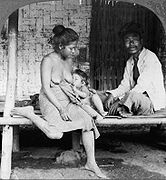
I like the current image, a couple of Thai country people, and I suggest titling it "Thai Gothic" after American Gothic. 192.12.88.7 (talk) 21:15, 23 February 2010 (UTC)
Simply the image of a human hand; fingers spread. An illustration will do. — Preceding unsigned comment added by 74.117.104.174 (talk) 18:03, 12 March 2018 (UTC)