This is an archive of past discussions. Do not edit the contents of this page. If you wish to start a new discussion or revive an old one, please do so on the current talk page.
Latest comment: 10 years ago2 comments1 person in discussion
The Nature article that's currently quoted as reference 2, seems to be somewhat selectively quoted. The current quotation is in italics, the concluding sentence of the abstract in bold:
Despite the continued increase in atmospheric greenhouse gas concentrations, the annual-mean global temperature has not risen in the twenty-first century, challenging the prevailing view that anthropogenic forcing causes climate warming. ... Our results show that the current hiatus is part of natural climate variability, tied specifically to a La-Niña-like decadal cooling. Although similar decadal hiatus events may occur in the future, the multi-decadal warming trend is very likely to continue with greenhouse gas increase.
The citation of the first sentence while not mentioning the last sentence doesn't really seem to accurately summarize the article. -- Bfigura(talk)03:31, 20 February 2014 (UTC)
Yes, but you ignored my comment below that that said, "The time will come when we start to get sensibly written secondary sources, that are firmly based in good science, published in sensible places. When that happens, I think it will be time to write a paragraph. If that grows, we can WP:SPLIT it out into its own article." I think that creating this tiny and ill-sourced article away over here at this time was a mistake. --Nigelj (talk) 10:38, 20 February 2014 (UTC)
I agree with both of you! In my opinion, Reedman72 (talk·contribs), it would be better to start building this in your user space as a Template:Userspace draft. You could certainly leave links at relevant talk pages to recruit any other interested eds to your userspace. But when the drafters feel it is ready to go live I also think it should be submitted for new article review. NewsAndEventsGuy (talk) 12:30, 20 February 2014 (UTC)
Agree with Nigelj and NAEG, this probably should be developed in a sandbox and then inserted Global warming. If it gets too big then it can be moved into its own article. Jinkinson let me know if you need help setting this up in a sandbox (add: I see that you are an experienced user so you probably don't need help with this, sorry). Regards. Gaba(talk)13:07, 20 February 2014 (UTC)
Either move to user talk then merge when ready, or move to global warming hiatus which is consistently used by reliable sources. . dave souza, talk19:52, 20 February 2014 (UTC)
Strip the other dates
Latest comment: 10 years ago2 comments2 people in discussion
To me, the stuff about all the other dates might be relevant to Global warming controversy but to me looks designed to make skeptics look like they are so inconsistent no one should be believe them. But the IPCC really does talk about a hiatus. I think we should strip all the stuff about other years, not try to make naysayers look foolish I disklike the label "skeptic" since all real scientists can be described as skeptical, in the best sense of the word, and focus instead on the science part of the "hiatus" that was mentioned by IPCC. Some of that science is discussed here. NewsAndEventsGuy (talk) 13:43, 20 February 2014 (UTC)
This comes from the article being a POV fork largely based on unreliable fringe sources: we should show them as such and not just hint that they're inconsistent. . dave souza, talk19:55, 20 February 2014 (UTC)
Fringe theories noticeboard
Latest comment: 10 years ago1 comment1 person in discussion
Latest comment: 10 years ago10 comments4 people in discussion
As the few reliable sources being used consistently call it a hiatus and not a pause, the article should be moved forthwith. Any objections? . . dave souza, talk19:55, 20 February 2014 (UTC)
e/c
:I don't care which one is the redir and which one is the article. Six = half dozen, and lots of RSs uses the "pause" version also. I officially have no objection to a change, and I am just as happy the way it is. Though I still think it is premature as an article and should become a user space draft while it matures a bit. NewsAndEventsGuy (talk) 20:13, 20 February 2014 (UTC)
The article seems rather short of reliable secondary sources, El Reg and the Daily Mail don't qualify, nor does an opinion piece by a contrarian in the Torygraph. The trouble with "pause" is that it's an increasing trend, not a pause:
"The observed global mean surface temperature (GMST) has shown a much smaller increasing linear trend over the past 15 years than over the past 30 to 60 years (Section 2.4.3, Figure 2.20, Table 2.7; Figure 9.8; Box 9.2 Figure 1a, c). Depending on the observational data set, the GMST trend over 1998–2012 is estimated to be around one-third to one-half of the trend over 1951–2012 (Section 2.4.3, Table 2.7; Box 9.2 Figure 1a, c). For example, in HadCRUT4 the trend is 0.04oC per decade over 1998–2012, compared to 0.11oC per decade over 1951–2012. The reduction in observed GMST trend is most marked in Northern Hemisphere winter (Section 2.4.3; Cohen et al., 2012). Even with this “hiatus” in GMST trend, the decade of the 2000s has been the warmest in the instrumental record of GMST (Section 2.4.3, Figure 2.19). Nevertheless, the occurrence of the hiatus in GMST trend during the past 15 years raises the two related questions of what has caused it and whether climate models are able to reproduce it." . . dave souza, talk20:54, 20 February 2014 (UTC)
Changed my mind (hence the strikeout above). Having gone back and studied more closely what IPCC AR5 WG1 had to say about the matter I agree this would be better moved to "Global warming hiatus" and "Global warming pause" should be converted into a redir. NewsAndEventsGuy (talk) 21:12, 25 February 2014 (UTC)
Latest comment: 10 years ago4 comments2 people in discussion
Can we import The Escalator graphic into Wikipedia to illustrate this article, while it exists separately here? I think it would be an ideal fit. I see that the image itself is a GIF, and that it "is licensed under a Creative Commons Attribution 3.0 Unported License." I don't know enough about all the rules, but does that not mean that a copy could be placed into Wikipedia (though not at Commons), and used here? --Nigelj (talk) 19:29, 25 February 2014 (UTC)
License looks ok, attribution required as usual, so that should be no problem. Probably a courtesy to let them know, but the license is irrevocable. Why not at Commons? . . dave souza, talk20:22, 25 February 2014 (UTC)
Support They also make a static image of the same thing available here, which works for color displays and non-color blind readers. ~~
It turns out that the smaller version of this file already existed on Commons. File:Escalator 2012 1024.gif That is a crap name as the 1024 pixel version was too big for Wikimedia software to render as a thumbnail, so it is actually the 500 px version. I'll try to get that file renamed, and my own upload of the 1024 version deleted over there. In the meantime, thanks for the support and suggestions here; I'll add it to this article now. --Nigelj (talk) 13:26, 26 February 2014 (UTC)
Regarding letting them know, does anyone here already have an account on Skeptical Science to drop them a link to the Commons file and to this page, for their info, to save me creating one just to do so? --Nigelj (talk) 14:13, 26 February 2014 (UTC)
volcanoes
Latest comment: 10 years ago13 comments8 people in discussion
Probably, yes. Here's some sources I've found about the issue: [1], [2], [3], [4]. Don't have time right now to go through them and add something to the article but anybody please feel free to do so. Regards. Gaba(talk)15:02, 26 February 2014 (UTC)
It's already there: "Other proposed causes of the decreased rate of warming over the past 15 years include increased sulfur emissions from volcanic activity..." Jinkinsontalk to me15:12, 26 February 2014 (UTC)
@Second Quantization, I disagree; there is no impediment to covering unfolding science stories and there is nothing inherently objectionable to newspapers just because they are newspapers. Michael Mann is quoted in the Scientific American article "Has global warming paused?" as saying "The problem isn't that we cannot explain the temporary slowdown in warming -- the problem is that there are so many explanations for it, we're not yet sure what the true role is for each". The date on the article was Nov 2013 and no date was given for Mann's remark. I don't know what he thinks of the papers that have come out the last few months. It is entirely appropriate to summarize the highlights of the various hypotheses and to the extent we have sources, cover the efforts being made to reconcile them. Volcanic sulphates in the stratosphere, as reported in "Volcanoes contribute to recent global warming 'hiatus'" at ScienceDaily, are definitely part of that unfolding scientific story. As for Newspapers' reliability, we can't just chuck the lot of 'em for science stories. We have to go through the thought process, with comparison to other sources, to assess questions of weight and undue. Its tedious, sure, and a one size fits all rule of thumb is an enticing - but fictional - prospect.NewsAndEventsGuy (talk) 11:10, 28 February 2014 (UTC)
My view is that none of this article is based on solid science; it's all a vox pop piece based on half-understood data and journalism from start to finish. As I said above, "The time will come when we start to get sensibly written secondary sources," but that time hasn't come yet. What we can't do is choose some popular press sources, but ban others. None of this is how science is done, but since the likes of Fox News are covering it, and so we have an article now, something has to be in it. --Nigelj (talk) 12:52, 28 February 2014 (UTC)
That's normal for a WP:FRINGE article. Just pick the most notable popular sources from each side, accurately report what those sources say without any spin or commentary, then report what is in peer-reviewed papers. The problem with these sort of articles is that nobody wants them to be encyclopedic or to have a neutral point of view. All we have to do is stick to the facts and avoid editorializing. Look at New Chronology (Fomenko) for one good example of this. --Guy Macon (talk) 16:53, 28 February 2014 (UTC)
I forgot to add in my prior comment that despite additional work I think this is still at a stage where it would be better hosted as a user space draft, and I somewhat agree with Nigelj's criticisms above. NewsAndEventsGuy (talk) 18:34, 28 February 2014 (UTC)
Gaba, if someone used the BBC and the Guardian in say, Blanketing effect, for deciding what paper was important to emphasise you would presumable remove the content as being insufficient for establishing weight (pick some other science article within your interests). Weight in those articles is decided by what the academic community in that area gives weight to. This is an article about a scientific subject, we should be sticking strictly to scientific sources. What the popular press decides to emphasise should have little impact on what we emphasise in scientific subjects. Also, the BBC and the Guardian are not always reliable, they are reliable for some things, not reliable for others (read WP:RS closely, you will see that reliability is always dependent on context) WP:NEWSORG. The article should stick strictly to the science, and perhaps have a paragraph highlighting the denialists (and refutations) if WP:ONEWAY is satisfied. Second Quantization (talk) 19:36, 28 February 2014 (UTC)
If I had read only the guardian's headline, I would have agreed entirely. However, the body of the Guardian article's text includes this Santer quote "This is a complex detective story,” said Benjamin Santer of the Lawrence Livermore National Laboratory in California, lead author of the study in the journal Nature Geoscience that gives the most detailed account yet of the cooling impact of volcanoes.
"'Volcanoes are part of the answer but there’s no factor that is solely responsible for the hiatus,' he told Reuters of the study by a team of US and Canadian experts."
That seems like a pretty accurate description of the professional lit of which I'm aware, and the measly newspaper rag was quoting one of the big names in climate science. So I still don't agree that wikipedia science articles have to chuck every source outside the professional literature, (which is what I think you're saying). NewsAndEventsGuy (talk) 20:09, 28 February 2014 (UTC)
Santer's statement to Reuters looks good, but someone with access should be referring to Santer, B. D.; Bonfils, C. L.; Painter, J. F.; Zelinka, M. D.; Mears, C.; Solomon, S.; Schmidt, G. A.; Fyfe, J. C.; Cole, J. N. S.; Nazarenko, L.; Taylor, K. E.; Wentz, F. J. (2014). "Volcanic contribution to decadal changes in tropospheric temperature". Nature Geoscience. 7 (3): 185. doi:10.1038/NGEO2098.. For the more established scientific consensus, AR5 TS 3 p. 62 notes "Furthermore, a series of small volcanic eruptions has increased the observed stratospheric aerosol loading after 2000, leading to an additional negative ERF linear- trend contribution of around –0.06 W m–2 per decade over 1998–2011" with caveats over satellite obs. We should be using AR5 as the scientific basis, and developing from that more recent research as well as evaluating popular accounts, including for example Volcanoes had small role in slower surface warming | Ars Technica. At the moment the article is too heavy on contrarian views, for example citing the notorious David Rose but failing to cite the actual Met Office paper. Time to structure the article, and ensure that due weight is given to mainstream views, including how fringe views have been received by the mainstream. . . dave souza, talk20:58, 28 February 2014 (UTC)
p.s. Looks like another paper covering volcanic as well as other influences: Schmidt, G. A.; Shindell, D. T.; Tsigaridis, K. (2014). "Reconciling warming trends". Nature Geoscience. 7 (3): 158. doi:10.1038/ngeo2105.. . . dave souza, talk21:12, 28 February 2014 (UTC)
It never rains but it pause
Latest comment: 10 years ago1 comment1 person in discussion
"Fifteen-year-long hiatus periods are common in both the observed and CMIP5 historical GMST time series", Box TS.3, AR5. . . . dave souza, talk06:19, 5 March 2014 (UTC)
"A pause in surface warming in the mid-20th century..... A pause in global warming since 2000—a global warming 'hiatus' ” abstract from Clement, A.; Dinezio, P. (2014). "The Tropical Pacific Ocean--Back in the Driver's Seat?". Science. 343 (6174): 976. doi:10.1126/science.1248115.. . dave souza, talk06:45, 5 March 2014 (UTC)
On repeated hiatuses, "temperature, they pointed out, had fallen for much longer periods twice in the past century or so, in 1880-1910 and again in 1945-75 (see chart)" with a figure attributed to the Met Office. It briefly outlines the contrarian views in its intro:
"This pause in warming has raised doubts in the public mind about climate change. A few sceptics say flatly that global warming has stopped. Others argue that scientists’ understanding of the climate is so flawed that their judgments about it cannot be accepted with any confidence. A convincing explanation of the pause therefore matters both to a proper understanding of the climate and to the credibility of climate science—and papers published over the past few weeks do their best to provide one."
Latest comment: 10 years ago57 comments9 people in discussion
== Elevator graph needs to go - misleading and strawman from blog and not scientific view of hiatus ==
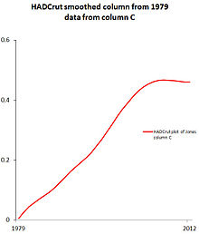
The graph has no sources stating how "skeptics" view data. It's a blog opinion piece. Nor is there any reason to believe this is a "skeptics" phenomenon as it's referenced in IPCC, Xie and other mainstream papers. None of the sources used for the hiatus is from skeptics so a graph that's titled with how skeptics view it is misleading. Graph should be done either as hadcrut does it with a 21 point binomial smoothing or a 5 year mean. Both show the hiatus that is addressed in the literature. Even Mann acknowledges the hiatus and I don't think he views the data as elevator to get there and unless there is some reason to believe this how scientists describe the hiatus it has to go. --DHeyward (talk) 15:52, 4 March 2014 (UTC)
None of this article is based on published science. We established above that it is a vox pop piece. --Nigelj (talk) 16:22, 4 March 2014 (UTC)
(smile) seriously, though, that elevator graph us not supported by any sources, unless there has been a definitive survey showing that these are, in fact, the views of "sceptics" and "realists". Nuke it and put in something that shows the facts without any POV. --17:23, 4 March 2014 (UTC)
Solution, import the RSs SkepSci cites, assuming they meet our RS standard. I think this is possible based on past experience.... I have looked up source data for several SkepSci graphics, and its always readily available from their site. If SkepSci provides links to what we would otherwise consider RSs for the graphic, then voila, we have sources and we can talk aobut improving the article by stating them at the page for the image file, and if ya'll feel necessary, here also. Last time I looked up our guidelines on point, it was OK to list RS on the file for the image, rather than repeating them everywhere the image is used. NewsAndEventsGuy (talk) 17:48, 4 March 2014 (UTC)
Xie and IPCC all refer to hiatus at 1998. Whatever data they used to conjure that up is what should be in the article. It's not hard to replicate the graph (global warming article did it). Usually its a binomial smoothing filter as hadcrut uses or it's a 5 year running mean (the difference is small but the binomial version is sourced). Neither of those sources used "skeptical science" blog graphs of an elevator or a straight line graph. It's pretty straightforward to recreate teh svg graph in Global Warming article. This article is about the mainstream view of the hiatus. Fringe elevator graphs are fringe. --DHeyward (talk) 18:11, 4 March 2014 (UTC)
The graph illustrates the mainstream view that there have been many periods where surface temps haven't risen as strongly as the trend, perhaps you've misunderstood Skeptical Science which opposes fringe views. . dave souza, talk18:33, 4 March 2014 (UTC)
That is a graph of a fringe view. Do you think the elevator view is not fringe? Do you thing the title "What sceptics think" has anything to do with this article? Do you think IPCC and Xie et al, used an elevator viewpoint to express the hiatus in their respective papers? Please elaborate why you wish to include a temperature graph of a fringe viewpoint and the relevance it has to the article which covers no fringe positions. Anyone can plot the data, drawing non-mathematical lines on it is fringe. --DHeyward (talk) 19:13, 4 March 2014 (UTC)
In my view, the article should
(A) define the scientific meaning of warming hiatus (called by some a "pause") using IPCC AR5 WG1 (as Dave inserted into the article a few days ago);
(B) address the specific hiatus discussed at some length by IPCC AR5 WG1 staring in 1998
(C) report on how skeptic/denier blogosphere have used variations on the theme with verbiage "paused"/"stopped"
I would be working on this somewhat in depth if I had the time now, which I don't. Nonetheless, if the skepsci sources qualify for import to the graphic image file as RSs, the graphic illustrates the difference between B and C better than any other graphic I know about, and it therefore makes a large article improvement NewsAndEventsGuy (talk) 19:31, 4 March 2014 (UTC)
Umm no. It makes no improvement if the only graphic is fringe data graph but there is no fringe viewpoints covered. Per WP:FRINGE. We have temperature graphs. They show what IPCC and Xie are talking about. (C) should barely be a footnote. It's widely accepted that a hiatus is occuring with various mainstream scientific conclusions. What does covering the blogosphere have to do with it? --DHeyward (talk) 19:40, 4 March 2014 (UTC)
Ummm, yes. This subject has (A) a science component and (B) a political-spin component. There are a l-----o------n------g list of RS for both aspects. To write only about one of them, and say nothing about the other at worst would suggest we're editing in favor of a POV, and at best would just mean we're lazy. NewsAndEventsGuy (talk) 20:49, 4 March 2014 (UTC)
I recreated the exact same graph. WMC reverted. "Elevator" is not a fringe source, it's a fringe view. Xie, Mann, IPCC, etc all identified the hiatus and none ever claimed it was noisy data. Look at the graph I created 1970 to 2014. 1970-2012 Same dates as elevator using the 5 year running mean that's on the GW page. Same reference period, same scale. --DHeyward (talk) 22:18, 4 March 2014 (UTC)
I might conclude differently after careful thought, but my off the cuff opinion is that both images are useful for the article outline I suggested. In addition, there is rich stuff for use here in the joint statement by US & British science academies. There quote that the slower rate of recent warming is temporary is more in line with the longterm trend in the skepsci graph (the red line) than the flat 5-year mean. NewsAndEventsGuy (talk) 22:53, 4 March 2014 (UTC)
Is there a source that says skeptics view temperature as the "elevator"? Most "realists" don't view it as a straight line linear regression whence the reason that realists say pauses are real and exist and why they use running averages/weighted averages and not straight lines. Both skeptics and climatologists are talking about the same GMST flat data over the same time period so I don't quite understand the argument (or sources) that skeptics see the data differently than Mann, Xie, IPCC, etc. They have different views on causes and therefore future trends but that's not the current hiatus that's being discussed. --DHeyward (talk) 23:04, 4 March 2014 (UTC)
I'm not sure what you mean. The skepticalscience graphic title on the chart for the "elevator" is "How skeptics view global warming". The linear plot morph title says "how realists view global warming". There is no source for that titling of the graph and is confusing when it says 'how skeptics view global warming' and then describes how IPCC and Xie see a flat line between 1998 and 2013. IPCC and Xie are not skeptics. In fact it's pretty clear that neither skeptics or realists have either of those views. --DHeyward (talk) 01:57, 5 March 2014 (UTC)
The escalator (not elevator) graphic illustrates well the point that "Fifteen-year-long hiatus periods are common in both the observed and CMIP5 historical GMST time series", from Box TS.3, AR5. The plot smoothed with a 5 year moving average shows how shorter averaging produces a deceptive result, as exploited by deniers. Both figures are useful, in context. The latter misses the TS.3 point that "During the 15-year period beginning in 1998, the ensemble of HadCRUT4 GMST trends lies below almost all model-simulated trends (Box TS.3, Figure 1a), whereas during the 15-year period ending in 1998, it lies above 93 out of 114 modelled trends", in other words an acceleration between 1983 and 1998 has been balanced by the deceleration between 1998 and 2013, coming back onto the longer term 30 year trend. Worth adding these lines to the second graph? . . . dave souza, talk06:34, 5 March 2014 (UTC)
I haven't seen other hiatus periods that are significant and relevant. Literature discusses the hiatus from 1998 until present. Every credible scientist acknowledges this. Within the next five to ten years GMST may change, but my graph is most significant withe same 5 year rolling rolling average. There is even a pretty color chart to shoe warminh months.— Preceding unsigned comment added by DHeyward (talk • contribs) 07:10, 5 March 2014
So you disagree with the IPCC AR5 and with Clement & DiNezio, for example? What incredible scientists are you citing? . . dave souza, talk10:59, 5 March 2014 (UTC)
I'm confuse because your responses are odd. The escalator graph does not show pauses of 15 year periods or highlight anything in IPCC. It's trying to show that skeptics aren't viewing the data as scientists view it, whence the two titles. 5 year running averages is the data that scientists use. 5 year running averages is what NASA publishes and is a proper smoothing of noisy data. It is certainly not a collection of short term trend lines which no scientist uses. The 5-year running average is the first chart in Global warming (from NASA). The timescale on the new chart was made to match the escalator graph and it uses the same noisy data (monthly data is noisy). A fifteen year hiatus is not present, except for the current one, in the interval chosen by skepticascience. The escalator graph is not making a case that there were other hiatus periods at all, he's making the case that skeptics view data differently and improperly. Xie, IPCC, etc, are all looking at the 5 year running average plot like the one I provided. It's the escalator graph properly smoothed, instead of multiple cherry picked start and end points. No scientist would draw a straight line from 1998 to present (or from 1970 to present). The plots of both are from measured datasets and have nothing to do with models running below the data and highlights nothing about model runs. Previous 15 year hiatus periods in the historic datasets before 1970 so they are not in either graph. --DHeyward (talk) 17:28, 5 March 2014 (UTC)
Chart by NASA using 5 year running mean. Same method as 1970-2014 chart I provided. It is not a skeptical view of data
The one graph is fine for scientists who know what they're looking at, the escalator graph is a very useful clarification for non-scientists of the issues of appearance of a hiatus in noisy data. The current hiatus of 15 years is still over too short a period to fully confirm a trend, given that 30 years is commonly cited, and the issue is more one of deviation from expectations based on models. Which has raised a number of complementary proposed explanations we should cover in the article. The public is exposed to unscientific arguments, such as the BBC giving "equal validity" to Nigel Lawson on the hiatus, so clear explanation is needed. The graph you've produced visually reinforces Lawson's misinformation, so it needs to be shown in context. The NASA graph is better, as it shows a longer period in which the "hiatus" is shown as not differing much from earlier noise. . . dave souza, talk21:29, 5 March 2014 (UTC)
This article is about the hiatus mentioned in IPCC, Mann, Xie, England, et al. It is not "appearance of a hiatus in noisy data." That's what's confusing. This is not a fringe theory article about how climate change has stopped. Covering it as "noisy data" is just wrong. The hiatus is simply an observation at this point. It became a scientific issue when decadally accurate models (CMIP5) weren't showing the response that is observed. It was enough to generate research and it's mentioned in IPCC This difference between simulated and observed trends could be caused by some combination of (a) internal climate variability, (b) missing or incorrect RF, and/or (c) model response error. These potential sources of the difference, which are not mutually exclusive, are assessed below, as is the cause of the observed GMST trend hiatus. {2.4.3, 9.3.2, 9.4.1; Box 9.2}" (page 62 of Full AR5 report). Where in this article is there a place for "What skeptics believe?" --DHeyward (talk) 22:00, 5 March 2014 (UTC)
What about "If you look at datasets that include the Arctic, it is clear that global temperatures are still increasing" as referenced in the article? What about if you include the warming of the deep ocean, as evidenced by smoothly continuing sea level rise? This article is precisely about the "appearance" of a hiatus in noisy and incomplete data. Trying to make it into something else is exactly what self-styled "skeptics" believe. However in Wikipedia coverage of a vox pop, media-generated story like this, we show all sides of the argument - including those that are wrong - but with due weight on the mainstream view, as it develops. --Nigelj (talk) 00:14, 6 March 2014 (UTC)
@DHeyward, this article is about pause/hiatus global warming verbiage, which includes, but is not limited to, what IPCC has said. We also have what others have said about what IPCC said, and we also have RSs about other ways people have used the verbiage, and we have RSs about the relevance of all of that as it relates to policy. I'm opposed to editorial restriction of article scope to editors' favored resected pieces of larger topics. NewsAndEventsGuy (talk) 00:21, 6 March 2014 (UTC)
My question still stands: how does the escalator graph that claims to show "How skeptics view global warming" and "How realists view global warming" has anything to do with the topic? I've never seen a skeptic draw lines like that on a graph. So I am at a loss as to it's value. The only hiatus claimed since 1970 by anyone/everyone is GMST trend since ~2000. It seems there is consensus on the measured data and disagreement on its meaning and significance. For Nigel, of course there are other datasets. Many of them. The standard metric for quite a while, though, for measuring Global Warming has been the GMST temperature measurements and that is pretty obvious based on the production and publication of that dataset. It's the first graph in Global warming. Whence the name Global warming hiatus. Are you suggesting there isn't a global warming hiatus because of noisy data? Is this a one-way theory or does it hide cooling too? If I drew escalators from low to high peaks and doubled the linear trend, and claimed that it was how green activists viewed the data, is that okay too? That makes the escalator graph entertaining but not accurate. --DHeyward (talk) 01:10, 6 March 2014 (UTC)
But I think NAEG and Nigelj are confusing "Global Warming hiatus" with "Climate change has stopped." That can be addressed in a different section to cover the vox pop aspects if that is what you are referring. Climate change continues despite pauses in GMST. There are limits to that but the current scientific consensus view is that the hiatus is not long enough, not that it isn't there or that the data is noisy or that it arises from escalator thinking of data. "pause" and "hiatus" are words that came from the science community. "stopped" is what comes from the skeptic community. --DHeyward (talk) 01:10, 6 March 2014 (UTC)
I've removed the image added by DHeyward since it only duplicates information already present in the better escalator image. Regards. Gaba(talk)03:06, 6 March 2014 (UTC)
You really look at those two charts and say it shows the same thing? The escalator graph shows contrived trend lines using cherrypicked points. The graph I added was a 5 year running average of the same monthly data as the escalator to show the data as a smoothed data set and no trendlines at all. Technically, in the escalator graph both skeptic and realist trend lines are cherry picked (the skeptic one is obvious, the "realist" line is harder to tell if it was regressed to a line but it seemed odd to end exactly on the last datapoint). 5 year running mean is the method and window nasa used and is the first graph in Global warming. The only thing similar is the underlying dataset starting at 1970 (> 40 years) and scale. I specifically chose the scale to illustrate smoothed data against the same data in the escalator. A more complicated filter might be able to ascertain inflection points and add trends but didn't seem necessary. What did you think was the same? --DHeyward (talk) 10:37, 6 March 2014 (UTC)
@DHeyward, please - PLEASE! - follow the RSs will ya'? It is the RSs that associate/confuse "hiatus" and "stopped". So we have a section to talk about that. Has anyone looked up SkepSci's sources for the blue lines on the escalator chart? Discussion of those sources would go in such a section, and maybe other stuff too NewsAndEventsGuy (talk) 06:04, 6 March 2014 (UTC)
What are you talking about? What reliable sources have said climate change has stopped (Hint: they are not reliable if they confuse it)? There are skeptics that claim it has stopped and scientists that say it hasn't. None of those arguments changed because of the hiatus. If you're talking about Gavin's RC post that cited articles about discussing the hiatus within media/public, I think you'll find that treating subjects and terms like this as "vox pop" is a big part of the problem. Articles that don't make a clear distinction between the meaning of "global warming" (which has always been expressed as rise of GMST) and "climate change" (which is the reaction of the climate to increased forcings). Both skeptics and scientists state that GMST has been relatively unchanged since ~2000. When a public source such as WP doesn't accurately reflect scientific language, it adds to the problem. It's the issue as what was discussed at Global warming. "vox pop" is the problem and continuing it in WP adds to confusion. I'll say it again: "hiatus" and "pause" are terms used by the scientific community, not skeptics. It doesn't make the article better by framing the hiatus as something imagined by skeptics and really isn't there when scientists are the ones using the phrase. Framing it as a hiatus with many possible scientific explanations, including issues with measurements, is useful. Continue on this "it's the skeptics!" track and it reinforces "vox pop" thinking that global warming = climate change and hiatus = stopped. --DHeyward (talk) 08:56, 6 March 2014 (UTC)
PS - I don't think there are any sources for skepticalscience's blue lines because it is mocking global warming skeptics. I'm surprised that's not obvious to everyone as it is a humorous graph. --DHeyward (talk) 08:56, 6 March 2014 (UTC)
Looks like we may need a graphic artist among us to look into modifying the graphic to comport to RSs
(A) ThumbsDown.... I found SkepSci's explanation for the blue lines. They are OR by a SkepSci reader. See the text below the figure in this SkepSci post
(B) ThumbsUp.... However, SkepSci does provide a start on sources where various skeptic claims are made. Follow the links of "Did global warming stop in 1998,1995,2002,2007, 2010?" (strikeout in original) especially the first paragraph here.
I agree we shouldn't be using the SkepSci graphic in its current form, thought the concept is good if someone can rework it and add to the image file the sources from whence the data came. NewsAndEventsGuy (talk) 12:27, 6 March 2014 (UTC)
...and the sources for any controversial captions. "Skeptical Science contributor Sphaerica says so" doesn't quite cut it. --Guy Macon (talk) 13:29, 6 March 2014 (UTC)
Interesting that he used this graph [5] as his basis considering the source (Christy and Spencer I believe provide that dataset). The title of his piece is also different than the point SkS is making in the text. The title is "Did global warming stop in..." but the article actually refutes claims of cooling over very short periods. There have been claims of cooling but it's more like guesses and wishful thinking along the same lines of guessing arctic ice extents. I haven't found anything numerical though or even widely held beliefs. SkS originally published the piece in 2008 or so but the wayback machine only goes to 2011 and I was hoping he had an original version that just said GW stopped. --DHeyward (talk) 13:38, 6 March 2014 (UTC)
Removing unsourced graph
I have been waiting for someone to address the fact that the "escalator" graph has no sources for the claim about "how skeptics view data". It is unsourced and I am going to remove it. If someone can show me a reliable source for that claim, I will gladly re-insert it and add the citation, but I hope that I am not about to see a blatant violation of WP:V. --Guy Macon (talk) 11:43, 6 March 2014 (UTC)
You also re-introduced the other graph which I had removed since it only duplicates information already available in this one. I've undone your removal of the escalator graph, the source is Skeptical Science. Given the discussion above and now this one, probably and RfC is needed. Regards. Gaba(talk)11:52, 6 March 2014 (UTC)
You just gave a link to a Wikipedia page when I asked for a source. For obvious reasons, you cannot use one Wikipedia page a a source for a claim on another Wikipedia page. Please read and follow WP:V and provide a reliable source that backs up the claim. --Guy Macon (talk) 11:59, 6 March 2014 (UTC)
@gaba, that's incorrect as I explained above. The graph I added with 5 year moving average has no trend lines at all, just smoothing. SkS has no smoothing, just trend lines. The similarities are the same underlying dataset (monthly temps) and the same X,Y scale. --DHeyward (talk) 12:44, 6 March 2014 (UTC)
Guy Macon I believe you did not understand what I said: the source is the siteSkeptical Science, not its WP page. If you believe this is not a WP:RS then please open a thread at WP:RSN and it can be discussed. Please don't remove the image again without consensus as per WP:BRD, thank you.
DHeyward the data is the same, having a smooth curve added or not is irrelevant. I believe the escalator image comes from a WP:RS and explains clearly an issue with how "skeptics" tend to see the variations. Your image is just a duplication of the underlying information and as I see it adds no value to the article. Regards. Gaba(talk)12:56, 6 March 2014 (UTC)
@gaba Actually, you cannot use a website as a reference either. You need to specify a particular page on that website and, if challenged, specify exactly where on the page you believe the claim was made. I do not believe that you have any source, reliable or unreliable, for "how skeptics view data". Please don't wave your hands and say "it is somewhere on the Skeptical Science blog". I need to read the actual words where the source makes the claim. This is all explained at WP:V. BTW, I also need to know this before posting to WP:RSN; they also insist on looking at the exact words of the citation and claim.
There at least two "better" sources than ScepSci - albeit both blog/op-ed/column posts under the Guardian's environment banner [6][7]... not exactly in the strong end of WP:RS - but certainly valid(/valuable?) in the opinion end of the RS spectrum. --Kim D. Petersen13:24, 6 March 2014 (UTC)
For reasons stated in the main thread, I agree the SkepSci image needs to be modified to comport with sources (at least some of which are at SkepSci link I posted) before we can use it. NewsAndEventsGuy (talk) 13:34, 6 March 2014 (UTC)
[Edit conflict] Good find! "Dana Nuccitelli, a blogger on environmentguardian.co.uk, says so" is a better source than "Skeptical Science contributor Sphaerica says so". There is a bio here. I still want to know what sources back up this editorial opinion, but at least I have a name. --Guy Macon (talk) 13:43, 6 March 2014 (UTC)
There's a couple problems with at least commentary on Andrew Neil. The first is he discounts hadCrut's method of smoothing, not Neil's. Second, he uses the escalator graph to highlight plateaus. That graph and SkS say the exact opposite of what Nuccitelli says. Namely, those are not real plateaus. They are artificially created by skeptics. The fact that smoothing eliminates them is a good thing, not bad. It's why smoothing is useful. I'm still shocked he said plateaus happen frequently from the same graph that SkS says is a skeptics view of data. I hope someone pointed that glaring error out to him. --DHeyward (talk) 13:56, 6 March 2014 (UTC)
The first part of what you say is simply nonsense. The graph shown by Andrew Neil was too smooth to be a hadCrut graph - and Neil himself said in during the interview "we've flattened it out a little bit"[8]. The source for their data is stated as "Hadley Center, met office" but it isn't a Hadley graph. --Kim D. Petersen16:35, 6 March 2014 (UTC)
It looks an awfully lot like this graph starting at 1980. [9]. I'll plot and see. It appears to be identical to the smoothed data column and graph from Phil Jones.Showing smooth graph from HadCrut4 in Jones paper vs. YouTube --DHeyward (talk) 18:33, 6 March 2014 (UTC)
Guy Macon the article source is right there in the image. I never said that trend lines and moving averages are the same thing, not sure where you got this from. I said the image by DHeyward adds no information of value to the image already presented by a WP:RS. Regards. Gaba(talk)13:34, 6 March 2014 (UTC)
Gaba, I think you're painting all SkepSci materials with a one-size-fits-all RS brush. I'm not anti-SkepSci, in fact I have reposted various of their well-sourced graphics here myself. However, since it is a WP:BLOG, anything we want to use has to independently meet an exception to the self-published rules. In the case of this graphic, original research by a blog reader (e.g., the blue lines) doesn't cut it. Further, the blog reader only found examples of decreases, depending on your number crunching. We have no evidence that the blog reader cited anyplace where skeptics make claims shown on the blue lines. Thus the image is original research by a blog reader, does not merit an exception to the self-published rules, and is unuseable in its present form. But it could be tweaked to match what skeptics have actually said..... NewsAndEventsGuy (talk) 13:43, 6 March 2014 (UTC)
Very well, seeing as I'm in the minority here and the consensus appears to be to remove the graph, then so be it. Cheers all. Gaba(talk)13:58, 6 March 2014 (UTC)
Fair enough. Instead, the NASA figure showing 1880 to the present (2013) illustrates well the robust rise in temps over the period, despite several 15 year hiatus periods, as described in AR5. . . dave souza, talk21:18, 6 March 2014 (UTC)
I am really glad that you added that. While the zoomed-in graph shows the hiatus well, it lacks the larger context that your addition gives. Good addition.
One small nitpick: one chart says "mean" while the other says "average". I suspect that they are both mean (why would anyone use the median in this context?) but whatever they are, they captions should use the same terminology. --Guy Macon (talk) 22:28, 6 March 2014 (UTC)
These are the same graphs as from global warming. One plots month;y averages, the other yearly. The 5-year running mean is obviously the same. Scales all match for easier comparison. --DHeyward (talk) 17:01, 7 March 2014 (UTC)
GISS data using yearly averageGISS data using monthly average
Why do we have new graphs? If the consensus is to show the GISS data, with a moving average, why re-draw it just for this article? In that case, I would prefer to see File:Global Temperature Anomaly.svg, as used on more than a dozen Wikipedia articles already. It is in a format that is maintained by NASA themselves, and it is SVG format, not JPEG, so it is not only more suited to showing graphic data per Commons guidelines, but the data is more easily verified against the NASA source, and it can be more easily extended when 2015 and further data become available. These are a number of points in its favour, why is it not in use here? --Nigelj (talk) 22:45, 13 March 2014 (UTC)
The only reason was scale and the escalator graph presented earlier which was misconstrued to imply multiple "hiatus". Graphs with the same scale are easier to view and compare. Also to show monthly vs. yearly data smoothed with a 5 year running mean. The 5 year running mean is always the same while monthly appears "noisier" than yearly for obvious reasons and refutes the argument that the hiatus is related to "noisy" data. --DHeyward (talk) 22:50, 14 March 2014 (UTC)
Import of record high temperatures
Latest comment: 10 years ago4 comments3 people in discussion
I had edited to fix this: "continuing record high temperatures" was given as another "means of measuring climate change". This is not a logically coherent statement. Continuing record high temperatures means continuing record high temperatures. It's another way of describing a flat line, or a pause. It is certainly not an alternative measure of climate change. Temperature is not an alternative measure of temperature.
That was the big problem. The others are similar. Sea level rise is not an argument against the pause, nor is ice melt. The melting point of ice is the same now as it was in 1990 -- the earth warmed enough to trigger ice melt, and since we haven't cooled it's still warm enough. Continued melting doesn't depend on new or current warming. The SciAm article is not a good source -- journal articles are better.
Someone reversed the edits. They even put "continuing record high temperatures" back in as another means of measuring climate change. We should have a higher standard than that. The article has a very defensive, biased tone, trying to argue against the pause or something. I realize this is a contentious topic, but the pause is pretty straightforward descriptive data -- favoring the consensus on AGW does not require anyone to deny or debunk the pause. BlueSingularity (talk) 09:01, 20 March 2014 (UTC)
Lacking any evidence that you read or understood what the cited sources say it's hard to take you seriously. Your welcome to articulate tangible reasons you disagree with the sources, citing your own RSs in support.NewsAndEventsGuy (talk) 09:47, 20 March 2014 (UTC)
Measuring temperature is one aspect of measuring climate, and therefore global warming, along with rainfall, wind strengths, growth rings on trees, ice cores and countless other measurements. Looking at record-breaking peaks, quantifying and comparing the frequency and severity of these, are yet other aspects. These are all part of the (apparently surprisingly confusing) relationship between weather and climate. --Nigelj (talk) 12:02, 20 March 2014 (UTC)
Have either of you addressed my point? The first was a logical point. "Continuuing record high temperatures" does not describe an increase or refute the pause -- it's another way of describing a pause. If someone wants to claim that (surface) temperatures are increasing, they should just say that temperatures are increasing, and cite a source. Otherwise, we should strike rhetorical evasions like "continuuing record high...". The second comment has nothing to do with my points, just described different measures of climate. I agree with all of it, but it has nothing to do with my points. The first comment "Lacking any evidence that you read or understood what the cited sources say it's hard to take you seriously." doesn't have any substantive meaning and is a violation of Wikipedia policy in its personal attack tone.
As of now, this article appears to have been hijacked by ideologues. Almost every sentence is geared around denying the pause, saying there is no pause, pretending that we know exactly where the heat went, betraying an oddly static and overconfident sense of how science works. We're just getting starting looking at the oceans and the article implies we already have all the answers. There are many, many scientists who unproblematically accept the pause. In fact, the last issue of Nature Geoscience is entirely devoted to the pause, which according to Wikipedia, does not exist (http://www.nature.com/ngeo/focus/slowdown-global-warm/index.html). (BlueSingularity (talk) 23:18, 19 April 2014 (UTC))
Head's up
Latest comment: 10 years ago2 comments1 person in discussion
Latest comment: 10 years ago3 comments2 people in discussion
The Bob Carter example given isn't a good choice. The original Carter op-ed is uncited & isn't available online. Thus we only have blogger Beck's criticism, and he's a dubious critic: "I have been blogging about climate change since 2006... ". And it's a bit of a strawman anyway, since Beck's op-ed is from 2006, early in the pause. Need to delete this one and try again. --Pete Tillman (talk) 16:43, 7 June 2014 (UTC)
Fair point, I've removed it. The main source for that section provided more useful information, which I've summarised. . dave souza, talk18:52, 7 June 2014 (UTC)
Better examples of the "global warming has stopped" bit
Thanks. Better examples of the "global warming has stopped" bit are given in Pause for thought, by Ed Hawkins, Tamsin Edwards & Doug McNeall: Nature Climate Change 4, 154–156 (2014) doi:10.1038/nclimate2150. Also see Edwards summary at Pause for thought:
"We believe the increase for ‘global warming stopped’ in early 2008 was driven by this New Statesman article and the peak in October 2012 m by this piece in the Mail Online. From March 2013, ‘global warming pause’ appears to have been popularised by another article in the Mail Online and one in The Economist. The peak in September 2013 is due to media coverage of the Summary for Policymakers IPCC Fifth Assessment Report Working Group I." (links at Pause for thought.)
New paper on Global warming hiatus says it is 19 years at surface and 16-26 years at the lower troposphere
Latest comment: 9 years ago6 comments3 people in discussion
Ross McKitrick has a new paper on this, at the Open Journal of Statistics: PDF. He says "I make the duration out to be 19 years at the surface and 16-26 years in the lower troposphere depending on the data set used." Interesting. We should have 3rd-party mentions to use in the article. --Pete Tillman (talk) 18:22, 1 September 2014 (UTC)
He is not widely respected, at all. Ross McKitrick's starting point is invariably the same:
God is unmistakably real
God is supremely intelligent
God designed everything, including planet Earth
Humankind are incapable of messing up God's design, therefore global warming is not real
McKitrick is not merely a signatory to the Cornwall Alliance's wacky declaration on global warming, he actually co-authored most of their material (along with Roy Spencer). When your starting point is always the same, so too is your end point. — TPX21:32, 1 September 2014 (UTC)
Latest comment: 9 years ago1 comment1 person in discussion
I found the article well-written and accurate, but it is not clear enough in stating that there has been no pause or hiatus in the human-caused warming of Earth; the anomalous warming has continued without a pause, and no climatologist thinks it has (the laws of physics prevent it from pausing). How can this fact be stated more clearly than the article does, without "dumbing down" the statement? --Desertphile (talk) 23:31, 9 September 2014 (UTC)
Effects of oceans
Latest comment: 9 years ago3 comments3 people in discussion
The whole of this article is about a fairly obscure edge of climate science. I would rather see the whole article go, as there is almost nothing worth saying to say about the topic. Having said that, if we are going to have an article about an ill-informed bit of media hype from the last few months, then we certainly must cover the tiny bits of published science that exist on the topic too. The sub-section in question makes a clear effort to say what it is based upon: "A study published on August 3, 2014 reported that..." and "Another study published later that month found evidence that..." In cases of media-driven recentism such as this, this is the best we can do, unfortunately. And actually it's really not that bad considering. --Nigelj (talk) 21:59, 30 August 2014 (UTC)
Latest comment: 9 years ago3 comments2 people in discussion
I just reverted an edit that made a point of adding to the lede that "it has been theorized that increasing heat may have been trapped in the oceans, at lower depths than previously thought," rather than "increasing heat had been trapped in the oceans, at lower depths than previously." Looking at the cited source, it says:
While the rate at which surface air temperatures are rising has slowed in recent years, heat continues to be trapped in the Earth system, mostly as increased ocean heat content. About 93 per cent of the excess heat trapped in the Earth system between 1971 and 2010 was taken up by the ocean. From around 1980 to 2000, the ocean gained about 50 zettajoules (1021 joules) of heat. Between 2000 and 2013, it added about three times that amount. Prior to 2000, most of the heat was trapped between the sea surface and a depth of 700 m. Since then, most of the heat has been stored at depths of 700 m to 2 000 m.
There is nothing there about 'being theorized.' If the other editor thinks that there is something suspicious about the World Meteorological Organization saying, unequivocally, that "From around 1980 to 2000, the ocean gained about 50 zettajoules (1021 joules) of heat. Between 2000 and 2013, it added about three times that amount," and "Since [2000], most of the heat has been stored at depths of 700 m to 2 000 m," then we need a WP:RS of similar or equal weight that explicitly calls these statements of theirs into question. --Nigelj (talk) 17:01, 11 September 2014 (UTC)
According to the sources, two papers were published in the same issue of Nature Climate Change this month, both from scientists at NASA's JPL. It would be remiss to cover one and not the other, and it is clunky to cover them as two separate issues. Authors from both papers have also made statements putting the two pieces of research into context with each other, which are well covered in the cited sources. I have tried to write an integrated paragraph that covers both of the pieces. I'm doing this despite the fact that Wikipedia is WP:NOT a day-by-day news source, and that usually disparate individual papers are not worth covering on any scientific topic before they have had a chance to be digested by the scientific community at large. I'm willing to go along with this less-than-ideal approach here because (a) this is a minor sub-article in a large and complex topic and (b) the madness of the ultra-right denialosphere in the USA is already talking utter nonsense about these papers - "The few odd headlines that did emphasize the second study (looking at you, Daily Caller) stick out like sore thumbs, as transparent attempts to cast doubt on the significance of man-made climate change."[11] - and some poor readers may be in need of some balanced coverage. --Nigelj (talk) 21:07, 11 October 2014 (UTC)


.gif)


![[5]](http://www.drroyspencer.com/wp-content/uploads/UAH_LT_1979_thru_February_2014_v5.png)

