This is an archive of past discussions about Evolution. Do not edit the contents of this page. If you wish to start a new discussion or revive an old one, please do so on the current talk page.
Latest comment: 17 years ago5 comments2 people in discussion
I propose that there be a "Robustness" section before even genetic drift as a mechanism of evolution. "Robustness" subsumes the concepts of redundancy and overlapping function, homeostasis, developmental homeostasis, canalization and niche reduction. Robustness enables evolvability.
"All living things are remarkably complex, yet their DNA is unstable, undergoing countless random mutations over generations. Despite this instability, most animals do not grow two heads or die, plants continue to thrive, and bacteria continue to divide. Robustness and Evolvability in Living Systems tackles this perplexing paradox. The book explores why genetic changes do not cause organisms to fail catastrophically and how evolution shapes organisms' robustness."[1]
"That physiological homeostasis is essentially the fundamental adaptation was recognized even before the term was coined, for, as Claude Bernard (quoted from Haldane,1932) stated three-quarters of a century ago, 'all the vital mechansms, varied as they are, have only one object, that of preserving constant the conditions of life in the internal environment'."[2]
"Homeostatic devices that stabilize an individual's reproductive performance have high selective value; the population benefits from having a heterogeneous genetic composition even beneath an apparently uniform phenotype. Thus Lerner emphasized the very great importance in evolution of "buffered and balanced genotypes, integrated genepools, and coadaptation.""[3]
"In a rapidly fluctuating environment, organisms evolve the flexibility to cope with variation within an individual lifetime; in moderately variable environments, populations evolve the ability to evolve rapidly; and in fairly constant environments, populations evolve robustness against the adverse effects of mutation.""When environmental fluctuations are rare, populations may experience extended epochs of directional selection and thus have sufficient time to achieve genetic robustness for any given state. Immediately following an environmental shift, however, such populations may pass through transitional periods of within-individual or between-generation plasticity before completely losing the previously favored phenotype in favor of a currently favored phenotype. This evolutionary transformation—from a trait that is acquired through phenotypic plasticity to a genetically determined version of the same trait—is known as the Baldwin Effect"[4]
"Many amphibian and reptile taxa experience dramatic shifts in their environment through development, essentially having to function in different niches. For instance, the komodo dragon (Varanus komodoensis) begins life as an arboreal predator of small insects, progressively moves onto larger insects, small vertebrates and eggs, then larger vertebrates and eventually fills a terrestrial large predator/scavenger niche (Auffenberg, 1981). Mutations providing a potential fitness advantage at any point along this continuum may be deleterious somewhere else during growth. This effect is less in mammals and birds because they typically feed their young until they can occupy the adult niche.""Compared with other vertebrates, mammals and birds are also notable for an increased emphasis on homeostasis, particularly endothermy (Ruben, 1995), so stabilising internal biochemical and physiological conditions. Both effects, reducing the range of niches during development and stabilising internal conditions, should enhance morphological evolvability. Indeed, while mammals and birds have diversified into widely different niches and morphologies from their ancestors that shared the planet with dinosaurs 65 million years ago, amphibians, turtles, lepidosaurs (snakes and lizards) and crocodilians typically have not (Benton, 1993). "[5][6]
"A mechanism for `evolvability'? We have provided what is, to our knowledge, the ®rst evidence for an explicit molecular mechanism that assists the process of evolutionary change in response to the environment. We suggest that in nature, transient decreases in Hsp90 levels resulting from its titration by stress-damaged proteins could uncover morphological variants for selection to act upon....Evolutionary models must encompass a dichotomy of stasis and change. Evolution exploits genetic differences between individuals in order to remodel developmental programs, yet development is generally robust to individual genetic differences and environmental perturbations. Theoretical models describe how developmental homeostasis is developed and why it is maintained, as well as how it could be disrupted so that evolutionary change can occur"[7][8]
The robustness mechanism that I think I had not appreciated before was niche reduction. The most exemplary of this is parental care. Think of all the mutations which are developmentally deleterious, yet can be tolerated because of parental care, and are advantageous to the adult. Think of all the mutations that made the human baby this slow, defenseless, sniveling, noisey predator attracting, relatively instinctless, large brained, empty headed little beast. Yet parental care allows that helpless large brain to develop into the most robust adaptation that evolution has yet devised. This was done through niche reduction. Mutations don't have to be developmentally stable in any niche other than that formed by the womb and parental care.
Robustness to mutation, and to the breaking of seemingly irreducable complexity appear to be the concepts that the ID adherants aren't familiar with, and which answers most of the issues they raise. --Africangenesis12:09, 15 May 2007 (UTC)
Interesting sources, this might fit best as a paragraph in the mutation section. Robustness does not change the allele frequency of populations, so it can't be classed as a mechanism of evolution. While "evolvability" would fit well with the discussion of the variation of bacterial mutation rates in response to stress. TimVickers16:59, 15 May 2007 (UTC)
I am not sure of the significance of this distinction, but I think it is clear that robustness, while technically not creating new alleles, is the key mechanism which allows their numbers to increase, e.g., "the population benefits from having a heterogeneous genetic composition even beneath an apparently uniform phenotype" Inherent in a lot of ID rhetoric is this idea that the well adapted organism is somehow perfect, so that any mutation must somehow be a deleterious deviation from that perfection. Robustness, not only protects fitness while harbouring a storehouse of alleles, but also protects evolution from ID perfectionist arguments. The enhanced evolvability enabled by robustness, may be evolution's most robust achievement. To paraphrase Jurrasic Park, "life has found a way".--Africangenesis17:21, 16 May 2007 (UTC)
Well, I'm just trying to think about where to put this in the article. I think it would go best in "Mutation" as it impacts the effects of mutations. It can't go in the "Evolutionary mechanisms" section as this only deals with processes that change allele frequencies. I suppose robustness and evolveability could be seen as outcomes of evolution, but we have many examples of adaptations already. TimVickers17:40, 16 May 2007 (UTC)
I'm thinking on it too. One thought I've had is the introduction, which currently is very sterile. Life and this characteristic robustness it has, is not even mentioned. Since this article has been noted as specific to the biological form, I think it would be entirely appropriate to mention life.--Africangenesis18:05, 16 May 2007 (UTC)
My revert
Latest comment: 17 years ago7 comments4 people in discussion
I just reverted Adam's deletion of "theory of." Look, there is always a close conntextion between theory and fact. Moreover, we all agree evolution is sometimes clearly a fact and sometimes clearly a theory. Adam thinks it is not clear what a theory is. Well, let's make it clear. And also let's be consistent. When we are talking about evolution as a fact (finches, hawthorne flies) let's just use the word "evolution." But it would only muddy the waters if we always and only used the word evolution alone. When we are talking about models of evolution and mechanisms of evolution we should be clear we are talking about the (or a ) theory of evolution. Darwin's arguments about evolution by natural selection is a theory, it really is. And it is a great theory! But whether you think it is a great theory or not, let's not hide that fact that it is a theory. Slrubenstein | Talk16:03, 15 May 2007 (UTC)
Hey Adam, do you know what it means when someone writes "see talk" in the edit summary? It means read a comment on the talk page explaining the edit. Do you see my explanation above? Obviously I thought your edit was wrong, but at least I paid you the courtesy of explaining why. Are you not capable of listening and responding to others? Slrubenstein | Talk16:14, 15 May 2007 (UTC)
I agree with Slrubenstein. Darwin didn't "put forth" evolution (which had been around long before Darwin). He expounded the theory of evolution - i.e. he proposed a way of making sense of the facts around him. It might be useful, however (less of a controversy-magnet), to delink the word "theory" in that sentence, and link its first occurrence in the History section. Snalwibma16:17, 15 May 2007 (UTC)
I agree with Slrubenstein. It's more confusing to use the word "evolution" when we mean two completely different things. Besides, we link to theory in the first sentence where the word is used, so anyone who doesn't know what it means can find out. I don't see the point of waiting until its second occurrence to link it; if anything, we might consider linking it both times, in case some people miss it.
The only accurate rephrasing for the sentence would be something like "put forth a model explaining evolution", but that would be less intelligible, simple, and accessible to readers, plus it would introduce confusing inconsistency: why is "theory" used everywhere else in the article, but not here? The implication is that "evolution" doesn't mean "evolutionary theory" here, when in fact it is supposed to. This is similar to the problem that arose when we tried to use "characteristic" in the first few sentences of the article, but "trait" for the rest of the page: it made the article more complicated by confusing readers about why we were jumping back and forth between terminology. -Silence16:29, 15 May 2007 (UTC)
Is it possible our defensiveness against using "Theory of Evolution" may be that certain individuals have used that descriptive as a pejorative against the reality of Evolution? The fact is that outside of our friends on the Creationist side, we would use Theory of Evolution to describe it. Orangemarlin01:50, 16 May 2007 (UTC)
I fully agree. Of course, we must take into account the reality of the situation: we're writing for laypeople, not scientists, and consequently we should, realistically, expect a lot of our readers to not know the scientific meaning of "theory". However, that doesn't mean we shouldn't use the word "theory"; it means we should be careful in how we use the word so as to make its meaning as clear and consistent as possible, and that we should link to its article so people can read up about it and clear up their misconceptions. -Silence02:06, 16 May 2007 (UTC)
I recall a few months ago we had to stand firm against renaming this article to "Theory of Evolution." As long as certain individuals have hijacked the word "theory" so that in laymen terms it appears that there's little science or thought behind this theory, we need to reaffirm that Evolution, as theories go, is about as close to a fact as you can get without having a time lapse camera that filmed the earth for 2 billion years give or take a billion. Orangemarlin23:13, 16 May 2007 (UTC)
Proposed new non-sterile introduction
Latest comment: 17 years ago11 comments5 people in discussion
For context see the discussion under robustness above. This is an initial cut at a replacement or prior placement ahead of the first few lines:
"Evolution is the process by which one or a few ancestral life forms became the diversity we see today and in the fossil record. Life's robustness in maintaining it'sits internal state and reproducing in the face of genetic mutation and external environmental change give it the property of evolvability."
I don't think "robustness" is the type of term one would expect as the title in a separate article. It is too nonspecific, and its use as a term of art in evolution is not generally familiar. Therefore I propose that both it and "evolvability" link to later sections in this article, where they are expanded upon a bit. This is just a first cut, suggestions are welcome.--Africangenesis18:32, 16 May 2007 (UTC)
I don't see "robustness" as any more important a requirement for evolvability than hereditary, variation, overfecundity and selection. Saying that something has the property of evolvability fails to define evolution. The lead should define what evolution actually is. TimVickers19:08, 16 May 2007 (UTC)
This seems incredibly useless. The purpose of the lead section is to explain basic concepts, not to unload lots of terminology on readers. Yet the new sentence doesn't seem to explain anything new to readers; it only serves to give new vocabulary to readers ("evolvability" and "robustness"), and not especially important vocabulary. Also, "it's" is ungrammatical; pronouns use apostrophes to denote contractions with "is", not to denote possession. ("His" is to "its" as "he's" is to "it's".) -Silence19:47, 16 May 2007 (UTC)
You're grammatical corrections are well taken. Robustness is not too far from its non-term-of-art meaning, and the context that follows its usage helps explain its meaning. Fortunately, the way the particular english language suffixes used in "evolvability", are generally understood not to change the meaning of their root, so the meaning is easily derivable and understood by most native english speakers when used in context such as this.
What is new to the readers is that life is very good at surviving mutation, so there is a way for mutations to persist, making evolution possible. You think most readers already know that?--Africangenesis20:28, 16 May 2007 (UTC)
I don't think people even know what "mutation" is at this point, or that mutation could be dangerous. You're putting too much detail in too early, and will inevitably confuse most readers by addressing a question they don't even yet know they're supposed to be asking. I'll agree that "evolvability" is easy enough to understand, but it's still a big word that will make people blink a few times and maybe have to reread the sentence to parse and comprehend it. For that reason, it's better to avoid it in the lead section, especially since it's not crucial. A sentence or two on it in the "Mutation" section would suffice. Besides, I'm not sure that mutation per se is what makes evolution possible: variation could still exist, and reproduction could still occur, without mutation, no? Mutation just helps make evolution so dynamic. -Silence21:08, 16 May 2007 (UTC)
I don't think we should list what is necessary for evolution before we define evolution. Articles begin by defining their subject. TimVickers21:23, 16 May 2007 (UTC)
"traits" and "generation" would appear to be far more amorphous concepts, even if correct. Somehow I suspect evolution is occurring even when the traits are not changing. We don't even have "life" in the current introduction, it is surprisingly sterile in this regard. I am not saying we have to delete the 6 sentence rambling introduction. Just delay it for two sentences. The first sentence I proposed, does define evolution.--Africangenesis22:44, 16 May 2007 (UTC)
No, it doesn't. Saying "Interminable discussion is a process that fills talk pages." does not define what interminable discussion actually is. It only tells you what its outcome is. :) TimVickers22:48, 16 May 2007 (UTC)
Interminable discussion isn't the ONLY process which fills talk pages, so that would be a rather unclear definition. Can you name another process which produces the diversity of life from one or a few ancesters than evolution? We don't have to completely describe the process in the first sentence. We can start by identifying it. --Africangenesis22:56, 16 May 2007 (UTC)
The proposed lead sentencedeals with higher-order consequences of evolution, not evolution itself. It might be alright for the section of the lead on common descent (though it does seem a bit more concerned with getting links in than conveying information by the end of it), but it's not suitable for evolution's definition. Adam Cuerdentalk23:28, 16 May 2007 (UTC)
Variation
Latest comment: 17 years ago5 comments3 people in discussion
Aye, but I couldn't find a good photographic depiction of variation at the species level, and that sketch seemed to illustrate it well. Adam Cuerdentalk04:01, 17 May 2007 (UTC)
If you can't find a good photographic depiction, then why add an image at all? The drawings are ridiculous, practically caricatures, and of no scientific value: they don't help people understand anything about evolution, beyond the (obvious) basic fact that not everyone looks exactly the same! Besides, ideally we should choose a non-human species, because everyone already knows that all people look different; what they may not realize is that all non-human species demonstrate (sometimes subtle) phenotypic variation as well. But I think the best image would be something that helps hammer home one of the many very difficult concepts that we discuss in "variation": we only have a limited amount of space to insert images, and every single one of them should help optimize readers' understanding of evolution. A diagram comparing phenotype and genotype, or clearly and non-technically showing how allele frequency varies, for example, would be more valuable than some silly picture showing something as trivial as the fact that not all humans have the same faces! -Silence04:36, 17 May 2007 (UTC)
Latest comment: 17 years ago1 comment1 person in discussion
This isn't exactly a huge dispute, but it's about a description of natural selection, so if anyone wanted to weigh in at Talk:Intelligent_design#Reversion, I'd appreciate it. I fear my views on it are abundantly clear over there, but I am willing to shut up if enough people disagree. =) Adam Cuerdentalk00:54, 17 May 2007 (UTC)
New lead image
Latest comment: 17 years ago51 comments10 people in discussion
Taking the comments above into account I generated this tree with genome sizes. This underscores humans "unexceptional" nature in evolutionary terms. In order to avoid the formatting issues noted earlier, I made a new template with no image. Comments? TimVickers22:24, 15 May 2007 (UTC)
Unfortunately, comprehensiveness does require small type. That is why I added the dots to mark two interesting organisms. As a way to get the best of both worlds, I've added a direct link to a high-resolution version. TimVickers02:07, 16 May 2007 (UTC)
It does look quite cool, but I strongly question its actual practical value. It's simply too small for any actual information to be parsed from it; even on full size it's almost impossible to read any of the text. It's simply too overstuffed with information to be appropriate for the top of the Evolution article, which should have a visually appealing, but useful, simple, and easy-to-understand diagram. Although I can understand the diagram (after looking very, very closely at it), I know enough to recognize that 99% of our readers won't.
I also strongly question the relevance of the genome-size comparison: size of genome is one of the least important indicators of evolutionary status. It's likely to be very misleading if we present genomic size as being of such overwhelming importance by highlighting it at the top of Evolution. My favorite ideas are still no image or the selection image (or a simple phylogenetic tree like the one in the evolution linkbox).
Also, don't put the top-level image above the disambiguation notices. That's been one of the major layout problems with the last few recommendations. Silence01:58, 16 May 2007 (UTC)
It's more accurate than the old tree of life (which clustered fungi with plants). I agree that a more readable one should be made for the whole tree, like this one but with most organisms removed -- not something obviously possible on their site. I wanted a tree to put into Genetics, so I made one using the Eukaryote branch of this tree. Eukaryote_tree.svg Ideally someone would make a simplified and accurate tree; until that happens, might as well use the one TimVickers has made.
Regarding genome size -- I think this term is deceptive, I was interested to note that it's based on the number of genes rather than sheer size (this tree is made of all fully sequenced genomes); it's true that sheer size is essentially irrelevant due to the amount of repetitive sequence in some genomes, the number of genes might also be questionable but seems interesting and a nice way to counter the "humans are the most complex" assumptions.
Is it really ok to use this image, btw? I'm wary of copyright issues, and this image is essentially the default tree that website creates. (My tree was traced over the lengths they provide, less problematic I think.) Madeleine14:45, 16 May 2007 (UTC)
I added genome size to counter the common idea that humans are the most "complex" organism. I know it does not indicate "evolutionary status" as there is no such thing. Complexity and ideas of progress are aspects of the article that is underdeveloped and is going to be covered in a new section on complexity (see above). This image covers many of the previous objections as it is not "linear" or "progressive" and shows something relevant to evolution. Moreover as it covers all the domains, it can't be seen as POV in any way. TimVickers02:13, 16 May 2007 (UTC)
Yeah, I tried that but it included dates of publication and number of domains in the figure as well. Looked like there was some kind of bug in their server. Strange. TimVickers03:31, 16 May 2007 (UTC)
As an alternative suggestion, I could just take the central unrooted tree and colour each branch to indicate bacteria, eukaryotes and archaea and remove any idea about labeling individual species. I'll have a go with this, see how it looks. TimVickers15:32, 16 May 2007 (UTC)
I like the information but the graphic is busy. Perhaps this image would be useful to discuss the C-value and G-value paradox i.e. the lack of a correspondece between genome size and complexity. That is why the total size of the genome is relevant as well as the number of genes. Perhaps a simpler image with more select examples would be more useful.GetAgrippa16:51, 16 May 2007 (UTC)
The colors look good (though I'm sure some people will be confused by the use of green, red, and blue elsewhere in the graphic), but I'm afraid that it's still completely useless: the phylogenetic tree is simply invisible at the size required by the Evolution page itself. And even if it wasn't, it lacks any helpful labels (Archaea, Bacteria, etc.) to make it of real value. The entire genome thing is clearly inappropriate for the top of Evolution: not only is it misleading (two people have noted that it is intended to dispel the myth that genome size correlates with complexity, but what it actually accomplishes is exactly the opposite of its intentions, since people looking at the chart won't understand what it's saying and will only be able to draw from it "genome size is crucially important for understanding evolution"), but it's also useless since we haven't even explained what a genome is by the top of the evolution article!
A phylogenetic tree might belong somewhere in the article (indeed, we already have one lower down on the page), but I honestly am becoming more and more convinced that it has no place at the top of the article, where we haven't even yet explained what evolution is. This is not the phylogenetics or the history of life article: it's the article on evolution.
Actually, I've got a completely new for what might be an excellent image to use at the top of this article. But I don't have time to explain it right now, as I've got a doctor's appointment; when I get back, I'll go into the details. It's a new diagram-like idea, but for explaining in general what evolution is, rather than trying to explain anything specific (e.g., natural selection, speciation, etc.). This would have much more actual practical value than any sort of abstract phylogenetic reconstruction, at the top of the page. -Silence17:18, 16 May 2007 (UTC)
The consensus seems to be (from the discussion above) that a phylogeny would be most appropriate for the article. I've cut off the genome sizes and removed the labels, which were too small to be read anyway. The new, new image is now shown. This discussion has been very constructive. Further comments? TimVickers17:31, 16 May 2007 (UTC)
A phylogenetic tree has been used at the top of the article for a long time in the past, yes: notice that it's the image that was in the "evolution" linkbox too, so it was already at the top of the article before your new proposals. Formerly, we had the larger version of the tree at the top, but that was moved to lower down on the article. In fact, if you check the history of this article, you'll find that I am the person who first added the tree to the top of this article, a few years ago! At the time, we had a really awful image at the top, so I provisionally proposed the tree as being a little more useful. And it stuck, if only because no one wanted to bother to come up with anything better, and because the linkbox discouraged trying to come up with a new article-topping image.
However, this situation has never been ideal: not only is it redundant to use a tree twice in the article, but there's no real point in having the tree so early in the article, before we've even explained the most basic aspects of evolution, like heredity and variation. People simply won't understand its significance at that stage, and are likely to either glance over it without comprehension, or, even worse, to misunderstand it and develop a misconception about what evolution is—e.g., the very common misconception that evolution is only macroevolution, or that it's purely a historical phenomenon. Those are both very real, very dangerous consequences of trying to top the Evolution article with a phylogenetic tree! This, combined with the lack of useful information the tree provides for people who don't understand anything about evolution and want to learn, gives us more than enough reason to consider good alternatives.
The alternative I'm proposing is: create a simple diagram which clearly demonstrates what evolution is. No more, no less. Without a grasp on the definition of evolution, the entire rest of the article becomes incoherent. Consequently, I can think of no better use for an article-heading image than to hammer home the meaning of "evolution", which, although we do a good job of explaining at the start of the page, is still such a tricky and obscure issue (especially considering the misconceptions and baggage most people associate with evolution) that I'm sure such an image, if done right, would enormously raise the amount of valuable information people take away from this article.
Specifically, I recommend that we illustrate the meaning of evolution by creating an illustration of three successive generations in a population: pick a fairly simple animal that would be easy to change in various ways (an insect, perhaps, or a rodent), make an easy-to-see black-and-white drawing of the animal, and copy that animal three times for each generation. So, we have a diagram of a simplified population (3 organisms large) at 3 different points in time. We then make each individual very slightly different from the other (demonstrating that individuals vary), and make each generation more noticeably different from the previous one. (Perhaps we could make the tails slightly shorter in each generation, for example.) This would be all we need to illustrate what evolution is (which we can state explicitly in the image's caption): "the change in a population's inherited traits".
We needn't specify whether the population is changing because of selective pressures, drift, or gene flow; indeed, if we want, we could re-use the image in the "mechanisms" section to show how each of those mechanisms could result in changes in the rodent/insect/whatever population we chose. It would be an enormously valuable educational tool, I think, and would greatly help with concretely grounding the topics being discussed; and once we've decided on the image's specifics, it wouldn't be hard to get one of Wikipedia's many talented artists to create it by submitting an image request.
One way I definitely think we could, and should, re-use the same image style would be in creating a new, simpler image for the "Speciation" section which just focuses on the basics of speciation rather than going into excess detail on the different kinds of speciation (many of which aren't widespread enough to be very noteworthy). We could easily use the same image of the insect or rodent or whatever, but this time have the second image be of the population splitting in half, and the third image showing the two separate populations having diverged from each other in various ways. (For example, one population may have grown longer tails while the other grew shorter tails.) I think this would be a fantastic way to simply and concretely illustrate speciation in that section. And all of that made possible, and easy, because of the simple evolution-illustrating image we could place at the top of the article. (Plus we could still use a pretty new phylogenetic tree image, and just have it replace the current large one we're using in the article body.) -Silence19:18, 16 May 2007 (UTC)
OK, why don't you do that and we can see what it looks like. That would be an excellent contribution you could make to the article. Myself, I'm happy with the current image, but if yours looks better and is clearer, it would be easy to change it over. TimVickers19:27, 16 May 2007 (UTC)
An example of what the lead image for Evolution should generally look like. Caption: "Evolution is the change in a population's inherited traits over time. Each individual is different, and evolution occurs when an inheritable difference becomes more common or rare in the population."
I neither have the time nor skill to create such an image, but I'd certainly be glad to create an example image, just to generally show what it could look like. Then we could discuss the details (e.g., what species to choose, in what ways to have the individuals vary, etc.). -Silence19:48, 16 May 2007 (UTC)
We should discuss what the image should specifically look like before I submit a request to Wikipedia:Requested pictures, lest we decide afterwards that we want something major changed (e.g., "using ants would be better than moths", or "how about we change ear shape rather than tail length", or "how about four mice instead of three", or "how about we make them brightly colored rather than black-and-white"). Here's an example of what the proposed image, very basically, could look like, just to give people an idea. I think an image like this would be infinitely more useful at the top of evolution than a phylogenetic tree; you need to understand what evolution is before you can understand the meaning and significance of our evolutionary history. -Silence20:24, 16 May 2007 (UTC)
Looks good, Adam. Thank you. Might it be better if you could modify it so that the fully white forms appear in the second round of mutation and reproduction? I know that is a bit rapid, but could be OK for of a simple introduction. See below, right. TimVickers20:27, 16 May 2007 (UTC)
Adam's doesn't really work for the lead section. It's too long and complicated. We should focus on just clearly explaining what evolution is first and foremost, in the lead image: inheritable variations becoming more or less common in a population over time. Evolution is not mutation; evolution is not speciation; and evolution is not natural selection. By making the image simply an illustration of evolution at its most basic, we give the rest of the article its stable, simple, easy-to-understand foundation. Without that very basic foundation, the rest of the article can't stand, as people won't even grasp what evolution is.
However, I really like some of the ideas the image provides, so my recommendation is to kind of break up the image Adam and Tim have been playing with into multiple sections, each illustrating a different aspect of evolution. This would also have the advantage of allowing us to avoid having a ridiculously huge image anywhere in the article: the current image is so big that it would either cause major layout problems, or be too small to be easily read. Breaking it up solves this problem, and mirrors the way the rest of the article works. We could use one version of this diagram in the "mutation" section, to illustrate a completely new variation arising; we could use another version of this diagram in the "speciation" section, to illustrate how species diverge; and so on.
But I think the current diagrams are not only unnecessarily "busy" and large, but also a bit redundant and ambiguous. Why is "reproduction" mentioned at two lines, when in fact every single line represents reproduction? Are the dots individuals, populations, or species? All interpretations seem problematic. Why do two new colors arise at once when the first mutation occurs? Why do the populations split so immediately following mutations? Why is selection portrayed twice, and why is it portrayed in opposite ways when in reality both positive and negative selection are probably at play? What does it mean for a population to be "highly adapted to its environment", and why the finality (and why the enigmatic pale circles?). This caption implies that there is still only one population being discussed, but if so, why aren't the different-colored lineages mixing and interbreeding? There's just too much ground being covered at once. It's more to the benefit of the reader if we take things slow and remember to use the entire article as an educational resource, not just the first three paragraphs. -Silence21:21, 16 May 2007 (UTC)
The idea was supposed to be them blending into the white background (the environment). Some of the lines represented reproduction, others were just moving the same population forward in time, which didn't really work. (I was also presuming an asexual population to keep it simple.) Adam Cuerdentalk21:54, 16 May 2007 (UTC)
I don't think it's at all clear from the image that the white background is supposed to be "the environment", and if that is the case, then I'm very confused about why the population is diverging so much: if we're dealing with a single population in a single environment, why so much apparent speciation and splitting-off? (The distinction is also lost in the second version, which uses "white" for one of the lineages yet gives no indication of the white lineage being "better-adapted" than the others.) It's likewise completely unclear when the population is "just moving forward in time" without reproducing: the population increases in numbers on every single line, which shouldn't be possible without reproduction. I also think that using an asexual population will confuse most of our readers, since readers tend to be more familiar with sexual than asexual species; we should make the examples seem as clear and familiar as possible, so that readers will be able to apply the information they gain as widely as possible (for example, to their pet dog, or even to themselves!).
What would "evolution is change over time" image look like? But if you mean an image that just explains that, I agree; I initially was in favor of an image explaining selection in the lead section, but on reconsideration delving into that would cause people to confuse selection with evolution, when really they're completely different things. The only way to hammer home the distinction is to have an image that's solely about evolution, without any of its mechanisms or anything explicitly dealt with. -Silence22:17, 16 May 2007 (UTC)
A good way to look at each section of the Evolution article is looking at what question it's designed to answer. The lead section is designed to answer the question, "What is evolution?" The image should help further the purpose of the lead section, by helping clarify and illustrate the answer: "Evolution is the change in a population's inherited traits over successive generations". Then, after the lead section has firmly established that essential fact (and after we answer the question "How do we know about evolution?" with the "History of evolutionary thought" section), we move on to explaining specifically how evolution works.
First, we answer the question, "How do organisms inherit traits?" with "Heredity", discussing genes, DNA, reproduction, etc. Then we answer, "How do organisms change and develop differences?" with "Variation", discussing mutation, recombination, etc. Then, having established the inheritance and variation of traits, we discuss how those traits become more or less common over time—that is, we answer, "What mechanisms does evolutionary change occur through?", discussing gene flow, drift, and selection. Next, we answer the question, "What does evolutionary change result in?", discussing adaptation, co-evolution, and speciation; and finally, we answer the question, "How has life actually evolved on Earth?", discussing common descent and major evolutionary developments (and, eventually, how we know about those things: homology, the fossil and genetic record, etc.).
The breakdown of the article in this ways show why it is premature to try to thrust all that into the lead section's image: we haven't even explained heredity and variation yet, so how can we possibly expect readers to correctly interpret some elaborate abstract diagram going into detail on the long-term influence of mutation, selection, reproductive isolation and speciation and niche adaptation, etc.? It's simply too much too soon, the end result being that fewer people come away from the lead section with that crucial question answered: "What is evolution?" There's no need to rush: we have an entire article to explain in detail the specifics of how various mechanisms act on evolution. -Silence21:47, 16 May 2007 (UTC)
Ah, I see. I actually like the idea of an image like this, though I don't think we need any text in it (we can explain the "Evolution is..." thing in the image's caption). The only problem I see with this image is that the populations are too diverse: we need to carefully walk the line between making the population's variation so extreme that it doesn't even seem like a cohesive species, and making its variation so subtle that it's unnoticeable. Maybe going with colors is a good idea: we could have a starting population that ranges randomly from blue to green, for example, and a finishing population that ranges randomly from green to yellow. Something like that. Shape is a bit more difficult to clearly represent, and if we go for something that elaborate it might be best to just go with my original idea of having the image be more representational, actually showing a real group of animals (e.g., dogs) changing over successive generations. I'm starting to move away from that idea, though (even though I really like making examples concrete rather than abstract, so people can connect with them better), if only because abstraction might make it easier to clearly illustrate the principles involved when there are fewer distracting details. -Silence22:23, 16 May 2007 (UTC)
On second thought, blue-green to yellow-green might not be a good idea because (1) the change might be unnecessarily extreme, and (2) green-blue colorblindness is quite common. So instead, maybe a yellow-to-red spectrum (with many shades of orange in between), and have the starting population be mostly yellow (with a minority of red) and the ending population be mostly red (with a minority of yellow). That, I think, would be the simplest and most direct way to illustrate what evolution is, at its most basic: the change in how common a trait is in a population. -Silence22:33, 16 May 2007 (UTC)
Actually, try this: I made an effort to put the first group into roughly the same layout as the first, to emphasise the similarity. I think it helps: Adam Cuerdentalk22:46, 16 May 2007 (UTC)
Again, I really, really think that the populations look way too heterogeneous. People won't understand that the populations are each supposed to be a single interbreeding species: they'll assume that the wide variety of shapes (squares, circles, etc.) means that the groups represent a wide variety of species (dogs, fish, etc.), which will destroy the meaningfulness of the example. The problem is that the shapes are so simple that the change from circle to square seems like a massive, fundamental change (and the fact that we only provide two snapshots makes it look like an abrupt change). People will think that evolution means "fish suddenly transform into humans out of the blue!", by analogy with our example of squares turning into circles. That's exactly the opposite of what we should be trying to imply with this very first example: the change should be as subtle as we can possibly make it, while still being noticeable. That's because the more subtle it is, the more believable and understandable it is: people are familiar with the idea, for example, that species can change colors (hell, even humans can do that, gaining and then losing melanism). Pointing out that this, when inherited, constitutes evolution, goes a long way toward making people understand just how commonplace, simple, and fundamental evolution is. Moreover, unlike your above example, the one I proposed emphasizes that evolution is incremental: a square would never suddenly transform into a circle, but rather it might become slightly more round in one of its corners. Unfortunately, subtle change is difficult to effectively show with tiny shapes, so that's why I recommended switching to colored circles. But, again, I must strongly recommend that we try to avoid making the change dramatic. Trying to emphasize that the shapes are in the same places is absolutely useless for getting the point across that evolution is occurring: if anything, it implies that metamorphosis is occurring, since it applies that the exact same population is existing at both times, just with different shapes. We need to be careful that we note that we are dealing with two different generations of the same population, not with the exact same organisms at different times in their lives. (I also recommend switching from left-to-right to top-to-bottom, if only because we'll probably use the same scheme for later diagrams and being consistent will just make processing the diagrams all the smoother.) -Silence00:54, 17 May 2007 (UTC)
Why not use a real example like changes in lateral plates in three-spine stickleback fish and changes in ectodysplasin (Eda, it also has a human couterpart) allele frequencies in freshwater-saltwater populations. I seem to recollect stained preserved specimens of the fish and alterations in the number of lateral plates. It would be useful to demonstrate a number of points-parallel evolution, speciation, mutations and changes in allele frequencies in populations, etc. After looking, I did find some useful and beautiful images from Science articles but do not know anything about use of such images for this purpose. GetAgrippa01:38, 17 May 2007 (UTC)
(unindent) My only concerns with using a real-life image are the concern that (1) it might be difficult to gain the desired information from the example, if it's not completely 100% clear what is being shown; and (2) that it might be an overload of information if too many different evolutionary concepts are illustrated in the example. The latter concern especially comes up for me since you say that the fish "would be useful to demonstrate a number of points-parallel evolution, speciation, mutations and changes in allele frequences in populations, etc.". What I think we should do with the top-level image for evolution is not to try to summarize as much as possible about evolution in a tiny little space, but rather to try to as clearly and explicitly as possible, with as little extraneous information as possible, just say what evolution is. Going into parallel evolution, speciation, mutation, etc. seems to me to only confuse the issue, since it will make many of our readers think that any of these things is necessary for evolution to occur, or, even worse, sufficient. Being clear on exactly what is necessary and sufficient for something to be "evolution" will make the entire rest of the article immensely easier for the typical layperson to understand. I think that's the best possible use for the top lead image.
Now, that aside, if we can find a free-use image that avoids both of my concerns, I would indeed be strongly tempted to favor it over a simplified diagram. If the image was also aesthetically pleasing, I'd find it almost impossible not to choose that image over a diagram. But if there are concerns about possible ambiguities or about overdoing it, then I'd still be inclined to say that an extremely simple diagram would be best, just for the sake of being as absolutely clear about the definition of evolution as possible at the start of things.
Another advantage of using the simple "circles" model is that we can introduce the language of it at the start of the article, and then re-use that same imagery many times throughout the article to explain certain concepts: we can use the same colored circles to illustrate mutation (by showing a new color randomly arising), speciation (by showing the circles splitting into two populations, then diverging in their coloration), natural selection (by showing a colored subset of the circle population flourishing while the other colors die out), etc. All of this, of course, would be to the detriment of the article's variety (though I consider this a nonissue if we make the circle images shiny and beautiful enough to still be eye-catching and appealing), but, significantly, to the great benefit of the article's accessibility and value as an educational resource, since it would make many of the concepts a lot more understandable. If we picked a concrete example, like fish (and especially if we used photos rather than drawings), it would be much, much tougher to implement such a valuable pictorial "language" for illustrating evolutionary concepts. -Silence02:04, 17 May 2007 (UTC)
Well the incidental information is not necessary, but an image demonstrating lateral plates and the loss of plates with Eda alleles seems useful. You don't have to mention parallel evolution, etc. Just a change in trait with a change in gene frequency. I like real examples rather than computer models or diagrams, but that is a personal bias. GetAgrippa11:35, 17 May 2007 (UTC)
I chose 10 colours from red to yellow, made one batch with two each of the first five etc.
Okay. I think this is what you wanted. I chose 10 colours from red to yellow, made one batch with two each of the first five, and one each of the second five, and the other vice versa. This was a little too subtle, so I then played around with it a bit. Adam Cuerdentalk03:56, 17 May 2007 (UTC)
Beautiful! Though it looks a bit cluttered. Just as we should minimize the amount of variation between generations 1 and 2, we should also minimize the number of individuals in each generation, since that will also help make it easier to immediately grasp the chart's meaning. If there's a lot of shapes, people will mistakenly think that there's some significance to that fact, and will try to detect patterns in the shape distribution, which will also mislead them. Having only a few shapes (and probably the same number of shapes above and below) will avoid that; plus leaving some white spaces in the middle of the image will emphasize the fact that the shapes are randomly distributed, and will just look more aesthetically pleasing. Lastly, again to improve the simplicity of the image, I recommend avoiding overlaps (they look nice, but people may mistakenly think that there is a significance to the overlap, when in fact it's just visual decoration), and I think that circles work better than squares (they take up less room and are easier to give the "random distribution" look too, plus we've already used them for the bacteria diagram and I was thinking we could use the same basic shapes for a series of evolution diagrams, e.g., one about speciation). What do you think? -Silence04:42, 17 May 2007 (UTC)
Also, I think circles just have a more "organic" feel to them in squares: hard right angles almost never arise in nature, whereas curves and bulges are everywhere. So people will, I think, have an easier time subconsciously associating the circles with living beings, whereas squares will seem more mechanical and inorganic to them. -Silence04:45, 17 May 2007 (UTC)
I'm not very happy with how circles look: It's simple, but it's too simple etc.
How about rounded-off squares, arranged in groups of 10?
I'm not very happy with how circles look: It's simple, but it's too simple: You don't really get a very full idea of the variation. As well, you could probably argue a little artistic merit for the square version, but this is just boring. How about rounded-off squares, arranged in groups of 10? Adam Cuerdentalk05:11, 17 May 2007 (UTC)
Gelatinous cubes move at a speed of 5' per round down tunnels, and eat adventurers. These gelatinous cubes are adapting after a move from the golden hallways of the dead dwarven king to the humbler red brick hallways in the poorer part of the city. Their improved colouring gives them +5 to hide checks.
Hahaha, cute. :) But have they evolved a resistance to Magic Missile? Honestly, they look kind of like evolving tombstones. I still think the circles will be easier for readers to "get", though: they may be more boring, but they get the point across a little easier, I think. If anyone else disagrees, though, feel free to speak up. Also feel free to try and think of other ways to spice up the image, without adding any unnecessary ambiguity or complexity that could throw readers: I'm sure there are ways to make the circle images a little less dull without making the image look as complicated as a playing card game. -Silence05:44, 17 May 2007 (UTC)
Yes, adding a few circles and moving them nearer might help. But on second thought, do we really need to go into this level of abstraction, or deal with populations of this size? What about just making an image of an animal, copying it six times (three individuals in the population's first generation, three in the second), and, say, coloring two of the animals yellow and one orange in the first generation, and one yellow and two orange in the second? Wouldn't that convey the exact same information in an even more simplified form, but without having to resort to abstraction and allowing us to ensure that readers don't forget that we're dealing with living things? Having just 2 colors, 2 generations, and 3 individuals in the population allows us to just as clearly demonstrate variation and the change in trait frequency, without getting into all those other complications. Or we could go with something other than color, like the mouse-tail idea from before (2 long-tailed and 1 short-tailed in gen1, 1 long-tailed and 2 short-tailed in gen2). I'm just starting to become concerned again that so much abstraction will make readers forget what this article is actually discussing: populations of organisms reproducing. -Silence06:24, 17 May 2007 (UTC)
The main danger of that is whether the three animals in each set are seen as a population with that few. That said, I can draw a bit, so if you want, say, six cats, I can probably do that. Maybe six cats, one or two of them nursing mothers, with 6 kittens between them. Then show the kittens vary from the adults.
Okay, for what it is worth, here is what I would love to see: Adam's "evolution is change" iconic graphic, and next to it, a series of photos (assuming we can get good free-use ones) that illustrate actual changes in a particular ecosystem, for example, of a temperate zone forest - you know, natural museums often have displays like this, that show the evolution of a forest after logging or a fire, how first one set of species grow, then they are replaced by different species and so on. Also, while I really like this as a general introductory graphic, I suggest that some of the earlier proposed graphisc might be used more specifically e.g. we should have iconic graphis specifically for natural selection and for genetic drift. Slrubenstein | Talk14:10, 17 May 2007 (UTC)
The new lead image is certainly very simple, but it is rather dull. The rounded-off squares are a little better. TimVickers14:31, 17 May 2007 (UTC)
Well I should have made the fish with two lateral plates have none in the saltwater population the more I look at it. I had hoped to convey a change in environment and a change in allele frequency coincides with changes in lateral plates. GetAgrippa22:35, 17 May 2007 (UTC)
That's a bit confusing to follow: It looks more like a top to bottom movement than a left-to-right, and there's no real sense of groupings. Adam Cuerdentalk23:15, 17 May 2007 (UTC)
Yep, I did quick on powerpoint, but it is a real example as transgenic fish with altered Eda alleles can have no lateral plates or supernumerary plates. I wanted the middle to show transition with time after a change in environment, but that appears to be confusing. The idea is that Eda alleles regulate the trait of lateral plates in the change from a saltwater to a freshwater environment-hence a change in allele frequencies and a change in traits. I believe the Eda genes also alter jaw and pectoral elements (I maybe thinking of cichlids however). GetAgrippa00:21, 18 May 2007 (UTC)
Latest comment: 17 years ago10 comments3 people in discussion
I prefer the lower tree for several resons
It does not imply "progress" by moving up the page,
It does not mix phyla names with general descriptions such as "gram positives" which I think is incorrect as this is not a genuine phylogenetic group at all, and contains multiple and very different phyla
It does not separate Trichomonads and Diplomonads from the other flagellates for no good reason
It does not class "Halophiles" as archaea, which is wrong as there are bacterial halophiles
It gives more space in the figure to bacteria, which are the most abundant form of life on earth.
First objection is irrelevant. Moving upwards doesn't imply progress anymore than moving outwards does. You could just as easily interpret "inside" as "inferior" for an outwards-moving chart, as interpret "lower" as "inferior" for an upwards-moving chart, or "upper" as "inferior" for a downwards-moving chart. In each case, it is only one's personal POV that is leading one to make the misinterpretation, not a fault of the graph; as long as something silly (like putting humans at a far extreme in the chart) isn't done, it's a trivial concern for such a broad-reaching phylogeny.
Although I agree that it is a grave deficiency to use non-monophyletic groups in a phylogeny, realize that the naming scheme actually has one huge advantage over yours: it actually uses words that our average readers might know the meaning of. Not one of the scientific phylogenetic classifications you use for your own chart (with the possible exception of Cyanobacteria, for people who remember the name of "blue-green algae" from high school biology) is likely to be recognizable to the average layperson, making the names useless in practicality. We need to find a way to reach a happy middle ground between inaccuracy and uselessness: our primary concern should be to avoid spreading misinformation, but what goes hand-in-hand with that is giving our readers useful, comprehensible information, not just technobabble-sounding names. I realize that this is extremely difficult to do for the often-arcane area of phylogenetics, but your chart doesn't even make any effort at making the areas comprehensible.
There are indeed inaccuracies in this chart, but there are also plenty of inaccuracies in your own; and although I'll certainly concede that your chart is "prettier", it's also a hell of a lot less useful to readers. So, right now, I think both charts should be thrown out as deeply flawed and we should only re-add a phylogeny once we have one that's actually accurate, non-misleading, and useful to laypeople. (And, ideally, "pretty", like the one you added, though in many ways yours sacrifices utility for aesthetics, e.g., in making the union between the three domains so small.)
So if I changed "Metazoa" to "Animals" (ignoring insects and nematodes), "Embryophytes" to "plants" and "Euapicomplexa" to "protozoa" would this be an acceptable compromise? The old tree is, we all agree, unacceptable and the new tree is much more accurate. Accuracy is vital. As to bacteria being the most abundant form of life on earth, I'd recommend you read this and this before saying the idea is silly. TimVickers17:43, 17 May 2007 (UTC)
How would changing "Metazoa" to "Animals" not include insects and nematodes?! Insects and nematodes are obviously animals. No one in the world who understands that sponges, jellyfish, etc. are animals could possibly think that insects are not. And the very first sentence of Insect already says "Insects (Class Insecta) are a major group of arthropods and the most diverse group of animals on the Earth, with over a million described species—more than all other animal groups combined.", while the first sentence of Nematode says "The nematodes or roundworms (Phylum Nematoda from Greek νῆμα (nema): "thread" + -ώδη -ode "like") are one of the most common phyla of animals, with over 20,000 different described species (over 15,000 are parasitic)."
The new tree is much less accurate than the old one in terms of where it places its ends: the distribution of "tips" of the tree is completely arbitrary and misleading, and consequently the close relationship between those tips does not reflect an actual consistent phylogenetic level, but rather things like "chimpanzees and humans are more closely related to each other than mice and rats", ignoring the obvious fact that the hominines are not just as large a group as, say, ray-finned fish, who are also represented by only two "tips"! Mammals are not twice as diverse as ray-finned fish. The errors in the old chart are merely a result of its being out-of-date, and would be exceedingly easy to fix; in contrast, the errors in the new chart are fundamental and systemic, and are a result of the simple fact that although this chart was based on attempts to eventually construct a better phylogenetic tree, the chart itself is not that tree, but rather is a chart of the relationships between a random selection of individual species. It's no more a phylogenetic tree of all life than a tree showing the relationship between, say, dogs, foxes, coyotes, and Escherichia coli would be. -Silence20:13, 17 May 2007 (UTC)
Throwing out both charts is not the way to go about this. I think the higher tree clearly has greater inaccuracies than the lower. We should use the lower chart and the minute a better one is offered we replace it. Wikipedia uses the best free-content illustrations availble. When a better one becomes availble that is when we replace it. Your argument for throwing out both is the same one often used by those who wish censor information from Wikipedia. I have seen many people argue that the free-content illustration of a object they do not wish displayed should be thrown out until a more accurate or up-to-date image is found in the indeterminate future. I do not at all think that is you intention. However I cannot be silent in my objection to that argument here and at the same time be vocal in my objection elsewhere.--BirgitteSB17:54, 17 May 2007 (UTC)
The higher one has far fewer inaccuracies (indeed, dozens and dozens fewer) than the lower one. The inaccuracies are just more noticeable because the chart itself has more useful, concrete information, and less fluff. Luckily, this also means that the mistakes are much easier to fix: it is exceedingly easy to redraw a few lines and change a couple of names. In contrast, fixing the new pseudophylogenetic tree would practically require us to start from scratch. My preference was to keep the more useful, out-of-date tree in favor of the less useful, near-completely meaningless tree: but because other people used the very argument you're mistakenly accusing me of (that we should throw out a perfectly good free-use image because it has errors, even if we haven't found an adequate replacement yet), I bowed to their request as a compromise and removed the image, without replacing it with the inadequate proposed one. Everyone except me is essentially using the "censor" argument you're talking about (though I think you're being a bit melodramatic, and bringing free-use into it is obviously irrelevant; the new image had about as much actual value to our readers as a scan of a random page from a German gourmet cookbook, so would you support keeping such a scan on the page just because it was free-use? a truly useless and irrelevant image shouldn't be kept around solely because it's free). However, I don't really think anyone has made "that argument", strictly, on this entire Talk page. You're jumping at shadows. -Silence20:13, 17 May 2007 (UTC)
Please refrain from accussing of me of being melodramtic or of jumping at shadows. I do not say things because I am melodramtic, but because I believe them to be true. Labeling people does not lead to consensus.
The point is this. It is improper to remove illustrations from an article because some hypothetical alternate illustration would be better. This is what you suggested right now, I think both charts should be thrown out as deeply flawed and we should only re-add a phylogeny once we have one that's actually accurate, non-misleading, and useful to laypeople. And in fact this is what you did. Removing both until 3rd alternative is found. This agument that an illustration should be removed until one meeting some higher standard is found doesn't work. If it did, there would no image at Temple garment or countless other topics people would like to see censored.--BirgitteSB21:10, 17 May 2007 (UTC)
You honestly think that repeatedly accusing people of "censorship" is any more appropriate than calling them melodramatic? It's possible to criticize without vilifying. I am not a "censor": if you actually read the discussion, you'll find that my preference was that we keep the Woese image around, despite its flaws, until we find a superior image, on the grounds that the circular image is both less useful (as a consequence of its overcomplicated and opaque format and its uncommon name choices, e.g., "Metazoa" rather than just "Animals") and more inaccurate and misleading (as a consequence of the removal of its species names and the reliance on them to determine the form of the tree). I only proposed that we temporarily (I was thinking for a day or two, at most) remove both images until we find a better one as a compromise, because clearly we'll get nowhere just revert-warring between two deeply flawed versions where one group thinks that X is better than Y and the other that Y is better than X. My idea was not "censorship", but a Gordian Knot solution: since everyone agrees that there are problems with both versions, let's stop wasting time over which is the lesser of two evils and just try to find a superior one. Attacking me for censorship simply because I proposed a novel solution to replace our pointless squabbling with a helpful collaboration to find or create a new image is rather unkind. I'm the last person who would want to leave an article permanently unadorned, and I'm certainly the last person to shy away from controversy, as anyone who knows me can attest. :) I simply don't see the value in perpetuating a false dilemma when it would be so much easier and faster to find a better way. -Silence23:25, 17 May 2007 (UTC)
Have you actually read what I wrote? Your argument for throwing out both is the same one often used by those who wish censor information from Wikipedia . . . I do not at all think that is you intention. However I cannot be silent in my objection to that argument here and at the same time be vocal in my objection elsewhere. You are not trying censor anything and I have never said you were. You are using a flawed argument often used by by people trying to censor things. The argument doesn't hold water there or here, depsite the variety of motivations behind. Your suggestion was inappropriate, and that is why I objected. Your actions were inappropriate especially on top of my objection and the lack of any support for them on this talk page.--BirgitteSB13:10, 18 May 2007 (UTC)
Latest comment: 17 years ago4 comments2 people in discussion
I haven't looked at the article in a while and I came back and it looks great! Congrats to all you who helped fix it up!Meson man23:29, 17 May 2007 (UTC)
We're hoping to get it through the FA process soon, but I've been saying "any day now" for a few weeks! TimVickers23:59, 17 May 2007 (UTC)
I'm sort of a newb, so can you tell me how to help get evolution to a FA(at least I know what that means!). Meson man03:55, 18 May 2007 (UTC)
Any help is appreciated. Any contributions to the article - copy editing, clarifying, addressing points in the peer-review - are useful. The most valuable editors are those who are positive contributors and actually add something to the text. TimVickers04:02, 18 May 2007 (UTC)
minor edit
Latest comment: 17 years ago1 comment1 person in discussion
I changed the thumbnail in the illustration for natural selection by placing the word dark instead of light. Meson man04:13, 18 May 2007 (UTC)
Compaction
Latest comment: 17 years ago7 comments4 people in discussion
As this page has reached the staggering size of 285kb, I've changed the archive bot setting to 3 days and compacted some of the older and inactive discussions. Yesterday we had 22 edits on the article and 133 edits on the talk page. TimVickers15:35, 18 May 2007 (UTC)
We need to bring the page size down, think of anybody on dial-up! I was going to allow the bot to do one run at 3d to archive all the older threads and then set it back to 14d. However, if you want to put it back immediately and keep the page this size, the control is at the top when you edit the entire page. TimVickers17:10, 18 May 2007 (UTC)
In the past we have also manually archived certain sections of the talkpage on an as-needed basis. Any section which is no longer active, or which is actively counter-productive (ie, Creationist nonsense) can be considered for premature manual archiving. Doc Tropics17:22, 18 May 2007 (UTC)
I've changed it to 9 days. 285kb is not large, if a reader thinks it is, they must be avoiding any pages with pictures also, unlikely on today's internet. I've got context up there that that I want it to be easy for others to refer to during future work, and I don't want to have to pad it to keep it around. The compaction also is a problem as it interferes with word searches on the page, without any benefit in reducing the size of the load.--Africangenesis17:26, 18 May 2007 (UTC)
Latest comment: 17 years ago72 comments11 people in discussion
Discussion
Silence wrote in his edit summary after removing the new phylogenetic tree:
"Restoring old phylogenetic tree until we can find a better one; the new one is inaccurate, because its prongs were based on which arbitrary species were chosen for their genomes"
Sorry, I don't understand this — is the tree's phylogeny actually wrong? It doesn't seem to matter if the species chosen are "arbitrary" (what would be non-arbitrary?), as long as the tree is correct. —John.Conway16:30, 17 May 2007 (UTC)
My guess at the meaning of that comment (although I can't be sure) is that as bacteria have been sequenced more than archaea due to their medical importance, this gives them unwarranted dominance in the proportion of species included. However, as we really have little idea about the relative diversity of archaea and bacteria, this is rather a hypothetical objection. More important is that the labelling of the old tree is inconsistent and inaccurate, as I've outlined above. TimVickers16:34, 17 May 2007 (UTC)
If that's the case, then it's not inaccurate, just (potentially) misleading about something it doesn't even claim to show (relative diversity). I prefer the new tree over the old one because it does not imply progression in any way, and is visually more attractive. If the old one is inaccurate as you say, then I definitely support using the new tree. —John.Conway16:41, 17 May 2007 (UTC)
Well, that's just my guess as to what he might have meant, I might not be interpreting that summary correctly. TimVickers16:47, 17 May 2007 (UTC)
I think it is clear the new tree is superior. It should also be noted that all trees are flawed by an arbitrary choice of which sequences to include or limited by which sequences are known. The prominance of eucaryotes is the normal problem. David D.(Talk)17:27, 17 May 2007 (UTC)
There is a difference between the two trees -- I had interpreted it as meaning the older tree was likely the inaccurate one, maybe someone can research this further: The old tree shows slime molds branching off earlier than plants/animals/fungi, ie: (slime molds, (animals, fungi, plants)). According to the Interactive Tree of Life the slime mold Dictyostelium discoideum clusters with the fungi/animal branch, after the plant split. ie: (plants, (slime molds, (fungi, animals))). Madeleine18:10, 17 May 2007 (UTC)
I don't see this as a problem since they use different data. The new tree uses 31 orthologs from the genomic sequences of 191 species. The old is probably based on far fewer orthologs, possibly only one. Also they use different species. That too will have an effect on the tree. David D.(Talk)18:25, 17 May 2007 (UTC)
"The pioneering work done by Woese and his collaborators is today being supplemented by other ways of comparing the genomes of different species. The revolution in genomic technology now allows numerous other sections of both DNA and RNA to be sequenced and compared. Each of these techniques is yielding its own tree of life, generally similar to that based on 16s mRNA, but not identical. In fact, we have reached the stage where entire genomes can be compared."
In light of the comments above, I'll put the new tree on the article for mow, until a similarly accurate but more comprehensible version can be found. TimVickers18:15, 17 May 2007 (UTC)
The prongs (i.e., the ends of the lines extending outwards) are completely arbitrary and misleading because they don't correspond to a meaningful, consistent phylogenetic level. They are vestiges of the original image, which was more about comparing genome sizes than about phylogeny, hence the disregard for accuracy: Homo sapiens and Pan troglodytes, two members of the same tribe (Hominini), are both given separate prongs, while the only other mammals represented are the Brown Rat and the House Mouse (both members of the subfamily Murinae); there are two representatives from Hominini and two from Murinae, yet not only no other Primates or Rodents (comprising most of the superorder Euarchontes), but no representatives at all from the superorders Afrotheria (elephants, manatees, aardvarks, etc.), Xenartha (sloths, anteaters, armadillos), or Laurasiatheria (carnivorans, ungulates, whales, bats, moles, shrews, hedgehogs, etc.), nor from the Marsupials.
By analogy, representing two great apes and two rodents, but no other mammals, would be like if we represented, for the birds, two species of Kiwi and two species of Rhea (both members of the Superorder Paleognathae, which also includes ostriches and emus), but no ducks, geese, swans, loons, albatrosses, penguins, pelicans, boobies, storks, herons, egrets, flamingos, falcons, eagles, hawks, kites, cranes, rails, gulls, doves, pigeons, parrots, cockatoos, cuckoos, owls, hummingbirds, kingfishers, woodpeckers, toucans, wrens, robins, magpies, nightingales, orioles, birds of paradise, crows, ravens, jays, larks, swallows, martins, cardinals, titmice, chickadees, thrushes, starlings, mockingbirds, sparrows, finches, blackbirds, grouses, partridges, pheasants, quails, peacocks, turkeys, chickens, vultures, condors, etc. You're arbitrarily disregarding most of Class's major groups of animals while fixating on extremely similar representatives from a small subset of a subset of the Class. The same thing occurs all around the circular phylogeny, I just focused on the mammals as an example (and used birds to drive home the example, though the one bird species provided in the actual tree is the chicken, and no reptiles or amphibians at all are included). The phylogeny is just made all the more misleading by removing the genome information while keeping the same prongs, since it implies that the prongs correspond to meaningful biological groups, when in fact they are completely arbitrary, as is the entire relationship between them (and thus the majority of the phylogenetic tree itself!).
My criticism thus had nothing to do with the relative focus given to Bacteria, though it is true that if the only reasons why Bacteria are given such a focus is because they are so commonly studied or because they are so prevalent, then this, too, is a severe deficiency with the circular phylogeny. Consider the fact that phylogenetic studies and systematics never take into account how many members of a group there are. Phylogenetic groups are not based on sheer number of individuals, ever! Rather, they are precisely and exclusively based on the diversity among and between groups; it is thus extraordinarily misleading to present a group as being broader than it really is merely because it accounts for a higher proportion of the total organisms or biomass: it's possible for there to be a genus with only 1 species, or for there to be a genus with over a hundred, and the only criterion used to judge such matters is, ultimately, diversity. It would be fully possible, at least in theory, for all of Bacteria to in fact represent only a single genus, or even a single species, as long as all bacteria were near-identical. The only reason Bacteria is a Domain is because it is sufficiently diverse, not because "there are lots of bacteria"; in Plantae, for example, one division of life has over 250,000 species (the flowering plants), while another has only a single species (the gingko). On a phylogenetic tree, these two divisions, if represented, would have to be given equal prominence based on their diversity; for the same reason, bacteria should not be excessively focused upon merely because of prevalence, except inasmuch as that prevalence is reflected in their biological diversity. -Silence18:29, 17 May 2007 (UTC)
Please read the reference given in the figure link and the second of the two references I gave you, not just the first. Once you have read the science the tree is based upon, we can discuss if it is more or less accurate than the old one. I am not going to revert your removal of this tree but we do need a tree in the article and this circular version is both accurate, referenced and unbiased. TimVickers18:33, 17 May 2007 (UTC)
Silence, no one is saying it is the best tree, but it is better than the older one from Woese. We can update it later but to have no tree at all would not be wise. Worrying about the details of this tree do not seem to be worth while given the very general usage in this article. David D.(Talk)18:39, 17 May 2007 (UTC)
I disagree that the new tree is better than the old one. Although I will certainly concede that the new tree is based on better information, since it used a much wider pool of genetic data to draw its conclusions, my examples above demonstrate that the way it presents that information is much less informative than the Woese one, much more misleading than the Woese one (implying, as it does, that it is a true phylogenetic tree showing the relationships between all life, when in reality it only shows the relationships between an arbitrary selection of species, disregarding the vast majority of equally-major groups of life), and much more arcane and opaque than the Woese one. Its only real advantages over the Woese one are that it is (1) prettier (which is less important than utility), and (2) based on better information (which is completely irrelevant if that information won't get through to our readers, and will in fact mislead them more often than not regarding lower-level phylogeny!). Since both fail to provide much useful information, and both are filled with inaccuracies, I see no compelling reason to use either. We should try to find another phylogenetic tree that resolves these issues. If we put one on the main page, it will imply that that one is adequate, when neither one is; lacking one will just help serve as an impetus to us to find an adequate (up-to-date, accessible to laypeople, non-misleading, etc.) tree. -Silence18:46, 17 May 2007 (UTC)
With regard to finding a good tree there is clearly a lot of data out there. See some of my discussion on the the very old TOL figure Image_talk:Tree_of_life.svg. The main problem I see is that most phylogeneticists are looking at the fine details at the tips of tree (or at best within domains, not the huge TOL picture that we are we wish to use here. It would be easy for us to do some original research and produce a tree that would fit the bill but that is not the role of wikipedians. For now, we have to sit and wait for the more phylogenetic TOL as opposed to the more genomic TOL. Personally, I prefer the one that is published from the most orthologs, despite its flaws. David D.(Talk)19:04, 17 May 2007 (UTC)
(edit conflict) I normally don't chime in on discussions where I'm likely to be the least-educated participant, but I do think it is important to have a tree image in the article. Most of the objections to the second image seem to boil down to "...it's not perfect", but David D. makes a cogent point. This is a general article, and the readers are unlikely to notice, understand, or be harmed by minor technical points which may not be 100% accurate. It would be far better to use a slightly inaccurate image until a better one can be found, than to have no image at all. That's my two cents worth, and now you can go ahead and call me an ignorant redneck who doesn't know what he's talking about : ) Doc Tropics18:53, 17 May 2007 (UTC)
The inaccuracies in the new tree are much, much greater than those in the Woese tree, so if we're going to use either tree until we find a better one, we should use the Woese one, just because it is less likely to mislead readers. The problem here is that people are really suggesting "let's use the tree that can't provide any useful information to readers, because it also won't misinform readers since it's so opaque, whereas the minor errors in Woese might mislead readers because the rest of the information in the Woese is so accessible to laypeople". There's no point replacing a useful tree that has minor errors with a useless one that also has minor errors, even if the errors in the latter are due to deliberately arbitrary formating of the lower-level taxonomy (because the new chart was originally meant to be used only with the genome information; it was not designed to be used as a general phylogenetic tree!!) rather than to simple error. I'd rather have a tree that has some valuable information for your typical rather uneducated Wikipedia-reader, rather than one that just looks nice and is devoid of useful content, even if the useful one is sadly out-of-date. But since both have such severe deficiencies, I see no reason not to use neither until we find an adequate one. If nothing else, someone could surely fix the errors in the Woese one pretty easily and put it back up with the corrections until we find a "prettier" one to replace it with that's also of actual use to our readers. -Silence19:35, 17 May 2007 (UTC)
Have you read the Science paper that the new tree is based on Silence? Your main point is covered in the paragraph just above figure 3. "Organisms that have been assigned to separate phyla in Eukaryota would clearly belong to the same phylum in the prokaryotic classification. Historically, eukaryotes have obviously been given more taxonomic resolution than prokaryotes, a testament to their greater morphological diversity."TimVickers18:55, 17 May 2007 (UTC)
The paper this circular tree is based on is titled "Toward automatic reconstruction of a highly resolved tree of life." for you to say that this is "not designed to be used as a general phylogenetic tree" only shows that you have not read the paper. Please, read the paper.TimVickers19:48, 17 May 2007 (UTC)
The circular tree is not the paper. As I said, the tree is not designed to be used as a general phylogenetic tree. That might be the goal of the whole project, but this circular tree is not that goal's ultimate fruition. Rather, it is simply a chart of the relationships between an arbitrary selection of species: at the very least for the purposes of Evolution, there is absolutely no purpose in going to the species level of detail here, especially since doing so has clearly made the tree as a whole so enormously biased in terms of the relative proportions each group of living things receives. Because the proportions of different parts of the tree are so radically different, readers will assume that these proportions have some reasoning behind them, and the tree is proportional to the diversity of each group—when in reality nothing could be further from the truth. Furthermore, they will probably assume that the "tips" of the tree each represent non-arbitrary, roughly equally broad major groups of organisms, hence their being placed on the same "level"—again, nothing could be further from the truth. Although the information behind the tree is doubtless excellent, absolutely no aspect of the way the tree is implemented makes it appropriate or useful for laypeople. The fact that you have to repeatedly ask others to read a series of scientific papers in order to understand the meaning of various aspects of the tree shows, in itself, that this is a terrible choice for use on Evolution. An image used there should, as much as possible, be self-evident and apparent in meaning. The tree here is precisely the opposite: it is deceptive in that it mirrors a typical phylogenetic tree in some respects, but in others (e.g., its arbitrary fixation on mammals, and specifically on supraprimates) is precisely the opposite.
Since making a phylogenetic tree is so easy (once we've gathered all the relevant information, all that's needed are a few minutes with Paint), I see no reason to resort to such a misleading image when we could probably put up an up-to-date revision of the Woese-style tree in mere minutes if we were inclined to. -Silence20:30, 17 May 2007 (UTC)
As i mentioned above, we could do our own tree by being more selective in our representative species but surely that would be OR? I can live with the flaw that it only includes sequenced genomes, given the huge number of orthologs that are used. What other tree of life allows you to see the respective phylogenetic distances for all three domains? Woese, obviously has done it, but he used one data set compared to 31 used for this tree, that is a huge difference. With respect to the fixation on mammals that is inevitable given the chosen data set (sequenced genomes) but the relationships for the phylogenetic depth of the branches are not changed by more tips in a few branches. David D.(Talk)20:51, 17 May 2007 (UTC)
You miss the point entirely. I haven't been arguing that we should use different representative species; I've been arguing that we shouldn't include representative species in the phylogenetic tree at all, in any way. There is no reason to have humans or pufferfish included on the tree; we probably needn't even go into any more detail than "Animal". We can certainly use the information gathered from sequencing the genomes of many different species, but I see absolutely zero value for our readers in including any of those species on the chart itself, or in distorting the chart based on the relative number of species that were used from each group (both of which the circular chart does, and does to an extreme). We should get rid of the current "tips" altogether and just use the up-to-date phylogenetic tree, sans the species-specific relationships (and sans the distortion that was caused by that specificity; if we're not going to bother to even try to make the groupings proportional to their biological diversity, then we should just make everything equally large rather than misleading our readers by varying the size for a non-apparent, arcane reason). -Silence21:15, 17 May 2007 (UTC)
I did not miss your point at all. Clean up the tips and only use selected species. i.e. an animal an plant, etc. Yes we could do that with the 31 orthologs. But, it is original research. David D.(Talk)21:43, 17 May 2007 (UTC)
How is it original research? It's what the current image already does, does it not? It just goes further and also traces the lineages within the animals, plants, etc., all the way back to the individual species. Simply removing the excess information would not be original research, but would resolve all the problems with the original "new tree". Skinning an apple is not creating a new apple, it's just getting to the tasty part faster. -Silence22:13, 17 May 2007 (UTC)
Which animal would you trace to the tip? Which plant? Having decided that, the phylogeny would have to be run on the computer program again. You can't just cut out the species and expect the branch depths to be the same. Each phylogeny is dependant on the whole data set. It will change as you add and remove species. Sure we can remove them with photoshop but now we have fake data. It is a representation of the original and likely to not prepresent the real tree of that subset of species if run with the 31 orthologs. I say it's better to go with a real, if more complex, data set. David D.(Talk)22:45, 17 May 2007 (UTC)
But the level of complexity in this case is so much greater that it renders the image near-useless for our purposes here. I understand the appeal of leaving the image as intact as possible, but it doesn't help our readers to do so. Our readers wouldn't even understand the significance of the branch lengths, so why not just scrap the depths (or make them so simplified and approximate that it doesn't even matter what specific species we might select) and only leave the interrelationships? The relationships are what really matters, and they're what people have a chance of actually gleaning from the image, if we don't overload the image with other issues. If the only real problem here is deciding how far away to place the "tip", then let's place everything an equal distance away, or circumvent the problem in some other way. It's not going to be a misrepresentation or distortion of the data; it's going to be a simplification and summarization of the data for layperson consumption. The "data set", as I said, can be discussed in the image description page; we can even provide a link to the fully-expanded version of the tree. It's just that including all that junk in the image itself is overloading our readers' eyes and brains, which means that less important stuff can get through to them. -Silence23:33, 17 May 2007 (UTC)
You are proposing replacing an accurate and unbiased phylogenetic tree (read the paper) that is based on a top-quality peer-reviewed research with what you can produce in Microsoft Paint. To put this as mildly as I can, I don't think that is a good idea. TimVickers20:37, 17 May 2007 (UTC)
We can keep all of the same information that's on the "accurate and unbiased phylogenetic tree", while ditching the baggage of its dozens of inaccuracies regarding low-level phylogeny and proportional representation. The chart would not necessarily be any less biased if it overrepresented Eukaryotes rather than Bacteria, so why do you see no problem with bias in one direction when you would no doubt object to bias in another direction? You're applying a double standard.
You've already utterly destroyed the original tree by removing the "genome" information; asking to keep around the uselessly distorted husk which was specifically created solely for that genome information (not as a representationally balanced, general-use phylogenetic tree; why do you think the genomes were included at all?) just out of meaningless loyalty to a scientific website and a ridiculous bias against Wikipedia's many talented artists (the "Paint" bit was just a humorous example of our many options illustrating how easy it would be to make an adequate tree, doi) is doing a disservice to our readers, sacrificing real content and utility for "prettiness" (which we could easily outmatch anyway if we submit a request to "Requested images") and authoritarian traditionalism. -Silence20:50, 17 May 2007 (UTC)
I'm afraid can't discuss the accuracy of the circular tree in any meaningful way with you if you refuse to read the paper upon which this tree is based. Please, read the paperTimVickers21:00, 17 May 2007 (UTC)
Silence I have to disagree with your analysis above. You wrote "You've already utterly destroyed the original tree by removing the "genome" information; asking to keep around the uselessly distorted husk which was specifically created solely for that genome information", but the paper barely mentions the phylogeny from a genomic perspective. In fact, there is only a single paragraph in the paper that mentions the phylogeny from a genomic perspective:
"Another universal trend is that smaller genomes evolve faster [i.e., have longer branch lengths (Fig. 3B)]. This has been noted before for pathogenic or endosymbiontic organisms with reduced genomes, and it is easily explained because they have only limited capabilities to remove mutations by means of recombination or DNA repair (28, 29). However, we observe this trend also for genomes of larger sizes, including free-living prokaryotes and eukaryotes. Intriguingly, there is not a single organism sequenced that is fast-evolving and has a large genome (Fig. 3B). This suggests that the coupled processes of genome reduction and evolutionary acceleration may be irreversible: Genomes apparently do not grow again after a prolonged phase of genome reduction." Science. 2006 Mar 3;311(5765):1283-7. PMID16513982
The focus of the paper is clearly from a phylogenetic perspective (but obviously a limited data set with respect to species). They chose the largest set of common genes that did not show signs of horizontal gene transfer. The phylogeny is based on those 31 sequences alone not on any genomic characters. What is this genome information that has been removed that creates such a problem? The use of 31 orthologs to get phylogenetic resolution far outweighs the species gaps in the tree. This is why it is superior to Woese tree. David D.(Talk)21:27, 17 May 2007 (UTC)
By the "genomic information" I'm not talking about the paper's use of genomes (I've never been talking about the paper; we aren't including the paper in Evolution, we're including an image, and we have to expect our readers to understand that image even if they don't read Science and haven't taken a course on systematics!), I'm talking about the image's use of the species name + genome size. Specifically, because the species names were removed, the tips of the phylogenetic tree have become not only arbitrary, but meaningless as well. Yet the species names were removed with good reason: they were so small as to be illegible, and that level of detail is simply pointless on the top-level Evolution article, which should only deal with the most bare-bones, basic phylogenetic tree possible in order to ensure that our readers get the basic idea rather than being dazzled and disoriented by details. Our real mistake wasn't removing the species names (although doing so, as I said, made the tree's tips even more incoherent to readers); rather, our mistake was not finishing the job. When we removed the labels of the tips, we also should have removed the tips themselves, and stripped down the tree to only carry the most essential information: the basic relationships between the major groups of organisms. We should care about the fact that Archaea and Eukaryotes are more closely related to each other than to Bacteria (a fact that is infinitely more clear in the simple Woese tree than in the new one); we shouldn't care so much, for the purposes of Evolution, about the fact that mice are more closely related to each other than to chickens and chimpanzees. That's not crucial information to tell to our readers. -Silence21:55, 17 May 2007 (UTC)
But that tree is dreived from the paper, the genomic sizes data that was added to the tree was not used to create the tree. If we redid the phylogeny with fewer species the tip problem would still exist. The animal or plant tip would be dependant on which sequences were chosen to build the tree. How do you propose we represent the length of the animal or plant tips in a way that it is more meaningful (from a phylogenetic perspective) than the tree we already have with no specific species mentioned? David D.(Talk)22:39, 17 May 2007 (UTC)
Again, you haven't understood anything I've said. When have I ever in any way said that the genomic sizes data was used to create the tree? For the third time, when I was talking about the genome information, I was referring both to the sizes and to the species names, both of which were removed at the same time. The species names, not the genome sizes, are the relevant information to my above criticisms. Reread what I wrote above.
And, once again, my point is not to redo the phylogeny with fewer species, but to redo it with no species: the species will be implicit in the image, without any links to them, even though they were used to gather the actual information on the relationships. (We can note the species used in the image description page, if that helps; it's just superfluous in the actual image, since we're intending it for people with next to no knowledge of phylogenetics or the history of life.) Since all animals share a common ancestor before the animals link up with another species, any animal chosen will be equally closely related to every non-animal; it therefore makes no difference, and we can use the aggregate information from all the sequenced animal species to build the relationship up from the "animal" stem, just as they did for the circular tree, but without bothering to list all those species' interrelationships to every excruciating detail. The "length of the tips" doesn't matter; we can choose to make all tips equally long, if that's the easiest way to present the basic relationships between these groups to laypeople without confusing them with differences that lack an apparent reason. Remember that this tree is designed for everyone from 11-year-old schoolchildren to bored 40-year-old accountants to 75-year-old grandmothers, none with a scientific expertise or background; obviously we can't expect them to understand 100% of it, but the higher we can make the percentage of easily-accessible, clear, and simple major information provided by the image, the more valuable that image is to Evolution. We can always use more complex and in-depth versions of the same image for other articles. -Silence22:54, 17 May 2007 (UTC)
I understand you want no species in the tree, but to build a tree you have to use data from somewhere You have no option but to pick representative species to build a tree. Lets focus on what you want rather than what you don't want. How many branches do you envisage? Is the Woese tree to complicated or about right? David D.(Talk)23:15, 17 May 2007 (UTC)
I understand we're using data, I just don't see the need to pictorially represent all of that data in one place at one time. What matters to our readers is first and foremost what the information is, not where we got it from; that's why we put our references in covert little footnotes rather than dumping them into the middle of paragraphs. In the same way, we don't try to pack every data source into every image, because it leaves the image too inaccessible. As for how complex the tree should be, the level of complexity used by Woese seems adequate, though something simpler would be even better—and by "simpler" I don't just mean having fewer branches, but also doing whatever we can to make some of the names of the branches intelligible without further burdening our readers with excess info. -Silence23:37, 17 May 2007 (UTC)
The two are one and the same thing. Look at the image page and follow the link to the page where I generated the tree. The data used are from Ciccarelli, et al., 2006. The paper David and I have been trying to persuade you to read. TimVickers22:37, 17 May 2007 (UTC)
archea and eucarya stripped down to minimum
Silence, this is what you want, and it can be done for the whole tree. In this case i just kept the longest tip for each phyla (or what ever they are). The issue here is that i believe doing this to this original data set is original research and not meaningful at all froma scientific perspective. What we need is the paired down data set in a published paper. We should not be building (drawing) a=our own trees. David D.(Talk)22:57, 17 May 2007 (UTC)
(unindent) Maybe I don't understand what the problem is. Could you explain to me how the image above is in any way truly "original"? How is this image any more original research than, say, Image:643px-Explanation of Evolution v2.1.PNG? It's just a different presentation for the same basic information. If there's some problem with the stem lengths or something like that being original research, we can just homogenize those lengths and make the tree as simple as possible; it's not like most of our readers will glean their significance anyway. Where's the problem? -Silence23:10, 17 May 2007 (UTC)
The explanation of evolution figure you link to represents a narrative. The tree, with branches as used for both the Woese tree and the circular tree, represent a data set. At least such a tree implies a data set was used in its creation. If we draw our own tree there is no data set. We could draw one and explicitely state it is a representation and not based on real data. What, precisely, do you envisage? David D.(Talk)23:49, 17 May 2007 (UTC)
That sounds perfectly acceptable to me. We could simply start the image caption with something like "This phylogenetic tree is a simplified representation of the relationships between the major groups of organisms." That sounds like it could resolve all of our problems, as it would mean that we could present the relevant information in an appropriately simple, clear, and easy-to-access way for our readers, but also stylize and restructure the information in whatever way makes it most visually appealing. For the purposes of a general Evolution article, that seems ideal, as the point of including such an image at all on this page isn't to go into the gritty details, but rather to just give a very general, loose idea of the interrelatedness of life, accompanied by only the most important major relationships (like the domains and kingdoms). -Silence00:10, 18 May 2007 (UTC)
Creating data is inviting problems from creationists. Using a tree based on a high-quality peer-reviewed source is preferable. TimVickers23:54, 17 May 2007 (UTC)
We won't be "creating data", we'll just be simplifying and summarizing the up-to-date phylogenetic tree for purely educational purposes. It'll be the same basic information: it's not like we're going to create a new domain or group the arthropods under Proteobacteria. The only difference is that it'll actually be accessible to readers, rather than being a tangled arcane mass of arbitrary interweaving branches. Surely we shouldn't sacrifice our readers' education just to make hypothetical creationists happy! Besides, we can provide a link in the image description to the fully-detailed version of the tree for anyone who wants to see the original data. -Silence00:10, 18 May 2007 (UTC)
Discussion of new tree
simplified universal phylogenetic tree
FWIW, I made this tree, tried to combine bacterial groups ... used the names for groups from this paper but mapped to renamed species nodes taken from each group, from the interactive tree of life. (There are differences between this and the 2001 paper I used to name groups with, I double-checked, I don't think I made any typos here.) I've replaced names with common or meaningful names, retained a lot of Eukaryotes because that's the most interesting part of the tree to a naive reader. Madeleine03:58, 18 May 2007 (UTC)
I like the design! The colors and gradients look nice, and this shows that you can make something look really pretty and eye-catching without making it needlessly complex or huge. (I expanded the image a little so we could see it, though.) The names "Eubacteria" and "Archaebacteria" are out-of-date, as just "Bacteria" and "Archaea" is preferred now. (Plus shorter names are good where possible.) The only major problem I see with this model is that is still has the exact problem we're trying to resolve: species bias. Why do the great apes get two representatives (humans and chimpanzees), when they're such a tiiiiny part of the overall population? Why do mammals get three overall, while the much more diverse fish only get 1? However, you did ditch some of the species (e.g., rat), which helped with the bias; and if you got rid of human or chimpanzee, it would be even less noticeable. But I still favor a design which doesn't stir up POV concerns at all, by not listing individual species as though they were representative. If there's consensus for keeping species around, though, this is a much better way to do it than the "circle" graph: because the image is so much smaller and simpler, it's actually possible for readers to read the names of the species. Even full-sized, this was almost impossible to do with the circle one. Dealing with species also had the disadvantage of leading to the disproportionality I've been talking it: it caused the Bacteria to be disproportionately large in the circle version, and it's caused the Eukaryotes to be disproportionately large in the hemicircle version. So, although I think we could go further with the simplification (and the usefulness) by ditching species altogether and just dealing with large groups, if others disagree, this seems like a good first step toward a compromise. -Silence04:16, 18 May 2007 (UTC)
Thanks. I've fixed the image to use those names. As for the species thing -- I do not have the information with which to build a more complete tree for Eukaryotes, I worked with what was available. If you can point future artists to an information source on which to base your desired tree on, that would greatly help them. Also... if I were going to be truly un-anthropocentric, the Eukaryote tree would be abbreviated to something totally uninteresting to the average reader, something like "Amoebozoa", "Chromalveolata", "Excavata", "Rhizaria", "Archaeplastida" (plants), and "Opisthokonta" (fungi and animals), at least that is what I gather from this paper... not exactly accessible to the average reader. I feel that some compromise for anthropocentricity needs to made here if this graph is going to be at all interesting to readers. I was sensitive to your comments though and removed doubles from a lot of branches -- removed C briggsae, mosquito, and rat. Kept S pombe because I wanted fungi section large enough to label. Kept human because we like to see ourselves. Kept chimp because as long as I'm being a little anthropocentric, I figure might as well show people our phylogenetic neighbor. Madeleine05:02, 18 May 2007 (UTC)
I have been following this discussion with interest and only now have some thoughts to share. I think we need to be very clear about the purpose of the tree. I agree with an earlier comment that suggested that the difference between the "circular" tree (which I admit looks pretty cool to me) and the previous one is only superficial. folks, twisting the tree into a circle is merely a matter of graphic design - it does not do anything to move us away from suggesting that evolution is linear (and for the record, I think we should work hard to communicate how evolution is not linear). The circle has a center; there is one direction from the center to the periphery - this is linear. The fact that the line takes the form of a circle is secondary (surely, we do not mean to say evolution is circular! And no one claims that the circular "tree" signifies that evolution is circular). The real issue has to do with the nature of the phylogenetic tree itself, not with any particular visual representation of it. The phylogenetic tree is good at showing (1) that all species descended from one ancestor; (2) giving a rough idea of when different orders and such diverged and (3) giving a rough idea of degrees of genetic related-ness. this is all valuable information. But let's acknowledge what a phylogenetic tree does not show. It does not show the way in which genetically distant species may co-evolve (i.e. the ways in which the evolution of one species depends on the evolution of another). It does reflect our new knowledge of genetics, but it sacrifices one bit of information older taxonomies (based on morphology, not genetics) showed: even distantly related species can evolve to appear similar, because they are acted on by the same selective forces. It does not illuminate the mosaic nature of evolution (at least among hominids, the only group I really know anything about - the dental system, brain, and locomotion systems evolved at different rates). To be clear: no finagling with the form of the phylogenetic tree will address these issues, because these are issues that just are not revealed by phylogenetic relationships. I think we should spend less time debating the form of the phylogenetic tree, and more time discussing how to communicate to readers clearly what it does and does not illustrate, and perhaps consider juxtaposing other diagramms that reveal other things about the evolution of life. In short, I think that the problem is not with the phylogenetic tree itself but when people think that the tree somehow represents evolution itself. It doesn't. It just graphically comunicates some important information about evolution, at the expense of other information. Slrubenstein | Talk14:54, 18 May 2007 (UTC)
Tree with branches collapsed to phyla level. Eukaryotes red, archaea green, bacteria blue.
Well-said Slrubenstein! Trying to squeeze the uber-multidimensional diversity of life into some low dimensional representation is always going to involve compromise. So, as long as two representations have the same information content, graphical coolness should win out! ;-) --Plumbago15:02, 18 May 2007 (UTC)
Great work! That looks good, I'm very happy with that. To deal with the representation problem we can take one of two approaches.
Give a general impression of sequence diversity/number of species, this is unbiased but obviously leads to bacteria dominating the diagram since these are the most diverse domain. For this we would use the relative proportions from the Ciccarelli paper.
Use a phyla-based approach and ignore the fact that prokaryotic phyla are much larger than eukaryotic phyla, thus introducing a pro-eukaryotic bias. For this we would use the NCBI taxonomy with 23 bacterial, 4 archean and 32 eukaryotic phyla.
Approach number one is simpler and more accurate, but number two gives people what they "expect" in terms of animals being a significant part of biodiversity. TimVickers15:07, 18 May 2007 (UTC)
Uh, thanks, but I think you are missing my point. I am suggesting juxtapposing different graphics in order to make the point that no single graphic can represent the complexity of evolution. One graphic (the phylogenetic tree) can illustrate degrees of relatedness. Another graphic can illustrate how one ecosystem has changed over time (plenty of ecosystems change considerably at a reasonable scale say one or two centuries, so it wouldn't be hard to represent). Another graphic (say, Linneus's taxonomy) can illustrate degrees of morphological similarity. Another graphic can illustrate relative diversity within an order, family, or even genus. Slrubenstein | Talk16:30, 18 May 2007 (UTC)
Sorry, this page is becoming hard to follow, I was replying to a post above. Fiddling about last night, I found you can collapse branches. This might overcome the serious "species focus" problem that Silence has raised. The collapsed tree is shown above, but I haven't added the labels yet. The list of phyle shown is not comprehensive (particularly for the metazoa where the phyla are tiny in terms of diversity), but the space given to each reflects the sequence diversity relative to the whole. TimVickers17:16, 18 May 2007 (UTC)
Collapsing the phyla sounds like a superb idea! The only two major problems I had with including the species-specific stems was (1) species bias, and (2) superfluous trivia. But it was noted that removing the species altogether might raise problems with the tree's accuracy and scientific validity. If we can find a way to remove the species and thus make it more simple and accessible to readers, while also keeping the tree accurate, then we'll have the best of both worlds! The only problems I see with the above chart are aesthetic. In particular, the "collapsed" segments are too sharp and jagged and abrupt: we should smooth them out and make them seem more integrated into the tree as a whole, perhaps by turning them into gradient fades, and/or by expanding the non-collapsed parts of the tree so the transition is made more gradual. -Silence19:39, 18 May 2007 (UTC)
I agree completely, Silence, I'm so glad we've reached consensus here! I think you are right about the triangles as phyla markers, their shape must mean something, but I'm dammed if I can work out what it is from the map-drawing program's rather sparse documentation. Would you prefer simple, thinker lines for all the phyla (which would avoid the X species in this phylum have been sequenced so it looks bigger bias) or all of the to get identical triangles? I'd favor lines myself, as I think that would look less cluttered. TimVickers20:25, 18 May 2007 (UTC)
If the triangular shapes aren't important, I think simple lines would definitely look best. We also might want to expand the width of the rest of the table so it's a bit more visible, then just make the ends equally as long. Beyond that, the only other issues are (1) how can we make the image prettier? for example, we could probably get a more graphically-minded guy to find a prettier and more organized way to incorporate the names; and (2) can we find a way to use fewer names? For example, we don't even have separate articles for Gammaproteobacteria, Betaproteobacteria, Alphaproteobacteria, Epsilonproteobacteria, or Deltaproteobacteria: they all redirect to Proteobacteria. Practically speaking, there's no reason to go into so much detail when it'll just confuse readers; grouping them together is fine and won't mislead readers into thinking that it's a tiny group, because the chart itself illustrates the diversity of the group. (Another option is to try making some of the names smaller than others, so they could fit more easily.) Also, (3), I'm still a bit concerned that bacteria is so large only because scientists have happened to sequence so many of their genomes: why the Alpha, Beta, etc. classes, when we don't go to the level of class for the other domains? Heck, we don't even seem to reach the level of phylum for anything other than bacteria. Just seems odd. -Silence20:57, 18 May 2007 (UTC)
This comes down to the central question of taxonomy - how do we divide up species. As the space given in the tree reflects the genetic diversity, you can see that in proteobacteria alone is as much genetic diversity as you find in all the eukaryotes. So two "proteobacteria" may be as different from each other at a genetic level as a malaria parasite and a human. Indeed, just one class of the proteobacteria have as much genetic diversity as all of the metazoa! This is unsurprising when you consider that eukaryotes are a very recent innovation in evolutionary terms and we have not had as much time to adapt and radiate as the bacteria have. Indeed, we are still discovering new phyla of bacteria - something inconceivable for most of the eukaryotes. This recent revolution in taxonomy is directly opposed to the traditional morphological approach so it's still not widely taught and not often discussed. The incorporation of the modern genetic taxonomy into the article would be a big step forwards in it's accuracy and completeness. TimVickers21:41, 18 May 2007 (UTC)
The above discussion sounds like it might be converging on an acceptable tree, which is good. I'd not be so keen that 'modern genetic taxonomy' needs to be among the things explained by the Evolution article. Evolution was discovered by 19th century naturalists who had never heard of DNA. And, from what I've heard, the taxonomy of bacteria is an intricate business: one that need not be thoroughly addressed in the Evolution article. EdJohnston22:47, 18 May 2007 (UTC)
Not discussed in detail, but a vital point often missed by early evolutionary biologists such as Darwin is that evolution does not equate with "progress". This view of progress flows very easily from a taxonomy that fixates on morphology and large, visible eukaryotes. In fact, the bacteria and archaea have been evolving for longer than any other grouping and are correspondingly more diverse than any other grouping. If you look at the figure I've added to the Complexity section above link, this fits well with complex animals such as ourselves being produced by a passive trend towards complexity. That is you get 1 new complex organism as the statistical result of the evolution of 1,000 new simple organisms. This discussion of "Progress and complexity" is missing from the article at the moment, but I'll add a draft of the new section this weekend. This tree is part of a bigger plan! TimVickers23:00, 18 May 2007 (UTC)
Let me preface everything I say by noting I just had a couple beers at social hour ... upon reflection, I agree the remaining species in the tree I made should get collapsed into groups, if possible. Also I don't think there's much of a difference between what I did and the collapsed tree TimVickers has made. I sympathize with all points made, the tree shouldn't be too anthropocentric, and yet it shouldn't be too alien. Bacteria have a lot more diversity than we give them credit for, and yet they may be overrepresented because we find them easier to sequence (more problematic, I think, is that the bacteria that are sequenced are those that can be grown in the lab, which represents a tiny fraction of the bacterial world), besides they aren't very familiar to the potential readers. I hesitate to push strongly towards modern classification, as I mentioned earlier, animals and fungi would end up as just one of six divisions of eukaryotes -- not accessible to the reader. :-/ Everything is a compromise, in the end. What do you think about the following changes to the tree?
proteobacteria --> expand to α, β, γ, δ, ε, and acidobacteria?
rice, thale cress --> monocots, dicots
fruit fly --> insects
zebrafish --> fish
chicken --> birds? reptiles and birds?
mouse --> rodents
human & chimpanzee, collapse to a single --> primates
re-sort everything to the groups TimVickers is using?
I'll work on it more if it looks like people would like to use the tree. Should I bother? It looks like maybe you'll be happy with what you have made with the collapsed branches. Madeleine 23:37, 18 May 2007 (UTC)
Made a lot of these changes in the tree now. Madeleine02:46, 19 May 2007 (UTC)
I don't know either. The point on bacterial growth is a good one. However, the ability ot sequence bacterial genomes doesn't affect sequence diversity - if you were to sequence 500 fish species, they would all still fall in the metazoa section, on this scale too close to be seen as anything but a single line. This is, as you point out, more than outweighed by the fact that we just can't grow the vast majority of bacterial species.
I've collapsed proteobacteria down to a,b,g etc and re-ordered the text to make it clearer to the reader. Both these trees are pretty darn good now, yours is clearer to those with no biological knowledge, and mine is more accurate but far less approachable. Perhaps a good solution would be to use both of them to illustrate different points? We could use mine in the "variation" section to illustrate the extent of genetic diversity in the three kingdoms and use yours as an illustration of the descent from a common ancestor in the "Origin/evolution of life" section? TimVickers23:55, 18 May 2007 (UTC)
Tim, if the Archaea and Bacteria are more diverse than any other groupings, then why are the Archaea smaller than the Eukaryotes? That's what makes me question the accuracy of the proportions for all these trees. If we're basing it on diversity rather than on recognizability (or the even more arbitrary issue of how easy to study they are), then shouldn't the Archaea be quite big too? And if we aren't basing it purely on diversity, then why make it so disproportional, implying that the proportions directly correlate to something like diversity? But I'll take your word for it for now if you say that the representation of bacterial diversity v. diversity other domains is accurate..
The thing is, all this talk about diversity aside, I truly don't see the need to include notices of the alpha, beta, gamma, etc. groups of proteobacteria in the image, regardless of how diverse they are. Remember that we don't need to include names (or even Greek letters, which have even more possibility to confuse readers) merely to signify that proteobacteria are vastly more diverse than animals and like groups: the image itself demonstrates that, by devoting so much more space and so many more branchings to the proteobacteria. The image therefore leaves us free to summarize and simplify the labels for the various groups of organisms, and the proteobacteria are a perfect example of this. Look, for example, at this earlier draft of the image: Image:Tree_of_life_1500px_coloured.png. I think we should probably aim to reach a good middle ground between the simplicity of that draft and the complexity of the current one, with regards to sheer number of group names. Remember that if we include greek letters or classes or whatever in the phylogeny, it'll be less likely that people will even grasp the "proteobacteria" part of the tree, whereas if we just include that name, although it may be an unfair simplification, it has the practical benefit that probably dozens of times more typical readers will remember that proteobacteria form such a huge part of the Earth's biodiversity. If we go into detail on what constitutes that diversity, and especially if we do so with long, opaque taxonomical names, we'll just end up confusing rather than educating people.
Madeleine, it sounds like most people support the circular model, and that one already has the species-bias issue entirely resolved, so we'll probably be mainly revising from that one. However, I really like the aesthetics of your version—it's less plain. And I especially like the fact that your version is more compact: it gets the same job done with only half a circle, and it also makes it easier to avoid the bias of, say, putting Eukaryotes at the top (as the circle one does, though that's an issue that would be easy to fix). Maybe we can incorporate elements from both versions into a final tree? I don't think using both would be wise, as it would waste space with redundant information. Better to present different types of information than to present the same tree in two different ways twice. If we end up with more than one good "final" tree, we can always just use the one we don't use on Evolution on a different article. (Phylogenetic tree, for starters.) -Silence00:39, 19 May 2007 (UTC)
The archaea are the least well-studied of all the groups, so this is probably where the genome bias comes in most strongly. In fact, if I were to have to guess what the "real" tree would look like with all the data, bacteria and archaea would be roughly equivalent, with eukaryotes a tiny sliver in between. However, this is the best data we have at the moment. The whole problem of prokaryotic systematics is discussed in this review, and the introduction gives a reasonably approachable overview (from my viewpoint as a non-taxonomist!)
As for the tree, I think I could remove some of the less well-studies bacterial phyla and group some others together into broad classes. I'll have a go at that tomorrow. TimVickers02:58, 19 May 2007 (UTC)
I like the tree (and I like the 2006 Science paper) but it should be prefaced (as the Science article) that some (Doolittle and colleagues) question the validity of trees and the excellent review article on the difficulties in creation of trees-(remember the 20004 Science paper and the generation of supermatrices which would really baffle people). This 2006 Science article is really about generating trees with some confidence using fully sequenced genomes, and that this is just the beginning of a new era in genomics and phylogenetics (Antonis Rokas Science 29 September 2006 313: 1897-1899 GENETICS GENOMICS: Genomics and the Tree of Life). Rather than much ado about the details perhaps a cartoon of the idea would suffice for the layperson. GetAgrippa03:23, 19 May 2007 (UTC)
A cartoon or disclaimer seems like it would take up way too much space. Would discussing this on phylogenetic tree (which we'll link to both in the article body and in the image caption) and on the image's description page be adequate? I realllly don't want to overload this very brief introduction with a lot of waffling, when the aim is just to provide a simple introduction to the basic concepts involved and the most fundamental scientific conclusions, not to give a complete overview of current scientific views. Perhaps if we end up making the section I proposed a while back on "Phylogeny and systematics", that might (briefly) fit. -Silence03:36, 19 May 2007 (UTC)
I share your view that bacteria and archaea are probably comparably diverse. That's one of the things that concerns me about trying to present this tree to laypeople: it will suggest that Archaea are a very small, minor domain with only a few groups of species. I very much like your idea about merging and trimming some of the bacteria; that should at least make the bias less dramatic. As long as it's not wildly off in terms of proportions, I don't mind minor inaccuracies that laypeople won't pick up on anyway (e.g., if Archaea represented 40% of all biodiversity, portraying them as 30% might be acceptable, but 20% wouldn't be). -Silence03:36, 19 May 2007 (UTC)
This is exactly what I was talking about above. Readers simply won't understand if we resort to symbols, and the full names are so elaborate that people will simply stare at them blankly without comprehending. Nor can we resort to yet more and more caption text to explain it all; a good image should have no more than 3 or so lines of explanatory captioning, as good images should generally be almost entirely self-evident and intuitive for any reader who's paying any attention. -Silence06:45, 19 May 2007 (UTC)
??? Do you not see what the problem is? Most of our readers won't even know what Greek letters look like, much less be able to identify a delta or gamma on sight. A bracket won't help with that one bit. The problem is that there's no purpose to our readers in introducing such trivia on the Evolution article. -Silence07:05, 19 May 2007 (UTC)
Weel, I suppose there's the possibility of drawing the Eukaryote tree instead of the full tree of life. That'd be more recognisable. Adam Cuerdentalk09:53, 19 May 2007 (UTC)
A firm and definite NO on that idea. Concentrating on eukaryotes would only reinforce people's ideas that evolution is progressive and some organisms more important than others. Eukaryotes are a very minor part of life. There is no reason to give them special treatment. TimVickers16:15, 19 May 2007 (UTC)


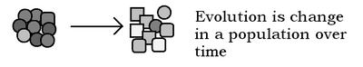 , followed, either immediately or later by other important bits. Might be a little too Introduction to evolution, though. Adam Cuerden talk 22:02, 16 May 2007 (UTC)
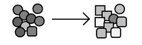 Adam Cuerden talk 22:46, 16 May 2007 (UTC)


