Talk:2009 swine flu pandemic in the United Kingdom/Archive 1
| This is an archive of past discussions. Do not edit the contents of this page. If you wish to start a new discussion or revive an old one, please do so on the current talk page. |
| Archive 1 |
Redirect?
There's actually more content in the main article than there is here, which undermines the purpose of forking. Anybody object to a redirect for the time being? –Juliancolton | Talk 22:42, 27 April 2009 (UTC)
- No, seems good to redirect for the time being. Redirect to keep the history though as some may be of use if enough information becomes available. It was a little hasty to split this off, though perhaps in a few days it can be opened again. |→ Spaully₪† 22:52, 27 April 2009 (GMT)
- Oppose redirect. This article is likely to grow, plus this article contains information which the "main" article doesn't, such as specific information towards the constituent countries. Leave the article as it is for the time being. Ijanderson (talk) 07:47, 28 April 2009 (UTC)
- Object; the article seems to be getting rapidly more comprehensive that the original main article and would be too much information to re-factor into the main global article.—Teahot (talk) 08:57, 28 April 2009 (UTC)
Relevance of Mexico City images to UK
The Mexico City images seem irrelevant and possibly misleading as they appear to suggest that face masks are being or should be being worn in the UK. I would suggest removing them --128.232.108.170 (talk) 10:08, 28 April 2009 (UTC)
- Agreed, I have removed them.—Teahot (talk) 10:45, 28 April 2009 (UTC)
A special article for this?
No one has even died. In the 1918 swine flu outbreak in the United Kingdom (there is no article for this), 250,000 people died in the United Kingdom. I really don't understand this. Wallie (talk) 14:28, 28 April 2009 (UTC)
- It's on the news, so everybody reads/hears about it and goes to Wikipedia to read and write about it. In 1918, Wikipedia didn't exist, so they didn't go off to write about the article as it happened. That's not a reason why we should not have an article on the 1918 flu, but the reason why we don't have one. Jolly Ω Janner 16:01, 28 April 2009 (UTC)
- Indeed. People are more interested in this outbreak than what happened in 1918, hence probably why someone has created this article and not the one you suggested. Not saying it is right, but that's the way things are. Wallie, please feel free to create such an article. Cordovao (talk) 20:38, 28 April 2009 (UTC)
- 1918 flu pandemic will help you greatly in writing such an article. If I were you I would go with the title of 1918 flu outbreak in the United Kingdom. "Pandemic" is a bit controversial, as it refers to a larger area than the UK like the whole of Europe for example. Jolly Ω Janner 20:47, 28 April 2009 (UTC)
- I wouldn't be surprised to see some merging of articles once this has calmed down, but in the mean time it is very helpful to have separate article for separate regions to make editing easier. No-one has died in the UK...yet...but that's not to say that no-one will. If they'd had wikipedia in 1918 I am sure that it would have been edited in the exact same way. magnius (talk) 20:53, 28 April 2009 (UTC)
Suspected case in London
http://news.bbc.co.uk/1/hi/england/london/8023627.stm --Simonr9999 (talk) 19:00, 28 April 2009 (UTC)
- I've updated the map accordingly. Jolly Ω Janner 19:39, 28 April 2009 (UTC)
- Actualy, I'm going to remove London, as tests proved she didn't have the flu. Jolly Ω Janner 23:11, 28 April 2009 (UTC)
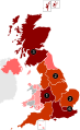
Map
Wouldn't it be more sensible to colour by county? As it is, the whole of Scotland looks infected, which isn't terribly useful when the only confirmed cases are in North Lanarkshire. 79.72.128.107 (talk) 13:27, 28 April 2009 (UTC)
- I live in Scotland and on my local news programme, a map of Scotland shows almost the whole country, excepting the Angus and Dundee areas, being infected, although not all cases were confirmed. Andrewmc123 (talk) 18:20, 29 April 2009 (UTC)
Division between constituent countries
Although I understand that there are different National Health Services amongst the UK, I do not think we need a table that divides the country up into four. I don't think we should have a map divided up like that either. England is a lot larger compared to Wales and Northern Ireland. One divided up into counties would be fairly useful if the outbreak spreads within the UK. I think a map of the UK with a pointer of the place in Scotland where the first British person was diagnosed with swine flu would be useful at this stage. Why bother with a separate article for the outbreak in the United Kingdom when the article is further divided into its constituent countries? Jolly Ω Janner 16:07, 28 April 2009 (UTC)
- There now appears to be a new map (File:H1N1 United Kingdom Map.svg), which is much better in my opinion. Although it should also have Northern Ireland included. The Republic of Ireland would probably be included in such a map, but it can be greyed out... I'll go search for a map. Jolly Ω Janner 16:18, 28 April 2009 (UTC)
- How can we update the map? At 5pm on 28 April we have to add suspected cases in London (Evening Standard report of a young woman in hospital) and "Wiltshire, Derbyshire, Yorkshire and Wales" (Daily Telegraph). The map seems fixed in graphic form. Does Wikipedia have a DHTML table overlay of a graphic we could use, so counties could be coloured simply by changing a text file included in the article? Anon, 17:32, 28 April 2009 (UTC) —Preceding unsigned comment added by 86.156.143.94 (talk)
- There might be, but I think it would be just as easy to update the map each time. It's only 194KB, although you need Inkscape to edit it. Jolly Ω Janner 16:41, 28 April 2009 (UTC)
- I have added Northern Ireland to the map, sorry about how it is, I'm not that confidant with SVG. -- [[ axg ⁞⁞ talk ]] 17:50, 28 April 2009 (UTC)
- There might be, but I think it would be just as easy to update the map each time. It's only 194KB, although you need Inkscape to edit it. Jolly Ω Janner 16:41, 28 April 2009 (UTC)
- Thank you. Jolly Ω Janner 17:57, 28 April 2009 (UTC)
I know that they are not relevant as such yet, nor or they apart of the UK, but should the Channel Islands and the Isle of Man be added to the map? Ijanderson (talk) 12:34, 29 April 2009 (UTC)
- I could easily put them onto the map and do support them being there, but does anyone else? -- [[ axg ⁞⁞ talk ]] 13:03, 29 April 2009 (UTC)
- I agree with your proposal, but where are the Isles of Scilly? Jolly Ω Janner 18:20, 29 April 2009 (UTC)
- They for some reason was not on the original map, fixed now. -- [[ axg ⁞⁞ talk ]] 19:03, 29 April 2009 (UTC)
- I agree with your proposal, but where are the Isles of Scilly? Jolly Ω Janner 18:20, 29 April 2009 (UTC)
Concerning facemasks use in the US
The following sentence needs to be revised or deleted, because it is not true for the US. It has only been recommended as being effective if the person already has the virus, not to protect oneself from the virus, except maybe as a reminder to be careful.
"In the United States and Mexico the use of surgical facemasks has been recommended as being effective.[24][25][26]"
The sources do not sustain the sentence as it is now. And the source(s)for the US are shaky. One is a medical supply company. They're just trying to sell their product. Jason3777 (talk) 04:05, 29 April 2009 (UTC)
See this CNN article - http://www.cnn.com/2009/HEALTH/04/28/swine.flu.masks/index.html Jason3777 (talk) 05:01, 29 April 2009 (UTC)
- Double checking the sources, the Times article only quotes specific events in Mexico and the US where face masks had been handed out (not necessarily in any official capacity) and advice from some US doctors (rather than authorities). The other two sources relate to Avian Flu rather than Swine Flu. On this basis I have removed this sentence.—Teahot (talk) 07:20, 29 April 2009 (UTC)
- Thank you!Jason3777 (talk) 21:53, 29 April 2009 (UTC)
Using "in the UK" on subtitles
Using "in the UK" on multiple subtitles seems highly redundant as the main page title is specifically "in the United Kingdom". Are there any objections to removing these surplus qualifications?—Teahot (talk) 07:24, 29 April 2009 (UTC)
- That's fine with me mate Ijanderson (talk) 11:14, 29 April 2009 (UTC)
- I've renamed the sub-headings accordingly. Jolly Ω Janner 16:57, 29 April 2009 (UTC)
Timescales for antivirals
The timescale for an antiviral to be effective is 48 hours; less is better. That is totally relevant to plans for distribution; having 33 million doses is useless unless they reach patients in time. I can envisage this to be a problem, in spite of anodyne announcements. In my own experience I know of a course of Tamiflu (in London, not the most remote place) which reached the patient 5 days after it was prescribed. Pol098 (talk) 14:03, 29 April 2009 (UTC)
Inclusion of general flu advice or non-UK information
As this is a UK specific page, non-UK general information is not appropriate and can be included in the main page. A number of recently added sources are about Avian Flu rather than Swine Flu and are also inappropriate (considering wp:NOTGUIDE). As my previous edit to remove some of this information has been reverted by User:Pol098 (see diff) I would like a consensus on sources appropriate for this page before being accused of edit warring.—Teahot (talk) 14:18, 29 April 2009 (UTC)
- As detailed in the previous section ("Timescales for antivirals"), information I added on the timescale of action of antivirals is 100% relevant to the UK in the face of government statements that emphasise the large stockpile but without details on distribution. I'd have expected to find somewhere in official guidelines and advice a mention, at least, of the timescales. The impression is given that if you take an antiviral at any time it will help you; in fact, more than 48 hours after symptoms appear it becomes an irrelevance. I know of a case where Tamiflu prescribed on a Friday evening got to the patient 5 days later; I'd hate to start running a temperature on the evening of 24 December. So that particular point is appropriate even within Teahot's proposed guidelines.
I had added information on facemasks, but have let Teahot's deletion stand. In my opinion this article will be used by people for information to allow them to take informed decisions; some idea of the options available and their effectiveness, over and above official guidelines, is desirable (and if others support it, I'd suggest reinstation of some of the deleted material). I'll put this argument forward and wait for other opinions. In the longer term I'd expect some of the material we're discussing to be deleted after the outbreak subsides. Unlike a paper encyclopaedia, Wikipedia can usefully include up-to-the-minute information information not of long-term interest - my note on timescale will be replaced by one of 3 alternatives: the outbreak subsided; it was contained by timely distribution of drugs; the distribution pipeline was too slow and broke down as the outbreak reduced mobility.
In the same way, some idea of general, non-UK-specific, precautions may be relevant. The fact that this epidemic is of porcine, rather than avian, origin is in many case irrelevant, as human-tranmissible flu of any origin will cause the same effects, so references related to avian flu might be relevant (I haven't checked any in detail). In fact, this flu apparently has contributions from both swine and bird viruses.
Let's see what others have to say. Pol098 (talk) 15:16, 29 April 2009 (UTC)
- Concerning the facemask sentence that I requested deleted -
- The second reference was to “Avian Flu Q&A” at http://www.kaysmedical.com/AvianFluQA.htm. From the Kays Medical Website - About Us: “From its beginnings over thirty years ago, Kays Medical has grown to become the UK 's leading independent first aid training and first aid, medical and safety supplies company.” This is a company trying to sell products and should not be used as a source in this way. I initially objected to the sentence because it simply is not true about the US and the sources do not sustain it. I think the section reads a lot better without this misinformation as the lead sentence.Jason3777 (talk) 22:30, 29 April 2009 (UTC)
- A lot more than that sentence was deemed best deleted. Pol098 (talk) 23:05, 29 April 2009 (UTC)
Yorkshire on map
The Daily Telegraph has said that "Their conditions are said to be improving, but doctors are monitoring possible new cases in Wiltshire, Derbyshire, Yorkshire and Wales".Daily Telegraph 29/04/09 However the source/information does not co-ordinate with the map, only North Yorkshire is coloured in on the map and there are four counties in Yorkshire (North, South, East and West), so how do we know which of the four counties should be coloured in? Should we colour them all or none? I think it is wrong to colour in just North Yorkshire when the source says Yorkshire. Is there any more specific sources? Until then I suggest that we colour North Yorkshire grey again until we have an exact source, because we are giving readers wrong and misleading information here. I am unable to edit SVG image, could someone perform my required edit please? Cheers Ijanderson (talk) 17:08, 29 April 2009 (UTC)
- The map could always be amended by merging the four areas into the traditional county of Yorkshire until there is an official outbreak in a specific area of the county, and then the areas could be put back, but I'm not so sure on this idea. -- [[ axg ⁞⁞ talk ]] 17:17, 29 April 2009 (UTC)
- I would support that, I won't object, thats how Yorkshire should be anyway, minus the swine flu obviously haha ;) Ijanderson (talk) 17:20, 29 April 2009 (UTC)
- I'll do that then, but If anyone does not like it, then they can just revert. -- [[ axg ⁞⁞ talk ]] 17:25, 29 April 2009 (UTC)
- If that be the case then, then none of Yorkshire should not be coloured in at all because we don't know which country of Yorkshire the Swine Flu is in yet and then we would be misleading the reader. I think colouring in the whole of Yorkshire is the best we can do for now as the source says "Yorkshire". We can change it later when/ if we have a more precise source. But cheers AXG for performing this edit mate Ijanderson (talk) 17:28, 29 April 2009 (UTC)
- I'll do that then, but If anyone does not like it, then they can just revert. -- [[ axg ⁞⁞ talk ]] 17:25, 29 April 2009 (UTC)
- I would support that, I won't object, thats how Yorkshire should be anyway, minus the swine flu obviously haha ;) Ijanderson (talk) 17:20, 29 April 2009 (UTC)
Swine flu information line now launched
This is now live using the number 0800 1513513. It is a passive voice recording with four options providing fairly comprehensive information similar to that available on the DoH website. This is not the National Flu Line due to be launched later in the year.—Teahot (talk) 11:23, 30 April 2009 (UTC)
3 more cases in UK
3 further cases, 2 in London, 1 in Newcastle, Tyne & Wear[1]
Total number in UK is now 8. pieboyjr (talk) 14:09, 30 April 2009 (UTC)
- Updated based on Guardian summary [2].—Teahot (talk) 14:29, 30 April 2009 (UTC)
Complying with notnews
The section Reported cases is a list of currently reported suspected or confirmed Swine Flu cases. Is there a consensus on how this could be re-formatted or adapted to comply with WP:NOTNEWS? I suggest that apart from reliably reported notable cases (such as the first two in the UK or the first recent school closure) the detail is dropped as the table of figures is sufficient to note the status of current UK infections and suspected infections.—Teahot (talk) 10:30, 30 April 2009 (UTC)
Misleading and alarming newspaper report (thelondonpaper)
I added information on a misleading and alarming article published in thelondonpaper, a widely read free newspaper. It was deleted with the explanation "This entire newspaper article is a work of fantasy and has no real bearing on the outbreak at hand"; this comment is obviously true, and I made that very clear in my text. I think information on the newspaper article belongs in the Wikipedia article because:
- publication of this sort of misinformation is a phenomenon which is related to the outbreak, and is in my opinion of long-term encyclopaedic interest. This is one of the things that happen in response to real threats.
- in particular it illustrates selective reporting, showing how omission of the date and selection of the highest figure in a spreadsheet used for planning leads to a sensational headline
- in the short term it may help people who use this article as a source of information, many of whom will have seen the newspaper article
In general the response of the news media to the outbreak is worth inclusion on the article
I ask for opinions on whether essentially the following text should be included:
- News media reports
An alarming report entitled "4,000 at risk of dying in Croydon if swine flu pandemic strikes" was published in thelondonpaper (a free newspaper); it is based on the fourth version of a constantly revised document produced by London Resilience[3] in March 2009, before the present outbreak, dealing with possible consequences of an established pandemic of what was expected to be a mutated strain of H5N1 bird flu. This report had the stated objective of planning response to a major pandemic and outlining roles and responsibilities of agencies, and has no relevance whatsoever to the situation as of the end of April 2009. The figure of 4,000 dead in Croydon was based on the most populous London borough and the worst combination out of the range of infection and mortality rates tabulated: the largest number in a spreadsheet with 429 cells.
Pol098 (talk) 18:54, 30 April 2009 (UTC)
 I'd say not to include such items in this article. I would follow the rationale of WP:NOTNEWS and WP:DIRECTORY in that the article is not intended to be a collection of all possible news articles or an completely exhaustive archive or exposition. It would be an entirely appropriate source for a new WP article based on the press manipulation of the flu outbreak in order to sell more newspapers. In a similar fashion you could argue for a new WP article based on the political manipulation of the flu outbreak or the economic impacts of the outbreak.—Teahot (talk) 22:28, 30 April 2009 (UTC)
- I do not see what this has to do with the actual outbreak. It is a work of fiction dating back to before the outbreak even occurred and has no relevance to the outbreak at hand. Articles such as this are here for facts, cold and hard, so there is no need to clog it up with fantasy. magnius (talk) 09:59, 1 May 2009 (UTC)
- "It is a work of fiction dating back to before the outbreak occurred" That's not so. If you read the article and the London Resilience report very carefully, everything in the body text is true. It is based on an absolutely legitimate government planning report[4], and does say in the text that the 4000 dead in Croydon is a worst-case figure. The headline "4,000 at risk of dying in Croydon if swine flu pandemic strikes" is I think misleading and reprehensible; "Croydon residents are at a higher risk of dying from swine flu than any other London borough if a pandemic hits the capital, a top-level report says" is untrue if interpreted strictly (more Croydon residents are at risk as it's the most populous borough, but the risk is assumed in the report to be uniform across London). The fact of the publication of this article under this headline is I think relevant to the outbreak, as I discussed above. However, I note so far 2 votes against, none for (excepting my opinion).
Regardless of the newspaper rehash, I think the official report itself is relevant, so will add a link to it.Pol098 (talk) 14:39, 1 May 2009 (UTC)
- "It is a work of fiction dating back to before the outbreak occurred" That's not so. If you read the article and the London Resilience report very carefully, everything in the body text is true. It is based on an absolutely legitimate government planning report[4], and does say in the text that the 4000 dead in Croydon is a worst-case figure. The headline "4,000 at risk of dying in Croydon if swine flu pandemic strikes" is I think misleading and reprehensible; "Croydon residents are at a higher risk of dying from swine flu than any other London borough if a pandemic hits the capital, a top-level report says" is untrue if interpreted strictly (more Croydon residents are at risk as it's the most populous borough, but the risk is assumed in the report to be uniform across London). The fact of the publication of this article under this headline is I think relevant to the outbreak, as I discussed above. However, I note so far 2 votes against, none for (excepting my opinion).
 Why did you bother to ask for other's opinions if you intended to ignore the consensus?.—Teahot (talk) 15:35, 1 May 2009 (UTC)
- The consensus, which I asked for and respect, is that mention and discussion of the report in thelondonpaper was not appropriate. When I asked for opinions "It is a work of fiction..." obviously is an objection to mentioning the newspaper item, not the official report. (If I misunderstood and it's suggested that the plan itself is a work of fiction, why of course, all plans are, but it doesn't make them irrelevant.) I don't see how the existence of a report planning London responses for a flu pandemic can be anything but highly relevant to "2009 swine flu outbreak in the United Kingdom#Preparations". However, I hadn't seen that the UK plan as a whole was available; this perhaps reduces the need for the ref to the London plan. I do think that brief mention of the official London plans should remain (together with other regional plans that may be available), but if there is consensus against this too, so be it. I also remain of the opinion that the text (above) which deals with the thelondonpaper report should be included, but so far the consensus is clearly against inclusion. Pol098 (talk) 16:08, 1 May 2009 (UTC)
- My apologies, I misunderstood your note and fully withdraw my comment. I would agree that the official London pandemic plan is a relevant report to include.—Teahot (talk) 16:12, 1 May 2009 (UTC)
- No problem! Pol098 (talk) 17:32, 1 May 2009 (UTC)
- My apologies, I misunderstood your note and fully withdraw my comment. I would agree that the official London pandemic plan is a relevant report to include.—Teahot (talk) 16:12, 1 May 2009 (UTC)
- The consensus, which I asked for and respect, is that mention and discussion of the report in thelondonpaper was not appropriate. When I asked for opinions "It is a work of fiction..." obviously is an objection to mentioning the newspaper item, not the official report. (If I misunderstood and it's suggested that the plan itself is a work of fiction, why of course, all plans are, but it doesn't make them irrelevant.) I don't see how the existence of a report planning London responses for a flu pandemic can be anything but highly relevant to "2009 swine flu outbreak in the United Kingdom#Preparations". However, I hadn't seen that the UK plan as a whole was available; this perhaps reduces the need for the ref to the London plan. I do think that brief mention of the official London plans should remain (together with other regional plans that may be available), but if there is consensus against this too, so be it. I also remain of the opinion that the text (above) which deals with the thelondonpaper report should be included, but so far the consensus is clearly against inclusion. Pol098 (talk) 16:08, 1 May 2009 (UTC)
2 more cases
Graeme Pacitti, the friends of Iain and Dawn Askham has contracted the virus, the first person to have contracted it in the UK itself. They are also reporting of somebody in Merseyside as positive. [5]
Total number in UK is now 10. pieboyjr (talk) 15:07, 1 May 2009 (UTC)
642 suspected cases
--Simonr9999 (talk) 15:52, 1 May 2009 (UTC)
- Now seen on HPA "HPA - Update on confirmed swine flu cases in England". www.hpa.org.uk. Retrieved 2009-05-01.—Teahot (talk) 16:00, 1 May 2009 (UTC)
11th case confirmed
New case confirmed in a Year 7 girl from Downend School, South Gloucestershire. School closed until Monday 11 May, followed same procedure as Paignton Community College, distributing Tamiflu to students in Year 7. [6]
Total number in UK is now 11. pieboyjr (talk) 16:27, 1 May 2009 (UTC)
13 cases in the UK
Another case of human-to-human transmission in the UK, this time in South Gloucestershire, but not connected to the schoolgirl case, and another case confirmed in the South-East of England. [7]
Total number in UK is now 13. pieboyjr (talk) 20:14, 1 May 2009 (UTC)
Misleading map
Currently the map suggests there are suspected cases in only a few counties, but this is based on scant local news reports. This misleads people into thinking their county is completely free when there are 230 suspected cases in the UK, probably widely spread. Perhaps the map should only indicate confirmed cases and the table can show the suspected cases. UK counties are just too small compared to states in North America. |→ Spaully₪† 12:28, 1 May 2009 (GMT)
- It's not how small they are, it's how many they are, keeping up to finding and updated the map is not easy. But I have gone with your advise and have removed the yellow on the map, and I have also changed the colours on the article infobox just to make it clear. -- [[ axg ⁞⁞ talk ]] 17:20, 1 May 2009 (UTC)
- Ditto. It's impossible to track the number of "possible" cases on the map... there are hundreds of them! Jolly Ω Janner 17:45, 1 May 2009 (UTC)
- Thanks, that looks good. There is also the issue of not being so much local reporting for both reasons of size and number. This is probably the best solution for now at least. |→ Spaully₪† 07:30, 2 May 2009 (GMT)
Names and addresses of swine flu victims
The article currently gives the names and locations of several early victims. Although some of these people have chosen to sell their stories to the newspapers, others may have been named in the press without their approval. I suggest that quoting full names and location is avoided on this page unless it is clear that the victim has chosen to speak directly to the press and can therefore be assumed to be happy that their name and location is widely published. What is the general view?—Teahot (talk) 09:58, 2 May 2009 (UTC)
- I largely agree with that, but as the Scottish couple have very clearly decided to identify themselves, going as far as hiring a PR agent, they should remain named in the article. It is enough to say age (if known), sex and locality in all other cases. magnius (talk) 10:06, 2 May 2009 (UTC)
Milestone summary
Rather than all the detail from reported cases I was considering adding a simple milestone/timeline table such as:
| Date | UK Swine Flu Milestone |
|---|---|
| 27 April 2009 | First two UK H1N1 cases confirmed in Scotland after a flight from Mexico |
| 29 April 2009 | Paignton Community and Sports College becomes first school closure |
| 1 May 2009 | First two UK person to person transmissions confirmed |
Some of the surplus descriptions from Reported cases could then be trimmed. Comments?—Teahot (talk) 15:21, 2 May 2009 (UTC)
- I have no problem with that, it would certainly make for a much tidier article. magnius (talk) 15:27, 2 May 2009 (UTC)
- Good idea, it makes it much more clear. Pieboyjr (talk) 16:03, 2 May 2009 (UTC)
15 cases based on ECDC
ECDC now says 15 [8]. What are they basing that on? I note that their table is dated 1 May, 21:00 CEST which puts it later than the HPA and on that basis I've updated the article to their figure. Interesting that the media has not used this figure for the morning press.—Teahot (talk) 06:58, 2 May 2009 (UTC)
- This is strange, there has been no mention of this on BBC or Sky so far today, and you think they would have picked up on it. I imagine the Health Protection Agency or the Government/Scottish Government will make some sort of announcement later today. Pieboyjr (talk) 12:27, 2 May 2009 (UTC)
- Sky News have just had confirmation from the Department of Health, announcing 2 new cases in North-West and South-East England. Also, the Scottish Government is going to hold an emergency press conference, they were planning to issue an electronic statement but have changed it at the last minute. [9] Pieboyjr (talk) 14:08, 2 May 2009 (UTC)
- BBC News' UK situation map suggests that a case has been found in Oxfordshire, however the total only comes up to 14. -- [[ axg ⁞⁞ talk ]] 21:52, 2 May 2009 (UTC)
- The map in question has discounted one of the confirmed tests in London/South-East, because the case was in a Mexican pilot who has now left the country, so technically there are now only 14 confirmed cases in the UK. Pieboyjr (talk) 08:11, 3 May 2009 (UTC)
- BBC News' UK situation map suggests that a case has been found in Oxfordshire, however the total only comes up to 14. -- [[ axg ⁞⁞ talk ]] 21:52, 2 May 2009 (UTC)
- Sky News have just had confirmation from the Department of Health, announcing 2 new cases in North-West and South-East England. Also, the Scottish Government is going to hold an emergency press conference, they were planning to issue an electronic statement but have changed it at the last minute. [9] Pieboyjr (talk) 14:08, 2 May 2009 (UTC)
Table listing number of cases
It isn't entirely accurate, for isntance not all the numbers add up to 27 (they addd up to 30) and in england there is supposidley 12, but in one part of england there is 13. -- xerkid —Preceding unsigned comment added by 82.5.221.244 (talk) 16:58, 4 May 2009 (UTC)
This table is in principle ambiguous at the moment, though unlikely to mislead anybody. Most entries in both the suspected cases and the deaths columns have the value "—". In suspected this means unknown or unspecified; in deaths, zero. Perhaps the deaths should all be zero? Or suspected simply left blank, or "?" ?
In fact, perhaps this table is premature, and the "suspected" (by region) column unnecessary as the figures aren't available, and the "deaths" column unnecessary at least for the moment (it can always be reintroduced); the only useful figures tabulated at the moment are the confirmed cases by region column. Pol098 (talk) 19:07, 4 May 2009 (UTC)
- Death column removed until such a time, if ever, that a death is attributed to this virus in the UK.—Teahot (talk) 20:18, 4 May 2009 (UTC)
If the cases under investigation column is kept it needs to be kept up-to-date: these numbers fluctuate wildly (e.g. 700, then 300 later the same day). Pol098 (talk) 22:23, 4 May 2009 (UTC)
- It's an interesting number, though perhaps the single UK figure on the map would do and be easier to maintain. Unfortunately the figure is the number of suspected cases based on the number of referrals awaiting testing rather than a predicted figure which might be more mathematically reliable.—Teahot (talk) 22:48, 4 May 2009 (UTC)
- Actually there appear to be 2 sorts of unconfirmed cases: ECDC's "probable cases" (6 for the UK at a time when there are 27 confirmed), and HPA's "cases under investigation" (331). Before I started meddling the article's infoboxes and tables mentioned "suspected cases" but listed the number of "cases under investigation". At the time of writing both text and numbers are "cases under investigation", which seems sensible to me. Somebody could well list ECDC "probable" cases here; we perhaps need to be aware of this and have a guideline. I propose the guideline: list only HPA "cases under investigation" (just to start the ball rolling). References to these numbers should best be limited to ECDC and HPA, with preference to ECDC for confirmed cases because the figures are updated on the same web page (HPA puts out reports on new web pages). Pol098 (talk) 00:02, 5 May 2009 (UTC)
Suspected spam or personal sites added to external links
I have removed the following sites under the guidance of WP:ELNO and WP:DIRECTORY as they are registered to individuals rather than organizations and are therefore less reliable than referring to the "official" sites of WHO, ECDC etc.
- www.swinemap.org - this personal site points to a google map of the outbreak but there is no explanation of how it will be maintained, apart from by the kindness of strangers.
- flucount.org - this anonymous personal site appears to aggregate total figures of official cases but this data is as readily available at the ECDC site, and again the site does not explain how it will be maintained.
- symptomsswine-flu.blogspot.com - obviously falls foul of WP:RS.
Policy on reporting school closures
The number of school closures are ramping up. Now the first five have been added, is there a number beyond which it's not worth naming them on the page but just having a total number of schools affected or some other notable feature (such as a large number of confirmed cases or repeated closures)?—Teahot (talk) 23:23, 4 May 2009 (UTC)
Table sorting
Is the table of number of cases by region supposed to be sorted on some criterion within each country? At the moment it looks random. The obvious criterion would be alphabetical. Pol098 (talk) 18:59, 6 May 2009 (UTC)
- At one point it was alphabetic, I think editors have added the latest county to the bottom as they arose. Alphabetic would make sense in the long term as it is easier to maintain.—Teahot (talk) 19:02, 6 May 2009 (UTC)
Link to HPA press releases
The HPA are at present issuing a daily press release with the current number of cases confirmed and under investigation, information on them and on the outbreak, and recommendations. They also have a web page with links to all their press releases, mainly daily updates at the moment.
In some places in this article we need the current figures; in others we want older, more detailed information (which will show out-of-date figures, of course). In some cases we'll want to link explicitly to an older release (e.g., for details of regional breakdown, schools closed, etc.). But I think that a double link to both the list of press releases (stable) and also the latest (changing) "Update on confirmed swine flu cases" is useful, so I've created a proposed link. I'm not sure if the cite web template will do, so I've changed the format[1]. So if you want to say that the current number of cases is 47[1], a number to be kept up to date in the text, we'll use the new reference. If we want to say that the number on 7 May was 34[2] (and always will be) and that one is a schoolchild, we reference the appropriate update.
Does anyone have strong opinions in favour or against?
- References
- ^ a b HPA list of press releases, including day-by-day updates on confirmed swine flu cases (this link is unlikely to change) The daily updates give the current number of cases confirmed and under investigation, with additional details, and are linked from this page.
Update on confirmed swine flu cases: 9 May 2009 (this link will be updated frequently) - ^ HPA Update on confirmed swine flu cases: 07 May 2009 (this link will not be changed)
- It's a much better system relying on a source nobody can doubt. Linking to the press releases page so the reader can choose the latest news themselves is a good bet.—Teahot (talk) 08:22, 10 May 2009 (UTC)
Requested move
Regarding the proposal to move this article to 2009 H1N1 flu outbreak in the United Kingdom (see top of this talk page), the matter has been debated extensively on the main article talk page (see 2009 swine flu outbreak#Article name) and if this ever resolves I would expect to follow that conclusion. In the meantime here is a summary of "official" sources, showing that from a UK perspective there is little official consensus on naming and consequently no urgent need to rename the page:
| Organization | Name | Ref |
|---|---|---|
| WHO | Influenza A(H1N1) | [10] |
| ECDC | Influenza A(H1N1) and novel influenza virus A(H1N1) | [11] [12] |
| HPA | Swine Influenza | [13] |
| BBC | Swine Flu | [14] |
—Teahot (talk) 10:18, 3 May 2009 (UTC)
- 'In the United Kingdom'. -- [[ axg ⁞⁞ talk ]] 10:24, 3 May 2009 (UTC)
- Thanks, tweaked the link name above.—Teahot (talk) 08:08, 5 May 2009 (UTC)
As the main article has been moved to 2009 flu outbreak, presumably the UK page should become 2009 flu outbreak in the United Kingdom; any objections?—Teahot (talk) 20:51, 4 May 2009 (UTC)
- Scrub that, it's been moved back to 2009 swine flu outbreak. No need to worry about it until the debate on Talk:2009 swine flu outbreak comes to a stable consensus.—Teahot (talk) 22:28, 4 May 2009 (UTC)
- I have removed the requested move tag on this talk page as the discussion on the main talk page has been frozen for the time being. The conclusion being to wait.—Teahot (talk) 20:45, 14 May 2009 (UTC)
Rate of increase/decline?

The article at present shows a snapshot of the current situation. Maybe a graph showing either the number of new cases and cases under investigation day by day, or maybe the cumulative number of confirmed cases and the number (not cumulative) of cases under investigation would give an idea of how the outbreak is developing? Pol098 (talk) 14:32, 5 May 2009 (UTC)
- There was one for a while included on the main 2009 swine flu outbreak page but it was probably removed as original research; I have included it as a thumbnail image here... If you could find someone publishing and maintaining a UK version somewhere on the web, it would be interesting to include.—Teahot (talk) 18:09, 5 May 2009 (UTC)
- I noticed that it's been back for some time on the main page, with a logarithmic version too. The data does not appear to include the UK (the spreadsheet is available on the Commons page for the chart).—Teahot (talk) 07:50, 12 May 2009 (UTC)
Table sources
The table lists many different sources for information on each region. Many of these are news items, so become out of date when there is a new case in a region. The BBC are publishing a map in their flu reports which seems to be updated (with a new URL) as new cases are reported. It would make sense to use the latest version of this map for all the information in the table so long as is is maintained by the BBC; the URL will change, but this single URL could be updated for the whole table. Here is the map current at the moment (with 28 cases UK-wide). If publishing the URL in this form is not acceptable, a link to the BBC report with the latest map would be OK.
This would involve removing all the individual references for the map, and adding a single one at the top. Hopefully adding up the numbers for the regions within each of the United Kingdoms could be done without it being considered original research? Pol098 (talk) 20:24, 6 May 2009 (UTC)
- It is a good source of data, and I agree that a central source would work better. Though there is no guarantee that the BBC will keep such a map up to date and I can see that at some future point the breakdown of cases by county may be too unreliable to keep maintained here and only the figure for the countries within the UK would have to do (based on HPA or ECDC official figures). I would recommend a reference to a top level BBC news page such as http://news.bbc.co.uk/1/hi/uk/8034260.stm as it is a better reference than the gif directly as the image is not actually dated as might be suspect as a source. As for the total figure, it would probably be best to stick to the latest published HPA or ECDC total for the UK rather than adding up the BBC figures by county as there are likely to be errors in reporting all cases at that level (for example some cases may reside in one county but be diagnosed in another or be diagnosed while travelling) and such a calculation, albeit a very simple one, probably would fall foul of WP:OR. Another small issue is that the BBC map does not consistently use county names but refers to towns and cities and this might be slightly confusing; considering the mention of "as it is presented" in WP:BURDEN.—Teahot (talk) 22:24, 6 May 2009 (UTC)
- >at some future point the breakdown of cases by county may be too unreliable to keep maintained here and only the figure for the countries within the UK would have to do
- obviously the article will have to change if the outbreak continues; accurate numbers of cases will cease to be available
>reference to a top level BBC news page...not the GIF
- Yes
>As for the total figure, it would probably be best to stick to the latest published HPA or ECDC total for the UK
- Actually irrelevant, as the BBC displays the HPA total below the map, but HPA and ECDC are better as the primary sources for UK totals; it's the county figures I suggest are best single-sourced
>the BBC map does not consistently use county names but refers to towns and cities
- I don't think we need to worry unduly about whether a case is in Greater Manchester or in the next road in Cheshire. Pol098 (talk) 23:38, 6 May 2009 (UTC) - The BBC uses WHO information anyway (it says underneath tha maps on the pags). The UK map is no longer updated (or hasnt been for nearly a week when I last checked. I think that the BBC is also a less reliable source. Personally i would just use HPA. All cases reported as confirmed are actual laboratory confirmations and the data has been updated daily without fail since the first cases in the UK. HPA authority on the subject compaired to BBC is almost too obvious to bother mentioning. Wuku (talk) 16:31, 14 May 2009 (UTC)
- >at some future point the breakdown of cases by county may be too unreliable to keep maintained here and only the figure for the countries within the UK would have to do
References in templates
Is there any guideline for not putting references in templates where possible? I ask because I moved the details of a commonly used and edited reference (HPAinfo) to the first place in the article where it was used, which happened to be in a template. I moved it to the first use on purpose, as it makes it a bit easier for a future editor to find it by searching from the beginning of the file; I paid no attention to it being in a template. I've done this on other occasions; maybe I shouldn't? Whatever the outcome I'm not going to bother to move it again here, it's not important. Pol098 (talk) 21:31, 10 May 2009 (UTC)
- I don't think there would be any issue. If a reference was orphaned then someone probably renamed a reference that another reference called. I doubt that the problem was it being embedded inside an infobox. Logically it would make sense for the citation to be named on its first occurrence on the page but again, if it were not, this would still not cause an error.—Teahot (talk) 21:51, 10 May 2009 (UTC)
- There was no question of error; it worked fine, and exactly the same before and after it was moved out of the template. But somebody saw fit to move the definition of the reference out of the template, commenting "Moving refs out of templates", and I wondered if there's a guideline or body of opinion. (The same edit also dealt with an orphaned reference, but it was totally unrelated to this point). Pol098 (talk) 23:21, 10 May 2009 (UTC)
AnomieBOT, a bot which fixes up orphaned references amongst other things, moves references out of templates unless there is
<!-- AnomieBOT: Don't move -->
anywhere inside the <ref></ref>. See the link for the reasoning behind this. Pol098 (talk) 15:22, 22 May 2009 (UTC)
Map up to date?
I have noticed that the map of UK flu spread has remained constant for a few days. Is the map up to date? If not how come? I have spotted one fault. North Lanarkshire is not shaded. http://en.wikipedia.org/wiki/North_Lanarkshire as far as i can tell the rest are good. —Preceding unsigned comment added by 128.243.253.113 (talk) 15:29, 13 May 2009 (UTC)
- North Lanarkshire was shaded but the first couple where actually from the neighbouring Falkirk, It's hard to update the map now since most sources are no longer telling which county they are in but the region instead. So I was thinking about merging the map to regions instead. -- [[ axg ⁞⁞ talk ]] 16:49, 18 May 2009 (UTC)
Policy on listing reported cases
The detail of reported cases is looking a bit tired. It's impossible to continue to report the details of how many people caught flu, where and on what day. Apart from key events (such as a particular outbreak) I suggest the daily reporting idea is dropped and the section is reformatted into a summary only.
On a similar note, the table of cases by county is out of date and will probably stay out of date as the HPA is only giving figures by wider region. I suggest the figures are only retained for countries in the UK.
Any other suggestions?—Teahot (talk) 20:40, 14 May 2009 (UTC)
Map (May 23 update, etc) & confirmed cases
-

-
 number of cases map
 -
 standard map


Perhaps instead of adding numbers to the UK map, a second UK map should be created, like the US map. 70.29.208.129 (talk) 03:28, 24 May 2009 (UTC)
- Agreed, the current map is a bit garish compared to the USA graduated style map.—Teahot (talk) 07:58, 24 May 2009 (UTC)
- I think that would be a better idea, I'll have a go. -- [[ axg ⁞⁞ talk ]] 10:32, 24 May 2009 (UTC)
I don't like it, change it back The C of E (talk) 10:58, 24 May 2009 (UTC)
- I agree, changing the current map to a new colour scheme is unproductive, since it requires updates across many languages. Right now, legend keys are broken across several languages because of that change. That's why I said a second map should be created. Then you could choose to use the old colour scheme or the new one. 70.29.208.129 (talk) 12:17, 24 May 2009 (UTC)
- Right:

-- [[ axg ⁞⁞ talk ]] 16:37, 24 May 2009 (UTC)
Use the origional one, its better than the current one The C of E (talk)
Disregard my last comment, I didn't look at the page first The C of E (talk) 17:22, 24 May 2009 (UTC)
New Map
Seriously, this new map is rubbish Bring back the old one! you need to see the amount of cases per county for ease of understanding. The C of E (talk) 10:57, 24 May 2009 (UTC)
- th old map is too far out of date. We only have up to date data for regions not counties! The new maps with larger regions are less precise but more accurate. The new map with pink/red scale should be used because it highlights how heavily infected a region is. Wuku (talk) 10:14, 25 May 2009 (UTC)
- No no no. If the map is out of date then just update it but don't use the pink/red scale because we can't see which individual counties are infected. And we can see the amount of infections anyway on the cases by region box in the Detailed reports section The C of E (talk) 11:45, 25 May 2009 (UTC)
- I added the regions map instead because the counties map would result in endless updating, it is way out of date and the HPA are reporting cases in regions, not in counties. Mirrorme22 (talk) 17:38, 26 May 2009 (UTC)
- The regions map is useless at this stage. Everything apart from Wales and North-East England is one shade of red. It adds almost nothing to what the world map already tells you and that is that there are confirmed cases in the UK. Either revert to an out of date county based map, or move to a county based map with varied shading. You might as well as just have a single red coloured UK, pointless. (on the plus side this would negate the need to update the map at all from now) Further more it also impairs adding the Isle of Man as it is not part of the EU and hence does not form a region that has the same status as the others. .--Lexxus2010 (talk) 12:15, 28 May 2009 (UTC)
- I agree with lexxus2010. Still, if people do not update it at a steady pace, I suggest we go to regions map. Notelitten (talk) 12:31, 28 May 2009 (UTC)
- Maybe so, but the Health Protection Agency is confirming cases in regions and not in counties. I agree that the region map doesent show very much, but nobody has updated the counties map in quite a while. I suggest we use the shaded regions map then, instead of the current one. Mirrorme22 (talk) 15:13, 28 May 2009 (UTC)
- I agree with lexxus2010. Still, if people do not update it at a steady pace, I suggest we go to regions map. Notelitten (talk) 12:31, 28 May 2009 (UTC)
- The regions map is useless at this stage. Everything apart from Wales and North-East England is one shade of red. It adds almost nothing to what the world map already tells you and that is that there are confirmed cases in the UK. Either revert to an out of date county based map, or move to a county based map with varied shading. You might as well as just have a single red coloured UK, pointless. (on the plus side this would negate the need to update the map at all from now) Further more it also impairs adding the Isle of Man as it is not part of the EU and hence does not form a region that has the same status as the others. .--Lexxus2010 (talk) 12:15, 28 May 2009 (UTC)
- I added the regions map instead because the counties map would result in endless updating, it is way out of date and the HPA are reporting cases in regions, not in counties. Mirrorme22 (talk) 17:38, 26 May 2009 (UTC)
- No no no. If the map is out of date then just update it but don't use the pink/red scale because we can't see which individual counties are infected. And we can see the amount of infections anyway on the cases by region box in the Detailed reports section The C of E (talk) 11:45, 25 May 2009 (UTC)
- th old map is too far out of date. We only have up to date data for regions not counties! The new maps with larger regions are less precise but more accurate. The new map with pink/red scale should be used because it highlights how heavily infected a region is. Wuku (talk) 10:14, 25 May 2009 (UTC)
people have to realise, the maps can only be updated using the data we are provided by reliable sources. It is not about having the most precise map if the data is less accurate and less reliable. The HPA (currently the most reliable and regular source) gives data by region and it is no longer possible to produce an accurate map by county. As a result all maps will have to be be regions. I agree that the plain red map is of little value, as it only identifies the few regions that have not confirmed cases, and that the red/pink scale map should be used. The current maps are fine, and should only need updating to show the current data, i can't imagine any further work needs doing untill any confirmed deaths arise. Wuku (talk) 22:55, 28 May 2009 (UTC)
Another map ... File:Swine_Flu_United_Kingdom_Regions_Map.svg
Another map has shown up... Image:Swine_Flu_United_Kingdom_Regions_Map.svg 70.29.208.129 (talk) 12:19, 1 June 2009 (UTC)
Maps.... confirmed cases everywhere!
The first map seen on the page is the completely red map. This is currently the less useful of the two (untill a death occurs it doesn't really say anything; of course it will be useful when/if that happens). I suggest we place the red/pink scale map in its place, at the top of the article. Also the map (red/pink scale) could also be modified to have a black spot in the centre of the region when a death occurs. This way the red/black map is no longer needed. Any thoughts? Wuku (talk) 10:22, 4 June 2009 (UTC)
- Compltelely agree. A completely filled in red map is useless until/if there is a death. The red-pink would be better until then. Jozal (talk) 08:33, 5 June 2009 (UTC)
- Yep completely agree, so when it does come to editing and adding black to the map are you suggesting that a black spot should be added, would this look a bit odd comparing this map with other maps that just fill in the whole area black? Also the dot would be a bit odd in the London region with it being a small area. I was think about since deaths are more likely to be reported, would it be possible just to use black in the counties in which it was reported? -- [[ axg ⁞⁞ talk ]] 09:18, 5 June 2009 (UTC)
- If we do the same as the USA maps we would have two maps; one for cases and one for deaths, in the style of the currnt red/pink scale maps (but with better colour scale hopefully). But only if there are multiple deaths per region is this practical. That is why i suggested the balck spots on the red/pink scale map to show the deaths while they are still in low numbers. It would just make it tidier using one map. Wuku (talk) 13:22, 5 June 2009 (UTC)
-
Yellow-Red-Black map (case type map)
-
Pink-scale map (confirmed cases map)
-
 Grey-scale map (deaths map)
 -
 Multicolour map (total cases map)


- USA uses four maps, now that the map is all red and black, the number of deaths work better; but that only works when there are atleast two shades used. 70.29.208.129 (talk) 05:15, 6 June 2009 (UTC)
Bargraph
An outbreak evolution bargraph might be good...
Look at the one under construction for Australia ( Talk:2009 swine flu outbreak in Australia/workpage )
70.29.210.130 (talk) 09:58, 9 June 2009 (UTC)
- Something like this: -- [[ axg ⁞⁞ talk ]] 00:33, 11 June 2009 (UTC)

User:Wuku
User:Wuku has deleted several discussions from this talk page before they had a chance to be archived. I have restored these sections. They will likely be archived at the next MiszaBot archival sweep. Or the one after that. 70.29.210.130 (talk) 06:50, 9 June 2009 (UTC)
- When the article was moved to the current 'pandemic' name, the archives were rather carelessly not moved along with it. I have now moved the archive and renamed the auto-archive location accordingly.—Teahot (talk) 09:43, 13 June 2009 (UTC)
Maps
.svg)
A death map has appeared for the UK (File:H1N1 United Kingdom Map - Region (Deaths).svg) ...
-
 Swine flu outbreak in UK 28-02-2009.svg
 -
 UK Swine Flu 2009.PNG


Two outbreak by country maps also exist for the UK...
Death in Scotland

So can someone update the world deaths map to account for Scotland?
70.29.212.226 (talk) 04:23, 15 June 2009 (UTC)
![]() Done
Done
Another new map...

Another new map has shown up, with numbers on the map itself... like one of the earlier revisions to the regular map when confirmed cases were numbers on a red map...
Maps of Argentina
-
 H1N1 Argentina Map.svg
Deaths/Confirmed/Suspected map -
 H1N1 Argentina map by confirmed cases.svg
Confirmed cases map -
 H1N1 Argentina deaths.svg
Death count map


Someone at the talk page for Argentina's flu article noted that the Falklands appears on the Argentine map... and that they are coloured in.
It's also interesting that it contains coloured sections for Antarctica... which it signed the Antarctic Treaty saying it wouldn't press its claim...
70.29.212.226 (talk) 08:34, 23 June 2009 (UTC)
- I'm not convinced that the presence of a map on Wikipedia means that the government of Argentina isn't abiding by its treaty obligations...!
- That said, I think that the Falklands should probably not be included in Argentina's map, or at least there should be a note explaining that the Falklands is claimed by Argentina but administered by Britain.
- Cheers, This flag once was redpropagandadeeds 11:09, 23 June 2009 (UTC)
- Ideally these maps would have surrounding countries, such as Chile, in grey to allow orientation. The Falklands really should be grey also but it is such a minor issue to argue over I have no intention of raising hackles by changing it. I would suggest letting it be unless anyone feels strongly about it. |→ Spaully τ 12:19, 23 June 2009 (GMT)
- Argentina has always claimed that it owns these regions. At one time any atlas imported into Argentina was stamped to indicate that the islands were "Malvinas", not Falklands; I don't know if this is still the case. The claims are consistently maintained without necessarily being pressed. This is a long-term political issue entirely unrelated to any particular event. Pol098 (talk) 13:11, 23 June 2009 (UTC)
- Ideally these maps would have surrounding countries, such as Chile, in grey to allow orientation. The Falklands really should be grey also but it is such a minor issue to argue over I have no intention of raising hackles by changing it. I would suggest letting it be unless anyone feels strongly about it. |→ Spaully τ 12:19, 23 June 2009 (GMT)
- The Falklands/Maldives are actually an overlay onto the Argentine mainland map, so is not useful for orientation, since they are out of place and not scaled to the size of the mainland. The same goes for Antarctica (which has no cases, AFAIK, but is still tinted as having cases). 70.29.212.226 (talk) 21:53, 24 June 2009 (UTC)
- An earlier note here says"I think that the Falklands should probably not be included in Argentina's map...". As this is discussed here, I would say, without any opinion of my own or axe to grind, that Argentina has always considered both the "Malvinas" (Falklands) and the claimed Antarctic sector as part of the country. Maps printed in the country always contain insets for both, and imported maps used to be (and may still be) overprinted; this may well be a legal requirement. If anyone wants to jump in and try to change the Argentina flu article, as Britain claims and controls the Flaklands (this was a genuine typo, but it's so appropriate I think I'll let it stand) and claims an overlapping Antarctic territory, be it so; but be aware that it will generate a lot of heat and little light. Let's hope there are no cases in the Falklands. This discussion is, in my opinion, totally irrelevant to this article and a waste of space. Pol098 (talk) 17:57, 26 June 2009 (UTC)
Isle of man
Isle of Man has first case [15] Map should be updated. - 82.16.6.88 (talk) 23:30, 25 June 2009 (UTC)
 Done, thanks. -- [[ axg ⁞⁞ talk ]] 07:35, 26 June 2009 (UTC)
Jersey and Isle of Man
I noticed that both have entries on the timeline of the Europe article, but aren't here. I think most readers would expect atleast a pointer for them here. 76.66.203.200 (talk) 14:51, 28 June 2009 (UTC)
Missing data
I believe the missing data on the bar chart sorta thing is:
- 3 / 4672
- 3 / 5516
Respectivly. --Doctor.cure (talk) 08:52, 30 June 2009 (UTC)
- Do you have a source for this data? All the the other confirmed cases are from the HPA website, which didn't cover 27 or 28 Jun. (By the way, there is a discussion page for the bar chart here: Template talk:UK swine flu bargraph) Mmm0tive (talk) 12:56, 30 June 2009 (UTC)
30 Jun data
I know it's only 10 AM (roughly) but I believe todays data to be between 6,300 and 6,400.
--Doctor.cure (talk) 09:02, 30 June 2009 (UTC)
- I think it is better practice to wait for an article/report (preferably from the HPA) with todays figures than to do make our own predictions. Mmm0tive (talk) 11:31, 30 June 2009 (UTC)
Regional updates[needs update]
The regional figures within England always seem to be out of date. While I can see the point of giving these figures, they're worse than useless most of the time unless someone updates them frequently. Possibly they could be omitted from the article as they're (at present) kept up-to-date on the HPA website and report which is linked: "See the HPA website for regional breakdown". Alternatively perhaps whenever they're updated they should have an ''{{update after|2009|6|23}}'' flag dated 2 or 3 days ahead (this shows as[needs update] from, in this case, 23 Jun 09)? This would perhaps prompt people to update the figures (and flags).
Incidentally, there are now so many cases in Scotland that maybe, if we keep the England regional breakdown, we should restore the Scotland breakdown? It's on the HPA and/or Scottish government websites. Pol098 (talk) 00:15, 23 June 2009 (UTC)
The "update after" flags have been removed on 28 June 2009, but the data are still badly out of date; the total cases figure listed is 4250, but the sum of the regional figures as listed in the table is 3502 (82% of the listed total). Removing the update flag is just wrong, it gives the impression that the figures are supposed to be reasonably accurate. (1) If nobody updates these figures they should be removed; it can be said that they are to be found on the HPA daily report. (2) Alternatively the update flag, dated 2 or 3 days ahead to allow a bit of slop, is needed to inform readers that the figures are wrong, and to prompt editors concerned about this to update them. Pol098 (talk) 19:24, 28 June 2009 (UTC)
- My mistake, people had been updating numbers without changing the {{}} dates making the page a mess. Numbers now up to date. Please do read WP:SOFIXIT though, all that time calculating could have been put to better use. |→ Spaully τ 21:51, 28 June 2009 (GMT)
- "All that time calculating?" Do you mean adding the numbers? Copy and paste into a spreadsheet, 20 seconds! My own opinion is that it's pretty pointless to have the regional breakdown as it has to be kept laboriously up-to-date, and official figures are only a click away on the HPA website; which is why I've been updating country but not regional totals. That's just a personal opinion, if it's generally thought to be a good thing, I have no problem. And it would also make sense to have regional breakdown in Scotland, with many cases; not yet in Wales or NI. (Added later: I find the breakdown for Scotland isn't available anywhere obvious, though I have seen it in the past.) The official numbers are likely to be major underestimates anyway; mathematical modelling in the USA estimates around a million actual cases vs. about 30,000 "confirmed" and 1500 "probable", and I see no reason for it to be different here in the light of the official criteria (if not either back from abroad or in contact with confirmed cases, do not continue with the swine flu flow chart and hence do not count). This is more a late-night ramble than a carefully reasoned argument so I'll stop 01:55, 29 June 2009 (UTC)
- Region update is needed for London, 1 death must be added. --Doctor.cure (talk) 11:53, 3 July 2009 (UTC)
- Done, thanks. -- [[ axg ⁞⁞ talk ]] 12:04, 3 July 2009 (UTC)
- Region update is needed for London, 1 death must be added. --Doctor.cure (talk) 11:53, 3 July 2009 (UTC)
Exponential growth
The UK growth is impressively exponential, really a great example of disease spread, except it takes us to 25k or so within 2 weeks! Excel has the growth equation to be:

Day zero being 27th April. R2, the measure of fit, is 0.97 for these dates; if you lose the first 8 days this comes to 0.99 fit for:

I will try to make a graph of the UK growth for the article, but this is really striking. It also indicates the UK government use of tamiflu and quarantine had pretty much no effect on the spread. Anyway, enough OR for one night, but really very interesting. |→ Spaully τ 00:13, 1 July 2009 (GMT)
- It's really interesting how predictable the figures have become. However, this is only the confirmed cases, there have been suggestions that there may be significant number of unreported cases. Probably still be a exponential growth though.
- I found, while setting up a graph for the cases, that has been a weekly variation in the number of cases reported. The percentage increase is more between on tue-fri. I'd guess that's probably more to do with the reporting of data than the actual spread of H1N1. -- m0tive (talk) 09:13, 1 July 2009 (UTC)
- I'd expect growth to be exponential regardless of measures taken unless the measures were sufficient to suppress the outbreak; but the measures would affect the exponent. I haven't thought about the theoretical details, just note that "the UK government use of tamiflu and quarantine had pretty much no effect on the spread" does not come from valid reasoning (fallacy). The exponential nature of the growth is not surprising if the mechanism of spread is constant and the number of cases is increasing. When and if the outbreak spreads to such an extent that existing measures have to be abandoned it will be interesting to see if the data becomes best fitted by a 2-part curve with one exponential up to a certain date, and then by an exponential with a higher exponent.
It might be interesting to relate the parameters of the exponential to the mean number of people infected by each case, and in turn to the mean time that people are both infectious and in contact with others and the probability that someone in contact with a case will become infected.
A useful formula, assuming exponential growth according to the formula above, is the number of days d taken for the number of cases to increase by a certain factor n: d = ln n/0.0937. Double in 7.4 days (just over a week); 10-fold in 24.6 days. Pol098 (talk) 14:13, 1 July 2009 (UTC)- True, though the data doesn't really support there being a lower exponent for the early spread - perhaps in the 50-150 cases range with the eye of faith.
- So you're referring to R0, the number of new cases per primary case, and the equation for the spread of a disease such as this is
- I'd expect growth to be exponential regardless of measures taken unless the measures were sufficient to suppress the outbreak; but the measures would affect the exponent. I haven't thought about the theoretical details, just note that "the UK government use of tamiflu and quarantine had pretty much no effect on the spread" does not come from valid reasoning (fallacy). The exponential nature of the growth is not surprising if the mechanism of spread is constant and the number of cases is increasing. When and if the outbreak spreads to such an extent that existing measures have to be abandoned it will be interesting to see if the data becomes best fitted by a 2-part curve with one exponential up to a certain date, and then by an exponential with a higher exponent.

It would be interesting to find or calculate exponentials fitted to the growth in different countries, and see if the exponent varies. This might reflect different containment and treatment strategies, winter spread in the south, etc.Pol098 (talk) 15:10, 1 July 2009 (UTC)
- You can see most of that information from the gradients of country plots on this: File:Influenza-2009-cases-logarithmic.png.
- The problem is that the UK is one of very few countries that has a sufficiently developed medical system and few enough cases to track a good percentage of cases and with what appears to be a minimal time lag. The US was too overwhelmed. Perhaps Australia is in a similar position to us though they appear to have been playing catch-up for the first week of their outbreak.
- There is a lot of interesting delving to be done, perhaps more worthy of a medical publication though. |→ Spaully τ 17:20, 1 July 2009 (GMT)
- Yes, within the context of Wikipedia this is all Original Research (anathema!). I'm not familiar with the mathematics of epidemics as such, though it seems obvious that if each case infects on average the same number of other people we'll get exponential growth. I could continue, but as you imply there's little point. Thanks for the pointer to the exponential spread figures, which I'll examine later. Pol098 (talk) 18:08, 1 July 2009 (UTC)
Clinically presumed
We may need to start thinking of a "clinically presumed" column in the regional table. This figure is given by the HPA for England at present. Note that the HPA algorithm doesn't call for lab testing in many cases that are almost certainly A/H1N1. Weeks ago a UK expert guesstimated that there are twice as many cases as officially confirmed; and in the US a study based on mathematical modelling on the basis of surveys estimated about 33 times as many cases as were confirmed. Pol098 (talk) 15:07, 1 July 2009 (UTC)
- I see somebody's replaced "34+19presumed" with "53". The trouble is that this isn't correct. Laboratory confirmed (lc) and clinically presumed (cp) are quite distinct (and well-defined in the HPA algorithm linked in the article). We must decide whether to ignore cp (and say so), or add lc and cp (and say so), or list lc and cp separately. There are going to be more cp cases as time goes by and testing diminishes. Pol098 (talk) 00:13, 3 July 2009 (UTC)
- Since the policy changed yesterday, most diagnosed cases will be clinically presumed and only a handful will be laboratory confirmed (as I understand it). I think we shall have to treat CP and LC cases as the same to keep up with the current published figures. -- m0tive (talk) 08:45, 3 July 2009 (UTC)
Graph of deaths
As long as deaths remain below about 0.67% (40 in 6000) the black bar on the graph will be invisible. That figure is 13 times the present rate. In other words, the black bar is pointless unless the flu gets a great deal more virulent (even 0.67% is barely noticeable; look at the red bar for 40-80 cases while the total stands at 6000). Pol098 (talk) 20:14, 1 July 2009 (UTC)
- Maybe scale the value by 40 so it is visible? Though, that would make it a visually miss representative of the number deaths vs cases ration. -- m0tive (talk) 20:37, 1 July 2009 (UTC)
- A separate graph for deaths? 70.29.208.69 (talk) 22:06, 4 July 2009 (UTC)
2009 flu pandemic in the United Kingdom and the Crown Dependencies
Should the article be changed from "2009 flu pandemic in the United Kingdom" to "2009 flu pandemic in the United Kingdom and the Crown Dependencies" because this article contains information about the three Crown Dependencies and it is misleading (some could say biased) to call the article "2009 flu pandemic in the United Kingdom". We could also create a separate article called "2009 flu pandemic in the Crown Dependencies"? But we can't leave it as it is. Ijanderson (talk) 17:28, 4 July 2009 (UTC)
- I don't think you could support a crown dependencies article on its own, it'd be very small, and someone will invariably nominate it for deletion. In any case you couldn't call it "crown dependencies" since that's biased, it assumes there are no other crown dependencies in the world except those of the English crown. It might be misleading, but it is how the rest of the world views the UK... how do the other UK articles handle the naming issue? 70.29.208.69 (talk) 22:04, 4 July 2009 (UTC)
- Someone might consider adding them to the map... 70.29.208.69 (talk) 22:10, 4 July 2009 (UTC)
Disused maps
- disused maps
-
by county
-
 deaths
 -
by country
-
 by confirmed cases (per region)
Why is this gallery included in this talk page? Is there any reason to keep this here?—Teahot (talk) 09:42, 10 July 2009 (UTC)
Regions confirmed cases maps
-
Swine Flu United Kingdom Regions Map.svg
-
H1N1 United Kingdom Map - Region.svg
-
 H1N1 United Kingdom Map - Region 3.svg
Seems like there's another region confirmed cases map available. 70.29.212.226 (talk) 07:21, 21 June 2009 (UTC)
- Region update is needed for London, 1 death must be added. --Doctor.cure (talk) 11:53, 3 July 2009 (UTC)
- Done, thanks. -- [[ axg ⁞⁞ talk ]] 12:03, 3 July 2009 (UTC)
- Region update is needed for London, 4 deaths need to be added causing a total of 5 deaths in London. The remaining 4 deaths are of an unknown location to me. --Doctor.cure (talk) 17:22, 9 July 2009 (UTC)
- The deaths will not be added until a locational source is provided, since I can't find any sources for the new 7 deaths. -- [[ axg ⁞⁞ talk ]] 19:23, 9 July 2009 (UTC)
- Region update is needed for SCOTLAND and EAST OF ENGLAND - 3 deaths need to be added to SCOTLAND giving a total of 5 deaths and 1 death needs to be added to the EAST OF ENGLAND giving a total of 2 deaths. This will give us the over all total of 15 deaths due to swine flu in the UK.--Doctor.cure (talk) 08:51, 11 July 2009 (UTC)
- The deaths will not be added until a locational source is provided, since I can't find any sources for the new 7 deaths. -- [[ axg ⁞⁞ talk ]] 19:23, 9 July 2009 (UTC)
- Region update is needed for London, 4 deaths need to be added causing a total of 5 deaths in London. The remaining 4 deaths are of an unknown location to me. --Doctor.cure (talk) 17:22, 9 July 2009 (UTC)
- Also I forgot to mention the shade of Wales's red needs to be changed from its current shade to the 50+ shade of red. Thank you who ever edits. --Doctor.cure (talk) 08:59, 11 July 2009 (UTC)
- We are still missing a death, your totals only add up to 14, also where is the source for Wales? -- [[ axg ⁞⁞ talk ]] 09:08, 11 July 2009 (UTC)
- Dude my source is sheer logic! if you look at the diagram its PINK showing 5+ cases of swine flu, but if you look at the table further down the page there are " 102 " cases in WALES, this data is 100% correct and thus the diagram needs to be updated so that WALES is the 50+ shade of RED. --Doctor.cure (talk) 17:53, 13 July 2009 (UTC)
- We are still missing a death, your totals only add up to 14, also where is the source for Wales? -- [[ axg ⁞⁞ talk ]] 09:08, 11 July 2009 (UTC)
- Also I forgot to mention the shade of Wales's red needs to be changed from its current shade to the 50+ shade of red. Thank you who ever edits. --Doctor.cure (talk) 08:59, 11 July 2009 (UTC)
File:H1N1 United Kingdom Map - Region 3.svg
-
File:H1N1 United Kingdom Map - Region.svg
-
File:H1N1 United Kingdom Map - Region 2.svg
-
File:H1N1 United Kingdom Map - Region (Deaths).svg
-
File:H1N1 United Kingdom Map - Region 3.svg
The map used on this article is broken, File:H1N1 United Kingdom Map - Region 3.svg has a big black square (formerly some black sea area) where it should be blank. See it in comparison to the two other maps used on the Europe article above, and the map it replaced.
76.66.192.91 (talk) 06:04, 15 July 2009 (UTC)
- Done, black area removed, I did not know what was doing it. -- [[ axg ⁞⁞ talk ]] 11:19, 15 July 2009 (UTC)
HPA graph
Would it be worth including one of the graphs from the HPA Weekly epidemiological update? Maybe figure 2 from the pdf, "RCGP weekly consultation rate for influenza like illness 2008/09 and recent years" -m0tive (talk) 12:42, 17 July 2009 (UTC)
Update suggestions
Infection rates for two London boroughs along with a number for all of London can be found in [17]. That could be something for the article. FHessel (talk) 11:31, 29 July 2009 (UTC)
What statistics?
After 2 July figures on lab-confirmed cases become meaningless (they were probably massive underestimates of actual cases anyway). Figures on cases will be based on guesswork, possibly based on surveys rather than picked out of the air. The time will come when the number of deaths will be the only meaningful measure; it will not be totally accurate as cause of death will not always be clear. (This is not particularly worrying, thousands of people die of flu every year.) What statistics should the article report, and with what regional breakdown? Maybe some detail on age distribution of cases and deaths would be desirable.
I'd suggest keeping the day-by-day progression graph as historical information that an encyclopedia should contain, but not adding to it. Pol098 (talk) 16:35, 6 July 2009 (UTC)
- It could still chart deaths, or you could separate the deaths into a separate chart. 70.29.208.69 (talk) 14:13, 7 July 2009 (UTC)
- If you are referring to "Laboratory-confirmed cases of AH1N1 Influenza in the United Kingdom", I'd vote for removing it. The data shows a nice curve but the graph looks dreadful in my browser (Firefox) with axis dates overlapping and the underpinning data is contestable as to accuracy anyway. Better just to refer to an external site with similar data in my opinion.—Teahot (talk) 09:47, 10 July 2009 (UTC)
The number of laboratory-confirmed cases has become meaningless since 2 July. I'd suggest that the most useful figure to replace it with is the GP ILI consultation rates, published weekly by the HPA[18]. In the current (week 29) update the UK daily rate and the worst regional ones, but not the daily rate for all regions, is published. Daily regional rates are plotted, and the previous week's weekly regional rates are tabulated. Unless I've missed something in a quick check. Pol098 (talk) 18:19, 16 July 2009 (UTC)
I still feel that for scientific interest purposes, for the general public; that the data which is meaningless in terms of the figure should still be shown. I have been trying to track the levels of this illness and it is very awkward to find the data. —Preceding unsigned comment added by 81.77.169.44 (talk) 18:20, 29 July 2009 (UTC)
GRAPH
- JUL 9th 2009 there are 9,718 cases and 14 deaths - please update the graph as we have the data and thus the data should be displayed. —Preceding unsigned comment added by Doctor.cure (talk • contribs) 17:20, 9 July 2009 (UTC)
- There will be no more figures for laboratory-confirmed cases; if there were, they'd be meaningless as testing has stopped. So the cases bars can't be continued. Deaths are fairly pointless on the graph at the moment as they're too few to show as a bar.
P.S. There is actually a figure for laboratory-confirmed cases of 10,649 on 15 July (HPA Weekly National Influenza Report 16 July 2009 (Week 29)), but I maintain that it's meaningless. Pol098 (talk) 18:08, 16 July 2009 (UTC)
Remove the outbreak map
I believe the map should be removed. It is no-longer serving a purpose. The death labels are out of date and infections are no longer being tracked. Thanks/wangi (talk) 18:18, 21 July 2009 (UTC)
- I agree with that Thenthornthing (talk) 21:06, 21 July 2009 (UTC)
map
We can replace the old map with the case-type map (Region 2) or the figurative death figures map. 76.66.192.64 (talk) 05:45, 22 July 2009 (UTC)
Policy on news items which may not be directly relevant?
Can I suggest a general consensus for inclusion (or deletion) of news items? I am considering the currently included items of:
- "28 Wimbledon staff had been asked to stay at home with flu-like symptoms..."
- "A study published in the Lancet suggests that prolonging the school holidays could reduce the spread of the virus..."
Rather than having separate debates about these, how about an inclusion criteria of:
News articles must be verifiable with quality sources from official government organizations or established news agencies and directly relevant to the UK 2009 flu outbreak. Speculative articles and transient news items which are unlikely to affect government plans or the UK public perception of the pandemic should be considered off-topic.
This could be added as a note to the top of the talk page as on-going advice for contributors.—Teahot (talk) 08:50, 21 July 2009 (UTC)
Now added at the top of this page.—Teahot (talk) 07:54, 22 July 2009 (UTC)
Number of deaths?
The article seems to contain 2 different figures for the number of deaths. In the infobox at the top it says there have been 36 deaths but on the table in the 'Detailed reports' section it says there have been 41 confirmed deaths. Islaosh (talk) 16:50, 13 August 2009 (UTC)